I’m back from the comic shop this week and I got five new comics.
Check them all out here:
I’m back from the comic shop this week and I got five new comics.
Check them all out here:
Sometimes my brain is tired and just can’t handle making any art but my hands still want to do something. It’s kind of a weird situation that most people never face but it’s fairly common to me. At those times I’ll do some things that are closer to craft than to art.
The difference between art and craft is the difference between creation and recreation. Keep in mind that there is a lot of overlap between the two. Art only has to be made once. Craft is making something many times over. If I’m making a painting I don’t ever think about painting that exact same painting again. If I’m knitting a sweater I want to make a pattern for that sweater so I can make more of them. It’s a different thought process knowing you have to make more than one of something.
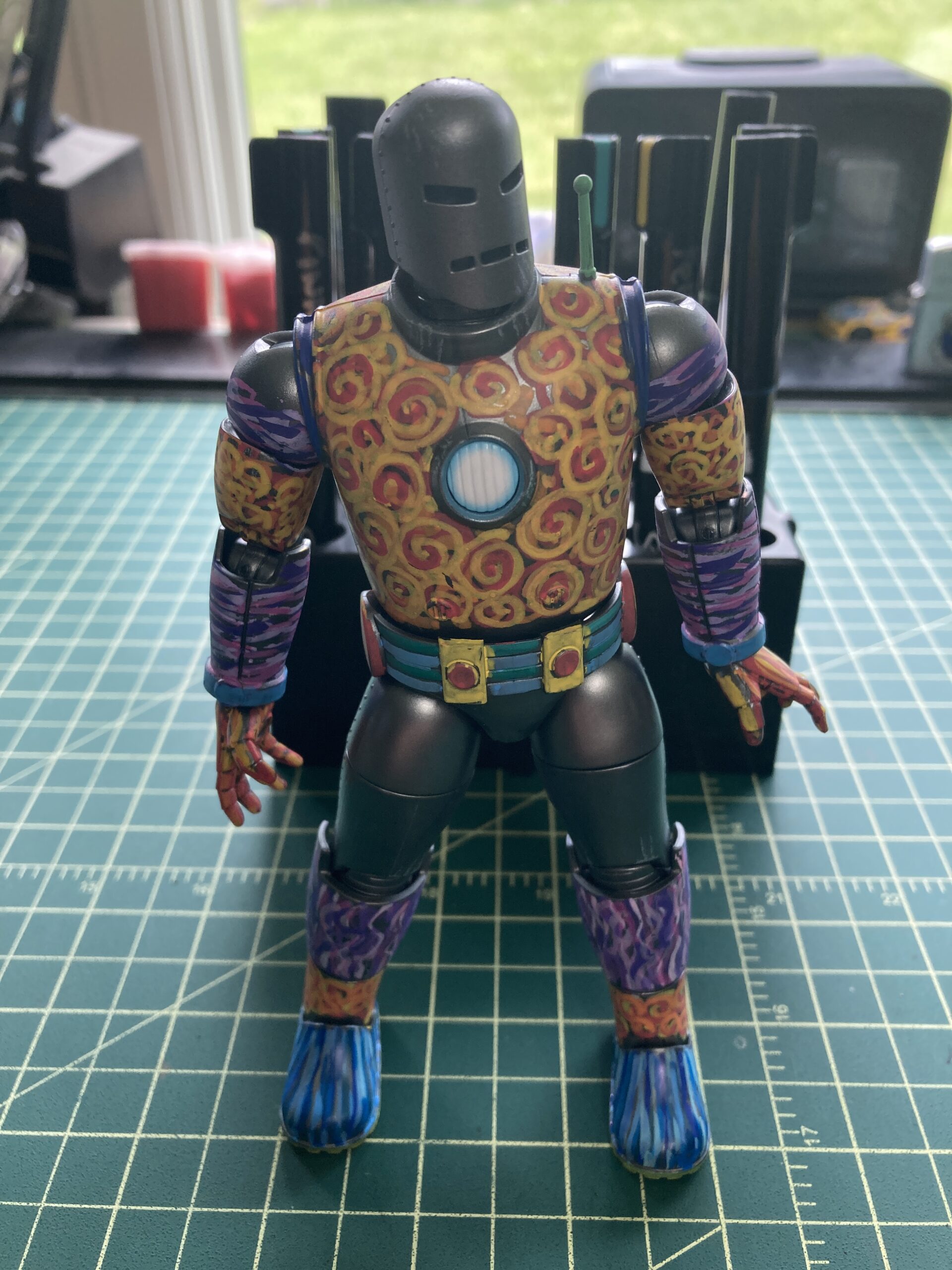
The two crafts that I was making were making prints form the covers of old comic books and painting an action figure.
Let’s take painting the action figure first. It’s an action figure of the original iron Man in his grey armor. I bought this one specifically because it is all grey and I thought it would be fun to paint. I’m going to paint him over time and so far I’ve only painted his arms.
This one has a lot of overlap between art and craft. It’s like painting a model and there are a lot of people who paint models and it’s mostly craft. They have learned a lot of techniques to paint models realistically and they do a terrific job of it because they know exactly what they’re doing. If they want to paint shiny armor they know the steps and can follow them precisely. That’s not what I’m doing.
I’m painting the toy in a more artsy way. I’m making Iron Man look like an abstract expressionist toy. So far one part of his arm is painted with swirls and the other with off color tiger stripes. I’m using acrylic paint pens and I have to invent my technique as I go.
The inventing of the technique is the artistic part. It’s like the person who comes up with the pattern for the sweater. That’s where the art is. Once the sweater pattern is done then anyone with knitting skills can recreate that pattern with their crafting skills. Anyone who learns these painting techniques that I’m coming up with (it’s not hard) can paint an Iron Man toy like mine. That’s the craft of it all.
The second thing I was doing is 100% craft. First of all let’s start off with the fact that I own an inkjet printer and if you own an inkjet printer you have to use it. If you don’t use an inkjet printer often its print heads will clog up and you have to waste ink running cleaning cycles. Is I like to print with mine at least a few time a week.
As you can tell from this blog I’m a comic book fan. One of the things I like to print out are 11×17 inch versions of comic book covers that I like. Just last week I bought a copy of The Flash #159 with a cover by Carmine Infantino with the intent of making myself a print of it. Just for fun. I looked on eBay for a copy of it that had a good clean cover, that means less digital clean up work for me, and I found one for about $20. Nice.
The process of making a print of the cover is all craft. Anyone can do it. At least anyone with a scanner and copy of Photoshop or the equivalent. I’ve been working digitally for thirty years so coming up with the technique for this was easy for me and it’s probably the same technique that anyone with digital skill would come up with.
First I scan in the comic book cover at 600 DPI. That’s as high a resolution as my scanner can do and it’ll be plenty. That’s my master file and I open it up to work on. The first thing that I do is to copy the image of the cover onto a new layer. I’ll make changes on this new layer/copy and leave the original untouched in case I have to go back to it.
After making sure the image is straight It’s mostly a matter of using the healing brush and clone tool to clean up any imperfections in the scanned art. Since the Flash comic is from the 1960s there are some nicks, scrapes, and ticks in the original ink. It takes some time and a sharp eye but these can be clean up fairly easily. I’ve also discovered over the years that “Content Aware Fill” does a good job of duplicating the line screen that comics are printed with. It duplicates the comic book dots well. That can help.
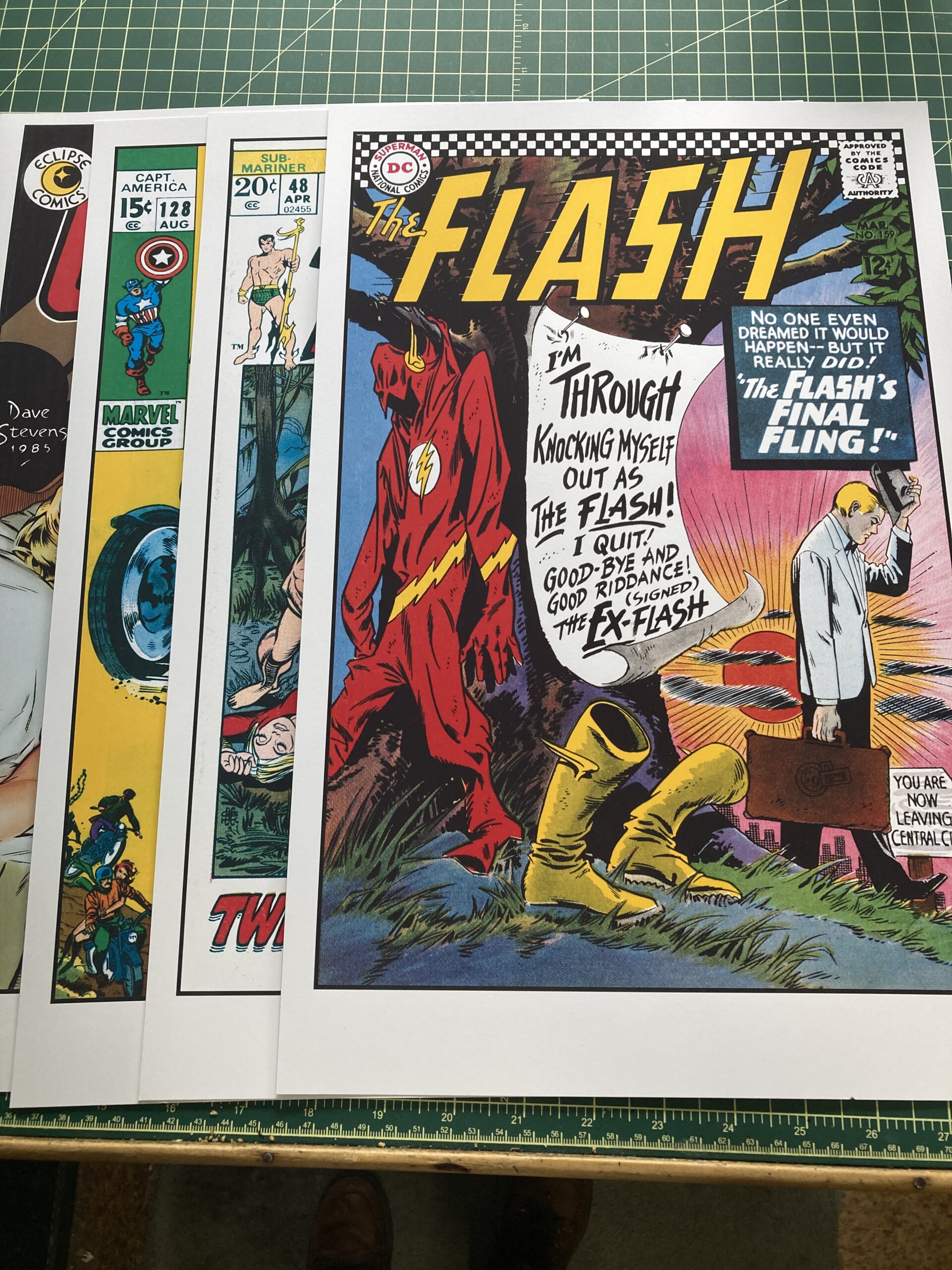
Printouts of Flash 159 and Company
Then I open up my 11×17 inch digital template (it’s at 300 dpi for printing) and paste in the new cleaned up comic book cover image. I have a black border in the template to cover up the ragged edges of an old comic book. At this point I will also clean up the edges to make sure they meet the border nicely.
I also have to color correct the comic. I convert the color to CMYK (Cyan, Magenta, Yellow and Black each color has its own “Channel”) from RGB (Red, Green, Blue) because the original comic was printed using the CMYK color space and I find it easier to color correct in CMYK. I’ve found that with these old comics the color had faded a little and also yellowed.
I use an adjustment layer and adjust the “Curves.” The curves are just a visual representation of what color is in the piece. I can adjust the curve of each individual channel. First I adjust the bottom of the curve. I move 10% down to 0%. That means that anything that was 10% of a color is now white. That gets rid of the paper greying over time. But the paper is still more yellow than any other color so I open the yellow channel and turn that down 20% to 0% and the “Paper” is white again.
Then I have to strengthen the top of the color curves. The original comic was printed only with 100% black ink but as I look in the black channel it’s much less than 100%. So I turn 60% black all the way up to 100% and the black channel is strong again.
Here is where knowledge of old school comic book coloring comes in handy. I know that the Flash’s costume is 100%M with 100%Y. My scan only has them at about 80%. So I go into the channels and turn them up. The same for blue.
Now that all the color correcting is done I print it out. Getting all the print settings correct is its own chore. If any of them are wrong the print comes out wrong. So I pick matte paper, the matte paper setting, 11×17 inch size, high quality printing, Photoshop manages color, hard proofing, and CMYK color space. I find that this gives me the best color. Then I print it out and have it to look at.
There you go. That is the couple of things that I was doing yesterday when I didn’t have the energy to make art. Sure craft takes energy too but it’s a different kind of energy. At least I had that kind.
I’m back from the comic shop this week and I got sixteen new comics.
Check them all out here:
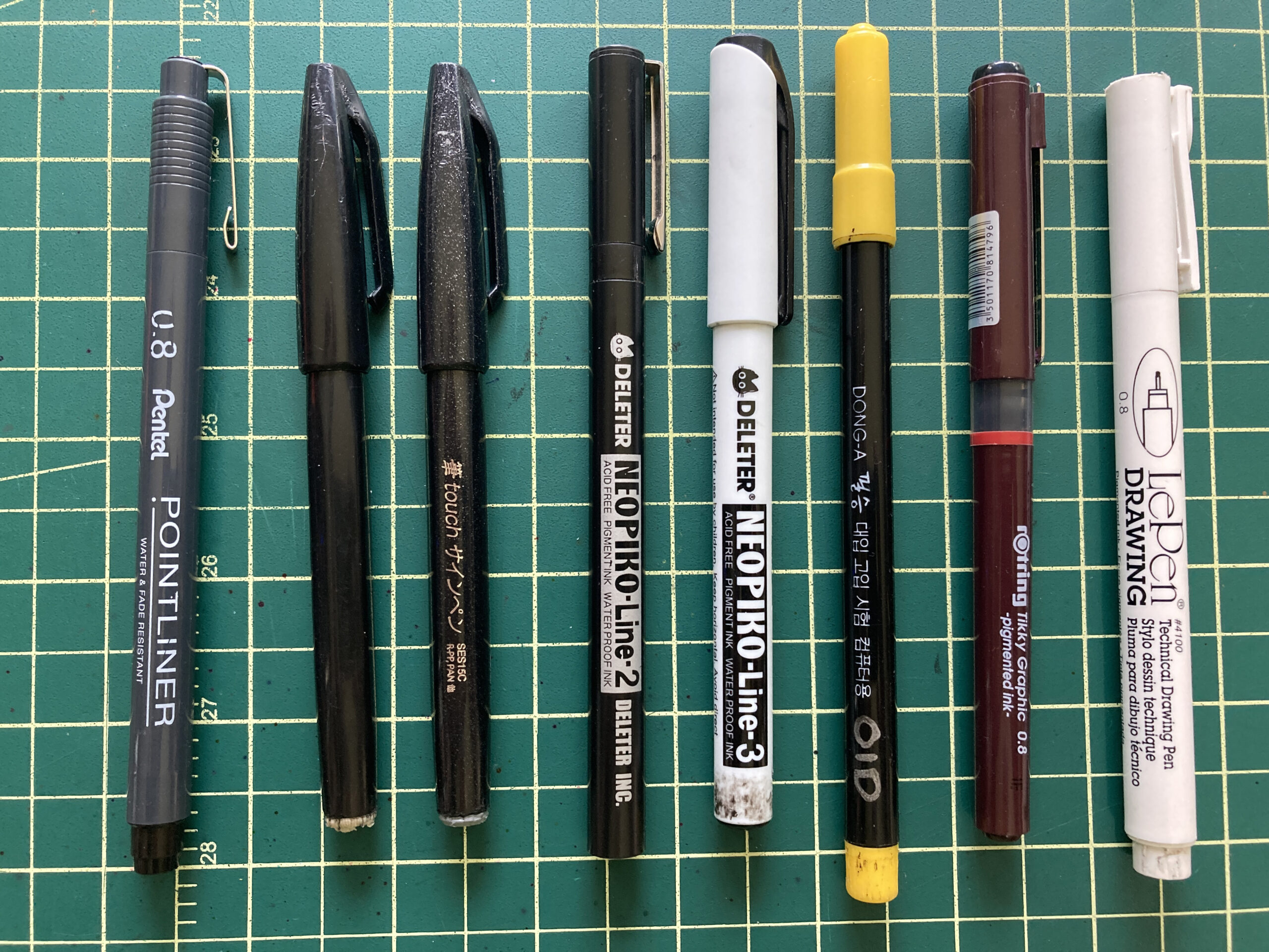
Lots of Black Markers
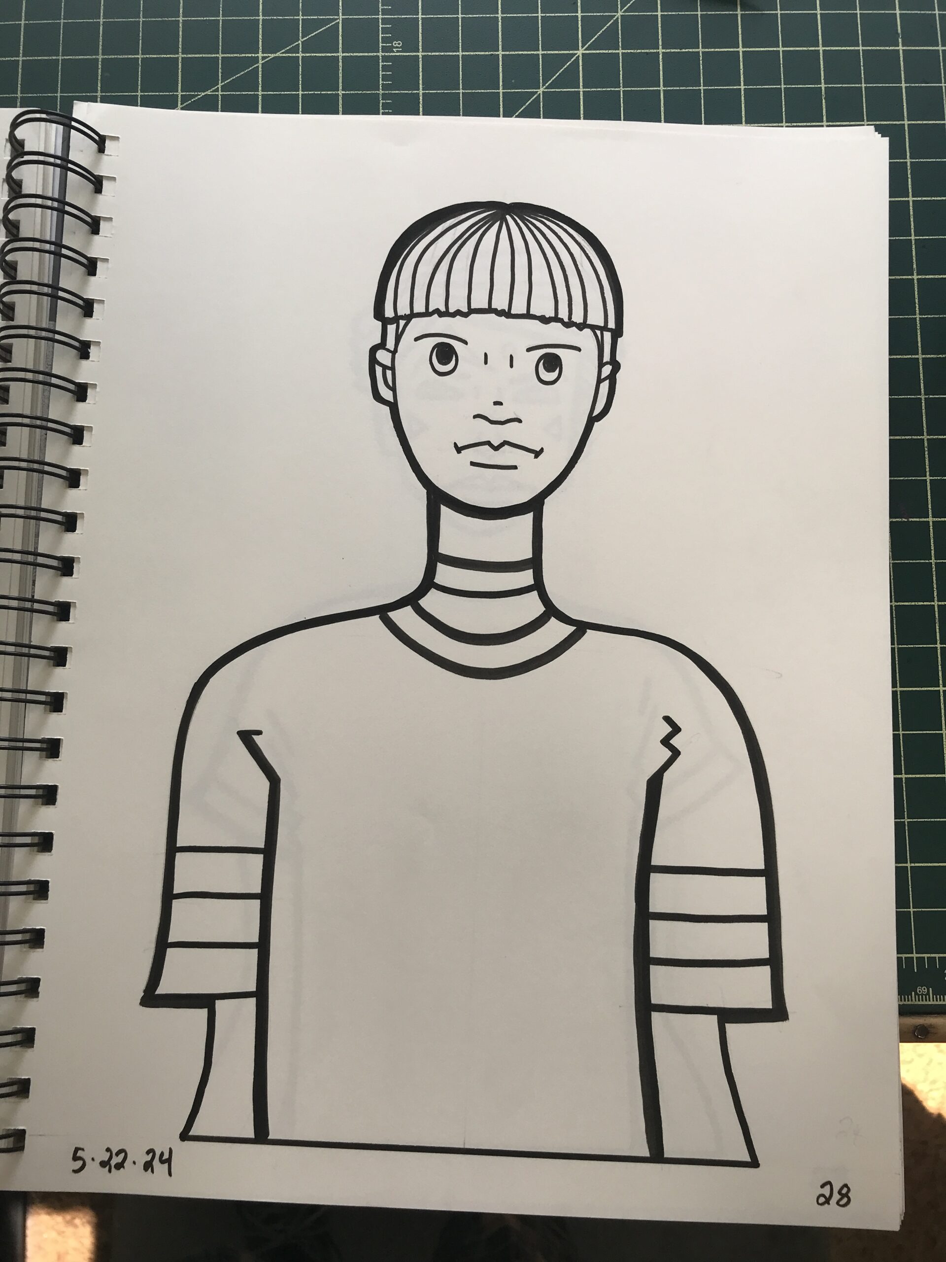
I was making some drawings this week and I made some with my Three Marker technique (Art Writing Three Marker Technique Blog) for the first time in a little while. It’s actually not as accurate a name for the technique as it once was because I’ve added some markers to it but I decided to go back to basics and make some with just the three pens.
That’s when I ran into a problem. One of the three pens, the Tikky Graphic .8 was running out of ink and I went to pull out a replacement for it and I had none. That was my last Tikky .8 and I wondered how I could not have bought any more when I pulled out that last one. When I went online to try and get some more that’s when I realized that they don’t make them anymore. Bummer.
The world of art supplies is filled with tools that they don’t make anymore. Every artist has a favorite brand of art supplies art a favorite particular tool that stops being made. I’ve heard from many a cartoonist that the best white-out ever made was something called Snowpaque. I’m unsure of that spelling because there is a new company called Snopake that makes white out but it’s not the same one. The original was gone by the 1980s and I’ve only heard tell of it.
I have a friend who has been using Primacolor Art Stix for years and years but they just recently discontinued them. He went out searching for the last of them and spent hundreds of dollars buying up all the ones he could. You can still get them eBay but they cost between $200 to $400 for a set of 48 Art Stix. And how long before those too are sold out and used? Not a good time if you’re an Art Stix fan.
All this got me thinking of my favorite supplies and which ones are gone now. It turns out that all three of the markers from my Three marker technique are no longer made. How crazy is that? But two have decent supstitues. It’s that Tikky .8 that doesn’t have one so far.
Tikky Graphic .8 — By the way the .8 in the name refers to the fact that the tip in .8 of a millimeter. At least that’s what I learned a long time ago. I learned it so long ago that I’m not even 100% sure if it’s correct. But what else could it be?
The Tikky has an ink that I really like a lot. It’s very dark and flows off the pen tip in a more liquid way than my other markers. It makes a very pleasing line. It also uses a liquid ink reservoir rather than a sponge with ink in it so I can’t refill it. Other markers I pull the sponge out of and refill them with India ink. So once the Tikky is dry it’s done.
Tikky still makes other size Graphic pens but the .8 was the biggest one and that’s why I like it. On Tikky’s website I saw that they are now making a .7 Graphic pen but they are nowhere to be found to buy. I’m certainly willing to try that one out but I can’t.
I ended up finding some of the Tikky .8s on Amazon. They were going for around $6 a pen so I ordered a half dozen of them. The strange thing was that the six pens I ordered came from five different places in five different packages. They all must have been among the last pens in whatever warehouse they were in. I don’t think I’ve ever had pens delivered like that before.
Dong-A Computer Pen — I used to get these pens from Jetpens.com and they’re just cheap Japanese Sign Pens. I refill them with India ink and they go for a long time. They don’t make them anymore but I still have a few of them left and the Pentel Sign Pen is interchangeable with it. There is not much of a difference between the two but I like the yellow caps and black barrel on the Dong-A. I’ll be sad when the last one is used up.
Deleter Neopiko Line 2 – 2.0 — This pen tip is big (2 millimeters) and has nice black ink (I also refill it) and is my go-to thick marker for my Three Marker drawings. It’s got a black barrel and cap but it was replaced by the Neopiko Line 3 which has a white barrel and cap. The Line 3 model is a solid replacement but the tip, though just as wide, is a little bit shorter. That and the fact that my Line 2 pen is worn down (from use) makes the new model feel very different. But I’ll eventually get used to it. And it’ll wear down like the old one too.
Technical Pen 1.0 — I’m throwing this one in here but you can still get tech pens. They just don’t make them like they used to. There are all different sizes and I can’t even remember which one was my favorite but I think it was the 1.0. These are pens that you would fill with India ink and it would make a single weight line.
Technical Pens were kind of replaced in the 1990s when archival artist markers such as the Micron were invented. Small tipped black markers were easier to use than to tech pen that often clogged. I preferred tech pens to those artist markers but I have to say that I don’t really miss them anymore. It’s been over a decade since my last good tech pen and I’ve gotten along fine with the markers. Especially since I figured out I could fill them up again by rewetting the sponge with ink.
French Curves — Once again, they don’t make these as good as they used to make them. A lot of the curves have burrs in the plastic and the curves are not smooth and even. I recently tried to buy some old ones on eBay but the sale got cancelled because the seller no longer had them.
Haff Hatching Machine — I mention this one but I recently wrote a whole blog on it. I still haven’t bought a new one (the old one still works though) and I no longer see any of them on eBay. Such is life.
Art Writing Haff Again Blog/
I’m back from the comic shop this week and I got ten new comics and five books.
Check them all out here:
DOT Covers Put on Actual Comics
Recently I’ve been thinking about what artistic things I want to get done this summer. I’m not big on list making but occasionally I do make them. So these are the things I’ve been writing down in my notebook that I’m going to try and get done in the near future. I don’t expect to get all of them done but I find it helpful to write it all down anyway.
A Story Told in Bookmarks – I’m not 100% sure what this idea is. It came to me one day not fully formed and I wrote it down. I think the idea is to tell a comic strip story across a series of bookmarks. Each bookmark will have a panel or two of the story and with ten or so of them together it will tell the whole short story. I guess it sort of makes the bookmarks collectable. I don’t know if this is a good idea or not but it’s what came to me.
Finish Great Gatsby Illustrated Book – This one is obvious. I’ve been working on my own illustrated version of “The Great Gatsby” for two and a half years. It’s almost done but I never seem to find the time to put the finishing touches on it. And now I also decided to do a smaller black and white version of it too. But first I have to actually finish the 9×12 inch full color one. Hopefully by the end of the summer.
Create New Characters for a Comic Strip – I’ve been toying with the idea of finishing my “Four Talking Boxes” comic strip and starting another one. What that other one is I have no idea. But it would require that I come up with that idea and a whole new set of characters. If memory serves it took me about two weeks (per character) to come up with all the character design drawings I needed for a single “Four Talking Boxes” character. So six more characters is twelve weeks of drawing. This might take a while so it’s only an idea in my head right now.
Message Tee Drawings – These are already underway. I’ve been working on a new set of 52 character drawings. Since these are just single drawings and not character designs they only take a short time and not the two weeks it would take to design a comic strip character. I have the pencil drawings for about forty of the drawings so far and when I get up to 52 then I’ll ink and color them. It’s going to take a bit of doing but these ones are for 2025 so I have time to get them done.
Message Tee Drawing Underway
Make Drawing Videos – I’ve got it in my head to make some instructional drawing videos for YouTube. Specifically I want to show a technique I use all the time called “Surrealist Automatic Drawing.” I’ve been using this technique for thirty years or so and I only recently realized that no one teaches it. I learned it on my own from reading about the ideas of the Surrealists. I’ve never seen a class that teaches this type of drawing and people really don’t know about it. So maybe I’ll tell them.
Spinal Tap Cover – This one is really a one-off joke that’s been on the list of ideas for a while. Y’see, years ago I got these CGC comic book slabs with no comic books in them. John from my local comic shop broke the comic book he bought out of them so he could look through the comic. So I took the now empty slabs to someday make something out of. I eventually got the idea to make a cover for a “Spinal Tap” (the movie) comic that goes to eleven. Comics are graded on a 1-10 scale so a comic that goes to eleven would be the bomb! But since the whole thing is just a goof I’ve never bothered to actually make it. But I’ve recently talked about it with some friends so maybe someday I’ll make it.
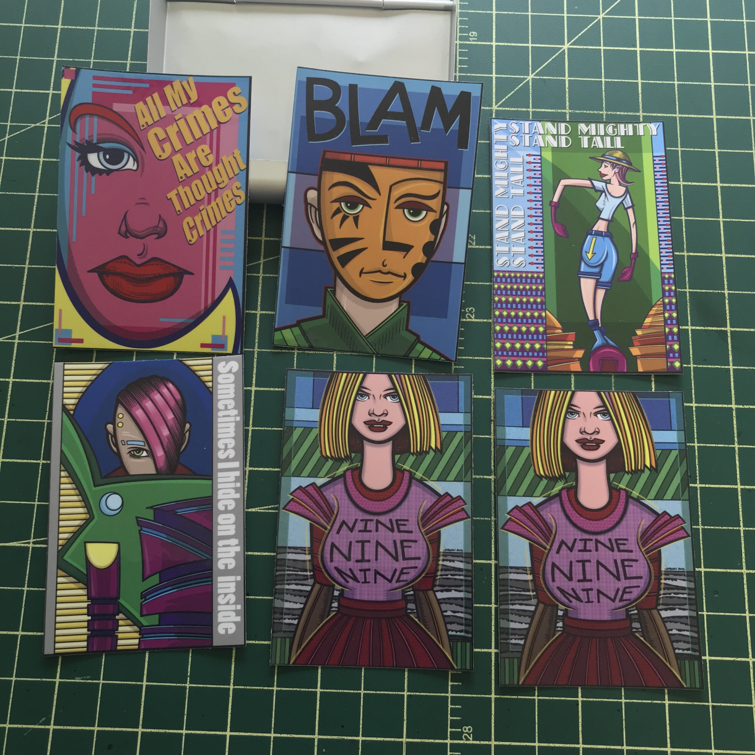
My Art Made Into Stickers
Stickers – I actually started this one just this week. I wanted to turn some of my art into stickers. I got some inkjet compatible sticker paper and after some trial and error with the formatting got some stickers printed out. They came out fairly well but I found that that came out much better if I put some self-seal lamination on them after printing. That’s just a sheet of clear 3mil plastic that’s sticky on one side. I had some on my shelf from a decade ago and I decided to give it a try. Not only does it make the stickers water resistant but it gives them more heft. Without the lamination sheet the 2×3.5 inch stickers curl up but with it they stay flat. Nice.
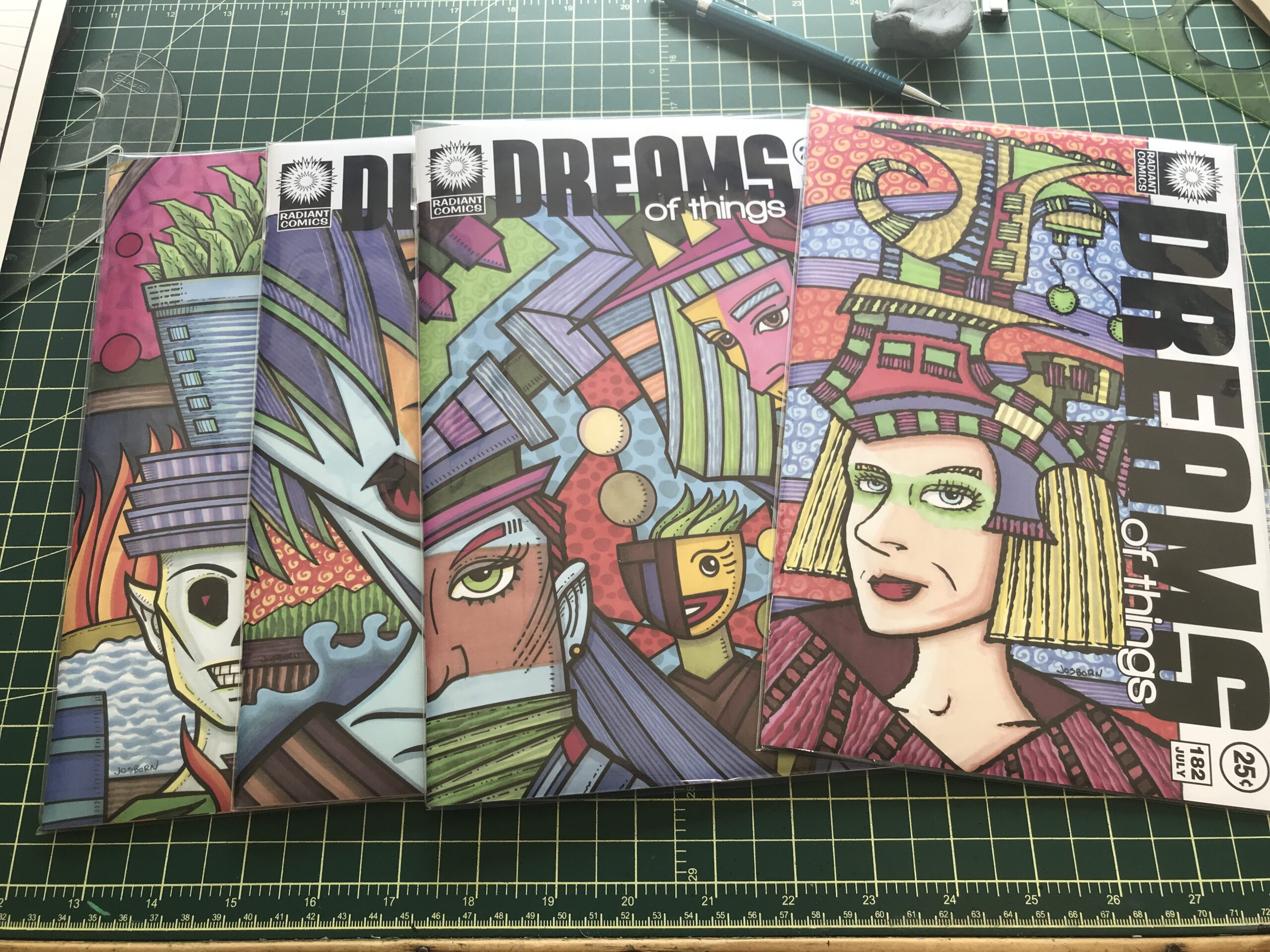
Make Prints – I’ve also started this one. I want to set up virtually all of my art as prints. This is a huge job. I’ve started with my actual prints and a bunch of my “Dreams of Things” covers. I’m setting them up first as 11×17 inch prints but I’m also sizing them down to 8.5.11 inch prints. The “Dreams of Things” ones take a little doing as I wrote about a couple of weeks ago. I also want to set up a lot of my large paintings as prints. That’s going to take even more doing. This could be a while.
Put “Dreams of Things” covers on Actual Comics – This is the last idea I came up with and wrote down in my notebook. I want to print out some of my “Dreams of Things” covers and attach them to an actual comic book thus making it look like a real comic book. I’ve done this sort of thing before with various pieces of art but somehow I’ve never done it with my “Dreams of Things” covers. I don’t know why it never occurred to me but now that it has I’m going to have to get it done.
There you go. That’s the list so far. I may add some other stuff to it if I think of new things to do. It’s okay with me if I put things on the list that never get done. The list doesn’t put pressure on me it just helps me visualize the future. But I also know that the future I visualize rarely becomes the actual future and I roll with it.
I’m back from the comic shop this week and I got eight new comics.
Check them all out here:
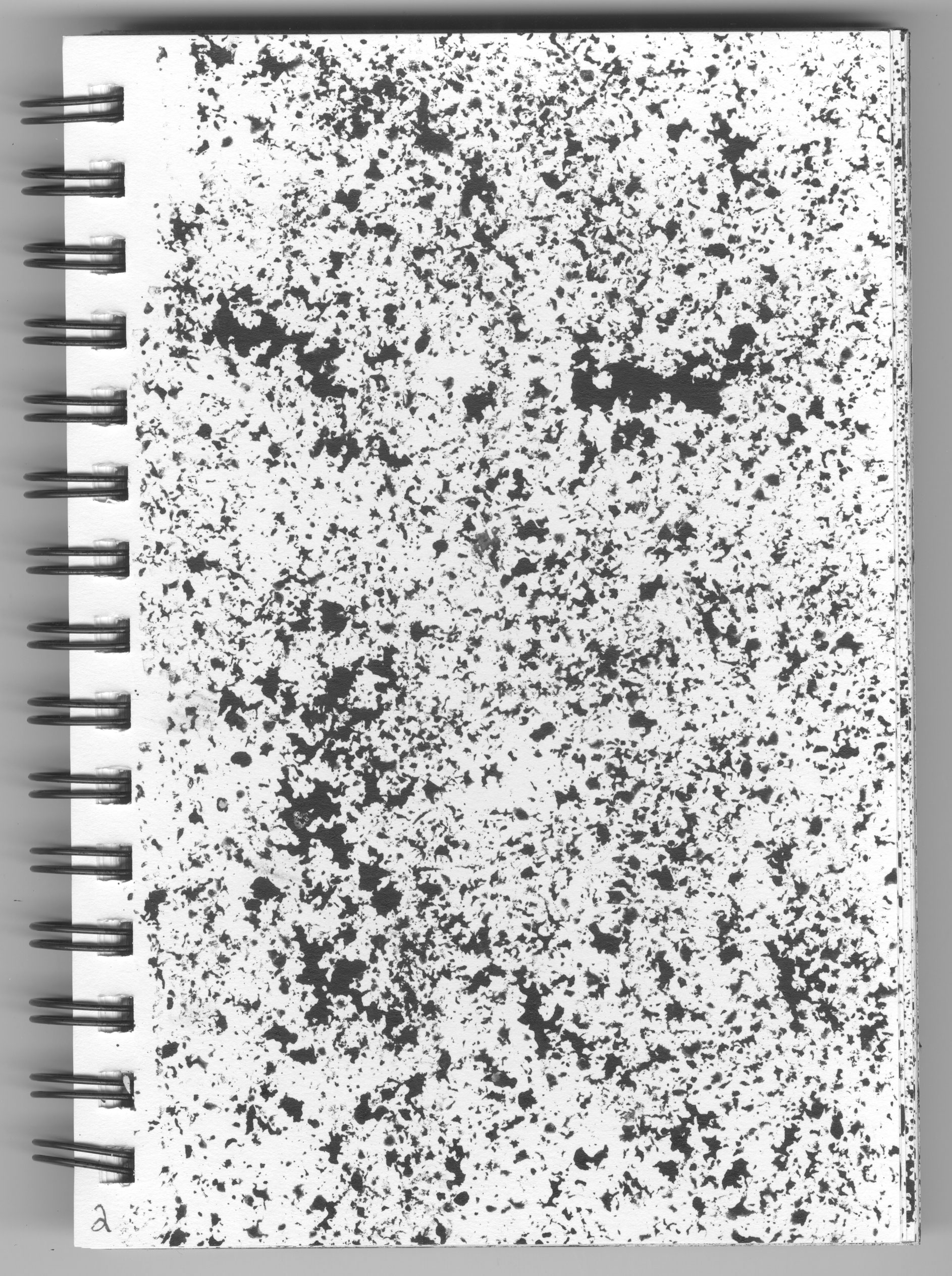
Yesterday I made 42 new ink textures. I made them in a sketchbook that has 42 pages (I filled the front of all the pages). A 5.5 by 8 inch Strathmore Visual Journal sketchbook that had good thick 100 pound paper. I made textures last year and filled up the front and back pages of one of these sketchbooks so I aim to eventually fill the back side of the pages in this one too.
I had fun making these textures. It was a day when I was having a hard time getting anything creative done. I did a little bit of drawing and made a painted sketch card but didn’t have the ambition to get anything big started. Some days are like that. So I pulled out the empty sketchbook and decided to make ink textures.
I use these ink textures digitally. After I make them I scan them in as greyscale documents. After scanning I set them up so that I can use them both in Photoshop and Illustrator. Just scanning them really means that I can use them in Photoshop but to make them Illustrator ready I first have to turn them into Bitmapped files and then bring those files into Illustrator and auto trace them so they become vector files. I can usually do this fairly quickly as I use Actions (Macros) to automate as many of the steps as I can.
I started out making this batch of textures with stamps. Back in the 1990s I bought these stamps, the kind you press into a stamp pad to ink, that didn’t have an image on them but were just texture. One was a lot of little dots and the other was a denser grainy sort of texture. I also had two stamps of famous paintings. One was a Renoir and the other a Van Gogh.
Rather than use a stamp pad I took an old battered brush, dipped it in ink, and rubbed the brush all over the stamp. Then I pressed the stamp onto the paper and it left some ink texture behind. It takes about eight to ten stamps to fill the page but in reality I stamped the page many more times than that.
I was looking for different patterns in my in textures so depending on how much ink was on the stamp and how hard I pressed it would leave a different mark. So I took the time to make each page of textures distinct from the others. With the four different stamps I could make a lot of different textures.
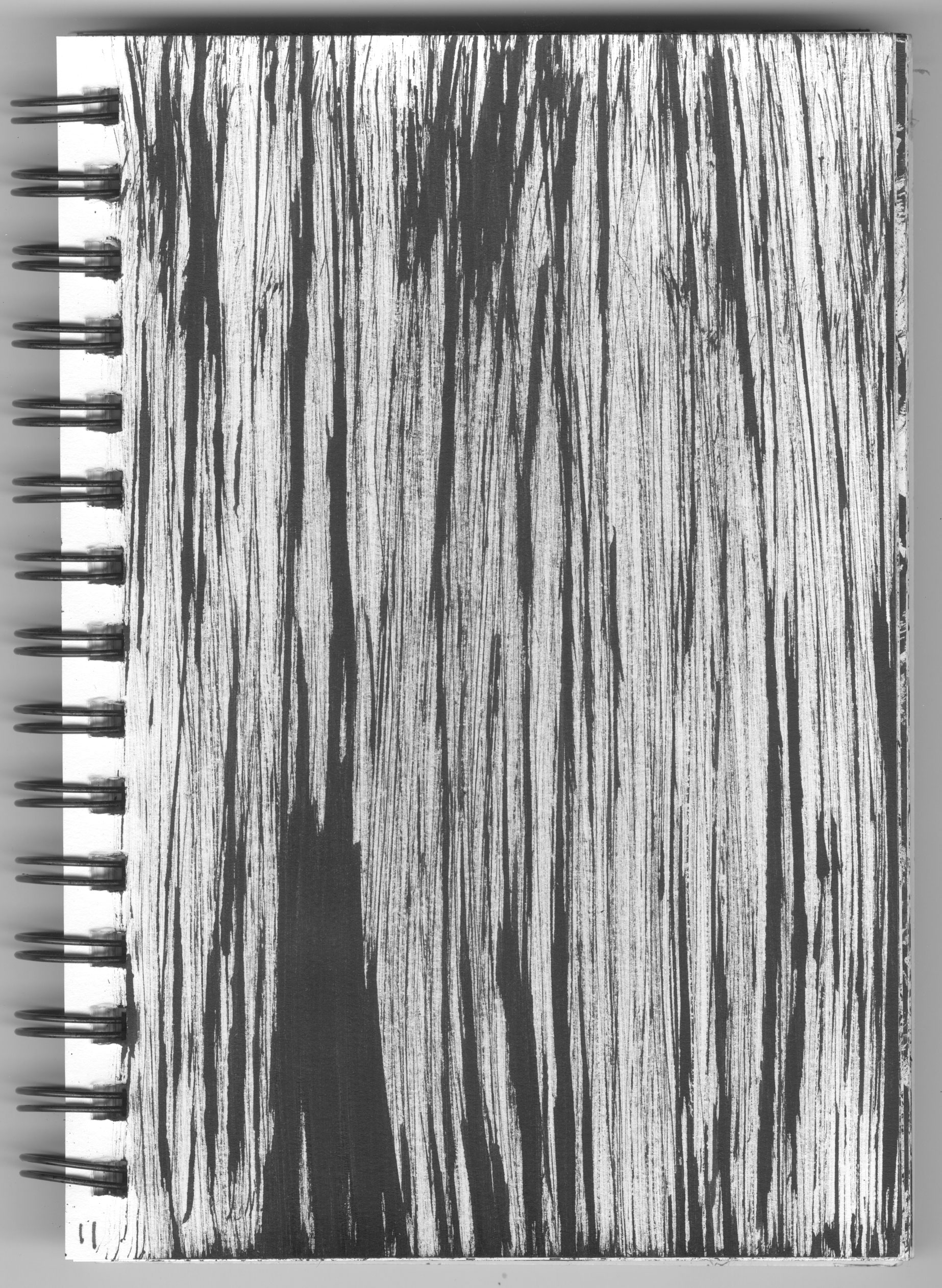
Forty two pages of textures is a lot. So after making a bunch of them I got bored with the stamps and moved on to a big brush. I have an old and crappy bamboo brush that was perfect for this project. The bristles no longer form a point and are a couple of inches wide when the brush is dry. So I put a little bit of ink on my ink stone and mashed the brush into the ink. The result was a big wide brush with about twenty five tips to it.
I gently dragged the brush across the paper and it would make a whole bunch of parallel ink lines. Rough and uneven lines. Those are good for making texture. I even spun the brush around making circular spirals of texture. I had a good time working with that brush. Sometimes I’d drag it across and work with those jagged lines and sometimes I’d dab the brush on the paper and work with those small marks. It gave me a lot of options.
I also discovered a new tool for making good textures. A pot scrubber. Just last week I found a six pack of those flat green pot scrubbers that are used for doing dishes. They were in the pantry and had fallen down behind stuff. They caught my eye on that texture making day and I thought that maybe I could use them to make textures. And I could.
The scrubbers are around four by six inches and I cut off a piece about four by two inches. About a quarter to a third of the scrubber. It’s made of a stiff fibrous plastic that has a lot of air in it. I took my battered old brush and rubbed some ink onto the scrubber. It took a lot more ink to wet it than a solid stamp so I had to be careful with it and use a light touch or all the ink would come out of it at once and make a big black blob.
It turned out to be easy to work with a light touch. I could dab the scrubber and leave patterns of ink or I could draw it across the page and leave rough lines of ink. It turned out to be a very versatile tool for making ink patterns. I was able to do lots of pages with it.
It took a solid three or four hours of my Saturday to fill up the forty two pages with ink patterns. It was a pleasant afternoon though. I’m glad I was able to get something done. Some days when I want to be creative but don’t have it in me it’s good to do tasks like this. They’re not as creative as working on a drawing or painting but they are things that will help with drawings and paintings in the future. I’ve already incorporated the first book of textures that I made into a few digital prints. Textures make digital prints look a lot more interesting.
I could probably make digital textures fairly easily. I know how. It’s almost the same method as real ink textures. You pick a brush and make some digital marks with it. But I don’t find the digital textures nearly as interesting. It seems I have less control over them as I make them. I can get what I want easier with physical ink and paper.
In looking back at the book I think I like the textures made with the stamps best. The way they came out is pretty cool. I think I’m going to have to make more of them on the back side of these thick pages. But that’s for another day. Maybe even another day when the creative river isn’t flowing as swiftly as I want it to. We’ll see.
I’m back from the comic shop this week and I got eight new comics.
Check them all out here:
This week I decided that I wanted to turn as much of my art into prints as possible. It’s going to take months and months to do but I want some ready to go in case I need them. Some things are easy to turn into prints and I have plenty of things that are already prints. But still they all need to be set up properly at the same size.
Though I want to print them all out as 8.5×11 inches a lot of my stuff is at 11×17 inches. So my first step is, rather than shrink them down, I want to set them up at the larger size and then shrink them down. That way they’ll be set up at 11×17 inches just in case I ever need them to be.
Photoshop Actions make the process go a lot faster so it’s good to learn how to use them. They are also called macros and actions record what you are doing and then you can play back those steps on a new digital file.
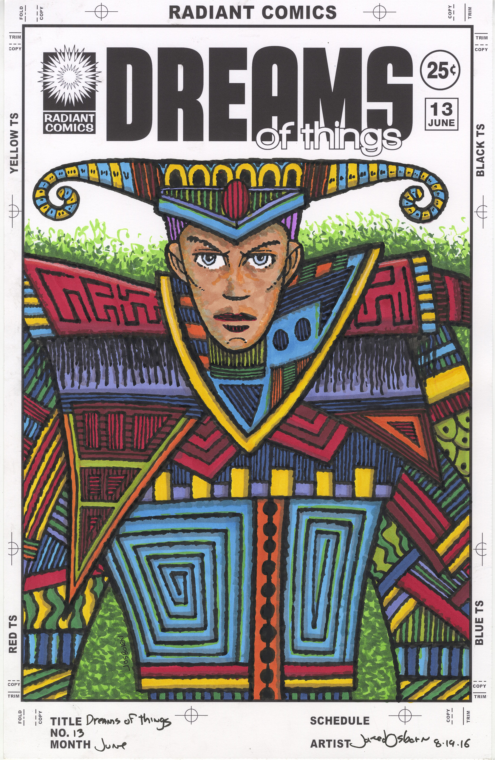
One of the things I am making prints of are my “Covers to comic books that don’t exist” series. Specifically I’m starting with my “Dreams of Things” cover series in which I have finished 230 covers. That’s a lot of art to set up.
The way I make the “Dreams of Things” covers is to print out the logos and trade dress on a piece of Bristol board and then draw the cover with black India ink and color it with markers. I like the logos to be printed on the board with the art because I think that makes the original look cool. But that doesn’t make a print look cool.
When I scan in a finished “Dreams of Things” cover and then print it out the logo looks a little grey and fuzzy. The original looks fine but the print not so much. So my solution to this, that I figured out many years ago, is to replace the logo with a new clean digital version pasted right over the printed out and scanned in one. The logo replacement method works well but I only did that to a handful of covers back in the day. I have most of the 230 covers to do if I want them as prints.
The steps went like this. I have the logos set up in a template but I had to make the template a higher DPI. It was set up at 300 DPI for printing but the scans of the art are at 600 DPI. Rather than lower the DPI on the art I raised up the DPI on the logos. It’s always better to have more DPI than you need then to have less.
After the DPI was set I picked either the horizontal or vertical logo and copied it. Then I chose the document with the cover in it and pasted the logo in. I had to move it right over the fuzzy logo that was already there. It takes some fine tuning to get the new logo in the right place and cover the old logo perfectly.
I also ended up using a patch of white underneath the “Radiant Comics” logo. The part that has the rays of the sun. The points of those little triangles that make up the rays were fuzzy and weren’t getting covered up by the new logo very well. They’re really small and I didn’t know if anyone but me would ever notice but it was easy enough to cover them with a white patch and make myself feel better.
After the patch was in I had to set up an adjustment layer for the art itself. I wanted to adjust the “Curves” on the art. Since the file was a scan of a pice of paper I could see the color of the paper which was an off white. I wanted it to be white. So I turned the bottom 10% of color into pure white. I also wanted the black ink to be a little darker. It scanned in grayish. So I went into just the black channel and darkened that making the blacks 100% black.
The final step was to type the issue number and month over again since the scanned ones were especially fuzzy.
All of this took about ten minutes a cover. Not the longest time in the world but I had a lot of covers to do. So I decided to sit down and make an action to do as much of that as I could. It took about half an hour to get the action right but in the end it cut my time down to about three minutes a cover. That’s much better. Actions are so good at cutting down the time of repetitive tasks.
I still have a lot of other things I want to set up as prints. I set up one of my “Big Ink” drawings so far but I have a lot of them to go. Plus I’m not even sure if the scans for those are all ready. I had to scan those in four different pieces and I’m not sure if I assembled all those pieces into one file per drawing. I know I put some of them together but I think I have quite a few still to be assembled.
I also want to see if I can make prints out of my paintings. They are too big to scan in but in the past I’ve photographed them to make prints out of but it’s been a long time since I did anything like that. I think I took photos of my paintings as I finished them but it’s been a while and I can’t quite remember if I did. We’ll see.
I also have about one hundred 11×17 prints to make 8.5×11 prints out of. Those are mostly good to go but I still have to set them up in this format. I have a lot of work in front of me.