I’m back from the comic shop this week and I got four new comics.
Check them all out here:
I’m back from the comic shop this week and I got four new comics.
Check them all out here:
I recently got an Apple Pencil to go along with the iPad that I got last December. I’ve had a Wacom Tablet and Wacom Cintiq for years so I’m no stranger to digital pens but there is definitely a learning curve drawing on an iPad. I started out wanting to dive right into the deep end but I’ve had to slow down my ambitions with it. I’ve changed over to just drawing with a “Pencil” rather than going into full blown painting mode.
I’ve been using an app called “Procreate” and it’s a good drawing app but it’s been taking me time to learn the basics. It’s easy enough to pick a pencil, pen, paintbrush, or marker and change the size and opacity of the tool but beyond that the app doesn’t act like a desktop application. All my long used keyboard shortcuts don’t exist because there is no keyboard. So far I’ve been having to look up a lot of basic stuff on the internet. Like how to cut and paste. Since it’s an iPad there are finger gestures to bring up those menus. I would have never figured that out on my own. Like lots of other things that have to do with this app things are hidden and not found in an intuitive way. It’s a good thing the internet exists.
I also had to look up tips on how to set up my own color palettes. Those are the little swatches of color that you tap the pen tip on to change what color you are using. In the Adobe desktop apps I set up my color palettes decades ago and have been importing them to all the new and different Adobe apps ever since. Setting up all new color palettes was looking like a real pain in the neck until I looked up some tips. I ended up taking a screen shot of my color palate and then sampling the colors in Procreate. It went smoothly.
After initially being a bit overwhelmed by Procreate I gave myself the task of drawing the equivalent of one of my 6×9 inch pencil drawings in it. I figured that I only used one pencil to draw them in real life so I’d only need one digital pencil too. That turned out to be true. I imported in a thumbnail drawing, dropped the opacity of it to 50%, and created a layer above it to draw on. In the real world I’d print the thumbnail drawing out in light blue and draw over it with a pencil. The process was about the same so I had no problem with it.
Turns out the biggest problem I had with it was where to draw. Normally I draw standing up at my drawing table but I use my iPad sitting down in a chair. I’m also usually taking a break when I sit down so it was weird to be working that way. Sometimes when I sit down to take a break I end up working on a photo on my iPad so the lines have been blurred before. I ended up doing a little of both but I mostly tried to stand and work.
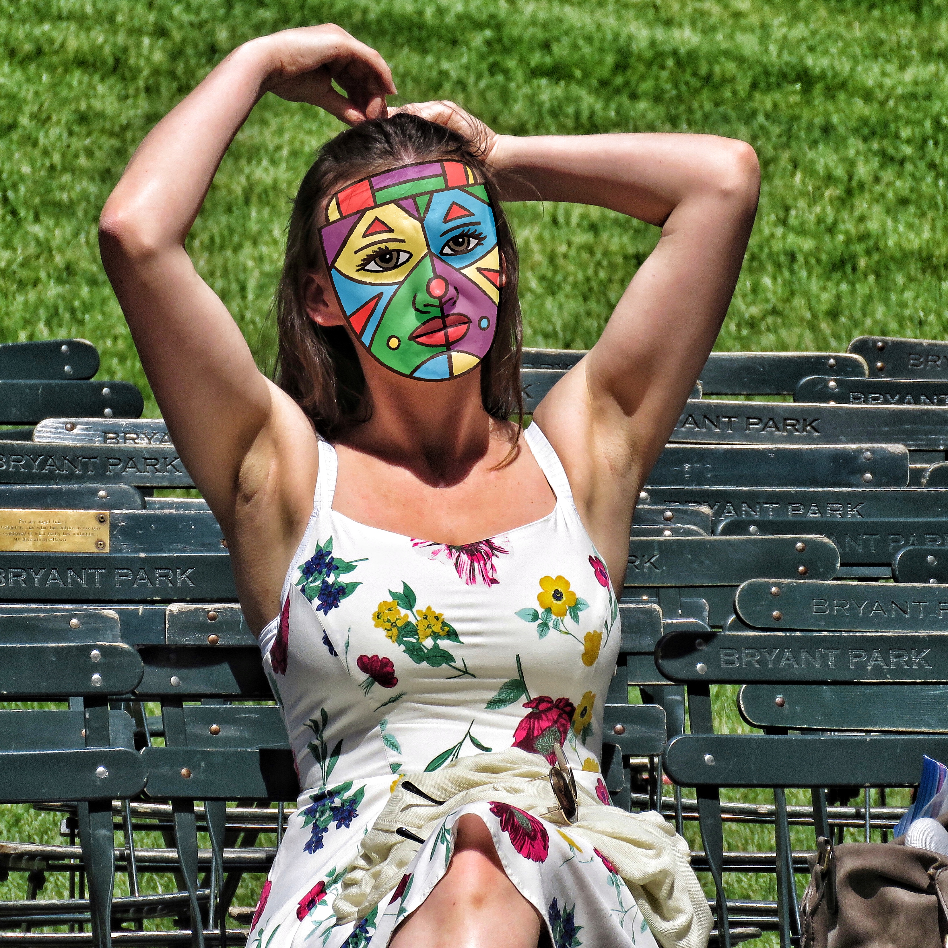
After getting comfortable with pencil drawing on the iPad I decided to revive my practice of drawing masks on my street photos. I like taking street photos but I don’t like posting them online because the people in them have no idea their photo is being taken. Since I don’t have many followers on Instagram (where I post them) it really doesn’t matter but it still makes me a little uncomfortable. I’m more comfortable with large group photos but when one person becomes my unknowing model I feel I owe them a little privacy. So years ago I developed a technique where I digitally put masks on them. Since I love drawing masks it was a natural and I like the end results. They always look like photos that are mine.
The main problem with the technique was that it took so much time. For some reason I was never able to master drawing the mask digitally with a Wacom tablet and pen. So I would print out a low opacity version of the photo on drawing paper, draw the mask on the paper, scan the drawing back into the computer, color the mask, and then digitally put the mask over the person’s face. It always came out well but it took about twice the time it could have. Maybe three times the time. Either way I’d do one or two of them but then the time suck would get me down.
One of the best things about drawing the masks on the iPad with the Apple pencil is the immediacy of it. First I look through a bunch of my street photos. This takes a while. It isn’t always easy to find just the right one but after I find the right one I can get to work right away. I bring the photo into Procreate, dim the opacity to 50%, create a new layer on top of the photo, and draw the mask on that layer. It all moves a lot faster than printing out and scanning in. Especially since it’s not a big and complicated drawing.
After I draw the mask I color it. I create another layer between the photo and line drawing layer. That’s usually how comics and cartoons are colored and the makers of Procreate even put a helpful trick in to facilitate this process. I can set up the line layer as a “Reference” layer. This means that the app sees the two layers as connected and I can automatically use the lines as boundaries for my color even though the color isn’t on the line layer. So I can fill in the color with one touch rather than have to color it in. That speeds things up.
I’ve done a few masked photos so far on the iPad. I’ve liked how they’ve come out too. I haven’t tried to print any of them yet as that’s the final test for this technique but I think they’ll print fine. In the days of my iPad 2 it would sometime downsample a photo that I put on it but nowadays when I work on a photo on the iPad it keeps the photo’s native resolution. So a high resolution photo stays a hires photo. That’s a good step up. I think this whole digital drawing thing is going to work out.
I’m back from the comic shop this week and I got three new comics.
Check them all out here:
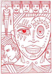
I’ve been working large lately on my 22×30 ink drawings so I thought for a change of pace I’d look at some small things. I’m going to pull four art cards out of my binder of art cards and take a look at them. Art cards are baseball card sized art (2.5×3.5 inches) and I’ve done a lot of them over the years. I keep them in nine card sleeves that are meant for trading cards so they are pretty easy to store and look through.
The first one I grabbed is art card number 936 that I drew on April 24, 2013. This looks like one of my spontaneous ink drawings. It’s drawn in just two colors: blue and black. When I first started getting back into markers in 2010 (I had used a lot of markers in my late 1980s college days) the first Copic marker I bought was a Tahitian Blue marker. It was a regular tipped marker and not a brush tip. All the other Copic markers I bought after that one were brush tipped so the first one never fit in with the rest of my markers. As a result it sat apart from them in the side tray of my drawing table.
I soon developed a drawing habit with this one marker. I’d draw art cards with it by first drawing spontaneously with it. No underdrawing with a pencil. I’d grab my blue marker and hit the paper with it. After I made a blue marker drawing I’d come in with a thin black ink pen and draw over the blue. The blue kind of acted as an underdrawing but it also added an element of shading to it. Also not every blue line has a corresponding black outline. In this drawing the moon and various stripes are all blue.
I like this combination of the two pens. Thick blue and thin black. Even when I draw multiple lines with the thin black I never make then solid to keep its thins intact. I don’t think this technique would scale up into a large drawing but I like it for a small one. I’ve done a bunch of art cards in this style.
The next art card that catches my eye is number 938 that was drawn on August 1, 2013. It’s on the same page as 936 so I didn’t have to go far to find it. You can see how I draw these cards sporadically as it’s only two numbers from 936 but was done four months later. I often draw them in bunches and there can be a lot of time in between bunches.
Art Card 938 uses a totally different technique form 936. This one wasn’t a spontaneous drawing so that means I drew it in pencil first. I had the drawing worked out before any markers came on the scene to finish it. This may have even been a larger finished drawing that I shrunk down and reused as an art card. I do that sometimes but often I just grab a pencil and start drawing on the card itself. This one could have even gone the other way and I liked the art card and so blew it up into a larger drawing.
I used a sign pen and Copic markers to finish this one. I refill the sign pen with black India ink and use that for my black line and then fill in the color with the Copic markers. I add a slight bit of shading to the color in the air and shirt with a dull purple marker. I also added texture to the drawing with rough vertical lines in the background and on her shirt. Overall I like the simplicity of this drawing. It has good lines, shapes, and colors and doesn’t get overly complicated.
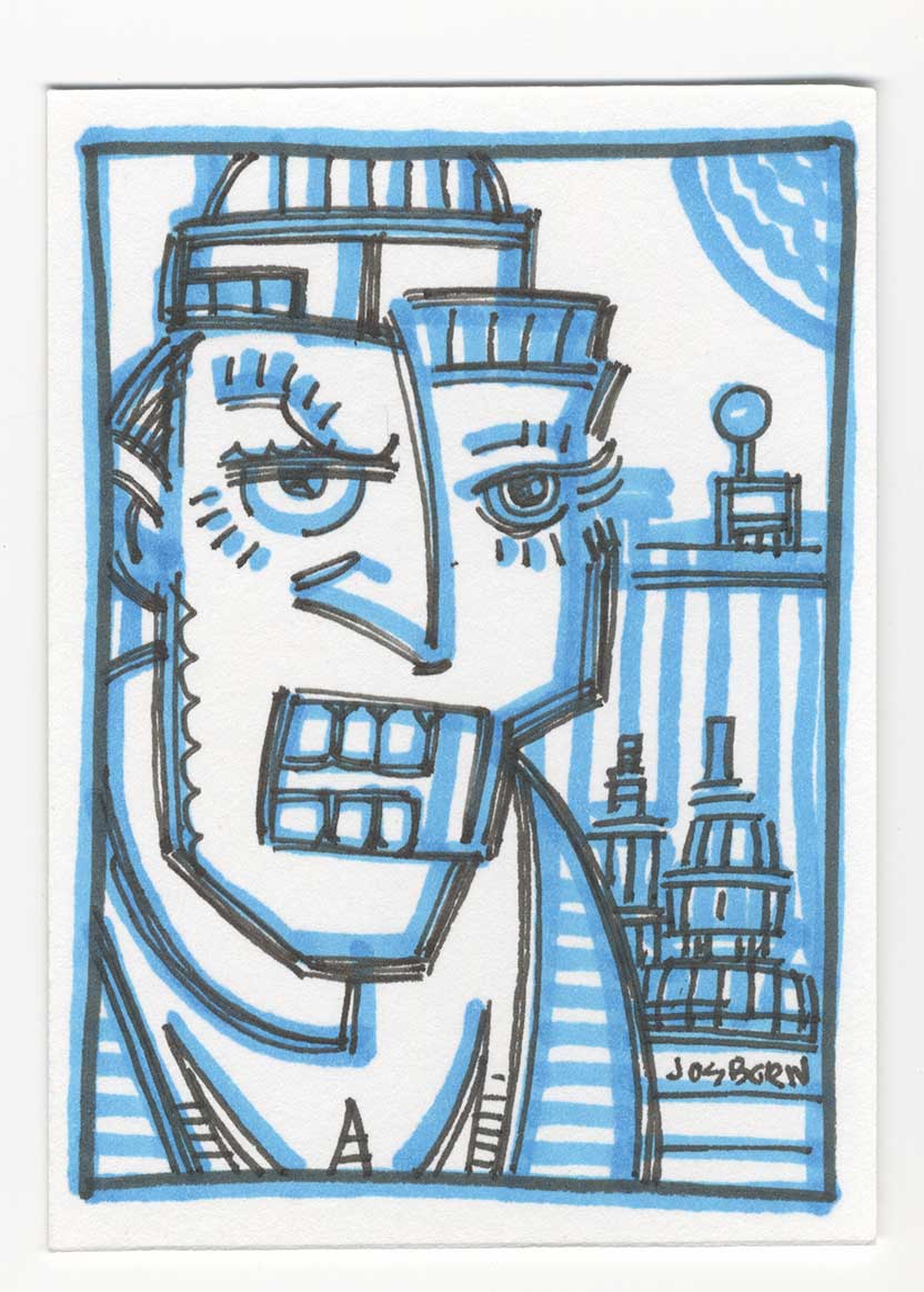
For our third card I flipped a bunch of pages to get to Art Card 1042 drawn on March 19, 2014. We’re into the next year and a different drawing tool. This is one of my monster faces but it’s not in ink like they usually are but it’s drawn with a Wolf’s Carbon pencil. That’s not a pencil I use very often but I can remember buying them around this time to try them out. I thought I could draw dark things with them. It turned out that I could but at the same time I was developing my “Busted Brush” technique and the brush was a lot more versatile than the pencil.
This face is a good example of what I could do with the pencil. I could lay down a really dark area of graphite and pull some light areas out of it. With this monster face you just get hints of the edges of his form. That’s how I wanted it. He mostly fades into the shadows with his white teeth showing the most. The carbon pencil only worked for these small drawings though. It was tough making something bigger than this with it because it took so much work to draw in large areas of dark. That was much easier to do with ink so I ended up only making a few of theses carbon monster faces and lots of ink ones in big sizes.
For our final Art Card I skipped ahead to October 27, 2014 and card number 1180. This one is brightly colored and not simple in it’s imagery. It uses the same technique of the sign pen and the Copic markers but this one looks like it was drawn at this size in pencil first for this specific card. There is no chance this one was a repurposed drawing.
It’s a complex piece in that card is broken into three different backgrounds. There is a blue sky on top, a purple sky in the middle, and a black and red wall on the bottom. Plus there is a fourth background in the hat in the middle. The hat has its own figure in it and there is a part of a head on the bottom. A lot of different things are going on in such a small area.
Then there is all that color. The bright green hair balances with the blue skies nicely. The purple sky plays off the orange borders well. The yellow and neutrals in the center act like glue holding the whole piece together. The pink skin acts as our whitest white and shines out at us. In hindsight I’m amazed I was able to pull off such complexity in something so small.
So there you go. A look at four little pieces that make up a small part of this big old world of ours.
I’m back from the comic shop this week and I got five new comics.
Check them all out here:
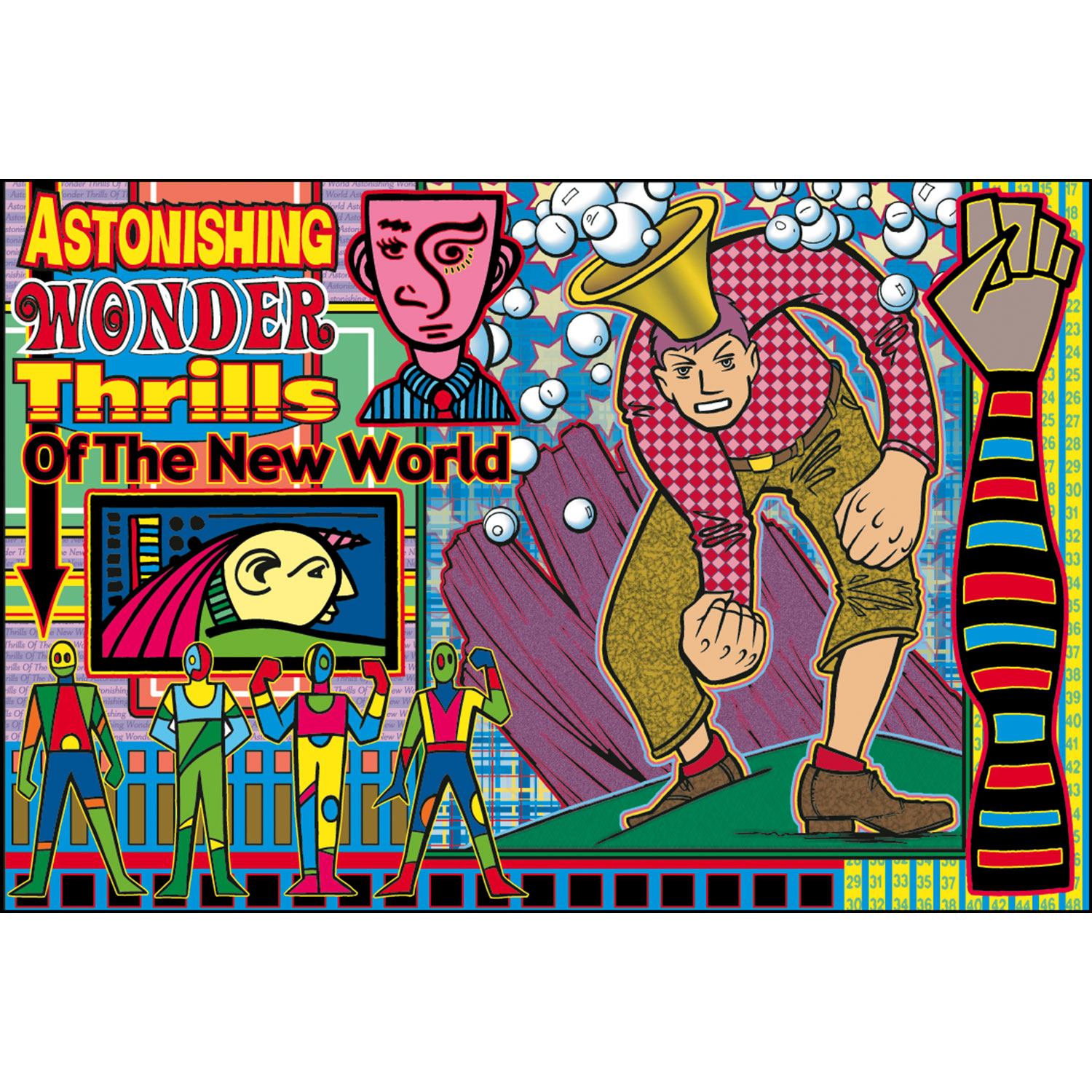
I’m going back into the past this week to look at a piece of art that I made back in August of 2000. That puts it at eighteen years old as of the date I am writing this. It’s a digital print named “Astonishing Wonder Thrills of the New World” and it’s print number six of about a hundred prints I’ve made over the years.
Let me take you back for a moment to the time I made this print. I bought my first computer at the and of 1995 and had been doing graphics on a computer since about the beginning of 1994. So by the year 2000 I was well versed in Adobe Photoshop and Illustrator but it was still not that long since I started working in them. This was around the time I started thinking I could make big full color prints in them.
A few years before, in about 1997, I made my first digital art prints but they were fairly small, maybe around 8×10 inches, and my inkjet printer really wasn’t good enough to make art prints. In those days you could tell with the naked eye what was an inkjet print. The color just wasn’t smooth enough. But by the year 2000 inkjet printers were a lot better so I decided to make some new art prints.
The first thing I notice about “Astonishing” is how busy it is. Normally I’m a simplicity guy but with these prints I indulged my complex side. I call them digital prints but my process for these wasn’t all digital. I made the drawings by hand with a brush and ink and then scanned them into the computer and colored them digitally. With this one, unlike most later ones, I also composed digitally.
This print was made before I was in the habit of drawing in my sketchbooks in ink (my ink books). So I didn’t have my now vast reservoir of thumbnail drawings to choose from and instead had a bunch on drawings on random sheets of paper lying around. In looking at this print I can see five different source drawings for the overall image. The largest drawing of the man with the firsts and bubble head was a finished ink drawing that came out of my “Surrealist Automatic Drawing” method, the four colorful figures are some of my “Mod Men” drawings, the yellow faced guy on the left was a tiny ink drawing, and the stripped arm and pink faced guy were pulled from pages of ink doodles that I made.
It was not easy working that way. Having to pull drawings from a variety of sources and put them all together into one drawing can be a tough go. The main problem I had was that I’d find an image or three I wanted to work with, fit them together, and that would suggest that I needed another image to complete the composition. But what image? It was back to looking through my drawings and hoping to find something. I think it was this process that lead me to drawing in my ink books and keeping my spontaneous ink drawings all in one place but at the time all I had was various piles of drawings.
It may have been a pain to work in that piecemeal method but that was the point of these early prints. I was trying to find a way to make something finished out of all these various small drawings that I made. For example I drew a bunch of those Mod Men over time but what were they for? They weren’t characters in a story. They were mostly decorative figures so I had to make something they could decorate. These prints were it.
Besides the variety of images in this print it also has an overload of patterns and outlines. It’s a little crazy busy. This also might be the only print that I used four different fonts for the headline. That’s really something you should not do. It’s also a bit of an amateur move to make each word or line its own font. Newbies do it because they’re so enamored with having so many fonts at their disposal that they want to use tons of them but the more experienced designer knows to stay away from that. But sometimes it does work and I think it does in this print. With all the busyness you barely notice the many fonts.
Outlines are also another tool that I don’t use often but used a lot in these early prints. I think it was because outlines helped integrate all the drawings. Normally an outline would be used to separate parts of a drawing, and it does that a bit here, but since almost everything has an outline in this drawing it becomes a unifying theme. I was tough using digital outlines though. Any little imperfection in the edges of my drawing were amplified by a digital outline. I had to do a lot of smoothing.
The background is filled with patterns. Stripes, squares, rectangles, stars, and bubbles fill the print. I even used more type and numbers on some of the background stripes. The bubble headed man’s shirt has a digital pattern and his pants have a digital texture. So does the rock behind him. The stars in the background even have a digital opacity fade to them. There is so much going on that it’s tough to note it all.
It’s a saying of mine that complexity is simplicity multiplied. That’s how I approached these prints. I added one element at a time. It was impossible to plan out in advance so I planned one step and after that was done I planned another. Or maybe I planned two or three steps in advance but not the whole thing. I’d drop a block of color here and there and then maybe a stripe before figuring out I needed another drawing in some spot. One decision lead to the next.
I look back on these early prints with a bit of nostalgia these days. It was before digital was as integrated into my workflow as it is today and I can see myself learning and exploring. As is my nature I eventually stripped down the complexity of my prints but it took a long time. Or maybe the complexity changed a bit since my “Painted Lady” prints are still pretty complex. But it’s a different kind of complexity. Either way I did dozens of prints in this style and it’s cool to pull them out every now and again and give them a look.
I’m back from the comic shop this week and I got three new comics.
Check them all out here:
This week I finally added a new piece of equipment to my art supplies. I got an Apple Pencil for my iPad. I’ve had an iPad for years and though I do a bunch of photography work on it I’ve never done much drawing on it. Before the Apple Pencil was invented I saw examples of artists who could draw with their finger or a regular stylus on the iPad but I was never able to do that. I couldn’t crack it. I wasn’t particularly good at digital drawing in general.
I use a regular Wacom tablet all the time. That’s the one where you use a stylus on a plastic tablet and look at your computer monitor to see what you’re doing. I sometimes draw with it but I mostly use it for digital coloring. That’s sort of a separate thing to me. I make art on paper, scan it in, and them make a finished color piece out of it. Sure there is some drawing involved but not nearly as much as if I drew it all with the tablet.
I just checked and it was way back in 2008 that I bought a 12 inch Wacom Cintiq. I would have guessed five years ago. Time flies. The Cintiq is different from my regular tablet in that it has a screen. As a matter of fact it is a screen that you draw on. So the stylus goes right on the tablet/screen and the drawing happens right under the stylus. No need to look at my monitor. I thought the Cintiq would change my workflow and I would use it all the time. It didn’t and I don’t. Because of various inconveniences with it I barely use it. In the end it was probably my biggest waste of money on a piece of equipment. I still have it but it’s attached to my backup computer and is hardly ever on.
One of the things I never liked about the Cintiq was the feeling of drawing on glass. The stylus was nice and was pressure sensitive but the feel of the plastic tip on glass didn’t feel right to me. I also found the thickness of the glass to be a distraction. The image I was drawing didn’t appear right under the stylus it appear under the glass of the screen so it was about an eight of an inch away from the tip of the stylus. I found that hard to get used to. I know tons of artists who love their Cintiq so it’s always bugged me that I didn’t like mine.
I’ve tried out the Apple Pencil before and it seemed really cool. The iPad has some advantages over the Cintiq. The main one being that it’s portable and doesn’t have to be attached to a computer. That last part is bigger than you could imagine. Both my Cintiq and my Wacom Tablet are old now and take a lot of fussing to keep running. Both Wacom and Apple have abandoned any support for them so I had to look online for ways to keep them running so I didn’t have to buy new ones. At least the iPad and Pencil will run for as long as I have them. Even if Apple abandons support for them and I can no longer upgrade them they’ll still work.
I’ve bought a few different drawing apps for my iPad over the years. None of them grabbed me but I didn’t have the Apple Pencil then. The two I’ve been trying out for the last couple of days have been Procreate and Affinity Designer. Designer is a vector based app like Adobe Illustrator is on the computer. That means it makes lines by connecting dots. I like making vector based art because that means I can “Build” things. It’s all about constructing shapes. I’ve been trying to get things goings in Designer but so far haven’t been able too.
Procreate I’ve had a little more luck with. It’s a bitmapped based program, like Photoshop is, and does its best to duplicate the feel of working with pencils, ink, and paint brushes. It’s really deep with a lot of tools to choose from. Too many for me at this point so I’ve been sticking mostly to the pencil as I learn to draw on the iPad.
So far my problem with digital art on the iPad comes down to technique. Turns out when it comes to digital drawing I have none. I’ve been drawing with a pencil all my life. It’s second nature to me now. On my drawing table I have at least ten different pencils that I use for many different tasks. When I need to draw something I grab the appropriate pencil. I don’t even think about it. With digital drawing I have a thousand pencils at my fingertips. But which ones do I use? And where are they? There is one pencil tool but it has lots of adjustable settings. Which one is best for the task at hand? I don’t know. It’s frustrating to have to learn something that is second nature to me with real tools.
Then there is actual technique. I know how to paint with gouache, watercolor, acrylic, and oil paints. Not to mention markers and inks. I know which one to pick for the outcome I want and how to physically paint with them to get to where I’m going. With digital I have no clue. Do I want a fake oil painting? Watercolor? Ink? I don’t know. Even after I choose I don’t know what brushes and colors to pick. I don’t know the destination or the road. It’s very confusing and I’m not used to that.
The final thing I think I’m having trouble with is the size of the “Paper” I’m working on being virtual rather than real. I’m used to a 5×7 inch piece of paper being 5×7 inches. It doesn’t change. Of course with digital I can zoom in and zoom out to my hearts content. But that makes the drawing constantly change size. It’s weird. Plus one of my habits of drawing is that the first thing I draw is a border around the paper. My most nature artistic talent is for composition so I like to define the edges of the paper to compose against. With a digital drawing that I can zoom in on the edges are constantly different. I find that a bit disconcerting.
So far the best thing about the Apple Pencil is that I like the feel of it. Everything else is going to take time and practice.
I’m back from the comic shop this week and I got seven new comics.
Check them all out here:
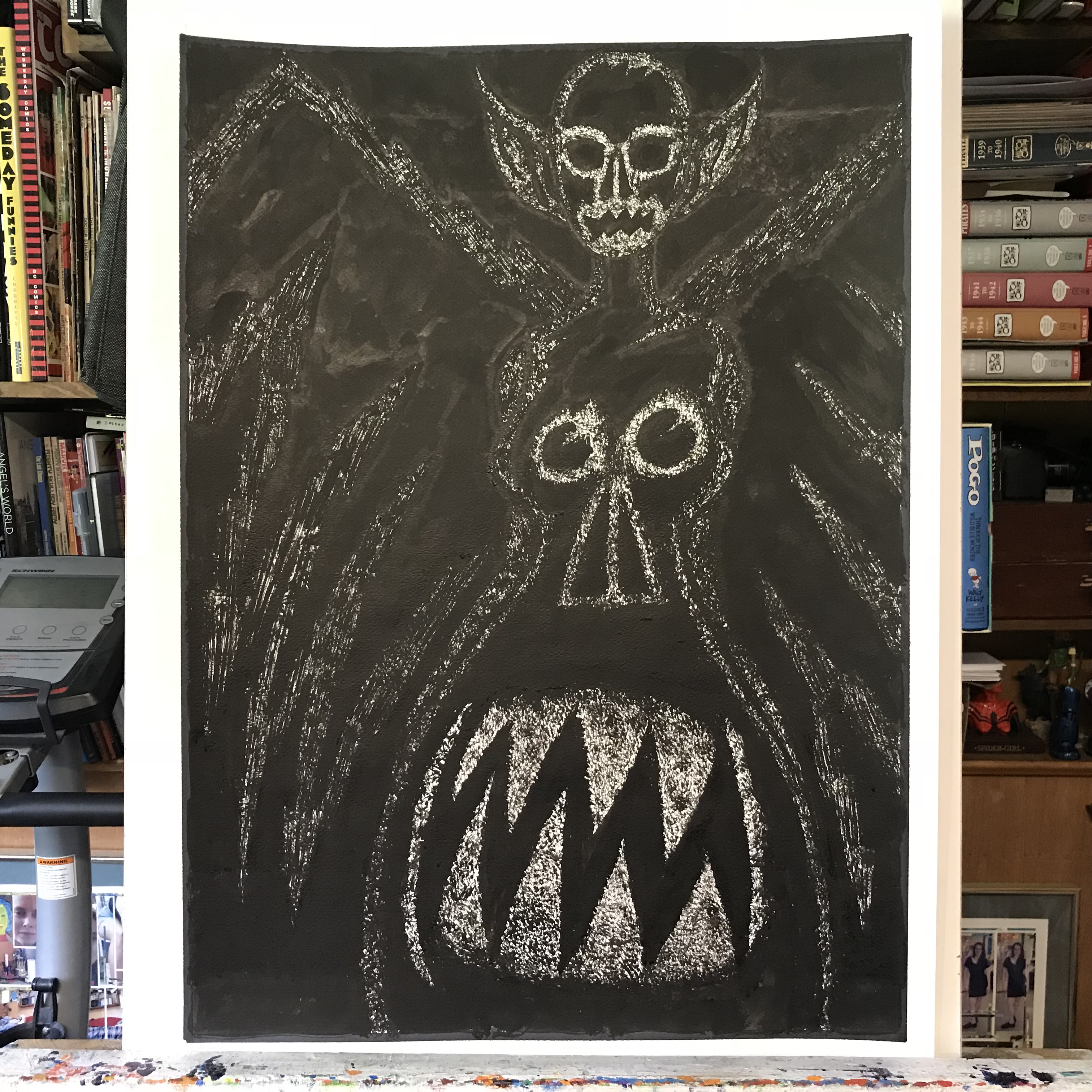
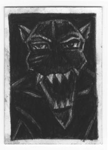
It turns out that size does matter and I can creep myself out. I found that out after making a large ink drawing this week. I’ve written about two big ink drawings I’ve done recently, the scary clown face “Face Seven,” and the monster face “Big Monster One”, and this one “Glory Days” was the third big ink drawing in a row that had a horror theme to it. Big and horrific. That’s what got to me.
“Glory Days” started it’s life as a small 6×9 inch drawing that I made back in 2012. After that made an 11×17 ink drawing of it but neither of those satisfied me. The were both swings and misses. I liked parts of them both but neither of them as a whole. Still I liked something about the drawings so I decided to give it another go but this time as a large ink drawing.
As I drew a new 6×9 inch drawing of the monster I noticed that the part I didn’t like was the teeth on the monster’s dress. I did a double face thing where not only did the monster have a face but there was a weird abstract face in her dress too. In the original drawing I made the teeth and mouth too abstract.
In general I have two ways that I make teeth in my monster faces. The first way is to make the teeth into sharp triangles that I then make a little more irregular and the second way is to use the many lines my busted brush technique generates to gesture in teeth without strongly defining the edges. In the original ink drawing I used the triangle teeth but instead of keeping them white I blackened them in and put a white outline around them. This messed up the positive and negative space of the mouth and obscured it in a way that didn’t work for me. So in the new drawing I worked out the teeth so they would be white.
The second thing that I changed was that I gave her big monster ears. In the original drawing she didn’t have any ears at all. I’m not sure why that is but I found that not very scary at all. It was even a little bit elegant looking. I guess I was going for a more skull-like look but I don’t think it worked. The big ears say “Monster” much more clearly.
After I worked out the new drawing at 6×9 inches I blew it up and transferred it to a 22×30 inch piece of paper. That was easy enough but as I started drawing it in ink I ran into a problem. How I originally made the drawing wasn’t working at the larger size and it was confusing me on how I should proceed. The original 11×17 inch ink drawing had hard edges. It was all about the shapes and how the positive and negative spaces played off each other. But I had to redraw and simplify a lot of those shapes to get the dress-mouth correct plus the hard edges at the large size didn’t look very scary. So I abandoned my regular brush and grabbed my multi-pointed busted brush.
I was planning on using my busted brush with this drawing but it turned out that I really hadn’t thought out how I was going to use it. Usually it’s easy to use. I use it to define the forms of a drawing. The roundness of an eye or the shape of a nose. But with this drawing I had mostly graphic shapes that didn’t define forms but defined positive and negative shapes. It was different so I had to take some time and think about it. I started with the face but only got so far before I switched to the other parts of the body.
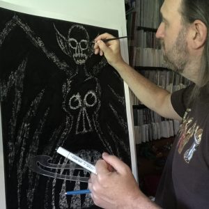
I ended up not defining the forms but obscuring them. This drawing is almost all black with only a little bit of white showing through. This white defines the forms but in a subtle way. Little hints of edges stand out to us and give the body its shape. I actually had the hardest time with the wings because they basically have no form. They were such a graphic element that it was impossible to bring any sense of form to them. I tried to define them using various direction brush techniques but in the end found that obscuring them was the way to go. I kept making them darker and darker until they sat back in space the way I wanted them to. That sounds easy to do but takes a remarkably long time to figure out and execute. In the end this large 20×28 inch drawing took me about ten hours to finish. That’s not too bad for one of these large drawings but it’s not a short period of time.
The different thing about this one was that by the time I was done it was creeping me out. I’ve done a lot of monster drawings over the last half a decade or so but they were all 5×7 inches or 11×17 inches. Sure they were some creepy ones but I guess them being smaller made them less creepy. I even like to take a few dozen of these small ones and line them up to take photos or look at them. They’re cool when they’re all in a group.
After I finished “Glory Days” I didn’t want to look at it. Normally after I finish one of these big drawings I leave it on the easel for a couple of days to think about it. This one I left up for a shorter time. It creeped me out. It didn’t help that the two before it were also creepy drawings but this one seems especially bizarre. It’s odd that I can make a drawing that can creep me out. After all I’m the one who made it and know how it’s done.
After making this one I had to clear my brain by making a larger drawing that was pleasant and fun. I went back to my clean edged style and made a drawing where the main figure was a smiling woman. Much less creepy.