I’m back from the comic shop this week and I got six new comics.
Check them all out here:
I’m back from the comic shop this week and I got six new comics.
Check them all out here:
This week I finished the pencils and inks on the “A Little Struggle” Spider-Man covers that I wrote about last week. Yes, that’s plural. I ended up drawing two different covers. I seem to always be making more work for myself. I was working on the first one, which was based on one of my spontaneous marker drawing compositions, when I decided I would need a second one too. A more conventional cover of Spider-Man hanging out in a typical Spider-Man pose. I’ll use one of them for the back cover.
My Ebay page to buy one of these
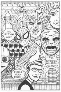
The first cover has a lot of elements to it. It reflects the contents of the very first issue of the Amazing Spider-Man. We have the Fantastic Four, J. Jonah Jameson, the Chameleon, Spider-Man, and Peter Parker. Not to mention the Baxter Building an some extra Spider-Man symbols. That’s a lot of elements. It was a real chore to juggle them all but that’s a chore that I’m used to.
It’s going to take color to really hold this composition together. When using established characters a lot of their appeal is in their costumes which are in color. Reed and Sue Richards are in blue, the Human Torch is red, the Thing is orange, and Spider-Man is in red and blue. Those colors define those characters and they’re absent in the ink drawings so it looks a little bit incomplete to me.
The backgrounds were tricky in this piece too. I used some of my usual background motifs such as cloud-like lines, a circle pattern, wavy lines, and some concentric circles, but I also wanted to work some Spider-Man #1 specific backgrounds in there. So I drew part of a city with the Baxter Building (the Fantastic Four’s headquarters) in there too. One part even ended up being a rocket ship that looks nothing like the Fantastic Four’s rocket ship but I put a “4” on it anyway.
I put a bunch of little spider symbols in one area and that drove me a little bit crazy. I only drew one of them and then duplicated that one digitally but when it came to inking them I had to do that all by hand. I was cursing myself a little when I came to the inking stage. The last thing I did was take the fence that’s behind Peter Parker and add some webs to it. It went from looking like a wooden fence to looking like a web fence. I thought that was more appropriate.
Of course the weirdest thing about the picture is that Peter Parker is wearing Spider-Man on his head like a hat. You don’t see that everyday on a Spider-Man comic. I was working from a composition taken from one of my spontaneous ink drawings and in that one a person is wearing a lizard head on his head. For some reason that was the one that appealed to me to turn into a Spider cover. I like the weirdness of it. Those early Steve Ditko Spider-Man comics can be really odd and I think this fits in with them. Plus it goes along with the non-literal nature of the cover. There is a lot of symbology in it.
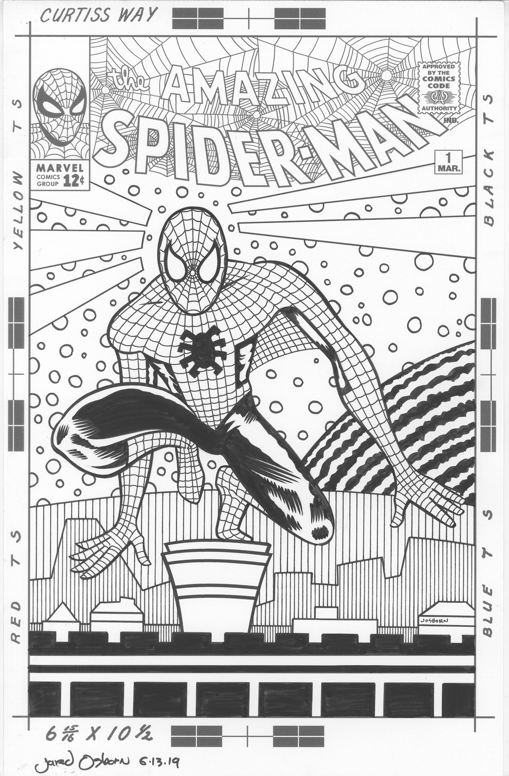
While doing this cover I decided I wanted to do a more traditional cover too. A pin-up type cover that is popular today. I wanted something to put on the back cover since I didn’t want that space to be blank. I had a really hard time with it. Despite the composition being much less complicated the pin-up cover took me longer than the first cover. I’m not used to doing things the conventional way and I have a hard time finding a creative way to do mainstream stuff.
The first thing I did was a lot of thumbnails. Small rough drawings. Spider-Man has his own visual language that is all about him crouching and twisting into poses. He can also stick to walls so I imagine his sense of gravity would be different than a regular person’s. He also has super strength so he can reach out, touch a wall, and stop himself from falling in an instant and with little effort. So finding a pose I liked was tough.
After a whole bunch to thumbnail drawings done in ink I had one I liked. I blew it up and tried to redraw it in pencil but I somehow failed and lost the character of it. Sometimes I find using a pencil inhibiting because I get too concerned about fixing my mistakes. That and a pencil only makes a thin line. So I switched back over to ink and made a bigger drawing of the figure that was more to my liking.
It was at this point I decided to take it to the digital realm. I scanned in the drawing and transferred it to my iPad where I could make a more refined drawing with the iPen and Procreate. It worked out fine. I then took that drawing, transferred it to my computer and put it together with the logo and trade dress to print out and further refine the figure and draw the background.
It took some doing to figure out the background. So many people have done so many good city backgrounds for Spider-Man covers that I didn’t even want to go down that route. I’ve seen covers with fully detailed cities in twisting perspectives with Spider-Man swinging through them. They always look pretty good but something about them also leaves me cold. So I decided to go for something a little more up my alley.
The first thing I put in were the shapes around Spidey’s head. They’re reminiscent of his spider senses but they’re really decorative elements. That’s what I’m good at. I can organize shape, line, and color into a pleasing arrangement. After that I put in the simple city shapes at the bottom and a curved line atop the bottom third. That curved line came out as some kind of wall but not really a solid wall. The next element I added to the piece was the round piece in the back that might be some kind of moon of planet That comes from my “Deep Space” covers that often had planets behind a space suited figure. I thought it would work here too. The last element I added were the circles that are all around Spider-Man. I wanted the give the background one more element. One more bit of texture.
In the end I like the way both of the covers have come out so far. It was a long way to get there but I think I got there. Now I have to finish them off with some color.
I’m back from the comic shop this week and I got four new comics.
Check them all out here:
I struggle making art sometimes. Especially art that’s outside my usual area of interest. I like to try new things, especially new tools, but sometimes it’s the approach to art, the conceptual side of things, that makes me struggle. The difference between art and illustration is one thing that can give me difficulty.
Art and illustration are closely related and may appear to be about the same thing but they’re not. Illustration literally means “To show” and that’s what it’s all about. It’s main function is to clearly show you something. So if you’re doing an illustration of a can of Coke for the Coca-Cola Company they want you to show how great the can is. If you don’t then you’ve failed. If you want to make art using a Coke can then it’s up to you to say whatever you want about that can. The sky is the limit and passing and failing is up to you.
With illustration it’s all about pleasing the client you are drawing for. If the client is yourself then it’s all about pleasing the audience. Meaning that if you want to make a drawing of Batman then you want people to look at it and think, “Oh, that’s a nice drawing of Batman.” If they think, “I wonder who that is a drawing of?” then you’ve failed. You were unclear in showing them Batman.
Related to that is another important part of illustration. The most important part of the “To show” part of illustration is to be on model. If you are going to draw a picture of Batman, a jar of peanut butter, or a horse then people have to be able to recognize the subject with no confusion. You can’t draw a guy in a pair of green swim trunks, long blonde hair, and a skinny build and say it’s Batman. Batman needs his cape, cowl, and costume or it’s not Batman.
Making art is different. If you want to make art with Batman you can start with a drawing of Batman and then make him unrecognizable. As long as you’re pleased with the outcome it doesn’t matter that it doesn’t look like Batman anymore. The point wasn’t “To Show’ everybody Batman. The point was to make an interesting piece of art.
When making art, as opposed to illustration, the audience you want to please is often yourself rather than a client or audience. Sure you want other people to look at your art and like it but they’re not part of the process like that are with illustration.
I’ve read successful artists complain about being trapped. They painted a certain way and their work got very popular and now that’s what people want from them. If they want to make money they have to paint in their famous style but if that style no longer holds any interest to them it makes them miserable. Those artists feel they’re not making art anymore they’re just pleasing their audience with paintings. That’s the rare case of and audience being part of the process of making art but I can assure you it doesn’t happen very often.
There are also artists who are pretty good at pleasing an audience. They make something halfway between art and illustration. They use some pop culture characters but put some twist on them or mash them up with another pop culture character. They mix up Darth Vader with Sherlock Holmes or some such. I’ve noticed with a lot of people who are good at this kind of art that pleasing other people is what pleases them. It’s what drives this kind of art.
I bring up this topic because this week I started a project that is giving me trouble because I’m not an illustrator. I draw comic book covers all the time. They’re one of my favorite things to do. I invent comic book titles, do the graphic design on a logo and trade dress, draw a “Cover to a comic that doesn’t exist,” color it, and make a print out of it. But all those covers are my own invention. I never make my own Spider-Man cover for example. Except this week I decided to make my own Spider-Man cover.
It’s a different beast making a Spider-Man cover. First of all it has to look like Spider-Man. Not only that it has to look like a really cool Spider-Man. Spidey is one of the most popular characters in the world and a lot of people have drawn him. A lot of people have drawn him well. There are thousands of Spider-Man comic book covers and a whole bunch of them are really good. Not to mention the classic ones. That’s what I’m up against.
“What can I bring to the Spider-Man table?” is the big question I have to ask myself. It’s tough to answer too. One of the reasons I’m not a good illustrator is that I’ve spent so much time making art that pleases me that I’m not great at pleasing others. Just thinking about pleasing an audience can paralyze me and make me do poor work. I’m not a pop culture guy and I don’t have my finger on the pulse of what people what. So I constantly second guess myself when trying to make this hypothetical audience happy and that leads to me doing mediocre work. It’s frustrating.
That’s where I found myself in trying to make this Spider-Man alternate cover. I did a bunch of mediocre sketches trying to come up with ideas. They were all derivative of other Spider-Man work (how could they not be?) and none of them were any good. For some reason I’m not the kind of artist who can take a popular character, put my own illustration spin on it, and make it into something cool. I can only make it into something mediocre. I can make a third rate illustration out of a first rate one.
So I decided to go back to my strength. I’m good at composition and making images. Original images unlike the ones others make. I took one of my recent spontaneous marker drawings and used that as the basis for a composition. It’s totally unlike a normal comic book cover. I’m still working on it as it’s taking a while but with this approach I have a chance of making it good and pleasing myself. Maybe then other people will like it too.
I’m back from the comic shop this week and I got five new comics.
Check them all out here:
I recently made seventeen ASMR live marker drawing videos. That may mean nothing to anyone else but to me it was completing a pretty amazing task. Each video is of me spontaneously drawing with a marker on a five by seven inch piece of paper. No underdrawing in pencil. I grab a marker, start drawing, and don’t stop until I have filled the paper. There is no talking by me either. All you hear is the sound of the marker on the paper. Each video takes between fifteen and twenty minutes to do and though they might look easy they take a lot of concentration.
I’ve made and posted (on YouTube) a bunch of these type drawings before but I haven’t made any in a while. According to the dates on the digital files I haven’t make one in about eight months and only made a half a dozen of them all of last year (2018). So you can see why getting seventeen of them done in a row is an accomplishment to me.
I have done a bunch of similar ASMR live drawing videos of my cartoon art cards but they’re not the same. I draw the cartoon art cards for my Sunday “Drifting and Dreaming” strip so I decided to film myself drawing them. They’re smaller drawings at only 2.5×3.5 inches and they’re all drawings of a single face each. Before I turn the camera on I draw a border and word balloon on each card and then write the card. Whatever writing I come up with gets written in pencil in the word balloon.
It’s at this point I turn the camera on. I have the camera on a small tripod that sits on my drawing table. It sits between my face and the paper so that makes it kind of hard to see the paper. I have to look around the camera in order to draw but I also have to keep my eye on the camera’s screen to make sure the drawing is framed properly. I can sometimes move the drawing off screen as I draw so I have to be sure to move it back.
As I said before these cartoon art cards aren’t as hard to do as the spontaneous marker drawings. First I throw down some pencil lines to outline a face. Then I go into the detail of the faces with a black marker. After that I letter over the pencil lettering with a black marker to finish the lettering. Before I grab my color markers and fill in all the color on the piece I erase any stray pencil marks in the drawing. I don’t erase the penciled lettering underneath the ink lettering until the very end. The inked lettering has to dry completely or it will smear. This takes a few minutes.
Each one of these cartoon art cards takes about ten minutes of on screen time to do. That doesn’t count the writing time but that’s not too bad overall. As videos they’re all kind of the same though. You know what you are going to get. The face of a strange character saying something strange to you. I started filming these cards on a whim. I figured why not? I was making them anyway so I might as well film them since it was fairly easy to. All I needed was some quiet.
The spontaneous marker drawings are a different story. They take a lot of concentration. I’m starting with nothing and have no idea what I’m going to draw. I have to clear my mind of its preconceived notions and respond to the marks I’m making on the paper. At different points in the drawing I have to make conscious choice about what I’m doing but at other points I have to react without thinking. It’s a process called “Surrealist Automatic Drawing” that helps create dream like images.
Each drawing may only take fifteen to twenty minutes to make but it usually takes me just as much time between drawings to recover and get ready for the next one. I started drawing the first for the seventeen drawings one night and it was on a whim. I hadn’t gotten anything creative done all day and was looking for something to do. Since I had a few days alone in the house I decided to take advantage of the quiet and get some done. I usually don’t start anything at night but I got these three drawings done from about seven to nine PM. A pretty good start.
The next day I had a lot of interruptions. I had my usual bike ride in the morning, a trip to the store with a friend, and my weekly trip to the comic shop to pick up my pull list. That’s more errands than I usually have in one day but I still managed to get seven ASMR drawing videos made. It’s not always easy to get anything creative done when I’m interrupted more than once but somehow I got stuff done. I was pretty happy about my ten videos and drawings.
The next morning I decided to do some more of these drawings. I had until about 2PM until my family arrived home so I decided to take advantage of the quiet to film some more. I also had no interruptions that morning. From about 8AM until somewhere around 2PM I managed to get seven more videos made for a total of seventeen. That’s a pretty impressive number. I really wasn’t expecting to get another seven done that last day so I surprised even myself.
I made the drawings mostly with Sharpie markers. I used various colors because that made things more interesting for me as I drew. I made two of the drawings with a Copic marker and one of them was drawn in pencil. I was happy that I had a lot of five by seven inch pieces of paper already cut up from when I was cleaning up the place a while ago. I cut up larger pieces of 11×17 inch paper that I messed up the front of so I can make smaller drawings on the back.
It also takes a bit of work after making the drawings and shooting the video. First I have to name all the drawings and write the name on the back of them so I can distinguish one from the other. Then I have to scan all the drawings in and name the files. Plus I have to transfer all the video to my computer and name all those files too. Finally I have to make a thumbnail of the drawing to post on YouTube for when I upload the video. It’s all the organizational stuff that nobody ever thinks about but has to be done.
I’ll be posting these videos over on my YouTube channel over the coming months. Probably one a week. Keep and eye out for them.
I’m back from the comic shop this week and I got six new comics.
Check them all out here:
Digital Version
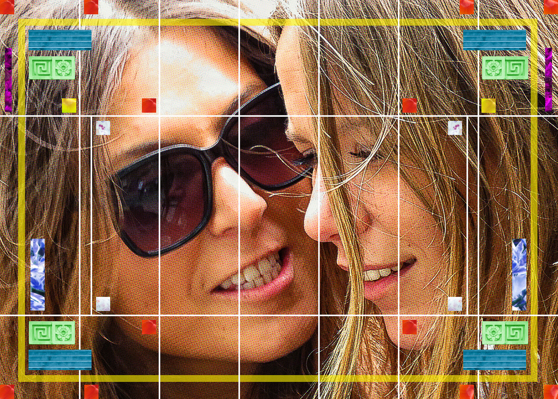
Usually when I make one of my big collage photos I work with a lot of different photos and organize them into, if not one big image, a series of images designed to work together. It’s all about using the different spaces in the photos to create a new space. A space that can’t be created with just one photo. A piece of land here, some sky there, a few building, and then some people. It all adds up to a different looking space compared to a single photo.
I changed up that formula for my latest photo. Instead of multiple images I decided to work with one big image. That’s something I haven’t really done before with my photography. I do it all the time with my drawing and painting but with photos I’ve always gone in a different direction. As long as I’ve been shooting street photos I’ve always been looking for series of images. Usually with photography you search for the one good shot but I never have. I like candid photography so I shoot from the hip and work with what I get. But occasionally I do get that one good shot. The law of averages says it has to happen every now and then. Especially when I’m out taking 5000 street photos on a single Saturday.
My “One good shot” photos I take get posted to Instagram. I look through a lot of photos on my iPad, pick one out, crop it, and do some digital manipulation with various iPad apps. Sometimes I also print out theses photos onto five by seven inch pieces of paper. I have a box of those 5x7s an pick one out to put on a little easel on my desk. I change the picture for a new one every so often. I mention all that because the current photo on my desk easel is the one I decided to blow up big.

Physical Version on the Easel
The photo is a close up crop of the faces of two women looking at a phone while sitting in Bryant Park. One woman is staring intensely through sunglasses at the second woman who is looking at the phone. I cropped the phone out of the picture so it looks like she’s staring into the middle distance. I like the emotions on their faces and the feeling of affection between them. It’s a good buddy photo.
I used this photo before as the base for one of my 11×17 inch prints. I paired it with the words “All Your Secrets are my Secrets.” It came out nice but it’s been a few years since I made that print and I wanted to make something bigger with this photo. The 5×7 version of this photo is cropped horizontally but the print was cropped vertically. I was looking to go horizontal with the big version.
I knew I didn’t have enough resolution to print this photo big. Usually I print stuff at 300 DPI but since this was going to be 20×28 inches my 15 megapixel camera would only give me about 150 DPI at that big size. But I’m prepared for such events. I teach a class in digital prepress. That’s printing stuff.
One of the things I teach my students is that if you don’t have enough DPI for printing you have to get creative. Over the years I’ve developed a series of Photoshop filter recipes that use pattern, color, and texture to turn a photo into something closer to a drawing. I still like it to be close to a photo but since it’s not a continuous tone it can be printed bigger. As a matter of fact a lot of the effects work better at lower resolution.
So I took the photo of the two women, sized it 20×28 inches, and then started to find the right filter recipes on it. For the first time in making one of my prints or photos I also used my iPad in the process. One of the good things about modern iPads is that they apps on them work on photos at full resolution. This wasn’t the case in the past. My old iPad would always lower the resolution on photo before working on them. It just wasn’t a powerful enough machine for full 10-15 megapixel resolution.
Certain photo apps on the iPad do one or two things really well and I wanted to use those. I have an app that allows me to transfer things to and from my desktop hard drive so I pulled my full resolution photo over, worked on it with a couple of apps, and copied the photos back to my desktop computer. Since the new photos were the same resolution as the original I could load them into Photoshop as layers and they would snap right into place. That’s pretty cool.
It took me a few hours to get the photo looking like I wanted it to. I ended up using about half a dozen different filter recipes and effects all on different layers and mixes together by setting the layers to different opacities. It’s something I’ve done a lot with my 11×17 inch prints so it was familiar to me. I also added some boxes of color photos but I kept them geometric and fairly abstract. There are the lines of some stairs, concrete decorative building elements, and random foliage turned different colors. I kept it minimal because I knew I’d add a few more elements after I printed out and pasted up the full size image.
The printing process was pretty easy. I kept the rectangular pieces smaller than 8.5×11 inches so I could print them all out on letter size paper. Then I put some sticky 3M paper on the back of the photos and cut them all to size. This all took another few hours. After that it was line them up, peel the backing off to reveal the sticky paper, and put them down in place on a big piece of 22×30 inch drawing paper. Then I had to do the same with the boxes of color. They get pasted down on top of the photo.
As I looked at the big finished piece it would give me ideas for more color blocks. I think to myself, “I need some more green here” and then go make that green happen on the digital file. I’d print out some new color blocks and add them to the physical photo. The very last thing I did was put in those four red color blocks closest to their faces. That finished it for me. I knew I needed nothing else after I had those in.
Well, I wasn’t quite finished. One of the photo rectangles, the one containing the woman’s lips, looked like it had a flaw in it. It was just some stray pixels brought up by the process but I didn’t like it. It was all I could see. So I went back to the digital file to fix it. Three hours later I finally had it fixed. It took so long to do it was crazy. It took nearly as long to get that one small flaw right as to make the original file. Sometimes trouble shooting is the most time consuming part of making something. Though I’m glad I got the trouble fixed. Now I can look at this photo without that flaw being what I see first.
I’m back from the comic shop this week and I got six new comics.
Check them all out here:
My movie watching habits aren’t what they used to be. I was just sitting here watching a movie and I lasted about five minutes before I turned it off and decided to do some writing. It’s not that I wasn’t enjoying the movie but I had enough of it. After five minutes I was done. I’ll go back and watch it some other time but probably in bits and pieces just like I watched that bit. I don’t think I have the patience to watch many movies all the way through in one sitting anymore.
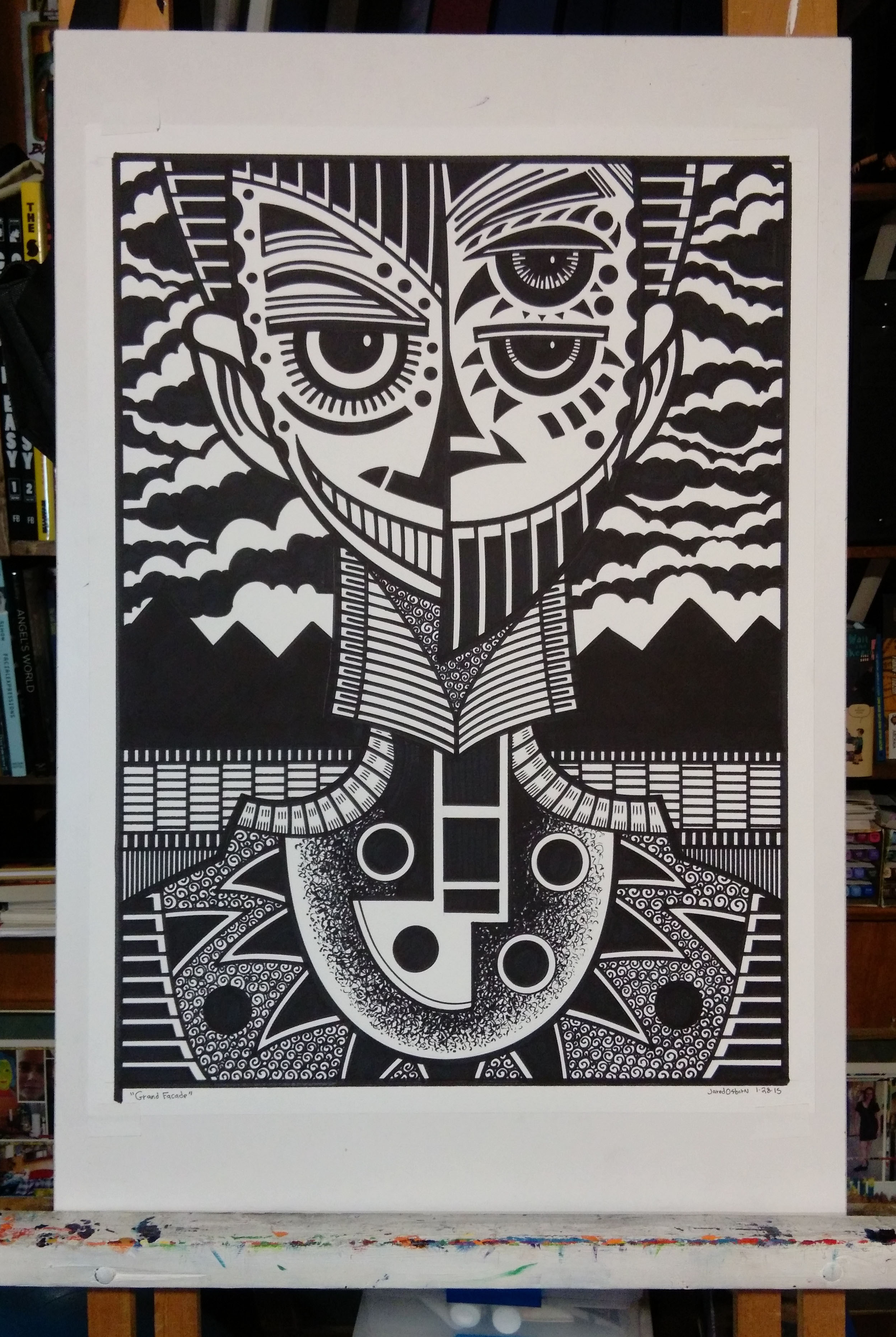
Patience is an odd thing. I still have plenty of patience for getting stuff done. Just this past Saturday I spent the whole day working on a big ink drawing. I started at about eight in the morning and kept going until about five at night. That takes a lot of concentration. It’s not like my powers of patience and concentration have gone away.
I also have plenty of patience for TV shows. I can put on a TV show and watch it for however long it is. Though without commercials TV shows are usually only 20 minutes or 40 minutes long. That’s considerably shorter than a two hour movie. I don’t binge watch TV either. I like to take time between episodes and give them some space. Normally I watch TV at night. I go to bed at 11PM so from about 9 until 11 I kick back and watch some shows. It helps me wind down.
The only time I’ve binge watched anything recently was when I was sick. I had a flu, sinus infection, cold, or some such. I had a fever and head congestion. What it lacked in severity it made up for in duration. I was sick for nearly two weeks and it lingered after that a bit too. The first week I had no concentration. I couldn’t watch anything because I couldn’t pay attention. That finally wore off in the second week and I had the TV back on.
One Saturday when I could concentrate a little I had the TV on all day. I binge watched the new Netflix zombie show “Black Summer.” Or at least what counts as binge watching for a sick person. What I liked about the show was that it didn’t demand I pay that close of attention to it. I could sit back, rest, watch the show, or not watch the show as my concentration waned. I had no expectations of the show except that it help me pass the time as I got better. It wasn’t a great show so I’m not sure if I would have watched all the episodes if I was well but since I was sick they hit the spot. It just kind of pleasantly passed by as I sat there with no energy.
I don’t go to the movies anymore either. I never went to them very much, maybe I went to six moxies a year in my heyday, but now I don’t go at all. I don’t miss them either. A lot of people like to go to the movies because they like the experience of it. The popcorn, sodas, big screen, and watching the movie with an audience. None of that ever appealed to me. I’d rather hang out and talk to my friends than go to a movie and have to sit there and be quiet for two hours. The movie always seemed to interrupt my good time.
A couple of days ago I decided I wanted to watch John Wick Chapter 2 for a second time. The first time I watched it I sat through it from beginning to end one night but not this time. I watched in in what I call “Old man style.” I watched it twenty minutes at a time. I enjoyed the movie and though it was a lot of fun but sitting there and watching it for two hours wasn’t something I wanted to do. That was too long. It took a couple of days to get through. I’d take a break from working on my big ink drawing and watch for a few minutes. I even watched it on my iPad a couple of times instead of my big TV. Sometimes it’s fun to hold the movie in my hands with headphones blaring in my ears. That’s a way different experience from being in the theatre.
The closest I come to binge watching a TV show is when I’m rewatching a sitcom. Right now I’m doing that with the show “Superstore.” I’ll watch an episode at lunch time, one at diner time, and maybe one more at night. That’s three episodes a day but at only about 20 minutes an episode they go fast. Of course them I might not watch any for a few days so it’s a slow motion binge. If it’s a forty minute TV show then one show a day is enough for me. I’m not sure what 40 minute show I’ve rewatched lately. It seems that comedies always get the rewatch with me.
Back in the days when I used to have cable TV and movie channels I would sometimes watch a movie a little bit at a time. A channel would play a movie over and over at different times the day so if I were to turn on the TV at any given time and see a movie I liked I’d watch it for a little while. Maybe I turned it on midway through and a good scene was coming up so I’d sit there and wait for the scene. But more often I’d watch a movie from start to finish when I got the chance.
The longest things I have on these days are podcasts. Though I often watch them on YouTube and they have video components I’m really just listening to them. I put them on as I work and they pass the time. I’ve had a bunch of true crime ones on lately but I also listen to a lot of comic book ones. They can be anywhere from five minutes to over an hour but almost none of them are two hours long. These days that seems to be an unreasonable amount of time for me to sit still.