This week I finished the pencils and inks on the “A Little Struggle” Spider-Man covers that I wrote about last week. Yes, that’s plural. I ended up drawing two different covers. I seem to always be making more work for myself. I was working on the first one, which was based on one of my spontaneous marker drawing compositions, when I decided I would need a second one too. A more conventional cover of Spider-Man hanging out in a typical Spider-Man pose. I’ll use one of them for the back cover.
My Ebay page to buy one of these
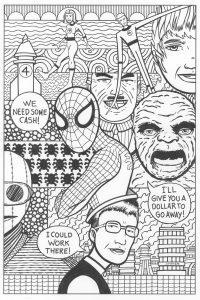
The first cover has a lot of elements to it. It reflects the contents of the very first issue of the Amazing Spider-Man. We have the Fantastic Four, J. Jonah Jameson, the Chameleon, Spider-Man, and Peter Parker. Not to mention the Baxter Building an some extra Spider-Man symbols. That’s a lot of elements. It was a real chore to juggle them all but that’s a chore that I’m used to.
It’s going to take color to really hold this composition together. When using established characters a lot of their appeal is in their costumes which are in color. Reed and Sue Richards are in blue, the Human Torch is red, the Thing is orange, and Spider-Man is in red and blue. Those colors define those characters and they’re absent in the ink drawings so it looks a little bit incomplete to me.
The backgrounds were tricky in this piece too. I used some of my usual background motifs such as cloud-like lines, a circle pattern, wavy lines, and some concentric circles, but I also wanted to work some Spider-Man #1 specific backgrounds in there. So I drew part of a city with the Baxter Building (the Fantastic Four’s headquarters) in there too. One part even ended up being a rocket ship that looks nothing like the Fantastic Four’s rocket ship but I put a “4” on it anyway.
I put a bunch of little spider symbols in one area and that drove me a little bit crazy. I only drew one of them and then duplicated that one digitally but when it came to inking them I had to do that all by hand. I was cursing myself a little when I came to the inking stage. The last thing I did was take the fence that’s behind Peter Parker and add some webs to it. It went from looking like a wooden fence to looking like a web fence. I thought that was more appropriate.
Of course the weirdest thing about the picture is that Peter Parker is wearing Spider-Man on his head like a hat. You don’t see that everyday on a Spider-Man comic. I was working from a composition taken from one of my spontaneous ink drawings and in that one a person is wearing a lizard head on his head. For some reason that was the one that appealed to me to turn into a Spider cover. I like the weirdness of it. Those early Steve Ditko Spider-Man comics can be really odd and I think this fits in with them. Plus it goes along with the non-literal nature of the cover. There is a lot of symbology in it.
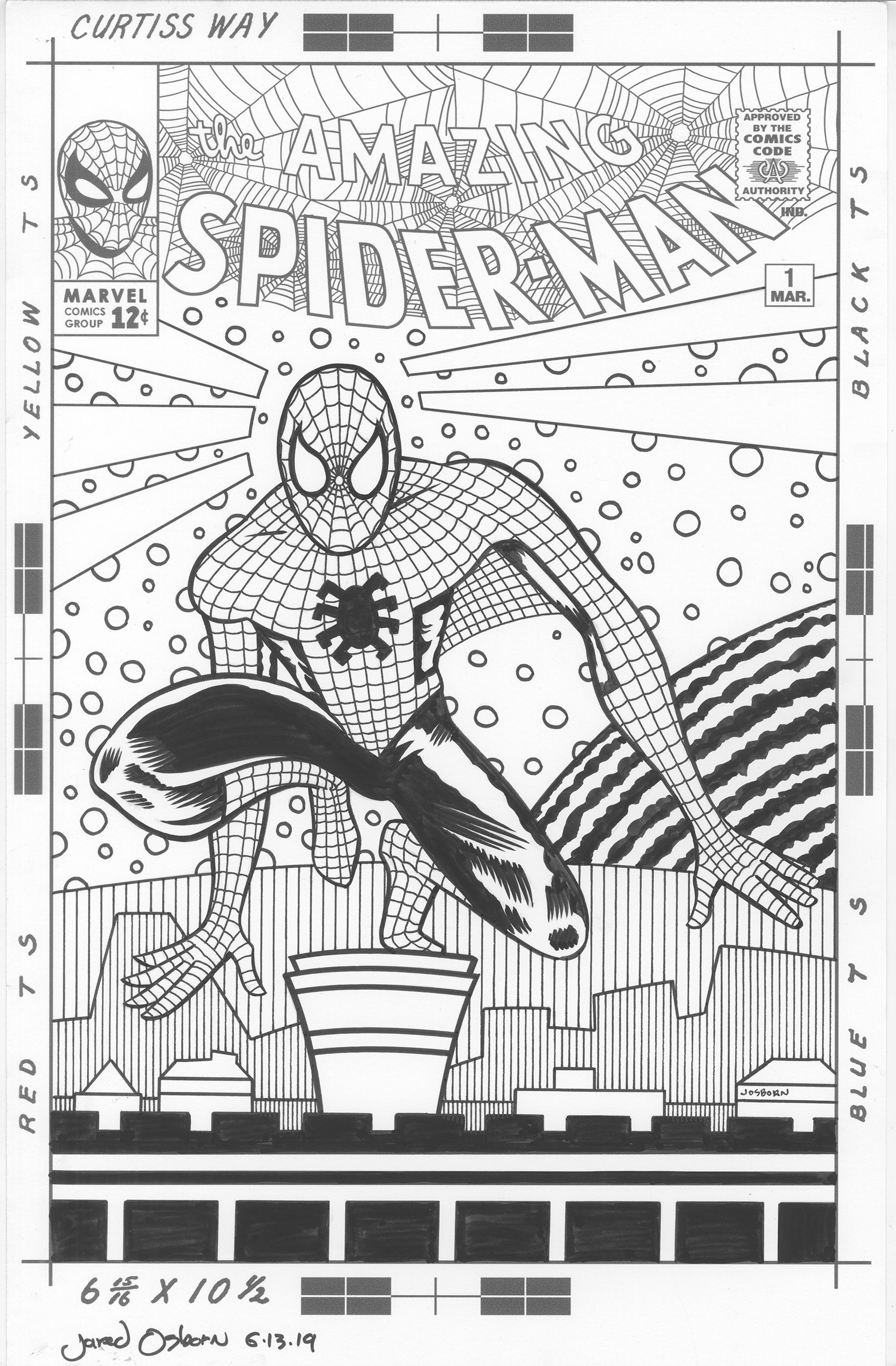
While doing this cover I decided I wanted to do a more traditional cover too. A pin-up type cover that is popular today. I wanted something to put on the back cover since I didn’t want that space to be blank. I had a really hard time with it. Despite the composition being much less complicated the pin-up cover took me longer than the first cover. I’m not used to doing things the conventional way and I have a hard time finding a creative way to do mainstream stuff.
The first thing I did was a lot of thumbnails. Small rough drawings. Spider-Man has his own visual language that is all about him crouching and twisting into poses. He can also stick to walls so I imagine his sense of gravity would be different than a regular person’s. He also has super strength so he can reach out, touch a wall, and stop himself from falling in an instant and with little effort. So finding a pose I liked was tough.
After a whole bunch to thumbnail drawings done in ink I had one I liked. I blew it up and tried to redraw it in pencil but I somehow failed and lost the character of it. Sometimes I find using a pencil inhibiting because I get too concerned about fixing my mistakes. That and a pencil only makes a thin line. So I switched back over to ink and made a bigger drawing of the figure that was more to my liking.
It was at this point I decided to take it to the digital realm. I scanned in the drawing and transferred it to my iPad where I could make a more refined drawing with the iPen and Procreate. It worked out fine. I then took that drawing, transferred it to my computer and put it together with the logo and trade dress to print out and further refine the figure and draw the background.
It took some doing to figure out the background. So many people have done so many good city backgrounds for Spider-Man covers that I didn’t even want to go down that route. I’ve seen covers with fully detailed cities in twisting perspectives with Spider-Man swinging through them. They always look pretty good but something about them also leaves me cold. So I decided to go for something a little more up my alley.
The first thing I put in were the shapes around Spidey’s head. They’re reminiscent of his spider senses but they’re really decorative elements. That’s what I’m good at. I can organize shape, line, and color into a pleasing arrangement. After that I put in the simple city shapes at the bottom and a curved line atop the bottom third. That curved line came out as some kind of wall but not really a solid wall. The next element I added to the piece was the round piece in the back that might be some kind of moon of planet That comes from my “Deep Space” covers that often had planets behind a space suited figure. I thought it would work here too. The last element I added were the circles that are all around Spider-Man. I wanted the give the background one more element. One more bit of texture.
In the end I like the way both of the covers have come out so far. It was a long way to get there but I think I got there. Now I have to finish them off with some color.