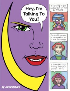
I’m back from the comic shop this week and I got eight new comics.
Check them all out here:
I’m back from the comic shop this week and I got eight new comics.
Check them all out here:

I’ve recently been working on a lecture about my history with digital art. Here is part two of three.
Here comes that question again, Before the age of digital if you were going to make a photograph you had to ask yourself, “What size?” Not the size of the photograph, that’s a question you have to ask yourself too, but what size film format will you work in. The main sizes were is 35mm, two and a quarter inches, four by five inches, and eight by ten inches. Those are all negative sizes. The last one is large format, the middle two are medium format, and the first one we just called 35mm.
Along with negative size came cameras and lenses. A 35mm camera was the most common by far. You could get a cheap snapshot 35mm camera, an expensive professional 35mm camera and all sorts of ones in between. You could also spend lots of money on lenses for those 35mm cameras. Fixed length lenses, telephoto lenses, zoom lenses, and wide angle lenses. The 35mm market was huge and that’s what almost everybody shot.
The medium and large format cameras were almost exclusively for professional photographer or maybe high end hobbyists. The negatives themselves were pretty big. The bigger the negative the more detail it could capture and the bigger you could make a print showing off that detail. So if you were a fine art photographer and wanted to make a three foot by four foot print you would want to use a eight by ten inch negative. That would be the equivalent of a very high DPI Photoshop document.
The other choice that came along with size and format with pre-digital photography was processing. It took chemicals to develop filming photographs. Your choice was negative film or positive film (slides) and black and white or color. With negative film (or negatives) you had to make a print. The film itself captured the light from the camera in a negative fashion. Then the image had to be projected onto light sensitive paper to create a positive version of the image.
Slides were a positive image. They were meant to be projected in a slide projector and shown on a screen. They were easier to develop since there was no positive print to be made but they also had to be cut apart and mounted in slide holders before they could be projected.
Lots of hobbyists took slides because they could develop them themselves. It became a running joke in movies and TV shows that people would put together boring slide shows of their vacations and want to watch them with their suffering friends. Professional photography for magazines, books, and newspapers also often used slides because the quality was first generation. The slide was the original. A print would be second generation and therefor the quality might be lesser.
Black and white film was easier to develop than color. It was a one step process. Color film often needed more than one step of chemicals to process them. Most beginning classes in photography were in black and white. You could even set up a home black and white photo processing lab if you really wanted to. The next level of classes were shooting on color slide film and color prints came after that.
Most people who weren’t professionals got their prints processed by the corner photo lab. Or maybe it was a photo store that sent the film out to be processed. They were everywhere. You would shoot a roll of snapshots, drop the exposed roll of film off at the photo store, and pick your processed negatives and prints of each photo in a day or two. That’s how most of us got photography done. The professionals sometimes did their own processing and sometimes sent their stuff out to high end professional photo labs.
With moving images it was just as important to choose a size and format. There was 8mm film, 16mm film, 35mm film, 1/2 inch tape (VCR), and 3/4 inch tape (Beta). If you were shooting motion picture film you had to send it out to be processed just like 35mm film. That cost money. Hobbyists and home movie makers shot on 8 or 16mm film. Anything bigger than that was shot by professionals. Film was measured by the foot. You’d have to calculate that into time yourself by how fast it spun through your camera.
By the 1980s VCR tape had taken over the home video markek. VCR camera were relatively cheap an there was no need to process any film. It could also playback right on your TV. Professional news cameras used 3/4 inch tape for better quality but home users used 1/2 inch tape.
If you really wanted make something with film or video you had to edit it. That was a whole other process that took a whole other set of equipment. With film it was cut and paste. You literally had to cut the frames of film out of the big roll of film you shot and use clear tape to paste it to the next scene. They had big editing machines with a hand crank so you could roll the film back and forth and watch your edits on a small screen. That’s how they put movies together.
Tape made things a bit easier for editing. Whether it was 1/2 inch or 3/4 inch tape all you needed was one tape deck for playback, one for recording, and a monitor to watch on. You’d put the master tape in the first deck, fast forward to the scene you wanted, hit play, hit record on the second tape deck, and then it would make a copy. Put another scene after the first and eventually you had a movie. This was called linear editing.
Nowadays in the digital world you need a camera and a computer. That’s about it. You still have to choose what size video to shoot, HD, Full HD, 4K, or even 8K but that’s just a matter of setting a switch on a camera. I have a fairly inexpensive, five year old camera that shoots up to 4K video. All I have to do is tell it do.
Most computers come with basic video editing software. So do phones and tablets. I edited a 45 minute video that was shot on a VCR back in 1991 on my iPad. First I digitized the video (smoothing you can do on a home computer), transferred the raw footage to my iPad, and then edited it in iMovie. It was remarkably easy. No giant film editing bay needed. I did it in an easy chair.
I’m back from the comic shop this week and I got four new comics.
Check them all out here:
I’ve recently been working on a lecture about my history with digital art. Here is part one of three.
How did we get from there to here? Analog to Digital in Art.
So let’s take a look at the world of analog art and see how we make things. If you want to make a piece of art what is the first thing you have to do? You have to ask yourself what size will the art be. What size paper should you draw on? What size canvas should you paint on? What size should you make your sculpture? What size should you make your book? This was the first choice you had to make.
So what is the first thing you have to do when making something digital? The same thing. You have to ask yourself, “What size is it going to be?” But since it’s digital there is a new twist. In the digital realm the idea of “Size” becomes conceptual. Is the size of the screen you’re working on the real size? What about he size of the screen someone will look at it on? Which is the real size? That’s a question for you to decide at the very beginning. You’ve got to pick your pixels.
Digital size is measured in pixels. But what’s a pixel? It’s the smallest unit of measure that makes up an image on screen. It’s a pinpoint of light. A tiny little dot that acts independently from all the other tiny little dots that make up a computer or phone screen. There is no set size for a pixel. It’s as small as the manufacturer can make it. A millimeter, half a millimeter, a tenth of a millimeter, who knows how small? The physical size of a pixel doesn’t matter when choosing what size to make a document. It just matters that we know the word and what it represents as a concept.
A screen is measured by how many pixels it contains. Also called its resolution. It’s basic math. Length times width equals area. Area is how many pixel it contains. Video is simple. You pick a size by how big the screen you want to show it on is. Some common screen sizes are: HD 1280×720=921,600 pixels. Full HD 1920×1080=2,073,600 pixels. 4K 3840×2160=8,294,400 pixels. 8K 7690×4320=33,177,600 pixels. Most people opt for as big as then can make it. Computers have gotten more powerful over the years and can push more pixels around but there are still limits. With resolution you can always make it smaller but you can’t make it bigger. At least not without losing quality. It’s best to go big but not into the area of too big. Too big is when it takes up too much of your time to push the pixels around. There is no fixed number for “Too big” and with computers getting more powerful the goal posts keep shifting.
Things get a little trickier when you leave the world of screens as the presentation device for your art piece when making digital art. When you decide you’re going to make something physical, such as a photo, poster, print, book, or magazine you have to decide what size the final piece is going to be and then determine what size you digital file is going to be. Let’s say you want to make a letter size photograph. That’s a standard size: 8.5×11 inches. That’s what you set your “Document Size” to. It’s also called “Canvas Size” in Photoshop and other art programs. Think of it that way. That’s the size of the canvas or piece of paper you’re working on regardless of how big it looks on screen. The app keeps track of the concept of how big you want your painting but it only exists in a digital space.
Document size is the first step in choosing a size the next is resolution. Resolution is measured in dots per inch (DPI), pixels per inch (PPI), or parts per inch (PPI)? How big is a dot, pixel, or part? Part of the answer is that it depends on your output device and part of the answer is that It doesn’t really matter. It’s all conceptual size. The only thing that matters is more DPI is usually better than less DPI. For example: If you wanter to make an 8.5×11 inch photograph you will need to make it at least 300 DPI. Maybe 600 DPI will be better but it might be overkill and merely slow you down. But 72 DPI is way too low and you won’t get the photo you want. I usually err on the side of overkill.
Now that I’ve told you about screen resolution and DPI I’m have to tell you that sometimes DPI doesn’t exist. Sometimes size in regards to digital art gets even more conceptual. DPI exists within a bitmapped digital world. Something that’s bitmapped means that every single bit on a screen it kept track over. What is a bit? It’s the same as a dot or part. It’s the smallest size piece that an app keeps track of. So an HD 1280×720 screen or Photoshop document kept track of all 921,600 pixels at all times. Even if they’re blank.
So when does DPI and resolution disappear? When instead of a bitmapped program you have a vector program like Adobe Illustrator. A vector program uses math to keep track of things. If you draw a square in a vector based program it doesn’t keep track of every pixel in the square. It keeps track of the four points that make up the four corners of the square and notes that they are connected to make a square. Since vectors are are math equations they are “Resolution independent.” That means you can make them larger indefinitely. Blow up a bitmapped image and it gets fuzzy. An old standard definition TV show shown on a new HD TV looks blurry. There isn’t enough resolution to make the old TV show look sharp on a new set. A vector based image would look as sharp no matter how big the TV set was.
Bitmap, vector, page size, canvas size, and DPI those are the things you need to know to answer the question, “What size do I want?”.
I’m back from the comic shop this week and I got eight new comics.
Check them all out here:
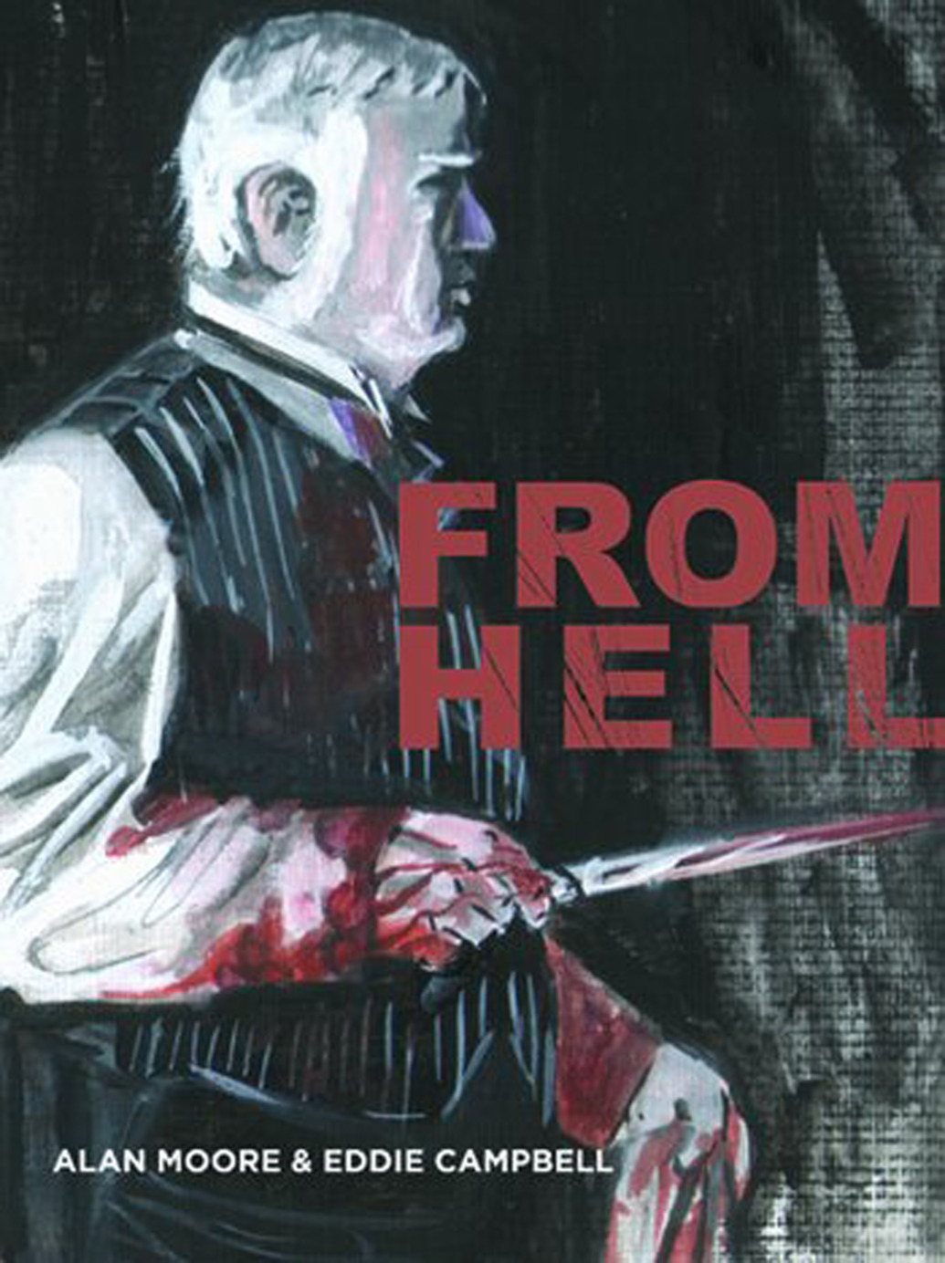
Eddie Campbell and Alan Moore’s comic book “From Hell” came out back in the 1990’s. I bought the first couple of issues and then decided to stop buying the single issues and wait until it was all finished and released all together in a collected edition. That’s not something I usually did and I can’t quite remember the reason I did so with this comic but it probably had something to do with the format.
The individual comics of “From Hell” were printed in a square bound format and that is a format I’ve never liked. I prefer my comics bound with staples rather than a glued spine because I find them easier to read. A stapled comic opens flat and stays that way. A glued spine doesn’t open flat and constantly wants to close itself. I’ve never appreciated that.
The “From Hell” collected edition that I have is a softcover book with a glued spine (as are all softcovers) but despite being a thick book opens up well and lays pretty flat. It has a lot of pages to it. According to Amazon the page count is 565 pages but I can’t verify that because the book doesn’t have overall page numbers. It has chapter page numbers that start over at number one with every new chapter. There are 14 chapters of at least 40 pages a piece. At a quick glance at least one chapter was longer.
This collected edition was originally printed back in 1999. That’s when I first read it. It’s hard to believe that 20 years have slipped by between readings. That seems impossible but of course it’s not. I remember enjoying those first two issues of “From Hell” when I read them individually but when I read the whole graphic novel in 1999 I remember it leaving me frustrated. I found it a bit confusing and impenetrable. When I reached the end of the book I found the forty pages of tightly packed author’s notes and couldn’t even read them because of the frustration. I figured I’d reread the book along with the author’s notes sometime in the future when I wasn’t so frustrated. Then those twenty years slipped by and here we are.
The only other comic book I can think of with such extensive author’s notes are Carla Speed McNeil’s “Finder” collected editions. But with “Finder” the story makes perfect sense without the notes but you can read them at the end and enhance your knowledge and enjoyment of the story. I read all the “Finder” stories as individual issues first and they became favorites of mine long before the collected editions with author’s notes in them were published.
The second time around I read “From Hell in a completely different way than normal. The author’s notes in back were broken down by chapter and page number. The notes referred to scenes that were broken down into one to four page increments. A single note might be a few paragraphs long and refer to three pages in the book. So I would read three pages of the comic and then flip to the back to read that notes about those three pages. That turned out pretty well for me because things became a lot clearer.
In case you don’t know “From Hell” is about Jack the Ripper. I don’t think I have to explain who he is but I will tell you that the story takes place in London in 1888. I don’t know a ton about the subject but being that I’m a history fan I do know a little. I’ve never read a book about the Ripper but I have read some short articles and seen at least half a dozen TV documentaries on the subject. That’s why, with my first reading twenty years ago, I was so frustrated. A comic about Jack the Ripper shouldn’t have confused me so much.
First of all I’m an Eddie Campbell fan. I bought his work before “From Hell” and have bought other stuff since. But his indistinct art style often confused me in this book. He uses a very expressive but sketchy line that didn’t always serve the reader in this book. That’s because there are a lot of characters in this black and white book and sometimes I couldn’t tell one from the other. When there are fourteen middle age London men to draw it’s tough to make each one distinct. Especially when that’s not your style. The same with the fourteen women. That made for some confusion but not the impenetrability. That was all Alan Moore.
I’ll give you an example of a scene that confused me. Chapter 2 starts with a three page flashback to 1827. Two of the pages are almost all black with dialogue until the final panel reveals a little boy with his dad on a boat. What was the point of that? I had no idea until I read the notes. It was William Gull (the doctor the story says is Jack The Ripper) as a boy. Why was it there? Because in his research Moore found out some stuff about Gull’s childhood.
Another example of an impenetrable scene was that one of the chapters began with three pages of a couple having sex with a panel that had blood gushing down some steps somewhere. Or maybe the blood rushed through doors. I can’t quite remember. I had no idea why that was there. Upon reading the notes it was made clear. Turns out that Moore had calculated that Adolf Hitler had to be conceived at sometime around the Ripper murders. So this scene was of Hitler’s parents having sex. Foreshadowing the violence of the 20th Century. Makes sense with the author’s notes but doesn’t without them.
There are lots of other scenes in this book that I didn’t get without the notes. That was the source of my frustration twenty years ago. In reading the book with the notes I did come to a new conclusion. This isn’t a book about Jack the Ripper. This is a book about Alan Moore researching Jack the Ripper. This isn’t Jack the Ripper’s story. It’s the story of everything that Moore found out about what went on around Jack the Ripper’s story. There are scenes of the coroner’s inquest taken verbatim from the inquest, scenes of what witnesses were doing taken from their testimony, and scenes of speculative fiction built from what Moore thought some of the characters would have been doing. There is a lot of detail that shows us what was going on that isn’t necessarily there for story purposes.
I really have enjoyed this reread of “From Hell.” With the author’s notes all the confusion and frustration went away. Though it may not be the ideal way to read a comic reading this one along with the author’s notes was a good time. I think I understand the book a lot more now and coming to the realization that it’s not about Jack the Ripper but about Moore’s research into Jack the Ripper was the key for me.
I’m back from the comic shop this week and I got eight new comics.
Check them all out here:
The past is a strange place. That’s my thought for today. It comes into my head because of what I’ve been working on lately. Y’see I love history. I’ve been a fan of history since my childhood when my mother used to bring my sisters and I to the library to pick out books to read. I’d pick out history books. I can’t recall the name but there was a line of books for children that were biographies of the heroes of the American Revolution. I remember reading about George Washington, Thomas Jefferson, John Paul Jones, John Adams, the Marquis de Lafayette, and probably many more that I can’t recall right now.
My love for history started early and because of that I like to keep track of things. Photographs specifically are what I’m talking about in this piece. My mother took family photographs my whole childhood. I didn’t start taking photographs for myself until my freshman year of college. That was in 1984 and I got my first camera then. I also took a photography class in college so I was able to get acquainted with my 35mm camera, develop my own black and white film, and make prints of my photos. I had fun doing it.
Even after my one and only photography class ended I kept on taking pictures. I usually took photos of friends, gatherings, and everyday events. After college I went to work at the offices of Marvel Comics in NYC and it wasn’t as easy to take pictures anymore. My 35mm camera wasn’t always around. This was long before the days when everyone carried a camera phone so if you wanted to take photos you usually had to have a good reason to carry your gear. I carried mine every now and then.
But then sometime in the early 1990s I got my first pocket camera. The Olympus Stylus. It was about the size of a large bar of soap so I could carry it in my pocket all the time. And I did. I became the guy who carried a camera around in case one was needed. I also took pictures whenever I could. I wish I had taken more. Back before the digital age you usually needed a reason take a photo. It took time, effort, and money to get photos printed so I didn’t just shoot willy nilly like I do today. But still I shot more photos than most.
Because of my love of history I got into the habit early of writing the names, dates, and places on the back of my photos. I may have only been 20 at the time I started but I knew there would eventually come a time when I might not remember the names of all the people who were in my photos. Some were good friends with names never to be forgotten but most were acquaintances who came and went. It’s a good thing I got into that habit because thirty years later a lot of names have slipped away.
Lately I’ve been scanning in a lot of old family photos. I’ve borrowed a few photo albums from family members and now the photos are digital. Photos from the 1920s up through the 1970s. Even with digital photos I have to write names, dates, and places on them. Usually I put the name of whoever is in the photo in the file name and I put them in a folder with the date and place on it. That way it’s easy to find and I don’t need any specific program to keep things straight.
Lately I’ve been doing something different. I’ve been loading all those old photos onto my iPad. I’ve always had my own photos on my iPad but they only run from about 1985 until present. With the old photos I know have photos spanning about 90 years on my iPad. That’s an amazing thing.
One of the annoying things about the iPad and Apple’s iOS in general it that it ignores files names and makes its own new file names. So all this names that make my photos easily identifiable on my desktop are useless when I transfer the photos onto my iPad. It’s really annoying.
What the iOS on the iPad does have is facial recognition software. It’s far from perfect. It doesn’t work anywhere near as well as on TV shows when the cops use it. But it does allow me to add names to faces. First the iPad has to scan the photos for faces. There is no start button for this. You plug the iPad in and lock the screen and then it’s supposed to automatically start scanning. This may be what’s happening but there doesn’t seem to be a rhyme or reason for it. Sometimes it scans faces and sometimes it doesn’t. Sometimes it scans all the faces in a photo, sometimes none, and sometimes just some of them. It’s weird how scattershot it is.
So as the iPad has been slowly scanning faces I’ve been naming them. It also tries to find other photos with those faces and automatically name them. That’s hit or miss too. So far I have about 400 named faces on my iPad. I don’t know if that’s a lot or a little but it seems like a lot.
So what about all of this makes the past so strange? It’s that having all those old photos means that I have a lot of photos of people who are passed on now. I have photos of them when they were young, middle aged, and old. I have photos of my living relatives at all three of those stages too. Plus I’ve been sitting with some of my older relatives and asking them the names of some of the extraneous people in the photos from their childhoods. I’m learning the names of young children who haven’t been young in 75 years but to me they’re five years old.
All in all it puts me in a strange head space. I’ve been looking at and naming so many photos that everyone is both old and young to me. The 1920s are still here and there are young people having fun on the shores of the Hudson River. So are the 1950s in a different part of town. Everyone likes to pose by their new car no matter what the year so what year is it exactly? I keep jumping from time to time as the iPad wants to know who’s face this one is. And the iPad doesn’t even care about time. As far as I know there is no place to date a photo as I name them. So in an odd way all time becomes one as I wander through the photos on the iPad. It’s a strange place to be.
I’m back from the comic shop this week and I got five new comics.
Check them all out here:
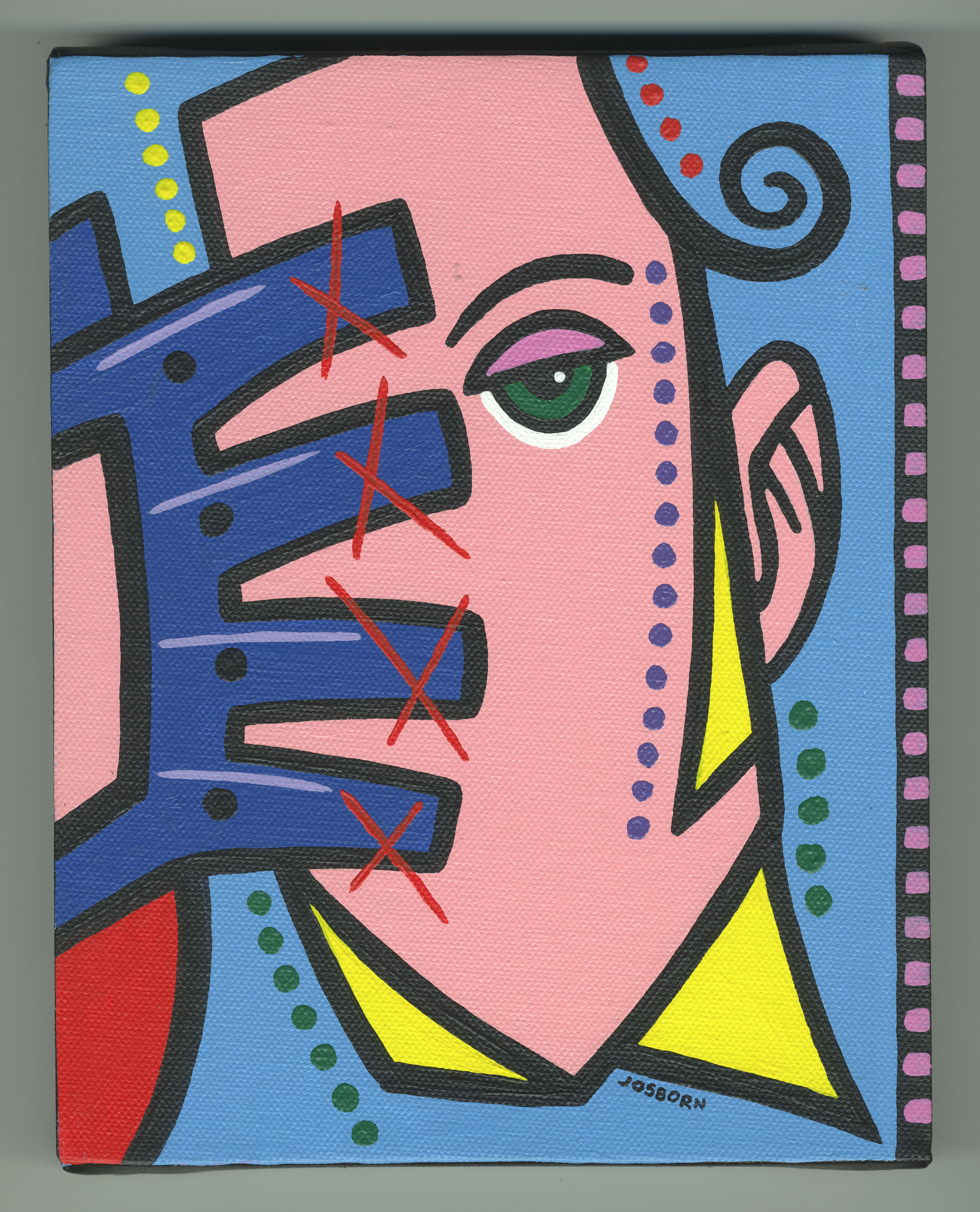
This week I thought I’d do that thing where I pull an old painting out of storage, take a look at it, and write a little something about it. This painting is one of my small 8×10 inch acrylic on canvas paintings. This one also wasn’t quite in storage in that in hangs on my wall above my front window. I have a row of of eleven 8×10 inch paintings up there, above my head, about seven feet in the air. Though I can see them from where I sit, like most things in everyday life, I take them for granted and don’t pay a lot of attention to them. Today I’ll pay attention to this one.
Since this painting is named and dated on the back I know it’s called “Rage Cage” and was painted on May 15, 2005. Wow, it’s fourteen years old. Time really does fly. Especially when looked at in hindsight. I think this might be one of my earliest 8×10 inch acrylic on canvas paintings. I originally started doing them because I wanted to work on more painted images. I could make four, six, or ten of these small paintings in the same time it would take me to make a larger 24×36 inch painting which I usually made. That allowed me to explore more imagery.
I bet there are also three other paintings that I finished on this same day. I used to do them in fours. That way I could switch between them as I was either waiting for the paint to dry or waiting to come up with an idea for what to do next on them. I’d decide what to do on one of them, lay down the paint, put that one aside, pick up the next one and keep the process going. It worked well for me. When working on just one of them at a time I found myself going too slowly. There was too much down time. With four of them at once there was always something to do next and I liked that.
“Rage Cage” is a stripped down painting of a face and a gloved hand. The face is especially stripped down in that the only feature it has is a single eye. There is no hint of a second eye, nose, or mouth. I’m betting that in the drawing stage they just got in the way. I don’t usually strip faces down this much so I’d guess that in the drawing stage I tried to put them in there but kept erasing them until I finally saw that they weren’t needed. The drawing stage is very helpful in figuring out what is needed and what is not.
The eye on the face is a few simple shapes and lines. I like the way it’s done. We have the upper eyelid in a slightly darker color than the rest of the face, the green of the eye, the black of the pupil, and a stroke of white for the white of the eye. The stroke of white doesn’t even have a black holding line around it. I like that part. It works for me. I bet a black holding line would have made the eye too heavy. As it is now it floats on the face in a striking way. I think the eye, looking back at us, is the key to the whole painting.
The second key to this painting is the color. It has two main colors. The portrait pink of the face and the light blue of the background. These two colors are both tints (color with white in them) and work together in harmony. Pink and light blue are also colors of childhood so there might be a bit of color nostalgia going on too. The dark blue of the glove is a good counterpoint to the tints. It’s solid pure color and acts as an anchor holding everything in place. Usually I’d use a dark color like that in the background but here in the foreground it acts like a paperweight keeping the other colors from blowing away in the wind.
I find the three yellow triangles interesting. They’re an accent color but they also define what appears to be a shirt collar and a sideburn. I usually don’t use the same color on two different objects so close to each other but since they’ve become so abstract they read as color more than as objects. My mind just sees yellow that looks like it belongs there and doesn’t even question what the yellow is.
The red in the bottom left corner is interesting. It reshapes the positive and negative space of the canvas when I look at it. At first glance the face is the positive space and the light blue is the negative space but when my eye eventually gets to the bottom red that becomes a new negative space and make the bottom light blue become a positive shape. It’s really weird. It’s like falling into a visual hole. It adds a little more complexity to the piece.
The red X’s on the glove were probably a finishing touch. They take the attention off the bottom corner red and leave you to discover that later. The X’s demand immediate attention and fight with the single eye for what is most important. Though they are marks rather than objects the X’s almost read as objects for some reason. It might be that they are where fingernails should be and so make me think of fingernails. As I do a piece like this I’m always trying to figure out how to fit all the pieces together and sometimes even after I fit them together I’m trying to figure out why they fit together well. That’s the process.
The small circles of color around the piece are usually the last things to be painted on. They’re the part of the process for getting the right color balance, balance of marks, brush strokes, and objects. The fine tuning of a painting. I needed a little more yellow on the top so some small circles of yellow went up there. I needed some violet so some circles went on the side of the face. Some green to work with the eye color went along the sides of the neck. This finishing touches don’t take long to do but often take a lot of looking and contemplation. Another reason to do four of them at once.
The last thing I’ll mention it the film like sprockets along the right side. A thin strip of black with pink/violet squares on it. They emphasize the asymmetry of the piece but also add some balance. A little more dark to balance the dark blue of the glove. When working with asymmetry balance becomes really important. That’s my advice for the week.