This week I thought I’d do that thing where I pull an old painting out of storage, take a look at it, and write a little something about it. This painting is one of my small 8×10 inch acrylic on canvas paintings. This one also wasn’t quite in storage in that in hangs on my wall above my front window. I have a row of of eleven 8×10 inch paintings up there, above my head, about seven feet in the air. Though I can see them from where I sit, like most things in everyday life, I take them for granted and don’t pay a lot of attention to them. Today I’ll pay attention to this one.
Since this painting is named and dated on the back I know it’s called “Rage Cage” and was painted on May 15, 2005. Wow, it’s fourteen years old. Time really does fly. Especially when looked at in hindsight. I think this might be one of my earliest 8×10 inch acrylic on canvas paintings. I originally started doing them because I wanted to work on more painted images. I could make four, six, or ten of these small paintings in the same time it would take me to make a larger 24×36 inch painting which I usually made. That allowed me to explore more imagery.
I bet there are also three other paintings that I finished on this same day. I used to do them in fours. That way I could switch between them as I was either waiting for the paint to dry or waiting to come up with an idea for what to do next on them. I’d decide what to do on one of them, lay down the paint, put that one aside, pick up the next one and keep the process going. It worked well for me. When working on just one of them at a time I found myself going too slowly. There was too much down time. With four of them at once there was always something to do next and I liked that.
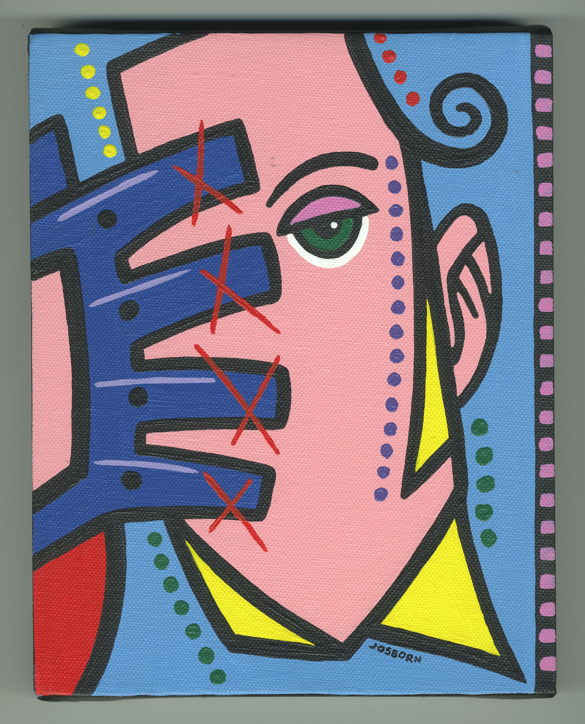
“Rage Cage” is a stripped down painting of a face and a gloved hand. The face is especially stripped down in that the only feature it has is a single eye. There is no hint of a second eye, nose, or mouth. I’m betting that in the drawing stage they just got in the way. I don’t usually strip faces down this much so I’d guess that in the drawing stage I tried to put them in there but kept erasing them until I finally saw that they weren’t needed. The drawing stage is very helpful in figuring out what is needed and what is not.
The eye on the face is a few simple shapes and lines. I like the way it’s done. We have the upper eyelid in a slightly darker color than the rest of the face, the green of the eye, the black of the pupil, and a stroke of white for the white of the eye. The stroke of white doesn’t even have a black holding line around it. I like that part. It works for me. I bet a black holding line would have made the eye too heavy. As it is now it floats on the face in a striking way. I think the eye, looking back at us, is the key to the whole painting.
The second key to this painting is the color. It has two main colors. The portrait pink of the face and the light blue of the background. These two colors are both tints (color with white in them) and work together in harmony. Pink and light blue are also colors of childhood so there might be a bit of color nostalgia going on too. The dark blue of the glove is a good counterpoint to the tints. It’s solid pure color and acts as an anchor holding everything in place. Usually I’d use a dark color like that in the background but here in the foreground it acts like a paperweight keeping the other colors from blowing away in the wind.
I find the three yellow triangles interesting. They’re an accent color but they also define what appears to be a shirt collar and a sideburn. I usually don’t use the same color on two different objects so close to each other but since they’ve become so abstract they read as color more than as objects. My mind just sees yellow that looks like it belongs there and doesn’t even question what the yellow is.
The red in the bottom left corner is interesting. It reshapes the positive and negative space of the canvas when I look at it. At first glance the face is the positive space and the light blue is the negative space but when my eye eventually gets to the bottom red that becomes a new negative space and make the bottom light blue become a positive shape. It’s really weird. It’s like falling into a visual hole. It adds a little more complexity to the piece.
The red X’s on the glove were probably a finishing touch. They take the attention off the bottom corner red and leave you to discover that later. The X’s demand immediate attention and fight with the single eye for what is most important. Though they are marks rather than objects the X’s almost read as objects for some reason. It might be that they are where fingernails should be and so make me think of fingernails. As I do a piece like this I’m always trying to figure out how to fit all the pieces together and sometimes even after I fit them together I’m trying to figure out why they fit together well. That’s the process.
The small circles of color around the piece are usually the last things to be painted on. They’re the part of the process for getting the right color balance, balance of marks, brush strokes, and objects. The fine tuning of a painting. I needed a little more yellow on the top so some small circles of yellow went up there. I needed some violet so some circles went on the side of the face. Some green to work with the eye color went along the sides of the neck. This finishing touches don’t take long to do but often take a lot of looking and contemplation. Another reason to do four of them at once.
The last thing I’ll mention it the film like sprockets along the right side. A thin strip of black with pink/violet squares on it. They emphasize the asymmetry of the piece but also add some balance. A little more dark to balance the dark blue of the glove. When working with asymmetry balance becomes really important. That’s my advice for the week.