I’m back from the comic shop this week and I got eight new comics.
Check them all out here:
Comment
I’m back from the comic shop this week and I got eight new comics.
Check them all out here:

“Thread It” an 18×24 inc acrylic on canvas. This is to one I write about.
I finally finished a painting that had been sitting around my studio all winter. It’s one that I made the drawing for, painted the basic line work of it on canvas, and even did a color sketch of. Then I grew bored with it and let it sit. This weekend I got tired of looking at it and decided to finish it. The bulk of the work was still to be done on it and as I was slogging my way through some of the early stages of painting the question occurred to me, “What makes a painting come together at the end and be finished?”. That’s a question that I didn’t know the answer to when I was younger and never contemplated much as I got older. Over the years I figured out how to make a painting come together and be finished but it wasn’t a conscious thing but a consequence of wanting to make paintings.
First of all finishing a painting takes planning. Some artists plan more and some plan less. From a practical standpoint you need to plan where and when you’re going to make your painting and have all the tools to make it on hand. That’s basic and obvious stuff but the novice might not know it. And so many artists have a hard time carving a place to paint out of their basic living space so it’s not always easy. Not to mention carving time out of life. And if you haven’t figured out what basic picture making tools you might need, from pencils to paint to canvas, then you’re going to have to spend some time and effort doing that. It’s amazing how these most basic steps can trip you up and stop you from ever finishing anything so take some time and get them locked down. After I got out of art school I had no money and no easel to paint on but I did have some scrap wood and basic carpentry skills. So I ended up building my own easel. It’s not the prettiest thing in the world but it gets the job done and I’m still using it twenty five years later. It was supposed to be temporary but it still works.
The next part of planning is the plan for an actual painting. Usually it’s idea, sketch, drawing, color sketch, and then painting. At least that’s how it goes for me. Some people have more or fewer steps in their process but usually everyone has a process. Some people do even more prep work like tracking down reference photos or doing a greyscale value drawing. Others skip right to the blank canvas stage and come up with ideas right on the spot. They then proceed to sketch or paint right on the canvas. They plan as they go. Any way you do it it’s important to plan. You need some sort of end goal for your painting in mind as you start otherwise you can find yourself with a directionless mess.
The next thing you need is experience. This is the tough part if you’re a young artist because you might not have any. You can compensate by having a good plan and being ready but it’s still tough. The problem is that at any time your plan can go wrong or not be good enough. There can be a flaw in any one of your phases from drawing to color sketch and you might not be able to recognize it. That is one of the most frustrating things. You know something is wrong, you can see something is wrong, but you don’t know where and when it all went bad. That is one of the most common picture making problems especially when you’re young. And it’s tough to let go. If the problem was in the drawing stage and you’ve done all this other work since then it’s tough to have to abandon that work. You’ll want to fix it. It takes experience to know when something is beyond fixing and toss it and start over. We’ve all had to do it but that doesn’t make it easy. With experience you learn to look more closely at things in every stage. It doesn’t stop all mistakes from happening but it sure does cut down on them.
The final thing you need to make a painting come together is confidence. This is also something a young artist has to build along with experience. When I was in art school I remember some people believing the very modernist idea that a painting should “Look finished” at every stage in its development. This is nonsense to me. Maybe if you don’t take the statement so literally and instead think of it as a way to be mindful as you go along making the painting I can accept it but there are some stages in my painting where it looks like crap. I’m specifically referring to after I paint in all my underpainting. I paint my holding line and then my color underpainting before I come in and do the bulk of the painting work over that base. Believe me when I get that underpainting done the whole thing looks like crap. And believe me the painting looking like crap at this stage affects me. It makes me think the painting is a failure and I don’r want to continue. That’s when I need the confidence to calm myself down and know it’s just the stage it’s at and I’ll make it pull together in the end. It was a moment just like that while working on this last painting that sparked me to write this piece.
I stood there in front of my painting wanting to stop because it looked so horrible and had to tell myself to have confidence in my plan and talent that I would be making a good painting in the end. It didn’t happen right away either. It was another couple of hours of sticking to the plan before I saw some of the results I wanted to see. Then I just followed the paint. Part of my plan is to have no plan near the end and let the needs of the painting in terms of color, composition, and brush strokes guide me. This is the stage that also takes experience. The experience to see that the painting isn’t leading me anywhere anymore. Sometimes I have doubts and ask myself, “Am I adding stuff will nilly?” but it always turns out that I find the place to stop. And stop I do.
I’m back from the comic shop this week and I got seven new comics plus a hardcover.
Check them all out here:
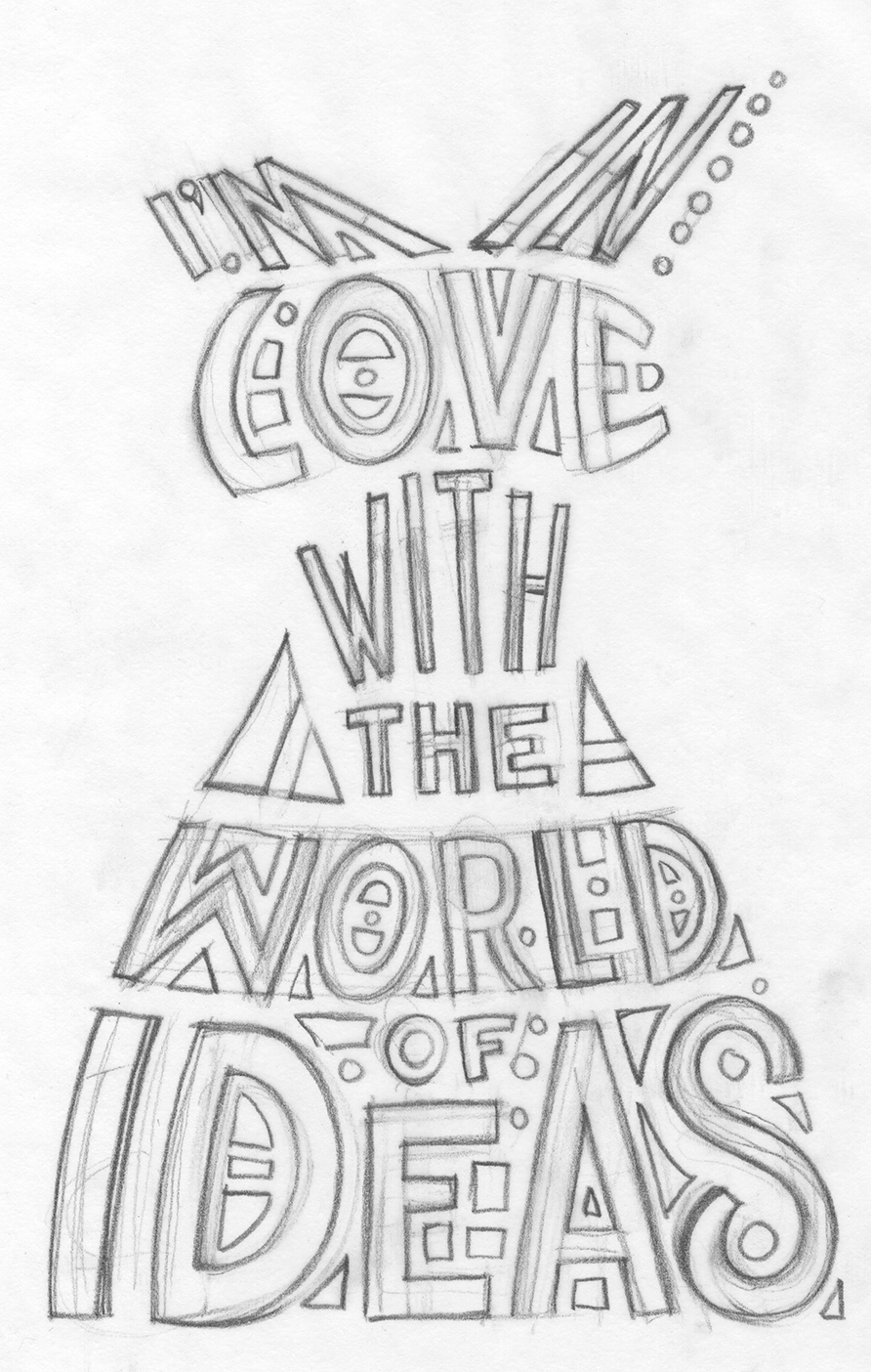
Message Dress Pencils Sketch of Type
Working with type isn’t always easy. That’s why there are typographers. People who specialize in type. Letter and logos. Computers sure have made working with type a lot more accessible and easier to do but it still takes work to make something good. With a computer there are a ton of fonts to choose from that are available at a button touch and you can always buy more from font makers on the internet. You can make the font bigger and smaller with a keystroke. I find it fairly easy to work with computer type in most situations. Designing a logo for example is much easier on a computer than by hand. Type whatever the word is that you are making the logo out of, find at least a dozen fonts you like the word in, and then go from there. Sure the “Go from there” part takes a lot more time and creativity than I indicated but the first part where you have to try the word in a lot of different type styles takes a lot less time than it used to. That was the boring part of logo design too so I’m glad it’s gone.
One of the best lessons I got back in my college days was not in a class but when I was watching a friend work. He had a freelance job designing swing tags for clothing. Those are the little tags with the store or collection name on them that hang by a plastic wire off the sleeves of shirts or pants. He was designing the type for the tag and he was drawing the letters. I had worked in type before and I had always kind of wrote or tried to build the letters. It never occurred to me to sketch the letters like they were any other object. From then on in I did.
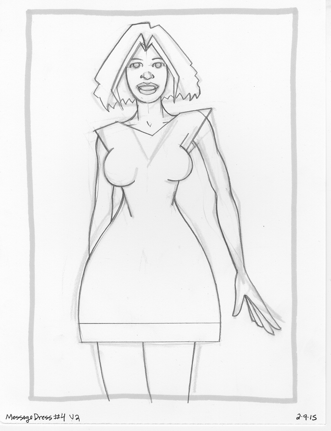
Message Dress Sketch
That brings us to today and my “Message Dress” drawings that I have been working on. I’ve mentioned them recently (/?p=4959). The basic concept was a drawing of a woman in a dress and I put a saying on the dress. Fairly simple and straightforward idea but I’ve had trouble executing it. I ended up drawing all the drawings twice. I was unhappy with them the first time and couldn’t get any type work done on them. After I drew them the second time I was much happier but still didn’t finish one. I came close but not close enough.
First off I wanted to go with hand drawn type. I wanted to squeeze the words into the shape of the dress in a sort-of 1960s psychedelic poster way. That’s not my usual way of handling type but I wanted to give it a try. Since the letters would be in such odd shapes I figure that would be tough to do on the computer. Turns out it is tough to do by hand too. On my first attempt back in the winter I ended up giving up on hand drawing the type and turned to the computer. Normally I handle all my computer type in Illustrator but with so much warping of the lettering I ended up switching over to Photoshop. In the end I did a solid job of it but it still wasn’t what I wanted so I abandoned it.
I barely even remember doing that type work but when I opened the Message Dress file I could see that I did. I even tried to draw some hand type with my Wacom tablet right in Illustrator. I could see the path I followed even if I didn’t remember the journey.
This time I was determined to make the hand drawn type work. I pulled out one of my Message Dress inked drawings and then threw a piece of tracing paper over it. I didn’t even think of the sentence I wanted to say at first. I just tried to fit words into the dress shape. After I decided I could do it that way I thought up what the dress should say. The pencil drawing was actually the easy part. It took some time but it was just a sketch. I knew I would have to finish it on the computer but how? I scanned in the type sketch and set it up in Illustrator. I decided I would have to build the type line by line. I say build rather than draw because that’s closer to how I work in Illustrator. I use the basic line tool to build shapes and then use those shapes to form letters and words. It’s not quite how I’m used to drawing so things went slowly.
This part took a lot of time and I almost gave up. I was so frustrated with the slow pace of building the letters that I switched over to Photoshop once again to see if I could manipulate the type to get what I wanted but faster. After a twenty minute detour in that direction I realized that way was never going to lead me where I wanted to go so I went back to my building of the type in Illustrator. By the end of the day I got it done.
As of this writing I stiff haven’t finished the piece. I have yet to color it. I made a pass at the color back in February when I made the type I didn’t like but looking at it now I’m not sure if I like it. It was fairly simple color with no shading and a texture for the skin so there wasn’t much to go wrong but it had no pizazz. I think that had to do with the design though. There basically was none. I used watercolor shapes for the background and I don’t think I pulled it off. I was trying to keep it simple but I think I need to put more thought into it. Think I’ll give it another go. Until then…

Message Dress Finished
I’m back from the comic shop this week and I got six new comics.
Check them all out here:
This week I was replacing some worn out parts on my bicycle with some fresh new ones. In the process I did one repair that I’ve never done before in all my years owning a bike. Changing the chain. I’m not sure why I never needed to do it before. It could be that I ride more often these days since I ride all the way through the winter. But I had my previous bike for twenty years and the chain never wore out. Maybe bikes were just made better in the 1980s.
I have changed my rear gear cassette before on this bike before. I bought the bike in March of 2009 and put a new gear cassette on it in July of 2012 and then again in June of 2014. Being that I put another one on this week that means they’ve been wearing out faster and faster. When the gears get worn they get pointy on top instead of flat. That means they don’t grip the chain as well and can slip when I’m pedaling. Plus the harder I pedal the more likely the chain is to slip. That is not a good thing.
The first thing I changed out this week was the front pedal crank. That’s the two big gears that go in front and are connected to pedal cranks and the pedals. I noticed a lot of those gears were looking pointy and since it had yet to be replaced on my bike I thought it was a good idea to do so. Another thing I had noticed was that the chain wasn’t quite sitting on the top of the gears as it should. It looked like the chain wasn’t catching in the gears until it was hitting the front of the gear wheel. I’m pretty sure that can cause the chain to slip.
Since I had to take my pedal cranks off a couple of years ago and clean the axel I already has the special tools that I needed to switch out the new crank for the old one. It’s easy to do and in no time I had the new pedal cranks on and was ready to go. As I looked at how things were meshing I noticed the chain still wasn’t sitting in the gears on the top of the wheel as it should. When I took it for a test ride the chain slipped worse than it ever did before. That’s when I decided to order a new chain.
Chains don’t just come off the bike frame. You have to unlink one of the chain links to get it off. I ordered a new chain and a chain link breaker tool to get the chain off. It was also easy to do. You put the chain in the tool and then turn the bolt on the tool by hand and it pushes the tiny chain link axel out of the center of a link. I watched a YouTube video to see how it was done. I’m glad I did because one of the things the video said about putting a new chain on was to make sure it had the same number of links as the old one. Don’t go by the length of the chain. That’s because it turns out that a bike chain doesn’t really “Wear out” it actually stretches. When I put the old and new chains side by side they were about the same length but when I tried to line up the individual links side by side things got confusing. There were more links in the new chain than in the old but they were the same length.
I eventually got the chains lined up to where I could figure out the correct amount of links and had to remove a couple of links from the new chain. Then I had to put the new chain on the bike frame. Turns out the new chain I bought has a master link that allows you to take the chain on and off easily. But it also said I needed these special chain pliers to use it. Crap. I didn’t have those pliers. Another Youtube video came to my rescue as it showed how to put the master link on by hand. Turns out that you don’t really need the special pliers but they make things a bit easier. I may buy some in the future.
With my new chain on it was time for a test ride again. But first a little background. When I ride my bike I mainly use just two gears. On the back cassette I keep the chain on the third largest gear and then I alternate between the larger and smaller gears on the front pedal crank. The smaller gear is for going up hills. In the winter I keep the chain on the second largest back gear as I need the bike to pedal a little easier in the cold. This means that this two gears will wear down and the others won’t. When I went for a test ride and had the chain on the third largest gear and boy was I getting slippage. I put it up in the second largest gear and things were smooth. I was happy about that but knew I had to order a new gear cassette.
I had read that you should replace the chain and gears on your bike all at the same time. I never had before and so never quite could see the reason why but now I do. I had also read that a bike chain could stretch over time but also never quite believed that. Metal could stretch? How? I still don’t know how but now I know that it does. Plus I’m assuming the stretched chain was wearing down my gear cassette at a faster speed than a good chain. That’s why that last gear cassette wore down in less than a year. It’s all good to go now but I’ll probably have to replace more stuff. I could use a new front brake. My current one sticks a little, the Allen bolt that hold it on is stripped (I’ll have to break it off), and its little thumb lever snapped off. It still stops me fine though so I haven’t been in a hurry. As long as nothing is slipping it’s all okay.
I’m back from the comic shop this week and I got eight new comics plus a hardcover.
Check them all out here:
This week I dipped into the well of things I like to make and came up with one of my “Covers to Comics That Don’t Exist”. That is when I draw my own comic book cover. I make a logo and trade dress for it and come up with a concept for a cover to draw. I’ve done a bunch of these over the years and therefor have a number of logos ready to go for them. Some of them are your normal sci-fi, horror, or superhero genres and some to them are just plain weird. This is one of the just plain weird ones. “Psychedelic Dreamer” issue number 29. I don’t have 29 of them done. I have four or five of them done. I just like to spread the numbers out to give myself a sense of the history of the fake comic.
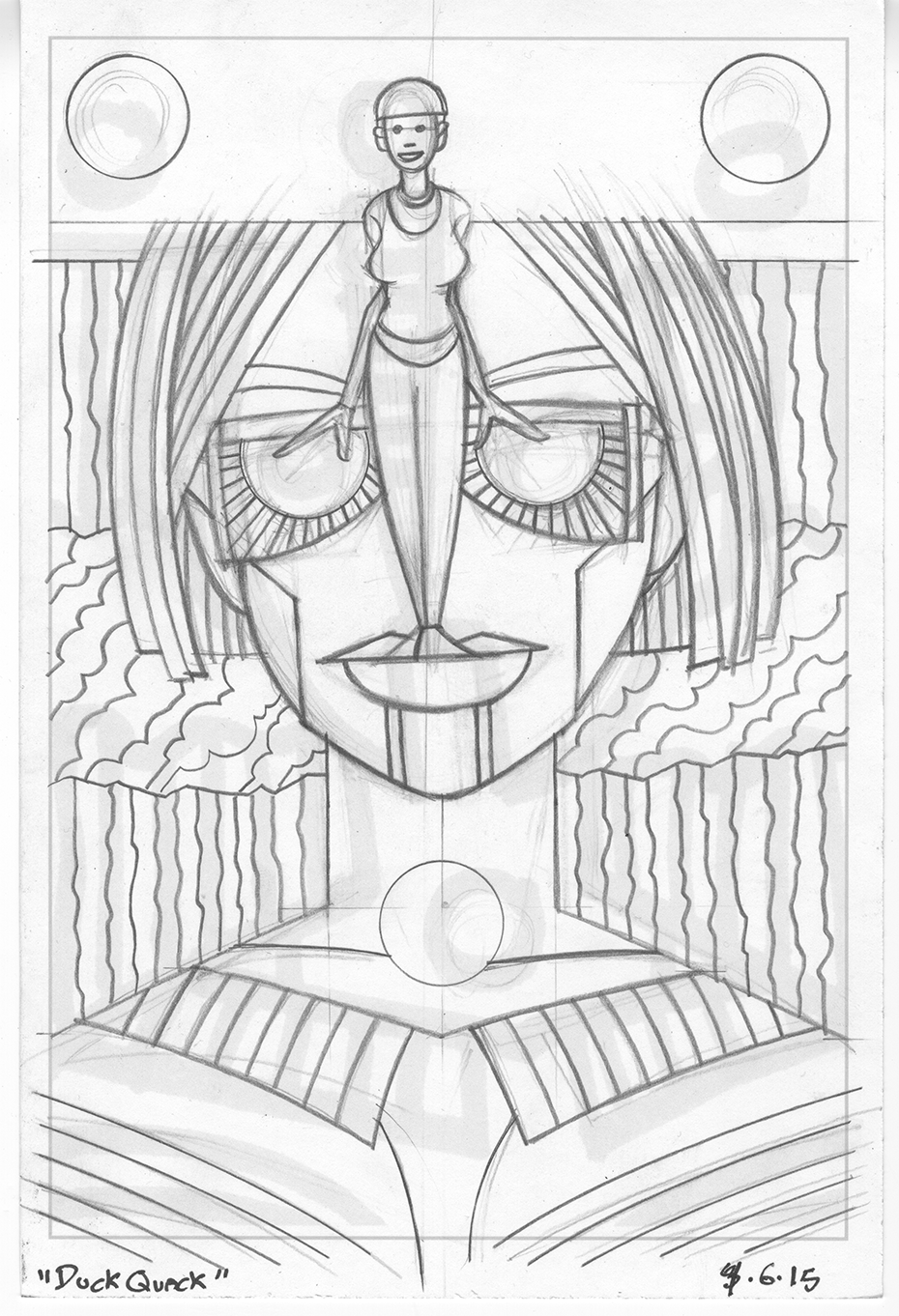
Psychedelic Dreamer #26 in the sketch phase.
This cover, like most of my work, started out as a drawing in my sketchbook. I hadn’t even thought of the idea to make another cover but was just looking to work on a drawing when the initial ink sketch caught my eye. I printed out that sketch in blue line on a six by nine inch piece of paper. That’s my small pencil sketch size (half of a nine by twelve inch piece of bristol board) and working that small helps me work figure out a lot of the basic drawing and composition. There was also pattern stuff to work out. This is also one of my asymmetrical drawings with the appearance of symmetry in it. That means everything appears to be symmetrical in it at first glance but they are really not. Things are shifted over half an inch or so and the left hand side is not quite identical to the right hand side. It’s a technique I use fairly often.
After drawing it at the six by nine size I didn’t think I had it. The woman wasn’t really worked out as much as I needed her to be and I really didn’t come up with a solution to the visual of her standing on the lip of the giant face behind her. I decided I needed another pass at it at a larger size. Sometimes I’ll go to an eleven by fourteen inch size from here but I decided I wanted to got to the bigger eleven by seventeen inch paper. That would give me a little more room for the small figure.
The larger drawing went smoothly except for the asymmetrical symmetry gave me a little trouble. At least in the area of the large face. I really didn’t work out the symmetry of the glasses and at a larger size the differences started to expand beyond what I thought were allowable tolerances. I had to go in and redraw the big face and glasses to make them more symmetrical. I also pulled out my French curves and such for the larger pencil drawing. I locked down the mechanical edges and used my Haff cross hatching matching to get my spacing even on the parallel lines. It’s always easier to do that stuff in the pencil stage so the inking goes faster. I also added some more decoration to the woman’s clothes and turned the large face’s lips into a mechanical platform. That seem to solve my lip problem.

Psychedelic Dreamer #26 in the pencil phase.
One of the interesting things about the pencil drawing is that I didn’t leave any room for the logo and trade dress of the comic. That’s because I decided to make this drawing into a comic book cover after I made the six by nine inch sketch. I could have fit the logo onto the drawing at the point of the larger pencil drawing but decided not to bother. I knew I could slide the drawing down and cut off the bottom of it without much fuss so I kept drawing the sketch as it was. This isn’t a solution that works very often but I could see it wouldn’t be a problem here.
I ended up doing a lot of work in the inking stage of this one. The initial inks were easy enough but then I went in with a lot of spotting blacks and patterns. I started out buy printing the logo and trade dress in black on a piece of eleven by seventeen inch bristol board along with the pencils in a light blue. The light blue means that when I scan the inked piece into the computer I use the “Bitmap” setting and all the light blue will drop out. Almost all of the light blue ends up unseen underneath the black ink anyway.
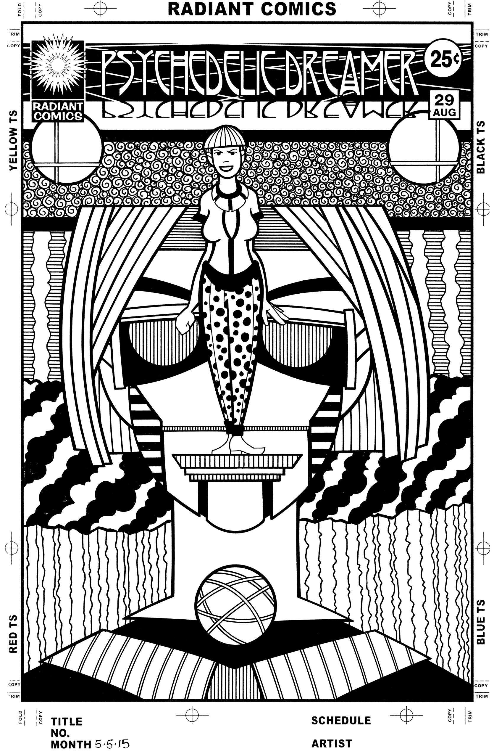
Psychedelic Dreamer #26 in the ink phase.
This became a much more visually complex piece after the inking. The main thing I changed from the pencils was the radiating lines on the glasses. I liked them in the pencil stage but they didn’t play well with the other patterns and I ended up making that whole area black. That makes a much stronger statement. Blacks also went down in some of the diagonal clouds and the big shirt. I broke out the Haff machine for the lines that create the grey patterns. I think my favorite grey pattern is the swirls behind the figure’s head. I’m a fan of swirls and sometimes use them as patterns but it cam be a bit tedious. I had to make all those little swirls in the stripe behind her and though I enjoy it when it’s finished it’s annoying as I’m doing it. Some techniques are like that. I went with some decorative elements on the three circles too.
Oddly the last thing I drew on this cover was the polka dots on her pants. I say oddly because that was the first of the patterns that I decided on but I resisted drawing them until the end. I’m not really sure why except I was so busy trying to work out the other patterns that the pants didn’t interest me. Or maybe I was saving it for a finishing touch. Either way I looked at the piece, decided it was done, and then added the polka dots.
I’m back from the comic shop this week and I got eleven new comics.
Check them all out here:
I spent this past weekend painting. Not such an odd occurrence but turns out that I haven’t finished an 18×24 inch painting in a little while. I bought five new canvases that size this winter but haven’t worked on one of them. I already have another canvas that same size on which I started a painting but never finished it. I ran into a problem that I sometimes run into where I plan out the painting so much that I get bored with it before I actually do it. That’s why I usually leave myself some room for spontaneity when I paint. But it doesn’t always work out that way. I’m pretty sure I’m going to finish that painting eventually but I haven’t in the last two months. So I decided a different approach was in order. A more spontaneous one.
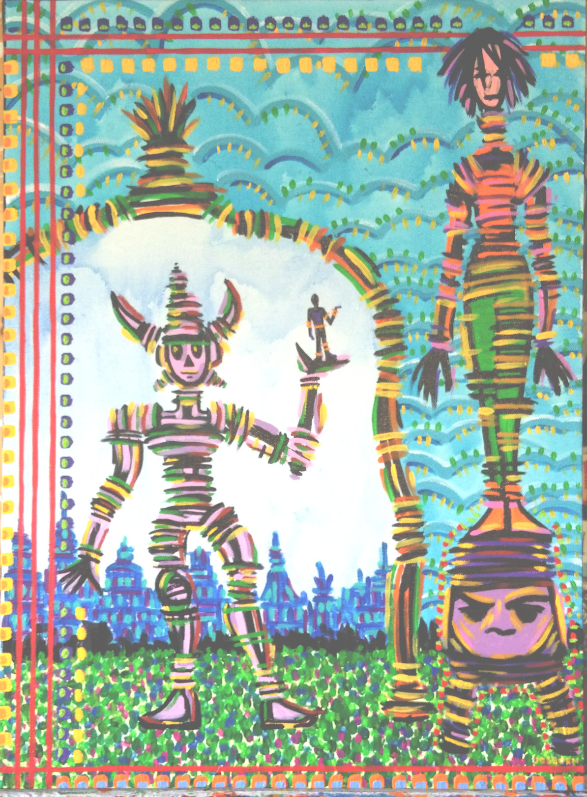
Slide Heels
I’ve tried painting in a less planned out manner before. It usually doesn’t go well. I have a few finished paintings I made like that laying about the place and I can tell exactly which ones they are just by looking. They’re generally less fully realized. The advantage I had this time was all the spontaneous ink drawings that I’ve been making lately. They’re small 2.5×3.5 inch drawings that I’ve been making with a brush and ink. And I’ve made quite a few of them. About fifty or so.
My spontaneous pen drawings are different than the brush ones. With the pen drawings I’m looking to create images that I’ll eventually turn into finished pieces. With the brush drawing they just are. I don’t turn them into anything. They just exist as small drawings. I’m not even sure why that is except that little brush drawings are all about mood and shape. Those are two things that don’t scale up easily. A blob of ink that works just fine at half a centimeter tall might not work at all once I tried to remake it at ten times that size. Small ink drawings are their own thing. Line drawings on the other hand I can blow up and work with easily. That’s why I spend most of my time with them.
With this painting I decided that if I was going to get anything done I would have to use my small ink drawing approach. I have a spin brush that is a sort of scaled-up version on my normal pointed watercolor brush that I use for ink. I figured I could use that plus some liquid black acrylic on the canvas to mimic what I was doing on a smaller scale with the brush and ink. Of course the problem with this method would be that I couldn’t go backwards. Once I put paint on canvas it was there. Being this was the first time I was trying this it was a little intimidating so I decided to just dive in.
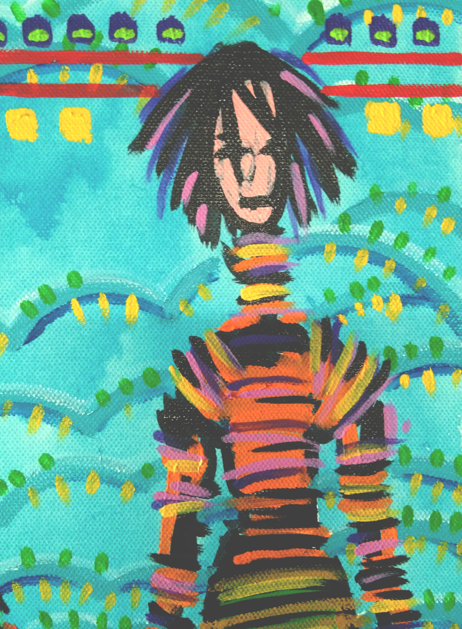
Detail Number One
I laid out some of my ink drawings on my desk for inspiration but I didn’t want to copy any of them. Then I grabbed my brush and paint. The first thing I painted was the black line on that horned robot-like creature on the left. I was quite hesitant with him and I think it shows. He’s not really on the ground and his legs are awkward. But there was no going backwards so I had to go with what I had. I glanced at my ink drawings at this point and decided to go with the arc/doorway that surrounds him. I had done something like that in one of my smaller drawings and thought it would work here.
The next thing I went for with the black paint was the woman on the right side. She’s a bit androgynous but I think of her as female. It’s the high hips. I knew that I wanted her tall and slender but not the full height of the canvas. I stopped her in mid-air not knowing what I would paint under her. It ended up being that strange stool with a face. At this point I had my initial black paint image work done. Two figures, a face/stool, and a passageway. It was time to figure out the color. None of the small ink drawings I made had color so I was stepping into a new area.
At this point there was no distinction between the sky and the sky behind the passageway. I decided to make one. I went with a thin wash of blue for both of them but a lighter blue behind the passageway. Then I wanted a more opaque look for the top sky so I went in with brush strokes of light, medium, and dark blues to indicate some clouds. After that the only solid colors left were the orange of the woman’s shirt and the green of her pants. Plus the purple on the face/stool. And a little pink in the woman’s face.
From here on in I knew I was mostly going to be using short brush strokes of color in a spontaneous way sort of like the initial black paint drawing. I kept going back and forth between the woman and the robot adding more strokes of different color. I think I first used pink and purple in the robot but over time added two yellows and a brown. It wasn’t until I finally hit him with some green that I was satisfied. The robot was definitely the hardest part of the painting to get to work.
The woman was a bit easier. She’s pretty well grounded on that stool and has a nice orange and green base to bounce the other colors off. Plus she has some interesting hair. All in all the stool was a little harder to get right than her. After all that I put in the grass. I didn’t want real grass so I went with blobs of paint in a pointillist manner. It’s mostly green on a light green wash with some red and blue in there to keep things lively. The grass is not spectacular but stays out of the way and gets the job done. I put the blue and purple city in behind the robot last. I also didn’t touch the sky anymore in the passageway.
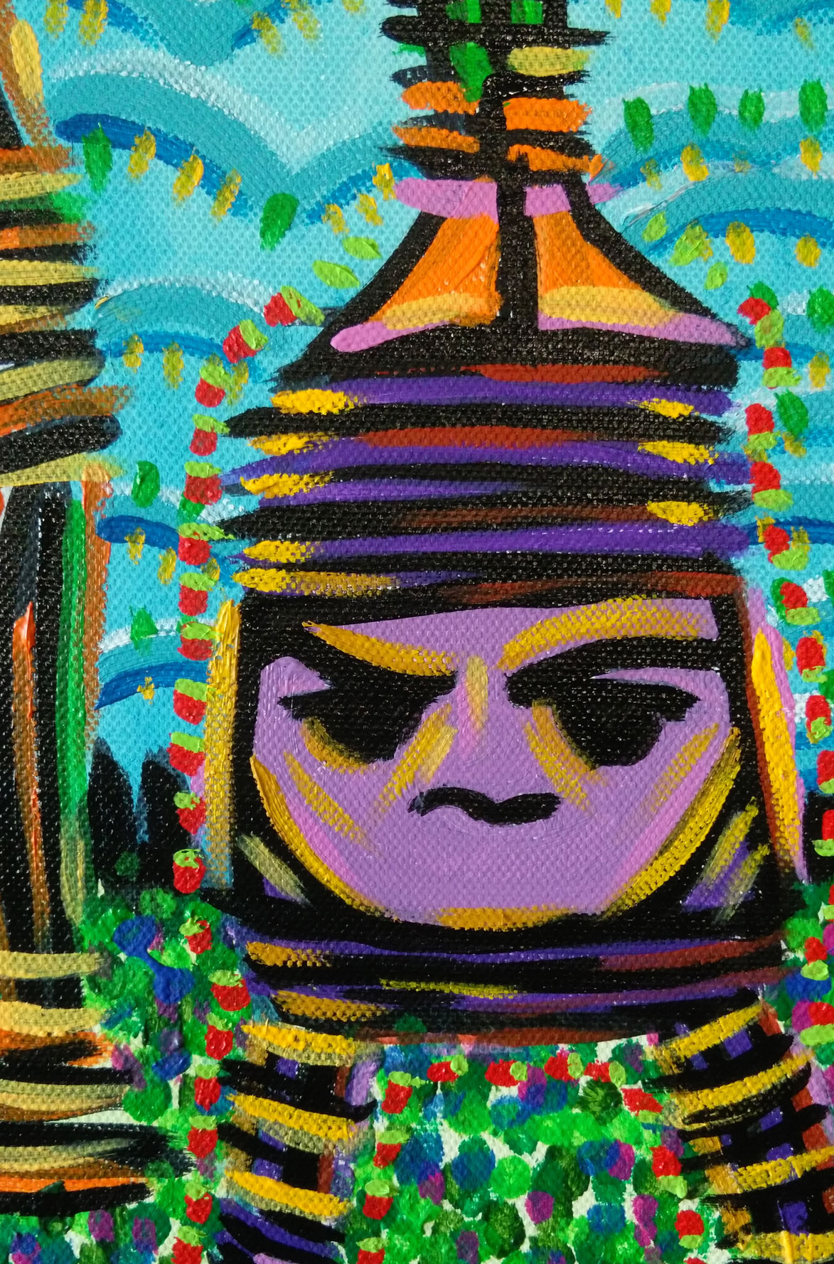
Detail Number Two
The final thing I painted was the lines and small boxes that sit on top of everything. They’re a staple of my painting and I think they work well here. Half way through making the painting I knew I would need those lines and they would have to be red. So I kept red out of the rest of the painting except in the grass a little. The rest of the little color boxes I made as I saw fit.
The funny thing about this whole process is how long it took. Once again things took longer to do than I thought. Spontaneity didn’t save me any time. It took two days to make this painting which is the same amount of time as one of my usual ones. Oh, well.