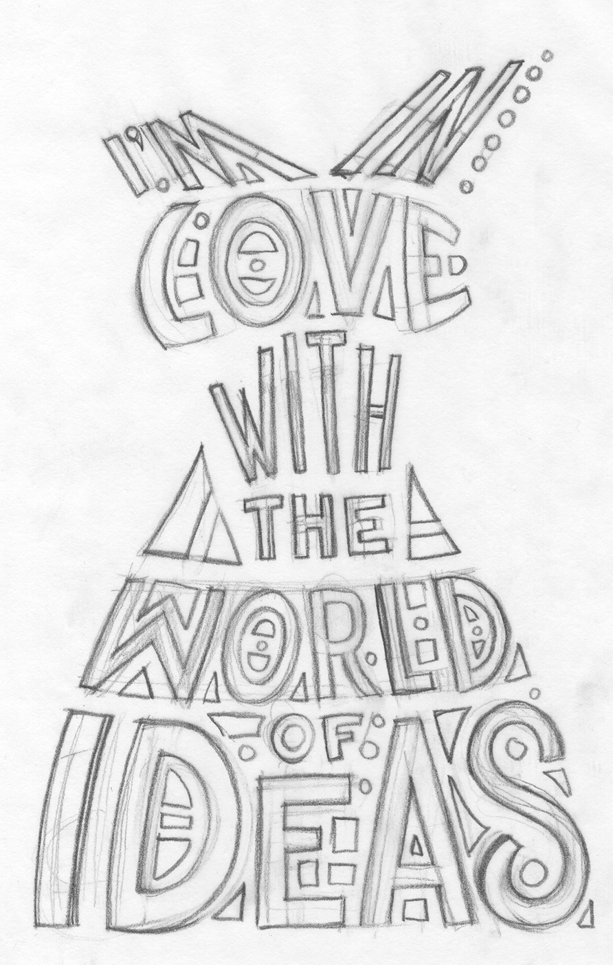
Message Dress Pencils Sketch of Type
Working with type isn’t always easy. That’s why there are typographers. People who specialize in type. Letter and logos. Computers sure have made working with type a lot more accessible and easier to do but it still takes work to make something good. With a computer there are a ton of fonts to choose from that are available at a button touch and you can always buy more from font makers on the internet. You can make the font bigger and smaller with a keystroke. I find it fairly easy to work with computer type in most situations. Designing a logo for example is much easier on a computer than by hand. Type whatever the word is that you are making the logo out of, find at least a dozen fonts you like the word in, and then go from there. Sure the “Go from there” part takes a lot more time and creativity than I indicated but the first part where you have to try the word in a lot of different type styles takes a lot less time than it used to. That was the boring part of logo design too so I’m glad it’s gone.
One of the best lessons I got back in my college days was not in a class but when I was watching a friend work. He had a freelance job designing swing tags for clothing. Those are the little tags with the store or collection name on them that hang by a plastic wire off the sleeves of shirts or pants. He was designing the type for the tag and he was drawing the letters. I had worked in type before and I had always kind of wrote or tried to build the letters. It never occurred to me to sketch the letters like they were any other object. From then on in I did.
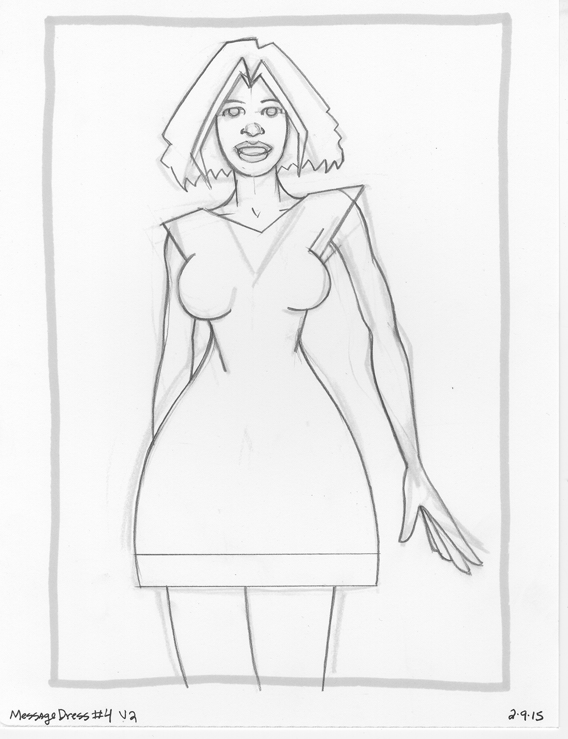
Message Dress Sketch
That brings us to today and my “Message Dress” drawings that I have been working on. I’ve mentioned them recently (/?p=4959). The basic concept was a drawing of a woman in a dress and I put a saying on the dress. Fairly simple and straightforward idea but I’ve had trouble executing it. I ended up drawing all the drawings twice. I was unhappy with them the first time and couldn’t get any type work done on them. After I drew them the second time I was much happier but still didn’t finish one. I came close but not close enough.
First off I wanted to go with hand drawn type. I wanted to squeeze the words into the shape of the dress in a sort-of 1960s psychedelic poster way. That’s not my usual way of handling type but I wanted to give it a try. Since the letters would be in such odd shapes I figure that would be tough to do on the computer. Turns out it is tough to do by hand too. On my first attempt back in the winter I ended up giving up on hand drawing the type and turned to the computer. Normally I handle all my computer type in Illustrator but with so much warping of the lettering I ended up switching over to Photoshop. In the end I did a solid job of it but it still wasn’t what I wanted so I abandoned it.
I barely even remember doing that type work but when I opened the Message Dress file I could see that I did. I even tried to draw some hand type with my Wacom tablet right in Illustrator. I could see the path I followed even if I didn’t remember the journey.
This time I was determined to make the hand drawn type work. I pulled out one of my Message Dress inked drawings and then threw a piece of tracing paper over it. I didn’t even think of the sentence I wanted to say at first. I just tried to fit words into the dress shape. After I decided I could do it that way I thought up what the dress should say. The pencil drawing was actually the easy part. It took some time but it was just a sketch. I knew I would have to finish it on the computer but how? I scanned in the type sketch and set it up in Illustrator. I decided I would have to build the type line by line. I say build rather than draw because that’s closer to how I work in Illustrator. I use the basic line tool to build shapes and then use those shapes to form letters and words. It’s not quite how I’m used to drawing so things went slowly.
This part took a lot of time and I almost gave up. I was so frustrated with the slow pace of building the letters that I switched over to Photoshop once again to see if I could manipulate the type to get what I wanted but faster. After a twenty minute detour in that direction I realized that way was never going to lead me where I wanted to go so I went back to my building of the type in Illustrator. By the end of the day I got it done.
As of this writing I stiff haven’t finished the piece. I have yet to color it. I made a pass at the color back in February when I made the type I didn’t like but looking at it now I’m not sure if I like it. It was fairly simple color with no shading and a texture for the skin so there wasn’t much to go wrong but it had no pizazz. I think that had to do with the design though. There basically was none. I used watercolor shapes for the background and I don’t think I pulled it off. I was trying to keep it simple but I think I need to put more thought into it. Think I’ll give it another go. Until then…

Message Dress Finished
Discussion ¬