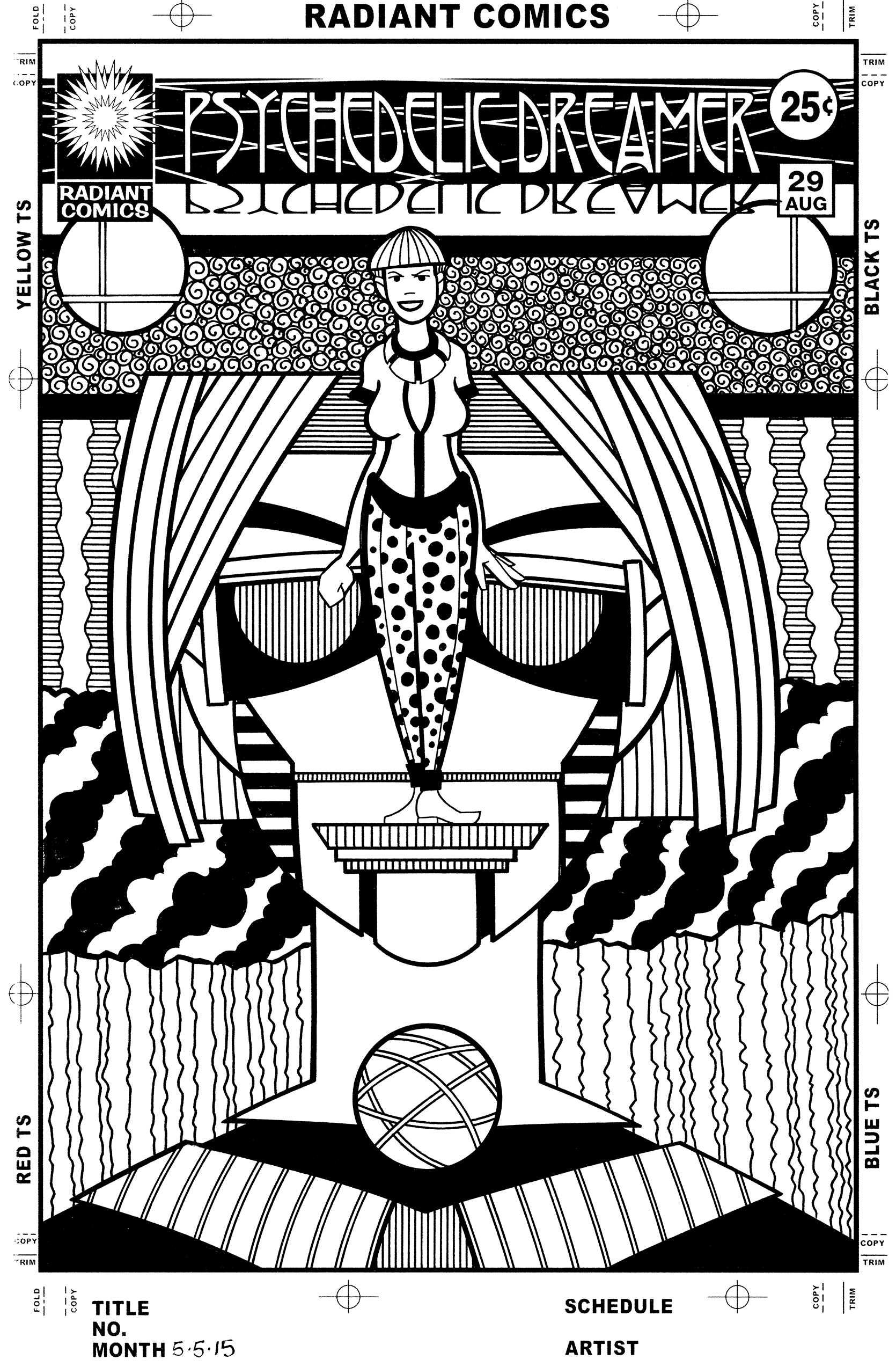
This week I dipped into the well of things I like to make and came up with one of my “Covers to Comics That Don’t Exist”. That is when I draw my own comic book cover. I make a logo and trade dress for it and come up with a concept for a cover to draw. I’ve done a bunch of these over the years and therefor have a number of logos ready to go for them. Some of them are your normal sci-fi, horror, or superhero genres and some to them are just plain weird. This is one of the just plain weird ones. “Psychedelic Dreamer” issue number 29. I don’t have 29 of them done. I have four or five of them done. I just like to spread the numbers out to give myself a sense of the history of the fake comic.
Psychedelic Dreamer #26 in the sketch phase.
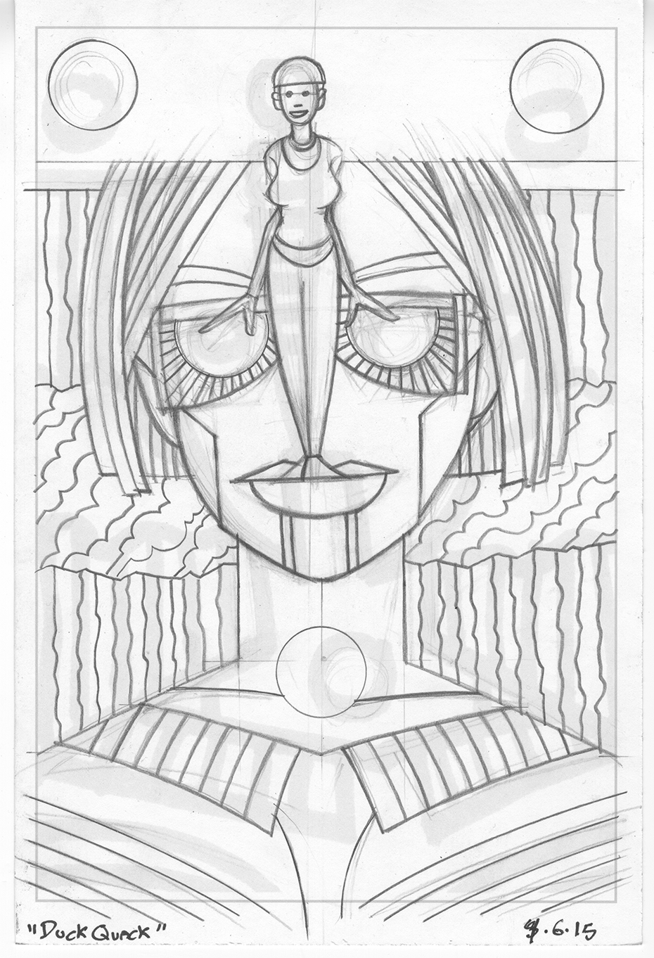
This cover, like most of my work, started out as a drawing in my sketchbook. I hadn’t even thought of the idea to make another cover but was just looking to work on a drawing when the initial ink sketch caught my eye. I printed out that sketch in blue line on a six by nine inch piece of paper. That’s my small pencil sketch size (half of a nine by twelve inch piece of bristol board) and working that small helps me work figure out a lot of the basic drawing and composition. There was also pattern stuff to work out. This is also one of my asymmetrical drawings with the appearance of symmetry in it. That means everything appears to be symmetrical in it at first glance but they are really not. Things are shifted over half an inch or so and the left hand side is not quite identical to the right hand side. It’s a technique I use fairly often.
After drawing it at the six by nine size I didn’t think I had it. The woman wasn’t really worked out as much as I needed her to be and I really didn’t come up with a solution to the visual of her standing on the lip of the giant face behind her. I decided I needed another pass at it at a larger size. Sometimes I’ll go to an eleven by fourteen inch size from here but I decided I wanted to got to the bigger eleven by seventeen inch paper. That would give me a little more room for the small figure.
The larger drawing went smoothly except for the asymmetrical symmetry gave me a little trouble. At least in the area of the large face. I really didn’t work out the symmetry of the glasses and at a larger size the differences started to expand beyond what I thought were allowable tolerances. I had to go in and redraw the big face and glasses to make them more symmetrical. I also pulled out my French curves and such for the larger pencil drawing. I locked down the mechanical edges and used my Haff cross hatching matching to get my spacing even on the parallel lines. It’s always easier to do that stuff in the pencil stage so the inking goes faster. I also added some more decoration to the woman’s clothes and turned the large face’s lips into a mechanical platform. That seem to solve my lip problem.

Psychedelic Dreamer #26 in the pencil phase.
One of the interesting things about the pencil drawing is that I didn’t leave any room for the logo and trade dress of the comic. That’s because I decided to make this drawing into a comic book cover after I made the six by nine inch sketch. I could have fit the logo onto the drawing at the point of the larger pencil drawing but decided not to bother. I knew I could slide the drawing down and cut off the bottom of it without much fuss so I kept drawing the sketch as it was. This isn’t a solution that works very often but I could see it wouldn’t be a problem here.
I ended up doing a lot of work in the inking stage of this one. The initial inks were easy enough but then I went in with a lot of spotting blacks and patterns. I started out buy printing the logo and trade dress in black on a piece of eleven by seventeen inch bristol board along with the pencils in a light blue. The light blue means that when I scan the inked piece into the computer I use the “Bitmap” setting and all the light blue will drop out. Almost all of the light blue ends up unseen underneath the black ink anyway.
Psychedelic Dreamer #26 in the ink phase.
This became a much more visually complex piece after the inking. The main thing I changed from the pencils was the radiating lines on the glasses. I liked them in the pencil stage but they didn’t play well with the other patterns and I ended up making that whole area black. That makes a much stronger statement. Blacks also went down in some of the diagonal clouds and the big shirt. I broke out the Haff machine for the lines that create the grey patterns. I think my favorite grey pattern is the swirls behind the figure’s head. I’m a fan of swirls and sometimes use them as patterns but it cam be a bit tedious. I had to make all those little swirls in the stripe behind her and though I enjoy it when it’s finished it’s annoying as I’m doing it. Some techniques are like that. I went with some decorative elements on the three circles too.
Oddly the last thing I drew on this cover was the polka dots on her pants. I say oddly because that was the first of the patterns that I decided on but I resisted drawing them until the end. I’m not really sure why except I was so busy trying to work out the other patterns that the pants didn’t interest me. Or maybe I was saving it for a finishing touch. Either way I looked at the piece, decided it was done, and then added the polka dots.
Discussion ¬