The comic shop is still closed so I got no comic books.
I made a video though.
Check them all out here:
In the first couple of months of this year I’ve been doing some new big ink drawings. I’m not quite doing them at the twice a week clip of last fall but I’ve been getting one of them a week done. Usually on the weekends. I enjoy making big ink drawings because I like creating images. Making big images is especially satisfying. Size really does matter. A five by seven inch drawing is fine but make the same drawing at 22×30 inches and it has a lot more impact on the viewer. It’s fun to make an impact.
I also like working with patterns. As you can see from the my big ink drawings I use a lot of parallel lines, swirls, and circles to fill the spaces of the drawings. Though I can also do this at a small size the patterns are harder to see when they’re smaller. The small patterns blend together into similar grey patterns. At the larger size the patterns become a different thing. They have more life.
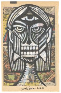
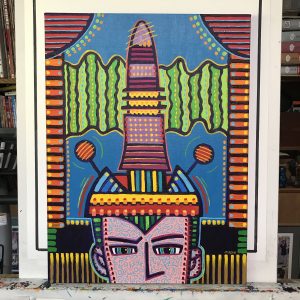
My latest big ink drawing is called “Say it Slowly.” It was originally a 6×9 inch ink drawing that I made from one of my inkbook sketches. That’s when I named it. After I make a 6×9 inch ink or pencil drawing I name the drawing with whatever title pops into my head. I do that so I can identify the drawings in my notes and keep track of them if I need to find them. That’s how I end up with some funny names for my big ink drawings.
I use three different inks when I make these drawings. First I have the bottled ink I use with my brush. Right now I’m using the Dick Blick house brand Black Cat ink. That’s the ink I use for most of the drawing and the ink that I use to fill in all the large areas of black.
The second ink is the Copic marker black ink that comes in the markers. I also have black ink refills for the marker so I can add more ink when they dry out. Most of the straight lines are Copic black ink. I use the marker against a straight edge or French curve to get a solid even line.
The third type of ink is Rapidograph technical pen ink. I refill some of my markers with this ink and also occasionally use a technical pen filled with this ink too. Technical pen ink has a matte finish and you can see the difference between it and the Black Cat ink as the light moves across it. At a distance it’s all the same but as you move towards the drawing you can see the change in ink easier.
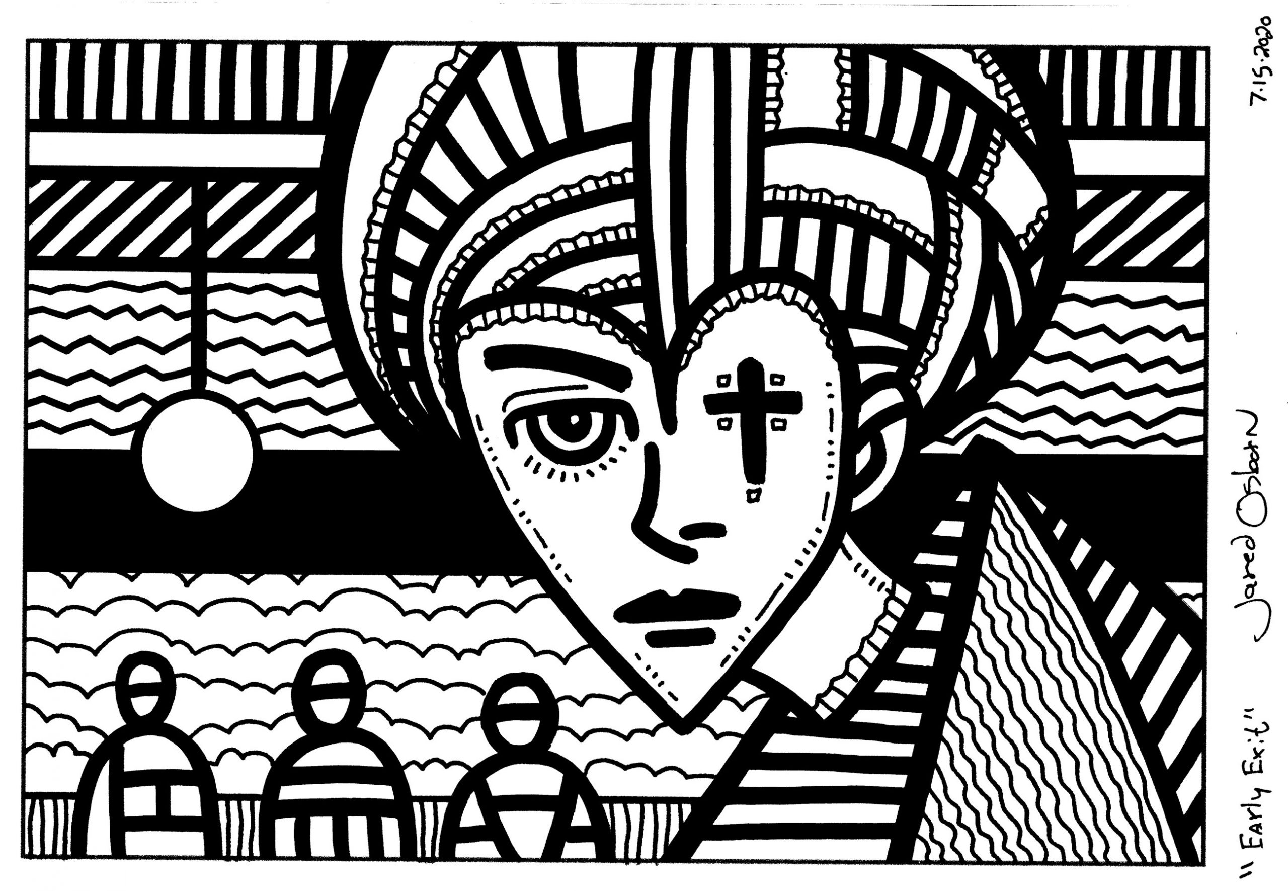
As I look at “Say It Slowly” it’s not like my usual big ink pieces. It only has two recognizable images in it. Two faces. A robot face (or helmet of some kind) and a woman’s face. The rest is filled with all sorts of shapes and patterns. There is no real background space in the drawing which is unusual for me. I often fill a lot of the negative space of big ink drawings with faces and other objects. But here I didn’t. I’m not even sure why. I didn’t notice it until the piece was well under way. Sometimes I work on instinct as much as intent.
Even with just the two faces I see a story in this image. I often see stories in the images I make but the stories are usually complex because the images are busy. This one is a little simpler. I see a story about a woman taking off her helmet. Her helmet is full of magic that is showing itself as she takes it off. Or maybe she’s putting the helmet on. And the helmet is smaller than her head so it has to be magic in order to fit. Either way the image is about a moment.
For a fairly simple image this one took me a long time to do. That’s the way it is with simplicity. It takes longer than you think. Often complexity is easier because there is a lot of stuff so and single image is less important than the whole. With simplicity often there is only one image so it is the whole. It has to be just right or the whole thing falls apart. It’s a lot of effort to make something look effortless.
Both the helmet and the face look a lot different than in the initial small ink drawing. The basic shapes are the same but the details are different. As you might expect there are more details on the larger drawing. The black markings on the face aren’t even in the original drawing. The helmet also has black markings that aren’t in the original. The eyebrows on the original helmet are just a single line instead of three lines.
I finished the helmet first in the big drawing and then finished the face. That’s because I had no idea how I was going to finish the face. It was much simpler for most of the three days I was working on this drawing but I knew I was going to do something with it. As I was working on the helmet and the background I was contemplating what to do with the face. It didn’t come to me for a long time. It wasn’t until the end when I put in the double cheek bones that I had an idea about its direction. Double eye brows and all the other face shapes came after that. With the giant eyes and lips the face took on a slightly clownish look. It went from a slightly weird face to a very odd mask.
The angles of the background lines were also important. I decided against eyeballing the angles and so I took the time to use my triangles to get the right 45º and 30º angles that I wanted. It took a while and a bunch on contemplation to get the textures and patterns I wanted. In the end I think it all holds together.
The comic shop is still closed so I got no comic books.
I made a video though.
Check them all out here:
Among the things I’ve been working on lately have been 6×9 inch ink drawings. I’ve been having at them without even the benefit of any pencil drawings first. I’ve been looking though my inkbook sketchbooks for a thumbnail image that I like, blowing it up digitally, printing the thumbnail out in blue line on a 6×9 inch piece of paper, and then I draw with ink right over that blue line to create a finished drawing.
I got a bunch of them done over the months of December and January and then I got it in my head that I wanted to make a mini-book out of them. I’d call it a mini-comic except they’re not really comics. There is no story or writing that goes with them. They’re pictures. The whole point of doing them was to be able to work out some images more quickly than I usually do and not to make comics.
If you remember earlier this winter I wrote that I started making and printing out black and white photos because I had an excess of black ink for my printer. Even with those photos I still had extra black ink and so decided I could print out some of my ink art since it was just made up of black lines. It seemed a natural.
I decided on a sixteen page book that was mini-comic size. That means a four pieces of 8.5×17 inch paper folded in half and stapled in the middle. Back in the 1990s I made mini-comics on a photocopier and had to make a paper “Master” of each page in order to photocopy it. This being the digital age instead of doing that I set up the comic digitally in Adobe InDesign. That’s a program specifically made for designing books, magazines, and other printed material so, though it took some time, it was easy to do.
Part of doing any kind of book is picking the paper you want to print it on. I checked my shelf to see what I had available and saw that I had some nice 47lb double sided matte paper to print on. It turned out to be a little too nice though. It seemed a little too thick for a small book. I had some plain paper too but that seemed a little too thin. I ended up putting together a prototype and the thicker paper worked well for the cover but the thinner paper was too thin for the interior. That and being plain paper it had no inkjet coating on it and so wouldn’t print art very well.
Searching for some new paper I jumped on the internet and found some Koala 120gms matte photo paper. It looked pretty good and after I ordered some and received it I found out it was indeed good paper. So now I had my magazine and art set up digitally, the paper for the cover, and the paper for the inside. I was ready to go.
I mentioned before that I made a prototype with the plain paper first. I do this because it can get a little tricky making your own mini-book. You have to make sure you print all the pieces in the correct order and on the correct pages so that when it folds over everything is in the right place. It’s best to do this with the cheaper plain paper.
What’s funny is that as I was putting this mini-book together I had no idea what the cover would be. I didn’t have a name, logo, or cover image for it and didn’t really want to take a lot of time to make them. This mini-book was all about me making a physical mini-book. I wanted to make something tactile. I had all the interior art laying around waiting to be made into something so that was a no-brainer but the cover stopped me in my tracks. I had nothing for it.
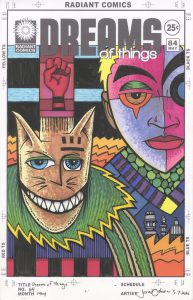
In the end I decided to go with my “Dreams of Things” logo. Why not? It was my fictional comic that I’ve drawn many covers for so I might as well make an mini art book out of it too. I used a face I already had drawn and never used for anything as the image for the cover. Covers 2-4 were also filled out with artwork other than the ink drawings I used in the body of the book. I have plenty of art finished so there was no need to work out a new piece for the cover if I didn’t want to.
After I had printed out all the pages I actually looked up a video on YouTube about how to fold a piece of paper in half. I’ve folded tons of pieces of paper in half including lots of mini-comics in the 1990s-2000s so why I felt the need to do this I don’t know. But I found a nice video by a woman who did a good job of explaining how to fold a piece of paper in half. She did it the exact same way I’ve always done it but it made me feel good to watch it. I even pulled out the bone folder (made out of plastic) that I got last year to press down on the fold.
I found the hardest part of making the mini-book to be the stapling. Maybe hard it the wrong word but I made the most mistakes during this part. I have a long reach “Swing” stapler from back in my mini-comic days that’s just the tool for the stapling job. Except that there is a bar to set that measures out the correct distance to sample at and I couldn’t quite get it right at first. Not all my staples landed directly in the middle of the fold and I had to take that staple out and put another in. That left extra holes in the paper. Oh, well.
I ended up making six copies of my mini-book and then was done. It took much more time to print them out, fold them, and staple them, then I thought it would. Then when I was done I looked at the copies, was proud for a moment, and then put them on the shelf not to be looked at for months. Once I scratched the itch of wanting to make something physical I had nothing to do with them. It’s not like anyone else cared that they existed. That’s life. On to the next thing.
The comic shop is closed so I got no comic books.
I still made a video though.
Another blog that was written before lockdown. It seems so long ago now.
I’ve been working on a bunch of things lately. On my commutes into the city on Mondays and Tuesdays I’ve been working on making some of my cartoon art cards for my “Drifting and Dreaming” comic strip. Over the last couple of years I’ve only been able to get about three months ahead with the once a week Sunday strip. It takes a lot of work to make one. It takes more work than my two other strips “Four Talking Boxes” and “Message Tee” because I don’t have to draw all new things for those two strips. I make those ones in a different way.
With “Drifting and Dreaming” any individual strip is made up of four parts: Two cartoon art cards, one regular art card, and the bit of writing that is “The Middle Story.” The art cards are easy enough. I just make a drawing on a baseball card size piece of paper. I’ve been making art cards for a long time now so it’s a habit. Usually I don’t have to draw them special for the strip as I’m doing them anyway and their numbers can build up. Of course that’s not always the case. Sometimes I run out of them.
The cartoon art cards are much harder to make. With them I have to do some writing and drawing to make each individual one. I now make them differently than I used to. When I first started them, and for many cards after, I would draw a face/head spontaneously in ink. I could do them faster that way and it led me down many strange and interesting paths. But after years of doing them that way I found I was repeating myself a bit too much and that got boring for me. I needed new faces.
So a couple of years ago I switched over to making quick pencil drawings to work out some of the features of the face. I would only spend a couple of minutes on each pencil drawing. I still wanted the face spontaneous. I just wanted to minimize repeating myself. After the pencil drawing I’d go in with my ink pen and draw over the pencils with a black ink line.
Once the face was drawn I’d go into the drawing with markers to color the drawing in. These cartoon art cards coincided with my learning to use markers way back in 2010. I first started out with Sharpie markers but then moved on to ShinHan Touch markers, Prismacolor markers, Pitt Pens, and Copic markers. I mostly use Copic markers these days but not always. Sometimes I get bored with them and use another set.
The coloring of the cards can take the longest time of all the stages. I usually make my cartoon art cards in batches of ten. I lay all ten cards out in front of me and first color all their backgrounds. I put two colors in the background of each card. I’ll grab my markers, pick a color, and start filling in backgrounds with that color. Then I pick another color, and another color, and probably up to five colors for the rest of the cards.
After doing the background on ten cards (sometimes twenty) I color each card individually until it’s finished. I start with the one on the left in front of me and color on down the line until I’m done. Well, I probably take some breaks in there too. It takes around two hours to get ten cards colored.
When I first made these cards I wouldn’t write what was in the word balloon until after I finished drawing the face. But somewhere along the way I switched my order. I think was when I started making ASMR drawing videos of my art cards. For video it was much better to have it already written and lettered so that at the end of the video I’d have a finished card. It’s not very interesting to watch somebody write on video.
Finally I scan in the finished art card and digitally set them up to be used. After that I have to do some more writing. I open up my digital file and write “The Middle Story” part of the card. I write ten of them in a row because I usually set up ten cards at a time. That’s two months worth of cards.
For the last month I’ve been doing some of these cartoon art cards on my commute. Since the trains don’t run on my schedule I have some time to wait at the train station. I can pull out my cards and do some pencilling or inking as I sit on a bench. I also work for a little while on the cards before I head out to catch the train.
Last fall I ever wrote a few of the cards as I was riding the train but I found it difficult. There are tons of other people on the train plus the distraction of the scenery going by. I had more trouble than usual writing them and they probably took me twice as long. It’s better to just read on my train ride.
So I started to write them on Sunday nights when I was doing nothing. I found this easy and relaxing. Since the writing in these strips is trying to be witty and odd I also found in easier to have a podcast or something on as I write them. I’m not really listening the podcast but certain words catch my ear and can start a phase for the cards.
I write directly on the cards in pencil. First I draw a border around the edge of the card, then draw guide lines on the top of the card to help me letter straight, and finally I draw the bottom of the word balloon. Then I write the card. After I get the writing correct I letter in the words in ink.
I’ve got a small aluminum card holder made for carrying around art cards. I put my lettered cards in that case and put the case in my commuting bag. Over the last month I got ten cartoon art cards finished the first week and then went a week for three weeks after that. That’s a good amount but it took a lot of effort. I’ve finished with this stage of them and now I have to go and write a whole bunch of “Middle Stories.” This might take a while.
The Comic shop is closed so I got no comic books.
I still made a video though.
Check them all out here:
I haven’t written about what TV shows I’m currently watching in over a year so I thought I would. Since it’s been so long there are even shows I’ve watched and forgotten about since I last wrote. Those will have to be lost to time. Or at least left off my list.
Locke and Key – Just finished this one. I read the graphic novels by Joe Hill and Gabriel Rodriguez a few years ago and so was looking forward to this. It was okay. I didn’t love it. I found the comic books to be much more imaginative. The show had more of a teen drama vibe than the comic. Still it’s worth a look.
You – I just started season one of this one and season three is already out. It’s the story of a NYC bookstore manager and his romance with a woman he is spying on. He’s also a murderer. I’ve heard it compared to “Dexter” since the lead character in that show is also a murderer and the narrator but this is really nothing like that plot-wise. I’m enjoying it so far.
Brooklyn Nine Nine – A favorite comedy that’s been around for many years now. It’s changed networks and has fewer episodes per season but is as funny as ever. A top of the line fast paced ensemble police comedy.
Young Sheldon – I missed the first season of this and started watching with the second and now it’s in its third season. It’s a good funny family comedy. The kid who played Young Sheldon does a really nice job.
Superstore – I can’t believe this one is already in it’s fifth season. I liked it at the beginning but it’s also really grown on me. It’s not as fast paced as Brooklyn Nine Nine but it moves pretty quickly and has a lot of funny stuff in it. I rewatched the whole series last summer and it held up well.
FBI – I don’t have as many police procedurals on my list as I once did but this one is there. As you may have guessed by the title it’s about the FBI. It takes place in their NYC office. In a way police procedurals are all the same so I’m not really sure why I like this one and not others but I do. This show even has a sister show this season “FBI – Most Wanted.” I gave that one a few episodes but didn’t like it.
Man With A Plan – This Matt LeBlanc show is back and only one episode has aired so far. I’d call it a family comedy but we hardly ever see his kids. LeBlanc and the actress who plays his wife are very good in it and that’s why I watch. I’m okay with the kids staying away.
Unicorn – This one stars the guy who played Boyd Crowder on “Justified.” It’s about the dating life of a newly widowed father. It’s pretty well done. It’s not spectacular but I’d give it a B. That’s enough for me top keep watching.
Sinner – This was the third season of the series and it was a weird one. They were all kind of weird but this one stuck out. It’s the story of a detective tracking down a murderer but it’s not really a police procedural and not really a detective story. There is all sorts of strange psychological stuff going on. I like it but find it hard to describe.
The Simpsons – What can I say about the Simpsons? I’ve been watching it for 30-something years and don’t plan on stopping watching.
Duncanville – A new family comedy animated show on after “The Simpsons.” It’s been funny so far. The dad from “Modern Family” does the voice of the father on this show and he’s a stand-out.
Modern Family – Speaking of this show it’s in it’s last season and is still good. I’ll miss it when it goes.
Better Call Saul – I think this is the last season for this prequel of “Breaking Bad.” So far I’ve like it better than “Breaking Bad” which I finally watched the last few episodes of. BCS is the story of a lawyer, who was a bit sleazy to begin with, as he gets sucked into working for the wrong side of the law. Good stuff.
Mr. Robot – I still have a few episodes of this to go but so far I’ve been liking its final season. It’s a show about hackers getting even with society. Or trying to. Things go wrong all the time.
Supernatural – A show in its fifteenth and final season and I’ve watched all of them. Once again what can I say that I haven’t said before? I’ll miss our two boys fighting monsters. They’ll carry on though.
The Rookie – Nathan Fillion’s show is in its second season and it’s a police show about Fillion being a 40-something year old rookie in Los Angeles. Police stuff happens so I guess it’s a procedural but it’s more about the rookies and what they go through. I’ve been watching Fillion on TV since “Two Guys and a Girl.” That was a long time ago.
Miss Sherlock – I’m rewatching this subtitled Japanese eight episode show about a gender swapped Holmes and Watson. It’s pretty good. I’ve only watched about one episode a month so this may take a while.
Money Heist – I stared this one on Netflix but have only gotten six or so episodes into it. It’s a show from Spain but its dubbed into English. The fourth season was released just this week but I’m a long way from that. It’s the story of criminals trying to pull off and get away with a bank robbery. I have no idea how they’re going to get four seasons out of this.
Better Things – A show that’s in it’s third season but I’ve only just started season one. It’s a comedy staring a woman I recognize from “Californication” but I have no idea what her name is. She’s a divorced actress living in L.A. and raising three girls. It’s funny and poignant.
The Blacklist – I just checked and we’re on season seven of this one. It’s been around for a while now. It’s either an FBI procedural or a criminal procedural. I’m not sure which but I’m still digging it.
Bless this Mess – A comedy about a NYC couple who move to rural Nebraska to run a farm. It’s a good ensemble comedy. This is its second season after a short first season and I think it’s even been renewed for a third already. Give it a look.
Brockmire – I just noticed this one was back and have seen the first two episodes. This show is a comedy staring Hank Azaria as a washed-up but trying to make a comeback baseball sportscaster. Except this season takes place years in the future after an economic collapse. It’s weird and maybe even a little too real to watch as this virus hits us.
Corner Gas Animated – I discovered the Canadian TV show “Corner Gas” (2004-2009) last year and watched them all. Now I’m onto the show that came after it (2018-2019) as the turned the show into a cartoon. It’s as funny as the live action one.
Death in Paradise – Another show that’s been around for eight seasons that I only discovered last year. It’s yet another BBC mystery show except this one takes place on a small Caribbean island. It’s slow paced, pleasant, and has great scenery. It’s amazing how relaxing a show about murder can be.
Miss Fisher’s Murder Mysteries – This show is from and takes place in Australia. Except it take place in 1920’s Australia. It’s a lot like other BBC type mystery shows. Someone is murdered and eventually Miss Fisher finds out who did it. Solid.
Seal Team – I guess this one would be a military team procedural. Or maybe just an action show. The Seal team goes on missions and have personal lives. It’s all pretty exiting.
Stumptown – Colby Smothers stars in this show based on a comic book that I’ve never read. At the beginning of the season she becomes a private investigator and spends the rest of the season solving her client’s problems and trying to find out what happened to her old boyfriend. Was he murdered or was it an accident? Another solid B. Carry on.
The Comic shop is closed so I got no comic books.
I still made a video though.
Check them all out here:
I’m going to take a trip to the past this week because I recently joined a Facebook group for collectors of comic book original art and shared a piece of John Romita art that I got from him want back in 1992. I posted the story of me getting the piece from him but I wanted to write something a little bit longer about it. I want to try and remember and capture the time and place.
Back in 1992 I was working at Marvel Comics on a freelance basis in the Marvel Bullpen. We Bullpenners were the people got the comics ready to print. We were also known as the Production Department. Paste-ups, lettering corrections, art corrections, and various other behind the scene things got done in the Bullpen. We were on the tenth floor of the building located at 387 Park Avenue South.
At some time around the summer of 1992. Marvel decided that the tenth floor needed a remodel. That meant moving everybody on that floor down to the fourth floor (which I assume was vacant) for a couple of months. The fourth floor was considerably smaller and different that the tenth floor.
On the tenth floor the Bullpen was a large open area with about ten to twelve desks and drawing tables in it. Down on the fourth floor they squeezed about ten drawing tables (not the desks they went somewhere else) into a room half the size of the tenth floor Bullpen. I wasn’t even in that room. As a freelancer I didn’t have a choice of desks. I got stuck wherever there was space leftover. There were a couple of spots.
The first spot was in a hallway with a row of cubicles along the side of it. It wasn’t much of a row. I only remember George Roussos nearby. He was Marvel’s house colorist and had been in the comic book business since about 1940. It was cool to be near him.
The second spot was the worst. One of the great things about the Marvel Bullpen of that era was the camaraderie. It wasn’t a great job. It was a fairly crappy one overall but that was made up for by the fact that we could talk all day as we did our job. A dozen or more creative people in a room talking as they worked could be a lot of fun and it was. Except the second freelance spot wasn’t anywhere near that room. Instead it was in a room with the photocopiers. It was the only desk in that room. So when I sat there I had no one to talk to unless someone came in to make copies. It was just me and the dull work.
It just occurred to me that there was a third spot where I worked on the fourth floor. There was a another room where the people who did the production on the covers worked. I think there were only two drawing tables in there but there were also a couple of desks right outside the room. I worked in there some days when I was filling in for one of the cover people. It wasn’t as lively as the Bullpen but it was way better than the copy room.
The only photos I know of from this period on the fourth floor were taken by Eliot Brown. Eliot’s Website He was an ex-Marvel bullpenner at the time and he liked to take photos so he came by one day and took some. I also like to take photos too but this was long before the age of everyone carrying a camera on their phone with them everywhere they went. It was either that year or soon after that I bought an Olympus Stylus pocket camera and started carrying it with me every day. But either way I took no photos of our time on the fourth floor. I wish I did. I wish I took a whole lot more photos of those days.
So back to the story of my John Romita art. This has to be my geekiest moment in comics. It took place during this time period on the fourth floor during the summer of 1992. The drawing is dated 5/1/90 so John must have been cleaning out his office. After all we had just moved floors so I assume a lot of people took that opportunity to get rid of unwanted stuff. Especially since most people’s space got smaller.
I had some reason to go into John’s office and speak to him about something or another. I don’t even remember what. Some random production problem. I noticed the working drawing on his desk as he stood across from me. Then as we were talking, and in the middle of our conversation, he picked up the drawing and and tossed it in the trash.
I immediately blurted out “You don’t want that? Can I have it?” I’m not usually one for blurting out stuff like that but it was such a beautiful drawing and as an artist myself I love to see the guts of a piece of art. How it’s done. John, who is the nicest guy in the world, looked at me for a moment as if I had grown an extra head and said, “Sure” and handed it to me out of his garbage bin. I was, of course, thrilled.
Now for what this piece is. At the time (in 1990) John was working with the paper company Strathmore to make some new paper for Marvel. Inkers like the paper to be smooth and pencillers like some tooth to the paper. John was working on finding the right balance for the Marvel paper that gets handed out for the artists to draw on. Here he was testing out a paper sample. He used various pens, drew a couple of heads, used some white-out on it, and generally put it through its paces. I love working drawings like this that generally never get seen.
Years later I scanned it in and it was printed in the “John Romita: Marvel Visionaries” hardcover book in the back with a bunch of other sketches and such. In the end anyone can now enjoy it. Good show.