I hit the wall this week. I had been working on my big ink drawings and acrylic on canvas paintings so much that I burnt out on them. I’ve enjoyed doing them but they take a lot of work and so I want to move onto other things. But what other things? That’s always the big question. I have no answer at the moment but I did manage to get one of my “Dreams of Things” comic book covers colored.
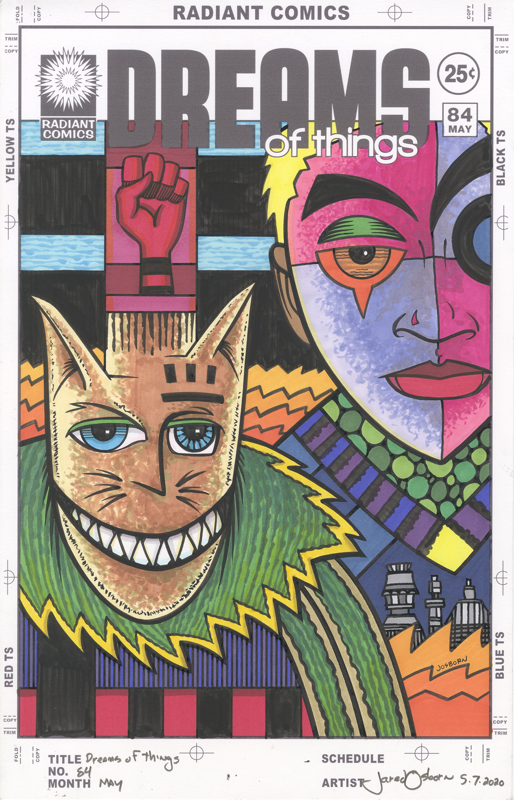
I haven’t made a comic book in a while but I continue to make comic book covers in my “Covers to Comic Books That Don’t Exist” series. That’s what this one is. “Dreams of Things” #84. Yes, I really have made 84 covers in this series so far. I’ve made covers for other non-existent series too but I often numbered them randomly. This is the first series that I started with number one and kept numbering them consecutively. And that number has kept getting bigger.
I draw these with India ink and Copic markers. I ink them first and then they often sit around for a while before I get around to coloring them. This one has been sitting for a couple of months. I let a bunch of them build up in a pile and work on the stage (pencil, ink, or coloring) that I feel like at the time. This time it was color.
As a side note Copic has been having trouble getting their refill inks to market. This winter I tried to buy a couple of new marker ink refills but everywhere they were out of them. I couldn’t figure out what was going on. Then in April I read that Copic redesigned their ink bottle and were letting supplies run low before they introduced the new one. Then the virus hit and messed up the supply chain. As a result I still can’t get refills for my yellow and orange markers.
I have two types of “Dreams of Things” covers. One has the logo horizontally and at the top of the cover like a traditional comic book and the other has the logo running vertically on the right side of the cover. I mention this because I was just making some mockups of new covers to be pencilled and most of them were the vertical type. I don’t know why but that seemed to be the trend. This one is the normal top horizontal logo type.
This one took me longer than usual to get done. I was so burnt out from working on my big pictures that I took a day off and just sat in a chair. When I got back to work the next day I was still feeling burnt out so I took things slowly. I worked on it little by little and took frequent breaks. It was the only way I could get anything done and it took me all day.
There was a lot of contemplation time with this one. I don’t do any color sketches with these covers so I have to get the color right the first time. I have a paper full of color swatches in front of me so I don’t have to guess what any of my marker colors look like on the page. It helps with contemplating color to have it in front of you.
The first colors I put down were the oranges and blues in the background. I really wanted to make that cat-like creature orange but thought it would be a bad idea. The idea was stuck in my head so I decided to use the orange first in the background to get the idea out of my head. After that I put down the blue but it ended up being too light so I darkened it a little bit later on. There isn’t much background in this piece so there weren’t a lot of decisions to be made.
Then I worked on the masked face on the right. The purple came to me right away but it took a while to make the decision to go with magenta for the other parts of the mask. I think I even left it blank for a bit and filled in the dark red on the bottom. I even went with the yellow hair before the magenta. I got there eventually though.
The orange was still stuck in my head for the cat and so I decided to go with an orange brown. I put about three marks down and it was all wrong. I shifted over to a darker brown with less orange in it. I used my scumbling technique to mix the various brown colors together. I like this technique because it adds a bit of texture to the drawing. One thing markers don’t have is any surface so I like to give them some texture. Overall I like the brown. After much contemplation I think it was the best choice.
As soon as I put the brown down I knew the cat’s collar had to be green. The only question I had was how to lay the color down. I ended up going with a directional approach to add a pattern and texture to the coat and collar. I drew some dark organic stripes in dark green before adding more green color in there. The color gives it a fur-like quality.
I am not sure what that red fist coming out of the cat’s head is. That’s the weirdest thing in this image. Is it a hat? Is it a visualization of his thoughts? Is it part of the background design? These are the questions I ask myself as even I don’t have all the answers. But I like images that make me think.
I finished up by coloring the city in the bottom right and the coat of the guy on the right. Since the main colors had been figured out already these colors almost chose themselves. I kept them mostly dark and neutral except for that burst of yellow on his collar. That stands out.
In the end I find this picture a little inscrutable. I try to figure out who these two are and what they want but they don’t seem to be interested in giving me answers. They have their own agenda that doesn’t include me. They stare ahead not wanting me to know what they’re up to. But that’s okay. I’ll give them a good hard look anyway.