I’m back from the comic shop this week and I got eight new comics.
Check them all out here:
I’m back from the comic shop this week and I got eight new comics.
Check them all out here:
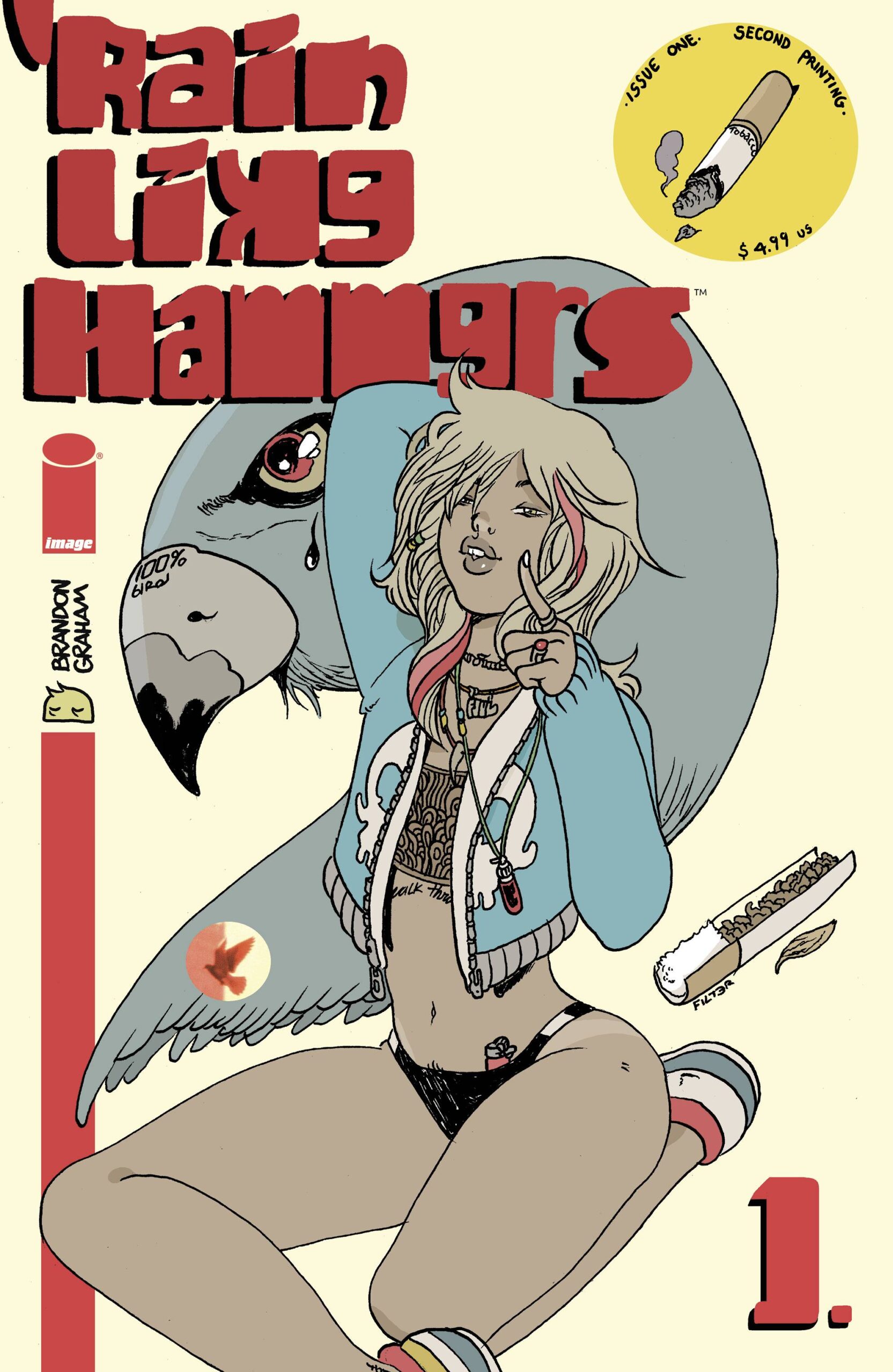
Recently I decided to reread the Brandon Graham comic book series “Rain Like Hammers.” It was one of my favorite series of 2021 so I looked forward to reading it all again. In that reread the series got me thinking about comic books and their relationship to time.
First of all, in general, all comic books are about time. The comic book creators are in charge of time in any given comic book and they can manipulate it to tell a story. They can slow time down and use a whole page and its panels to show us a split second in time or they can show us a whole year passing by; showing us the seasons going by in just one page. That’s what comic book storytelling is all about but “Rain Like Hammers” didn’t even get me thinking about that kind of time.
I like buying and reading my comic books as single issues. Some people like to “Wait for the collected edition” (there is time again) but I don’t. A reader only gets one chance to read a comic book as it’s coming out issues by issue. For the rest of that comic book’s life new readers will read it as a whole and not in parts over time.
What I like about reading a comic in parts over time is that other fans are reading it the exact same way at the exact same time and we can discuss it. I mostly talk comic books on YouTube these days but that’s still fun. I discuss with other fans what comic books came out that week and we talk about them. What happened this issue, what does it mean, and what we think will happen in future issues.
If you “Wait for the collected edition” then you’re on your own. Much like me rereading “Rain Like Hammers” right now no one else is doing it at the same time. It’s not most people’s habit to rush out, buy the collected edition, and read it right away. After all they have patiently been waiting for the collected edition so there is no rush. Plus often the reaction from us “Read it as it was coming out in single issues” comic book fans to the “Collected edition waiters” is that we’re done talking about whatever comic was just released as a collection. “Yeah, we talked all about that last year” is the attitude.
So here I am reading “Rain Like Hammers” all together (not a collected edition but all the single issues) and it’s a different experience than reading it fo the first time over time. It always is. The month to six weeks wait between issues is now a matter of minutes or seconds. I’ve got the next part right there at my disposal. There is no wondering what is going to happen and what events in the book mean. Instead I can know right now. Time has changed how I perceive the comic. But I also have the memory of how I first perceived the comic as it played out over time.
Another aspect of “Rain Like Hammers” that got me thinking about time is it’s page count. Unless they are special issues, Marvel and DC comic books are 20 pages a month. Most of the indie comic books that I buy are around 22-24 pages a month. Brandon Graham’s comic was released in five 48 page issues. Sometimes he even used the covers as part of the story. So the whole thing is about 250 pages long.
A lot of comic books come out monthly but indie books sometimes come out every six weeks instead. I think this one was monthly but I really don’t remember. So I originally read it over a period of five to six months. For 250 pages that’s a short period of time. If this were a 20 page comic from Marvel I would have read it over a year’s time in twelve issues instead of five. How would that change in time have made the book different to read? I’m not sure but I was thinking about it.
Then there is Brandon Graham’s notes about the book. Some issues have some writing from him telling us behind the scenes stuff. Such as that he was working on this comic during Covid lockdown. That certainly changed all of our perceptions about time. Suddenly time didn’t pass in the world as it usually did. That was a big deal.
Graham also wrote about writing the story and how it changed over time. The first issue is almost self contained. It’s a sci-fi story that takes place in the future (more time) and involves an average Joe adjusting to a new job in a new city. It’s all about his routine and how he spends his time. The next three issues have a different cast and plot and the original character doesn’t show up again until the final issue.
At the time the comic was coming out one of the discussions we were having was how that first issue was going to tie in to the rest of the story or if it even would. We would speculate on how the story was written. Was it all planned out or was Brandon Graham writing it issue by issue not knowing exactly what was going to be in the next issue? Comic books are written both ways.
Graham mentions in one on the later issues that he was originally going to have the book be a series of short stories. It was as he was going along that he decided that it was one big story. Time made the story change in his mind.
The story changed for me too as I read it over an evening and a morning. It moved differently. It moved faster but sometimes it seemed to move in a little more of a jerky-jerky fashion too. That’s because I was probably moving through it faster too.
When I get a new issue of a comic book I read it twice. I read it for the first time within couple of days of buying it and then I let it sit around for a week or so and then I read it again before filing it away. That gives me a fair amount of time with a new comic book and I might even be discussing it on YouTube, Facebook, or Twitter during those first two weeks.
As I sit and read all the issues of a comic book by myself as a whole time is different. I spend less time with it and I may even be a little more impatient as I have a pile of comics rather than just one. Plus there is always the next one to read to see what happens. It’s a different sort of experience. Time makes it that way.
Time is a tricky thing isn’t it?
Now I’m going to take some time out of my time talk to tell you that, “Rain Like Hammers” is a good comics. It was one of my favorites of 2022 so you should take some time to track it down and read it. You’ll be happy you did. At least I think you will be.
I’m back from the comic shop this week and I got nine new comics.
Check them all out here:
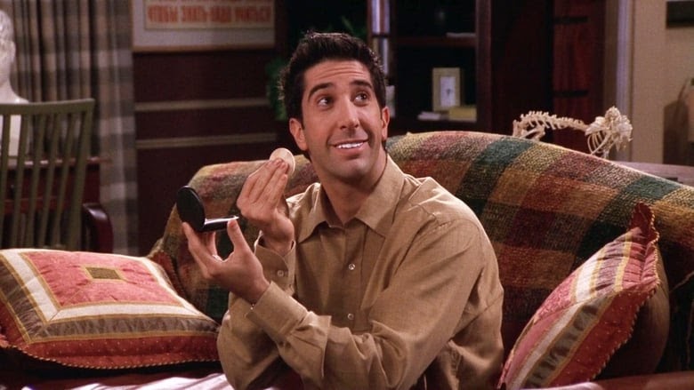
I haven’t watched “Friends” in a while and I haven’t written a walkthrough in a while so I figure that I would. Let me see what episode I’m up to. Looks like we have “The One With Ross’s Teeth” Season 6 Episode 8 from November 18, 1999. Let me check my calendar to see what I was doing that week.
Looks like that day was a Thursday (Duh, it always ran on Thursday nights). I worked at Marvel Comics in Manhattan. The next day went downtown to a bar called “Ace Bar” for a friend’s 30th birthday. I even have pictures from the evening. According to my calendar I spent the rest of the weekend hanging out in Brooklyn with friends. That sound like a good time. Now let’s start the show.
Chandler pops over to visit Joey since they’re no longer roommates. Joey has a new hot model roommate now. Elle Macpherson, an actual hot model is playing her (Janine). Chandler checks out his old room. He is shocked at how feminine it is now and gets Joey all riled enough about the apartment losing it’s manly look (plot one). Monica shows up and we figure out it’s really Chandler commenting on his own new living situation with Monica. Here comes the theme song.
The next scene is Central Perk. Ross finds out that a coworker of Monica’s is single and he wants to be set up with her. The Ross and marriage jokes fly (they never fail to amuse me). That is plot two that will lead us to Ross’s teeth. Phoebe wants to use Rachel’s work photocopier at Ralph Lauren’s. This will lead to plot number three. Joey ends the scene with a joke about the unrealism of the gang always having time to hang out at the coffee shop. It’s a meta “Friends” joke.
Next we get Phoebe at Rachel’s workplace. Phoebe claims to have made out with Ralph Lauren in the copy room. Of course Rachel is flabbergasted. Funny stuff.
Now it’s time for Joey to contemplate the femininity of his apartment. He has a talk with Janine and she is a bit confused at just what he’s getting out. Famous photographer, Anne Geddes, gets name dropped. One of the jokes it that Joey doesn’t know what a curling iron is. He also learns the potpourri aren’t chips. It’s an okay scene if not a little obvious and over the top at times.
Here comes Rachel. She’s getting on an elevator at work. Her boss, Kim, is on the elevator with her. Rachel want to get Kim’s attention and bond with her but it isn’t working. That is until she hits Kim with the hot gossip about Phoebe and Ralph Lauren. Kim even hits the “Stop Elevator” button so she can hear more. I wonder if anyone has ever done that in real life? I think it’s just a TV thing. Hitting the “Stop Elevator” button for no serious reason is bound to get you noticed and to get you in trouble.
Back to Central Perk. Ross has had his teeth whitened and now they’re too white. They’re almost glowing. He did it for his date with Monica’s coworker, Hillary. Rachel drops by to tell Monica and Chandler about Phoebe and Ralph Lauren. Phoebe drops by too. Turns out it wasn’t Ralph Lauren she made out with. It was Kenny the copy guy. Now Rachel’s gossip was all wrong and she’s afraid her boss will hate her for it.
Time for a Ross’s apartment scene. Monica is trying to help Ross downplay his bright teeth. She’s trying to talk him into wearing some makeup to lesson the white of his teeth. Phoebe walks in and yells “Demon” at Ross’s teeth. Good old weird Phoebe. I dig her!
Now we’re back at Monica and Chandlers’ and he’s had enough at helping her out with girlie stuff so it’s off to Joey’s for some male bonding. Meanwhile at Joey’s he is learning to knit from Janine. Goofy stuff. Chandler walks away disappointed and goes over to Ross’s where Ross is trying on the make-up that Monica gave him. There is no manliness for Chandler to find!
We go back to the elevator at Ralph Lauren’s where Rachel tries to tell her boss the truth about the kissing. That it didn’t happen. Of course it boomerangs back on Rachel as it was her ID card that was made to make the copies. Now Kim thinks it was Rachel who made out with Ralph Lauren. And then Ralph Lauren walks into the elevator, says nothing, but Kim really doesn’t believe Rachel now.
We finally get Ross’s date. Lots of awkwardness as Ross tries not to show his teeth. Not the funniest scene ever. Kind of painful.
That was quick. There really isn’t a lot to Ross’s plot line so we move back to Joey’s apartment as he’s showing Monica his new flower arranging skills. Chandler walks in. He can’t take it anymore as he yells at Joey to be more of a man. Not a whole lot of funny stuff in that plot line. It’s more typical sitcom stuff.
Meanwhile at Central Perk Rachel and Phoebe are talking over Rachel’s problem with her boss. They come up with no answers but make some funny jokes.
Back to Ross’s date. There is really not much there but the punchline is that when his date turns off the lights it turns out she has a black light so Ross’s teeth glow in the dark. A fun moment.
Another elevator scene where Kim thinks Rachel is sleeping with Ralph so Rachel tells her that he dumped her. Ralph Lauren walks into the elevator again and Kim thinks he was giving Rachel the cold shoulder so she believes the breakup story now. Here come the credits.
The final scene is between Joey and Janine. It’s an amusing little wrap up.
Now lets see what was cut out form this episode for syndication. One of Chandler’s “You’re not man enough” lines from the opening scene. No great loss. A couple of the Ross marrying jokes were cut. I liked those. A Ross highlighter joke and one of the jokes of the final scene. Those last two were okay cuts.
I’m not sure what I’d rate this one. I kind of enjoyed it but I haven’t watched an episode in weeks so that might have something to do with it. Being that two of the three plots were just okay (I like the Rachel plot best) I should probably give it two out of five stars but I’m going to give it a three. I liked it well enough and to me three out of five means it’s an average episode. Average means good when I like something Let’s see what I rated it years ago. Looks like I gave it three stars back in 2013 too. So there you go. I hoped you liked the episode too.
I’m back from the comic shop this week and I got five new comics plus five birthday books.
Check them all out here:
I’m a methodical artist. That means that method is important to me. It’s how I get things done. I do things a certain way. A series of steps. I do step one, followed by step two, then step three, until I’ve finished however many steps it takes to make a finished piece of art. I’ve also got a bunch of different methods for a bunch of different types of art. My “Drawings on Comics” have a different method from my “Big Ink Drawings.”
As a consequence of being methodical I can usually tell if things are going wrong early in the process. If there are problems with the piece on step three then those problems are not going to get better on step five. Conversely if things are going well they’ll probably continue on that path. As a consequence I’m not usually surprised when a piece comes together in the end and looks good. After all that’s the plan. But sometimes I do surprise myself.
One of the dangers of being a methodical artist is getting bored. If I plan things out too much then there is a chance that I’ll get disinterested in the piece halfway through making it. In my head I can see it finished and it seems to be just going through the motions to actually finish it. In my youth I abandoned pieces because I got tired of making them.
To avoid this problem I developed ways of doing things that left room for improvisation at the end. A put a place in my methods for the very last finished stages to be unplanned. This gave me a place to be creative. After that I looked forward to finishing a piece. The boredom of being able to see it finished halfway through was replaced by seeing the places I could get creative at the end. I could surprise myself.
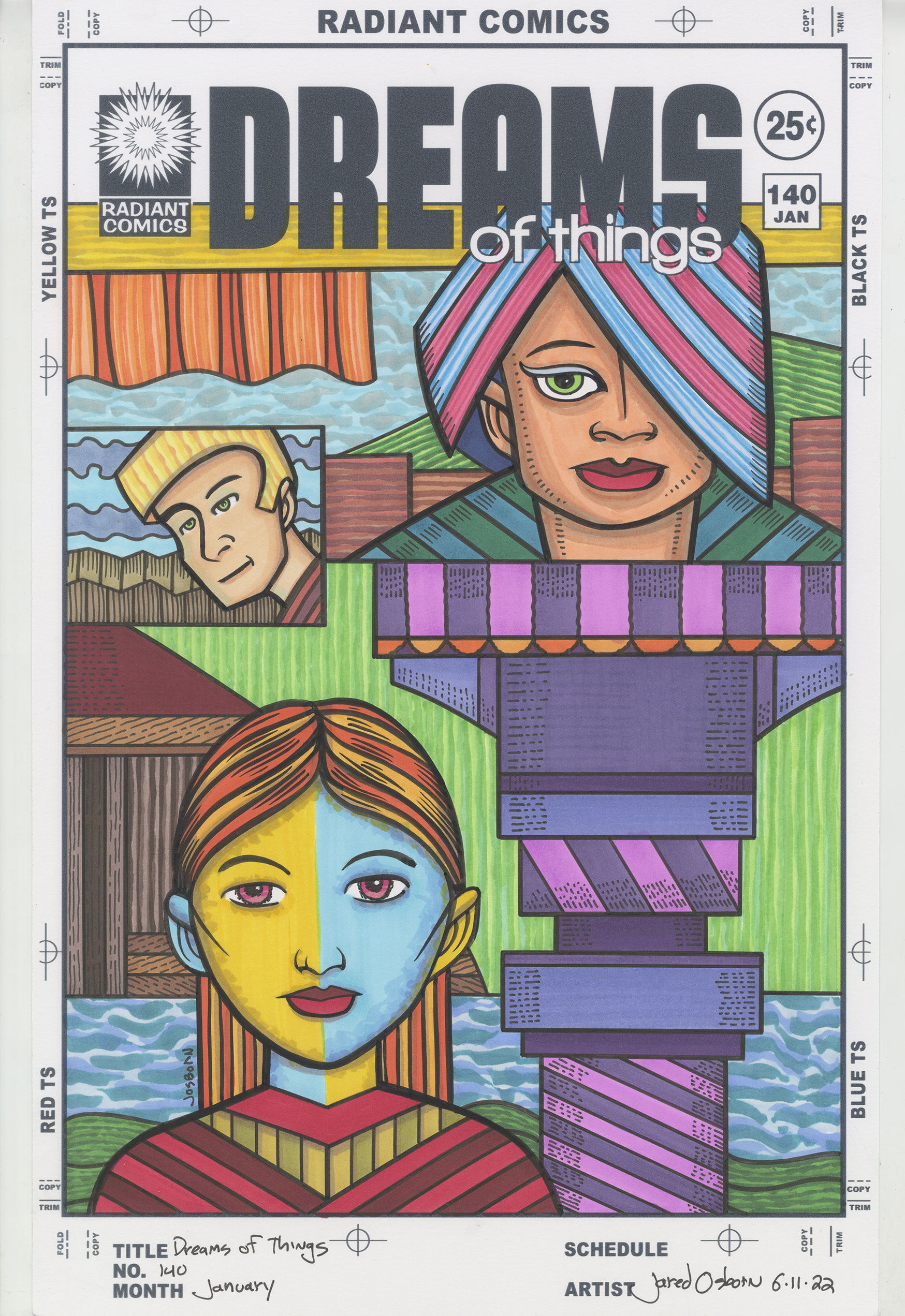
I bring this topic up because just yesterday I finished marker coloring “Dreams of Things” number 140. It’s from my “Covers to Comic Books That Don’t Exist” series and I it surprised my how much I liked it after I colored it. That doesn’t always happen but here it did. With this series I leave room for it to happen but I’m often surprised when it does.
The “Dreams of Things” seres are done in three stages. First I draw them in pencil, then I print out the pencils in blue line with the logo on it so I can ink it, and finally I use markers to color right over the inked line. Usually these stages are days or weeks apart as I can have from three to five of them going at any given time.
Often these covers look good in their inked form. They could be finished ink drawings if I wanted them to be. They’re fully realized as images even though I eventually add color to them. With others the ink drawing looks drab. Not terrible or anything like that but they lack technique to make them look interesting. I’m saving the flair of technique for the coloring. The ink drawings are left looking “open for color.”
I have a few inked covers on the pile waiting for me to color them. All of them look bland to me right now. Maybe that’s why I was unenthusiastic about coloring them. But one day I there was nothing I wanted to do so I picked the next cover off the pile and decided to give it a go.
For a lot of the covers I have color schemes in mind. I don’t know why but the colors suggest themselves to me. With #140 the colors had no suggestions for me. I couldn’t visualize any of the colors beforehand as I so often can. In cases like that I start with the background and usually some easy literal colors. In this case I started with the blue sky on top. After that I decided to make the green sky in the middle but at the last second changed it from a sky to alternating rough green parallel lines. I think that was a good choice. Third was the darker bottom blue sky. Finally I decided to make the tiny little blue sky in the small guy’s box blue too.
The skies were only the initial background elements. There was still a lot of other stuff in there. I went literal with the two areas of green land too. They helped balance out the green in the middle plus made the weird triple landscape a little more grounded.
The next background pieces were the various bits of brown. They look like parts of fences and houses. The first piece of bright color I put in was the orange on the curtains on the top left. They stand out against the sky. I was going to put dark blue over the curtains but then I realized the color would blend in with the logo too much. Some yellow would be a better choice. So I went with some rough yellow and yellow ochre lines.
The last of the background was that strange machine on the right. I went with purple for it but it was too flat. I decided I would have to try and do something about that at the end with some black ink. Color couldn’t help that bit any more.
Finally only the three faces were left. I like to mix up my skin tones and make all different faces from dark to light or with crazy colors. I find if I don’t specifically think about the skin tones I default to making everyone my own skin tone and that gets boring. So I started with the top one and made him/her (I don’t always have a gender in mind with my androgynous faces) a dark orange-ish skin tone. The I decided to do one of my split face skin tones on the bottom woman (I don’t know why I think of her as a woman but not the top one). The yellow/orange and blue make a nice combination. The little patch faced guy was the last skin tone.
I finished the color with the blue green of the top face’s shoulders and then the red and yellow of the bottom face’s shirt. That was it for the color so them I decided to go in with some black ink lines and give a little more visual interest to the purple machine. I drew in all those little parallel lines to give a stylized indication of roundness.
In the end I really liked this cover. The color made it come alive. After I finished it I let it sit on my easel for a day and then I looked at it with fresh eyes. I was a little surprised that I liked it. I went from a bit indifferent about it in its ink stage to liking it with color. That doesn’t always happen. It was a nice surprise.
I’m back from the comic shop this week and I got six new comics.
Check them all out here:
If you ever want to know why artists, illustrators, cartoonists, or anybody on a deadline does things the same way time after time I have the answer for you. Trying to do something a new way takes ten times as long. This weekend I’ve been working on my Gatsby Project (for which I’m not on a deadline) and I’ve been doing things a new way and it has been slow going. Frustratingly slow.
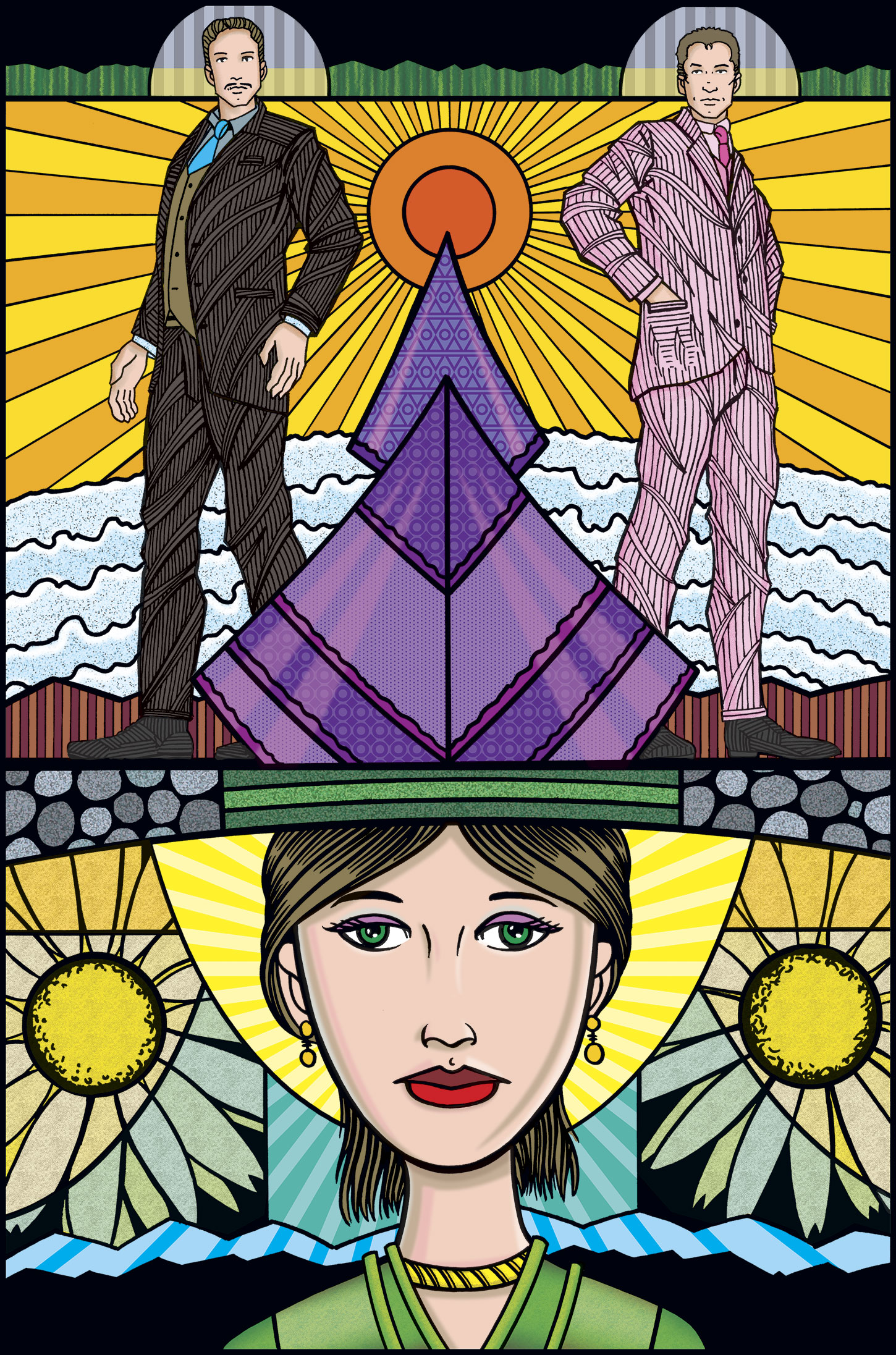
I’ve been working on making illustrations to go along with the book “The Great Gatsby” since the beginning of 2022. It has taken me a couple of months to find my footings with it but for the last couple of months (it’s the beginning of June as I write this) things have been going well. I’ve got a few illustrations finished and a few more in the process. Not bad.
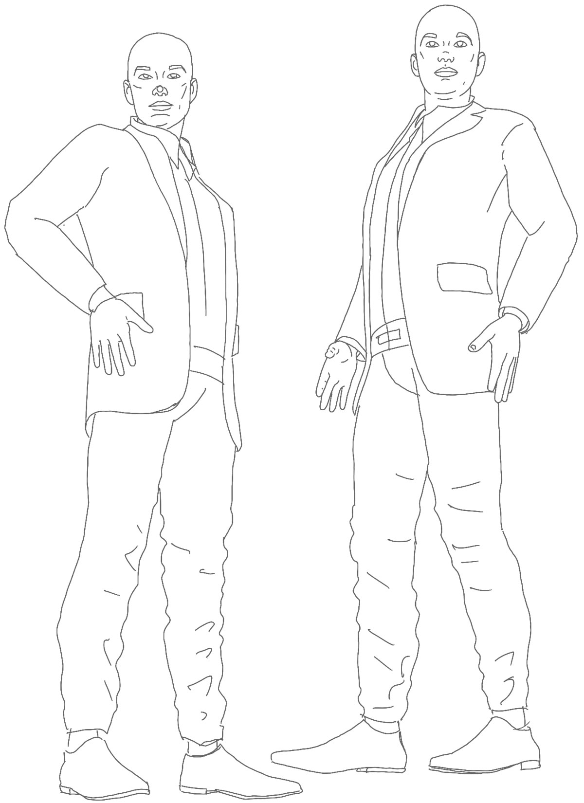
This weekend I decided to go back and work on one that was almost finished but that I didn’t like how it was turning out. It was an ink drawing that had Tom, Gatsby, and Daisy in it. The main problem was, once again, drawing the suits. This time it wasn’t the fashion details of the suits that was bothering me (I think I have the details down now) but the drawing style itself. The drawings of the two men looked boring.
The drawings were full figures of Tom and Gatsby standing apart but back to back. Each drawing is about six inches tall and the men are wearing suits. It was one of the drawings that I used 3D models to get just the right pose and then drew suits over the models. They were adequate drawings but too boring for me to be satisfied with them. So I redrew them.
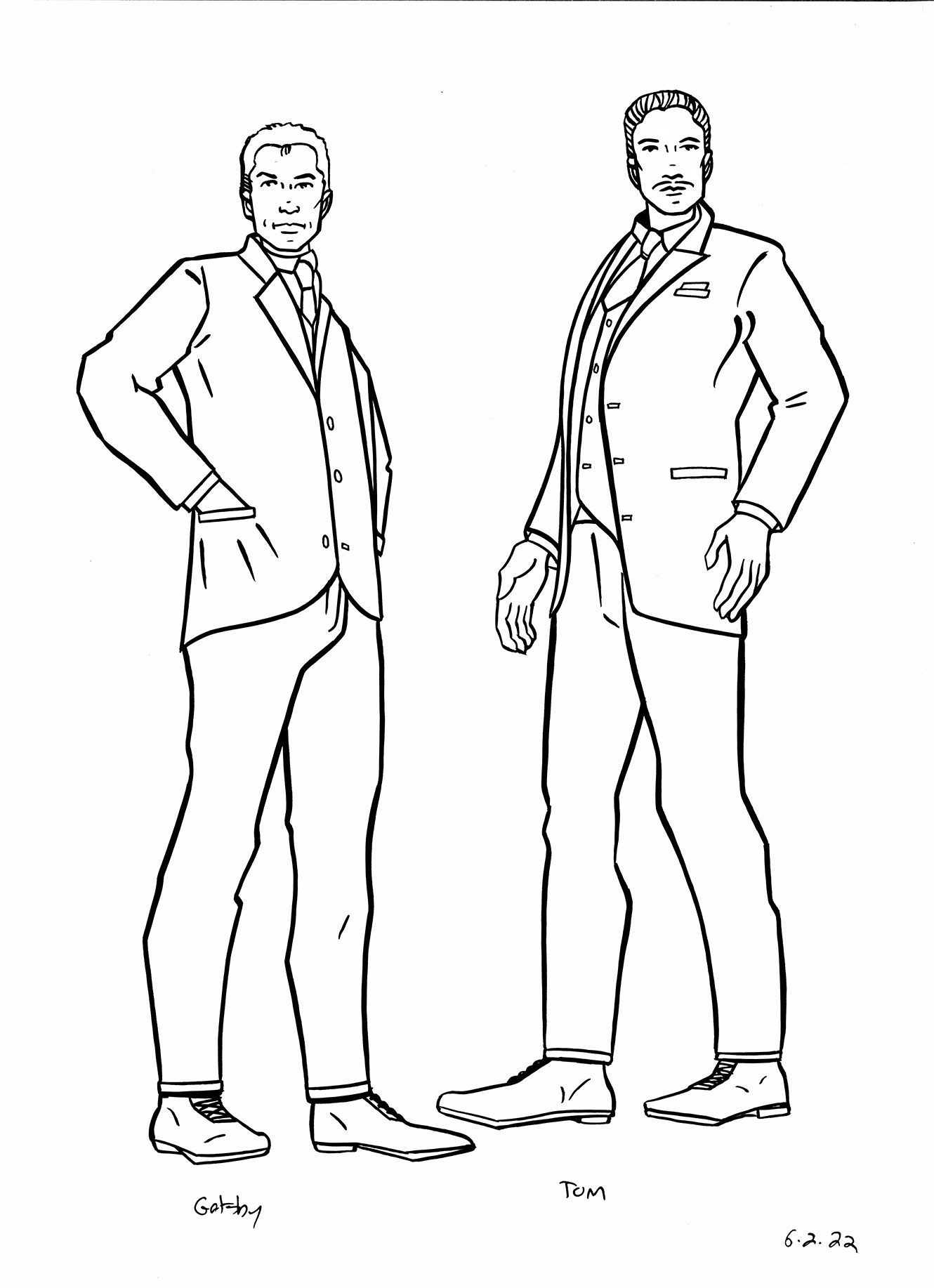
First I redrew them with pencil and then I inked them. I tried inking them with some pens but they didn’t come out well. After that I inked them with a brush and they were fine. I digitized the ink drawings and set about coloring the piece in Photoshop. As I was coloring I thought the suit drawings were still boring. I tried to compensate with some coloring techniques but nothing I tried worked. I probably spent two hours trying to color those suits only to come up with nothing. So I went back to the ink drawings.
I decided the failure was still in the ink stage so I tried some other ink drawing techniques. I failed another three times. I finally remembered that the comic book artist Frank Cho had done some nice suits that I saw months ago on Instagram. I decided to look them up. He was using an Art Deco hatching technique where he drew black lines directionally following the pull of the tension of the fabric. He did a really great job with it.

I gave a try to that technique but it took me another three tries to get it right. At least as right as I could get it. There wasn’t a lot of tension and folds in the suits I was drawing. The suits weren’t in action and were designed to have a good looking straight silhouette so it was hard for me to pick the right lines and the direction of them. But I got it done. In the end I like the technique a lot better than what I had before.
Finishing the suits I had to decide what I wanted for the large Daisy head I had at the bottom of the drawing. I wanted to color it but it was a stripped down and simplified face. It seemed to want some shading and realism but how much and with what technique? I wasn’t sure at all.
I’ve been doing a lot of coloring with markers in the last few years. If I had decided to color this piece that way instead of digitally I would have had this face done and looking good in forty minutes. That’s what I mean when I say people on deadlines don’t try new things. Two hours later and I still didn’t have what I wanted with the Daisy face.
At one point I even decided to try and finish the face as if I was using my markers. I scanned in the marker color swatches I made on a piece of paper so that I could sample the colors and use them in Photoshop. It didn’t work out. Drawing digitally is not like drawing in the real world no matter how much I prepare and want it to be. I couldn’t pull it off.
Keep in mind that last weekend I digitally colored two of these Gatsby drawings. They took a long time to do but I knew what I was doing the whole time. I was using my usual techniques and liked the drawings I was working on so that I didn’t have to “Fix” them at any point. So today’s drawing was extra frustrating.
I’m still not done with the Daisy face but I think I figured out how I’m going to do it. After failing with various digital drawing techniques I finally decided to draw only the shapes of the shadows with the vector pen tool to make the curves. It’s a tedious way to draw but sometimes I like the result.

It took me a good two hours to nail down the technique but I still have to erase all that and start again. Y’see, between using my regular color palette and the marker palette that I made I really screwed up my color. He face was not quite in harmony. I also made the mistake of putting my shadows and highlights on the same layer. That makes it harder to mass change either category of the color. I have to redo it all, get the color correct, and put the shading on different layers. That way if I decide I want my shadows a little darker it’s an easy adjustment. If they’re on the same layer it takes more time and therefor discourages me from making possibly necessary changes.
But it’s 8PM on Sunday night right now. That’s way too late for me to start anything. Daisy’s face will have to wait for another day.
I’m back from the comic shop this week and I got fen new comics.
Check them all out here:
Time sure can slip by can’t it? I ask this because this week I decide to make one of my Big Ink Drawings. They are done on 22×30 inch paper and are made with brushes, India ink, markers, straight edges, French curves, and my Haff hatching machine. All the stuff that helps me get black ink on paper. Sometimes I use color ink but most often its black ink.
I can’t even tell you how many of these Big Ink Drawings I’ve made of the last ten years. I could tell you if I dragged them all out and counted them but I’m not going to do that. I’d guess that I’ve made fifty of them though.
My habit with these drawings is to keep them on my easel when it’s not in use. I usually take photos of the drawings while they are in progress but, like all my other drawings, I like to scan them when I finish them. Unlike all my other drawings I don’t have a scanner big enough to accommodate a 22×30 inch drawing. My scanner is 11×17 inches so I have to scan the Big Ink Drawings in six pieces.
Scanning a large drawing in pieces is actually pretty easy except in order for me to do it I have to move my scanner onto a portable table that has the room around it to fit the drawing. My usual scanner spot can’t fit a 22×30 inch drawing in it. I don’t like to move the scanner and set it up to scan just one drawing so I don’t scan until I have a bunch of them ready to go. I have a bout eight of them stacked on my easel.
Since I have drawing table, computer, easel, and iPad and use all of them for drawing I don’t use my easel every day. Often I won’t use it for weeks. In that case the Big Ink Drawings just sit there on the easel. Otherwise I take the drawings off the easel in the morning and lay them down on my bed. That way I can work on the easel.
I sign and date all my drawings. It’s a good habit for young artists to get into because otherwise, over the years, you’ll forget exactly when a certain piece of art was from. I didn’t learn that lesson until my late 20s so there are some pieces I have that I know are from between 1991-1994 but I’m not sure exactly when. Sign the work too because that’ll help you get over imposter syndrome.
I mention all this as a long way to get around to the fact that it has been nearly a year since I’ve made a Big Ink Drawing. It’s May, 23, 2022 as I write this and the date on my last Big Ink Drawing is June 6, 2021. That’s a long time ago. How did it happen that I haven’t made one in over a year?
The first answer to that question is painting. Last summer I decided I wanted to do some painting. Before that I hadn’t painted in a while. I bought five new 24×36 inch pre-stretched canvases and worked on them all summer and into the fall. They take considerably longer to make than a Big Ink Drawing and so took up all my art time for about four months. The paintings are what I got done.
I’m not sure why I didn’t get any done after that except that I get on rolls with things. I got on a roll with paintings last summer and got all five canvases done. I’ve been on rolls with the Big Ink Drawing and there have been periods where I’ve done one or even two a week for weeks in a row. This winter I was on a roll making my Paste-Up Mash-Up Magic the Gathering cards. I guess I never got on a Big Ink roll for a year.
In making these Big Ink Drawings I sometimes make a whole new drawing and sometimes I look through my archive of drawings and find one that I want to make into a Big Ink Drawing. This time I wanted to make a new drawings so I pulled out my Ink Book and looked through my thumbnail drawings until one caught my eye.
Actually a few caught my eye beyond the first one so I set up four thumbnails so that I could make a 6×9 inch pencil drawing from them. I figured I’d give myself some choices in case the first one didn’t work out.
Over the years my Big Ink Drawings have ranged from fairly simple to incredibly complex. Simple often takes more preparation than complex but the eventual execution can be quicker. I would spend more time preparing the drawing but less time making the finished drawing. I’m not exactly sure why but simple appealed more to me than complex for this first Big Ink Drawing in a year. So I put the prep time in and made the drawing.
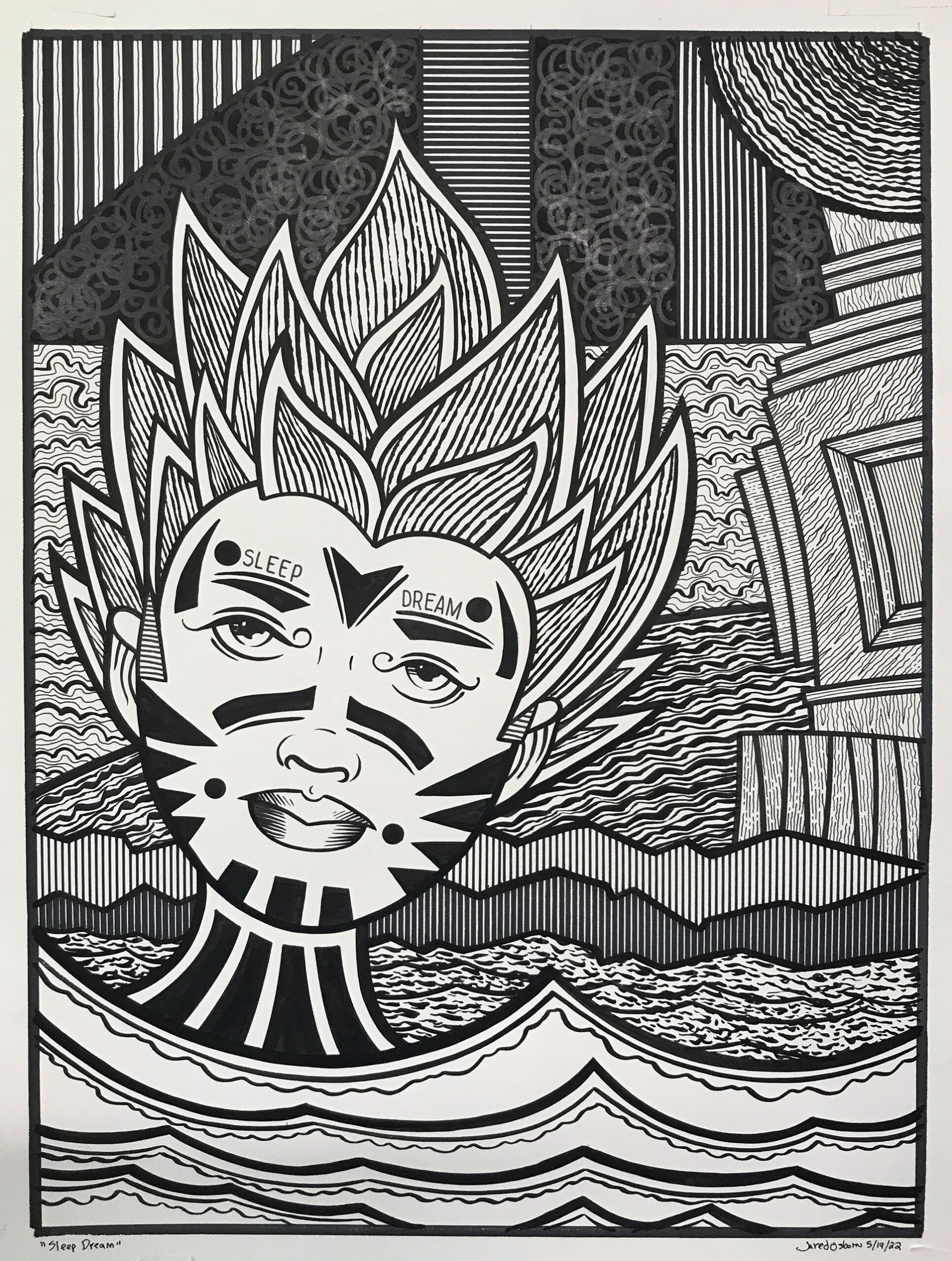
This Big Ink Drawing is called “Sleep Dream.” In an unusual moved I used the title of the drawing in the drawing itself as I wrote those words over the eyebrows of the face in the drawing. It’s a simple drawing in that it’s only one face. Water for the foreground, and a background full of simple shapes. Lots of texture in the background though.
It went about as I expected it to. It took around three days to complete and was painless to execute as I worked most of the piece out before hand. I like the way it came out. The face has a pensive look that I have empathy for. The hair could be on fire so there is a little bit of alarm in the piece but the hair could also be some sort of artichoke. That’s some weird hair. I like the two thickness of lined clouds in the back too.
I discovered a new technique with this drawing. The three black areas on top were going to be spirals but I didn’t like them and so blacked them in. Then I somehow got it in my head to draw black on black spirals. I used a marker that has a matte black in it and drew over the glossier black ink. It’s almost like a really dark grey over the black. I’m not sure if it’ll be visible in all light but I like the way it looks. I’ll have to try to do something in another piece with that. Maybe I’ll even get on a roll. We’ll have to see.