I’m a methodical artist. That means that method is important to me. It’s how I get things done. I do things a certain way. A series of steps. I do step one, followed by step two, then step three, until I’ve finished however many steps it takes to make a finished piece of art. I’ve also got a bunch of different methods for a bunch of different types of art. My “Drawings on Comics” have a different method from my “Big Ink Drawings.”
As a consequence of being methodical I can usually tell if things are going wrong early in the process. If there are problems with the piece on step three then those problems are not going to get better on step five. Conversely if things are going well they’ll probably continue on that path. As a consequence I’m not usually surprised when a piece comes together in the end and looks good. After all that’s the plan. But sometimes I do surprise myself.
One of the dangers of being a methodical artist is getting bored. If I plan things out too much then there is a chance that I’ll get disinterested in the piece halfway through making it. In my head I can see it finished and it seems to be just going through the motions to actually finish it. In my youth I abandoned pieces because I got tired of making them.
To avoid this problem I developed ways of doing things that left room for improvisation at the end. A put a place in my methods for the very last finished stages to be unplanned. This gave me a place to be creative. After that I looked forward to finishing a piece. The boredom of being able to see it finished halfway through was replaced by seeing the places I could get creative at the end. I could surprise myself.
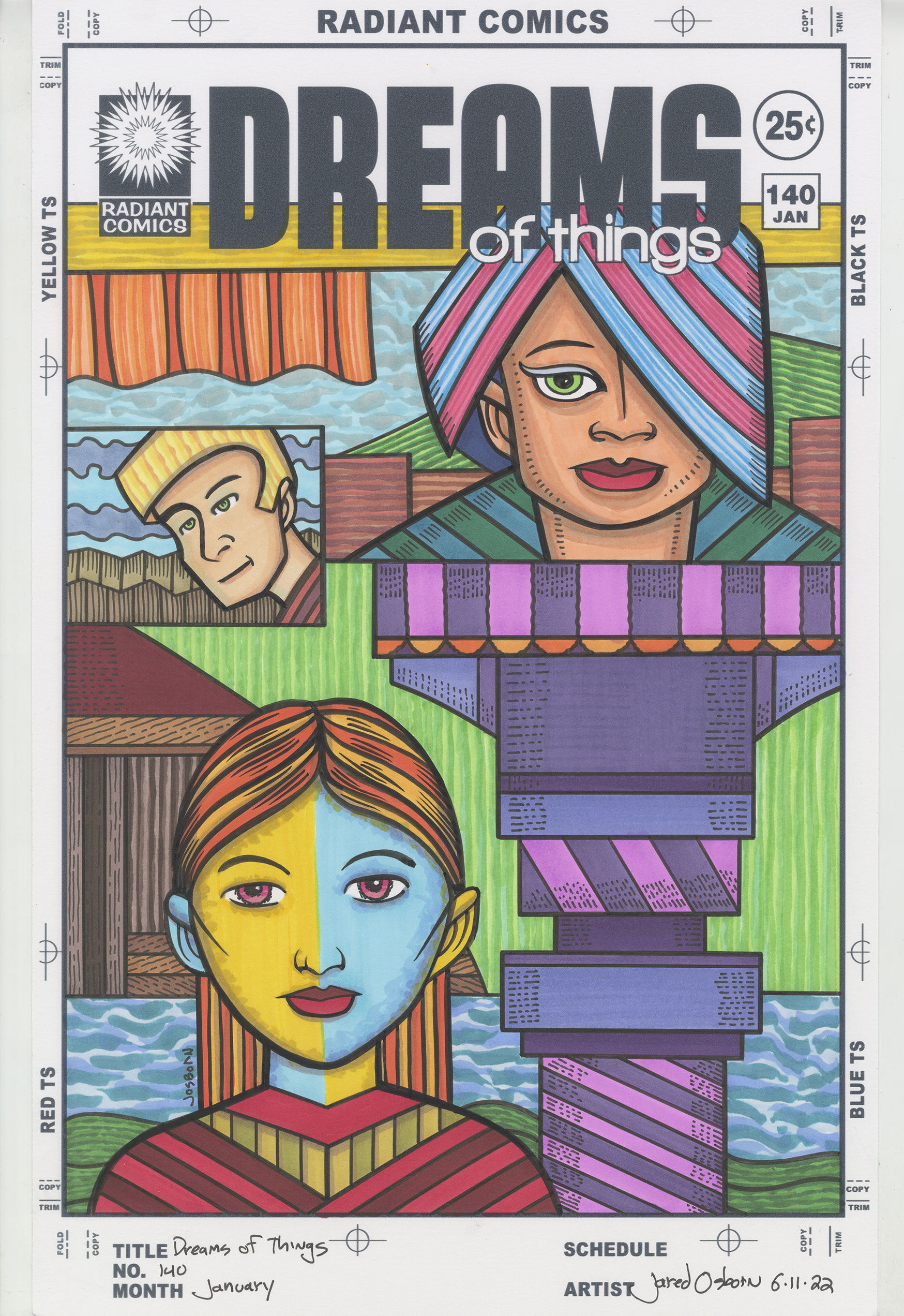
I bring this topic up because just yesterday I finished marker coloring “Dreams of Things” number 140. It’s from my “Covers to Comic Books That Don’t Exist” series and I it surprised my how much I liked it after I colored it. That doesn’t always happen but here it did. With this series I leave room for it to happen but I’m often surprised when it does.
The “Dreams of Things” seres are done in three stages. First I draw them in pencil, then I print out the pencils in blue line with the logo on it so I can ink it, and finally I use markers to color right over the inked line. Usually these stages are days or weeks apart as I can have from three to five of them going at any given time.
Often these covers look good in their inked form. They could be finished ink drawings if I wanted them to be. They’re fully realized as images even though I eventually add color to them. With others the ink drawing looks drab. Not terrible or anything like that but they lack technique to make them look interesting. I’m saving the flair of technique for the coloring. The ink drawings are left looking “open for color.”
I have a few inked covers on the pile waiting for me to color them. All of them look bland to me right now. Maybe that’s why I was unenthusiastic about coloring them. But one day I there was nothing I wanted to do so I picked the next cover off the pile and decided to give it a go.
For a lot of the covers I have color schemes in mind. I don’t know why but the colors suggest themselves to me. With #140 the colors had no suggestions for me. I couldn’t visualize any of the colors beforehand as I so often can. In cases like that I start with the background and usually some easy literal colors. In this case I started with the blue sky on top. After that I decided to make the green sky in the middle but at the last second changed it from a sky to alternating rough green parallel lines. I think that was a good choice. Third was the darker bottom blue sky. Finally I decided to make the tiny little blue sky in the small guy’s box blue too.
The skies were only the initial background elements. There was still a lot of other stuff in there. I went literal with the two areas of green land too. They helped balance out the green in the middle plus made the weird triple landscape a little more grounded.
The next background pieces were the various bits of brown. They look like parts of fences and houses. The first piece of bright color I put in was the orange on the curtains on the top left. They stand out against the sky. I was going to put dark blue over the curtains but then I realized the color would blend in with the logo too much. Some yellow would be a better choice. So I went with some rough yellow and yellow ochre lines.
The last of the background was that strange machine on the right. I went with purple for it but it was too flat. I decided I would have to try and do something about that at the end with some black ink. Color couldn’t help that bit any more.
Finally only the three faces were left. I like to mix up my skin tones and make all different faces from dark to light or with crazy colors. I find if I don’t specifically think about the skin tones I default to making everyone my own skin tone and that gets boring. So I started with the top one and made him/her (I don’t always have a gender in mind with my androgynous faces) a dark orange-ish skin tone. The I decided to do one of my split face skin tones on the bottom woman (I don’t know why I think of her as a woman but not the top one). The yellow/orange and blue make a nice combination. The little patch faced guy was the last skin tone.
I finished the color with the blue green of the top face’s shoulders and then the red and yellow of the bottom face’s shirt. That was it for the color so them I decided to go in with some black ink lines and give a little more visual interest to the purple machine. I drew in all those little parallel lines to give a stylized indication of roundness.
In the end I really liked this cover. The color made it come alive. After I finished it I let it sit on my easel for a day and then I looked at it with fresh eyes. I was a little surprised that I liked it. I went from a bit indifferent about it in its ink stage to liking it with color. That doesn’t always happen. It was a nice surprise.