I’m back from the comic shop this week and I got nine new comics.
Check them all out here:
I’m back from the comic shop this week and I got nine new comics.
Check them all out here:

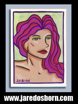
Today I’m going to go to my shelf of 8×10 inch paintings, pull one down, take a look at it, and write something about it. A little bit of a look at my past work. According to my calendar I haven’t made any of these small paintings in about six years. It really has been a while. Let’s see what I can find.
I pulled down a painting named “Sand Storm” that I painted on July 25, 2007. It’s July 31, 2022 as I write that so the painting is almost exactly fifteen years old. This painting looks more familiar than most so I may have actually written about it before but I don’t want to look up if I did or not. I think it could be fun to write about the same painting years apart.
After I pulled down the painting the thought came to mind to look up on my calendar what I was doing on that day, as I do with my “Friends” walkthrough blogs, but then it occurred to me that this painting was what I was doing on this day. But I often did paintings in batches of four so I could have done three other paintings at the same time as this one.
The first thing that jumps out at me about this painting is that it’s horizontal. I’d say that only about one in five of my paintings are horizontal. I generally prefer vertical works and I don’t even know why. Maybe that’s just artistic tradition. I think there are more rectangular vertical paintings out there than any other shape and orientation.
The second thing that jumps out at me is that it’s a landscape painting. That’s also a reason that it’s vertical but in general I don’t do many landscape paintings. I like face and figures most. I love imagery and making images that haven’t been seen before. Such images usually include people. I have less success coming up with landscapes and buildings that are new and striking. But occasionally I do.
The third thing that strikes me is the orange sky. I also painted the sides of these canvases and they are also orange too. The first step I took was to paint the front of the canvas and all four sides with that orange and then all the other paint went on top of it.
The orange paint itself looks to me to be a paint that they stopped making. I think it was a Windsor Newton paint and it may have been some kind of Cadmium Orange. I can’t remember the name but I do remember that they stopped making it and replaced it with a similar orange. I have a memory of not liking the similar orange as much but I’ve been using it ever since. After all that’s what the sell now.
As are a lot of people I’m a fan of spirals. They’re not always easy to make but I have a few different types of them. “Perfect” spirals are the hardest. Getting the twist of the spiral just right with the line even all around takes practice. I usually do these type of spirals in an ink drawing when there are just a few of them. In the end the spiral looks like one line but I make it with many brush strokes and build up the thickness of the line over time.
Another type of spiral is the “Wall of Spirals.” This is when I fill a large are with a lot of small spirals. With these it’s not important to get them perfect. It’s better to have the imperfections so that there are many different variations of spirals in the mass of them. Each individual spiral is made with one hand motion with the brush or pen. Sometimes I go back and clean a few of them up but mostly I get it in one shot.
This painting has a third type of spiral. It’s a painted spiral that shows off the brush stokes of how it’s made. It’s sort of made the same way as the “Perfect” spiral but without the line being opaque the colors show through one and other. These spirals are made with a bright yellow, dark brown, and a yellow ochre. You can see the three colors mixing together as the brush drags them around. There is also something Van Gogh-ish about spirals in paint.
Sometimes seeing the brush strokes in a painting gives me a sense of time. I can see the artist’s hand as he or she makes the brush strokes and I can see the time it takes to make them in my imagination. I like that. It can humanize a painting for me.
As an aside I keep calling these spirals but it is really a line with two spirals. One on each end of the line. I wonder if there is a name for that shape? It may have been called a scroll back in my Junior High metal shop. I’m not sure. Junior High was long time ago.
Now for the buildings and fence. I like the way they came out. I’ve done buildings like this other times and I haven’t liked the way they came out but this time it really works for me. I drew them first in black paint (the only black paint in the painting) and then painted in two colors of blue over the black. The blue strokes take on volume and make the building solid. It comes to three dimensional life for me. It’s not a building technique I’ve come to master. I think, in part, because the weird shape of the building is very important to the technique. Unfortunately I can’t draw that same weird shape every time.
The last thing in this painting is the solid ground. It’s made with a brown/red with darker and lighter lines on top of it. It’s sort of a burnt orange so it fits in and enhances the orange of the sky. I like it
One final note is the name of this painting. “Sand Storm.” That looks like a pretty literal name. That’s unusual for me. I more often name things by thinking of word pairs that pop into my head and they rarely have a literal connection with the drawing. This painting looks like a sand storm. How odd.
I finally looked and I did indeed write about this painting back in 2017. Here it is! Sand Storm Blog Post #1
I’m back from the comic shop this week and I got ten new comics and a collected edition.
Check them all out here:
I keep a calendar. A digital one. If I have any kind of appointment in the future I put it on the calendar but that’s not the bulk of the things written on my calendar. It’s mostly filled up with things that I did or made on any given day. If I work on one of my Gatsby illustrations I make a note of that. If I do a 6×9 inch ink drawing then that gets typed in for that day.
I started keeping a calendar that way back in the late 1990s. It was on a paper calendar back then and there was less space per day but it worked at the time. The reason I started keeping a calendar was to keep track of what art I finished and to give myself a sense that I had gotten stuff done. Usually I make a drawing, it gets filed away, and I don’t see it again. That is not a recipe for a sense of satisfaction.
I mention this because keeping a calendar can sometimes change my sense of time. Or at least it makes me contemplate time in a way I don’t normally do. Years ago I actually entered all the notes from my 1990s paper calendars into my digital one so that I could easily access them. So now if I want to look up what I did on any given day 20 years ago I can. That’s kind of cool. And a little strange.
It doesn’t have to be my deep past that gets me contemplating time either. I usually write in my calendar the day I do something or maybe the next day if I was too busy or maybe forgot. So I look at the calendar about every day. I also copy and paste the repetitive stuff that I do rather than type it. So if I ink a “Dreams of Things” cover I look back to the last day I inked one, copy the “Inked ‘Dreams of Things’ #141 cover,” paste it in a new day, and change the number.
I mention this because just yesterday I marker colored a “Dreams of Things” and when I went to enter it into my calendar I noticed it had been two weeks since I marker colored the last one. For some reason that struck me as a longer time than I imagined.
I’ve written a couple of essays in the last month about how I was having trouble getting art things done but I was still chugging along and finishing things. I think that art malaise has distorted my sense of time a bit. I thought back to those two weeks and they seems to have passed very quickly but uneventfully. That’s a strange combination.
To make things even a little bit weirder is that I’ve now gotten two “Dreams of Things” covers marker colored and finished. It’s really not even that weird that I haven’t finished a cover in that two week time. It’s probably happened over and over. I even got a lot of other things done in that time. I even pencilled four new “Dreams of Things” covers over the weekend that are ready to be inked. I could just be that my calendar reminded me that time is passing and I somehow hadn’t noticed time recently. You’d think with writing in a calendar every day that I would.
Another thing I noticed when contemplating time and my “Dreams of Things” covers is that my images can have groupings. A month or two ago I noticed a few of my covers in a row had big faces in them. It wasn’t a conscious choice but it was how things worked out. After I finished these last two “Dreams of Things” covers I put them on the easel side by side and they had some things in common too.
Each cover has a large main figure and two more smaller figures in back. The compositions aren’t really the same but there is some similarity to them. Plus the coloring I did share some common elements. Each has a primary color main figure with a couple of large elements of green in them. I didn’t plan any of this but sometimes when things are close to each other in time whatever artistic elements that are in my mind can make groupings all on their own.
After I finished marker coloring “Dreams of Things” #143 it struck me that I haven’t put in an art supply order in about three months and I wanted to look into buying some new markers. I don’t actually need any new markers right now but that doesn’t mean it isn’t time to start thinking about it. There is that time thing again. There is a time for planning to buy art supplies and a time for buying them. Figuring out which is which isn’t always easy.
So I went onto the art supply website and started looking at the colors of Copic markers that I don’t already have. I have about 110 colors so I’ve got a lot of them. I ended up picking out another 15 of them. But at around $6 a piece plus another $6 a piece for ink refills I was up to $180. I don’t really want to spend that much on markers right now. So I guess it’s not the time.
Here is the kicker. The day after looking at markers I worked on “Dreams of Things” #144. The one I mentioned before that is similar to #143. It turned out it is really similar in color too. I mentioned the main figure and big green areas but a lot of the other color motifs were similar if not the same. The two really do make a pair but maybe I could also use some new color markers to choose from. I’ll buy them some time.
I got no new covers marker colored in two weeks and then two in two days. Now I have to figure out what to do next. Maybe another one? Maybe ink one of those four that I pencilled over the weekend? I don’t know. Time will have to tell.
I’m back from the comic shop this week and I got five new comics.
Check them all out here:
Part of being an artist or creative type of any kind is looking at your own work and figuring out what you like about it and what you don’t. You have to be able to figure out what you did right and what you did wrong. Hopefully there won’t be too much wrong but you also have to examine what you are saying with your art and if you’re getting that point across. A lot of self examination goes on.
My art tends to be strange and weird. It comes from a dreamlike place of the subconscious and is not always relatable to a wide group of people. This is just the way it is with me and I go with it. When I think about trying to please people with my work, a general mass of people that is, if inhibits me. I lose my train of thought. Including the audience in my creative process makes me hesitant and timid. Whenever I try to do it I end up making mediocre art.
You might ask why I would think about the audience as I’m making something and that’s because I want my art to be popular. All of us creatives want success and popularity except it’s a very rare thing that we really have no control over. Sometimes putting the audience into my thought process gives me the illusion that I can control how popular something will be. That though is quickly proved wrong when I make a bad piece and no one cares.
I bring this up because one of the things I often think my work is missing that would make it more popular is sex appeal. I see plenty of artist who can draw sexy people well and they get popular because of it. My work tends to be on the intellectual side and is dripping with strange images. There isn’t a whole lot of sex appeal in that.
I’ve developed some themes over the years that have sex appeal. My “Painted Ladies” and “Swirl World” series both are about pretty women and the female figure but I still can’t play it straight and I have to add weird shapes and drawings to the bodies. That’s what makes it interesting to me. It doesn’t seem to be nearly as interesting to other people.
Last winter (2021-22) I got it in my head to do some sexy pin-up art cards. I did a few of cartoon women in bikinis and a friend said, “If you’re gonna do then don’t chicken out. Make them nude drawings.” So I made some nude pin-up art cards. They came out nice and I was going to try and sell them on Ebay (I think seeing others sell them was what got me interested in the first place) but I never did. I grew disinterested in them. Once again making something just for an imagined audience didn’t hold my attention. Without my own weird twist on them I lost interest.
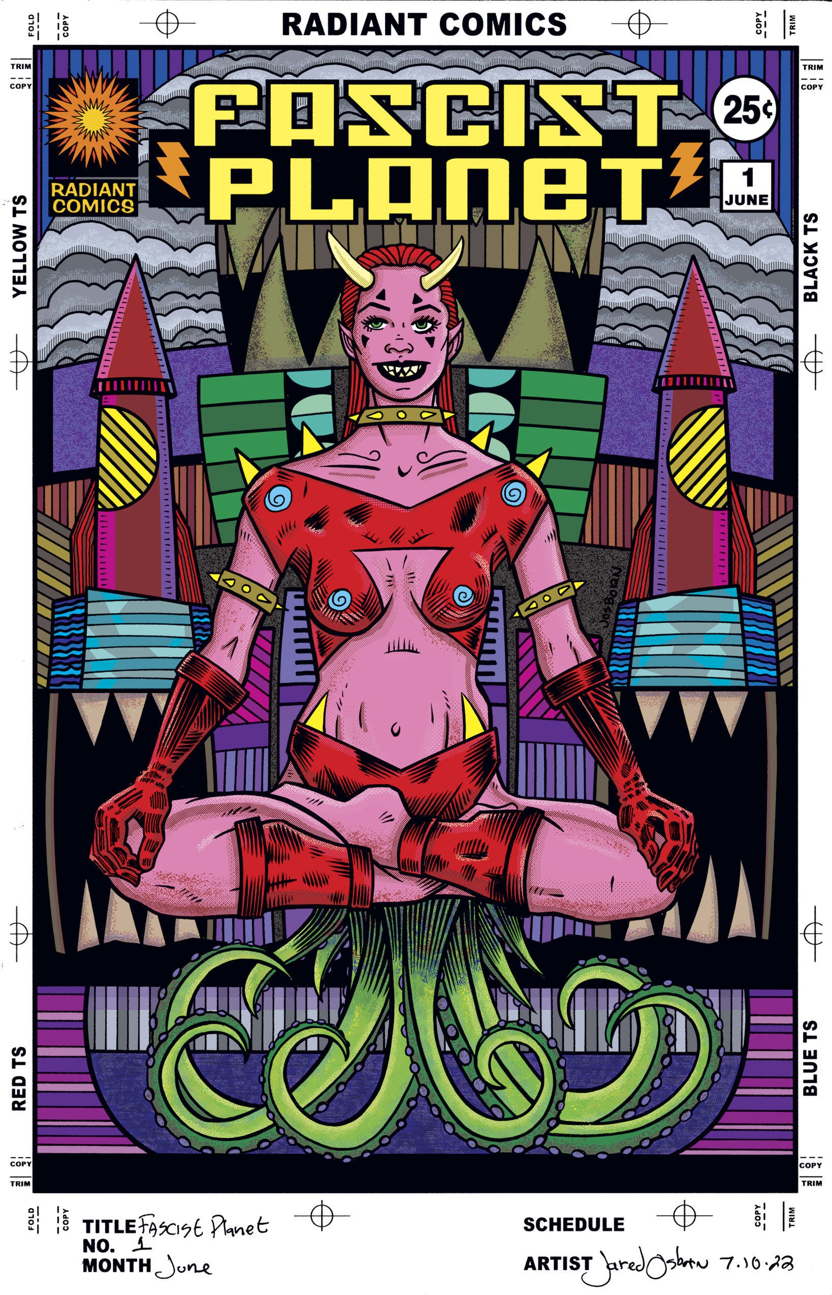
I bring up this subject because I decided to work on another of my “Covers to Comic Books that Don’t Exist” series. I’ve been making a lot of “Dreams of Things” covers over the last few years but those ones don’t have much sex appeal to them. I’ve still got some of them in the pipeline but instead I decided to make some in my “Fascist Planet” series.
I haven’t done any “Fascist Planet” covers in years because they’re hard to do. They’re weird and twisted. I think they first started with me trying to add some sex appeal to my cover series but then it took a dark turn. I’m guessing I got bored with the sexy angle and started drawing strange stuff into the covers. They ended up going down a sexy horror angle but without a wink and a nod to tell the audience that everything was okay. Just a joke.
There is nothing shocking about these covers. They’re not exploitation covers but I think that makes them more out there. We all know what sexy exploitation art is and can easily recognize it when we see it. I don’t quite recognize what these “Fascist Planet” covers are. Neither do most people. But they hardly get to see them.
When I decided to do some more “Fascist Planet” covers I made some thumbnail sketches. I drew about six of them and none of them got me going. On my computer I have a folder of reference photos that I’ve collected over the years. Since I wanted some sexiness I scrolled through the folder labeled “Reference Women” and looked for something I could work with. I found a twenty year old photo of a women in the lotus position. Being so old it was low resolution but it still was good enough for me.
I’ve been using my iPad and Procreate to draw from photos these days. I can use my Apple Pen and draw right on top of the photo. I sketched out what I wanted and then printed the sketch onto a 9×12 inch piece of paper. I drew just the woman’s body on that piece of paper, scanned it in, and then printed that drawing on an 11×17 inch piece of paper.
It’s on that 11×17 inch piece of paper that I drew my drawing. The “Fascist Planet” cover. That’s when all the weird stuff came in. The woman got horns, a strange outfit, spikes, and sharp teeth. She became a sexy devil but a weird disturbing sexy devil. Those pointed teeth kept her from being a “wink-wink” sexy devil. Without them she looks like an attractive women cosplaying a devil. With them she becomes creepy. Then I added the tentacles she is sitting on.
Years ago I kind of reversed Japanese tentacle porn in some drawings and instead of having the tentacles going at the women I had the tentacles coming out of the women. It adds a good horror element to a sexy drawing. I went for something similar her if a little tamer than I used to do it as it looks like she’s just sitting on tentacles here.
With the main figure done the background became atmosphere. I leveraged a drawing I had already made to get the composition of the background but then I had to figure out the details. I went with sharp stuff. Building became teeth. Hopefully it’s no place you want to visit.
So that is what I was doing this week. Bringing sexy back. But in a weird and scary way.
I’m back from the comic shop this week and I got seven new comics, a back issue, a graphic novel, and a collected edition.
Check them all out here:
Sometimes in life, and sometime art life, I’m just stumbling along. That’s when I’ve go no plan. Or at least no plan that looks like it’ll work out at the moment. But life still goes on without a plan and we all still have to live it.
As I write this it’s already July 5, 2022. I say, “Already” because last year my plan was well under way by now. Last year was my “Summer of Painting.” From the middle of May until the middle of October I painted six large canvases. I hadn’t done many large paintings like that in years so it was fun to do. Plus it took a lot of time.
This summer I have no big plan like that. I do have the plan I gave myself at the beginning of the year. That’s my “Make an illustrated version of ‘The Great Gatsby’” plan. I’ve been working on that for six months now and it’s going along fine but lately it hasn’t felt like a plan. Or maybe I just fear that it’s not going to work out in the end. The mind is a tricky thing.
I’m still getting stuff done though. I can remember back in my school days I had a friend who wanted to do 3D painting for one of his studio classes. He got nothing done on it. One day he told his teacher that he spent some time looking up how to do 3D painting but couldn’t find anything. So rather than waste his time with a painting that probably wouldn’t work out he did nothing. The teacher wasn’t happy with my friend’s nothing.
I’ve never been able to make doing nothing a successful option. When I need rest then doing nothing is the thing to do but if I want to get something done then I can’t let fear of failure get in the way. Fear of failure does try to get itself in the way. Even more than failure itself. Failure can make you give up or try harder but fear of failure mostly makes you give up. So even if I have no plan and I’m not feeling especially creative I still try to get stuff done.
The first thing I got done was a Gatsby drawing. I little while ago I found an old photo of a man in a suit that I used as reference for a Nick Carraway drawing. He’s the narrator of “The Great Gatsby.” I made a pencil drawing, and ink drawing, and then a color ink drawing. It came out well. I like it. You would think that would make me feel like my Gatsby plan was coming along well but somehow it didn’t.
I worked on a couple of my “Dreams of Things” comic book covers (to comics that don’t exist). I keep a bunch of those around in various stages of completion to work on. I inked cover 144 one day and then on another day I marker colored cover 142. That’s a fair amount of work on a long term project for me. I’ve completed 142 cover illustrations in that series now. But sometimes when it’s something I always get done it doesn’t feel like an accomplishment to get it done. The mind is a weird thing.
A project that I revived recently is my “The Painted Lady” project. That’s another title in my “Cover to Comic Books That Don’t Exist” series. I draw a woman’s body and then I draw a bunch of designs on her. They’re mostly in black and white but I have colored a few of them and so I decided to color this one too. It’s number 24 in the series and I’ve been learning new coloring techniques in Photoshop and Procreate lately so I tackled this one in Photoshop. I like the way it came out but somehow it didn’t feel like part of any plan. It felt like stumbling along.
My ultimate stumbling along pieces are my 6×9 inch three pen technique ink drawings. For the last couple of years I’ve always had some of these ready to work on. I look through my Inkbook for some thumbnail drawings, blow them up, print them out on 6×9 inch paper, tape the edges, and them draw them with three different thicknesses of black ink pens. These are generally quick to do. They can take anywhere from half an hour to two hours to draw. It all depends on my energy level. Sometimes I’m just slow.
I mentioned my Inkbooks before. They’re my sketchbooks that I make small ink drawing in. It’s where I come up with ideas. I fill a hundred page book a year which means I have to fill around eight pages a month. So far this year I’ve gotten a steady two pages a week done. In previous years I haven’t always been steady and have drawn in my Inkbook it fits in starts. As I’ve been writing this I realized I haven’t gotten my two pages done yet this week. Another regular thing I can trudge along with.
Besides writing this piece one of the things I have on my plate today is to computer color “The Painted Lady” number 25. I couldn’t think of what I wanted to do with my Fourth of July so I decided to draw another one of those covers. I hadn’t done one in a few years and now I’m working on my second in a week or two.
It was a few years ago that I can up with “The Painted Lady” concept and started drawing them. I can remember being very into it. I even made a “Swirl World” variation of the concept where I drew swirls on women. It all seemed like a plan. Like it was part of a project. That’s a hindsight thought. I probably did at least a handful of them just trudging along.
Somedays that’s all there is to life. Trudging along and trying to get things done. After all getting nothing done has never worked out for me. So I’ll keep on going.
I’m back from the comic shop this week and I got four new comics.
Check them all out here:
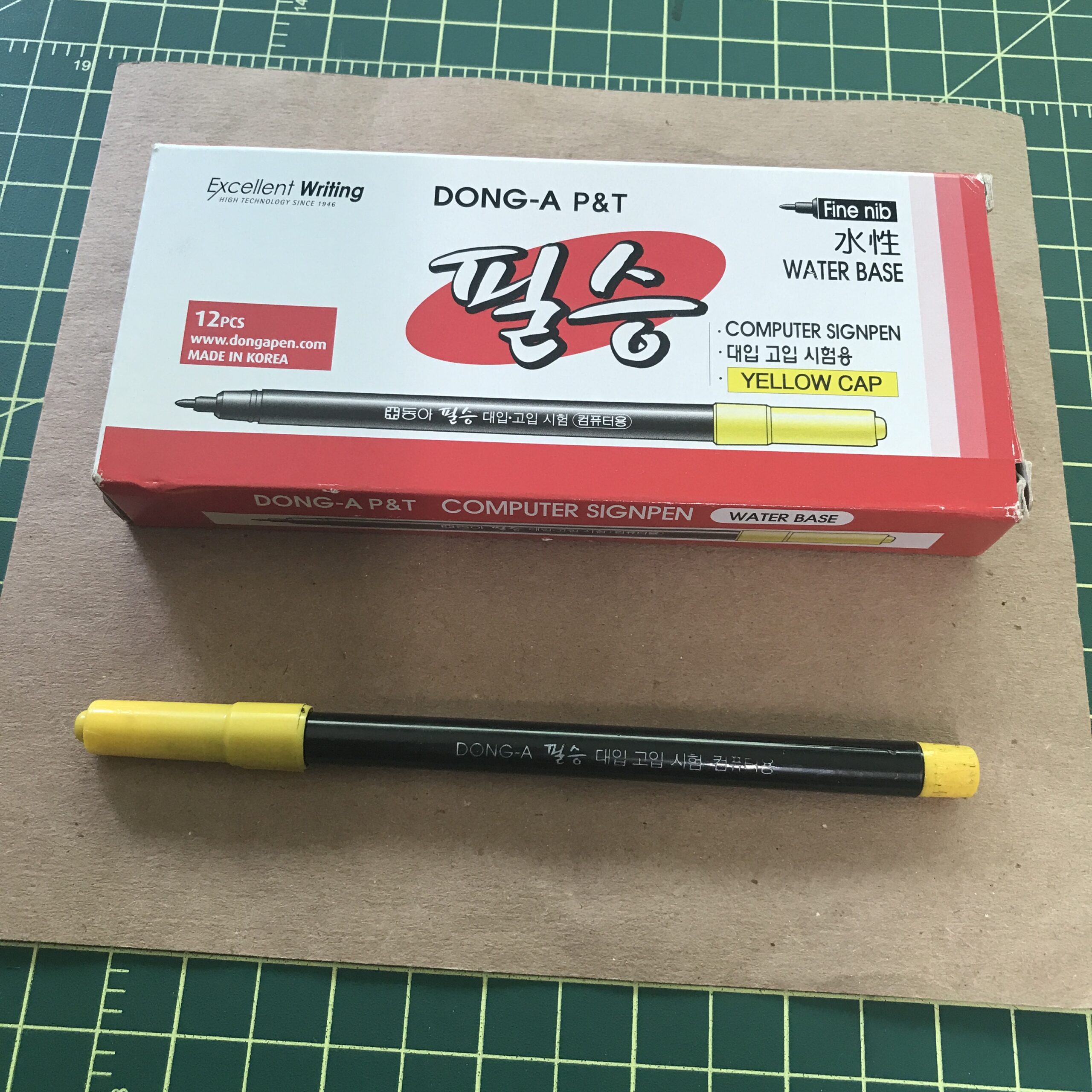
I was drawing this morning with one of my favorite pens. It’s a simple black marker that I use all the time. It’s a Pentel Sign Pen. With all the art markers in my collection of art supplies the humble Sign Pen gets used quite a bit. It’s got a bit of an origin story with me too.
First of all the Sign Pen has been around for ages. There are other brands of them besides Pentel but it was the Pentel one that was around all the time during my childhood in the 1970s. It was the black marker that could be found in various stores that had school supplies. It was always among the pencils, paper, and ballpoint pens. I probably had them during my childhood but they made no special impression on me then.
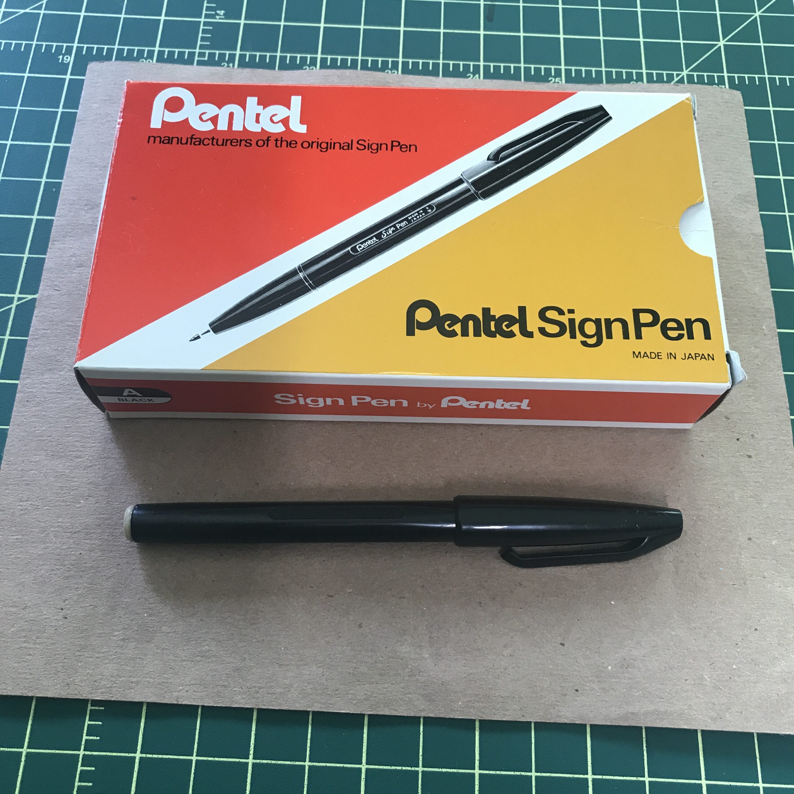
It wasn’t until the late 1990s that I started using Sign Pens regularly for drawing. I was working in the Marvel Comics Bullpen in the late 1990s and for some reason I needed a black marker. I went into my boss Dan’s office and asked if there were any in the supply closet. There was so he gave me one and it was a Pentel Sign Pen. I did whatever task had to be done with it and really liked it.
After that I discovered I liked drawing with Sign Pens. The pens usually have dark black ink (there are color ones too) and a nib that’s hard with little give to it. The hard nib gives a consistent line weight to a drawing. It’s a fairly thick line too. Maybe a sixteenth of an inch across. I found it was good for making simple and small drawings. I liked it for getting down ideas in thumbnail sketches.
After using the pen I checked back with Dan to see if there were any more of the Sign Pens. There were. He told me that he ordered them for Michael Golden who was Marvel’s Art Director at the time. I found that interesting and popped into Michael’s office to ask him about the pens. He told me that he liked them too and learned about them during his time in the animation business. Because of the smooth single weight black line a lot of animators liked to use they to draw. Consistent line weight is an asset in the animation world.
After working with the Sign Pen for a little while I realized I had actually read about other comic book artists using them before. Most comic book artists used brushes, dip pens, and India ink to make cartoons but I remember reading about both Neal Adams and Gil Kane using Sign Pens to ink with at times back in the 1970s and 1980s.
One of the problems with Sign Pens back in those days was that the ink was fugitive. Unlike India ink or most of today’s magic markers back in the 1970s markers were made with an ink that would fade away after a few years. I’ve heard stories of Gil Kane inking comics with a Sign Pen in the early 1980s. Those pages faded to a light brown by the early 1990s. I even got to see a few of those faded pages at comic book conventions in the early 1990s.
I don’t remember seeing any Neal Adams finished art inked with a Sign Pen but I have seen various sketches and preliminary art that looks like it was done with one. It has a line that’s very recognizable to me these days.
The ink in Sign Pens these days is much better than it was in the 1970s. I have sketch books with Sign Pen ink in them that have been around for over 20 years and the ink hasn’t faded at all. In the early 1990s magic marker companies started making black markers aimed at artists and so they improved the ink in them. “Fade Proof” markers came into existence so much so that it trickled down to even the cheaper old markers. Now most black markers are “Permanent.”
I don’t always stick with the marker ink that comes in the Sign Pens. I discovered long ago that you can refill most black markers with India ink. The ink reservoir in markers is usually a sponge. So I get pliers and pull off the plug that’s on the back of a Sign Pen and pull out the tubular sponge that’s inside. Then I drip about 20-30 drops of ink onto the sponge. After that I put the sponge back in and replace the end plug the marker keeps going.
Though I’ve used many inks in markers I find that Technical pen ink works the best. Technical pen ink has glycerin in it. That’s a surface tension breaker that helps the ink flow. I find other inks work well for a while but then they clog up the sponge or something. It takes weeks to happen but eventually the ink stops flowing regularly. This doesn’t happen with technical pen India ink.
The year 2000 was the first time I filled up one of my 5.5×8.5 inch sketchbooks with drawings made with a Sign Pen. I call them my Inkbooks. I draw anywhere from six to nine small boxes on a page and fill up all the boxes with spontaneous ink drawings mostly done with a Sign Pen. I’ve filled up a book a year since then so I’m on Inkbook 23 right now. I pull one off the shelf and look through it when I need an idea for a drawing.
I found a website, years ago, called JetPens.com that has a lot of pens. I’ve bought and tried out a few different brands of Sign Pens from there. There is one Japanese brand of Sign Pens that have a yellow cap and are called “Computer Pens” (for some reason) that are good ones. Those and the Pentel ones have been the mainstays of my Inkbooks for decades.
Not all artists art like this but I love to try out new art supplies. It’s one of the ways I keep going. I love looking through art supply websites and catalogues and ordering all sorts of stuff but sometimes it’s the simple things that really work. The ordinary Sign Pen has been extraordinary for me.
As an addendum to this piece I’ve been reading a book called “Popism” by Andy Warhol. In it he mentions that in the early 1960s some of the people who worked in his studio, The Factory, used to take speed and then obsessively draw complex designs with Sign Pens. That is now the earliest mention of a Sign Pen that I’ve read.