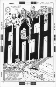
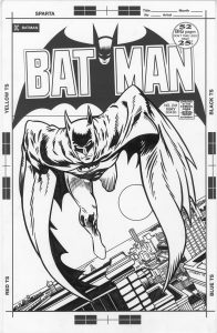
I’m back from the comic shop this week and I got five new comics.
Check them all out here:
I’m back from the comic shop this week and I got five new comics.
Check them all out here:
I’ve been digging out some old stuff this week and working on it again. Some old concepts that is. I made a couple of my faux comic book covers in my “Painted Lady” series. That’s the name of the fake comic book “The Painted Lady” but unlike a bunch of my other faux comic book covers this one doesn’t have a story to back it up. There is no strong man or jungle queen lurking on these comic book covers. Instead there is a highly decorated woman.
I’ve made a bunch of prints in the past of decorated female bodies and that is the origin of this series. Instead of prints I put them into comic book cover form. I pencilled and inked the covers for issues four and five along with pencilling the cover to issue six. The final inks are all on 11×17 inch paper. I think I may have made the first three smaller than that but I don’t remember. I’ll have to dig them out to look but I’m not that ambitious right now.
These covers start out on the computer. I photo or 3-D reference these ones either by using a 3-D artist model program that I have or else I scour the internet for suitable reference. I would prefer to shoot my own reference but since I don’t have the resources to I make do. Finding a photo that suits my purpose is remarkably hard. Maybe hard isn’t the right word but it takes time. There is a difference between making a photo to be a stand alone piece of work by itself and making a photo to facilitate another piece of art. But eventually I find something I can use. The internet is filled with photos. My final piece is usually so far removed from the photo that it doesn’t really reveal itself to be photo referenced unless you really know the clues to look for.
I start out by drawing right over the photo on the computer. I set up a a separate layer in Photoshop and draw right over the photo layer in red. This is as much a tracing as a drawing because I’m not looking for anything but the basic figure. Nothing fancy just a single line weight drawing. It probably takes a bit of skill and practice to be able to pick out that single line as quickly and efficiently as I do but it’s nothing I think about very much. I knock it out as fast as possible so I can move on to the real drawing.
The next step is to convert my red line drawing into a light blue line drawing and print that out. I was working on a 9×12 inch piece of paper for this step because I wanted to pencil it a little bit smaller than the final 10×15 inch size (on 11×17 inch paper). I find the drawing often goes faster at this size while ten years ago I would have drawn it bigger. I also do more drawing in the ink stage than I used to do ten years ago. I do the figure drawing in pencil over the blue underdrawing. This doesn’t take a whole lot of time but I take extra care with the hair and face. It’s all the black designs and shapes that I then draw on the figure that takes the most time. Lots of elongated triangles, sweeping curves, and circles. I have to take special care not to repeat myself too much because certain shapes suggest themselves over and over.
After I’ve got everything drawn in pencil I scan it back in to the computer and put in in my template that has the logo and trade dress in it. I also stared a new step here. I stared it with issue number five because I came up with it after seeing the finished inks for issue number four. Originally it was just the figure on a white background. In the prints I made years ago this was not a problem because I added type and design work to the background. But these are supposed to be finished pieces by themselves and the background looked empty and plain. So I decided to come up with a black and white pattern for the background. So now in this step is where I’d go into Illustrator and figure out some sort of geometric background. I came up with an elongated checkerboard pattern that I liked. I brought that pattern into Photoshop so I could put it in the background of the pencil drawing digitally. Piece of cake. I then converted the drawing and background to blue line to print out and ink over.
When I print out the piece in blue line I keep the logo in black. I have no interest in hand inking the logo for every single cover. That would take just about as long as the rest of the cover. Besides logos on comics are always put in mechanically. In the old days a photostat (a fancy photocopy) was pasted down on the art to put the logo on. These days it’s done on the computer but either way a logo was never hand drawn except for the time is was created. I could have also printed out the background pattern in black but I preferred to ink that in by hand. Sure it takes a bit of extra time filling in all those little black areas but I think that time is worth it. It makes the piece look a little more uniform and makes the mechanicalness of the logo blend in. If the background and logo were both mechanical looking it may overwhelm the piece.
Overall I liked the way issue four came out better than issue five. I like the way the figure sits in the space more. There is a little more elegance to it by my eye. Issue five seems a little more tribal. She seems denser with sharper and darker markings. I’m happy in general with both of them so that might just be my taste. It’s amazing that what I like even in my own work can be so subjected to my taste.
I’m back from the comic shop this week and I got six new comics.
Check them all out here:
I just made it through another low productivity period of time this summer. I never like days like that. They might not even be as low productivity as they feel like to me because I do get stuff done but not a whole lot of my time was spent at the drawing board. Also I don’t always count things that I have to get done as doing things I got done. That’s a weird quirk of mind.
One thing that I got done that I don’t always count is my Sunday “Drifting and Dreaming” comic strip. They take a bit of work. Over time I have to draw and color a whole bunch of individual cartoon art cards. Usually I wait until I have enough for about thirty strips. That’s sixty cartoon art card to be drawn, written, lettered, and colored. But since I’ve been doing it for a while, and I expect to do it, it doesn’t always count as an accomplishment in my mind. Plus there is another thirty regular art cards and a Middle Story to be written. That’s a lot of work for me not thinking it is.
I’ve also almost finished up two books I’ve been working on. My “Ghost of Fifth Street” comic and my “Moments Float Back To Me” art book. Each one has gone through about five drafts of the writing. That takes a lot of time but it doesn’t feel like I get a lot of work done. “I got the third draft done but still don’t like it” is not a feeling of satisfaction. I’m still happy I got all the writing done though.
Of course all of that takes away from the time I have to make anything new. A new drawing, a new painting, or some such. I did manage to get some new photos done. I seemed to have a bit of concentration to use on them. There were a few days when I was writing and getting other things done that I tried to draw and couldn’t. So I switched over to working on my street photos. It’s funny how different things take different types of concentration. It takes me hours, at least five of them, to get one of my photos done but I was able to do it by working twenty minutes here and twenty minutes there. But then I stopped getting them done too. Don’t know why.
This week I finally got some drawing done. And how did I do it? By skipping the drawing stage. Well almost. My usual method is to first make same small drawings in my ink book (which I’ve still managed to do this summer), pick a small drawing to work on larger, draw the bigger drawing in pencil, and finally make that drawing in ink. Sometimes the pencil drawing even goes through two steps. First I draw it at about 6×9 inches and then I redraw it at 10×15 inches. That’s a lot of drawing but it really helps me refine the image. Yet I just couldn’t do it this time. It takes a lot of concentration and I didn’t have enough of it. So what did I do? I skipped the pencilling.
After making some videos for my new Art by Osborn YouTube channel about how to choose and use a brush I decided to use one myself. I went right to the inks. I went to my ink-books and found an image I liked. It was only a small thumbnail drawing as they all are in my ink-books but I blew it up to about 6×9 inches and printed it out in blue line on some bristol. This is usually where I’d pull out my pencil but instead I pulled out my brush. I drew in ink with it.
Drawing in ink is a totally different mind set than drawing in pencil. With a pencil you search around for the line. You sketch with your pencil and redraw the same line over and over and over until you suss out the right one. When drawing in ink you have to think about the line before you put it down. You have to be sure where you want it to go. When doing something like my spontaneous ASMR ink drawings I’m making those decisions on the fly as I come up with the image on the spur of the moment but with these ink drawings I have something to work with already. The blue line drawing.
Since I have the blue line drawing on the paper already I have an idea for the image. I know what it’s going to be. Or at least the bones of what it’s going to be. But the bones are important. They make it a different type of drawing than spontaneous ink drawings. I would decide what line were already good in the drawing and then add to them. I did one and liked the way it came out. Lots of bold black brush lines. It was also fun to make. It was satisfying to be able to think about what line I wanted to put down and then doing it.
I ended up making five of them over a week. The imagery came out differently than my usual imagery and I thought that was interesting. The black strokes of ink were also much bolder than I usually make them. That’s probably because I wasn’t following a pencil line. I used pattern a bit too. Overall they came out okay.
The final thing I did this week was to kick the size up a notch. I have a few already finished drawings printed out at 10×15 inches in blue line. They sit in a pile waiting for me to one day ink them. For most of last winter and spring I was doing a lot of inking with a pen and French curves rather than a brush. These pencils were meant to be inked that way buy I’ve been tired of doing that. So I decided to ink one of them entirely with a brush. Almost. I used a circle template a little bit. It was interesting. Once again I enjoyed drawing freely in ink. I had most of the drawing done in pencil with this one but still there was a lot to be decided as things went along. And things did go along. It was nice to get them done.
I’m back from the comic shop this week and I got five new comics.
Check them all out here:
What is a comic book inking brush? That is a question that I answered in a video for my art blog but I thought I’d write about it too. In general the brush used to ink comic book drawings is watercolor brush. A sable hair watercolor brush that comes to a point. It’s really important that it comes to a sharp point otherwise you could use any old blunt brush. The most used one by comic book inkers is a Winsor Newton Series 7 watercolor brush. I like a size three but some people prefer the slightly smaller size two. A size three being slightly bigger means I can make bigger lines with it and that it hold more ink in its bristles. That means longer lines with less dipping of the brush in ink. I’ll take that.
The main problem with inking with a sable hair watercolor brush is that India ink isn’t good for them. India ink will slowly break down the hairs of the brush and make them fall out. A watercolor brush that only touches watercolor will last a lifetime but not one dipped in ink. All throughout my twenties I tried my best to keep my ink brushes as clean as possible. I even tried to keep the ink out of the base of the brush hairs and washed it with soap and water after every time I used it. I was vigilant. I really wanted all that cleaning to matter but in the end I don’t think it made the brush any better and sometimes it even seemed to make my brush wear out faster. I finally decided I was better off leaving it alone.
I wish I could find where I read it but once or twice I ran across a story about cartoonists Will Eisner and Joe Kubert discussing how to clean an inking brush. Will Eisner was all for cleaning one but Joe Kubert’s take was the only way to clean a brush was with a pair of scissors. Cut off the bristles. He meant there was no way to clean an ink brush. I’ve come around to that side of the argument. I never clean my ink brushes anymore. I rinse them off in my jar of water when I’m done using them, otherwise they’d harden up and become unusable, but I never take soap and water to a brush anymore. That seems pointless to me now. And my brushes may have lasted longer but I’m not sure of that. It’s hard to tell.
A Winsor Newton Series 7 watercolor brush comes to a nice point. That is what you want in an ink brush. It allows you to make a very sharp and precise ink line. You’ll know the brush is done for when it no longer comes to a point. Instead it will split and you’ll have two points. That is no good for precision. I don’t throw away my wrecked brushes though. Instead I keep them and use them for oil or acrylic paints. Paint is much thicker than ink so I don’t need the brush to come to such a fine point. Plus the really wrecked brushed are good for various dry brush techniques. I make my monster face drawing with a brush so wrecked that it usually has half a dozen points. It makes weird monster lines then.
Since I also use watercolor brushes for watercolor I have to keep track of which brushes are for ink and which are not. I figured out an easy method years ago. I carve a narrow ring around the brush just below the ferrule (the metal part of the brush that holds the wooden handle to the brush hairs). I take my X-Acto knife and run the edge around the brush handle with just enough force to scrape away the paint in a narrow ring around the brush. One ring means it’s a good ink brush. Once the tip starts to split and the brush is no good anymore I carve a second ring around it. That makes for easy identification. One ring, two rings, or no rings.
For the last couple of years Series 7 brushes have been hard to get. For some convoluted bureaucratic reason the sables that are uses to make sable hair brushes found their way onto some sort of endangered species list in the USA and therefor their importation was banned. Except it’s a different sable that’s endangered. It’s all so confusing that I’m still not sure if there is a ban on the brushes or not. But art stores ran out of Series 7 brushes a while a go and just got some new ones in recently. The price has gone up on them too. I used to get a number three brush for around twenty dollars but now they are ten dollars more than that.
I’ve tried a few different brands of sable brushes over the years. The second best is Raphael brand brushes. I’d say they were slightly below the Winsor Newton ones but if I could get them for a good price I always did. I never had any complaints about the Raphael brushes. They’re also the same size as the Winsor Newton ones. That’s one of the problems I’ve had with ordering brushes from a catalog. Sometimes one company’s size three isn’t the same as another company’s size three.
I recently bought a size three from a company called DaVinci and it was more like a size two. That means the brush will hold less ink and make a slightly narrower line. Plus I found the DaVinci brushes has less spring-back than I was used to. That means as I put pressure on a brush against the paper as I release the pressure the brush should resume its original shape. Instead it just stayed bent over a little as if I was still pressing on it. That’s not the end of the world since it still holds its point but I have to be careful which way I touch the brush to paper the second time. Things can go sideways.
I love a good brush. When it comes to comics some people like to ink with pens but not me. I’m a brush person. Hopefully they’ll keep making them.
I’m back from the comic shop this week and I got five new comics.
Check them all out here:
If this isn’t your first time reading my blog then you’ve probably seen my Saturday posts about what comics I bought in any given week. Those and the videos that go along with it. For years I just wrote what comics I bought but then in 2014 I discovered YouTube comic book haul videos and decided to make my own. Those are videos where people show off each comic that they get that week. So now I have a written list that I can easily reference and a video where I get to talk and interact with other YouTubers. It’s fun stuff. I also show off some of my artwork after I show the comics.
That lead me to start a new channel this week. An “Art by Osborn” channel. On that one I plan to post some art “How To” videos, show off some my art, and maybe figure out some creative ways to present art in general. It’s all just beginning so I’m not sure how it’ll go.
In making the initial videos I’ve already been discovering how difficult it is to make “How To” videos. First off the technical aspects are tough. I had to buy a horizontal tripod extender to get things started. That’s basically a monopod that attaches horizontally onto a tripod so you can aim the camera straight down. I already had a monopod and tried to figure out a way to modify it for horizontal use but that prover to be futile. I ended up spending nearly a hundred dollars on a horizontal extender. I’m kinda broke but I needed the piece of equipment. It’s been on my wish list for a year now and I finally bought it. I must say it works well so far.
The first video I made for the channel was fairly easy to do. It wasn’t so far removed from my usual videos. It was an art supply tip showing how a person can refill a thin black marker. All I had to do was point the camera at my desk and show my hands holding my markers and refilling them as I said the instructions. Piece of cake. If I do more video like that one they’ll be the easy ones.
The really tough task is shooting myself as I draw. Even with the extender it’s a little cramped but without it it’s nearly impossible. Plus I have to make sure the paper is always in frame. Being that I move the paper around as I draw I was having a hard time with that. The first video I made I had only half the paper in frame for the first few minutes. I caught on after a while and began to learn to check the camera’s viewfinder often.
The first video I made with the extender was about ten minutes long. My ASMR drawing videos are about fifteen minutes long but they are easier to make because I’m not talking. With this how-to video I’m talking as I’m drawing and that turned out not to be so easy. Plus I think it was a little boring. I just don’t think I had enough interesting things to say.
In that first drawing video I took out a five by seven inch piece of paper and drew a head and face on it. I used two different pencils. A Generals Sketch pencil and a basic 4B pencil. I think I did okay with the drawing but the whole thing seemed a little uninspired. I don’t know what it was. When I looked back at the video it was okay but a little off. I decided to go at it again.
For the second drawing I decided to strip things down. I wanted to make a video all about just the very basic proportions of the face. In the first video I made an actual face but in this one I was just going to have basic markers of a face. I went smaller with the drawing too. I used one of my baseball card size pieces of paper and only my 4B pencil. This second time through was a lot smoother and snappier. It wasn’t anything new or revelatory. It was the most basic information on the general proportions if the face that you can find in any drawing book. But it’s where I wanted to start. And I kept it to a tight five minutes.
After making the videos I messed around a little with them in iMovie. Not too much. I added a photo of my artwork at the beginning to use as a title card and one at the end for the same purpose. I didn’t add any music though. I’m not sure if I ever will. I’ve seen a lot of videos with cheesy background music and those aren’t the type of videos I want to emulate. I stayed away from music and sound effects in my title cards too because that’s another thing that often annoys me. People put a little intro before their video but the sound isn’t leveled out. The intro is blaring and the video is quiet. I’m trying to avoid that.
I written a lot about my artwork over the last three years in this blog. From my beginnings in school to my various paintings, drawings, comics, photos, and other projects over the years. I’m now going to try and transfer some of that into the realm of video. I’m not sure how that’s going to work but I’ll give it a try. Video is still a fairly new medium for me. I’ve been shooting it for years now but that’s different than making a finished project out of it. It’s the difference between sketching and making a finished painting. It’s a long way to go from one to the other.
I’m back from the comic shop this week and I got seven new comics.
Check them all out here:
Here I go again. I can’t quite believe it but I’m writing about my third Bryant Park street photo trip of the summer. I don’t think I’ve ever written about my street photo taking this much. Unlike the first two that I wrote as I was out for the day this one I’m writing a few days later in the comfort of home. A look back approach.
I came in through Grand Central Station again which meant a trip across the Tappan Zee Bridge to Tarrytown. That was easy enough in the morning but on the way home the bridge was backed up and took twenty minutes or so to cross. The same thing happened last time so I assume, with all the bridge construction, that’s just the norm these days for a Saturday evening at 5 PM or so. Or maybe it’s the norm for always because it looked backed up in that direction in the morning as I was going the other way.
Every year for the first three Saturdays in August the city closes Park Avenue South, from 7AM to 1PM, to car traffic all the way up to Grand Central Station so people can bicycle, rollerblade, jog, skateboard, or just walk up the middle of the street. It gets really busy with people and that’s why I went down that third Saturday of August to get some photos. But first I detoured to Bryant Park.
Like other summer Saturdays they had dancing in the park from 9AM to 11AM. By dancing I mean that a modern dance group leads whoever wants to participate in some dancing across the lawn. They have a drummer to keep the beat and what looked like two women to lead the dances. They have lots of jumping up and down, sweeping gestures, and running across the grass. The people doing it look like they’re having fun. I got there just after ten thirty and for twenty minutes or so took photos of all the people dancing back and forth. It’s not an easy setting in which to take picture but I always get one or two good ones that I can use.
At about 11AM the dancers called it quits and I walked the couple of avenues over from Fifth Avenue to Park Avenue South. That is where all the bicyclists were. It was only last year that I discovered I should photograph the cyclists by using my camera’s “Sports” mode. All my life I’ve been shooting in “Aperture Priority” mode as to let as much light into the camera as possible. That still works okay with cyclists but in sports mode it keeps the autofocus moving and refocuses between split second shots. I found I got a lot more in-focus shots of moving people that way. If the people were still I switched back to “Aperture Priority” mode because then I didn’t want the focus to change all the time.
I walked from 40th Street down to 23rd Street shooting pictures as I went. It was a 94ºF day so I stuck to the shady side of the street. It took me until about 12:30 PM to make it to 23rd Street and I was a bit tired when I got there. Lately when I’ve been shooting in Bryant Park I make sure to sit down rest every so often but on Park Avenue South there aren’t any chairs. I took it easy in the shade around 23rd Street and got a few minutes rest before heading back up to the park. Luckily I wasn’t walking the whole time as I often stood on a street corner for fifteen minutes or so at a time as I took photos. I walked up the sunny side of the street on the way back but still tried to find some shade. Downtown walk was an hour and a half and the uptown one was half an hour. I grabbed a seat when I got to the park and took a break. I made sure to drink plenty of water that day too. Maybe twice what I normally drink.
It was a weird day shooting in the park since it was so hot out. Bryant Park has a big open lawn in the middle, maybe two football fields big, with trees and paths surrounding it. Around the park itself are some really tall buildings and the library at the east end. There were a couple of dozen sun worshipers out catching some rays and getting tan but almost everyone else was huddled in a small area in the south east portion of the grass. That’s where the shade was. Usually I do laps around the park taking pictures from all angles but that day I stayed mostly to the area of shade with everybody else.
I took pictures of the sun worshipers further off in the grass as I often do but I also took photos of people as I sat amongst them. Usually everyone is so spread out that there is no “Amongst” but this day there was. About three different times I sat down in a chair and took photos of those around me. It was much cozier than I’m used to.
I’m normally far away when I take my street photos and people rarely notice me. But every now and then I think someone does but I can’t always tell. Last time I was in the park I think a woman got annoyed with me but this time it was the opposite. A woman noticed I was taking photos and seemed to be happy I was photographing her. She was in the cozy shaded section with her little dog and would glance over and smile as I was shooting every now and then. She even nodded to me as she left. But I always think no one notices me so I don’t know if anyone really does or not.
The heat was really bad around the corner on the library steps. I usually spend a lot of time photographing there but it was so hot and there is no shade on the steps. The tons of people that are normally there were down to dribs and drabs. I did end up finding a shady spot off to the side of the library where I could shoot people on the street corner. This is usually a secondary spot for me but with the blazing heat it became a primary spot that day. The street corner had a little bit of shade too that people could cling to.
All in all it was a pretty good day for photography. The only problem I noticed is that photos of people riding bikes can really be way too similar to one and other. Oh well, I’ll work with what I got.