This week I worked on another cover homage. Two weeks in a row! Not something I’ve done a lot of but here we go again. This time it was Flash number 174. A Carmine Infantino drawing. I’ve never been a huge Infatino fan. I grew up reading comics in the mid to late 1970 and that was not when Carmine Infantino was doing his best work. A lot of people like his Star Wars issues but I don’t. I didn’t like any of his stuff that I bought from the ages of ten on up. But in looking back on his 1960s work there is a lot of nice stuff there. He especially drew a lot of nice covers that he also designed quite well. He was really trying to innovate in those days and he had the talent to back it up. That’s the work he referred to as his unfinished symphony as in the late 1960s he moved from being an artist to being the publisher at DC Comics. His work for Marvel in the late 1970s after he lost his publisher job lacked the ambition of his younger days.
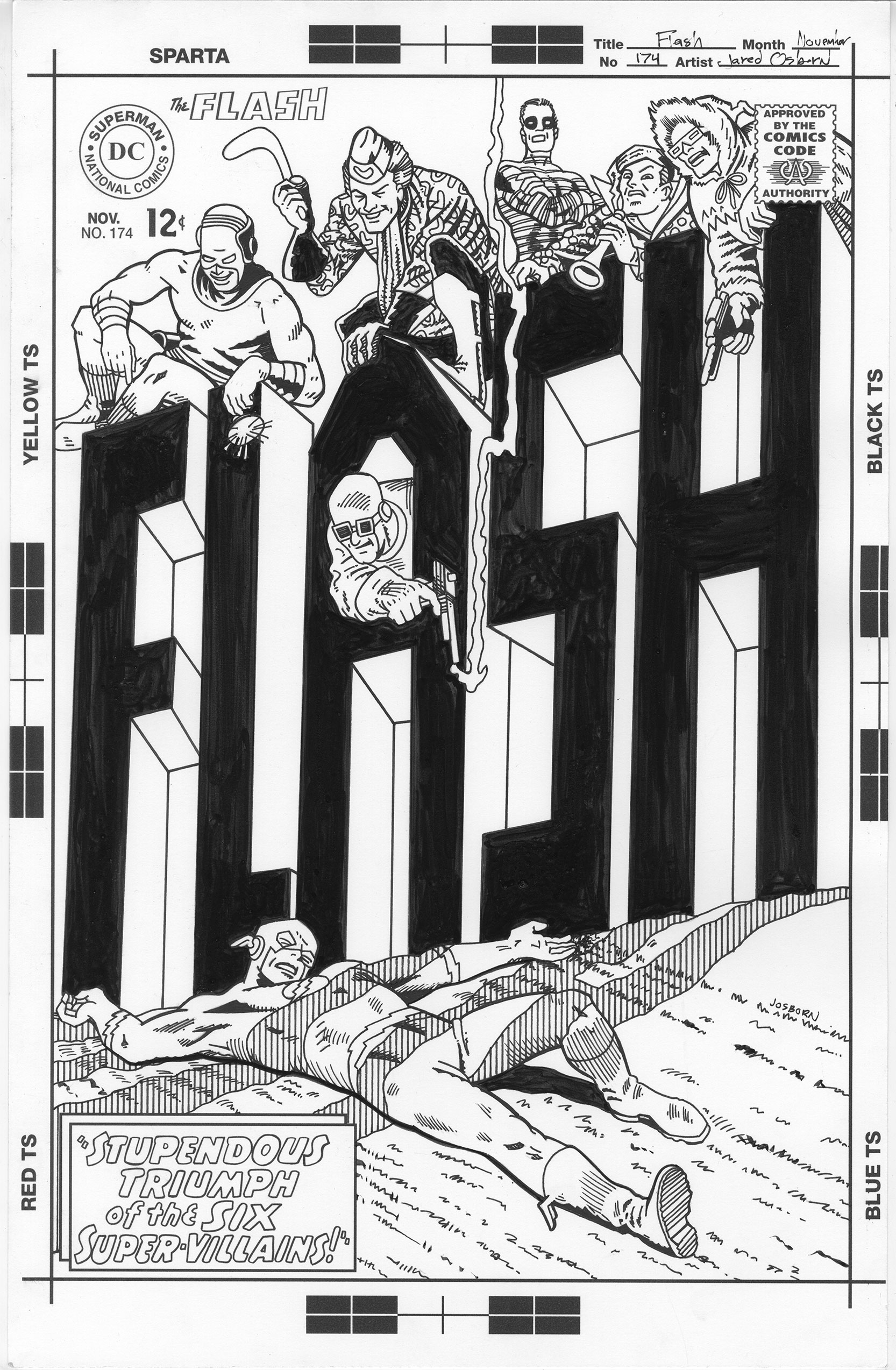
I looked through online scans of a bunch of his covers and eventually settled on Flash 174. It was a tricky one though. I wasn’t sure how hard it was going to be. At least half of the cover was taken up by a giant version of the Flash logo, and that part was easy enough, but there are also seven figures on the cover. That’s a lot. I figured the easy part would make up for the hard part but I’m not sure it did. This was a hard cover to do.
First of all I couldn’t find a good scan of the cover. Ideally I’d like to have the issue on hand but that’s not always possible. I’ll settle for a good scan of it but in this case I had to settle for a mediocre scan of it. At least it wasn’t a totally low resolution scan. I put the scan into my DC Comics original art template that I made for the Batman 241 cover I just made. I’m not even sure if that’s the correct template since the Flash issue was from years before the Batman one but since I couldn’t find a scan of the original Flash 174 art I used what I had. I printed it out on eleven by seventeen inch paper in blue line to draw over.
I did not have an easy time redrawing this cover. There is a simplicity and effortlessness to Infantino’s drawing that I was having a hard time keeping up with. I could tell that he had drawn these characters over and over and was very familiar with them while I was not. Each had their own characteristics and quirks in their faces, postures, and costumes. The cover was a lot more complex than it first appeared to me. And I originally thought it was pretty complex. I decided that the only way to do it was a little bit at a time.
It was good for me that I decided to do this cover as I was scanning in some old family photographs and negatives. The negatives are medium format 120 size and they take a bit of doing to scan in. I have a scanner that can do the job but that means putting two negatives at a time into a special holder and then using the special scanner software to scan them in. The scanner takes about five to eight minutes per negative to scan. That means I’ve got a few minutes of hands on negatives work and then ten to fifteen minutes of waiting. It’s tough to wait and it’s tough to get stuff done during that wait. That’s why scanning a hundred and twenty negatives is such a drag.
Those ten to fifteen minutes did offer me the perfect opportunity to work on the Flash cover. A little at a time. Even at one and a half times larger than the printed size those super-villain figures were smaller than I was used to working. I often use a .7mm mechanical pencil for my drawing. That actually seemed to big and clumsy for this work so I had to pull out my .5mm mechanical pencil. I don’t use that one very often but it was necessary here.
Being right handed I preceded to start in the upper left and work my way across one figure at a time. Ten minutes at a time as I scanned. First I’d figure out a head, then I’d figure out a hand, and then maybe a shirt. Since his style is so different than mine I had to figure out what he meant by each line. It wasn’t hard but I had to really look. His effortlessness took a lot of effort on my part to figure out how to duplicate. Since the scan I had wasn’t great I had a bit of trouble seeing some of his small feathering techniques too. That was annoying but since I wasn’t duplicating his technique I let it go. It took me a lot of negative scans to get all those figures drawn.
Once I had the figures drawn I drew the logo which was easy. It’s just a series of straight lines that I had to follow. Then I scanned it all in, added the smaller logos and trade dress elements digitally and printed it all out to be inked. This time instead of printing the pencils in blue line I printed them in grey line. They looked more like pencils that way and were going to get covered by ink in any case. I had to ink the piece just as I pencilled it. A little at a time.
When it comes to inking I’m normally a brush person. But that’s not how this cover was inked and wouldn’t suit the style. I was going to have to ink with a pen. I decided I was going to try one of my Copic drawing pens that I had refilled with India ink. I never liked a Crowquill dip pens very much that are often used for inking so I figured it was best to stay away from it. The drawing pen really suited the task for me and little by little I scanned and picked away at the drawing. It really took some time but paired up well with the scanning.
In the end I like the cover. I think I captured some of Infantino’s original natural effortlessness but he probably put a lot more effort in it than it appears. It’s amazing how much effort it takes to make something look easy.
Discussion ¬