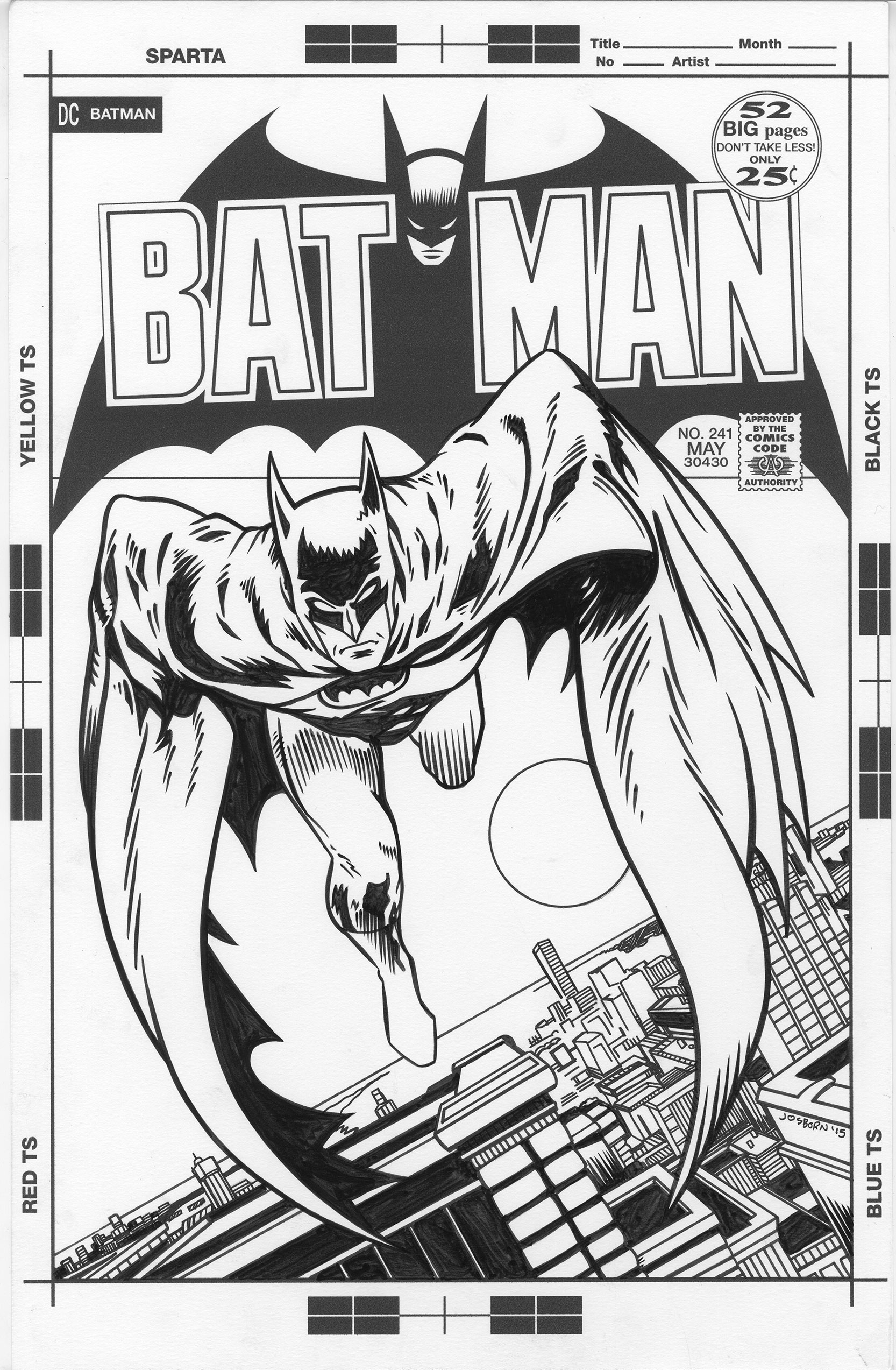
I decided to do something a little different this week. I decided to work with someone else’s image. I do that on occasion. Normally coming up with an original image is the most fun part of making a piece of art for me but every so often I like to work with an image that’s not mine. That’s why I chose to do a cover homage to Neal Adams Batman #241. I’m not going to lie to you. I picked that cover because it’s a fairly easy one for me to recreate. Neal Adams can make some very illustrative and intricate covers but this is one of his more simple ones. There is only a single figure and a cityscape. Neal Adams is way out of my class in terms of illustration but this is one I can handle.
I don’t own a copy of this comic but I’m familiar with the cover since it’s one of Adams’ more famous Batman covers. I looked it up on the internet and found a good scan of the cover. I also managed to find a bad scan of the original art for the cover. That was important. I’ve only made a couple of cover recreations myself but I’ve set some others up for other artists to do. In setting them up I like to recreate all the original production marks on the paper that was originally used. I didn’t have any examples of DC Comics cover paper from 1972 until I found that bad scan. I then recreated the paper markings digitally.
The next thing I had to do was recreate the Batman logo, trade dress, and other cover lettering. I already made the Comics Code stamp for past cover recreations so that was done. Then I had some decisions to make. Was I going to make a historical recreation or an homage? They’re two different things. One is more of a copy and the other uses the original as a starting point. I decided to go with homage. Like I wrote before Adams is out of my league as an illustrator so why would I want to try and copy his style? That also freed me up to not follow the design of the cover as closely as if it was a recreation.
The first thing I decided was that I didn’t like all the type on the cover. It made things too cluttered and took away from the beautiful simplicity of the Neal Adams’ design. I dropped the extra blurb and the whole line about Robin’s backup story. I wanted the “DC Batman” part that’s in the upper left but decided to delete the Batman head below it. I saw no point to the head. With all the other top type got it didn’t fit there anymore anyway. I kept the 52 pages circle plus the number and Comics Code but that big caption at the bottom had to go. It’s clutter and adds nothing as far as I’m concerned.
I then spent some type digitally recreating the logo, 52 circle, and the Batman head and bat behind the logo. The bat was a little tricky because it’s not actually symmetrical as you think it would be. I made it symmetrical and then had to shift things around to get it to match up. The logo was straightforward enough. All this type recreation stuff is already in my skill set so it’s not too hard for me to do. Just takes some time.
With all that type gone it gave me the opportunity to make the Batman figure larger. I blew it up digitally and found the size and place I wanted Batman in. That was easy enough. The hard part would be drawing the missing parts of the city. Since I got rid of that giant caption at the bottom there was now a hole with no city drawn in it. Not to mention since Batman was now in a different place there was missing city where he used to be. There was a lot of missing city.
The logo and trade dress was all done, the paper markings were all made, and I figured out the modified layout. The next step was to printout the black line of Adams’ drawing in blue line for me to draw over. So that’s what I did on al eleven by seventeen inch piece of paper. I then took a pencil and treated Adams’ drawing like it was my underdrawing. I didn’t trace but I drew right on top of it. It’s not hard to do since all the hard work is already done and the figure took me no time at all. It was that city that took up my time.
Luckily Neal Adams is no slacker and he drew the city in a proper perspective. He didn’t fake anything and I easily found the vanishing point he used. That helped a lot but I don’t draw many cityscapes like this. I can imagine him knocking that city out fairly quickly but I had to take my time to get things to look right. I eventually got things to where I liked them but it took me a while. After I finished with the pencilling it was easy enough to scan it in and add the pencils to the logo and such. Then I turned the pencils into a blue line and printed them out on the same page as the black logos and such. It was ready to be inked and finished.
Once again I had a fairly easy time inking the figure. I inked it in my own style but all I really had to do was follow Neal. The cityscape must have taken me twice as long as the figure. I think I did some good work adding to what was already there but it still took a lot of mindfulness. I had to think about it as I was doing it. Make sure I got everything correct. I think I did a solid job but certainly not as good as if Neal Adams drew the whole city himself. You can’t have it all.
The final thing I added in was the moon. It’s a simple circle so I left it out until the end. I didn’t want to do it in pencil and then have that printed out in the blue line for fear my circle template that I was going to using in the inking stage wouldn’t perfectly line up with the blue line circle. It was just as easy to drop the circle template on the page and draw in ink. So that’s what I did and the piece was finished.
Discussion ¬