I’m back from the comic shop this week and I got eleven new comics.
Check them all out here:
Comment
I’m back from the comic shop this week and I got eleven new comics.
Check them all out here:
This last Fourth of July I did something I hadn’t done in a long time. I read a bunch of comics all in one day. Not a lot of different types of comics but a single series. I always think to myself “I want to go back and re-read that whole comic book series” but I hardly ever do. This time I did. I picked “Stray Bullets” by David Lapham and it has forty one issues in volume one. This isn’t a review of “Stray Bullets” because the review should be obvious. I like it. I bought the series in the past and continue to buy the new issues as they come out. If I buy it then I like it. That’s my review. Now go check out the comic for yourself.
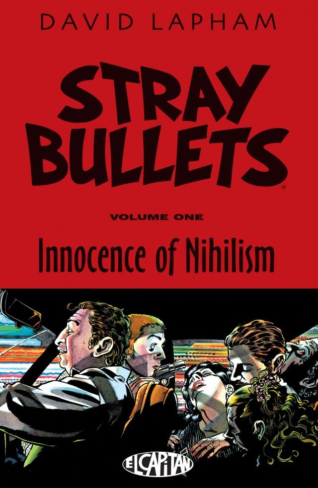
I’m writing more about the experience of sitting down and reading forty one issues of a comic. I didn’t read them all in a row without getting up. Instead I read a few, did something else for a bit, and then read few more. I read the first one around 8 AM and finished the forty first one about 11 PM.
“Stray Bullets” made it’s debut with a first issues that is cover dated March 1995. I wasn’t on board with it then but I began to hear some rumblings that it was a good book. I think I hesitated on it even after hearing good things about it. The first “Stray Bullets” issue I have is number twelve that’s dated January 1997. I though I bought an issue of it that was in the single digits but I must be misremembering. Either way I didn’t like the first issue of it that I read. It didn’t click with me.
The next issue I bought was number fifteen and that one is dated July 1998. I guess I wanted to give the series another try. It had been a year and a half since I read an issue and this issue was the beginning of a new story arc. I liked it and “Stray Bullets” has been on my pull list ever since. I even bought the oversized hardcovers of the first two story arcs that I missed. I liked them too. I have no idea why I didn’t like issue twelve the first time around.
By the time the third story arc was done I bought the oversized hardcover version of that one too. That was in 2001 and I read all three hardcovers in a row at around that time. That was the last time I read a bunch of “Stray Bullets” all at once. Twenty one issues. Fifteen years ago. Time sure does fly doesn’t it?
I like monthly comics. I enjoy their periodical nature. Some people complain that they don’t like monthly comics because they want the whole story right now, and I understand that, but that misses the point to me. Everyone has only one chance to read a comic as it comes out. And it’s a completely different reading experience. A new issue comes out, you read it, maybe reread it, talk about it, maybe talk or read about it online, and then the next issue comes out giving the previous issue new context. As each piece of the story is released new excitement is built. I find that fun. I also find it fun to read four or five different comic series each week. I enjoy the variety.
Of course I also like reading collected editions and back issues of comics but that’s a different reading experience. There is a finished product in front of me and I won’t be talking about it or pondering it with anyone until I finish reading it. And cliffhangers don’t work if you just have to turn the page to see what happens. That’s a little bit of a drawback. But with comics I bought off the shelf I have the memory of that cliffhanger. A little bit of that adrenaline can come back. Not so much with comics I’m reading for the first time in their collected form.
“Stray Bullets” number forty is dated October 2005 and then Lapham left us hanging until March 2014 when he wrapped up volume one with issue forty one and then launched a new volume of “Stray Bullets”. That means it’s been over a decade since I read issue forty. That’s a long time and one of the main things I noticed upon rereading this is that I had forgotten nearly all of the details of the story. Volumes two and three have been coming out steady since 2014 and they must have colored my memories of the original run.
The other thing that’s interesting is that “Stray Bullets” jumps around in time a bit. Most of the stories are from the early 1980s but some cam jump forward and back a bit. The stories that are fresh in my mind from volume 3 actually take place before the very first volume one stories. That was strange. But it was even stranger that it all seemed new to me. It had been fifteen years since I read those first twenty one issues and it felt like it. I would estimate that only about ten to twenty percent of the story felt familiar to me. I found that a little amazing.
Another thing I noticed is that the pace of the stories sped up a bit at the end. Maybe by issue thirty. I wouldn’t call the early issues dense or wordy by any stretch of the imagination but I found myself getting through the latter ones at a quicker pace. Hmmm… I just checked and that could have been because the issues were actually smaller at the end. Issue fifteen has twenty nine pages and issue forty has only nineteen. No wonder I was getting through them faster.
Overall it was quite a treat to get to read all forty one issues of “Stray Bullets” in one day. It’s a good series. In case you’re not familiar with it “Stray Bullets” is a crime series. There are recurring characters, one shot characters, and characters who get killed off. It’s all about how random crazy violence can affect a person’s life. This series is often about the bad guys. More often than not I’d say. Sometimes they get their just desserts and sometimes they don’t. Either way it’s a good comic. Give it a read.
I’m back from the comic shop this week and I got five new comics.
Check them all out here:
I draw in layers. Most artists do. A thumbnail sketch becomes a pencil sketch, then a finished drawing, and then maybe an ink drawing. This can all happen on one piece of paper or on a few pieces of paper. One of the ways I do it is with tracing paper. Throw a piece of tracing paper over a drawing and redraw on the new piece of paper. That can free the mind from the fear of making mistakes and saves erasing. Or in the case of a finished ink drawing where I can’t erase anyway it let’s me redo something.
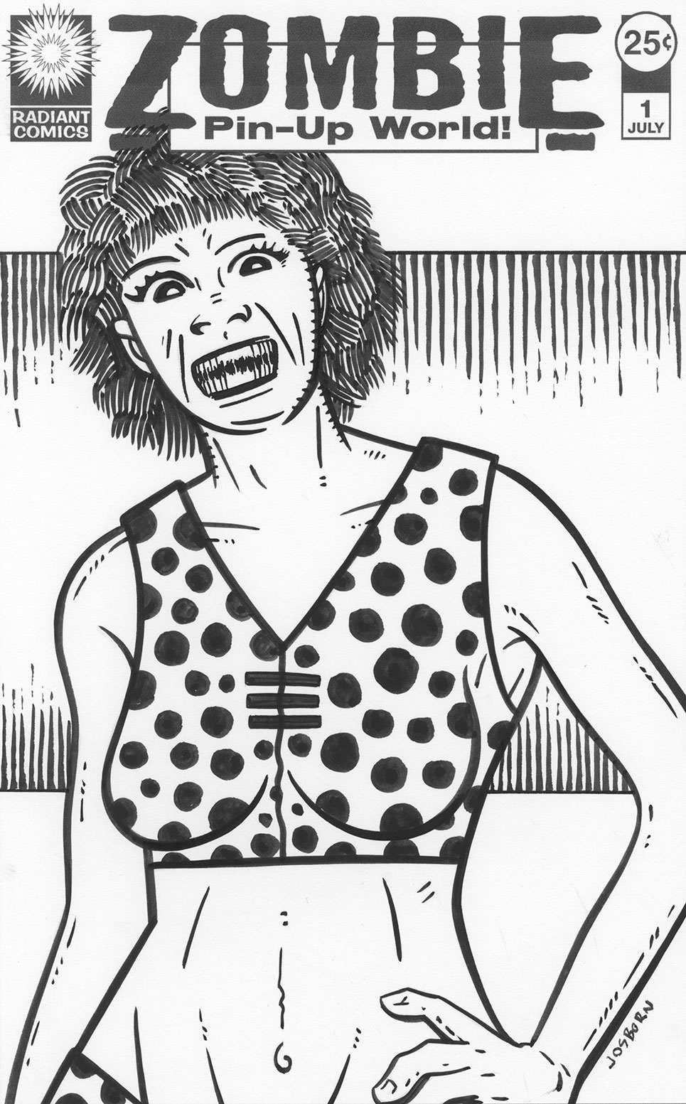
There I was with a “Pretty Danger” faux comic book cover that I had just finished and didn’t like very much. It wasn’t terrible but it was a little bland. I especially didn’t like her passive and emotionless face. I threw a piece to tracing paper on top of it and drew a new face. Since I have been drawing a lot of monster faces over the last couple of years that’s what I started to draw. Actually it may have started out as a cuter Dan DeCarlo Betty and Veronica type face but it didn’t stay there for long. DeCarlo draws these cute eyes with the pupils floating or near the bottom of the eyes. He does a great job of it. When I try to copy that style I often end up drawing crazy eyes. I think I did that in this case but it inspired me to further draw a crazy monster face.
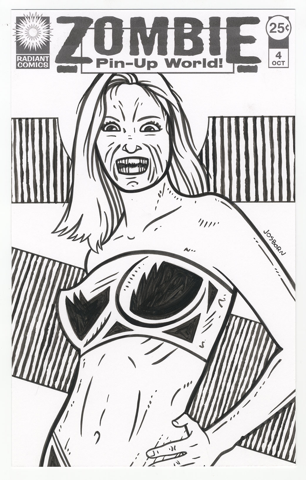
I’ve found the key to drawing one of my monster faces it the mouth. Nothing says “Monster” like an open mouth full of sharp and jagged teeth. After I drew the crazy eyes I moved down to the mouth a and drew those crazy teeth. That made it all come together in a moment. I suddenly had an idea I liked. Monster pin-up girls. Zombie pin-up girls in a Zombie Pin-Up World. Suddenly I had a name.
As hard as the “Pretty Danger” logo was to do the zombie one was easy. It’s barely a logo but I wanted something bland to fade into the background. I even went for a two font solution because, despite me not liking that solution very much, I think it was appropriate here. Two fonts, a box, and two underlines later I was done. I think this one took me about an hour. But I had already been working on the “Pretty Danger” one for twice that amount of time earlier in the day so I was warmed up for logos.
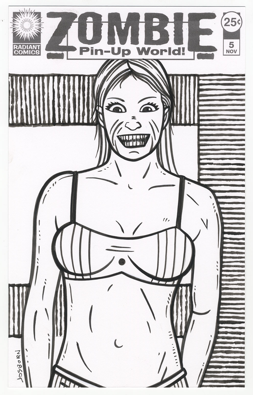
I printed out the the same basic pencil drawing that I used for “Pretty Danger” #1 to redraw for “Zombie Pin-Up World” #1. It was a fairly easy drawing to make since I had just drawn a similar one. I just made the face more monstrous and added extra lines to the body. Those lines sort-of define the form but also serve to give the body more texture as if it was a zombie body. I’ve noticed that the more “Detail” lines I add to the female figure the more people seem to think the drawing is ugly. I took advantage of that for these drawings. What are those lines? Scratches? Filth? Stink lines? Who knows, but they seem appropriate on zombies.
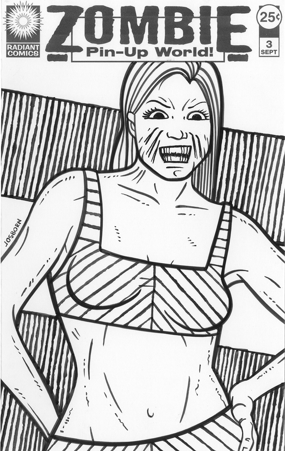
I liked the way the first one came out. It was still missing something so I came up with the background technique. It’s not a complicated technique but sometimes simple is the way to go. It involves defining the background space geometrically with just some simple lines. For the first issue I used just two horizontal lines with vertical ones comic off of them which makes the middle of the background into a positive shape as the top and bottom of the cover move into negative shape territory. I even went back to the “Pretty Danger”#1 cover and used this background technique on it. I think it helped the cover a lot. I especially like the circle around the character’s head that acts as a halo. I was okay with the “Pretty Danger” cover after that.
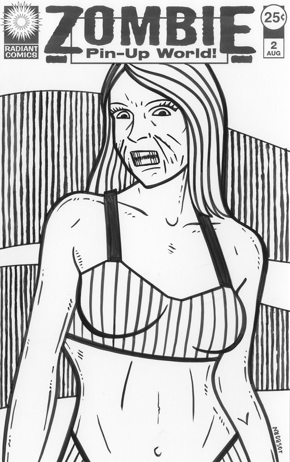
After I finished the first issue cover I immediately worked on two more. I got caught up. That’s what happens when an idea is going my way. It’s a bit amazing that it all started with an idea that wasn’t working for me. I pulled a couple of more basic drawings out of my stockpile and zombied them up. One of the problems I was having using these older photo referenced drawings was that they weren’t quite pin-ups. They had more to do with my usual “Female body as canvas” drawings since that is what I usually work on. I still like the way they came out but they had more flatness to them than a usual pin-up drawing. Flatness is something I work with all the time in my work but I wasn’t sure how much I wanted to use it here.
A few days later I made a fourth cover and looked around for a photo to draw from that was different than my normal ones. I found something with a little more twist to the body and shot form more of a pin-up angle. I followed that one up with a fifth one where I returned to the flatter angle that I had used before. I need both numbers four and five at the same time and it was a struggle to get number four to work. I liked the drawing but with the graphic background flattening things I had to find a way to bring her body twist back to life.
I had been using stripes and dots the decorate the tops the women were wearing but I couldn’t get that to work with cover number four. That was flattening things too much. I finally abandoned that whole approach and went with the black shapes on her top. That worked out for me. I liked it and it became my favorite one. Now I’ve got to make more.
I’m back from the comic shop this week and I got seven new comics.
Check them all out here:
Sometimes I have no idea what I’m doing. That’s just the way life is. Or maybe that’s just the way art is. I was trying to figure out what to make this week art-wise and I was at a loss. I had just finished up a bunch of my book projects and I was tired all my usual stuff. I’m not one to sit around and wait for inspiration though. I believe in doing things. Making art. Even if it’s not good art at least it’s something and that can lead to something good. Nothing always leads to nothing with me. Sitting around doesn’t help me. That’s why I have a variety of little projects I’m always working on. Art cards, ink cards, my spontaneous drawing book, and my 6×9 inch ink drawings to name a few things. But I had been doing enough of all of those little things and didn’t want to go back to them for the moment. I wanted something a little bigger than little.
That’s when I got it into my mind to do some more comic book size drawings of comic book covers. I normally do my “Covers to Comics That Don’t Exist” at a ten by fifteen inches (on eleven by seventeen inch paper) but these ones I do at six and a half by ten inches (trimmed right to the edge of the art). That’s the size of a printed comic book and I can put backing boards on them and slip them into comic book bags for viewing and handling. I think that’s pretty cool presentation. I’m easy to please sometimes.
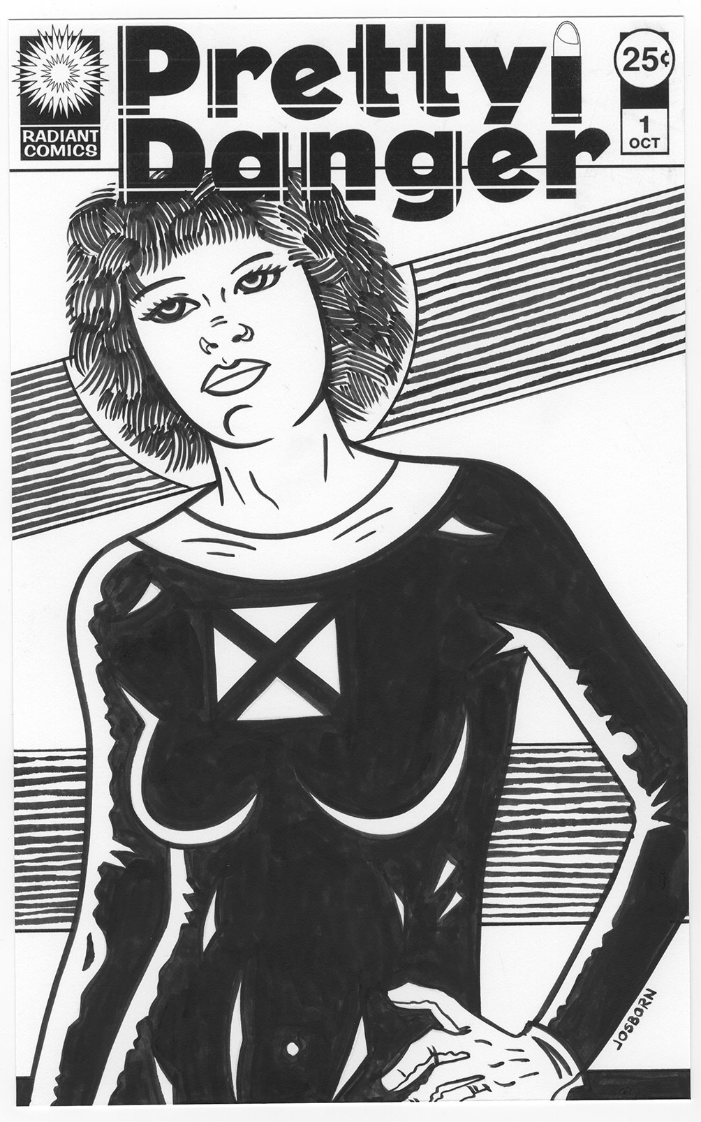
This time, for some reason, I could only come up with a half-baked idea for some new covers I wanted to draw. I wanted to draw a series of women that were somehow dangerous. How were they dangerous? I didn’t know That’s why the idea was not fully baked. I decided on the title “Pretty Danger” and spent a good few hours working on the logo. It took a while. Sometimes logos go easy and sometimes they go hard. This one tended towards the hard side. I must have messed around with dozens of fonts before I found a starting place. I even messed around with a two font solution which is something I don’t really like to do. Using two fonts for the two different words can be cheesy. The bullet case lipstick graphic I added to the logo already upped the cheese factor a bit. The lipstick graphic also looks much better in color than in black and white. It reads easy when the lipstick is red and the cartridge is brass but in black and white it gives me pause. I keep thinking about taking it out. But it fills a space nicely so it’ll stay.
All the time I was making the logo I was still thinking about what I wanted the drawings and cover to be about and I was getting nowhere. It was frustrating but I forged on ahead. After finishing the logo I was faced with my indecision and decided to make a decision. I didn’t want to start fresh and figure out an exact new pose to work with so I looked through my archive of basic drawings and picked out one to start from. It was just an underdrawing of a woman and I’d draw what I wanted on top of it. But what did I want? I still didn’t know. I didn’t let that stop me of course.
I finally decided that the only way I could think of to make this particular woman dangerous was to put her in a black cat-suit. Some things are classic for a reason. But I couldn’t even decide on a specific black suit for her. It just kind of ended up being all black with a white collar and white gloves. I don’t even know why. I added a negative space defining stylized X over her heart to symbolize her being heartless and dangerous but it may just look like an X-Men costume. It doesn’t look like any specific X-Men costume I can remember but they must have had something similar over the years. Four triangles making an X isn’t that innovative so lots of people have probably drawn it.
>P> First I drew it in pencil, then I scanned it into the computer, and finally I printed it out in blue line with the logos on it for inking. I inked it all with a brush. After I got the inking done I gave it a good look and y’know what? It wasn’t very inspired. It seemed a bit dull to me.
I try not to let things that don’t come out right get me down. Sometimes I do something badly and abandon it before it’s done but that’s different than finishing something and then not liking it. You have to learn to be ruthless when working on a piece and it’s not going in a good direction. Abandon it and start over or you’ll end up wasting time trying to fix what can’t be fixed.
Something not coming out as you hoped it would is a different thing entirely. I might not like it but someone else could. That happens. They don’t have the vision of it that’s in my head so they’re judging it by what it is and not by what it’s not as I am. One of the things I’ve had to learn is to allow people to like a piece of art of mine that I might not like. Give them that space to appreciate it. I have to not ruin their good time with my frustration. It’s not an easy thing to learn.
In looking at the finished “Pretty Danger” piece I was plain bored by it. I thought her face looked passive and very un-dangerous. I have since added a patterned background to it that makes me like the drawing much better but at the time the lack of background wasn’t helping the drawing. In the end I was so frustrated that I threw a piece of tracing paper over the drawing and proceeded to draw a whole new and very mean and twisted face on her. That of course put me in the mind of making her a zombie. More on that next week.
I’m back from the comic shop this week and I got two new comics plus some freebies.
Check them all out here:
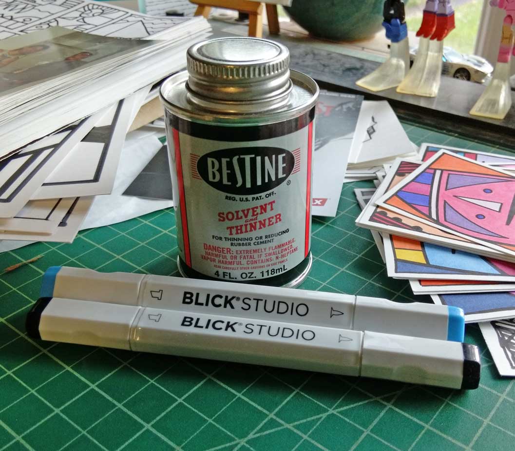
What am I writing about today? How about a pointless trip to the art store. Since I’m a total art supply geek it wasn’t really a pointless trip but I didn’t go there for anything specific. It was more of a spur of the moment trip. A friend of mine needed some paper so I went along for the ride and to see if they had any Tahitian Blue Copic marker ink.
Tahitian Blue has been the color that’s eluded me. It was the first color Copic marker that I ever bought and it’s a favorite of mine. It’s such a nice color blue. I still have a marker that’s full and a little ink left in my refill bottle but I need a new one. About a month ago I ordered from the Dick Blick website but they were out of stock on almost all of their Copic marker supplies. I have no idea why that was but it meant I couldn’t get one. The last two times I was to the Paramus NY Dick Blick store they also didn’t have any Tahitian Blue refills. I figured maybe they would this time. I’ll save you the suspense. They didn’t.
It was odd that they had about twenty other different types of blue refill ink but not the one I needed. They have a really nice point-of-purchase display for their markers. It lines up all the markers and refills in different spots and you can spin it around to see what they have. I spun around to the refill section (I really should have brought my reading glasses but they’re new and I’m not used to carrying them) and looked through it thoroughly. There wasn’t even a spot for Tahitian Blue. Up in the marker section that had a few Tahitian Blue markers in stock so why don’t they have the the refills? It’s a mystery to me.
I ended up buying a couple of new markers though. Not Copic ones but a couple of the new Dick Blick brand brush markers. They’re done in the Copic style with a brush marker on one end and a chisel tip on the other. At four dollars a marker they’re a couple of dollars cheaper than Copics but being that there is no refill ink for the Blick ones they have to be thrown away when they run dry. That ultimately makes them more expensive in the long run. I bought them just to try them out. Lately I’ve been buying a black and a blue marker when trying out a new brand so that’s what I did here. I haven’t really put them trough their paces but so far with a little drawing with them they seem nice. They brush tip is smooth and the ink flows nicely. Without refills they have almost no chance of joining my starting lineup of markers but we’ll see if Blick comes out with refills some day.
The second thing that I bought was a little can of Bestine Rubber Cement Thinner. I mostly use that for removing glue residue from anything that might have sticker glue residue on it (often comics, pens, or books). It’s only a small four dollar can but I always feel a little disappointed when I buy something like that because it’s not an art supply I make something out of. I maybe should have spent a little more on the bigger can. This one is only four ounces and the larger twelve dollar one was sixteen ounces. But it really wasn’t the size that makes me say that but the can itself. I had one of the sixteen ounce size for years (I really don’t use it that much) and it served me well. After that I got a four once can and it seemed to run out fast. I think that was because it evaporates more quickly out of the smaller can. If the lid is even a little loose the can can dry out. I think I lost a lot of the last can because of that. I’ll have to see how this one does.
The other thing that I was going to buy but didn’t was another Simmons white sable round brush. I ended up not getting any because they were considerably more expensive at the store than online. They had a confusing discount on them that didn’t help.
At the Blick website the brush that I wanted was about five dollars. I’ve bought them there before. In the store the same brush was ten dollars. I believe that’s the full retail price on them. There was also a sign that said if you spent forty five dollars then the brushes were five dollars a piece. But what the heck does that mean? If I buy five ten dollars brushes does that cost twenty five dollars? Or is the sixth brush I buy then five dollars? What if I buy fifty dollars worth of paper and fifty dollars worth of brushes? Does that make the brushes twenty five dollars? What if they ring up the brushes first? That made me not want to bother with the brushes. I’ll get some more another day at the web site. At least there I’ll know the price.
I do like the Dick Blick store in Paramus because it’s a real art store that has real art supplies in it. They are usually a little more expensive than online but it’s fun to go to an art store. I also go to A.C. Moore but that’s more of a mainstream arts and crafts store. Sure I can get some stuff there but it’s mostly crafting supplies. They don’t have any Copic markers at all and that don’t even carry the Simmons white sable brushes among their other Simmons brushes. I’ve purchased some Strathmore 300 Bristol paper from A.C. Moore before but the reason we had to go further away to Dick Blick is that A.C. Moore doesn’t carry the Strathmore 400 Bristol. That’s the good stuff that my friend needed.
I’m back from the comic shop this week and I got seven new comics.
Check them all out here:
This week I’ve finally finished everything for a project that I’ve been working on. It’s my first print-on-demand magazine style collection of some of my art. My Painted Lady and Swirl World pieces. Except I can’t seem to finish the written introduction. The digital books that I recently made were a mixture of art and writing but this one is all art. That made me think I need some sort of writing at the beginning to explain things. Makes sense. Most art books have introductions. Much as I’ve tried I couldn’t seem to get it started though. I don’t know why. I often seem to have problems stating a writing project. I have no problems writing my weekly post for here though. That is such an ingrained habit that it doesn’t need any special effort. Just regular effort. It’s not always easy but at least it’s familiar. So I decided to combine the two tasks and see if I could come up with an intro here. After all I often write about my art here. So here we go with the intro.
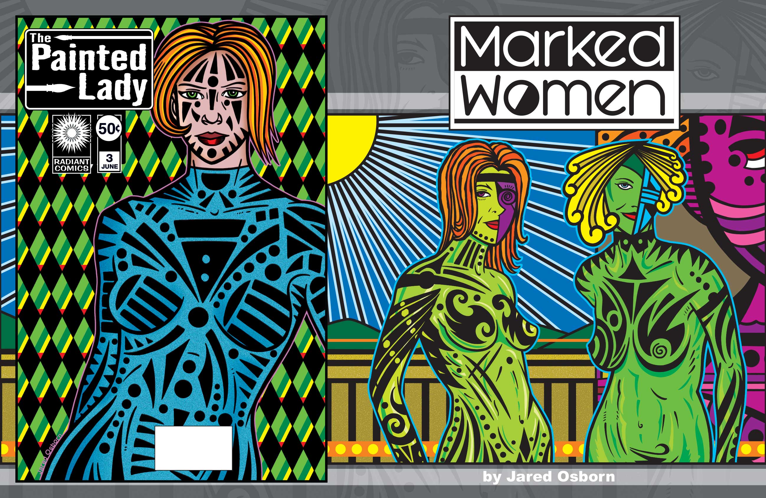
Artists have habits. Ways of doing things. From the way a pencil is held to how to stand, or sit, while working. Artist also have themes. Subjects they like to work with. Visuals that appeal to them so they come back to them over and over. Landscapes, monsters, the human figure, architecture, faces, t-shirts, and comic book covers are some of the subjects that I come back to again and again.
I get caught up in a them. If making one faux comic book cover is fun than making six of them is even more fun. It turns a piece into a series. That puts the original piece in a new context. There is also fun in looking at them all together when they’re done. Mind you it’s not a lot of fun to do six times the work in order to make a series but that’s what it takes. Exploring variations on a theme always takes more work that a one off image.
I make plenty of single images too because coming up with new imagery is one of the things I like to do but one working with a imagery theme imagery can be habit forming. Each new picture puts the others in a new light. Number one becomes a different thing when there is also a number two and number three and by the time a number ten rolls around there is a whole new context to the series. I like changing contexts.
Another of the things I like to do is to draw on bodies. As I am a fan of drawing weird faces it all started out there. I’d draw faces with exaggerated features but I’d reach the limits of exaggeration. Still I would want to make the faces even stranger. would often do such things as draw one of the eyes to look “realistic” eye but with the second eye I’d draw a series of flat circles and lines done in a “design-y” fashion to suggest an eye. From there it was natural that I began to expand that “design-y-ness” to the rest of the face. Faces got black bars, circles, and triangles on them. I was decorating them.
The next logical step was to move those markings from the face to the rest of the body. When I first starting drawing what I now call my “Marked Women” it took a long time to complete one. I would work with layers of paper. First I would draw the basic figure on one piece of paper and after that I would draw the black markings on another piece of paper. Then I even added two more steps. I would draw where the darks and highlights of color would go on yet a third piece of paper. I would then put them all together digitally and color the whole piece on the computer. It was a overly long process and frustrated me quite a bit. I completed a number of prints with this method but then it lay fallow for quite a while. It wasn’t until a few years later that I picked up the technique again.
Another of my techniques is to make women’s breasts into swirls. I’m not sure where or why I picked this up but I don’t think it’s terribly uncommon. I would add swirls into a general drawing of a female figure every now and again but it was a while before I made a drawing about the swirls. As a matter of fact I first made paintings about the swirls. It was about ten years ago that I made a series of a half a dozen eight by ten inch acrylic on canvas paintings that involved many of the same drawings as my “Swirl World” images you see here. I thought the paintings were okay but they didn’t thrill me. I stopped the series. Yet, a few months ago, I remembered the drawings and wanted to see if I could bring them in a different direction.
By this time I had been making my “Covers to Comic Books that Don’t Exist” series for years. Those are faux comic book covers where I make up a series name, logo, and trade dress and then draw and ink a comic book cover. I came up with the “Painted Lady” series and had drawn a few covers by then but had since left it alone. I picked up the idea a few years ago and by that time all my experience with drawing on female figures made the process a lot faster and I no longer needed all the layers of paper. For the “Painted Lady” series I drew out the figure by itself and then drew on all the markings. I did the same with the “Swirl World” figures except I left the color darks and highlights to be done totally on the computer. By this time I knew what to put in and leave out. That is totally what was missing at the beginning of my Marked Women drawings. Now I have it down better.
So there you have a little look into the origins and processes of this series of drawings that I have to present. A little glimpse inside my head as I made these. I hope you have some fun looking at them.
And here is the link to the book on Blurb” http://www.blurb.com/user/13Jack