Sometimes I have no idea what I’m doing. That’s just the way life is. Or maybe that’s just the way art is. I was trying to figure out what to make this week art-wise and I was at a loss. I had just finished up a bunch of my book projects and I was tired all my usual stuff. I’m not one to sit around and wait for inspiration though. I believe in doing things. Making art. Even if it’s not good art at least it’s something and that can lead to something good. Nothing always leads to nothing with me. Sitting around doesn’t help me. That’s why I have a variety of little projects I’m always working on. Art cards, ink cards, my spontaneous drawing book, and my 6×9 inch ink drawings to name a few things. But I had been doing enough of all of those little things and didn’t want to go back to them for the moment. I wanted something a little bigger than little.
That’s when I got it into my mind to do some more comic book size drawings of comic book covers. I normally do my “Covers to Comics That Don’t Exist” at a ten by fifteen inches (on eleven by seventeen inch paper) but these ones I do at six and a half by ten inches (trimmed right to the edge of the art). That’s the size of a printed comic book and I can put backing boards on them and slip them into comic book bags for viewing and handling. I think that’s pretty cool presentation. I’m easy to please sometimes.
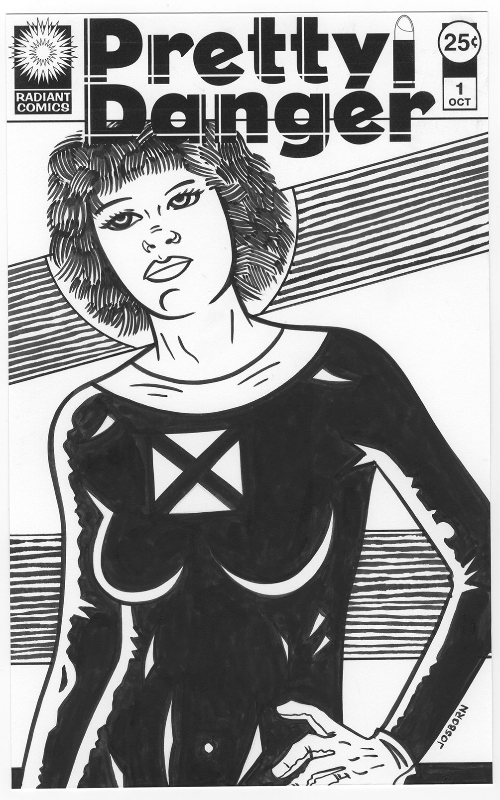
This time, for some reason, I could only come up with a half-baked idea for some new covers I wanted to draw. I wanted to draw a series of women that were somehow dangerous. How were they dangerous? I didn’t know That’s why the idea was not fully baked. I decided on the title “Pretty Danger” and spent a good few hours working on the logo. It took a while. Sometimes logos go easy and sometimes they go hard. This one tended towards the hard side. I must have messed around with dozens of fonts before I found a starting place. I even messed around with a two font solution which is something I don’t really like to do. Using two fonts for the two different words can be cheesy. The bullet case lipstick graphic I added to the logo already upped the cheese factor a bit. The lipstick graphic also looks much better in color than in black and white. It reads easy when the lipstick is red and the cartridge is brass but in black and white it gives me pause. I keep thinking about taking it out. But it fills a space nicely so it’ll stay.
All the time I was making the logo I was still thinking about what I wanted the drawings and cover to be about and I was getting nowhere. It was frustrating but I forged on ahead. After finishing the logo I was faced with my indecision and decided to make a decision. I didn’t want to start fresh and figure out an exact new pose to work with so I looked through my archive of basic drawings and picked out one to start from. It was just an underdrawing of a woman and I’d draw what I wanted on top of it. But what did I want? I still didn’t know. I didn’t let that stop me of course.
I finally decided that the only way I could think of to make this particular woman dangerous was to put her in a black cat-suit. Some things are classic for a reason. But I couldn’t even decide on a specific black suit for her. It just kind of ended up being all black with a white collar and white gloves. I don’t even know why. I added a negative space defining stylized X over her heart to symbolize her being heartless and dangerous but it may just look like an X-Men costume. It doesn’t look like any specific X-Men costume I can remember but they must have had something similar over the years. Four triangles making an X isn’t that innovative so lots of people have probably drawn it.
>P> First I drew it in pencil, then I scanned it into the computer, and finally I printed it out in blue line with the logos on it for inking. I inked it all with a brush. After I got the inking done I gave it a good look and y’know what? It wasn’t very inspired. It seemed a bit dull to me.
I try not to let things that don’t come out right get me down. Sometimes I do something badly and abandon it before it’s done but that’s different than finishing something and then not liking it. You have to learn to be ruthless when working on a piece and it’s not going in a good direction. Abandon it and start over or you’ll end up wasting time trying to fix what can’t be fixed.
Something not coming out as you hoped it would is a different thing entirely. I might not like it but someone else could. That happens. They don’t have the vision of it that’s in my head so they’re judging it by what it is and not by what it’s not as I am. One of the things I’ve had to learn is to allow people to like a piece of art of mine that I might not like. Give them that space to appreciate it. I have to not ruin their good time with my frustration. It’s not an easy thing to learn.
In looking at the finished “Pretty Danger” piece I was plain bored by it. I thought her face looked passive and very un-dangerous. I have since added a patterned background to it that makes me like the drawing much better but at the time the lack of background wasn’t helping the drawing. In the end I was so frustrated that I threw a piece of tracing paper over the drawing and proceeded to draw a whole new and very mean and twisted face on her. That of course put me in the mind of making her a zombie. More on that next week.
Discussion ¬