I draw in layers. Most artists do. A thumbnail sketch becomes a pencil sketch, then a finished drawing, and then maybe an ink drawing. This can all happen on one piece of paper or on a few pieces of paper. One of the ways I do it is with tracing paper. Throw a piece of tracing paper over a drawing and redraw on the new piece of paper. That can free the mind from the fear of making mistakes and saves erasing. Or in the case of a finished ink drawing where I can’t erase anyway it let’s me redo something.
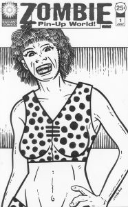
There I was with a “Pretty Danger” faux comic book cover that I had just finished and didn’t like very much. It wasn’t terrible but it was a little bland. I especially didn’t like her passive and emotionless face. I threw a piece to tracing paper on top of it and drew a new face. Since I have been drawing a lot of monster faces over the last couple of years that’s what I started to draw. Actually it may have started out as a cuter Dan DeCarlo Betty and Veronica type face but it didn’t stay there for long. DeCarlo draws these cute eyes with the pupils floating or near the bottom of the eyes. He does a great job of it. When I try to copy that style I often end up drawing crazy eyes. I think I did that in this case but it inspired me to further draw a crazy monster face.
I’ve found the key to drawing one of my monster faces it the mouth. Nothing says “Monster” like an open mouth full of sharp and jagged teeth. After I drew the crazy eyes I moved down to the mouth a and drew those crazy teeth. That made it all come together in a moment. I suddenly had an idea I liked. Monster pin-up girls. Zombie pin-up girls in a Zombie Pin-Up World. Suddenly I had a name.
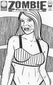
As hard as the “Pretty Danger” logo was to do the zombie one was easy. It’s barely a logo but I wanted something bland to fade into the background. I even went for a two font solution because, despite me not liking that solution very much, I think it was appropriate here. Two fonts, a box, and two underlines later I was done. I think this one took me about an hour. But I had already been working on the “Pretty Danger” one for twice that amount of time earlier in the day so I was warmed up for logos.
I printed out the the same basic pencil drawing that I used for “Pretty Danger” #1 to redraw for “Zombie Pin-Up World” #1. It was a fairly easy drawing to make since I had just drawn a similar one. I just made the face more monstrous and added extra lines to the body. Those lines sort-of define the form but also serve to give the body more texture as if it was a zombie body. I’ve noticed that the more “Detail” lines I add to the female figure the more people seem to think the drawing is ugly. I took advantage of that for these drawings. What are those lines? Scratches? Filth? Stink lines? Who knows, but they seem appropriate on zombies.
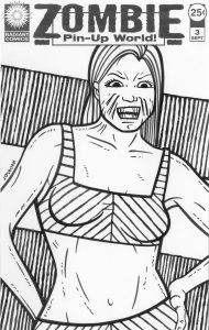
I liked the way the first one came out. It was still missing something so I came up with the background technique. It’s not a complicated technique but sometimes simple is the way to go. It involves defining the background space geometrically with just some simple lines. For the first issue I used just two horizontal lines with vertical ones comic off of them which makes the middle of the background into a positive shape as the top and bottom of the cover move into negative shape territory. I even went back to the “Pretty Danger”#1 cover and used this background technique on it. I think it helped the cover a lot. I especially like the circle around the character’s head that acts as a halo. I was okay with the “Pretty Danger” cover after that.
After I finished the first issue cover I immediately worked on two more. I got caught up. That’s what happens when an idea is going my way. It’s a bit amazing that it all started with an idea that wasn’t working for me. I pulled a couple of more basic drawings out of my stockpile and zombied them up. One of the problems I was having using these older photo referenced drawings was that they weren’t quite pin-ups. They had more to do with my usual “Female body as canvas” drawings since that is what I usually work on. I still like the way they came out but they had more flatness to them than a usual pin-up drawing. Flatness is something I work with all the time in my work but I wasn’t sure how much I wanted to use it here.
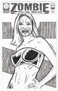
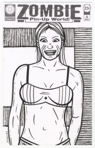
A few days later I made a fourth cover and looked around for a photo to draw from that was different than my normal ones. I found something with a little more twist to the body and shot form more of a pin-up angle. I followed that one up with a fifth one where I returned to the flatter angle that I had used before. I need both numbers four and five at the same time and it was a struggle to get number four to work. I liked the drawing but with the graphic background flattening things I had to find a way to bring her body twist back to life.
I had been using stripes and dots the decorate the tops the women were wearing but I couldn’t get that to work with cover number four. That was flattening things too much. I finally abandoned that whole approach and went with the black shapes on her top. That worked out for me. I liked it and it became my favorite one. Now I’ve got to make more.
Discussion ¬