I’m back from the comic shop this week and I got six new comics.
Check them all out here:
I’m back from the comic shop this week and I got six new comics.
Check them all out here:
So what have I been reading lately? Comics. Mostly new comic books at that. I often mean to go back and read some long runs of old favorite comic that I have but that’s no easy for me to find time for. I won’t go into what new comics I’ve been reading since I post what comics I get every week on this very blog. It’s usually around five or six comics a week so that’s fair amount. Plus I read them all twice. I read them once and then sit them on top of my printer to be read again a week later. I find I get more out of my new comics if I read them twice before filing them away.
The first time I read a comic it’s often about the plot. What happens next. The second time I read the comic I catch more of the nuance. I’m not rushing along headlong with the plot and stop and so I appreciate the scenery. I often see different things in a comic the second time around. That second read can be a different experience from the first. I started doing this a few years ago because I was so quick filing away my comics that is was often like I never read the thing. Out of sight. Out of mind. Now a new comic hangs around in my sight for a week or two. I find it makes me more mindful of them.
One thing I’ve read a lot of lately is a magazine I have a subscription to. It’s called “The Sun” and I’d describe it as a literary magazine. A magazine that’s about writing. It’s filled with short stories, one interview an issue, essays, poems, and some photography. Some of the stories can be heartbreaking and a little depressing because the writing is all about real life and sometimes life can be a bummer. But I really enjoy the magazine and have been a subscriber since sometime in the early 1990s. That’s a long time.
For the first time ever last fall I stopped reading the magazine and let them pile up for six months. I have no idea why. I just didn’t feel like digging into it. “The Sun” is like that sometimes with me. I look at it, remember the more depressing stories, and don’t want to read it. When I get around to reading it I always love it and am a little sad when I finish it. This past summer I was also saving the magazine to read on my train rides into Manhattan when I went to take street photos. I think I was a little disappointed the summer was over. Anyway it happened I had six issues sitting there.
I read those six issues in about two weeks. Once I started I just kept going. I’d read a little here and there but mostly I stopped putzing around reading on the internet. That can really suck up reading time because it takes some time to find something worth reading. A half an hour can easily go by surfing the web. That’s a quarter of a magazine’s worth of reading time. I dedicated that time to “The Sun” and read up everything I had. It was a lot of fun.
The other magazine I’ve been reading lately is “Archeology.” That one comes out bi-monthly as opposed to “The Sun” which comes out monthly so there are half the number of issues of “Archeology.” I kept up with those and am in the middle of the latest issue. As a history fan I really like the magazine. Plus the front half of it is filled with short stories of bits of news and so is easy to read in small bursts.
Another thing I read every morning with my breakfast is a regular bunch of webcomics. “The Devil’s Panties”, “Least I could Do”, “Wondermark”, “Girls With Slingshots”, “Oglaf!”, “Something Positive”, and “Doonesbury” are all on my list. They don’t take up a whole lot of time but over the years it adds up.
I’ve given up reading paper books. With all my paper comics I don’t have the room for them. I’l sample digital comics but it I like a comic I’ll buy a paper copy of it. Regular books get read on the iPad. I really do enjoy reading text on the iPad. I have a whole bunch of books for it too that I’ve never read. Since I’m a member of Amazon Prime I get one free book a month from a handful that they send out. I always pick the one I’m most likely to read but since I don’t have a ton of book reading time I only get to one in ten. But I have read a couple of books that I bought for the iPad.
It was a while ago, maybe in the summer, that I reread “The Great Gatsby.” That was fun. I like it better than when I first read it many years ago. I’ve meant to reread “This Side of Paradise” too but haven’t yet gotten around to it. I’ve also read some books on the history of Christianity and the origins of some famous quotes. I told you I liked history.
The book I’m reading right now is a short biography of Roy Lichtenstein entitled “Lichtenstein in New York: A Pop Art Life.” Its written by a former Marvel co-worker friend of mine, Mark Bernardo, who I keep in touch with on Facebook. He posted his book was coming out and I thought it was right up my alley. As an artist I’m, of course, familiar with Roy Lichtenstein and we studied him back in art school but I’ve never read any kind of biography on him. I still have a few more chapters to go but I’m really enjoying it. It’s written well and I’m learning quite a bit. It does a good job capturing a moment in time when Pop Art broke onto the scene. It does a good job with the other times in the book too.
So that’s what I’ve been reading. What about you?
I’m back from the comic shop this week and I got nine new comics.
Check them all out here:
“Time really does fly” was the thought that went through my head as I looked at my painting “Sand Storm.” More accurately the thought went through my head when I flipped the painting over and looked at the date. July 25, 2007. We’re coming up on this painting being ten years old. It’s an acrylic painting done on an 10×8 inch stretched canvas. I pulled it off the shelf to look at and write about it. That’s what I do sometimes.
The first thing that strikes me about this painting is the orange. I really liked that orange paint but they stopped making it. I can’t remember anymore exactly what color it is but I think the brand is Winsor Newton. They replaced it with another orange that’s pretty good but falls just a little bit short for me. I use the new orange because it’s the best orange around but I still like this older version better. The orange is interesting in this painting because it’s the strongest color, yet it’s in the background. This means the eye fights to keep it in the background as the orange wants to come forward. It even peeks through the yellows of the sand storm. That keeps things lively.
I used two main techniques for making this painting. One was how I made the buildings and the other was how I made the sky. The building technique comes out of my sketchbook where I draw with a sign pen. That type of pen draws with a single weight marker line and over the years I started drawing buildings with it by making basic shapes and then filling those shapes with various angled parallel lines. It gives the illusion of architectural detail without being hemmed in by having to draw actual architecture. They’re art buildings. You wouldn’t want to really build them. Plus it gives the buildings a familiar but alien look. They don’t quite look like the building we know but they look like we could know them. They’re not so alien that someone might think, “What is that? Is that a Building?”
The buildings are different than the ones I draw in pen because of the color. The pen ones are all made with just a line and therefore the line is the positive shape and the space in-between the lines are the negative shapes. In the painting I used a black line to create the building but then I went in with color over the line and the color became the positive shape. Whatever brush stroke is on top becomes the positive shape. Its shape defines the shape that’s underneath it. So as you can see I use two different color blues in the house and the blue brush strokes are right overtop of the black paint. I even brought the blue into the fence on the left. I bet I was originally going to let the orange of the sky show through the fence but then decided it would look better with a touch of blue. I let the orange show through the top of the fence though.
The second technique is the spirals in the sky. I like spirals. Who doesn’t? I think Van Gogh’s painting “Starry Night” is one of his most popular painting because he has a couple of spirals in the sky. They’re more natural than my geometric spirals but they’re there. I think that may have been what gave me the idea for the spiral skies that I draw. I’ve always drawn spirals but they were usually in hair, in eyes, and in womens’ chests. I don’t think I used them in skies until right around this time. Spirals work well in paint. With ink they’re all about the graphic design but since paint has a more 3D surface you can build the spirals out of brush strokes. They sit on top of the canvas and become an object of their own. They become the subject of the painting rather than the design.
I wish I was masterful enough with the brush and paint to make those spirals with one stroke, in one motion but either my skills or the tools won’t allow it. I’ve seen videos of Chinese or Japanese brush master make all sorts of beautiful long brush strokes in ink on paper but the thicker acrylic paint that I use can’t do that. At least I don’t know how to do it. Instead I build the strokes up slowly. I go over them a few times to get the shape I want. Since the strokes are made up of three colors I moved back and forth between them until I decided on an order. The bright yellow ends up in front as the positive shape with the darkest brown helping to define the yellow’s place.
I don’t think much of the ground on the bottom of the painting. It’s just there. It’s only purpose is to provide a solid foundation for the picture. It gives the world its gravity. The color is a warm brownish red but it’s the closest thing to a neutral that this painting has. There is some action going on in the brush strokes but it’s minimal. I didn’t want it to compete with the sky and the house. The land should stay in its place.
Overall I think this is a fairly simple painting. Maybe because I think of landscapes a simpler than figurative painting. Simple isn’t bad either. I like simple. It’s not always east to achieve. We have the top third to half filled with spiraling sand, the middle with sand and orange sky, and the bottom third id the ground with a solid house on top of it. I bet there is some sort of classic landscape formula that landscape artists use for such arrangements but I don’t know of it. I more of a faces and bodies artist but every now and them I like to dabble. And I really like that orange.
I’m back from the comic shop this week and I got seven new comics.
Check them all out here:
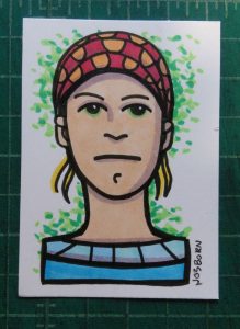
I like to make cards. Baseball or trading type of cards. I mention this because I made some recently. I use them as giveaways to get people to go to my website. I don’t give that many of them away but if I run into someone who is interested I can hand one out. Like a business card. I like trading cards in general and find it fun to make my own.
Back in the 1990s I used to buy trading cards but only get them every now and again these days. Maybe once every year or two I buy some cheap cards on eBay. This past winter I pulled the trigger on a “Woman of James Bond” lenticular card set. Those are the kinds of cards that have a few images on them and when you move the card from side to side it appears like the people on the card are moving. It’s a little animation. What’s weird about these lenticular cards is that they’re printed on clear plastic. That made them hard to see. It was only when I put a white piece of paper behind them that I was able to see them clearly. I found that odd. Probably why it was only a ten dollar set. And they were chase cards. So obviously no one was chasing them anymore.
My cards are printed on my home printer. It’s easy to do once I set up a template for it but it’s the template that’s the tricky part. Not calculating rocket trajectories tricky but feeding lots of paper through the printer tricky. My cards have backs and fronts and I have to get them to line up. So I print out an outline of the front of the cards for placement, flip the paper over, and then print out an outline of the backs. This never works the first time. I have to go back and nudge the outlines on the back a little bit. They print it again. It usually take half a dozen tries to get the cards to line up correctly and often things go mysteriously wrong but I can get it eventually. And once I get it done I’ve got a template that works for all cards the same size.
After the template is finished (for 2.5×3.5 inch cards by the way) it’s just a matter of picking out artwork. Well, you have to have a design for the back of the cards too. I guess I skipped that part since I’ve been using the same back design for a while now. It takes some time to come up with something but that’s not hard. It’s just one design. It’s easier than making all the art for the fronts. Not that I make all the art at once. I’m picking art from all the art I’ve done over the years so I don’t do any specifically for my giveaway cards. That makes things easier.
It does take a little doing to pick art though. I have a lot of choices but it always the cropping that’s a problem. Not all my art has the same proportions as the cards I’m making so I have to cut the sides or top and bottom of of some art. It’s all done digitally so there is no fear of ruining the physical art but often a crop in the wrong place can weaken a piece of art.
There is also the tedium of filling up the template. I have to pick a piece, go find the right digital file of it, paste it into the template, resize it, crop it, and then repeat that until I have nine cards on the page. It’s not dragging rocks up a hill but it’s not exactly exciting either. I try to mix things up and get a variety of stuff on one page. Plus I rarely make only one sheet of cards. Usually I like four or five sheets for the variety. That’s gives me a much bigger job to do but I like the results.
One good piece of advice I can give you is to print out one page of card backs and then one page of card fronts. Both on the same page. There have been times that I’ve printed out five pages of card backs all at once and then started to print five pages of card fronts after that. I thought everything would be fine since it wasn’t a new template but everything wasn’t fine. I didn’t even look at the prints until the second one was out of the printer. It was somehow misaligned. One of those things that mysteriously goes wrong. I had to start from scratch and make my template line up again. It was a lot of paper and ink wasted. Now I always check the first printout even if the template has worked fine in the past.
Now it’s time for the laminator. If you don’t have a laminating machine they only cost about $20 plus another $10 thrown in for some laminating pouches. That’s the plastic. You put the printout into the plastic sleeve/pouch and run it through the laminator. This part is pretty darn easy but make sure there is no dust or grit on the paper before you laminate it. Just a precaution.
The last step is to cut out the cards. This is most work and my least favorite part. I use an X-Acto knife and a metal ruler to cut against. It takes some practice to line the ruler up in just the right spot to cut against. Take it slow and concentrate. My template has the cards butting up against one and other so I only need to make one cut between the cards. That would take two cuts if they weren’t butting. But I have to be extra careful to get the cut right or I ruin two cards.
One last step that I’ve been skipping lately is to use a corner punch on the cards. I used to like my card to have round corners like a playing card but lately I’d preferred them with sharp rectangular corners like a baseball card. I think the art looks better that way. A corner punch is a little hand held thing that you put paper in, press down on, and it cuts the corner round. It’s convenient but it’s tough going through the lamination. It takes a lot more pressure. I used to press down on it with a small piece of scrap wood rather than the palm of my hand because I had to do it so many times in a row that my hand hurt. The corner punches also get dull fairly quickly cutting through laminated paper. Another reason I stopped rounding my corners. But I’m still making cards. They’re kind of fun.
I’m back from the comic shop this week and I got seven new comics.
Check them all out here:
I put four different types of drawings onto my easel the other day. To look at them. I do that all the time with my drawings and paintings but I usually put drawings of a single type or from a single series up to look at. That gives me an idea of what I’ve done and where I’m going. Putting the four different types of drawings up was different. It ended up making me compare and contrast them. Especially since all four are the same size but made with four different techniques. That’s worth contemplating.
The Walking Dead “Monster Nine” – This is one of my hand bound sketch covers. Like the World’s Finest 290 sketch cover it looks like it’s the same size as the other two but the drawing actually continues on the back cover. On both of them there really isn’t much to the back cover so it’s easy to count just the front. It’s only a piece of shoulder on the back.
“Monster Nine” is the only one that’s in black and white. It’s actually only in black because it’s made with black ink and no white paint. The only white on the cover is the white of the page. “Snow Creep” is also in black and white (with the paper having color on it) but it’s made with black ink and white pastel. That’s a different type of black and white.
As the title implies I’ve done eight monsters on Walking Dead covers before this one. Some patterns have emerged. This monster is of the skinny-necked variety. I seem to got thick or skinny with the necks. Plus he has more normal teeth. The other teeth I do are all giants fangs. There are only four or five fangs across and they are big sharp triangles. This guy could have any number of teeth.
World’s Finest 290 – This is the second Superman I’ve done for one of these sketch covers. With these I’ve been taking a headshot from a panel on the inside and blowing it up to fill the cover. I’ve found that it isn’t always easy to find a good head shot inside. Each comic only has a couple of choices that are suitable for my purpose. Since I’m going in tight for a close up I often have to add a little art to the shoulders. Often word balloons cover parts of the shoulders.
Since I’m taking a headshot that could only be an inch tall and blowing it up to six inches tall the lines get bigger too. And I keep them that way. I like the big chunky forms that made up the eyes and rest of the face when they’re blown up. I have no interest in redrawing them with smaller and more detailed lines. I found them less striking when I tried to do that. Plus it a challenge to make the shapes work at a larger size. I find that fun.
Monsters On Comics “Snow Creep” – This is the first one of this type that I’ve done in a while. I first started drawing on pages torn from a comic because my local comic shop was throwing out some destroyed old comics but some of the pages were still good. I brought them home and used marker and white conté crayon to draw on them. But soon I was out of conté crayon and bought some new ones to replace the old ones. Turns out the new ones were crap and didn’t get the job done. So I stopped making these.
Of course you noticed up above that I wrote this drawing was made with pastel and not conté. When I ordered some art supplies I added in a Rembrandt super-soft white pastel. When it arrived I decided to give it a try with a new monster drawing. It worked like gangbusters. The pastel was even softer than the good conté crayon and it was like working with a stick of butter. The white come off the pastel stick so smoothly. Though I was so busy learning the new tool that I didn’t concentrate on the drawing as much as I should have. I don’t think this is one of my stronger monsters. I didn’t get the eyes anywhere near even on the face as one floats higher than the other but since it’s a weird monster it’s not that big a deal.
Far Away Worlds 9 – I consider the final one of the four to be the most fanciful. I don’t do a lot of landscapes so I started doing this series so I could let loose a little. I could throw off my shackles of figurative drawing and make something out of whatever crazy lines came out of my brush. I’d work with horizontals, diagonals, and verticals to create and alien space rather than my normal shapes and forms.
Of course I had to throw some eyeballs in because I didn’t seem to like the drawings as totally non-figurative. I also think a giant eyeball staring out at us makes the drawing a little more creepy. And oddly a little more relatable too. The landscape seems a little more impenetrable without the eye there. I can relate to the eye and it lets me into the weird landscape space.
Despite the ground being a purplish color this one seems more like home than some of the others in this series. The mountains are green and it looks like normal daylight. There are no strange moons or planets in the background. This one is almost comforting.
So there you go. Four different approaches and four different styles. All lined up in a row they look pretty cool. They hang together yet are distinct from one and another. They are familiar yet odd. Superman sure has a normal face but that Walking Dead monster isn’t as human as he could be. But he’s still more human than “Snow Creep.” Are they less monstrous than that giant eye looking at us from the Far Away World? A solid question. Back to contemplating.
I’m back from the comic shop this week and I got five new comics.
Check them all out here:
This week I found a new thing to do with unwanted old comics. Yes, there is such a thing as comics that no one wants. Comic shops are filled with them. Lately I’ve been trying to clear out some space in my closets and get rid of some comic books and trade paperback collections that I don’t want. They’re books that I’ve accumulated over the years rather than collected. Some of them I’ve read once and have never cared to read again and some I’ve never even read at all. They’re books that someone gave to me because they didn’t want to throw them out. I’ve been putting them up on eBay to see if anyone will buy them but even if they’re really cheap sometimes it’s still not cheap enough. That’s how is was with my early 1980’s issues of World’s Finest Comics.
I was a Marvel Comics kid in the late 1970s. DC Comics didn’t interest me very much. That changed in 1980 when Marv Wolfman and George Perez started doing a comic for DC called The New Teen Titans. It was a really good comic more in line with the stuff I liked over at Marvel. That got me to try out more DC books including these ones that no one wants anymore. World’s Finest was a comic that starred both Batman and Superman. Neither of these characters are among my favorites but the book was okay. When I first started buying it in the early 1980s it was a larger than normal comic book and instead of having one story in it had three or four. That got me to like the book. It may not have been great but it had variety. Three or four different creative teams to see each month. I thought that was pretty cool.
So I put a bunch of these World’s Finest issues on eBay and got no takers. Even in a bundle at a dollar an issue with a “Best Offer” button on them they sat there for two months. That was enough for me to give up on the idea of selling them. So I got another idea. I would turn them into art.
I’ve written about the self-bound Walking Dead sketch covers I’ve been doing lately (Here you go). I take a 25¢ Walking Dead #163, pull the staples, fold two ply Bristol board (with a logo printed on it) around the comic, put the staples back, and then draw on the new blank cover. This is what I had in mind for these old World’s Finest comics. After all they were as worthless as the 25¢ Walking Dead comics so who would miss them? And it’s not like they were high grade comics either. They were mid-grade at best. Besides I don’t think wrapping my art around them ruins them. It makes them better.
I needed a different concept for the covers other than the monsters I was drawing on the Walking Dead ones. I decided on taking a face from a panel inside the comic book and using that as a basis for a new cover drawing. It was a decision born out of practicality. Y’see I’m not a huge fan of drawing other people’s super hero characters. I find it a chore and so my drawings of such usually turn out mediocre. Instead of drawing from scratch what I did was go through the comic and pick out one face that I liked. Then I scanned in that face, digitally isolated the black line drawing (as much as I could), blew up the drawing, and printed the drawing and the logo I recreated onto a sheet of Bristol.
First of all I went with an older World’s Finest logo that was from long before this era. The actual logo, or rather logos, on these comics were a new and smaller World’s Finest plus the Batman and Superman logos. That was a little too cluttered for me. I recreated the 1960s logo instead and printed that out in black and white along with the rest of the 1960s cover trade dress. I like the look of it.
I did no redrawing of the faces. After blowing them up really large they got fuzzy and distorted a bit. Going from an inch tall in a printed comic to six or seven inches tall makes a difference. But all the basic drawing was still there as done by the original artists and all I was really doing was presenting it in a different way. I broke out my ink and brush and worked right over the original drawing on the Bristol. Most of the shapes remained the same but the lines became my own.
After working in ink I put the color in with my Comic markers. Since the inside color was simple I kept it that way. Just a few flat colors. No shading or dark to light techniques. The biggest challenge was getting the color in flat. When working with a marker it takes some doing to get flat color where the marker strokes aren’t obvious. I do this by filling in a broad are of color either with even strokes or by moving the marker brush in little circles. I also put down two coats of color. That makes the color more dense and fills in the areas more evenly.
I’ve made four of these World’s Finest covers so far. Issue numbers 287, 288, 292, and 297. None of these are actually the larger four story issues that I mentioned. They’re the regular size issues that came out just after the oversized $1 comic era. I started with these once because they’re the ones I like the least. But it also means that I’ll have to figure out a different size if I do the dollar issues. One step I forgot to mention is figuring out exactly what size to cut the Bristol paper so it can be wrapped around the comic properly. You’d think it would be easy but it takes a few tries to get right. I measure the comic, make the outline of a box that size in Photoshop, print out the box on scrap paper, cut out the box, and see if that gives me the exact size paper I need. Repeat that three times adjusting the digital box size each time until I get it right. There you go. That’s all there is to it.