I’m back from the comic shop this week and I got six new comics.
Check them all out here:
I’m back from the comic shop this week and I got six new comics.
Check them all out here:
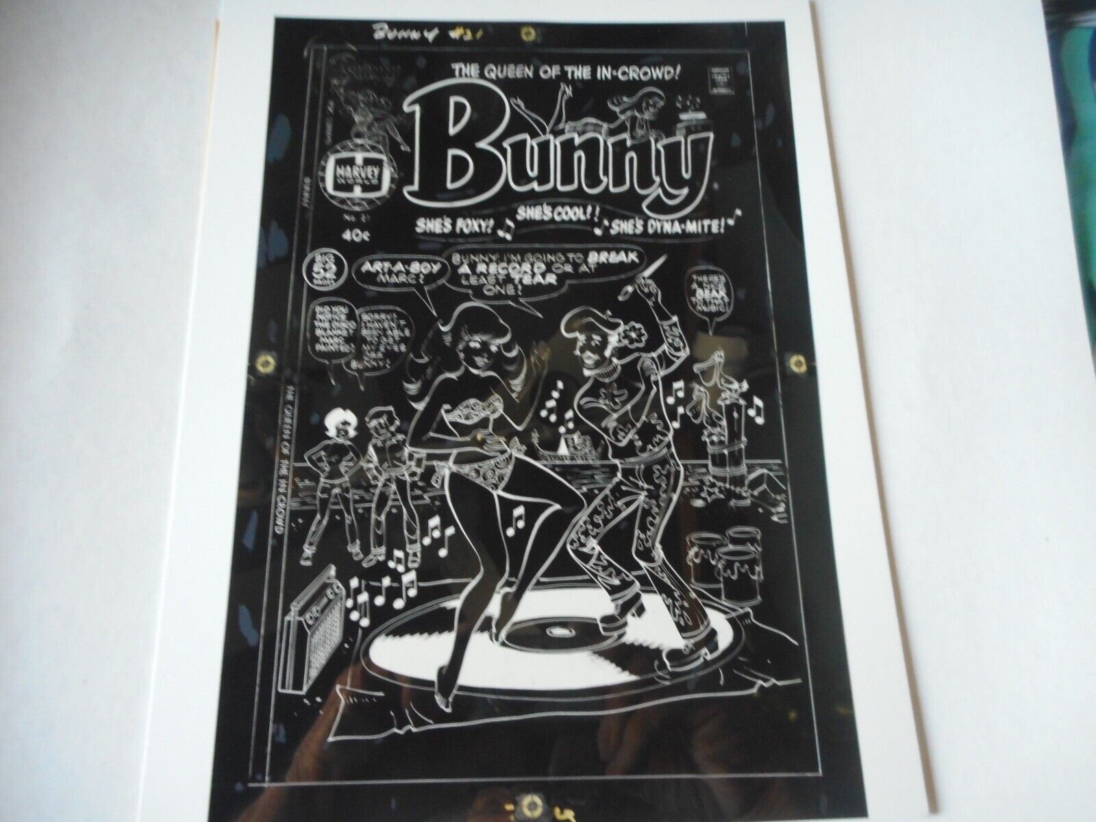
Photo A From eBay Black Plate
I got something interesting on eBay this week. At least it’s interesting to me as an old school comic book production guy. It might not be as interesting to everyone else. It’s the production negatives to the cover of a comic book, Bunny #21 (Harvey Comics), from 1976.
For the last year or two I’ve been buying comic books that have references to Pop Art on their covers. They are mostly from the 1960s and I only have a handful of them but I keep an eye out. I also bought one that has a reference to Surrealism and Bunny #21 references a clichéd version of artist in general. It’s kind of cool.
It turns out that Bunny numbers 1-20 came out from 1966-1971 and then 21 didn’t come out until five years later. Weird. So I had Bunny #21 bookmarked on ebay but I hadn’t bought a copy yet. Then as I was looking at the various copies of it on eBay last week I saw the production negatives for the cover on sale. Shipped they were $50 so I decided to grab them.
What are production negatives you ask? They are part of the process of printing a comic. At least they were in 1976. They don’t really exist anymore in our current desktop publishing digital world. They are around 8.5×11 inch photo negatives of the color separations of the cover artwork.
The way comics were colored back in the day was that the colorist (who was credited in the comics) would paint in the colors to be used in the comic with Dr. Martin’s color dyes over a photocopy of the comic book art. This was called the “Color Guide.” It looked kind of like a watercolor version of the comic book.
Those color guides would go to the color separator. The color guides also broke the colors down into percentages. A 50% red, a 25% blue, and a 100% yellow are examples. The color separator had a copy of the black and white artwork to use as a guide. Sort of like a coloring book so they could keep the colors inside the lines. Then on a sheet of clear acetate (a cell they’re called in animation) they would color in each of the three color plates (Red, Blue, and Yellow).
The odd thing was that they didn’t color them with color. They stuck with black and white because it was faster. So if the color guides called for a 25% yellow the separator would use a 25% grey on the yellow acetate. For 25% red they would use the same 25% grey but on the red acetate. At the end the three acetates had grey ink all over them.
These acetates, the color separations, would then be put on a big graphics camera and photographed at the same size as the separations (around 8.5×11 inches). The negatives from this camera were then used to make the printing plates to print the comic book. These are the negatives that I bought.
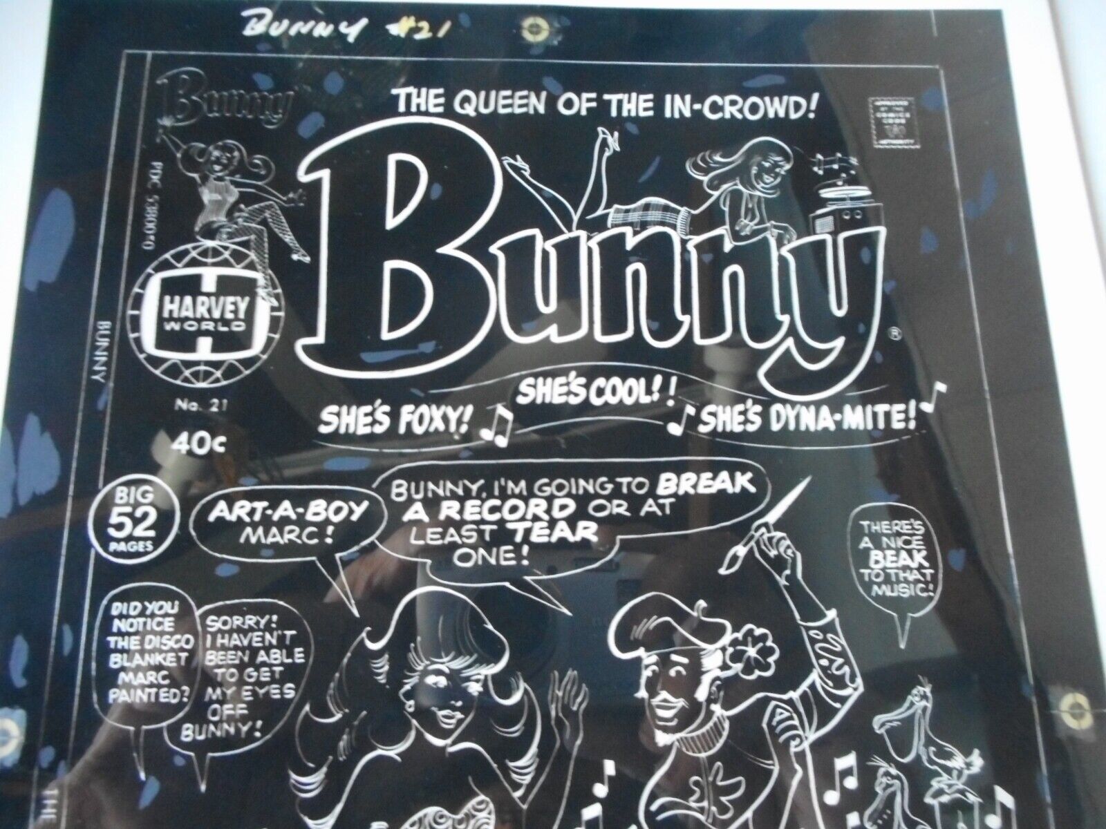
Photo B From eBay Black Plate
What good are these negatives? They are really not of much use anymore but they are fun to have. I also decided to see if I could digitize them and make a print of the cover from them. Of course I knew that I probably could so that’s why I bought them.
The first thing I had to do was to scan in the four negatives. This isn’t quite as easy as it would be if they were on paper. A scanner shoots a bright light at whatever it scans and this can reflect weirdly of stuff that is shiny. Negatives are shiny.
These negatives were also “Screened” as they took the picture of the color separation art back in the day. That is how the little printing dots that make up all printed material are made. If you remember Roy Lichtenstein comic book paintings he painted the images he copied with the little dots in them. These little dots are tough to scan in evenly from a negative. The acetate doesn’t lay as perfectly flat as it should so the dots can be slightly uneven. That happened to my scans a little bit.
When I mentioned blue, red, and yellow before those aren’t really the colors of the printing world. Cyan, Magenta, and Yellow are the colors of printing ink. Hence in Photoshop the color mode used for printing stuff is called CMYK (with Black for the K). So I had to scan in each color plate in black and white and then insert that into the proper color channel. I had to put the cyan plate int the cyan channel.
One thing that really helped me line things up were the old registration marks on the acetates. It’s how they lined things up back then. Registration marks are little bullseyes that were put in the same places on the acetates. So just line up all the bullseyes and the colors should all line up. And they did!
After getting all the scans in place in a digital file I had to adjust all the colors. It said right on the negatives that each color only had three shades. 100%, 50%, and 25% of each color was all that was there. All of those were really made up of dot patterns of 100% of the color. It took some fiddling to get it all correct.
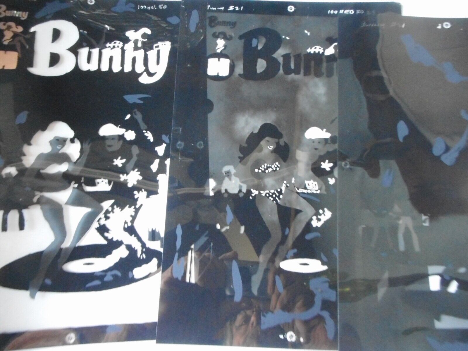
Photo C From eBay Color Plates
Back in the day the printers would also make proofs of the color (sometimes called 3Ms) for the published to look at. They would print positives of the color plates onto clear acetates and line them up one on top of the other. That way the publisher could examine each color individually to catch where a mistake was if there was one there. So I decided to do that too.
I bought some clear acetate that I could print on with my inkjet printer. It’s generally used for printing out stuff for overhead projectors and the such and I had never used it before. After some more adjusting of the colors I got each color printed on a sheet of acetate and lined them up like an old fashioned 3M. It looked cool.
I still don’t have the printer settings right for printing on acetate though. I don’t think the colors are quite dark enough. It’s passable enough but I want it to look even better. I’m going to have to do a little more research and try to look up the right settings. But that’s for another day.
I’m back from the comic shop this week and I got five new comics.
Check them all out here:
A few weeks ago I wrote about giving away art supplies. Now I’ve put together the final list. For those of you following along there are six new things on the list.
As I’ve written before I love art supplies. I especially love trying out new art supplies. As a consequence I have a bunch of art supplies around the studio that I never use. I may have used they once or twice when I first got them but didn’t take to them. Some have been sitting around for over a decade. So I decided to gather them up and I’m giving them to some art students. At least then they’ll have a chance of being used rather than rotting away in my studio.
ShinHan 64 Marker Set — This is the first set of markers that I bought back in 2011 when I set out to create a technique for markers that I would consider “Finished.” Previous to that I used markers in the 1980s and 1990s to make working drawings and color sketches. I bought this set on sale after buying and trying out a bunch of blue markers from this brand.
ShinHan 14 Brown and 23 Blue Markers — Here are the blue markers I bought. There are about twenty of them and before I committed myself to buying a set of markers I worked on a technique in only blue. That simplified thing and helped me work the technique out. I bought these markers back in 2011 too and about six of the light blue colors turned out to be fugitive. The pigment was not lightfast and faded away. The markers are still full of alcohol but they have no color. They’re clear markers. The brown set is a woodgrain set that I bought on clearance and never used. After I bought them I moved on to Copic markers.
PrismaColor Markers — I like to try out different brands of markers and as I was trying them out back in 2012 I bought these PrismaColor markers. I bought about 25 of them in various colors and used them a bit. But they never make the starting lineup because they are not refillable like Copic markers are.
LePen Black Eight Marker Set — I just bought this set of various size markers back in February of this year. I tried them out, liked the .8 size the best, and then bought a box of the .8 size. So I really have no need for all the other sizes. I may as well pass them on.
Rembrandt Pastel Set of Fifteen — This is a really nice set of pastels that have sat unused for around ten years. I wanted to try out pastels since I never had before but I found out they weren’t for me. Patels are a lot messier than I thought they would be. Pastel dust gets everywhere. I found it way messier than paint. Mess aside I never figured out how to make them work for me anyway. So off they go.
Pan Pastel Set of Ten — These were a new thing (at least to me) about five or eight years ago. They’re kind of like working with makeup. They are pastel pigment in a small flat pan (the pans also stack). You rub something into the pastel pan and then rub that on the paper. I could never get anything going with them. I found them too weird.
Set of 30 Colored Pencils — I always think I’m going to find a use for colored pencils. Every so often I see a set go on sale for a good price and I grab them. Then I get them home and they just sit there. I don’t think I’ve sharpened these even once. They barely have ever touched paper. I’ll probably even buy another set years from now and think, all over again, that I can find a use for them.
Set of 30 Watercolor Pencils — These are like regular colored pencils except you can also wet them with a brush and they act like watercolors. I love gouache but I hardly ever use regular transparent watercolor. So why I would ever think that I use these is a mystery but the set sure does look cool. Hopefully someone else can make something with them.
Set of 20 Steadler Color Pens — I was gifted these and never found a use for them. They are sort of like ball point pens for artists. They’re fine lined and I prefer my pens and markers to have a broader tip. Once again they’re a cool set that I never figured out what to do with.
Set of 24 Pans of Watercolor — I bought these just this summer. They’re a cheap set that are sort of like my favorite Pelikan set of 24 gouache pans. I put them aside and didn’t even try them out. I didn’t like the case they came in. I much prefer the Pelikan ones so I’ll stick with those. It’s a cheap set too.
Set of 9 Round Sable Brushes — I got these only a couple of months ago to try out some new brushes. I really only tried out one of the brushes as I was painting my coat. It was okay. I eventually went back to using my normal brushes. These weren’t that expensive anyway. The set was about $20 and that’s what I usually spend on one brush.
Set of Black and White Ink —I have a once ounce bottle of Higgins Black Magic India Ink that I have no idea where it came from. I buy my ink in 16 ounce bottles so I have no need for this random one ounce bottle. The white ink is Japanese and I bought it to try out a long time ago. I don’t remember the last time I used it. So I don’t need it. I just bought a new bottle of Pro White to handle my white ink tasks.
Set of 4 French Curves —It is not easy to find good French Curves these days. They just don’t make them well anymore. As a consequence I’ve bought a lot of them over the years but not all of them make it into the starting lineup. Here are a few that didn’t make the cut. Not necessarily because they’re bad but because they’re not the size I like.
Bic Mark-It Pens Set of 24 — These are the Bic version of Sharpies and I bought them ages ago. So long ago that some of them have dried out. Maybe four of them and the rest are still good. I was thinking about buying a new set so I may as well give the rest of these away. I’m in no hurry to buy a new set since I don’t use them that much but I certainly don’t need two pens of each color.
Foam 36 Marker Holder — This is a marker holder I bought just this year. But I bought a lot of marker holders this year and wasn’t even using this one. Since I’m giving away so many markers I may as well give this away too.
So there is the list of art supplies I’m cleaning out and giving away. I hope the students that I’m giving them to will make things with them.
I’m back from the comic shop this week and I got eight new comics.
Check them all out here:
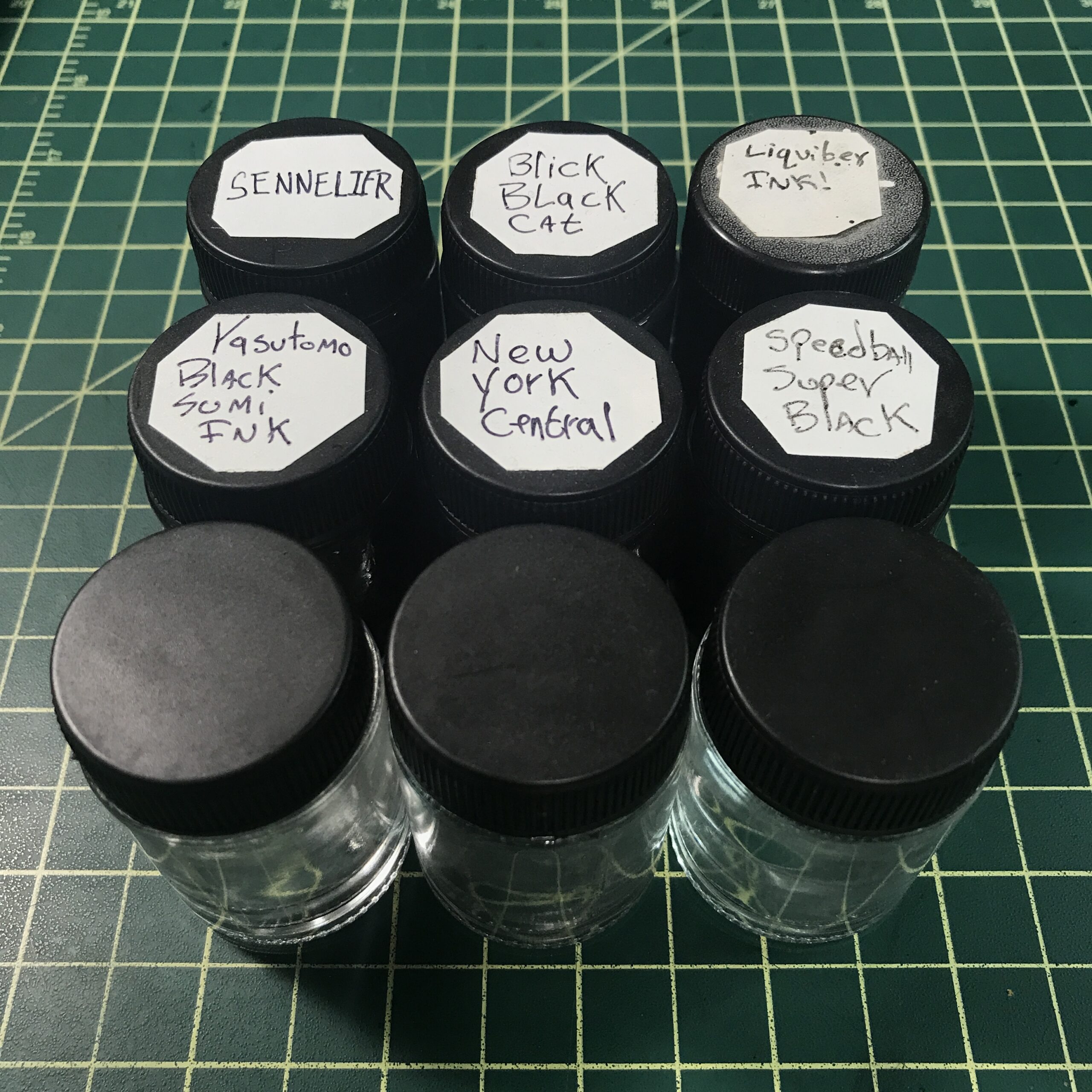
I got one art supply this week and it was a minor one. I got a box of twelve little glass jars and lids. They are not the most important art supply in the world but I’m glad to have them. Y’see I keep the ink into which I dip my brushes in a similar little glass jar and have since around the early 1990s.
The little glass jar that I’ve been using since way back originally had fabric paint in it. I bought that paint in the mid 1980s. I can’t remember the brand name of the fabric paint but it was everywhere in the 1980s and I probably had a dozen or three jars of it as I used to paint my jean jackets with that paint.
After I used all the paint I kept the little glass jars that they came in. At least I kept some of them. They were nice jars and were one of those things that a person thinks they will have some use for someday. We’ve all got stuff around like that.
One of those little glass jars eventually became my inkwell. Actually a few of them did as I use a few different brands of ink. The jar is two inches tall and about an inch across. I usually buy my ink in eight to sixteen ounce containers and then pour some into the small glass jar.
I like using a small glass jars better than the small plastic one ounce jars that ink often comes. The small glass jar is heavier and easier to see into. When I dip my brush into the ink I like to see exactly how deep the bristles go into the ink. Dipping the brush in blindly is no way to go. I usually top off the ink in the little glass jar every morning or two. If the glass gets down to half full it gets harder to see into.
I’ve thrown out, recycled, or misplaced most of my 1980s little glass jars. I still have about three of them up and running but I used to have more but I don’t remember what happened to them. I know that I’ve never broken one. I could have stuck a few somewhere long since forgotten or I could have finally gotten rid of the ones I never used. Either way they’re not around.
There have been times over the years that I’ve thought to buy some new little glass jars but I never have. I kind of always wanted the same ones but never saw any. It wasn’t until I bought two new bottles of two new brands of India ink that I decided I needed new jars. Plus I wanted the new ink in the same jars as the old ink. So I stared looking on Amazon and eBay. I found all sorts of different jars on those two sites but not the ones I wanted.
It turns out that one of the problems I was having in searching for the jars is that I had their size wrong. I had always thought that the jars were one ounce jars but it turns out that they’re only three quarters of an ounce jars. I think I got that idea from the plastic one ounce cubbies that I’ve bought over the years. They look about the same size but one has walls of thin plastic and the other walls of thick glass. That could easily make up for the one quarter of an ounce difference.
It turns out that Amazon had the most variety of little jars so I ended up looking at a lot of them on there. It seems that all of the one ounce jars were plastic or the wrong shape as they were made for makeup. The makeup jars are wider and shorter than the ones I was looking for but I was leaning towards, at least, trying some of them since they were what I could find. But then I stumbled onto some jars that looked similar to mine.
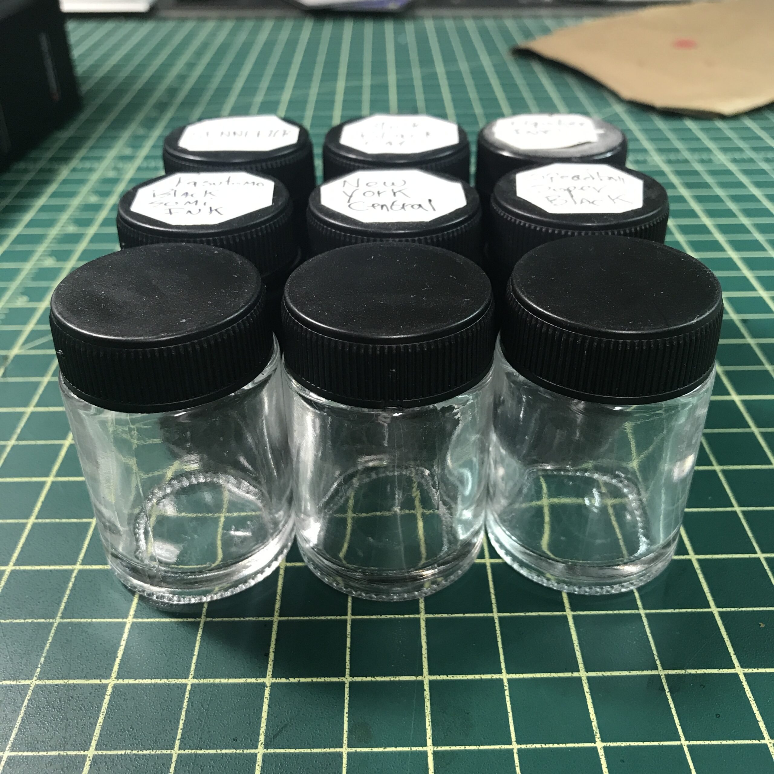
The similar looking ones were three quarters of an ounce (22cc). The picture looked like what I wanted but often the pictures have no scale. But most things sold online have specifications that you can read if you look around. I read that the jar was about two inches tall by an inch across. I went and measured my jars and they were the same. At $16 for twelve jars I decided to give them a try.
It turns out that these jars are airbrush jars. You fill them with paint and then screw the jar onto the airbrush and it becomes the paint reservoir. After you’re done with that color you unscrew it and put the lid back on. I never paid much attention to airbrush jars before so I always missed them.
One thing I notice about the new little glass jars as opposed to the old ones is that the new once have a gasket/seal on the underside of the lid. This is to keep them airtight so the paint stored in them won’t dry out. The old 1980s jars may have, at one time, had such a seal but they are long since gone. The old jars aren’t quite air tight but are close enough that the ink doesn’t dry up in it very quickly. I’ve had untouched ink in a jar for months at a time and it only dries out a bit. Usually I empty the jar of ink if I don’t plan on using that brand of ink for a while.
Now that I bought two new brands of ink along with the three old brands I already have I’m not only glad to have new jars but I’m glad to have new airtight jars. Some of the jars will probably be sitting around unused for a while. With five types on India ink that’s definitely the way it’s going to go. I even transferred some of the old ink in the old jar into a new one.
That’s a lot of writing about a simple little glass jar but often it’s the small things that are important. I love trying new art supplies and I’m always up for something that’s more efficient and better but if I find the best tool for the job I like to keep using it. That’s not always possible but this time it was.
I’m back from the comic shop this week and I got five new comics and two graphic novels.
Check them all out here:
I’ve been down with a sinus infection or some such for the last four days (It’s December 10, 2023 as I write this). It’s not the worst thing in the word but it has meant that I’ve gotten nothing done. I’ve sat in my chair the whole time, reading, watching TV, or watching YouTube videos. I’d guess the last time I haven’t gotten any artwork done for four days, not even a quick sketch, was the last time I was sick. I don’t get sick terribly often but I do remember last year (2022) I had to miss Thanksgiving because of a sinus thing. I didn’t get anything done then either.
One to the things that I read was Frank Miller’s “Sin City” volume one. I hadn’t read it in a long time but it’s always stuck with me. After reading and enjoying in this time around I came to the conclusion that it’s my favorite comic by Frank Miller. It’s a wonderful piece of pulp writing and drawing. I don’t remember liking any of the other volumes as much as I like this one but I’ll have to reread them sometime.
“Sin City” is in black and white. That’s how it was meant to be and Frank Miller clearly designed it with that in mind. Yet, as I read it I wondered how it would look in color. It’s pretty close to perfect in black and white as it’s a noir story and there is no real reason to color it except as an art exorcise but I’d like to see some colorists take a shot at it. Just for fun. For my amusement.
I didn’t exactly read it, since it’s an art book, but looked through the new Michael Golden “Artist Edition.” That’s one of the series of books that presents original comic book art at full size (11×17 inches). They scan the pages in full color and print it in full color even though the art is in black and white so we can see exactly what the original art looks like in real life. We can see white out corrections, notes on the side, and whatever else happens to be there. It’s fun to look at the page that way.
Besides being a terrific artists Michael Golden was Marvel Comic’s Art Director back in the late 1990s so I got to work with him. He is a nice guy and it was fun to get to talk with him about art all the time. So not only did I get to look through pages of his art that he drew for Marvel but I got to remember him as a person too.
I also finished reading a Livia Lone novel by Barry Eisler. It was the third one. I started it on my train rides on Tuesday and Wednesday and then finished it over the next couple of days as I sat in my chair. I read it digitally on my iPad. Though I prefer to read all my comics on paper I like to read books digitally. Not that I would mind reading them on paper but I’ve got enough comics and books in my collection that I don’t need any extra novels about the place. Novels are mostly one time reads for me. No need to keep them.
It was a good book. I’ve come to enjoy Eisler’s thrillers over the last few years. This one is about a Seattle sex crime detective who gets involved in a big case against powerful people. Luckily she’s got friends and contacts that are pretty good “Operators.” It’s spy versus spy stuff.
One of the TV shows that I watched was “Foundation” season two. It’s based on the Issac Asimov books and I find it confusing and nonsensical at times but I do enjoy it. I think the reason it rubs me the wrong way sometimes is that I’m tired of stories based on prophecy. In this one the prophecy is math based rather than religious but in the end it’s the same thing. When a plot revives around prophecy people don’t have to do things because the things are logical. Instead they do things because the prophecy tells them to do them. It’s a plot short cut that I grew tired of a long time ago.
Coincidentally I watched season one of “Foundation” last year when I was down with a sinus thing. Maybe it’s a show I appreciate more when my head is scrambled.
I also started my yearly watching of an old 1997 MTV sitcom called “Austin Stories.” It’s only 12 episodes that are about 23 minutes long so it’s not a big commitment. I watch it every December. I’ve been doing that since I first saw them on MTV in 1997. I watched them a couple other times over the years during the summer so this may be my thirtieth time watching them.
The show is about three twenty-somethings living in Austin Texas. It’s a “Show about nothing” in the short-lived “Seinfeld” tradition (it’s the tradition that was short-lived. Not “Seinfeld”). I enjoy them and it makes me feel a little nostalgic for days gone by. https://www.austinmonthly.com/an-oral-history-of-mtvs-austin-stories/
I also started watching a show called “The Night Agent.” It’s a show about an FBI guy and a regular woman caught up in a conspiracy. I’m a few episodes in and I’m enjoying it.
Here is the weirdest thing I’ve done while I’ve been trying to get better by sitting in this chair. I bought some Funko Pops off of Amazon. Those are vinyl toys with about five inches tall with big heads and small bodies. There are a million of them. Every TV, comic book, and movie character has one made of them. I generally have no interest in them but these ones were cheap.
I think Pops usually go for between $12-$15 but these random ones were between $3-$4 a piece. Plus I had about $12 worth of credit with Amazon. I like to spent my credit on things I wouldn’t usually buy for myself. So I started looking up how to paint custom Pops. You strip the paint off with acetone (I got that), prime them (I can get primer), and then paint them. I’ve got tons of paint. Then I got a flash of an idea (I saw them in my head) to paint the Pops like monsters. I want to paint them like my black and white “On the Rough” monster drawings.
I won’t be able to get to messing around with the Pops until January or so but I ordered five different ones. They cost me $3.80 total so it’s not much of a money risk. I’ll let you know if anything becomes of them. Or doesn’t become of them. That might be more likely.
I’m back from the comic shop this week and I got twelve new comics.
Check them all out here:
Here are my comic book awards for 2023.
Best Same Old Same Old of the Year
(These are the comics I buy year in and year out. They are always good.)
Ice Cream Man – 34-37
Only four issues of this in 2023 but they were as s good as ever. Each issue tells a done in one horror story and it is always imaginative.
Love and Rockets (Volume 4) – 13-14/Psychodrama Illustrated- 6
The Hernandez Bothers’ stuff. If you don’t know about this by now where have you been since the 1980s?
Monstress – 42-48
A lot of the story in this series came together this year. We’re forty eight issues deep in it now and this year we got a lot of answers to what was going on in the back story. Mythological stuff to us readers became real and present.
Palookaville – 24
Rather than a comic book this series by the one named cartoonist Seth now comes out as a small hardcover book. He is one of my all time favorites and I always love to see that a new issue is coming out. This was another good one as he continues to do a comic about working at a summer job.
Parker Girls – 4-10
Though this individual Terry Moore series wrapped up I put it on this part of the list because I always buy his work no matter what series he’s got going. Though I just read that he no longer wants to put out his stuff in single issues. I find that disappointing but understandable.
Radiant Black – 21-27 (25-27 have two versions)
I continue to enjoy the superhero adventures of Radiant Black. This year they are doing a gimmick where the two characters who share the Radiant Black super powers have to choose only one of them to be the hero. Thus we get two issues a month each with only one of the main characters as Radiant Black. I think they’ve pulled it off well. There is only one more two issue month and then we’ll get to see which one becomes Radiant Black permanently.
Savage Dragon – 263-267
Only five issues of the Dragon this year but they are all good. Erik Larsen does his best to keep the series interesting for himself and his readers. He does a nice job of it and I always look forward to a new issue.
Usagi Yojimbo: Ice & Snow – 1-3, Space Usagi: Tokai Hunter – One Shot, Space Usage: Death and Honor – 1
This is the list of Usagi stuff that came out this year. I’ve been buying the book since about 1986 and it never disappoints. Stan Sakai is one of the comic book masters.
Honerable Mentions
(They didn’t quite make it into any category but I liked them a lot just the same.)
Damn Them All – 4-11
Charlie Adlard is killing it on the art for this book.
Dark Ride – 4-9
Brought to us by the “Birthright” team this is a horror comic about running a horror based theme park. But there is real horror behind the scenes. A good series.
Forged – 2-6
A magazine size sci-fi comic about a military team in the future. Good stuff . I especially like the art. Lots of intrigue and action.
Grim – 7-15
The story of a grim reaper (there are many) whose afterlife is upset by finding out that she has to take over from death. This one has been good with some nice art.
In Hell We Fight – 1-5
A new series with great name! It’s a fun series about a bunch of characters who are trapped in hell. So they have to fight. Of course hell is bad but in this comic it’s the kind of bad you can still have an adventure in.
Love Everlasting – 6-10
I really like art by Elsa Charretier in this comic. It blows me away every issue. It’s the story of a woman who is trapped in a romance comic. For the first six issues or so there were two or three stories an issue and at the end of one she would show up in the next. She’s aware she is trapped in a story. For the last few issues she has been trapped in a single story and has lived out her whole life in 1963. It’s good stuff.
Miss Meow – 6-8
This one is a cheesecake super hero comic. I bought the first issues on a whim and ended up liking it a lot more than I ever would have guessed. It’s a solid superhero book where the super people all work for competing corporations and are pop culture stars. It’s really well done. I think it has ended but I’m not 100% sure.
No/One – 1-7
This one is a mystery, crime drama, journalism drama set in the Massiveverse which is the Radiant Black universe. I think there is even a tie-in podcast but I’ve never listened to it. That seems too much like homework to me. I’m liking the series.
Rogue Sun – 10-17
Another superhero Massiveverse series that’s a solid B for me. The current plot has a bad guy taking over Rogue Sun’s body. I’m not a fan of body takeover stories so I’ve not been liking this comic as much as usual but there was a nice twist at the end of last issue. I look forward to the next issue.
Saga – 61-66
This comic has always been a solid B for me and it still is. I never loved it as much as a lot of Saga fans but a whole bunch of them have peeled off from the book and I haven’t. I still enjoy it after 66 issues.
Sickness – 1-3
This is one I get in the mail. On a whim I subscribed to it on Uncivilized Books website. They were a little slow getting me the second issue but they had things cleared up by the third issue. It’s got a weird and creepy story about people being driven crazy by a sickness. It’s by the same team that brought us “Black Stars Above” and it’s equally as strange.
Spawn – 337-348
I only started buying Spawn around issue 305 because it was the last of the $3 comics. I figured I should support it and I have. Since Rory McConville took over writing from Todd McFarlane the book has gotten better. A big Spawn war in hell is going on. It’s fun.
What’s the Furthest Place From Here? – 10-16
This one got a little off track for me with its issues in the beginning of the year but now I’m liking it again. It’s a strange comic that takes place in a world without adults. It’s got nice art too.
Best Mini Series
Don’t Spit In The Wind – 1-4
The art in this one caught my eye and I ended up getting the whole series. It’s a strange sci-fi-ish tale of Earth being a garbage dumb and the people sent to clean it up run into some crazy natives. And flamingos. The flamingos just stand there keeping an eye on things.
Dwellings – 1-3
A trio of big thick comics by Jay Stephens. All three have a few stories in them that are drawn like children’s comics but are wild and adult. Good stuff.
Giant Kokju – 1-3
This one is drawn by my old Marvel friend Scott Koblish and his work in it is really good. He puts a lot into these pages. The story is about giant monsters going on sexed-up rampages in cities. Good weird fun!
The Great Gatsby – 7
Since I’ve been into the book “The Great Gatsby” for the last few years I thought I’d note that this adaptation came to an end this year. It was well done and you can get it in the collected edition now. I overpaid for the collected edition hardcover on Kickstarter but you can get the cheaper regular collected edition.
Hey Kids! Comics! Volume 3 – 1-6
The third volume of Howard Chaykin’s history of the comic book industry (with the names changed) ends and I liked it just like I liked the first two volumes. If you like comic book history then check this one out.
Junkyard Joe – 4-6
The second comic in the Geoff Johns and Gary Frank universe was a good one. I liked it even more than “Geiger” that the two did together. Frank’s artwork was the nicest I’ve seen him do. There was a lot more expressiveness in his art than I’ve seen him do before.
Savage Strength of Star Storm – 1-6
I’m still not sure if this comic was the work of an amateur or a slick professional aiming for an amateur vibe. Either way it had a charm and enthusiasm to it that I liked. It’s a massive and sprawling superhero and alien invasion story.
Best Ending of a Series
Ginseng Roots – 12 (of 12)
I only discover this book with issue 10 but I enjoyed the last issue a whole bunch. There won’t be a collected edition for a couple of years but I’ll get that for sure when it comes out.
Time Before Time – 19-29
This was an excellent series and they stuck the landing. I found the last few issues to be quite emotional and was sad to see it go. Probably the best ending to a series since “Birthright.”
Best New Series to Me
World Tree 1-6 (Various Printings)
I picked up the first four issues of this series all at once from my LCS. It’s a cyberpunk story that has some interesting visuals. I look forward to when it resumes with new issues. Hey! It just did. I got issue six this week!
Godzilla: War For Humanity – 3
I picked this one up because of the Jake Smith art and was not disappointed. I didn’t even realize that it was a third issues and not a first issue but now I want to track those down too.
Best Start to a Series
(We’re not deep into the series just yet)
Deviant, The – 1-2
A Christmas noir story. So far I really dug the first two issues.
Edenwood – 1-3
A comic written and drawn by Tony S. Daniels. It’s a fantasy story that’s fun and dramatic. I’ve seen Daniel’s art before but I’ve never seen him write anything. He does a good job here.
Local Man – 1-7, Local Man: Gold (One Shot)
This story of a superhero with a ruined reputation who has to move back to his home town is well done. I like the art a lot and the storytelling is excellent
Ministry of Compliance, The – 1
Only one issues of this so far but I liked it plus I liked the spy to sci-fi twist in it. I’ll buy more.
Petrol Head – 1-2
Tow good issues about a robot in the future who races cars. Or at least he used to. It’s got an odd premise but it’s well done. Once again the art in it grabs me
Best One Shots
Bill Dogma and Jane Legit – (One Shot Magazine Size from Kickstarter)
Though I haven’t seen him in person in about 20 years I went to college with Dean and have always liked his work. This is almost romance comic featuring his two long running characters. It’s fun and poetic.
Dean Haspiel’s Covid Cop – (One Shot from Kickstarter)
This is another cool and fun comic by Dean. I always recommend his stuff. The title gives a good sense of what it’a about. A cop story that grew out of the pandemic.
Chilling Adventures: Fear the Funhouse Toybox of Terror – 1 (One Shot)
This one comic is a stand in for the whole Archie Horror line. I bought about eight of them this year and they’re all pretty good.
Wonderland Annual: Out of Time – One Shot
I’ve never purchased any Zenescope comics before until I decided to give this one a try. I enjoyed it. There were a few stories in it with characters based on old fairy tales and I enjoyed them.
Best Comics I Bought Just for Their Covers
(Sometimes I don’t care about the interiors and just buy a comic book because I like its cover)
Fantastic Four – 7-8 Scott Koblish Variant
I bought this one for the Koblish connecting covers with a hundred figures on them. A whole bunch of characters from Fantastic Four history. I love covers like this.
Femforce – 200
I had no idea Femforce was still around so when I saw this issue at my LCS I decided to buy it. It had a cool cover too.
Something is Killing the Children: Pen and Ink – 1 (One Shot)
This cover is printed on metallic paper. I really liked the way the black and white drawing looked on the metallic paper so I bought it.
Best Series I Worked On
(I did the production on more Bad Idea comics this year.)
The Destroyer – 1 (One Shot)
I think this may be the best of them. It came out in December and I really liked it. It’s kind of a tie-in with Oppenheimer.
The Ends – 1-3 (of 3)
Old WW2 guys against a bunch of gang members in the early 1980s by David Lapham. I always like Lapham’s work.
Escape From Wyoming – 3 (of 3)
A fun ending to an aliens using our planet to house their secret prison story.
The Finder – 1 (One Shot)
A guy is good at finding stuff. Or was that the TV Show? I can’t remember. But I remember it looking pretty.
Inebrio Horsefeathers – 1 (One Shot)
A good Tony Millionaire comic.
They’re All Terrible – 2 (of 2)
This one was a lot of fun. A barbarian army goes on the warpath to get treasure. Mayhem ensues.
By the way I got 30 Facsimile Editions this year. That seems like a lot!