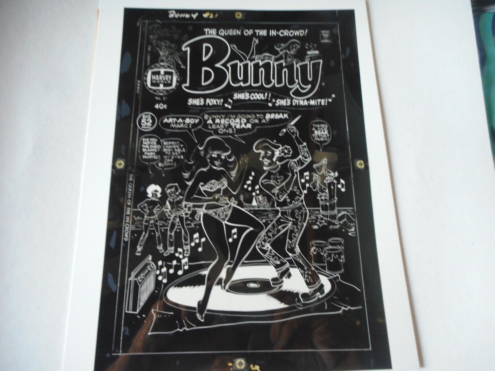
Photo A From eBay Black Plate
I got something interesting on eBay this week. At least it’s interesting to me as an old school comic book production guy. It might not be as interesting to everyone else. It’s the production negatives to the cover of a comic book, Bunny #21 (Harvey Comics), from 1976.
For the last year or two I’ve been buying comic books that have references to Pop Art on their covers. They are mostly from the 1960s and I only have a handful of them but I keep an eye out. I also bought one that has a reference to Surrealism and Bunny #21 references a clichéd version of artist in general. It’s kind of cool.
It turns out that Bunny numbers 1-20 came out from 1966-1971 and then 21 didn’t come out until five years later. Weird. So I had Bunny #21 bookmarked on ebay but I hadn’t bought a copy yet. Then as I was looking at the various copies of it on eBay last week I saw the production negatives for the cover on sale. Shipped they were $50 so I decided to grab them.
What are production negatives you ask? They are part of the process of printing a comic. At least they were in 1976. They don’t really exist anymore in our current desktop publishing digital world. They are around 8.5×11 inch photo negatives of the color separations of the cover artwork.
The way comics were colored back in the day was that the colorist (who was credited in the comics) would paint in the colors to be used in the comic with Dr. Martin’s color dyes over a photocopy of the comic book art. This was called the “Color Guide.” It looked kind of like a watercolor version of the comic book.
Those color guides would go to the color separator. The color guides also broke the colors down into percentages. A 50% red, a 25% blue, and a 100% yellow are examples. The color separator had a copy of the black and white artwork to use as a guide. Sort of like a coloring book so they could keep the colors inside the lines. Then on a sheet of clear acetate (a cell they’re called in animation) they would color in each of the three color plates (Red, Blue, and Yellow).
The odd thing was that they didn’t color them with color. They stuck with black and white because it was faster. So if the color guides called for a 25% yellow the separator would use a 25% grey on the yellow acetate. For 25% red they would use the same 25% grey but on the red acetate. At the end the three acetates had grey ink all over them.
These acetates, the color separations, would then be put on a big graphics camera and photographed at the same size as the separations (around 8.5×11 inches). The negatives from this camera were then used to make the printing plates to print the comic book. These are the negatives that I bought.
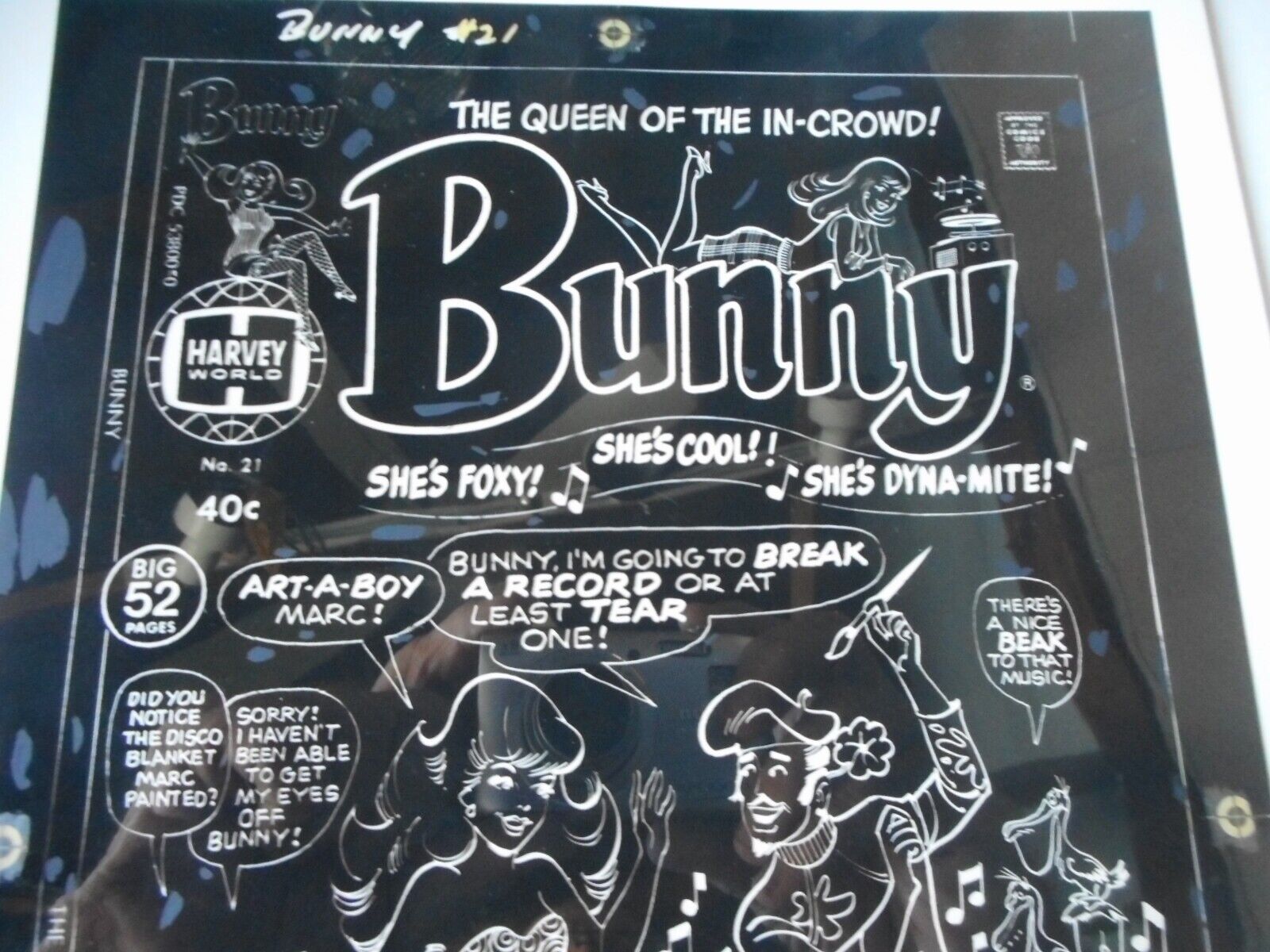
Photo B From eBay Black Plate
What good are these negatives? They are really not of much use anymore but they are fun to have. I also decided to see if I could digitize them and make a print of the cover from them. Of course I knew that I probably could so that’s why I bought them.
The first thing I had to do was to scan in the four negatives. This isn’t quite as easy as it would be if they were on paper. A scanner shoots a bright light at whatever it scans and this can reflect weirdly of stuff that is shiny. Negatives are shiny.
These negatives were also “Screened” as they took the picture of the color separation art back in the day. That is how the little printing dots that make up all printed material are made. If you remember Roy Lichtenstein comic book paintings he painted the images he copied with the little dots in them. These little dots are tough to scan in evenly from a negative. The acetate doesn’t lay as perfectly flat as it should so the dots can be slightly uneven. That happened to my scans a little bit.
When I mentioned blue, red, and yellow before those aren’t really the colors of the printing world. Cyan, Magenta, and Yellow are the colors of printing ink. Hence in Photoshop the color mode used for printing stuff is called CMYK (with Black for the K). So I had to scan in each color plate in black and white and then insert that into the proper color channel. I had to put the cyan plate int the cyan channel.
One thing that really helped me line things up were the old registration marks on the acetates. It’s how they lined things up back then. Registration marks are little bullseyes that were put in the same places on the acetates. So just line up all the bullseyes and the colors should all line up. And they did!
After getting all the scans in place in a digital file I had to adjust all the colors. It said right on the negatives that each color only had three shades. 100%, 50%, and 25% of each color was all that was there. All of those were really made up of dot patterns of 100% of the color. It took some fiddling to get it all correct.
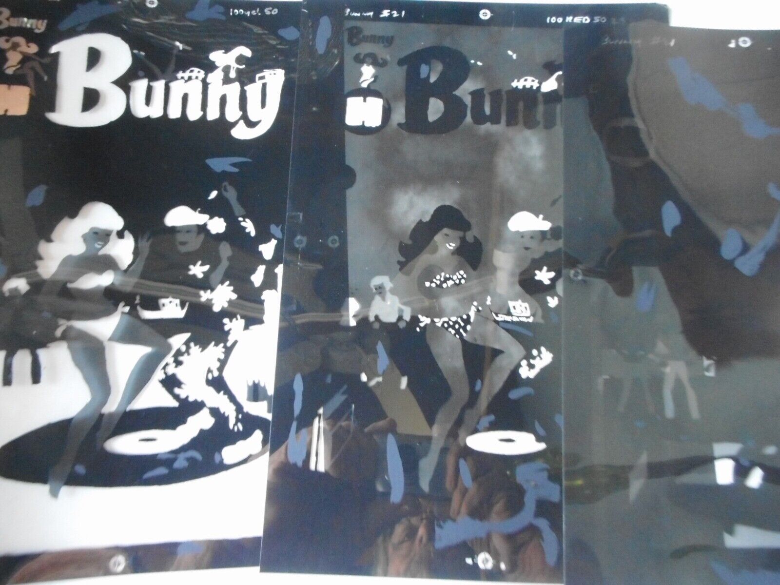
Photo C From eBay Color Plates
Back in the day the printers would also make proofs of the color (sometimes called 3Ms) for the published to look at. They would print positives of the color plates onto clear acetates and line them up one on top of the other. That way the publisher could examine each color individually to catch where a mistake was if there was one there. So I decided to do that too.
I bought some clear acetate that I could print on with my inkjet printer. It’s generally used for printing out stuff for overhead projectors and the such and I had never used it before. After some more adjusting of the colors I got each color printed on a sheet of acetate and lined them up like an old fashioned 3M. It looked cool.
I still don’t have the printer settings right for printing on acetate though. I don’t think the colors are quite dark enough. It’s passable enough but I want it to look even better. I’m going to have to do a little more research and try to look up the right settings. But that’s for another day.