Comics I Bought This Week: October 12, 2013

I’m back from the comic shop this week and I got seven new comics.
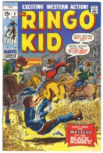
This week’s comic book cover to look at and examine is “The Ringo Kid” #9 from 1971. It’s penciled and inked by Herb Trimpe. This is one of those comics I bought, probably in the mid 1990s, just for its cover. Herb Trimpe drew a bunch of covers in the early 1970s for Marvel’s western comics. I had never seen them before I bought this one but he drew a lot of nice ones.
The first thing I notice on this cover is that there is a lot of action. Three men shooting all at once and one man getting shot. The horses are all galloping away from the viewer but the bullets are coming towards him. With movement everywhere it’s an interesting composition. Trimpe also left the Ringo Kid hanging in the air with his hat flying off (I guess that chin strap didn’t work too well) so we get a sense of a moment stopped in time. A snapshot. Everything is moving yet everything is frozen.
I like the drawing on this cover. It’s got a less polished finish than Trimpe’s super-hero work. He’s inking himself and working with a thin brush line that gives things a rustic western look. A lot of this cover looks like it was drawn quickly and that gives it an energy I enjoy. He used the dust the horses are kicking up to not only give the cover a sense of texture but to hide the horses legs so he didn’t have to draw them. It works for me though because I don’t think drawing the horses legs would have added anything and might have confused the composition. Either way I can imaging myself saying, “I’ll just put some dust here” and making the same choice. The buildings are also just kinda indicated rather than having every plank and board delineated and I’m okay with that.
I like the type-work on this cover. The balloons work fine as a compositional element but are completely unnecessary to the cover’s telling of the story. Th actual words add nothing and I don’t even read them when looking at this cover. The cover caption is also okay but not really necessary in my mind. I like the cornerbox and the logo. The yellow of the logo against the deep blue sky is a nice element. Overall the colors are good with lots of neutrals with splashes of color on top. You can see why I easily paid the $1.60 for this comic. Yes, the price sticker is still on the back of the bag.
Discussion ¬