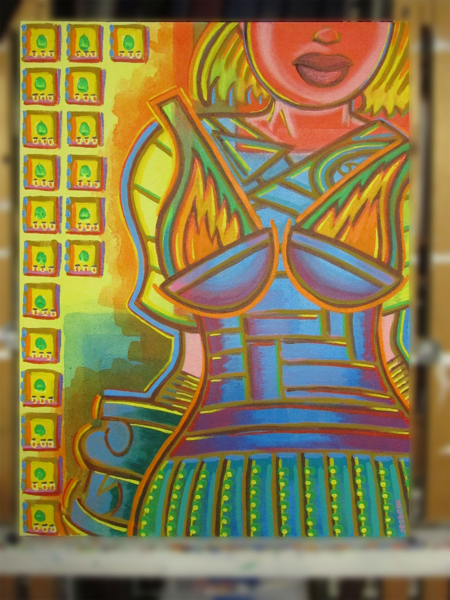
This week I went to my stack of paintings and picked out one of my 18×25 inch acrylic on canvas paintings to write a piece on. This one has the date on it of 2/7/2012 and is named “Since You’ve Been Gone”. That wasn’t forever ago but I had too look at it for a few minutes to remember it and remember what I was thinking when I made it. The first thing I notice is the stained background. When I first got a batch of these 18×25 inch canvases I was trying something new. I was trying to work with thin areas of stained color rather than my usual building up of paint. Turns out I really didn’t have much to say with stained areas of paint and I mostly obliterated them with my normal method of building up paint. You can, of course, still see areas of the stained color in the background and I think it works pretty well but I wanted it to be the main focus of some paintings and it never was. The background has some interesting areas such as the orange stain over the yellow and the last hints of three different layers of blue rectangles but it all sits in the back.
Actually the stained background was the first thing I noticed when I walked up close to the painting. The thing I noticed right away was the flaming breasts the woman has. How could I fail to miss them? There are quite a few influences going on in those breasts. First off they reference the real life world of corsets. The tightness of the outfit around the ribs reminds me of that. Secondly they look like braziers. Those are portable bowls that they used to put fires in for light and heat. And thirdly they reference fantasy paintings with women wearing form fitting metal armor that would in no way actually protect them. That’s more references in a single pair of breasts than I usually have in any given painting. It could be me or more likely that our society gives a lot of importance to breasts and my paintings and I are along for the ride.
Now that I’m no longer distracted by flaming boobs I notice another thing about my stained color field approach to this painting. The red of her face and neck is actually the stained color field rather than a color I put over top of it. I’m remembering how I did this and I tried to make an abstract geometric stained color field painting and then lay my image over top of it. Turned out I was terrible at stained color field painting but, at least in this one, I was pretty good at integrating an image with it. I might have to try that again.
I think the stained color field face helped me out with the lips. I often find mouths problematic to paint. I not exactly sure why except there are not a lot of choices when painting lips. Since I mostly work with forms that I’ve simplified I can take the simple shape approach to lips or I can make them a bit more three dimensional. I just don’t have a lot of lip techniques in my bag to work with. I’m always deciding between those two techniques and always questioning that decision. That doesn’t seem to happen with other features. But here I had the additional choice to make the lips opaque since they were going over a transparent color background. Usually everything is opaque in one of my paintings and I don’t have that choice. So I went with it for the lips and I think it works.
The most unusual choice I made for this painting is the small little squares on the left side. I’ve often used geometric shapes, brush stokes of color, and little tick marks of color in my paintings but I think this is the only time I used little squares like this to basically fill in an area. I used them because their opacity works nicely with the light transparency of the background. They move forward a little bit and become objects filling up the space without being literal. I often have a literal background but here wanted the stained color field to be the background. I like how the opaque yellow of the squares harmonize with the transparent yellow of the background yet remain separate.
I used a lot of outline in this painting. Being that most of the forms are very flat things don’t separate without the outlines. Interestingly it’s mostly the complementary colors of orange and blue that I used as outlines. I wouldn’t think that would work. They are what I added last to the painting and pulled the painting together. I remember this was one I didn’t like until I got those last few brush strokes on. It was too flat and not coming together until I put down those little boxes on the left and the outline brush strokes. I like the orange ones in particular around the flaming bra. They seem to hold the whole thing together.
There are also much more subtle outline brush strokes in there though. The thin lines of yellow and dark orange on the very outside of her arm work well for me. They tame the thicker line of blue a little bit and make it less overwhelming. The blue came a little too far forward in that area but the little bits of orange and yellow bent it back in space. Then the yellow strokes on the glove bring it forward. Yes , that’s a glove on her hand which isn’t even in the picture. It’s mostly just a large shape to balance out the shape of her upper sleeve but it’s also a glove that shows my comic book influence. For some reason in the 90s there were a lot of super-heroes who had a giant glove or giant gloves on. I think the artists liked drawing them and that’s kind of what I did here. Without you actually being able to see the whole glove.
One final thing is the blue and purple corset. I find that a strange color combination. The blue is from the stained color field and the purple is painted on top of it. The colors don’t blend well together and tend to shimmer a bit. That’s not something that usually happens in my paintings but I like it here.
Discussion ¬