Comics I Bought This Week: November 2, 2013
I’m back from the comic shop this week and I got four new comics.
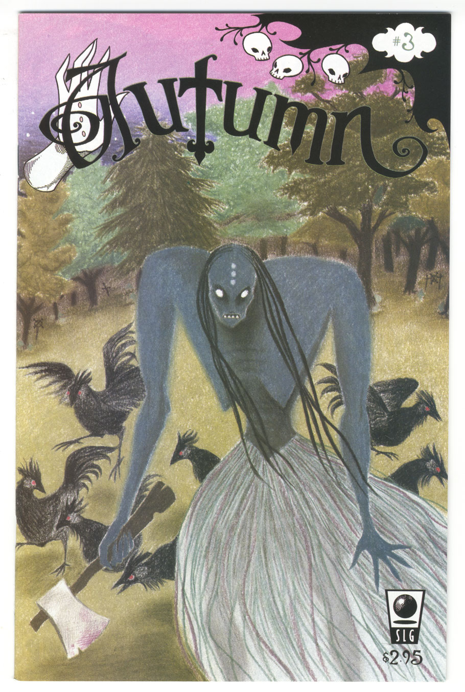
This week’s comic book cover to look at and examine is “Autumn” #3 published in 2004 by SLG. The cover is by Tommy Kovac. I was looking around my shelves for something to write about and I saw this comic. It’s been a while since I’ve looked at it but the series ran for a handful of issues back in the early 2000s. I liked it. It’s about a little big-headed witch named Autumn who is on all the other covers but it was this one that jumped out at me. I don’t remember who he is but I like that monster. He’s fun.
As this was an unusual comic the cover technique is a bit unusual. It’s not the normal computer coloring one would expect in 2004 or even a traditional illustration technique. It looks like some kind of pastel, pastel pencil, or colored pencil. It’s not like people haven’t used those tools for illustration but it’s still unusual to. It’s also strange that I’d like a pastel technique since I usually don’t.
I think it’s the childlike qualities of the technique that I like here. No one is going to confuse this with a child’s drawing but there is still a bit of the disordered scribbling of filling in color to give it energy. It’s especially apparent in the background but doesn’t overwhelm the piece. The only place where the technique lets me down is in the monster’s skirt (or whatever it is). That’s where the disordered scribbling takes over too much. There ceases to be any shape or form in that part and the technique seems aimless.
Meanwhile I really like those black chickens. The technique works for me there with all the beaks, feathers, and claws. There is a lot more variety in them than in the grass skirt. The blue monster is cool too with his big ax, claws, and sharp teeth. Yet his tapered waist make him seen delicate and approachable. A nice contrast.
Finally I like the logo. The hand, the playful letters, the skull tree corner, I like all of it. I especially like the spirals. Spirals are a favorite of mine. Overall it’s not a classic cover by any means but a nice one. It has some good imagery in the chickens and the monster, a nice sense of movement with his swinging hair and skirt, plus a sense of menace with the ax which you only notice when it’s too late.
Discussion ¬