I want to do some writing about painting but I’m not sure where to start. I don’t think I want to write a “How To” painting piece but “How To” does have a lot to do with painting in general. Since this is about my painting I think my best bet is to go back and dig out some of my earliest paintings and try to figure out what I was doing. I gotta say that’s a little daunting on a psychological level but I think that’s how I’m going to do this.
I just dug out photos of three of my oldest paintings. Remarkably these photos were a lot easier to find than I thought. I photographed all of my paintings in 2006 and they were on my hard drive right where they were supposed to be. I wasn’t sure they would be since 2006 is a long time ago and I haven’t had any reason to look at these particular photos but it took me less than ten minutes to find them. There is some advice for you: develop and practice good organizational skills. They’ll help you find things when you need them.
These three paintings were from my senior year of college. I actually has a senior year and a half since I was a transfer student. These were from the Fall semester of 1987. I did two more semesters after that and graduated in December 1988. I made about fifteen paintings that Fall semester all in this same style that eventually became the main style that I painted in for years. It still echoes in my current paintings. I gave away the other ten or twelve paintings to my classmates that year because I didn’t have the room for fifteen twenty four by thirty six inch paintings and my classmates wanted them. I also was done painting this particular way and wanted to move on.

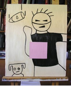
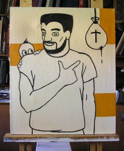
These three paintings plus the missing ones were all exactly the same size and nearly the same composition. Each was of one of my cartoon characters that I was drawing for my comic strip in the school paper or some other oddball character I made up. The round headed guy with the line splitting his face was called Mr. Rude but I don’t remember the name of the other guy or the child showing half his face. I remember choosing to use all those characters just to have something to paint. It’s hard to remember as I’m older now but in art school I had no idea what or how to paint. Just like every other student. This whole series of painting was about me learning to paint.
I had been studying fine art painting for a year up to that point (and commercial art for the two years before that) and it was just then that I was ready to figure out what I wanted to paint. That is not an easy thing to do. I decided to take things slow and one step at a time. I chose to make a series of paintings all the same size so that size wouldn’t be a decision I’d have to make again. I always liked figurative work but chose my cartoon characters because I already knew how to draw them and wouldn’t have to rely on live models as I was learning how to paint. Setting limits is often the best way to learn.
The other limit I set is easy to see. Color. I limited my use of color to help me learn how to use it well, it fit the style I was using, and it worked well with composition which is my most natural strength. Composition is pretty much all I had in those days when I was learning how to paint. “I always know where to stick the Ottoman”, as Norm on “Cheers” once said.

This was also before the days before I knew anything about Surrealist Automatic Drawing and pulling weird images out of the corners of my minds. I was making up those strange little things that surround the figures more consciously than I do these days though not with meaning. They are really there to make the overall image more interesting and to add some search for meaning to the painting. I didn’t care as much for actual meaning as much as I cared about searching for meaning. That’s why all those objects have little symbols or some kind on them too. They look like the mean something but what? I want to know too.
It’s not easy to write about a painting that you’re supposed to stand in front of to see because any reproduction of it can’t capture the surface of the painting. That’s what people who don’t see actual paintings might not know. Paintings, especially since the Impressionists, are as much about the surface of the painting as they are about anything else. How the paint is put on the canvas matters to the painter. Is the paint thick or thin? Textured or smooth? These are the decisions that are lost in reproduction.
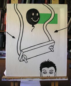
In these paintings the white in not blank or empty. The white is all painted with paint the same thickness as the color. It’s so thick that the black line actually has less surface than the white. It looks like the black line was carved out of the white. That’s gives the white space more weight than it would otherwise have. There is so much surface texture to these paintings that people would often tell me that it looked like they were painted on wood.

The blocks of color are all uses spatially. They affect the composition and they move other things forward and backward in space. This is how I learned how color affects the space of a painting. For example the green block in the painting with the swing looks like it’s behind everything but it doesn’t want to stay there. It’s not even actually a rectangle but two separate irregular shapes that our eyes make into a rectangle. And as our brain connects the pieces it moves it in front of the swing’s rope.
Of course all of that doesn’t just happen. The swing has to be in the right place, the negative space around the swing has to be just so, the arrows help move the swing and the space in our minds, the color has to be in the right place, and it has to be the right color. The images look fairly simple but each of these painting took me about a week. I spent most of that semester working on this series and I was learning a lot. Now you’re back at the beginning with me.
Discussion ¬