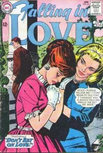
I’m back from the comic shop this week and I got four new comics.
Check them all out here:
I’m back from the comic shop this week and I got four new comics.
Check them all out here:
How did I get nothing done again today? I’ve had some sort of sinus infection. That’s how. I could feel it starting on Friday. You know that felling. The feeling of being a bit run down but nothing too bad. Sometimes that feeling goes away with a good night’s sleep but often it doesn’t. Usually that feeling means there is some sickness creeping up on me. I tried to rest on Friday to make myself better so I didn’t get anything done that day. Then I woke up on Saturday feeling even worse. So I rested most of the Saturday and watched some playoff football.
My symptoms weren’t that terrible. Sinus pressure, a stuffed head, weakness of body, and a general lack of focus. They made it tough to think. I took a nasal decongestant and that made me more comfortable but I still had no energy. It was better than having a flu though. That can really knock a person out. I had one of those a few years ago and was down for the count for a week. Couldn’t even get off the couch for more than an hour at a time.
Sunday I did get something done. I made five of my “Four Talking Boxes” strips. I make five of those every week and I’ve been doing three of them on Sunday and two of them on Monday for the last year or so (the days have varied over the years) but on last Sunday I decided to get all five of them done. It took about three times as long to do them as it normally takes me but I was glad to be doing something. Finishing them is also more of a technical process than a creative one so that was a bit easier on me. I didn’t have to think.
After getting all five strips done I had some more energy so I started another technical thing in the afternoon. I started recreating the Marvel Comics “Machine Man” logo as a vector graphic so that a friend of mine could use it in a cover recreation. I do this sometimes for friends and myself. I make a vector graphic in Adobe Illustrator out of an old comic book logo. It takes concentration rather than thinking or creativity so it’s something I can do when I’m not 100%. I didn’t finish it though. I ran out of energy eventually and rested the rest of Sunday.
On a side note I don’t do that well with either DayQuil or NyQuil. I gave up on DayQuil years ago because it makes be feel worse than the sinus infection. On Friday night I decided to try some NyQuil to help me sleep since I didn’t sleep well on Thursday night. Waking up on Saturday morning it felt like I was hit by a bus. I was weak and shaking from about 5AM until I got out of bed at 6:30 AM. I was happy when the effects wore off later in the morning and then I only felt bad from the sinus infection.
Monday rolled around and I was still not well. I got a little something done though. I finished the logo, trade dress, and template for “Machine Man.” It wasn’t a whole lot, not nearly as much as I got done on Sunday, but was something. I like to get things done. It gives me a good feeling. Getting nothing done isn’t how I like to spend my time. But I was still sick so I sat in a chair most of the day trying to rest. That’s what active people have the hardest time with when they are sick. Resting. Just sitting there when I want to be doing something. But resting has to be done.
On Tuesday I was feeling better but not well. I wanted to get stuff done but only managed to start my new sketchbook/inkbook for the year. I grabbed my small dictionary and randomly chose a word from it to name my sketchbook. It’s now called “Sidelong” as in “A sidelong glance.” I write that title on the cover and then write the definition on the inside front cover. It’s a habit of mine so that I can distinguish one sketchbook from another. I also managed to draw a page in it. Nine little ink drawings. Normally that would take me an hour but it took me twice that. Then it was back to the chair.
That brings us to today. Wednesday. I was feeling pretty good this morning. I’d say I was almost better. I drew another page in my ink book, went out to the store, and started working on an art card. I really thought I could get back to normal today and get some stuff done. Except I ran out of energy. That one little 2.5×3.5 inch art card took me way too long to draw. I kept having to sit down and rest and then get up to draw a bit of it. It was really frustrating. After I finished it I tried to get something else done but I couldn’t. No focus or concentration left.
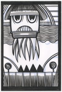
It’s a snazzy little art card. It’s a person with a weird haircut and flowered robe on. It’s not the greatest thing ever but I like it. It looks a little more precise than usual. I think because it took me more energy than usual to concentrate I really made the shapes distinct.
So now I’m better but not quite better. I haven’t taken any medicine since Tuesday when I only took one does of nasal decongestant so my sinuses aren’t killing me anymore but they’re still slowing me down. Since I usually stand and work I’m really tired of sitting. But even if I couldn’t stand and draw for a while I thought I could get a little something done while sitting so I decided to write. So here I am now. I’m not going to tell you I’m better but I couldn’t have written this on Saturday.
I’m back from the comic shop this week and I got three new comics.
Check them all out here:
This week is a good time for a winter cycling update and the update is that it’s too cold to ride. That hasn’t happened often. I first started winter riding back in December of 2010 and I’ve kept it up ever since. Every winter and all winter. I even like riding my bicycle in the winter nowadays. It gets me out into the world. Put on enough warm layers and it’s like riding in the summer. Except for a couple of things. Winter riding takes some adjustments and there are a couple of drawbacks. When it gets really cold my legs don’t work as efficiently as in the warmth and ice make for a very bad ride.
Warmth really isn’t a big problem as long as I’m dressed properly. Lots of layers and a windbreaker. Still I have a temperature cut off. If it’s below 20ºF outside I don’t go for a ride. My legs just don’t work well below that temperature. They lose their strength and rhythm. I’ve found that in the cold I have to pedal differently that in the warmth. I have to slow things down in the cold. My legs don’t have that burst of energy that they have in the warmth. I put the bike in a slightly easier to pedal gear and go slow and steady. Everything becomes a little harder but doable. That is until it’s below that 20ºF mark. Then it becomes too hard to bother with the risk.
Over the past seven winters I’ve missed some days riding because of the weather. Usually a day or two here and there because of a snowstorm. I think the most I’ve missed was three days in a row. I usually wait a day after a snowfall for the roads to be cleared before I get out there again. I’ve missed a few days because of the cold but not many.
This winter has been different. It’s been extra cold. I usually cycle in the morning and there have been a few mornings over the years where I’ve been eyeing the thermometer waiting for it to make its way to 20ºF. It almost always does. This week not so much. So far it’s been a week since I’ve been able to ride outside. It’s crept up above 20ºF on some of this days but not until well into the afternoon and well after my ride time. We’re in a deep freeze here in the NYC suburbs.
I used to ride a stationary bike in the winter. I was a warm weather rider like everybody else but I grew tired of the stationary bike. It’s boring to ride one. I still have one though so I pulled it out of it’s stored away spot and set it up to ride. It’s one of those ones with electronics in it so I can set it up for a ride in the park, strength training, interval training, cross training, and maybe a couple of other things. Plus there are level settings for all those things that control the resistance. I really don’t know how to set it all up properly so I’ve switched between them to try and find one I like. So far they all seem about equally boring. Though I’m usually out on the real bicycle for around 45 minutes I set the stationary bike for half an hour. That’s all I can take.
One of the things I’ve discovered about exercising is that in order to do it regularly it shouldn’t be incredibly hard. Back when I was in my twenties I could exercise hard, build body mass, and test my limits as I saw fit. But starting back in my forties (maybe late thirties) things changed. Recovery times got longer and maintaining things got more important than trying to beat yesterday’s score. So now I know it’s more important to be on the stationary bike for half an hour than to not be on it at all. When something is too hard that’s when people stop doing that something. So half an hour it is.
One good thing about the stationary bike is that I can catch upon some TV shows that I wanted to watch but didn’t have the time for. I’ve been checking out “Glow” on Netflix this week as I’ve been on the stationary bike. It’s about the 1980s’ women’s wrestling TV show. It got good reviews when it first came out and I think it has lived up to them. It’s a drama with some comedy in it. It makes the ride go faster too. The first day I was on the stationary bike I didn’t have the TV on. That half an hour went slowly. With the TV show to distract me the time goes by a lot more quickly. I even took an extra “Ride through the park” one night just to burn off a little bit of extra energy as I watched TV.
The stationary bike that I ride on is a Schwinn with a big, wide, and padded seat. You’d think that would be more comfortable than my narrower bike seat but so far it’s not. After a week of riding my butt is less sore but I’m surprised it was at all. I’ve been riding my regular bike for years and years with no seat soreness. It also took a couple of rides to get the seat and pedal adjustments right so there have been physical adjustments to riding the stationary bike as well as mental ones.
As I write this the snow is piling up outside my window. What started out as a predicted one inch has moved on to a predicted six to ten inches. Yep, the storm blew inland. The worst part of it is that the snow isn’t going anywhere soon. We’ve got a single digit Fahrenheit weekend coming up. It’s been so cold that even the couple of inches of snow that fell last week never melted. Not good winter cycling weather. As I look ahead in the forecast it won’t be until Tuesday morning I could possibly ride. That’ll be twelve days without being able to get out on the bike. Unprecedented.
I’m back from the comic shop this week and I got four new comics.
Check them all out here:
I like ink. Black India ink mostly. Historically the ink is actually from China but ages ago the English imported it through India so it’s come down to us as India ink. It’s the ink that’s been used by cartoonists and comic book artists since the beginning of the medium. Drawings are made in pencil and then redrawn in ink. The ink reproduces better than the pencil. At least in the olden days.
I’ve used a lot of different inks over the years. Back in the early 1990s, when I was just getting started learning to draw in ink, I bought a whole bunch of different inks and made a sample chart of them. I drew a grid of about ten boxes on a piece of Bristol board, labeled each box with the name of an ink, and then did some small sample drawings in each box. I used brush, ink, and whatever else I thought of of to make the sample drawings. I thinned the ink, erased over it, and scratched it with a razor. All the techniques I could think of. In the end I liked Higgins T-100 Drafting Film Ink the best. That was my favorite until they stopped making it sometime in the 2000s. Now I jump around from ink to ink.
I find it’s important to use waterproof ink. Once waterproof ink dries if you get it wet it won’t run or smear. If you get non-waterproof ink wet it’ll run and smear. I’m sure non-waterproof ink has its uses but I don’t have any for it. Early on I accidentally bought a big bottle of non-waterproof ink and didn’t have the money to replace it. So use it I did. It’s not like I’m spilling water all over my ink drawings but there is one wet object that always comes in contact with the ink. My hand.
I usually try to rest my hand on a piece of brown paper that I put on top of the art but that’s not a perfect system. When I was using the non-waterproof ink and my hand would rest on the art the sweat from my hand would pick up some of the ink. When I put my hand back down it would act like a stamp and put little ridges of ink on the paper. It wasn’t even a lot of sweat either. Just normal day sweat. They were light marks too. I didn’t even notice them at first but then they multiplied over time. Smears built on smears. I eventually abandoned the bottle.
Over the last couple of years I’ve gotten into colored inks. There have always colored inks around but a lot of them were dye based. That means that they’re not stable and their color will fade over time. I never used them for just that reason. In recent years there have been a lot of new inks on the market. They all seem to be called acrylic inks so I guess they have something in common with acrylic paints. There must be some plastic in them. They also have very dense color that doesn’t fade like dye based ink does. So I’ve bought a few bottle of those colored inks over the last five years or so and have drawn a bit in them. I don’t use the color inks much differently than black ink but they do make drawing look different. Color will do that.
I made four red and black ink art cards this week. That’s one type of drawing I do with the color ink. A duotone drawing. They’re usually my spontaneous ink drawing type where I don’t figure anything out in pencil first. I grab a brush and ink and see what I can come up with. This week’s art cards were in black and red. I often start with the color ink and then finish with the black ink but not always. With the horned monster and the three figures I started with black and then went to red. With the two head shots I did the opposite. They came out differently because of that.
When I start with the color ink I know I can block in a lot of color. Since the black is darker than the color I can carve back into the color with some black lines and shapes. Those ones tend to have less black ink on them. The ones where I start with black tend to be a bit denser. The horned monster has lots of ink on it. It looks like I went crazy with the red ink. The three figures are almost made entirely out of black ink. Only their capes are red. More red in the background balances things out but black still dominates.
The other type of color ink drawing that I’ve done is where I replace what I would have drawn in black ink with a color. Usually a single color. I have a couple of different types of those. The first type are the ones that I recycled some old drawings for. I dug out a couple of my old “Message Tee” drawings, printed out the pencils in a single colored inkjet ink, and then drew over them with the same color ink. I added a lot of different ink techniques over them too. I wanted to go off in a different direction than my “Message Tee” drawings.
The third type of color ink drawing that I’ve made is the themed one. They’re like my normal ink drawing except there was a thematic reason I went with a color ink. They are part of my goddess series and one drawing was of a fire goddess and another was of nature goddess. As you might guess the fire one was in red ink and the nature one was in green ink. Other than that they’re done like my normal India ink drawings. I pencil them, scan in the pencils, print out the pencils in the same color as the ink, and then get to the brush and color ink to draw on top of the color pencils.
So that’s what I’ve been doing this week. A little drawing in ink and a little thinking about ink.
I’m back from the comic shop this week and I got four new comics.
Check them all out here:
I had to take a trip to Brooklyn this week for a meeting. I haven’t been to Brooklyn in a while. I used to be there all the time but not these days. It’s always a bit of a pain traveling into NYC. Traveling around NYC isn’t too hard, they’ve got subways, busses, taxis, and bikes, but getting into NYC is always a question. Should I drive or take public transport? Driving is almost always faster and I’m not at the mercy of a train schedule but it’s also more expensive and can be more of a pain in the neck. Traffic and parking are two omnipresent problems in NYC. I decided on the train as I usually do.
It was the 8:55 AM train from Nanuet that I aimed for so that meant I left my house at about 8:20. I parked and made it to the platform and the ticket machines at about 8:45. I remember a couple of years ago there was an option on the ticket machines to buy a MetroCard and I hoped it was still there. Since I would be taking the subway it would be nice if could get the card in Nanuet instead of in NYC but that option isn’t there anymore. That meant I’d have to stop at another ticket machine once I got into the city.
The train came promptly ay 8:55 and I got on board. One of the reasons I decided on the train was that I could get some stuff done. I had my small notebook with me and I planned on writing some pithy sayings for my “Message Tee” comic strip. How does one write pithy sayings you ask? You sit there and try to think of them. I don’t find it very easy to write them. Over the last two months I’ve been trying to write a hundred of them so I can pick fifty two of them for next year’s comic. I aimed for about twice as many as I’d need so I could weed the weak ones out.
Since those pity sayings are not easy to do I find it hard to make myself sit down and write them. I used to write them as I went on walks but for the last year I haven’t been walking much and instead have been doing dumbbell workouts. So I’ve been behind on them and the train ride offered me a good opportunity to get some sayings written. I was on the same train going into Manhattan just a week before and got some stuff written. I was getting some stuff written again this morning but then the train stopped and didn’t start again.
It was about fifteen minutes into the ride I noticed the train was no longer making any noise and the cars outside were starting to build up at the train crossing. I noted that the time was 9:07. I wondered when we would get started again. The conductors didn’t know what was going on. I saw some flashing police light ahead at the train crossing and wasn’t sure if there was a problem outside or with the train. I could see the cars outside start to turn around and go the other way. I was not feeling confident I’d make my meeting on time.
I’m the type of person who likes to be on time. I get places early to make sure I’m not late. Even though I knew this meeting was really more of a drop by to fill out paperwork and therefore my being a little late wouldn’t matter it still irked me. Plus it was too much of a distraction for me to think up pithy sayings. It took us until 9:30 to get rolling again and we seemed to be rolling more slowly after that.
I was still distracted by the fact that I would be late but I managed to get some writing done. It helped that I was on the train with nothing else to do. Plus if I had been driving I would have got nothing done so I was glad I was on the train. Eventually we arrived at Secaucus Junction and I switched to a train that brought me into Penn Station. That’s a pretty painless process as there are no stops between Secaucus and Penn and trains run pretty frequently between the two.
It was about 10:40 when I arrived at Penn and I quickly made my way to the A train but first I had to stop at the MetroCard machine. I like the old days when all I had to do was go to the subway booth that had a person in it, hand over cash, and get some subway tokens. Now I had to get into this amorphous line with people kind of milling around. There were three machines in a row and the one in front of me opened up so I stepped up to it. I still have no idea if I cut the line or not since there was no clear line but no one said anything to me. I think I spent about $6.10 for two rides. I had to pay a dollar extra for since I wasn’t refilling a card. After the two rides I’d still had a few useless dimes on the card. It all felt like a scam. The MetroCard has always felt like scam to me. Tokens were more honest. You knew what you were paying for and what you were getting.
I took the A train to Brooklyn, switched to the G at Hoyt-Schermerhorn, walked to my meeting and was out of there by noon. That might have been the only part of the trip that went smoothly. The next train from Penn to Secaucus was at 12:29. Could I make that one? It was a close call but the next train after that one was 1:41. I gave it a try. I hustled to the station and luckily didn’t have to wait too long for the G. I made it back to Hoyt-Schermerhorn and waiting across the tracks for me was not the A train but the C train. The local. Waiting for the express would probably not save me any time so I got on.
I checked the time and it was around 12:10. I had eight stops to go until 34th Street Pen Station. At an optimistic two minutes between stops that got me there three minutes before my train left. I was watching the clock at every stop as my optimism faded. When I finally arrived at Pen. It was 12:30 and I knew I had a wait. I had brought my pocket camera with me for just such an occasion.
I spent the next forty-five minutes walking around the streets of NYC taking photos. Usually that’s not a winter activity but I was there with time to kill and so I did. Not a bad way to spend some time. I eventually got a train to Secaucus and finished up my writing in the fifteen minutes at the station there. This left me the train ride back to Nanuet to listen to some music. All in all I lost a couple of races with time but that was okay. I got some stuff done.
I’m back from the comic shop this week and I got three new comics.
Check them all out here:
I’m writing this moments after I’ve finished drawing my faux comic book cover “Dreams of Things” #50. I don’t think I’ve ever written about a piece this close to finishing it. I want to try it out while everything is still fresh in my mind. Or at least the coloring is. That is the part I just finished. I did the drawing and inking a few weeks ago.
I wasn’t a hundred percent positive where I was going with this one when I started it or even right before I colored it. It’s a drawing of a woman who is standing and smiling at us with seven lines behind her. That’s really not a lot to go on. Sure she has lines and marks all over her body but I wasn’t really positive what they all meant. They weren’t my usual “Painted Lady” type markings so that direction was closed off to me. Even after inking it I didn’t know how I was going to pull it all together. It sat for a while for just that reason.
The first part of this that I colored was the background. Often when doing a painting (or a marker drawing) we are taught to do the background first as a matter of technique. If you do the foreground first and then the background you will often have to go back into the foreground to change things. After all the foreground is the most important part and if there is a conflict with the background the foreground wins. But it’s often tough to do the background first since it’s usually the most boring part and you want to get on with the interesting stuff. But in this case it was easy since I still had no idea how to handle the foreground color.
Since the background had such simple shapes and design I decided to go with a three colors (two shades of each) and some textures. Light blue, purple, and an orange/yellow were my choices. I use the side of a brush marker to lay down the darker of the color pairs in a flowing cloud-like texture. I went from thick to thin really quickly with the side of the brush as I moved it across the page. I was looking to give the shape some texture and life. After the darker color is down I fill in the rest of the shape with the lighter color. It’s a technique I use in bits off background a lot but here it’s even more dominant so I took my time with it to get the colors and shapes how I wanted them.
It was a good choice to color the background first because that helped me decide what I was going to do with the main figure. I decided to color her like a Mod Man. Mod Man is one of the “Characters” that I’ve been drawing for years. I put the word character in quotes because Mod Man is really a decorative character. He’s never been in a story nor have I written any words for him. He’s something I draw. Usually Mod Man is a simple drawing made up of very few lines and colored in primary colors. Red, blue, and yellow are the colors of Mod Man. He also looks a bit like a Mondrian or other modern painting. I thought I’d copy his color scheme for this piece so that mean using the primary colors.
I started with blue and I started on the bottom. Oddly I knew I wanted her thighs to be red but I didn’t want to start with red. I have no idea why. So I colored her floating bikini bottom blue and then proceeded to work my way up her body coloring in the blue areas. That’s a matter of figuring out a pattern. I knew I was going to be using the three primary colors and the key is to try and not have too much of one color in one area. Red shouldn’t be next to red and the same for the other two colors. I quickly realized I was going to need a fourth color to make a pattern happen and I decided on a second blue. But that came later.
After I figured out where my first blue was going the rest of the pattern was easy. I put the red down second and that all worked out fine. As I was finishing up the yellow I realized that I hadn’t decided how to color her face. I was originally going to color her face a flesh color as if she was wearing a body suit but then I decided to color her face yellow. I only had a few strokes of yellow down when I changed my mind and made her face half yellow and half red. I think that balances the color better. The second blue, which is close in value to the first blue, went down next. I think that second blue is just light enough to act as an almost highlight and not make the first blue too dominant. I could have gone lighter with it but that might have been too much contrast.
All along I had the idea that I was going to color her hair orange but then I didn’t think that would work. There was already a ton of red in the piece and the orange might blend in too much. So I went with green. I think that was a good choice and I should have seen it all along. It’s a pretty obvious choice for contrast.
After the green I added a little shading along the edges. Not too much. I wasn’t going for a modeled look but I like the edges of the color to sit back in space a little. I use a color called “Light Grape” for this but I also had to add in some other dark reds and blues because light grape doesn’t work so well on the dense red and blue that I chose. I even dropped a little shading on the “Seams” between colors for some visual interest.
The very last thing I did was to put a pink textured halo around her. I wanted a little separation between her and the background so I doubled down on the texture. Since I’m putting transparent color on top of color there is no clear distinction between the halo and the background and that’s just what I wanted. It tied things together for me.
So there you go. I finished a piece and then wrote about it right away. Now it seems like forever ago that I finished it. That’s a little weird.