I’m a big believer in working with what you have. That’s my creative mantra. I try not to worry about what equipment or art supplies that I don’t have and concentrate on the ones that I do have. I’ve seen people get stalled or hung up on something they want to create because they don’t have one of the things they think they need to create it. I try never to get hung up like that and move forward with the tools I got. But it isn’t always easy. The desire for the perfect tools and circumstance is strong in us humans.
I recently wrote a blog about reviving all my gouache paint (a type of watercolor) so I could use them again. “Art Writing: Back to Gouache” was its name. And what did I do after I wrote that blog? I went onto my wish list on dickblick.com and put a whole bunch of new tubes of gouache on my wish list. About $150 worth. I really wanted to buy it. I had just set up all my old gouache, which was still perfectly good, but here I wanted all new tubes.
Why did I want all new tubes? I think because in my head that seemed like an easy starting point. Cleaning up all the old tubes and cubbies of gouache was hard and it was all a bit disorganized in the end. I imagined that if I could start over again with all new tubes I could get more done. I have no idea if that would be true but the very thought was stopping me from getting things done. Even when I know that I should concentrate on what I have and not what I don’t have it isn’t always easy to do.
As I was looking for new tubes of gouache I stumbled upon something I hadn’t seen before. Some gouache (or watercolor) is sold in pans. You get 12, 24, 36, or even 48 colors in small pans in a set. You wet the paint and off you go. I knew about pan sets but I didn’t realize you could buy the pan sets empty and add your own gouache. I though that would be cool to do with all those new tubes of gouache I was looking at. Now my price was up to $170.
In the end I came to my senses and didn’t buy all those new tubes of gouache. But I also remembered that I had a cheap set of gouache somewhere in my cabinets. I looked around and found a Reeves 24 tube set of gouache that had probably been sitting there for half a decade. I ended up ordering an empty pan set for $20 and now I’ll put the Reeves paints I already have in there. I don’t even care about the new tubes anymore. Sure I might get them someday but not today. I can get things done with what I have.
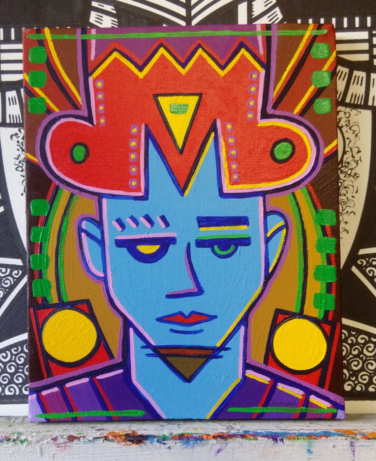
You’d think that all that couldn’t happen to me twice in one month, right? Well it did. This week I decided to do an acrylic on canvas painting. I don’t think I’ve painted in acrylics in at least three years. I have my acrylics in tubes, jars, and in small plastic cubbies. I often mix my colors in the cubbies. They’re fairly air tight but over three years acrylic paint will still dry out in them. Acrylics can’t be revived with water. They turn to solid plastic. I can peel them out of the cubbies but that takes some doing.
The cubbies I like are hard to find these days. In fact I can’t find them. So as I was painting I decided to clean out all my cubbies. About sixty of them. If I was richer or they were easy to find I would have just thrown these ones out. It really is a fair amount of work to clean a cubby of paint. I cleaned out a few of them to use as I was going along but for the most part I used my acrylic paint straight from the tube or jar.
Almost all of my tubes and jars of acrylic were in good shape. A couple of them were dried out but those were ones with little paint in them. The paint in some of the jars was thickened and needed some water added to them but that’s because they were nearly ten years old and had a lot of paint missing from them. I’m amazed they were even still good.
I worked on the painting for a few days and it was a little bit clumsy without all my mixed color in the cubbies. I did have plenty of paint though. I have three 11x14x3 inch plastic bins with tubes of paint in them plus about ten other jars of paint. I estimate I had 75 tubes and jars of paint to choose from. That is plenty. I got the painting done and it came out nice but do you know what? I didn’t enjoy making it. It was a hard process. Sometimes working on art is like that. It could have been because I haven’t made a painting like that in a while.
So guess what I did afterwards? I started looking at new acrylic paints on the internet. Yes, I somehow got it in my head that if I started over and put together a new set of paints things would get easier. I’ve got 75 tubes of paint and I wanted new ones. Before I actually took the time to pick all the colors out I came to my senses. I think I’ll take an inventory of the paint I actually have. That’s probably the way to go before adding more.
One last thing is the canvas I painted on. It’s an 18×24 inch canvas and I bought a bunch of them back when I was doing acrylic on canvas work regularly. I have three of them left but it also got into my mind that I should order more. These three have been sitting around for years and I immediately wanted more before they were even used. Sometimes it’s tough to work with what you have. The allure of what we don’t have is strong.