I’m back from the comic shop this week and I got seven new comics.
Check them all out here:
I’m back from the comic shop this week and I got seven new comics.
Check them all out here:
I’ve been thinking a bit lately about the things that collect in our lives. Not the things we collect, like comic books, DVDs, stamps, Beanie Babies, or whatever else you got, but the things we take along with us without giving them a lot of thought. The things that build up in closets and junk drawers that are around us. They’re not always junk. Sometimes the stuff to be found in junk drawers are sign posts that mark certain places we’ve passed through on the way from there to here. As an artist I have a lot of stuff tucked away. Art that I made a long time ago. It’s not junk. I have no interest in throwing it out but some of it doesn’t exactly fit into the art category. Some of that stuff is what I’m contemplating today.
Way back in 1990 I was lucky enough to be working in the Marvel Comics production bullpen. That’s where all the behind the scenes stuff that needs to be done to get a comic book ready to be printed gets done. It wasn’t a great job but it was a great experience. It was a fun place filled with a lot of creative people and most of us loved comics. It was also a great place to learn about making comics. Editing, writing, pencilling, inking, lettering, and coloring. It all got done there and there was always someone willing to share how something was done.
That brings us to inking. Inking a comic book began because it’s much easier to print a comic from an ink line than from a pencil line. So after a comic book is drawn in pencil it’s inked. That means it’s redrawn in ink. It’s not quite as easy as that one sentence makes it sound because there is a lot of nuance to inking. Since the pencil drawing isn’t going to be reproduced it usually isn’t a finished drawing. To save time some subtleties of the drawing are left out. The inker will put that stuff in. So the final drawing is a collaboration between the penciller and the inker.
The main problem with learning to ink is finding pencils to ink over. When you’re a young artist it’s not easy to learn how to pencil and ink at the same time with your own work. A young artist inking over his or her not quite professional pencils can lead to a lot of frustration. You still have to do it but learning over professional pencils can help a lot if you can get copies of some. Thanks to the internet a young artist can find copies of professional pencils online with a few clicks. But back in 1990 there was almost no way to get them. So it was lucky for me that I was working at Marvel.
In those pre-digital days an inker worked right over the top of a penciller’s pencils. It was all done on one piece of paper so the original pencils were gone by the time the inker was finished. But the pencils were often photocopied first so that they could be lettered on an overly at the same time as they were being inked. We in the bullpen had access to lots of photocopies of pencils. Of course photocopy paper isn’t good enough quality to ink on so that the inks had to be done on an overlay.
An overlay is when you take one piece of paper and put it on top of another piece of paper. In this case I’d take a piece of vellum, a thick tracing paper, and tape it on top of a photocopy of pencils. Working on vellum isn’t ideal. Though it works fine for the task vellum isn’t perfectly clear, much like regular tracing paper isn’t, so you really have to concentrate and make sure of what you’re looking at. That and the vellum tends to curl up a little bit as ink is applied to it and dries. As a consequence the vellum doesn’t always want to sit flat on top of the photocopy. I used to combat this by holding the paper down with the handle of a brush in my left hand as I inked with a brush in my right hand. I made it work.
It took me a while to ink a page like this back in the early 1990s. It probably took me about six or seven hours a page. That was a long time to put into practice pages. I never dated them so I have no idea what years they span but I would bet from 1990-1992. I have about forty of these pages so that’s a good month’s worth of work. As I was also working on my own drawings and inking over my own drawings I’d do a few of these practice pages every now and again until I didn’t think the practice would do me any good anymore.
So now it’s twenty five years later and I still have these inks on vellum that I did. They’ve been sitting in a drawer all these years. I’m glad that I kept them because that means that I kept the photocopies of the pencils that went with them. They’re the real prize. I wish I had kept even more of the photocopies. After we were done with our work with them in the bullpen we just threw the photocopies out. We’d keep a special one every now and again but mostly they were trashed. Otherwise weed be flooded with them and no one had the room for that. Plus there would always be new photocopies of pencils the next day. We were young and thought it would go on forever that way. That’s the way of youth.
The photocopies I understand but I can’t quite figure out what my practice inks are now. Are they art? I don’t think so. They look like art since they look like comic book pages but they’re not the pages that were printed in the comic book that the pencils are from. They’re kind of nothing. I still like them and find them a little interesting because they’re mine but what are they to anyone else? Who knows? I’m still trying to figure out what if they’re more than a curiosity to me. I do like curiosities though.
I’m back from the comic shop this week and I got nine new comics.
Check them all out here:
I have a friend, a fellow artist and comic book fan, who likes to commission comic books artists to make drawings for him. Sometimes he likes them to reinterpret an existing comic book cover. That’s where I help him out. Since it’s in my skill set I help him by digitally recreating the logos, trade dress, and production marks of the original cover. I scan in or search the internet for a scan of the original cover and then rebuild all the mechanical pieces of the cover. I print out all those pieces on a blank 11×17 inch piece of Bristol board for the artist to draw on. It makes a nice presentation.
The cover to Avengers #57 was the latest one I was working on. It was a fairly easy one to recreate since I had a lot of the pieces made already. I had already worked on an Avengers #4 so I had the logo made though I had to change the letter spacing a little bit. It seems Marvel changed the logo slightly between numbers four and fifty seven. I also had the corner box “Marvel Comics Group” logo done from a previous cover. The Comic Code logo was done because that is on every cover so zI made it ages ago and that just left the corner box heads and the cover copy. Luckily the cover copy was in a blank area so it was easy to cut out and clean up for printing. The heads took little longer to clean up but since there were only four of them it wasn’t too hard.
Another of the things I like to do when making these templates for cover recreations is the track down some original art from the same era to see the production markings on the paper. In the mid 1960s or so Marvel and DC Comics started handing out paper to their artists with preprinted marks on them so the artists did the work the correct size and there was room to write editorial and printer’s notes on the paper. To make the cover look more authentic to the time period it was originally drawn in I like all that stuff printed on the board. I already had the production markings recreated for this time period so I popped the logo and trade dress into that template.
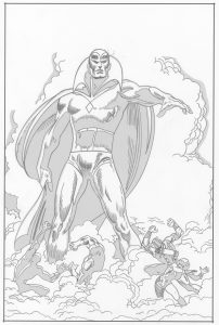
After I finished all this work on the Avengers #57 cover and it was ready to deliver I decided that I wanted to take a shot at making a recreation of it myself. Sometimes I like to do that. It can be fun to work with someone else’s image but it takes a bit of doing to recreate recreate a whole cover. I find it easier to work with big images than with small ones so I was attracted to the large figure of the Vision on this cover. That and there were no buildings on the cover. One of the covers I recreated last year was a Batman cover that had a lot of buildings on it. I find recreating someone else’s buildings to be a tedious task. The smoke on this cover seemed to be more straightforward. And it was.
When redrawing a cover my first step is to try and isolate the black line of the original cover. Since the scan I make of the cover is in color this isn’t always easy. Sometimes I can find a scan of the original art to make things simple but that’s not always the case. I digitally separate the black line as best as I can from the cover so that I can turn it into blue line to print it out. I make the blue line print out on 11×17 inch Bristol board and then I draw with a dark pencil right over the blue line. That’s not always easy. First of all the finished drawing I’m working over was done ink and now I’m working in pencil so it’s going backwards in the process. It’s a little weird to draw that way. Second the whole thing is done in another person’s style. I try to capture that but I’m also reinterpreting it a bit. Balancing that out is tricky.
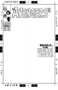
After I have the pencils done I scan them into the computer. I drop out any trace go the blue lines so that just my grey pencils are the only thing left to be seen and then I put those pencils into the template I made that has the logo, trade dress, and cover copy in it. I print out the logo and such in black with my pencils in blue line. Then I go to work inking the final piece. As I inked I found a few things I left out in the pencil stage. A line here and a shape there. I had to go back to the pencil version three times to put some more lines in but that was just for the future since I had already put those lines into the inked version too. Sometimes you just miss things.
The large figure of the Vision was pretty easy to work on but I underestimated the amount of work in all those small figures at the bottom. Those are really skillfully done in the original. They all have interesting gestures that are tough to duplicate since that’s not how I usually draw small figures. It really took me a bit of time and concentration to get them close to the originals. It’s the small stuff that really impresses me as I’m attempting a recreation.
One pain in the neck thing that happened to me on this one had to do with the corner box heads. I forgot to print them out. Corner box art was never drawn right on the original covers. Like the logos and trade dress that they are a part of they were photostats that were pasted down on the original cover. That’s why I always scan them in, clean them up, and print them out as part of the trade dress. This time I somehow left them out when I printed up the blue line to ink over and didn’t even notice the corner box was blank until I finished inking the whole piece. That meant I had to go back and draw and ink them on the piece I had just finished. It’s a tough feeling to finish something only to discover I’m not finished. But I soldiered on and drew and inked the heads. Of course it was all a lot more work than I though it would be. That’s how these things usually work out.
I’m back from the comic shop this week and I got five new comics.
Check them all out here:
One of the truisms I’ve discovered over the years that has to do with art is that numbers impress. If you show a person one drawing they might be impressed by it but if you show them twenty drawings, especially twenty drawings that share a theme, they’ll be much more impressed. It’s just the way our minds work. That has to do with another habit of mine. I’m not sure what to call it besides a confidence booster but every now and then I have to lay out a lot of my work in front of me.
Most artists I know are most interested in the piece that’s in front of them. Whatever I am working on now has my attention almost to the exclusion of all else and then after it’s done it’s gone from my attention. This leads to the feeling that I’ve done nothing. Maybe if I was a rich and successful artist I’d be surrounded by the trappings success and had a feeling of self satisfaction but instead I file things away and they often disappear from my consciousness. I find the key to countering that feeling of getting nothing done is to pull out a bunch of my work, set it before me, and give it a good look. That’s what I’m doing right now with my “Far Away Worlds” series.
I’m not much of a landscape artist. I make landscape images occasionally but it’s a specialty that I haven’t delved deeply into. Oddly the landscape paintings that have influenced my ideas most I haven’t even seen in person. They would be the landscapes by the famous figurative painter Gustav Klimt. I’ve only seen reproductions of them but I like them a lot.
“Far Away Worlds” is park of my faux comic book cover series and unlike my other faux comic book covers this series isn’t figurative. It has no people on it but is all about alien landscapes. Alien landscapes offer me more freedom to put weird things in them and use colors freely. Strange trees, weird hills, odd buildings, and planets in the background are some of the things I work into the images. I’ve drawn six of them so far. First I draw them in pencil, then I ink them, and finally I color them with marker. I’ve done enough of them now for patterns to emerge.
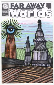
The first one seems most connected to my ‘Dreams of Things” covers. I was working on them at the same time so that’s not surprising. All of the ink work on it was done with my side of the brush technique. That makes a ragged and textured line. It also has the style of buildings in it that I’ve been using for years. This one is closest to other normal landscapes that I had drawn before it. It is the first of the giant eyeball towers. This developed into a theme. I think it’s a way to get something relatable into the image. At least relatable to me. I think I connect more with faces than landscapes so if I stick an eye in the landscape it affects me more than if it wasn’t there.
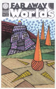
The second one has no eye in it. It’s the only one so far without an eye. It does have three slender pyramids in it though. Pyramids are another staple of my landscapes. You can often find them in the backgrounds of my pictures because they are a great basic shape and I’m a fan of history in general. The pyramids represent deep history. The house is a weirder than my usual ones. It doesn’t have any of my usual ancient Greek and Roman shapes but looks more like it has overlapping tiles. It’s not quite rectangular either which is odd.
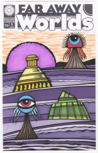
The third one is like the Klimt paintings. It has a high horizon line with levels in it. A modernest space. It doesn’t move back in 3D space like a realistic painting but builds from the bottom to the top. It also is the first with two eyes in it. I guess I was making up for the lack of an eye in the last one. I’m not sure what that giant purple sun is behind the yellow building. It’s almost a planet like shape that I’ve used before (especially in my “Deep Space” faux covers) but it’s in front of the mountains so it can’t be a heavenly body. Must be some sort of power dome. Weird buildings too.
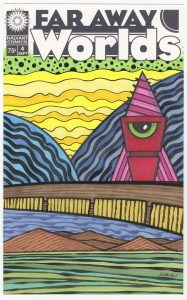
The fourth one is the most outer space-like. The building looks like it could be a space ship plus we’ve got two planets in the background. It’s a split composition too. The bottom half under the brown bridge is almost it’s own landscape. It has a sky, mountains, and grass all of its own. Also the atmosphere behind the planets is very cosmic. Yellow and green. Those aren’t colors we see in the sky.
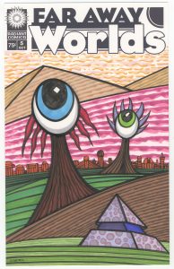
The strange eye trees become the star of the show in cover number five. The large blue eye is front and center. We get two three types of buildings with this one. Some basic pyramids in the background along with my simple shape line buildings on the horizon and a modified pyramid in the front. There are lots of elements here. This might be the best composed of all of the covers.
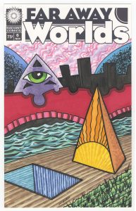
The sixth one might be the weirdest. The eye on the pyramid seems the most human of the eye creatures to me and somehow that makes it the weirdest. Maybe it’s that it seems to be standing on a bridge and only people stand on bridges. The bridge only became a bridge as I was working on it. It started out as a shape that might have become hills that morphed into a bridge. That was a surprise to me. The bridge is mostly symbolic too because it isn’t shaped like a real structure. The water under the bridge is also symbolic. It doesn’t fit into the world of the cover as real water would. The sun pyramid and the hole in the ground are what anchors the whole picture. They set the ground in place and let everything float about them no matter how weird the everything is. I like the weirdness of this one.
So there we got. Six faux covers. I laid them out in from of me and gave them a lot. I almost feel like I accomplished something!
I’m back from the comic shop this week and I got six new comics.
Check them all out here:
I’m back from the comic shop this week and I got six new comics.
Check them all out here:
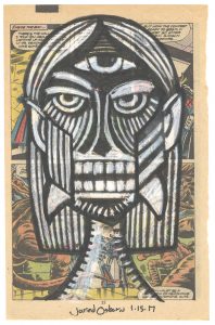
As an artist I’ve never been a big believer in waiting for inspiration. You’ll end up waiting for a train that rarely arrives. But sometimes it does pass through the station. Or at least something close to inspiration. Maybe it’s just a coincidence of events but either way a bit of preparation also helps.
It was back in 2006 that I did a couple of drawings that I called “Monsters on Comics.” At the time I had a lot of free new comics that a friend had given me and I didn’t have much use for them. Neither did anyone else. I couldn’t even give them away. I eventually ended up giving them to my local comic ship for their dollar bins. They’re probably still in there. But before I did that I decided I wanted to draw on some of them. It’s sort of a thing in the art world to draw on the pages of old books, old sheet music, and whatever other old printed matter you can find. A little sub-genre of drawing. It wasn’t an original idea for me to draw on comics but since it was comics I had available it would be comics I would draw on.
I think I only made two drawings. Two monsters on comics. It wasn’t easy. The paper didn’t take the charcoal or conté crayon that I was using on it very well. Plus since I had to draw over printing there was very little room for any kind of preliminary drawing. It was a struggle to get a finished piece done. I abandoned the idea after a week or two and a few tries but over the years it popped into my mind every now and again.
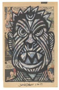
So cut to ten years later, which is now, and the idea has been rolling around in my head again. I don’t know why but I’ve been thinking about drawing on comics but what’s held me back was not being able to decide what comic to draw on. Sure I’ve got plenty of comics I could get rid of but I don’t have the freebies that I had back in 2006. The paper in comics has also changed over the last ten years. It’s thinner and glossier these days. That’s not very good for drawing on. So I never got it going again.
This weekend I was at my local comic shop. I was hanging out and chatting about comics as the owner was organizing his dollar box comics. He was pulling out some of them that were so beaten up that they were garbage. That’s when the idea for drawing on comics popped into my head again. I had no idea if I’d do anything with them but I took a few free crappy old comics home with me.
At home I got started on them right away. I guess I was excited about having some old newsprint comics to draw on but my excitement was quickly dimmed. I pulled out some charcoal, ripped out a comic page, and started drawing. That’s when I almost gave up. The paper wouldn’t take the charcoal. It was like rubbing on paper with a rock. It was a frustrating no-go. That’s when I got out the white conté crayon to try. That worked better but still wasn’t great. I put the whole thing aside for a minute.
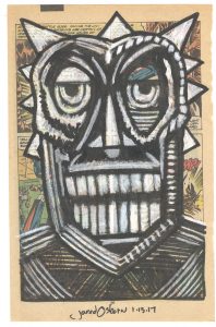
One of the things that’s changed since 2006 is that I have a lot more markers these days. I used markers a bit in the late 1980s and into the mid 1990s but then stopped using them. It was in the late 2000s that I decided to get into using markers again and there were a lot more markers to choose from than there used to be. They are better markers too. As a consequence I have a lot of markers laying around. Especially black markers. I like to try those out. I generally use the same few black markers but I have half a dozen more than those few in my marker bin. So I grabbed a Pitt Big Brush marker instead of the charcoal.
The marker took to that old newsprint like nobody’s business. The paper sucks the ink right out of the marker so there would be no trouble making black lines with it. The white conté crayon also worked well over the marker. Plus I found out that if I held the conté crayon at just the right angle it worked well on the bare paper too. I was good to go. Almost. Though I had figured out the tools that I needed I hadn’t figured out the imagery. My first monster on a comic was almost a bust. I couldn’t get it right. Finally out of frustration I put it aside.
Since the 2006 “Monsters on Comics” I’ve drawn a lot more monster faces. It was time to fall back on that experience and avoid the frustration. I found out that was easy enough if I did a small thumbnail drawing of the face first. Nothing fancy. Basic eyes, nose, and mouth positions. Plus the general face shape. It was so simple. The little drawing would take me two minutes and save me a lot of frustration. The little drawings were so simple that I didn’t even save them like I would a preliminary drawing. I just erased them and drew the next one on top. That helped keep it really simple.
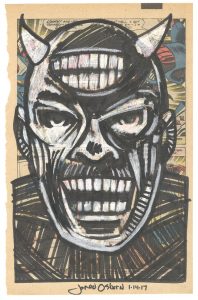
After the little drawing was done I grabbed the Pitt brush marker and drew in some basic features. I have a variety of brush markers and I’m not even sure why I choose the Pitt one. Maybe its big, chunky barrel caught my eye in the moment of choosing. Any way I choose it the Pitt worked well for me. It’s a bit tough to see the black line as I draw it depending on what’s printed on the page so I have to trust my little drawing for a while. I draw a bunch of black lines and shapes but the face doesn’t start to come into focus until I start to work with the white conté crayon. That’s when I start to see what I want to see. For the rest of the time I work back and forth between putting in more white and more black. It’s a balancing act until it’s finished.
I’m not sure if it was inspiration or just keeping my eyes open for something different to draw but I really enjoyed the process of making these “Monsters on Comics.” I worked on a bunch of them over the weekend and got six of then done. They make for a nice little set.
I’m back from the comic shop this week and I got six new comics.
Check them all out here: