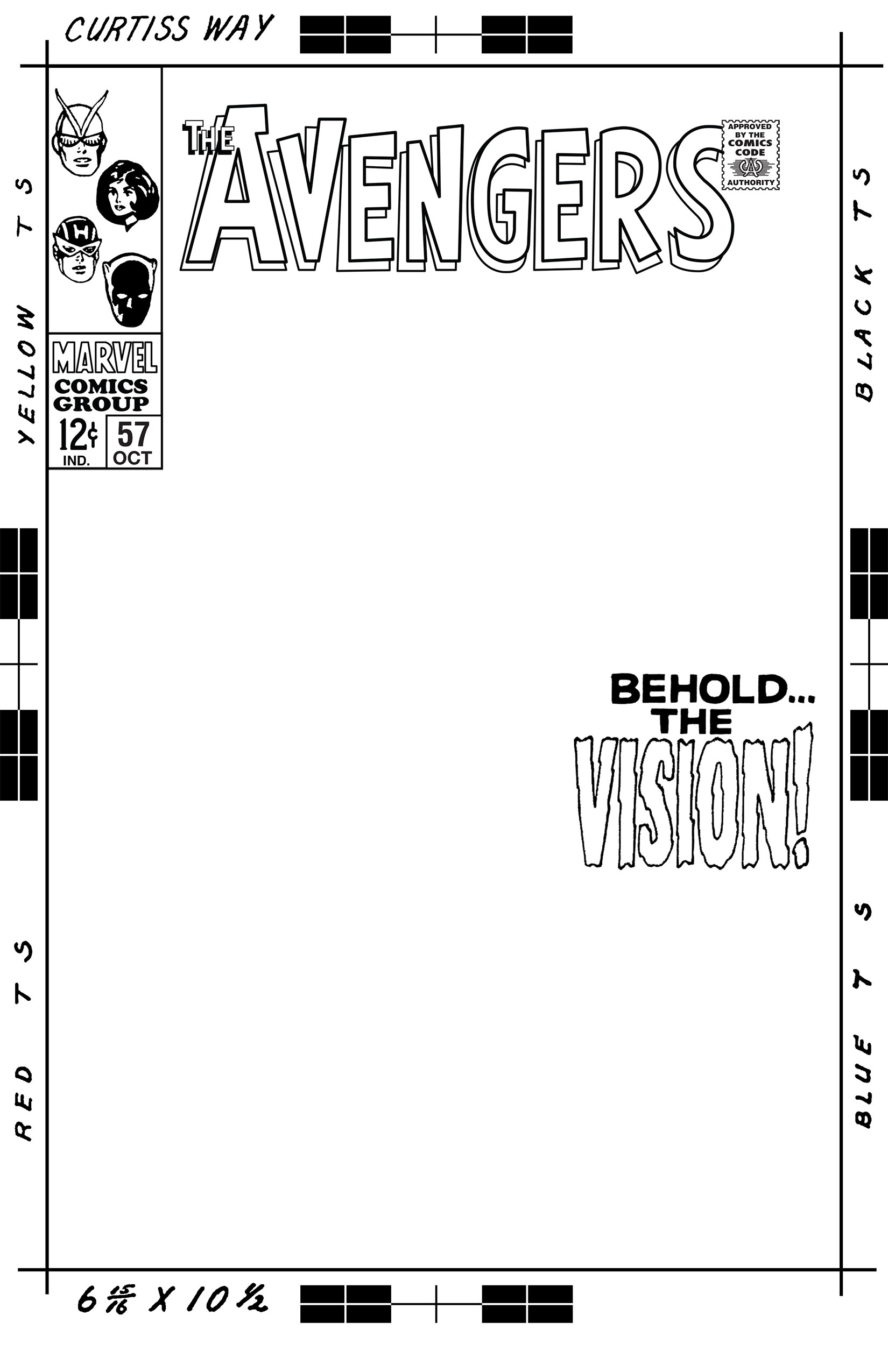
I have a friend, a fellow artist and comic book fan, who likes to commission comic books artists to make drawings for him. Sometimes he likes them to reinterpret an existing comic book cover. That’s where I help him out. Since it’s in my skill set I help him by digitally recreating the logos, trade dress, and production marks of the original cover. I scan in or search the internet for a scan of the original cover and then rebuild all the mechanical pieces of the cover. I print out all those pieces on a blank 11×17 inch piece of Bristol board for the artist to draw on. It makes a nice presentation.
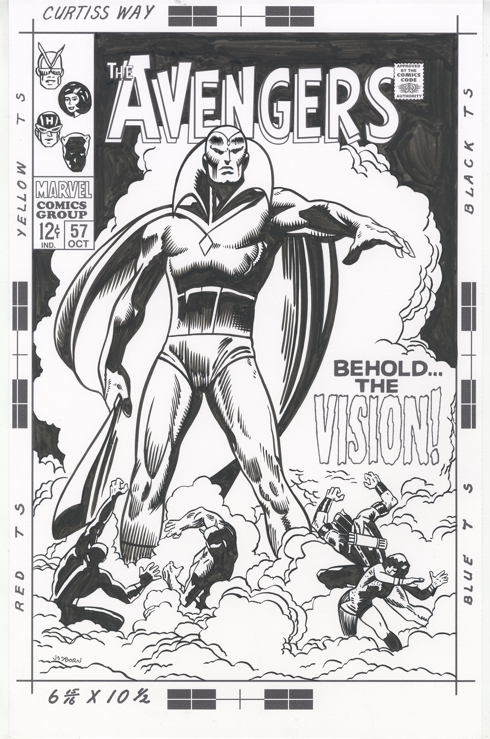
The cover to Avengers #57 was the latest one I was working on. It was a fairly easy one to recreate since I had a lot of the pieces made already. I had already worked on an Avengers #4 so I had the logo made though I had to change the letter spacing a little bit. It seems Marvel changed the logo slightly between numbers four and fifty seven. I also had the corner box “Marvel Comics Group” logo done from a previous cover. The Comic Code logo was done because that is on every cover so zI made it ages ago and that just left the corner box heads and the cover copy. Luckily the cover copy was in a blank area so it was easy to cut out and clean up for printing. The heads took little longer to clean up but since there were only four of them it wasn’t too hard.
Another of the things I like to do when making these templates for cover recreations is the track down some original art from the same era to see the production markings on the paper. In the mid 1960s or so Marvel and DC Comics started handing out paper to their artists with preprinted marks on them so the artists did the work the correct size and there was room to write editorial and printer’s notes on the paper. To make the cover look more authentic to the time period it was originally drawn in I like all that stuff printed on the board. I already had the production markings recreated for this time period so I popped the logo and trade dress into that template.
After I finished all this work on the Avengers #57 cover and it was ready to deliver I decided that I wanted to take a shot at making a recreation of it myself. Sometimes I like to do that. It can be fun to work with someone else’s image but it takes a bit of doing to recreate recreate a whole cover. I find it easier to work with big images than with small ones so I was attracted to the large figure of the Vision on this cover. That and there were no buildings on the cover. One of the covers I recreated last year was a Batman cover that had a lot of buildings on it. I find recreating someone else’s buildings to be a tedious task. The smoke on this cover seemed to be more straightforward. And it was.
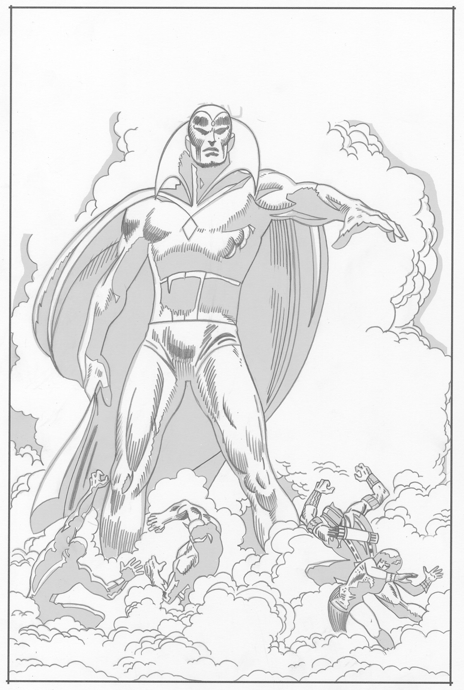
When redrawing a cover my first step is to try and isolate the black line of the original cover. Since the scan I make of the cover is in color this isn’t always easy. Sometimes I can find a scan of the original art to make things simple but that’s not always the case. I digitally separate the black line as best as I can from the cover so that I can turn it into blue line to print it out. I make the blue line print out on 11×17 inch Bristol board and then I draw with a dark pencil right over the blue line. That’s not always easy. First of all the finished drawing I’m working over was done ink and now I’m working in pencil so it’s going backwards in the process. It’s a little weird to draw that way. Second the whole thing is done in another person’s style. I try to capture that but I’m also reinterpreting it a bit. Balancing that out is tricky.
After I have the pencils done I scan them into the computer. I drop out any trace go the blue lines so that just my grey pencils are the only thing left to be seen and then I put those pencils into the template I made that has the logo, trade dress, and cover copy in it. I print out the logo and such in black with my pencils in blue line. Then I go to work inking the final piece. As I inked I found a few things I left out in the pencil stage. A line here and a shape there. I had to go back to the pencil version three times to put some more lines in but that was just for the future since I had already put those lines into the inked version too. Sometimes you just miss things.
The large figure of the Vision was pretty easy to work on but I underestimated the amount of work in all those small figures at the bottom. Those are really skillfully done in the original. They all have interesting gestures that are tough to duplicate since that’s not how I usually draw small figures. It really took me a bit of time and concentration to get them close to the originals. It’s the small stuff that really impresses me as I’m attempting a recreation.
One pain in the neck thing that happened to me on this one had to do with the corner box heads. I forgot to print them out. Corner box art was never drawn right on the original covers. Like the logos and trade dress that they are a part of they were photostats that were pasted down on the original cover. That’s why I always scan them in, clean them up, and print them out as part of the trade dress. This time I somehow left them out when I printed up the blue line to ink over and didn’t even notice the corner box was blank until I finished inking the whole piece. That meant I had to go back and draw and ink them on the piece I had just finished. It’s a tough feeling to finish something only to discover I’m not finished. But I soldiered on and drew and inked the heads. Of course it was all a lot more work than I though it would be. That’s how these things usually work out.
Discussion ¬