I’m back from the comic shop this week and I got six new comics.
Check them all out here:
I’m back from the comic shop this week and I got six new comics.
Check them all out here:
Some days I don’t know what I’m doing and some days I do. That’s life isn’t it? Some days when I’m making a piece of art I dive into a piece where I don’t know what I’m doing. But it’s on purpose. I’m trying to find something new. Trying to find some new tool or method of making a picture. I find that to be a good idea and I always think it’s going to be fun but it always turns out to be a chore.
It’s not easy for an artist to find his or her method or medium. Some people might dive into watercolor and find they love it right away. Others might try watercolor, not take to it, and then try it again years later and like it. That same person might also like painting people with watercolor but not landscapes. Or maybe that person likes fantasy landscape but not natural ones. Multiply that by oil paint, acrylic paint, pencils, ink, brushes, and even digital art and you have a lot of different artistic mediums to try and find your style in. It’s not always easy.
Time is a factor too. I’ve been making art since my student days back in the mid-1980s. That’s thirty-five years of making art. My techniques and tools are not the same ones I used back in 1989. Some are. I still use pencils and ink but from 1985-2000 or so I used oil paint. I switched over to acrylic paint sometime in the early 2000s. In the mid-1990s I learned to use gouache paints. Around the year 2010 I took up markers for the first time since my student days. I also went digital in 1995 and have been working on a computer ever since. Digital and analog is mixed for me.
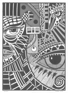
I write about this topic today because this past weekend I tried something new with one of my big ink drawings. Usually they’re either very tight images made with bold brush and pen strokes or loose drawings (usually big faces) made with my busted brush technique. This time I wanted to make a cross between the two. I decided to take one of my small loose ink drawings and blow it up into a big ink drawing.
My small ink drawings are baseball card size. 2.5×3.5 inches. I haven’t made any of them in a while but I have about 300 of them from over the years. They’re spontaneous drawings. I take a brush, dip it in ink, and then get to drawing shapes and see what I can do. At least a quarter of them are terrible but that’s all part of the process. I turn the initial ink marks into figures and places.
My big ink drawings are on 22×30 inch paper. That’s a long way from 2.5×3.5 inches. The normal way I start a big ink drawing is to blow up whatever drawing I’m working with and then print it out on eight 8.5×11 inch sheets of paper that I tape together. I then tape that piece of Franken-paper on top of my big ink paper and put some graphite paper between the two. That way I can trace over the printed out drawing and the pressure of the pencil transfers a line from the graphite paper to the big ink paper.
With the small ink drawing I wasn’t sure if I could use this process. The small ink drawing was mostly made up of shapes and not precise lines. My usual drawings have precise lines. Without them I thought it might be better to draw the drawing freehand to transfer it to paper. It seemed I could skip the printout step here to save time. But in the end I suspected it might take even more time that way. If I transferred the drawing by eye I’d have to be very careful to capture the shapes and proportions. That can take time.
In the end I blew up the drawing and printed it out. When it came to transferring it to the big paper rather than trying to follow lines (that weren’t really there) I drew loosely and tried to get the gesture of the shapes. It took some doing but it was definitely faster than by eye.
As with so many other things I thought this drawing wouldn’t take me a lot of time. Most of these big ink drawings take me at least two days with some of the more complicated ones taking me three. I though this one was loose and fast and I could get it done in an afternoon. It took me nearly two days.
The main problem I had in making this drawing was figuring out my technique. The small technique wouldn’t just scale up like a line drawing will. I’d need a foot long brush to duplicate the lines and brush marks that I made on the small drawing. Instead I decided to use my busted brush technique. That’s where I draw with an old brush that is split into a dozen points. It’s all about the lack of control. Stray lines are everywhere and it’s up to me to make something out of them.
I have to do a lot of building up of shapes with this technique so that’s what I spent the first few hours doing. It took a while. I built the black shapes up more and more over the day but there was still something missing. I wasn’t getting it. There were some parts of the drawing that I liked. The two figures were okay but not spectacular. A lot of the texture and shapes in the negative spaces were not very interesting.
One of the things I’ve never used with my big ink drawings is white ink. All the white in the drawing is the white of the paper. That’s how I do it. But looking at this drawing I thought it might need to work back into it with some white ink. I resisted it though. I’ve worked back and forth on pieces with black and white paint before but somehow in this context I didn’t want to. It would ruin the purity of the drawing for me in some way. I had to get over that.
I finally went into the drawing with white ink and a busted brush. I worked on the halo around the main figure’s head and the grass on the bottom. After that I worked on the sky and the spirals. Then back to the grass and halo. Later, rinse, and repeat. I did this over and over. White then black then white again. For hours I tried to find the right balance and I’m not sure I ever did.
Usually I know when I’m done with a drawing but in this case since it was a new technique I wasn’t sure. That’s one of the problems with doing something new. If I don’t have a vision for the finished piece how do I know when it’s finished? On the second day I ended up just stopping. I had to choose a place to be finished so I did.
In the end I’m not sure if I like this piece. It’s okay but it’s so different than my other stuff I’m not sure about it. That’s the way it is with something new.
I’m back from the comic shop this week and I got four new comics.
Check them all out here:
I was just writing about my collection of photographs and I realized I have another photo collection. Photographic negatives. It started back in 1999 when I discovered that I could buy old negatives on eBay. I bought some old 1960s medium format negatives of the backstage of a Paris burlesque show of some sort. Those negatives sat around for years. The story of which is here: http://radiantcomics.com/art-writing-paris-1964/
Since I bought those Paris negatives I sometimes look on eBay to see what other negatives I can find. The main idea is to find some old forgotten images that I can use to make something new out of. I love creating my own images when I make art but every now and then I like to make something out of someone else’s image. I even once found a negative being sold on eBay by the photographer hoping someone would do that very thing with his negatives. That was kind of cool. I made something and sent it to him.
That was the exception though rather than the rule. Most of the negatives for sale on eBay are not by the artists or photographers but by people who buy up lots of random things to sell on eBay. The vast majority of it is old pornography. Sure there are auctions that have random old family slides or negatives in them but they’re generally useless as far as I can see. At least I’m not willing to pay money to take a chance on them.
The old pornographic negatives are generally pretty useless too. At least as far as I can tell. The photos are of low quality and the imagery is dull. Just some random naked woman standing there not looking very interested in life. I bought a couple of lots of such negatives over the years hoping I could get something out of them. I picked the best ones I could find and got them for dirt cheap but I still haven’t ever done anything with them. That just sit on my hard drive unlooked at. I see four sets of negatives that fall into this category.
The best stuff I’ve found on eBay is stuff by “Name” photographers or models. I don’t actually know who these people are but some pin-up photographers and models are better known than the rest. I can see why. It’s usually collectors or dealers who sell this sort of stuff. The few pieces I’ve picked up have been fairly cheap. In this category prices can get high. I’ve seen a single negative go for a hundred or two hundred dollars. That’s rare but I guess there are collectors of vintage pin-up negatives and photos out there.
I’m good at organizing stuff and my hard drives are no exception. I know right where to find all the scans I’ve made of these negatives over the years. They’re in a folder called “Ebay Photos.” Pretty simple. The strange thing is all the stuff I’ve forgotten that’s in that folder. I haven’t worked on anything in it in what looks like three years. That’s a while. Let’s see what’s in there.
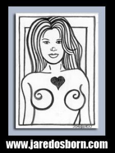
The first one on the list is one of my masked photos. Since I’m looking to transform these negatives into something new rather than just make prints of them one of the things I do is draw masks on the faces. In the case of this photo named “Amateur Big Butt” (probably what the auction was named) I also drew a mask on her butt. It’s tough to transform pornography into something else so masking her butt became my solution. I also see “Busty Brunette Studio Pose” is another photo I drew a mask on. This one is more of a fine art photo. There are also two “named” photos, Cathy Crawford and Cassandra Robinson that I drew masks on.
I have a single non-nude negative of the actress/model Mila Jovovich. I never did anything with it. I probably bought it because of her celebrity but never came up with an idea of how to use it. Probably because of her celebrity. It’s also not a great picture. Just an okay one.
One of the folders is named “Female Nude Figure Models” and has a bunch of scans in it. I looks like I started three photos that were supposed to go together that I don’t think I ever finished. It looks like I did a lot of work on them. They have masks draw for their faces and “Tattoos” for their arms. I wonder what I was up to with these? I’ve long forgotten.
There is a folder called “Four Negatives” from February 2020. I think these were the last negatives I bought. I scanned them in, cleaned them up, and then lost interest in them. I haven’t done any work on them since. I also see a “Harrison Marks UK Model” folder from 2017. Nice photo but I also never did anything with it. This one catches my eye right now though.
Next I have a folder named “James Schuckner Reference Photos.” It turns out he was an illustrator and he took photos to make his illustrations from. Pretty cool. They look almost like someone took photos of his photo session though. The model is always looking like she’s posing for another camera and not the one taking these photos. It’s a little bit weird.
The last folder is filled with negative scans of photos of a model named Rachel Wilson (whoever she is). I remember the “Exposure” menu in Photoshop helped me out a lot with these ones. They’re from back in 2014 and I had already been working in Photoshop for 20 years at that point but had somehow never used the Exposure menu much. That menu helps correct a photo when the exposure wasn’t quite right when the picture was taken. You can under or over expose the digital file to make it look better. I liked these photos and ended up using two of them to make masked photos out of.
One final note on the negatives and my use of them is that those masks were really hard to draw. I used to have a whole convoluted system for making them that always took more time than I thought they should. Then I got an Apple Pencil and iPad and they became a lot easier to draw. I’d draw the mask in Procreate right over the photo. Yet after a couple of those I lost interest. I’m not sure why. Now I feel like going back and revisiting my masked photos.
I’m back from the comic shop this week and I got six new comics.
Check them all out here:
I collect photographs. Or maybe I accumulate them. I once had an acquaintance tell me that if your collection isn’t in any type of order than you don’t have a collection. You have an accumulation. That’s stuck with me and I think there is some truth to it. My comic books are certainly a collection. I have a database of my many thousands of comics and I can look up and find the location of any of them. My photos are less organized. But then again they don’t really need to be.
My photo collection isn’t very big. I’ve been collecting fine art photography since the late 1990s when people started selling their work on eBay but it’s not like I’ve bought hundreds of them. I don’t even think I have one hundred photos. I have mostly bought fine art female nudes but sometimes I’ve bought photos of landscapes and doorways. For some reason I have a fondness for pictures of windows and doors. I think it’s because I like the geometry of them. I’m big into rectangles.
Most of the photos I buy are 8×10 inches or smaller. I have a couple of bigger poster sized ones tucked away in portfolio cases but almost all of my collection is in one 11x14x3 inch archival art storage box. I keep the box on a shelf right near the seat I am sitting on this very moment. Occasionally I pull it down and give the contents a look.
I keep my photos two different ways. For the larger photos I mount them on boards with photo corners and then place them in mylar sleeves. I like to pick them up and look att them rather than frame them. Since I’m a comic book collector I use the same bags and boards I have for my comics for the photos. They’re a little bit bigger than comic book bags but I get buy them from the same place. For smaller photos I use three ring binder archival photo sleeves. I have those in 5×7 inches, 4×6 inches, and slide, negative, and baseball card size.
I also try and keep some sort of record of where and when I bought the photos. Give them some provenance. I haven’t always been good at this and have forgotten sometimes so it’s not all complete. Plus I think I have some of the records digitally and not printed out and stored with the accompanying photo. I’ll have to straighten that all out one day if I can.
The two big poster size photos I have are stored mounted on matte board and slipped into a really big piece of mylar. I make my own really big photo collages that are around 20×30 inches. Sometime in the early 2000s when I started putting a lot of my comic book collection into mylar bags I discovered they made all sorts of sizes including up to about 30×40 inches. I bought some of those for my own photos and ended up using them for the big ones I bought too. I probably even bought the big ones since I was confident that I could store them. Those big sleeves aren’t cheap. They run about $6 a sleeve and you have to buy them in a batch of ten. I’ll have to pull those big photos out and put one of them on my easel for a little while. That’s how I look at them.
I mention my photo collection because just this week I got in some Instax photos. They’re the instant Polaroid photography of today. An Instax is a small, 2×3 inches, one-off photo that an Instax camera makes. They’re meant to be a fun instant gratification party thing. I follow a bunch of alt-models on social media and sometimes they sell Instax photos of themselves to make money. In the world of endlessly reproducible digital photography an Instax is supposed to be a one-off that a person can own for themselves. An object of art. An original.
The main problem I have with Instax photos is that they’re not very good art objects. They’re generally small and crappy. There are some 3×4 inch ones that are a little bit bigger but those are still small. The print quality isn’t exactly great either but that has a lot to do with the size.
There is one Instax photo that I bought a few years ago that’s my favorite. It’s by and artist/model named Tiffany Helms and it’s a 4×3 inch Instax that she painted on. It’s a nude photo of her twisted up and in the negative space of the background she painted in two greens and two reds. It creates a flatness and a roundness that I like. This one really is a nice piece of art. I keep it on my drawing table.
Despite me thinking Instax photos are crappy in general I occasionally buy some just because they can be cheap. By that I mean around $5 for an Instax. That way I can drop $20 on four, support a fellow artist, and get a few pieces. One of which must be good. The odds say so. Often Instax photos are sold sight unseen when they’re this cheap. A random grab bag. That’s okay with with me as I like the surprise.
Last month I bought four of them on Etsy from Angie Marie Dreams. Well, actually I bought three but then she went out of town without sending them so to make up for the time it took for me to get them she threw in an extra one. That was cool.
After I got them I did what is now my habit with such small photos. I scanned them at a high resolution (2400 dpi), cropped them, color corrected them a little, and then printed them out on 5×7 inch luster photo paper. I put my prints of the Instax in my photo box along with the original Instax photos. That way I can see the originals or look at the easier to see 5x7s. It’s a good system for looking at them.
So if you’re looking for some photos they’re easy to find online. Just check Ebay, Etsy, or even Instagram. I bet you could find something you like.
I’m back from the comic shop this week and I got two new comics.
Check them all out here:
I like doing things. Especially making art and such. I’m not very good at doing nothing. That makes it hard to relax sometimes. I usually sit in a chair and watch TV to unwind for a couple of hours before bed but besides that I’m not good at sitting and doing nothing. It’s always more fun for me to do things. But I can’t do things all the time or I’ll get exhausted.
In my younger days I’d do that every so often. I’d be working for a living a certain amount of my time and I’d be working on my art with whatever other time I had. I’d end up going for ten to twelve hours a day for weeks on end until one day I just couldn’t go anymore. My body would make me sit down and do nothing. Sometimes by starting to get sick but mostly by just feeling tired and burnt out.
I’ve learned to pace myself better in my middle age. I’ve managed to not make myself exhausted like I used to for about a decade or so. I’ve also learned to do busy work when I want to keep busy but don’t have the energy to do anything real. Busy work is work that is repetitive and keeps my hands busy but not my mind. It’s the stuff I can do in my sleep as the saying goes.
In the past I’ve done scanning as busy work but that can actually be more tiring than I expect. When I scanned in about 50 of my 22×30 inch drawings I got worn out just moving all those large drawings around. They’re not heavy but each one had to be scanned in four pieces so that’s 200 careful and precise movements. That took more out of me than I thought it would.
Back in the early 2000s I scanned in all my photo negatives from the 1980s and 1990s. That was a huge project and far from busy work. Each negative strip had to be carefully handled, cleaned, and mounted into a scanning tray. That took me weeks to do and was in no way relaxing.
The scanning I’ve done that is busy work is mostly old photographs. I take them out of a box or album, place a bunch of them on the scanner bed, and then scan them in. There is no cleaning of them and they’re small and easy to handle. I can put four or five of them on, set them up to be batch scanned, and then let the scanner do its work. Much easier than negatives. But negatives make for better scans since they’re the originals.
What I’ve found myself doing this week to relax is typesetting. Though it has been part of my job over the last decade I find it easy to do. What is typesetting you ask? It’s making type look the way the designer wants it to look. It’s about putting the words in bolds, italics, paragraph styles, and generally making an article or book pleasant to look at or easy to read. Typesetting is usually done after the design process is over and the creative work has been done. Of course it’s done on a computer. Usually in Adobe InDesign.
I recently read online that during this Covid quarantine a lot of sports card stores have been doing well. People have been looking to find things that made them happy in the past and have been digging out their old cards and even ordering more. Before I even read that I started digging out some of my old Collectible Card Games from the 1990s to look at them.
One of those card games was a Windstorm CCG from 1995. I remember playing that one and enjoying it back then. Now we cut to 2003. That was the year I was first getting nostalgic for the game and look on eBay for the cards and discovered there was a solitaire version of the CCG. I bought some cards but then never played the game. Now, seventeen years later, I dug the cards out to give them a try. But the instruction book was really tiny. Too tiny for my old eyes.
My typesetting skills in 2003 are a fraction of what they are now. These days I can typeset in my sleep. So I got the idea I could scan in the instruction book, set it up in InDesign, typeset it, and then make a PDF for my iPad. I could have just scanned the pages in as images but that didn’t seem like much fun. And it would be inelegant. So I used the Optical Character Recognition (OCR) setting on my scanner and scanned in the thirty two tiny pages of the instruction book.
OCR is far from perfect and with this tiny book it made a lot of mistakes. Italic type a sixteenth of an inch high isn’t easy for the computer to read. A lot of my typesetting time went to copyediting rather than typesetting. Fixing spelling mistakes. But it was still relaxing. Typesetting is like putting together a puzzle. Make this part bold, this part body copy, indent here, this part has to be a bullet list, and this part need to be a headline. It’s all about taking care of the details. There are no creative decisions needed.
This type of busy work is almost like meditation for me. I end up not thinking about anything. I enter a head space where I’m just following the pattern. I’m making this computer document look like this tiny book. I have to pay close attention with my eyes but no so much with my mind. It took me a couple of afternoons but I got it done. Then I tried out the game with an easy to read instruction manual.
After I finished that game’s manual I continued to dig through some of my other cards. There are a lot of CCGs that I remember fondly so I decided to typeset and make PDFs out of their instruction books too. So far I’ve typeset a card game named “Dixie” and another one named “Heresy.” There was a third one named “Guardians” that I scanned in images of because OCR wouldn’t work well on it.
For now I’m done with typesetting old instruction books and have moved on to other stuff. But if I find myself in need of some busy work to help me relax I might get back to it.
I’m back from the comic shop this week and I got nine new comics.
Check them all out here:
I’ve been making some big ink drawings in the last few weeks. One a week for the last three weeks. I got some new 22×30 inch watercolor paper so I figured I may as well start using it. I take in progress photos of my big ink drawings (as long as I remember to) with my iPad. In recent months I’ve even taken to using the drawing app Procreate to her me with my big ink drawings. Turns out it works well for that.
Procreate is the best drawing app I’ve found for the iPad. By its popularity a lot of people agree with me. It costs about ten dollars which is a bargain as far as I’m concerned. It has good brushes, layers, and works well with the iPencil. It has a lot of the drawing functionality of Photoshop. You can even do serious digital painting with it but I don’t. I prefer to use it for sketching.
I’m going to start by showing a photo of a big ink drawing at the end of day one. Usually it takes me two days to finish one of these provided that I had the initial drawing all done. I take picture during day one but these just show the work in progress from the top to the bottom of the drawing. I’n not usually making big decisions on day one. I’m just doing the basic ink work. Putting the lines in and getting the thicks and thins just right. It’s on the second day that I add all the blacks, textures, and patterns to make the drawing come to life.
You can see in the first photo that it’a all there. All the shapes, all the line weight, and all the drawing is in there. Everything is clear. This is the drawing that I did at a smaller size brought to life on a 22×30 inch piece of paper. But it’s not done. This is when I take a photo of it, bring it into Procreate, and draw right over the photo to see what I can do with it.
You can see what I did with it in the second photo. I added more lines in the smaller figures face. This makes him look a little more interesting as well as it makes him look older. That’s a general rule. The more lines you draw in a face the older that face looks. I even gave him some bags under his eyes. And a few more lines in his hair. Not to mention the stripes on his shirt. With the bigger face I rounded off his jaw line and made a weird beard out to the side bits. I also gave him some circles around his eyes. I tried all this stuff out in Procreate first before I did it on the real drawing. It helps to be able to mess around. I also gave him a left side to his nose.
At this point in the process I take another photo. Let’s call it number three. I load it up in Procreate and draw on it to see what I can do. Looks like I spotted some blacks. That’s easy to do in Procreate. All I have to do is drag a sample of the color black into the area I want to color and it fill is automatically as long as there are no breaks in the line. I spotted blacks all in the background on the bottom and right side and then filled them in on the actual drawing. Then I figure out what to do with those mountains. I made a series of ink lines that got thicker as the mountains moved back in space.
In photo four we can see more changes. I put lots of parallel lines in the “Shirt” of the bigger guy. Plus I put lines under his chin making it more of a beard. I think I meant to do this in the last step but forgot. I also defines his teeth, Then I added thin lines into the clouds in back thus making them more of a grey tone. And look at that. I spotted some more blacks on the smaller guy’s sweater. I call it a sweater because the texture makes it look fuzzy.
In the fourth photo we get small parallel lines in the bottom background and a few small perpendicular lines it the bottom guy’s hair. Not a lot of dramatic changes but this is really late in the drawing and I spend more time contemplating what I’m going to do than doing it. Procreate really helps at this stage to try things out so I don’t ruin the drawing by making a mistake. Looks like I also put some swirly cheek bones onto the big guy.
The only change I see in photo five is some more lines in the background clouds. This time thicker lines. I must have been stuck at this point and took one final photo to fool around with.
The sixth and final photo actually has some big changes in it. I added more stokes of ink for hair in the big guys hair, blackened in his eyelids and nostrils, and added some shedding lines on his lips. That’s a lot of changes to his face. I also added more lines and some circles to the bottom guy’s sweater. I thickened up the outline of his face too but I’m not sure if I didi it at this stage of the last one. It’s hard to tell from the photo. And when did I add those horizontal lines to his collar? It must have been a few photos back but I failed to notice them.
So that’s it. Day two and it’s finished. Day one is all about getting the technical aspects of the drawing correct but day two is about making it come alive. Day one is all about acting and day two is about reacting. Sometimes I like one or the other better but most times I like mixing it up.