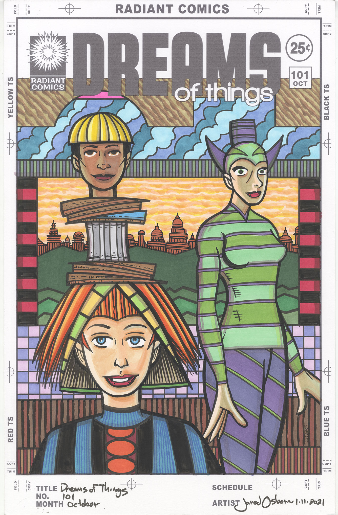
I finished coloring a “Dreams of Things” cover this week. Number 101. I colored it with Copic sketch markers over India ink. I used Blick Black Cat India ink on this one. For these covers I usually pencil them one day and then put them away to ink another day. After I feel like inking one I then ink it and put it away again for coloring some other time. Though I keep a calendar and write down exactly what I do each day I don’t put a date on the piece until I finish it.
I don’t know how long it’s been since I’ve mentioned this but I print out the logos and trade dress on the piece of paper I’m going to ink and color on. That’s because I want the finished piece to look like a comic book cover with all its accoutrements. I even print the production markings around the outside of the paper to make it look authentic. Comic book companies used to print up paper with similar markings to give to their artists to draw on. This ensured that the artwork was done at the correct size. I like the way the marks look.
Here is a tip for anybody interested in working with markers. Write down what colors you use for a specific purpose. I call them “Color Recipes.” I did this a lot more back when I was just starting to figure out a finished technique with the markers but it came in handy with this piece. There are three faces in this one and I wanted to make them three different colors. I went to my notebook where I wrote down my recipes and and picked three skin colors to use. I didn’t have to figure it all out over again.
The most complex part of this cover is the background. There is a lot of it. Though there are three faces and two figures they don’t take up a lot of the image. That’s unusual fo me. I count at least six major areas of background. The very top (right under the logo), the clouds on top, the landscape in the back, the side stripes, the checkerboard, and the fence at the bottom. I knew I’d have to figure out the background first.
As I was figuring out the background colors I had two things in mind. I thought the woman on the right’s shirt should be green and the little area under the D and R should be pink. I didn’t put those colors in until the background was all finished but I had them in mind. Sometimes a couple of colors jump out at me from the very beginning and it happened this time.
I’m usually a top to bottom artist. That means I don’t work on different areas of the page willy nilly. I start at the top of the page and work my way to the bottom. Most of the time. There are exceptions.
With this piece the first color I put down was the brown area underneath the logo. I went with three colors in the diagonal pattern to make that area a little less flat and more visually complex than it would be with a simpler color scheme. The clouds under the brown part also has three colors of blue in it. That was my theme for the part part of this piece. There color combos. I think that was the are that had the least going for it drawing-wise so I needed some rich color up there.
At this point I skipped over the area right under the blue to color in the landscape. I knew I wanted that skipped area to be a neutral color but which neutral I didn’t know yet. Once I decided I wanted a three-tone orange sky I decided the building should be a darker orange tone. That kept my complex tone theme going. It was natural to keep the ground of the landscape green but I also kept the greens dark since I knew I wanted that shirt green. I had the idea to make the sides red but I wasn’t sure and didn’t color them yet.
Here is where I skipped down to the bottom and made the fences brown. I went with only two tones of brown each because if I went with three tones that would be too much color change. I wanted to calm things down a little on the bottom since there was a lot of color in the figures at the bottom. I also thought to go with light purple and pink in the checkerboard at this time. So the top has color in threes and the bottom has it in twos.
Then I went on to color all three faces from three different color recipes from my notebook. These faces have the most colors in the smallest areas of this piece. For some reason I often like orange hair and the biggest face got the orange hair this time. There is some light green and yellow in there too but orange is the main theme. That made me give the top face yellow hair. I made the hat thing neutral grays and browns and then finally decided the biggest character’s shirt should be blue.
Now is when I finally got around to coloring the figure on the left. I knew I wanted her shirt to be green all along but I wasn’t sure if the pants should be green or not. I put down the two tones of green in the shirt and then decided that the thin stripe should be purple. This lead me to the purple and violet pants with a green stripe. I like the way that worked out and colored her head gear like that too. I even decided to bring that color theme into the space under the clouds. I finally colored that area.
Though I had the idea for the red sides earlier on I didn’t actually put in the red until late. I wasn’t sure if it would be too much but since I used no other red in the piece it wasn’t. It also makes a nice triangle of color with the orange buttons on the shirt. The last thing I filled in was they little bit of hot pink under the D and the R. And it was done.
I like the way this one came out. I wasn’t sure of what I was going to do with it and was hesitant going in but I took it step by step and it ended up nice. If only they could all go like that.