I got weird with it this week with “The Acid Ram” number twelve. It’s another in my faux comic book covers series. I think the series might even be the favorite of my fake comic book covers because I like the name a lot. “The Acid Ram.” I don’t even have an exact meaning for it and that’s part of why I like it. It’s weird and anyone can bring their weirdness to it. Have you got something that you want it to mean? Go ahead and let it mean that to you. It’s that kind of title. It fires up my imagination.
“The Acid Ram” also is an outlet for my strangest drawings. One of the things about being an artist who has a lot of strange drawings is that you have to find an outlet for them. A way to present them to people. Sometimes if people are handed a bit of weirdness they find it off-putting. They don’t know how to take it. I have to give them a way in and making the drawing into a faux comic book cover with a weird name can be that way in. As long as the weird name is a good one. I think I have a good one in this case.
This drawing came about as a result of my habits. I recently read a Chuck Close quote on creating art.
“The advice I like to give young artists, or really anybody who’ll listen to me, is not to wait around for inspiration. Inspiration is for amateurs; the rest of us just show up and get to work. If you wait around for the clouds to part and a bolt of lightning to strike you in the brain, you are not going to make an awful lot of work. All the best ideas come out of the process; they come out of the work itself. Things occur to you. If you’re sitting around trying to dream up a great art idea, you can sit there a long time before anything happens. But if you just get to work, something will occur to you and something else will occur to you and something else that you reject will push you in another direction. Inspiration is absolutely unnecessary and somehow deceptive. You feel like you need this great idea before you can get down to work, and I find that’s almost never the case.” ― Chuck Close
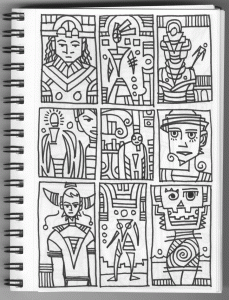
Process is important to me. As Chuck Close says all the best ideas come out of it. It’s how I keep things going. Sometimes I have nothing. Not much energy and no inspiration. That’s when I fall back on my habits. When I’ve got nothing to go on I dig through some of my past sketches and thumbnails to find something to draw. Usually just a small six by nine inch drawing. Sometimes they’re all I can work on for a couple of days and I’ll get four to six of them done. Then I take those small drawings and decide if I should blow them up and draw them some more or blow them up and get to inking them. Or maybe even turn them into a faux cover.
Over the course of a few recent days I set up about half a dozen comic book covers. I scanned in all the drawings, put them in their templates, and printed them out on eleven by seventeen inch paper. They were all good to go so I put them in the box I keep all my good-to-go pieces in. I had a bunch of stuff in there already but it’s always fun to add more. A few days later I was looking for something to work on so I grabbed “The Acid Ram” number twelve out of the box and began inking. The inking didn’t take a long time since it’s mostly thick lines and shapes. I probably spent about three hours on the inking and after I was done I scanned it in and then put it back in my good-to-go box. A week after that I was again looking for something to do so I pulled it out of the box and decided to color it with markers.
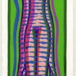
The coloring took longer than the inking. That’s not always the case but this time I left a lot of decisions to be made in the color stage. The first decision was what to do about the spiral boobs. Spirals can be tricky if they’re not closed. Does the color run out of them or not? I usually find that it doesn’t work to have the color run out of them so I decided to close them off. But I didn’t want to close them off with a black line so I decide to stop the purple color at the narrowest point. I think that worked out. After that I gave her orange hair. Orange always works for hair. And some orange lips in her stomach to balance out the hair.
The next thing I did was I decided her stomach should be divided in two and have different colors on the left and right. There was no black line down her middle so I had to put one there. I was thinking that green should be a dominant color so I colored her shoulders and wings in a bright green. Then I went with the blue and darker green on her stomach. Since that dark green is a strong color I decided I wanted to bring the brighter green down into her skirt to make it more dominant than the dark green.
After I had those more dominate colors set up I went about picking my accent colors. The dark pink is the strongest of them and is almost in their category but its small shapes keep it from overwhelming the green. The same with the yellow. It doesn’t quite reach the critical mass of the green so it hangs back. The dark yellow spots on the yellow arms help push it back too.
The green face was an interesting choice. I had a hard time deciding what color her face should be but I eventually went with a mid-green. I didn’t want it as bright as the main green nor as dark as the stomach one. This was the last color I chose and I wasn’t sure if I was ever going to get it to work. I took much more time deciding what it was going to be than putting it on the paper.
After I get all the basic color down I go back in and add textures and a little shading. That’s the icing on the cake. The textures can be strong or not depending on the situation but I keep the shading subtle. I want just a little roundness on some edges. I’m not looking for 3D realism.
I think this piece succeeds. It has good color and just the right amount of weirdness. To make it extra weird it’s probably one of a small number of my pieces with no eyes in it. Strange.


