I dug out a bunch of old paintings this week. I tend tuck things away in boxes and in cabinets and there they sit for years only to be taken out and looked at on occasion. This box has a lot of small gouache and watercolor paintings in it. The sizes are from around art card size, 2.5×3.5 inches, up to about what looks like 6×8 inches. They’re from before I jumped on the art card bandwagon though so none of them are exactly that size. The closest ones are 2.75×4 inches which is a little bit bigger. I have no idea why I decided on that size back in 2003 (as the date on the paintings says) but it seems a good size.
I made these small painting specifically to be really nice objects that you can hold in your hand. Their tactile “Pick them up and look at them” nature is integral to why they exist. They’re all on nice watercolor paper that feels good when handled. There are some 4×4 inch ones that are on smooth 150lb watercolor paper and the 2.75×4 inch ones are on an even thicker 300lb rough watercolor paper. I could never decide if I liked a rough surface or smooth surface better so I worked on both of them.
I’m going look at three of the 2.75×4 inch inch ones because I just put them in my Etsy store so why not give them a look?
My Etsy Store.
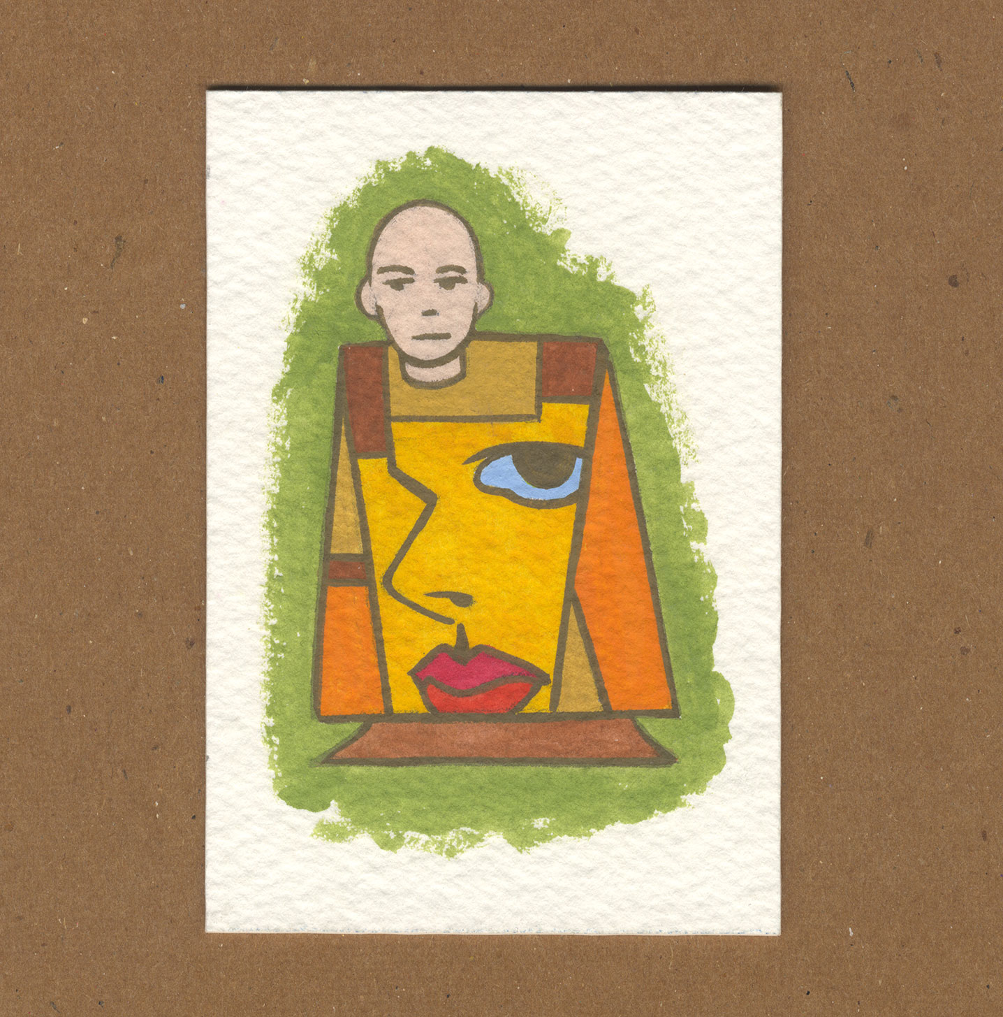
The first of them is called “Double.” It also has the number 13 on it so I must have numbered them at first and then went back and gave them names at some point. The name “Double” seems pretty literal for this one because the painting is of a person with a face on his shirt. Two faces therefor “Double.” I don’t usually name things so literally. I like the colors on this one. It’s a nice mix of earth tone oranges, reds, and yellows. Nothing is too bright. The blue in the eye on the shirt really stands out as it’s the only blue in the piece. The “Hold in your hand” part works well as I like to bring it closer to my eyes and look at the faces and the edges of the green background. Overall it has a simplicity that’s appealing to me.
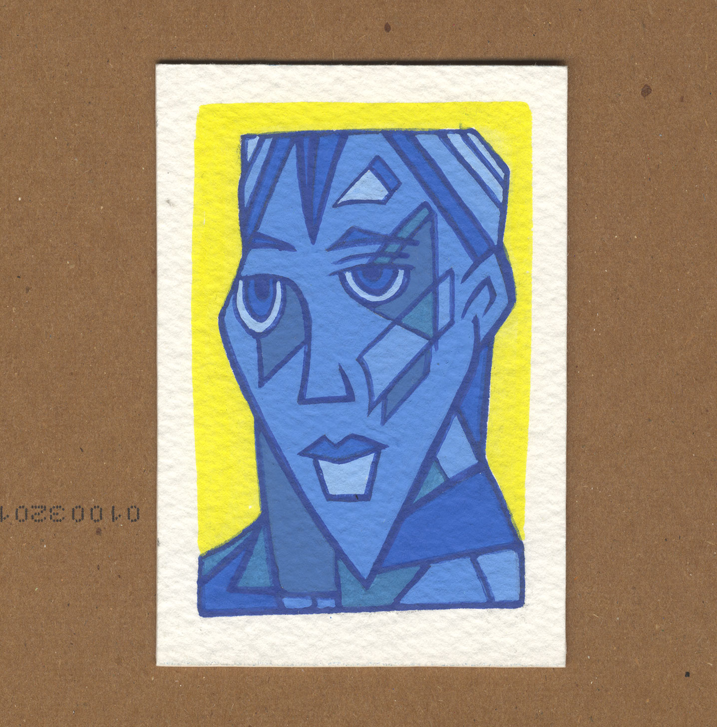
The second one is numbered with a five and is titled “Brian in Blue.” Once again a very literal name despite me having no idea why I used the name Brian. I’m guessing it was just for the alliteration. I remember using these blue colors for a bunch of paintings. I mixed up about ten different shades of blue gouache and painted a bunch of small paintings with them. This one seems to have a Cubist bent to it but upon close inspection the shapes don’t define the space like Cubism does. It reminds me more of a Mondrian type geometric abstraction. A couple of the shapes on the face vaguely follow the cheekbones but the shapes aren’t very three dimensional as Cubist shapes would be. It’s an odd thing to be sort of Cubist but not really.
The third painting is numbered one and named “Sentinel.”Once again this name seems very literal to me as the woman is giving us the side-eye and watching us as a sentinel would. I must have been going through a very literal naming person back in 2003. This painting is notable for its bright and low contrast line.The other two have dark lines and though they aren’t black lines they create enough shape separation as if they were. This one has a red line with another purple line inside it. The red line acts line a dark line in the face but in the rest of the painting it vibrates with the purple line and makes it hard to focus on either. It’s as if the line starts to fade away. That her shirt is dark brown adds to the effect. The hints of blue do more to anchor the shapes than the outlines do. That doesn’t happen very often.
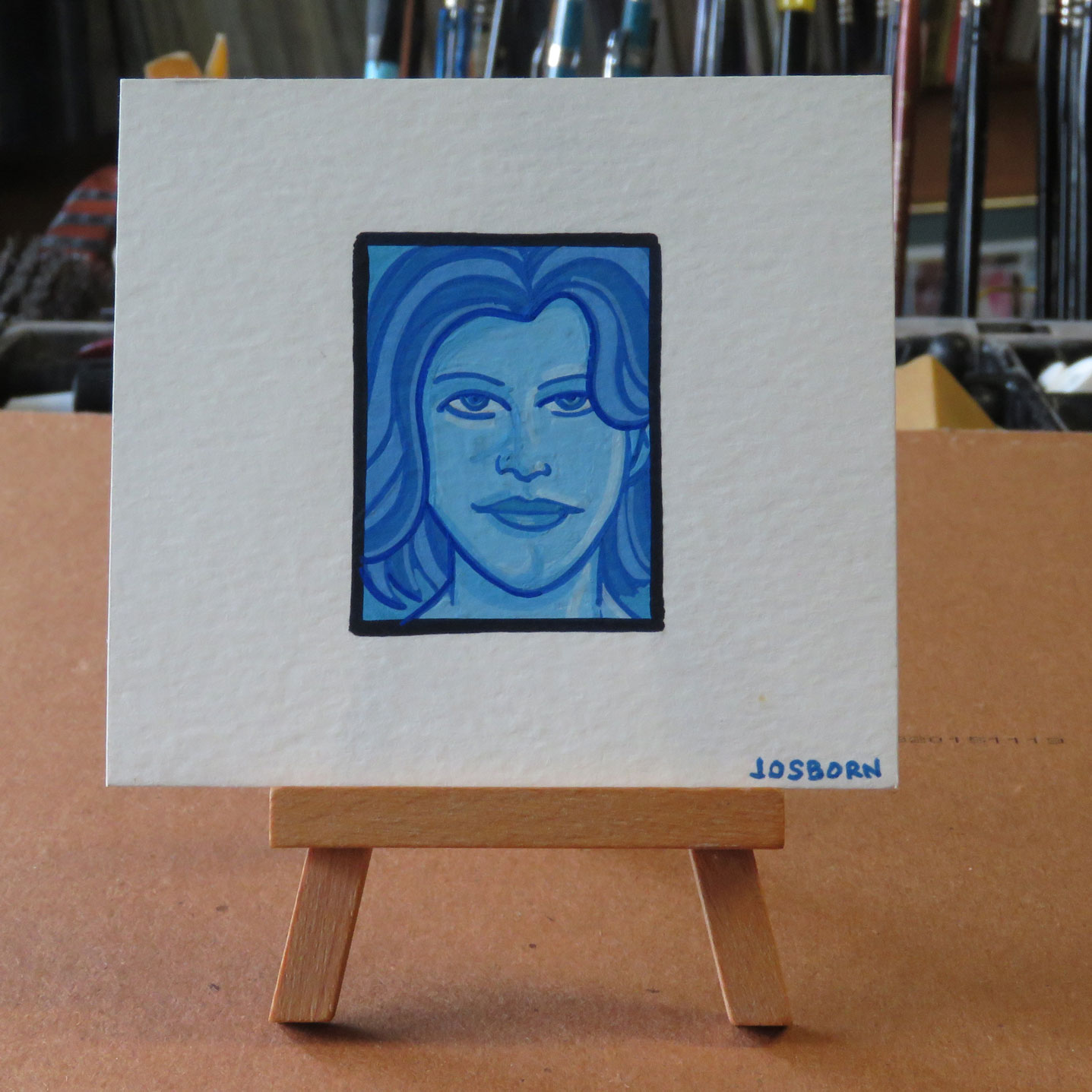
Since I mentioned my blue paintings I’m going to pop over to one of the blue faces that I painted back in 2003. I have about eight of them in this box but we’ll look at the one named “Dream State.” It also has the number two on it. Though it’s on a 4×4 inch piece of paper the painting is only about 1.5×2 inches. I usually don’t leave that much blank paper around a painting but I think I did it to give the painting more of a presence as you hold it in your hand. This might have been the only time I’ve painted this small. I’m not even sure what motivated me to make these tiny faces. They are obviously not photo referenced as they are very simple and filled with asymmetry. Just glancing at this one neither the eyes, nose, or mouth is symmetrical. Why is that? I have no idea. It looks like I took great pains to make the hair and face smooth so I was going for some sort of realistic look but the features are awkward. I obviously meant them to be but looking at them now the awkwardness is hard to take. And all of them share this awkwardness. Weird.
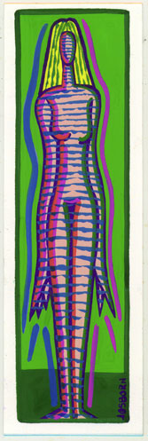
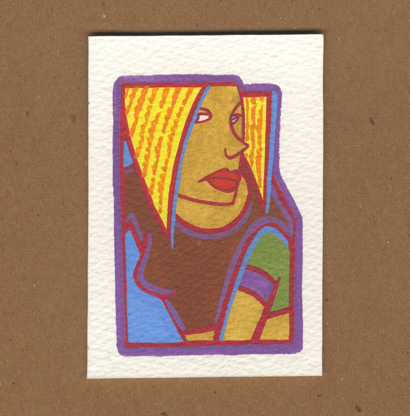
The last one I’ll look at is from 2005 and is called “Mummy Girl.” Another literal title. This one is tall and skinny at about 2×6 inches. Of all the paintings I’ve looked at so far this one has the brightest colors. Bright green, bright magenta, and a strong blue make this one more typical of my work. I’m not sure about the imagery though. It’s a little bland. It’s a basic elongated figure that looks like it was drawn on the spot in paint. It’s not terrible but I’ve done better. The horizontal lines that go across her body are the most interesting thing in the painting. I’m guessing that I put those on last to add some more visual interest. Overall I do like the color and shape of it.
So there you go. That’s what happens when I dig through boxes. I get paintings from fourteen years ago to look at and maybe figure out what they’re all about.
Discussion ¬