I haven’t watched an episode of “Friends” in a while. Not since I wrote my last walkthrough seven weeks ago. That means I’m up to Season 6 Episode 4: “The One Where Joey Loses His Insurance.” What a bleak title. It first aired on October 14, 1999. Let me check my calendar and see what I was doing that day.
It looks like that day I was working in Manhattan at Marvel. I also spent $67 at Kam Photo. That means I got a lot of photos processed and printed. It sure was a lot more expensive before the digital age. Looks like all those photos were from a friend’s wedding the previous weekend. I was also home sick the day before. I never got sick very often so that’s unusual. I was also out sick two days the week before. I wonder what I caught?
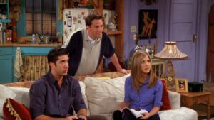
Let’s start the show. We open with Rachel moving out of the apartment with Monica (Chandler is moving in). Rachel is moving in with Ross as just friends but Ross is still in love with her. Phoebe confronts Ross about it but Ross gets all goofy and accuses Phoebe of being in love with Rachel. Crazy Ross is the funniest Ross. Rachel tries to move out some candlesticks but Monica hides them away. I think this becomes a running joke this episode. The old “Who owns what stuff” routine.
This is the episode where Ross first gets a job teaching at NYU. I think this is his job for the rest of the series. Phoebe drops the bomb the Rachel and Ross are still married. Then she gives a “Just kidding” to Rachel. Funny moment because they really are still married. Ross never took care of it. Now here comes the theme song.
The next scene is a Central Perk one. Phoebe tells the gang that her psychic says she is going to die this week. Phoebe believes it but in a funny way. Ross stops by to try his first lecture out on the gang. They all are bored by his boring delivery. A solid scene with some funny stuff.
The next scene takes place in Joey’s apartment where he gets the news that his benefits from the Screen Actors Guild have lapsed. Twentythree years later and we still need universal health care in this country. Joey is upset that he can no longer get hit by a bus or catch on fire.
That was a quick scene and now we’re back with Rachel and Phoebe as Phoebe is waiting for death. Phoebe takes a nap and Rachel discovers the candle sticks. She takes them back and keeps the gag going. Here comes Ross to tell the girls how well his lecture went. He tells it in a funny way. I’m good with that.
Hey! It’s Joey’s agent Estelle’s office. Here comes Joey to try and get work and his benefits back. Estelle thinks Joey left him and is coming crawling back. The joke has always been that she’s an incompetent agent. Here they double down on it.
That was another quick scene and now we get to see Rachel and Monica show up to one of Ross’s lectures. Turns out it went well because he uses a fake English accent. He spots the girls. That was a one minute scene.
Meanwhile back at Joey’s apartment Chandler finds him in pain on the floor. Turns out he was exercising and got a hernia. “Damn you fifteens!” Sad and funny scene.
Back to class where Ross tries to explain himself to Rachel and Monica. Monica and Rachel start doing accents too.
Coffee shop and Joey is in pain but won’t go to the hospital. Duh, he has no insurance. This hits too close to home for me. Phoebe sees the bright side. Joey might die and join her in death! Totally dark humor. That’s rare for “Friends.”
Back to Monica and Rachel fighting over the candle sticks. They split them. Here comes Ross. What is he going to do if they find out he’s a fake? Wow, that was another fast scene. Sometimes I forget how quick the scenes in this show can go by.
Now Joey is trying to audition with the hernia giving him pain. It doesn’t go well. It comes off creepy and weird since he’s auditioning with a kid. Next audition he can’t pick up a bag of dog food. Third audition. This one is for “Dying Man.” And the short scene is over. Fast editing in this episode.
Here come Monica and Rachel making prank phone calls to Ross in accents. Phoebe walks in and tell the ladies that it’s her psychic who is dead so she’s off the hook. And that scene ends. Another one minute scene.
Now Chandler is helping out Joey on his commercial shoot. He got the “Dying Man” job. It’s a painful shoot. The hernia comes in handy when the kid he is playing against won’t cry so he shows him the hernia. That may have been a two minute scene.
Rachel answers the phone. What does she find out? She finds out that she and Ross are still married. Wow, that was thirty second scene.
Now Ross is in class and is phasing out his English accent. The class notices and he comes clean. The students all think he’s weird. Rachel storms in and yells at Ross that she can’t believe he didn’t get the divorce. In front of the whole class. This is the funniest scene in this whole episode. And credits.
The credit scene is Joey celebrating that he got his insurance back by wearing a football helmet and having Phoebe hit him in the head with a bat. One of the goofiest jokes in the whole series. Monica and Chandler join in too. Super goofy.
Now it’s time to check and see what was cut out of this episode for syndication. Just one joke early on about Chandler and his lack of success with women. Then later in the show they cut a joke about Phoebe and Joey dying. A Ross’s accent joke goes too. And finally the sound effect they added to the final Joey and helmet joke. Not that much was cut from this one and no really good stuff either.
Let’s see what rating I gave this show back in 2013. Right now I’d give it 3 out of five stars. It was solid but not spectacular. Looks like I gave it a three back then too. Sometimes my ratings change but most of the time they stay they same. Until the next episode…
