I’m back from the comic shop this week and I got five new comics.
Check them all out here:
Comment
I’m back from the comic shop this week and I got five new comics.
Check them all out here:

The summer TV season is over and the new fall one has arrived. That is if there is such things as seasons anymore. Things blur together as not only streaming, on-demand TV happens but first run streaming TV happens too.
I watched a few summer TV shows that were okay. At least four of them won’t be back for another season. “Under the Dome” made it’s way through three summers with thirteen episodes each season. It was never a great show but it was okay. It posed as one of those annoying “The plot of this story is us wondering what is going on in this story” TV shows but it was really about all the characters plotting against each other. It didn’t really matter why the dome was there. It mattered that the dome amped up the drama in a small town. When it took a sci-fi turn in its last season to explain things it was anticlimactic. It was solid but if you missed it don’t sweat it.
Another “What is going on in this show?” show was “Wayward Pines”. There was no dome but there may as well have been. Once again it was a bunch of people brought to a small town and things are not as they seem. Mysterious and oppressive government, missing technology, can’t get out of town, and time travel?!? All the weird stuff that makes for a confusing story. It was okay but I just had to look up the name of it because I couldn’t remember. This was a ten episodes and done mini-series.
The third now cancelled show I watched this summer was “Extant” with Halle Berry. This one made it through two thirteen episode summer seasons. This second season they changed the whole tone and plot of the show. The first season was more conceptual with one plot about creating an artificial boy and another about weird alien life coming to earth. There was a lot of mysterious vagueness. In the second season the did away with all that vagueness and gave us an evil conspiracy and some killer robots. Plus they knocked off Halle Berry’s boring scientist husband from the first season and gave her a new rugged bounty hunter love interest. Or maybe he was a cop. It was the future so who knows? Once again it was a solid show but if you missed it it’s no big deal.
One show I didn’t watch much of was “Daredevil”. Everyone seemed to love it but me. It was on Netflix and was almost universally praised but it didn’t do it for me. First off I don’t much care for origin stories. I find them boring and all the same. They decided to make this a season long thirteen episode origin story so I was out after three or four episodes. It wasn’t terrible. I just didn’t care. I know the story already and to have it told to me over thirteen hours was too much. No amount of brutal, slow motion fight scenes could win me over. I can’t love them all.
I did manage to catch all of the TV show that nobody watched “Welcome to Sweden”. This is a joint US and Swedish made show that is part in English and part in Swedish. Don’t worry, they provide subtitles. It’s a nice little comedy. It’s had two ten episode seasons with ratings as low as things can go on network TV. I think the only reason it got a second season is that it runs in Sweden too so it’s paid for already. I like the show even if no one watches it. It’s pleasant and little zany. Some nice Swedish scenery too.
Another under-watched half hour comedy was “Playing House”. It’s the story of two women who are longtime friends and one comes back to their home town to help the other out. It’s a buddy comedy. With only ten episodes last year and eight this year there aren’t a lot of shows but they’re all pretty good. I like the leads in the show, Lennon Parham and Jessica St. Clair. They’ve been in stuff before together and I find them funny. I don’t know if there will be a third season of this but I’ll watch if there is.
Another summer drama that I forgot to mention is “Complications”. This one caught my eye because it was from the producer of one of my favorite shows “Burn Notice”. It’s been cancelled after one season so it’s not going to have the same long life as “Burn Notice” but it was pretty good. It was the story of a doctor who saves a little boy’s life out in the street one day. That little boy turns out to be a pawn in a gang war and soon the doctor finds himself to be a pawn too. Not good for him. He tries to navigate his way through the gangs, the police, his family, and his boss all without making things worse. Of course he makes things worse. Otherwise there wouldn’t be a show. It was a solid man-in-trouble show. But now it’s gone.
A not very new show that I’ve been watching this summer is “Parks & Recreation”. It’s a show that was on for seven seasons and I always meant to check it out but never did. I have no idea why. The first five seasons of it were streaming on Amazon Prime so I finally gave it a look and was hooked. It’s a funny show. Lots of smart writing and crazy characters. It’s a show I really should have been watching all along. Good stuff.
And I almost forgot two other shows I watched. One was the much talked about second season of “True Detective”. A lot of people didn’t like it but I thought it was okay. A totally different flavor than the first season (which I liked but the last episode was a letdown). The show might have been a mess but I found it to be an interesting mess.
The other show is the second season of “The Strain”. Vampire fighting goodness. I like my vampires to be evil and not sexy and that’s what we get here. Solid cast with some good writing except for the annoying kid. It’s not the actor’s fault. The writers keep making him do stupid things that get people hurt. He’s more a plot device than a character. Other than that I like the show. It just finished its second thirteen episode season.
So that’s what I watched this summer. “Parks & Recreation” is the best of the bunch with “The Strain” leading the pack of dramas. What did you watch and like?
I’m back from the comic shop this week and I got six new comics.
Check them all out here:
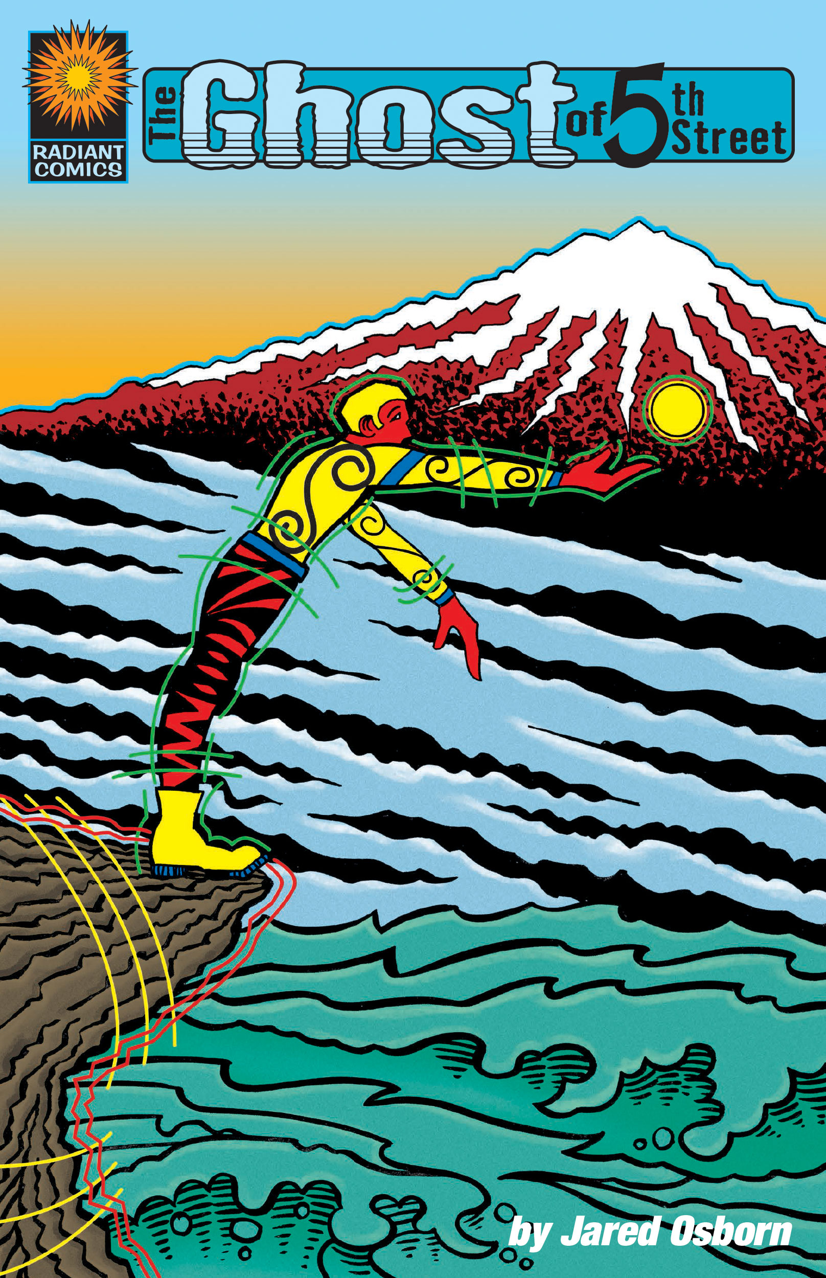 I got it done. Finally. Yes, my 48 page comic “The Ghost of Fifth Street” is, at last, available as a digital book through both Amazon and Apple. This is the first time I’ve done such a thing and it took a while but it won’t be the last. I have a few other things I want to publish that shouldn’t take as long to do as a forty eight page comic book so I’ll get those out soon. First on the list is repackaging my webcomic in digital comic form. But that’s for later.
After finishing the actual comic book it still took some doing to get it ready for digital publication. I had the thing all set up in InDesign and ready to go as a PDF but it turns out Apple and Amazon have their own programs to format books in for their sites. Nothing is universal.
I started out with Amazon and found they have a program called Kindle Comic Creator that I would have to use to submit my comic to them. I downloaded the software and fired it up. I don’t know how many of you try out new software on a regular basis but it’s rare these days that software comes with any kind of manual or instructions. Luckily I have lots and lots of experience in image editing and layout software so it wasn’t too bad for me but I wonder what it is like for someone without my experience. The first question I had to ask myself when starting up the software was, “What the heck is this?”. I imagine a lot of people don’t know how to answer that question. Took me a minute.
I quickly figured out that I could open up my finished PDF of the comic in the software and it would translate all the pages into pages in the Kindle Comic Creator software. But to what end? It took me another little while to suss out that this software was all about detecting the comic book panels so that it could zoom in on a single panel to make reading easier on a smaller device. It would auto-detect most of the panels in such a way as I didn’t even know it was doing it. When I realized it was doing it I also realized I had to hand-set some of the pages where I had a single large image with captions floating on it. The software saw that as one panel and wouldn’t zoom in. I also had to break some panel designations in half because the panel stretched across the width of the page and therefor the software wouldn’t zoom either. It took me a few minutes to figure out how to get those panels in the proper order after I did that but I got it done.
When everything was ready to go I realized I hadn’t given it a final read yet. When I did I found some mistakes and then had to figure out how to replace the old pages with the new ones. Not hard but this all took time. Then I realized I wanted someone else to read it before it went out. I had a friend kind enough to read it out for me and she corrected a bunch of things. I read it one more time and found one last typo. Proofreading is a real pain. I decided to start over with Kindle Comic Creator rather than add and subtract all the corrected pages. I think I set up the panels in this book at least three times. That’s because I erased them once or twice in my learning phase. I can only imagine how frustrated a person not used to such software would be.
After I had all that done it was just a matter of signing up for an Amazon Author account but that wasn’t too hard. You just have to have all the tax and bank stuff you need ready to go. Filling out that info in this day and age always makes me a bit nervous but what are you going to do? I uploaded my finished file to Amazon and was ready to go.
Apple was trickier. First off there is no software specifically for comics with Apple so I would have to use iBook Author to upload my book. I’ve complained before about how much I don’t like iBooks Author and this didn’t change my mind. My first problem was that it can’t read PDFs. This was my finished format that most programs can handle. It said it needed a digital publication format (.epub) so I looked into that. The good news was InDesign, the book layout program I was using, could output in that format. The bad news was the comic turned out crazy when I did.
The quick version is the lettering is in Illustrator, the artwork is in Photoshop, and InDesign puts them together and outputs them to a specific format. Except that this time when the format was .epub it split the lettering from the art. It doubled the amount of pages and the lettering was on the left and the art on the right. Not good. After messing around with it for a while I thought I was going to have to rebuild the whole comic in iBook Author. I did not want to do that. The solution I hit on was to match up the art in Illustrator and then bring just that file into InDesign. It was doing what I was already doing but in a clumsier way. I hate doing things in a clumsy way but I had no choice.
Despite the clumsiness of both iBooks Author and the way I had to get my files ready things went pretty smoothly after I figure it out. I had to fill out all the same info I needed for Amazon and I was just as nervous doing it but it got done. A day later and they were both for sale and ready to go. You’ll find the links to get the books on iTunes and Amazon over on the top right. Check them out.
I’m back from the comic shop this week and I got five new comics.
Check them all out here:
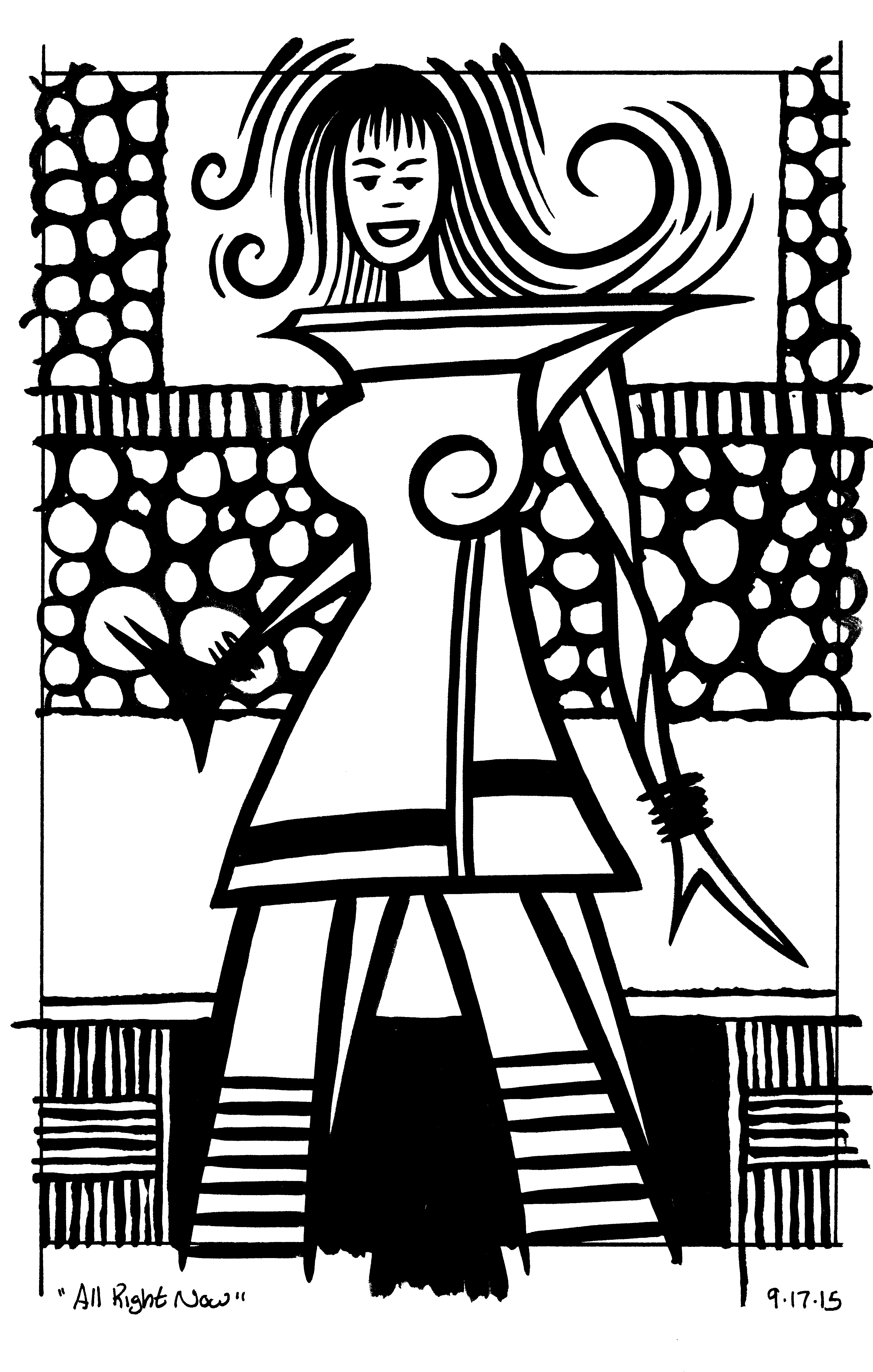
I’ve been digging out some old stuff this week and working on it again. Some old concepts that is. I made a couple of my faux comic book covers in my “Painted Lady” series. That’s the name of the fake comic book “The Painted Lady” but unlike a bunch of my other faux comic book covers this one doesn’t have a story to back it up. There is no strong man or jungle queen lurking on these comic book covers. Instead there is a highly decorated woman.
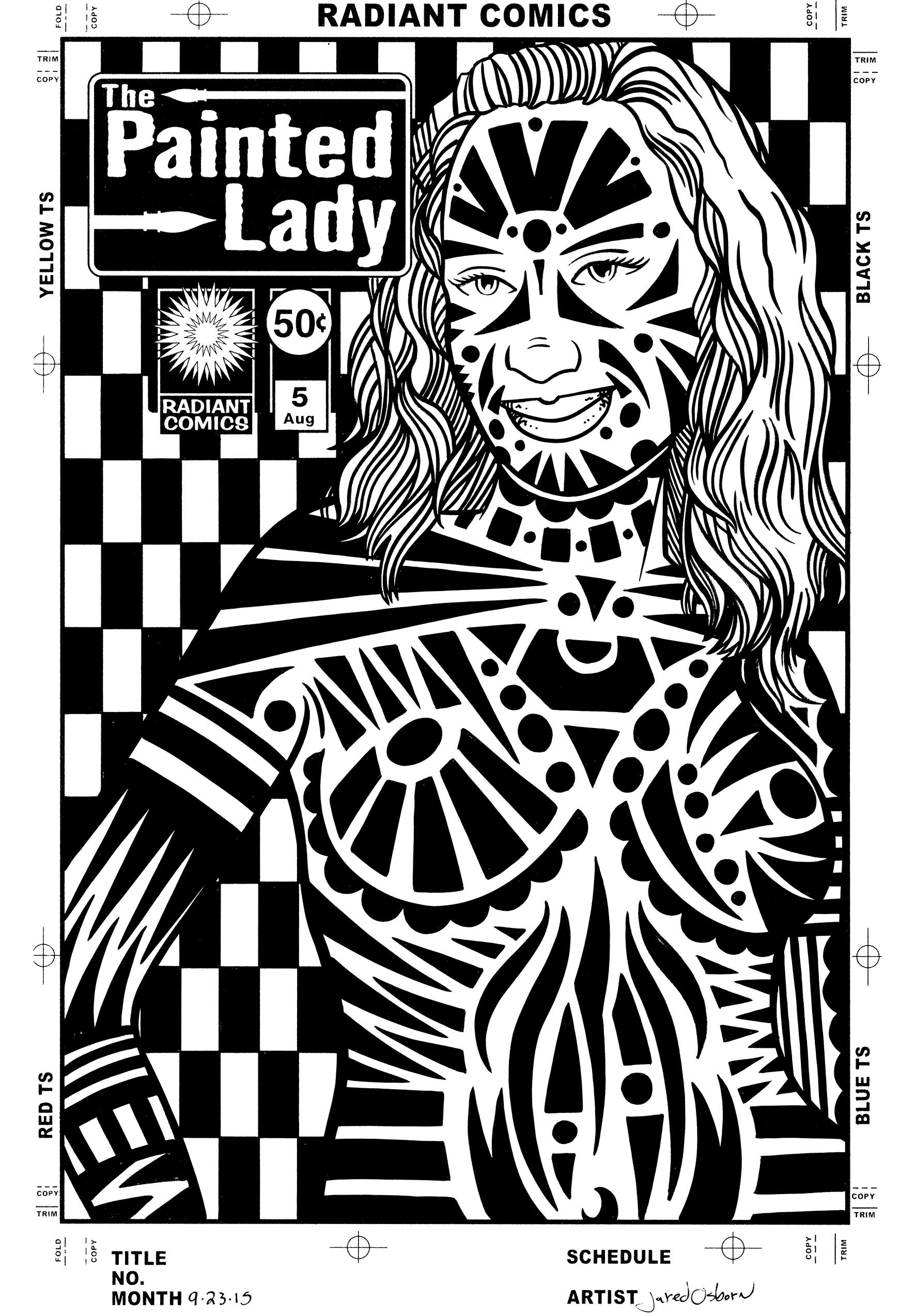
I’ve made a bunch of prints in the past of decorated female bodies and that is the origin of this series. Instead of prints I put them into comic book cover form. I pencilled and inked the covers for issues four and five along with pencilling the cover to issue six. The final inks are all on 11×17 inch paper. I think I may have made the first three smaller than that but I don’t remember. I’ll have to dig them out to look but I’m not that ambitious right now.
These covers start out on the computer. I photo or 3-D reference these ones either by using a 3-D artist model program that I have or else I scour the internet for suitable reference. I would prefer to shoot my own reference but since I don’t have the resources to I make do. Finding a photo that suits my purpose is remarkably hard. Maybe hard isn’t the right word but it takes time. There is a difference between making a photo to be a stand alone piece of work by itself and making a photo to facilitate another piece of art. But eventually I find something I can use. The internet is filled with photos. My final piece is usually so far removed from the photo that it doesn’t really reveal itself to be photo referenced unless you really know the clues to look for.
I start out by drawing right over the photo on the computer. I set up a a separate layer in Photoshop and draw right over the photo layer in red. This is as much a tracing as a drawing because I’m not looking for anything but the basic figure. Nothing fancy just a single line weight drawing. It probably takes a bit of skill and practice to be able to pick out that single line as quickly and efficiently as I do but it’s nothing I think about very much. I knock it out as fast as possible so I can move on to the real drawing.
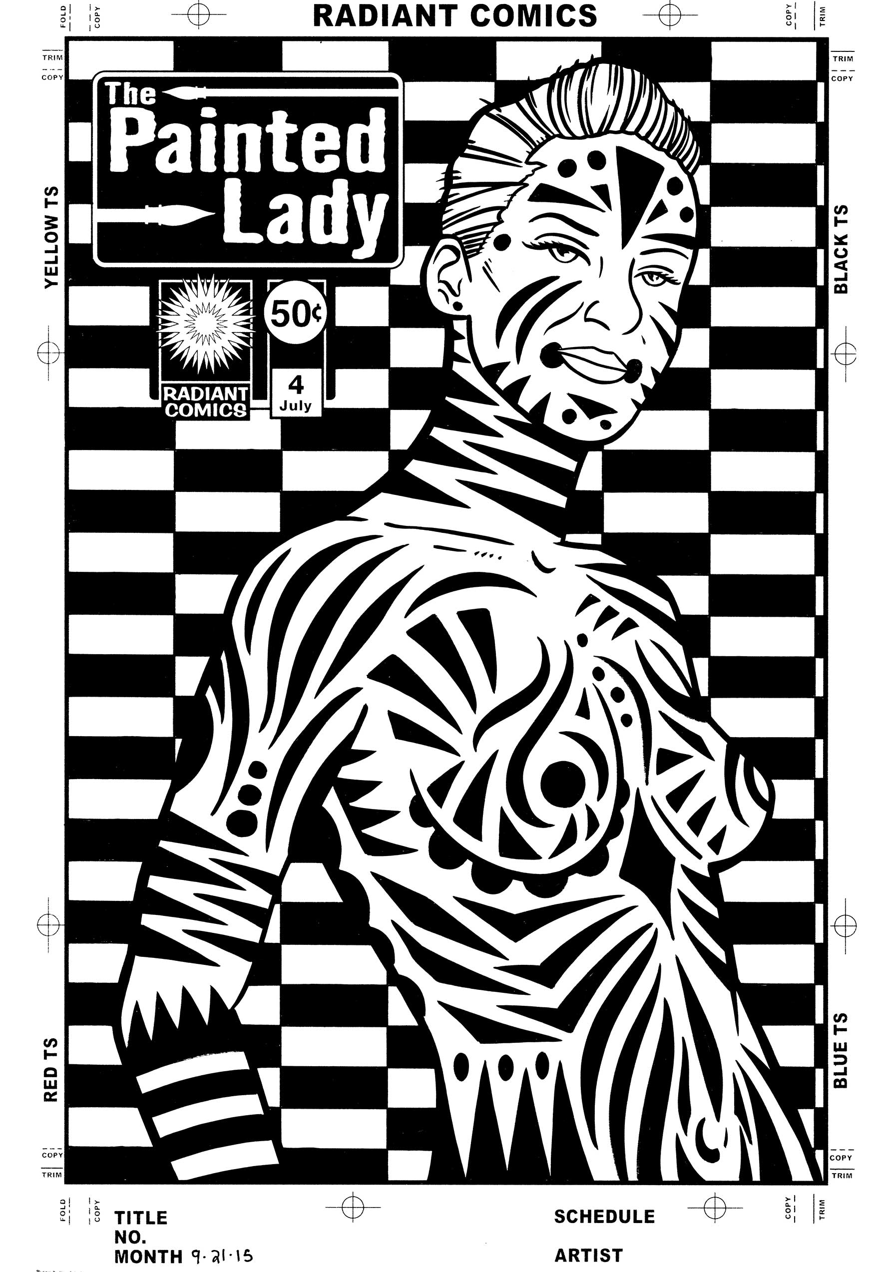
The next step is to convert my red line drawing into a light blue line drawing and print that out. I was working on a 9×12 inch piece of paper for this step because I wanted to pencil it a little bit smaller than the final 10×15 inch size (on 11×17 inch paper). I find the drawing often goes faster at this size while ten years ago I would have drawn it bigger. I also do more drawing in the ink stage than I used to do ten years ago. I do the figure drawing in pencil over the blue underdrawing. This doesn’t take a whole lot of time but I take extra care with the hair and face. It’s all the black designs and shapes that I then draw on the figure that takes the most time. Lots of elongated triangles, sweeping curves, and circles. I have to take special care not to repeat myself too much because certain shapes suggest themselves over and over.
After I’ve got everything drawn in pencil I scan it back in to the computer and put in in my template that has the logo and trade dress in it. I also stared a new step here. I stared it with issue number five because I came up with it after seeing the finished inks for issue number four. Originally it was just the figure on a white background. In the prints I made years ago this was not a problem because I added type and design work to the background. But these are supposed to be finished pieces by themselves and the background looked empty and plain. So I decided to come up with a black and white pattern for the background. So now in this step is where I’d go into Illustrator and figure out some sort of geometric background. I came up with an elongated checkerboard pattern that I liked. I brought that pattern into Photoshop so I could put it in the background of the pencil drawing digitally. Piece of cake. I then converted the drawing and background to blue line to print out and ink over.
When I print out the piece in blue line I keep the logo in black. I have no interest in hand inking the logo for every single cover. That would take just about as long as the rest of the cover. Besides logos on comics are always put in mechanically. In the old days a photostat (a fancy photocopy) was pasted down on the art to put the logo on. These days it’s done on the computer but either way a logo was never hand drawn except for the time is was created. I could have also printed out the background pattern in black but I preferred to ink that in by hand. Sure it takes a bit of extra time filling in all those little black areas but I think that time is worth it. It makes the piece look a little more uniform and makes the mechanicalness of the logo blend in. If the background and logo were both mechanical looking it may overwhelm the piece.
Overall I liked the way issue four came out better than issue five. I like the way the figure sits in the space more. There is a little more elegance to it by my eye. Issue five seems a little more tribal. She seems denser with sharper and darker markings. I’m happy in general with both of them so that might just be my taste. It’s amazing that what I like even in my own work can be so subjected to my taste.
I’m back from the comic shop this week and I got six new comics.
Check them all out here:
I just made it through another low productivity period of time this summer. I never like days like that. They might not even be as low productivity as they feel like to me because I do get stuff done but not a whole lot of my time was spent at the drawing board. Also I don’t always count things that I have to get done as doing things I got done. That’s a weird quirk of mind.
One thing that I got done that I don’t always count is my Sunday “Drifting and Dreaming” comic strip. They take a bit of work. Over time I have to draw and color a whole bunch of individual cartoon art cards. Usually I wait until I have enough for about thirty strips. That’s sixty cartoon art card to be drawn, written, lettered, and colored. But since I’ve been doing it for a while, and I expect to do it, it doesn’t always count as an accomplishment in my mind. Plus there is another thirty regular art cards and a Middle Story to be written. That’s a lot of work for me not thinking it is.
I’ve also almost finished up two books I’ve been working on. My “Ghost of Fifth Street” comic and my “Moments Float Back To Me” art book. Each one has gone through about five drafts of the writing. That takes a lot of time but it doesn’t feel like I get a lot of work done. “I got the third draft done but still don’t like it” is not a feeling of satisfaction. I’m still happy I got all the writing done though.
Of course all of that takes away from the time I have to make anything new. A new drawing, a new painting, or some such. I did manage to get some new photos done. I seemed to have a bit of concentration to use on them. There were a few days when I was writing and getting other things done that I tried to draw and couldn’t. So I switched over to working on my street photos. It’s funny how different things take different types of concentration. It takes me hours, at least five of them, to get one of my photos done but I was able to do it by working twenty minutes here and twenty minutes there. But then I stopped getting them done too. Don’t know why.
This week I finally got some drawing done. And how did I do it? By skipping the drawing stage. Well almost. My usual method is to first make same small drawings in my ink book (which I’ve still managed to do this summer), pick a small drawing to work on larger, draw the bigger drawing in pencil, and finally make that drawing in ink. Sometimes the pencil drawing even goes through two steps. First I draw it at about 6×9 inches and then I redraw it at 10×15 inches. That’s a lot of drawing but it really helps me refine the image. Yet I just couldn’t do it this time. It takes a lot of concentration and I didn’t have enough of it. So what did I do? I skipped the pencilling.
After making some videos for my new Art by Osborn YouTube channel about how to choose and use a brush I decided to use one myself. I went right to the inks. I went to my ink-books and found an image I liked. It was only a small thumbnail drawing as they all are in my ink-books but I blew it up to about 6×9 inches and printed it out in blue line on some bristol. This is usually where I’d pull out my pencil but instead I pulled out my brush. I drew in ink with it.
Drawing in ink is a totally different mind set than drawing in pencil. With a pencil you search around for the line. You sketch with your pencil and redraw the same line over and over and over until you suss out the right one. When drawing in ink you have to think about the line before you put it down. You have to be sure where you want it to go. When doing something like my spontaneous ASMR ink drawings I’m making those decisions on the fly as I come up with the image on the spur of the moment but with these ink drawings I have something to work with already. The blue line drawing.
Since I have the blue line drawing on the paper already I have an idea for the image. I know what it’s going to be. Or at least the bones of what it’s going to be. But the bones are important. They make it a different type of drawing than spontaneous ink drawings. I would decide what line were already good in the drawing and then add to them. I did one and liked the way it came out. Lots of bold black brush lines. It was also fun to make. It was satisfying to be able to think about what line I wanted to put down and then doing it.
I ended up making five of them over a week. The imagery came out differently than my usual imagery and I thought that was interesting. The black strokes of ink were also much bolder than I usually make them. That’s probably because I wasn’t following a pencil line. I used pattern a bit too. Overall they came out okay.
The final thing I did this week was to kick the size up a notch. I have a few already finished drawings printed out at 10×15 inches in blue line. They sit in a pile waiting for me to one day ink them. For most of last winter and spring I was doing a lot of inking with a pen and French curves rather than a brush. These pencils were meant to be inked that way buy I’ve been tired of doing that. So I decided to ink one of them entirely with a brush. Almost. I used a circle template a little bit. It was interesting. Once again I enjoyed drawing freely in ink. I had most of the drawing done in pencil with this one but still there was a lot to be decided as things went along. And things did go along. It was nice to get them done.
I’m back from the comic shop this week and I got five new comics.
Check them all out here:
What is a comic book inking brush? That is a question that I answered in a video for my art blog but I thought I’d write about it too. In general the brush used to ink comic book drawings is watercolor brush. A sable hair watercolor brush that comes to a point. It’s really important that it comes to a sharp point otherwise you could use any old blunt brush. The most used one by comic book inkers is a Winsor Newton Series 7 watercolor brush. I like a size three but some people prefer the slightly smaller size two. A size three being slightly bigger means I can make bigger lines with it and that it hold more ink in its bristles. That means longer lines with less dipping of the brush in ink. I’ll take that.
The main problem with inking with a sable hair watercolor brush is that India ink isn’t good for them. India ink will slowly break down the hairs of the brush and make them fall out. A watercolor brush that only touches watercolor will last a lifetime but not one dipped in ink. All throughout my twenties I tried my best to keep my ink brushes as clean as possible. I even tried to keep the ink out of the base of the brush hairs and washed it with soap and water after every time I used it. I was vigilant. I really wanted all that cleaning to matter but in the end I don’t think it made the brush any better and sometimes it even seemed to make my brush wear out faster. I finally decided I was better off leaving it alone.
I wish I could find where I read it but once or twice I ran across a story about cartoonists Will Eisner and Joe Kubert discussing how to clean an inking brush. Will Eisner was all for cleaning one but Joe Kubert’s take was the only way to clean a brush was with a pair of scissors. Cut off the bristles. He meant there was no way to clean an ink brush. I’ve come around to that side of the argument. I never clean my ink brushes anymore. I rinse them off in my jar of water when I’m done using them, otherwise they’d harden up and become unusable, but I never take soap and water to a brush anymore. That seems pointless to me now. And my brushes may have lasted longer but I’m not sure of that. It’s hard to tell.
A Winsor Newton Series 7 watercolor brush comes to a nice point. That is what you want in an ink brush. It allows you to make a very sharp and precise ink line. You’ll know the brush is done for when it no longer comes to a point. Instead it will split and you’ll have two points. That is no good for precision. I don’t throw away my wrecked brushes though. Instead I keep them and use them for oil or acrylic paints. Paint is much thicker than ink so I don’t need the brush to come to such a fine point. Plus the really wrecked brushed are good for various dry brush techniques. I make my monster face drawing with a brush so wrecked that it usually has half a dozen points. It makes weird monster lines then.
Since I also use watercolor brushes for watercolor I have to keep track of which brushes are for ink and which are not. I figured out an easy method years ago. I carve a narrow ring around the brush just below the ferrule (the metal part of the brush that holds the wooden handle to the brush hairs). I take my X-Acto knife and run the edge around the brush handle with just enough force to scrape away the paint in a narrow ring around the brush. One ring means it’s a good ink brush. Once the tip starts to split and the brush is no good anymore I carve a second ring around it. That makes for easy identification. One ring, two rings, or no rings.
For the last couple of years Series 7 brushes have been hard to get. For some convoluted bureaucratic reason the sables that are uses to make sable hair brushes found their way onto some sort of endangered species list in the USA and therefor their importation was banned. Except it’s a different sable that’s endangered. It’s all so confusing that I’m still not sure if there is a ban on the brushes or not. But art stores ran out of Series 7 brushes a while a go and just got some new ones in recently. The price has gone up on them too. I used to get a number three brush for around twenty dollars but now they are ten dollars more than that.
I’ve tried a few different brands of sable brushes over the years. The second best is Raphael brand brushes. I’d say they were slightly below the Winsor Newton ones but if I could get them for a good price I always did. I never had any complaints about the Raphael brushes. They’re also the same size as the Winsor Newton ones. That’s one of the problems I’ve had with ordering brushes from a catalog. Sometimes one company’s size three isn’t the same as another company’s size three.
I recently bought a size three from a company called DaVinci and it was more like a size two. That means the brush will hold less ink and make a slightly narrower line. Plus I found the DaVinci brushes has less spring-back than I was used to. That means as I put pressure on a brush against the paper as I release the pressure the brush should resume its original shape. Instead it just stayed bent over a little as if I was still pressing on it. That’s not the end of the world since it still holds its point but I have to be careful which way I touch the brush to paper the second time. Things can go sideways.
I love a good brush. When it comes to comics some people like to ink with pens but not me. I’m a brush person. Hopefully they’ll keep making them.