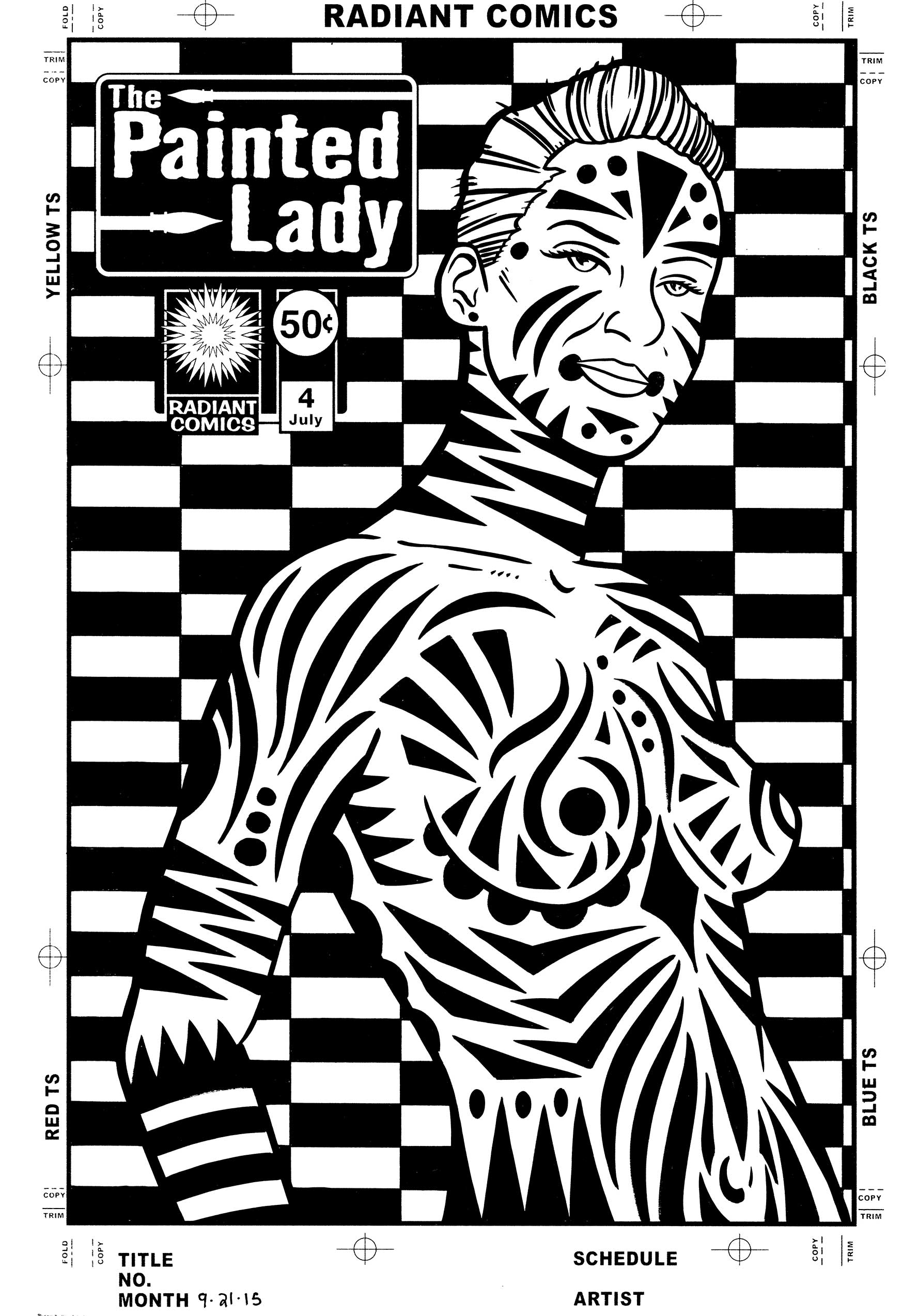
I’ve been digging out some old stuff this week and working on it again. Some old concepts that is. I made a couple of my faux comic book covers in my “Painted Lady” series. That’s the name of the fake comic book “The Painted Lady” but unlike a bunch of my other faux comic book covers this one doesn’t have a story to back it up. There is no strong man or jungle queen lurking on these comic book covers. Instead there is a highly decorated woman.
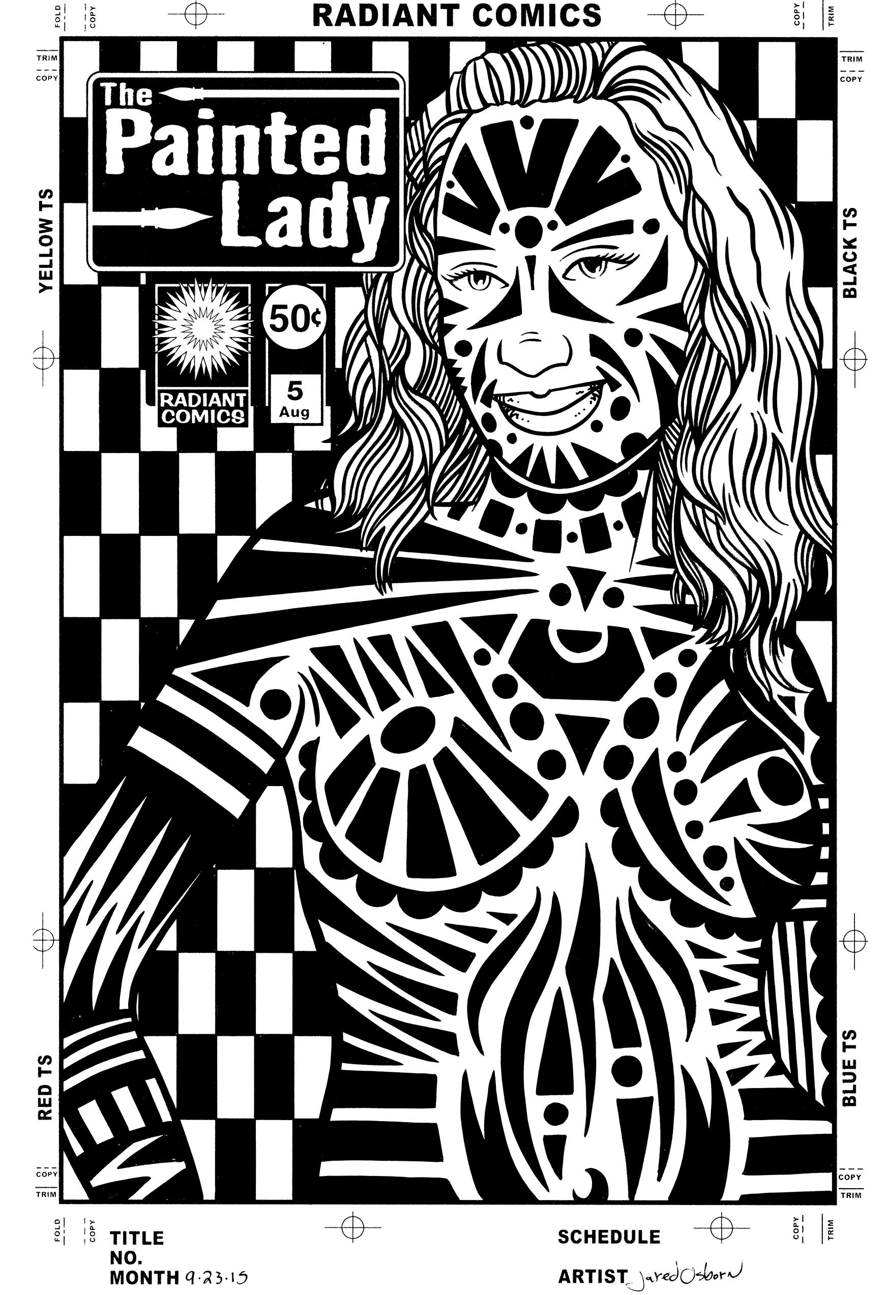
I’ve made a bunch of prints in the past of decorated female bodies and that is the origin of this series. Instead of prints I put them into comic book cover form. I pencilled and inked the covers for issues four and five along with pencilling the cover to issue six. The final inks are all on 11×17 inch paper. I think I may have made the first three smaller than that but I don’t remember. I’ll have to dig them out to look but I’m not that ambitious right now.
These covers start out on the computer. I photo or 3-D reference these ones either by using a 3-D artist model program that I have or else I scour the internet for suitable reference. I would prefer to shoot my own reference but since I don’t have the resources to I make do. Finding a photo that suits my purpose is remarkably hard. Maybe hard isn’t the right word but it takes time. There is a difference between making a photo to be a stand alone piece of work by itself and making a photo to facilitate another piece of art. But eventually I find something I can use. The internet is filled with photos. My final piece is usually so far removed from the photo that it doesn’t really reveal itself to be photo referenced unless you really know the clues to look for.
I start out by drawing right over the photo on the computer. I set up a a separate layer in Photoshop and draw right over the photo layer in red. This is as much a tracing as a drawing because I’m not looking for anything but the basic figure. Nothing fancy just a single line weight drawing. It probably takes a bit of skill and practice to be able to pick out that single line as quickly and efficiently as I do but it’s nothing I think about very much. I knock it out as fast as possible so I can move on to the real drawing.
The next step is to convert my red line drawing into a light blue line drawing and print that out. I was working on a 9×12 inch piece of paper for this step because I wanted to pencil it a little bit smaller than the final 10×15 inch size (on 11×17 inch paper). I find the drawing often goes faster at this size while ten years ago I would have drawn it bigger. I also do more drawing in the ink stage than I used to do ten years ago. I do the figure drawing in pencil over the blue underdrawing. This doesn’t take a whole lot of time but I take extra care with the hair and face. It’s all the black designs and shapes that I then draw on the figure that takes the most time. Lots of elongated triangles, sweeping curves, and circles. I have to take special care not to repeat myself too much because certain shapes suggest themselves over and over.
After I’ve got everything drawn in pencil I scan it back in to the computer and put in in my template that has the logo and trade dress in it. I also stared a new step here. I stared it with issue number five because I came up with it after seeing the finished inks for issue number four. Originally it was just the figure on a white background. In the prints I made years ago this was not a problem because I added type and design work to the background. But these are supposed to be finished pieces by themselves and the background looked empty and plain. So I decided to come up with a black and white pattern for the background. So now in this step is where I’d go into Illustrator and figure out some sort of geometric background. I came up with an elongated checkerboard pattern that I liked. I brought that pattern into Photoshop so I could put it in the background of the pencil drawing digitally. Piece of cake. I then converted the drawing and background to blue line to print out and ink over.
When I print out the piece in blue line I keep the logo in black. I have no interest in hand inking the logo for every single cover. That would take just about as long as the rest of the cover. Besides logos on comics are always put in mechanically. In the old days a photostat (a fancy photocopy) was pasted down on the art to put the logo on. These days it’s done on the computer but either way a logo was never hand drawn except for the time is was created. I could have also printed out the background pattern in black but I preferred to ink that in by hand. Sure it takes a bit of extra time filling in all those little black areas but I think that time is worth it. It makes the piece look a little more uniform and makes the mechanicalness of the logo blend in. If the background and logo were both mechanical looking it may overwhelm the piece.
Overall I liked the way issue four came out better than issue five. I like the way the figure sits in the space more. There is a little more elegance to it by my eye. Issue five seems a little more tribal. She seems denser with sharper and darker markings. I’m happy in general with both of them so that might just be my taste. It’s amazing that what I like even in my own work can be so subjected to my taste.
Discussion ¬