I’m back from the comic shop this week and I got six new comics and a trade paperback collection.
Check them all out here:
Comment
I’m back from the comic shop this week and I got six new comics and a trade paperback collection.
Check them all out here:
I’m writing this about a piece moments after I finished that piece. That’s something I don’t think I’ve ever done before but I just want to capture some initial thoughts. First off I’m not terribly happy with it but I also have no distance from it yet. I recently saw a tweet by a well known cartoonist asking if any artist is ever happy with their work. I answered that with a yes. There are lots of artists who are happy with their work but I added a caveat. Those artists usually aren’t on deadlines.
I’ve known a lot of working comic book artists in my day and often they are dissatisfied with their own pages. This is because drawing a comic book take a lot of work in a short amount of time which necessitates compromise. It doesn’t matter if all the drawing on a page isn’t 100% to your liking because you have to move on to the next page. You have a lot more to do. The comic has to go to press on a certain day and that’s when it has to be finished. It doesn’t matter if you’re happy with it or not.
That’s how almost all commercial art is. You’re being paid to do the job and you have to do it on budget and on time. It’s like any other job. If your boss tells you to dig a hole and have it done by 5PM and you don’t have it done in time you’ve failed and your boss will be angry at you. That you were taking your time to make the hole meet your own specifications won’t help you with your boss. Fail too many times and you’ll be looking for another job.
Non-commercial art is different. An artist does that to please himself. Sure maybe selling it is in the back of an artist’s mind but that’s a dream. And since there is no sale there is no deadline. You can take as long as you’d like on a piece. I’ve had pieces sit around for years before I ever finish them. It’s not finished until I’m pleased with it. Sometimes I’m never pleased with it and it becomes an abandoned work. It’s actually pretty rare for me to finish something and not be happy with it. Since nobody is buying my work I can keep working on it until I like it.
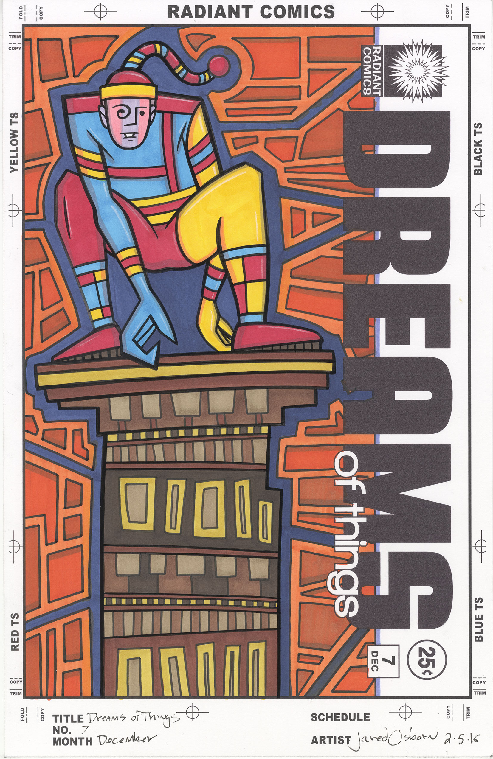
That’s what makes this “Dreams of Things #7” cover different for me. I’m not sure I like it. It’s my own fault to because the process I’ve been using for these covers has emphasized speed more than I usually do. That means I wanted to get them done quickly. That’s not quite the same as a deadline but it means there is compromise involved. I’ve made a few of these covers using old drawings. Drawings I finished and scanned it but never made a finished piece of art with. I print out the drawing in blue line, ink it, and then color the drawing with markers.
Usually whenever I color something I first make a color sketch. That saves me from making mistakes. But with these “Dreams of Thing covers I wasn’t doing that for two reasons. One was that I wanted to get them done quickly and two was that I was using simple graphic drawings were the color would be simple. Of course then things got complicated.
The drawing I picked for number seven is filled with shapes. It’s a weirdly dressed man crouching on a rooftop with lots of geometric shapes around him. The drawing isn’t particularly complicated but the color is. Like all the covers of this sort before I came up with a basic color idea but didn’t really work it out before hand. I knew I wanted the figure to be primary colors and the background to be secondary ones but that’s all I had.
The first color that I put down was the dark blue in the background. I wanted a night sky look to the background but the dark blue necessitated a lighter blue in the figure. Though still one of the primary colors this blue is really a tint of a primary color. It has white in it. It works as I anticipated it would but the lighter blue is still not quite as red as the red is nor as yellow as the yellow is.
That brings us to the building. I knew I wanted neutral browns for this but I think the brown/yellow might be a little too yellow,. It’s fighting too much for attention with the yellow of the guy’s clothes. I can fix that by making it a little more brown but I’m not sure if I want to. That might make the browns too brown. This is where a color sketch would really have helped. Other than that I’m fine with the building.
I had the most struggle with the orange boxes in the background. At first I was unsure if they should even be orange. I was thinking maybe purple but I stuck with orange. The problem then was that I don’t have very many orange markers. I basically have two. A middle orange and a dark orange. Except the dark orange is close to a mid-tone. I ended up dulling down the darker orange with a purple. This lead to greater differentiation between the oranges which is what I was looking for. It still might be a little too monochrome for but there is not much I can do about that. Overall there is a nice contrast between the dark blue and the orange. That works. It’s just looks a little ugly to me.
As I sit back and look at it on my easel I’m a little happier with it than when I first finishes it. I can’t say it’s my best piece but it has a certain appeal to it. I like the composition and the quirky image. It also fits with the weird dream imagery of the rest of the series. Like but not love. Looks like I’ll have to settle.
I’m back from the comic shop this week and I got four new comics.
Check them all out here:

Scanning a whole lot things is nowhere as easy as I always think it should be. Scanning one thing isn’t too much of a strain so I always think that scanning many things shouldn’t be too difficult. Wrong. It is difficult. Many years ago I scanned all of my film snapshots into my computer. I bought a dedicated film scanner and spent about a hundred hours scanning in thousands of photos. That was probably about the year 2005 and I’m glad I got it done. I’ve been using those photos for things and posting them on social media for years now. It was a lot of work but time well spent.
Cut to just a few weeks ago and my sister was asking me about film scanners. She wanted to scan in some of her old film snapshots. I said I’d leand her mine since it’s not something I use everyday plus I’ve got a backup non-dedicated film scanner that can do the job for me if I need it. I couldn’t locate all the parts and wires I’d need to give her right at that moment so it would be a few weeks until I could bring her the scanner. It was yesterday that I finally got everything unhooked from my machine and in one place. But then I decided to plug it in to make sure it was working. After all I had’t used it in a while.
I have a couple of binders that I keep my negatives in. They’re all in three ring archival plastic sleeves on a shelf. I knew I had one binder that had some negatives in it that I had never scanned in before. Odd and ends sort of stuff. I scanned in all my negatives that had people in them back in 2005 and the ones left were the stuff I didn’t care about as much and didn’t have the energy to scan in a decade ago. I thought there were a few sleeves worth of stuff in there that I could scan in now to make sure the scanner was in working order. An hour of my time at most. Boy was I wrong.
Turns out I had a lot of stuff in that binder. Stuff I wasn’t interested in ten years ago but I wanted to scan in now. First off there were a lot of my early street photos of NYC. I hadn’t done a ton of street photography in film but that is when I started doing it. I can see why I didn’t scan them in back them but they’re more interesting to me now. I think I can make something of the since I have a lot more experience with street photography now. Plus it’s fun to see some stuff from the 90s. Most of my street photos were made after I went digital in 2000.
The next cool thing I had was some multiple picture panoramas of some of my friends NYC apartments. Since even back then I was making my large cut together photo collages I would sometimes take panoramic pictures of places. There was no photo software in those days to automatically stitch the pieces together into one large photo so I never bothered to scan those ones in. In 2005 I’d have to put them all together in Photoshop myself and I had no interest. Nowadays Photoshop can do that automatically and so can a new (and cheaper) program called Affinity Photo. I think it even does that particular thing better than Photoshop. I tried it out on some apartment pictures and it worked well.
I also had a lot of old reference shots and assignments from back in my early college days. The mid 1980s. I had already scanned in the ones that had people in them so these were the less interesting ones. Still a few of them had potential so I just scanned them all in. That was easier than trying to figure out which ones were which. Maybe I can make something out of one or two of them.
The last category of photos is my still lifes. For a while there in the mid 1990s I was collecting little nicknacks and arranging them to make still life photos out of. That is where my dice collection started. I made a couple of cool photos this way but I found it very restraining. Since I was depending on your basic commercial photo lab to process my film and prints I mostly ended up with kinda lifeless little four by six inch prints. I had a couple of them printed larger and used some of them in my collages but they really went nowhere. They look much better on a big computer screen.
There really is one more category of unscanned photos and that is the miscellaneous category. I don’t know what they are. Odds and ends, whims, flukes, and whatever else. Back in the old days of film it was common to just snap a few photos to use up a roll of film so you could have it developed. I had a bunch of those in the sleeves. May as well scan them in now.
All totaled I ended up scanning in about six hundred photos. That is a lot. The scanner does most of the work but I have to pull a negative strip from the sleeve, put the strip in the holder, put the holder in the scanner, hit the scan button, and then wait five to seven minutes and repeat. About 175 times. I was doing things during the wait. That’s when I was making the panoramas, doing some inking, and even writing this. But all told it took about twelve hours. That’s a lot of hours of scanning. I’m tired now. I’m glad I got it done but is it ever a pain.
One more thing about scanning. Get organized. The only way I know these negatives have not been scanned is that over the years I’ve written “Scanned” on the negative sleeves after I’m done scanning them. I even wrote “Scanned bottom three” on some of them. That really helped. Now they all have “Scanned” on them.
I’m back from the comic shop this week and I got five new comics.
Check them all out here:
I’m back from the comic shop this week and I got ten new comics.
Check them all out here:
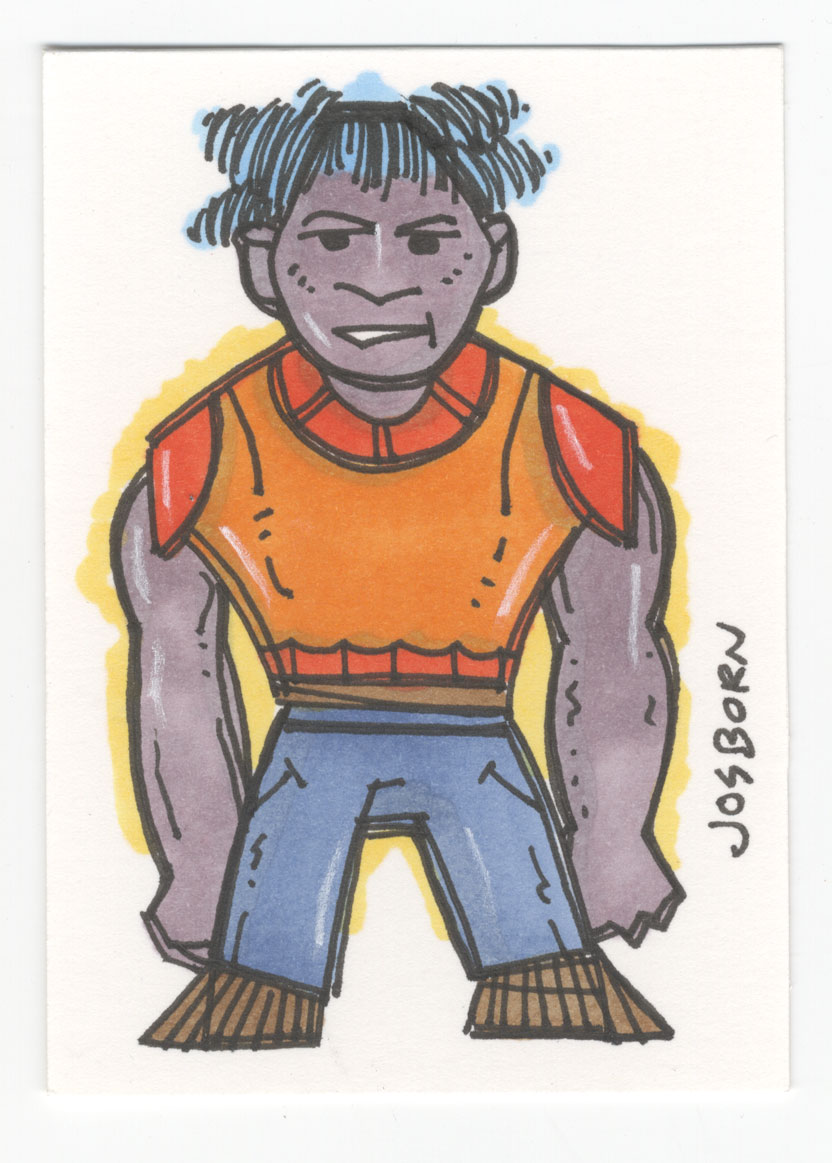
I feel like writing at the moment but can’t think of anything I want to write about. That happens. Sometimes I look for an idea but I can’t find one. So I looked around for a moment and decided to write about one of the first things I saw. Two of my Tiny Monster Art Cards. That’s the one good thing about writing about my own art, I have a lot of it laying about the place. So if I can’t start out with an idea as I write maybe I can end up with one. Or maybe it’s just an exercise in writing. That’s okay anyway. I can always use some exercise.
In looking at the two Tiny Monster Art Cards that have dates and numbers on the backs of them. The purple skinned fella is number 26 and has the date of June 20, 2015 on it. The red skinned fella is number 38 and has the date of June 29, 2015 on it. These dates might be a little misleading because I did these cards in two stages. First I drew them in black and white and that’s the way they were supposed to stay. They’re art cards so they’re 2.3×3.5 inches, the size of baseball cards, and I originally drew a whole bunch of them. Probably around forty of them. Sometimes I get into a particular thing for a short while. I probably liked the pen I was drawing them in and had a good time drawing little monster cards. Then they sat for a while.
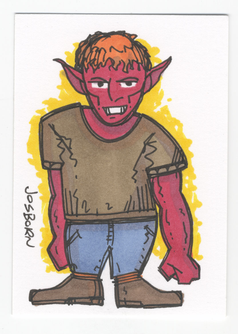
I just checked my calendar where I write down such things and it wasn’t until November that I added color to these cards. I was probably having a hard time figuring out what I wanted to work on, saw the black and white cards, and decided they needed a bit of color. That happens to me from time to time. Often deciding what to do is the hardest thing for an artist. If it’s work that you’re getting payed for it’s easy to figure out what to do. It’s whatever you’re getting paid to do. But when you’re on you’re own making art figuring out what is the best use of your time and effort isn’t easy. That’s why I like little things like these cards. They can keep me going when I can’t figure out a direction. They may not quite be bread crumbs pointing me in a direction but they’re bread crumbs I can eat until a big meal comes along.
First of all these Tiny Monsters are cute monsters. They’re not very scary or terrifying. They may be weird but they’re not giving anyone nightmares. They might not be so cute that they make people say, “Awwwww…” but no one is looking away in horror. They’ve got fairly cute proportions. That means they have big heads for their body size. What keeps them from being really cute is that their eyes are not so big. One of the cute rules is the bigger the eyes the cuter the drawing. In these the eyes are just big enough to be easily seen.
These were ink drawing which means I didn’t do any pencilling first. I drew in ink and so couldn’t erase anything. So I kept it simple. The masters are standing there not in complex poses. They’re just being. I also drew the legs very short. This helps with the composition as it makes the monsters rectangular so they can fill up the space of the card better plus it makes them appear a little bigger. That’s because it’s their upper bodies that look more muscular and that’s what we count for “Big”. If I was to draw them as if they were nine feet tall on these little cards they’d probably end up looking tall and slender. It’s better to go for big and broad.
The color is made with my Copic markers. Though I like markers of all types the Copic brand ones have ended up being my favorite because they are refillable. It’ll cost you a bit up front. A marker and refill are about six dollars a piece but for your twelve dollars you get the equivalent of about ten markers. That’s a lot plus you get the security of knowing that your marker isn’t going to run out on you in the middle of a drawing leaving you high and dry. You can refill it and keep going. It took me a few years to build up a stock of markers and refills but as of now I’m all set. It’s funny though because I always see new brands and types of markers that I want to try, some even refillable, but in the end I decide I’m pretty well set so there is no reason to spend extra money.
Of course the best thing about markers is that they’re instant color and the color is dry and stable the moment you put it down. As much as I like paint it’s not instant. Watercolor is the fastest of the paints and even that take a few minutes to dry as I use it. But not marker. Lay it down and it’s done. That makes it fun to work with.
As I look at these two cards I notice I took opposite approaches with the colors. On one I made the skin tone a bright color and the shirt a neutral and on the other I made the shirt a bright orange and kept the skin close to a neutral. With both I went for brown shoes to ground the drawing a bit. It’s mostly simple color with only a hint of shading but I generally find the color to be effective. It gives a little life to the drawings. I like the choice I made of a light yellow halo around the figures. It’s subtle but lifts them off the background just a bit. The yellow and white fight a little to see which is going to be the whitest white of the piece and that gives it some life.
There you go. A couple of little drawings that gave my writing a little life for a bit.
I’m back from the comic shop this week and I got six new comics.
Check them all out here:
Home printers can be tricky things. Especially when trying to make high quality art prints with them. I’ve been making prints on home printers for a couple of decades now. All the way back to when you could see the dots of an inkjet printer with the naked eye. Problems still crop up out of nowhere just like they did way back in the 1990s.
I’ve had a Canon printer for about the last five years. A Pro 9000 Mark II. Before that I used Epson printers for about 15 years. I finally abandoned Epson (the Stylus Photo R1800 being my last one) because I had too many problems over the years with clogged print heads. My R1800 worked perfectly 98% of the time but that 2% that it wasn’t working perfectly could eat up a lot of time and money. It eventually became frustrating enough for me to try a new brand when the time came to get a new printer.
The Canon wasn’t without its frustrations. Mostly because it turned out that there was a flaw in the model I bought and it would just stop working never to run again. A month after I bought the printer it died. Turns out this was a known flaw so Canon sent me a new one very quickly. The new one lasted a week. Canon sent me a third one and that one has been running fine these last five years. I’d have to say it runs perfectly as close to 100% of the time as possible because I don’t remember losing a lot of time or money to it. Except for yesterday.
Most printer manufacturers tell you to only use genuine whatever-their-brand-is products. Usually this means ink and paper. I’ve found that to be true with the ink. As much as it pains me to have to buy super-expensive printer ink the knock-off stuff doesn’t work as well when trying to make high quality prints. I’ve learned that the hard way. Paper is another story. There are a lot of third party companies that make good inkjet paper. Most of them will work with any inkjet printer you’ve got. I even still use a lot of Epson paper with my Canon printer. Epson’s matte finish papers are among my favorites for price and quality. I use them all the time.
I also like to print on semi-gloss or luster photo paper. I’ve used various brands of luster paper from Epson to Canon to whatever I could find. Over the last few years I’ve been printing out some of my street photos on five by seven inch luster paper and I keep one of the photos on my drawing table on a little easel and then change it out even few days. As a result I’ve tried a few different brands of five by seven inch paper but have lately settled on one by a company called Inkpress Media. They make some nice paper and it’s reasonably priced. I’ve been cranking out some small photos on it for months now.
At Christmas time I often make photos as presents for my family. I take old family photos, jazz them up a bit, and put them in frames. Usually these photos are on eight and a half by eleven inch paper. I was almost out of paper that size so I ordered some. I decided to go with the Inkpress Media paper that had served me well at five by seven and bought some eight and a half by eleven sheets of it. I made my photos, printed them out, and put them in frames. But as I was doing this I began to notice an odd problem. The bottom corners of the photos looked a little dirty. A tiny amount of ink was on them. Maybe a quarter inch long and a thirty second of an inch wide bit of black ink. Not a lot. I had seen it from my printer before but it really didn’t matter on these prints. I was busy too so I pretty much ignored it.
Cut to a few weeks later, I’m trying to make some fine art prints, and here come the little smudges. An art print has to be perfect so that won’t fly. That meant trouble-shooting. As I printed a photo I could hear the printer doing a weird thing at the end of the printing process. It’s like it was grabbing the paper and shaking it. I think that’s what was making those marks. Otherwise the print was fine. I opened the printer utility software and used that clean the heads, rollers, and whatever else they had. It made no difference. I looked online and couldn’t find many answers. I changed all my printer presets and toggled between different settings. None of it made the slightest bit of difference. There was that weird printer skip noise at the end and there were those smudges. 99% of the print was fine but that last 1% was not.
I must have changed things ten times and printed out ten prints all to no avail. I was getting frustrated before I decided to change one last variable. The paper. I had already printed low res on plain paper and that seemed fine but I figured that was because there was far less ink used. I got out some Canon photo paper, used the same preset as I had before, and it printed out perfectly. No weird hesitation sounds and no ink smudges. I was baffled. Still am. The Inkpress Media paper worked fine at the five by seven inch size so how come it failed in such a weird way at the larger size? I have no idea.
Also I was printing the photos with white around them. About a quarter inch of white all around. So it’s not like the smudged ink was near the ink of the actual photo. The printer should have just left it white and kicked out the photo. But it didn’t. The printer hesitated near the end and dropped some in smudges on at the last moment. It’s like it was sabotaging the photos because they were on another brand of paper. Strange.
I’m back from the comic shop this week and I got six new comics.
Check them all out here: