I’m writing this about a piece moments after I finished that piece. That’s something I don’t think I’ve ever done before but I just want to capture some initial thoughts. First off I’m not terribly happy with it but I also have no distance from it yet. I recently saw a tweet by a well known cartoonist asking if any artist is ever happy with their work. I answered that with a yes. There are lots of artists who are happy with their work but I added a caveat. Those artists usually aren’t on deadlines.
I’ve known a lot of working comic book artists in my day and often they are dissatisfied with their own pages. This is because drawing a comic book take a lot of work in a short amount of time which necessitates compromise. It doesn’t matter if all the drawing on a page isn’t 100% to your liking because you have to move on to the next page. You have a lot more to do. The comic has to go to press on a certain day and that’s when it has to be finished. It doesn’t matter if you’re happy with it or not.
That’s how almost all commercial art is. You’re being paid to do the job and you have to do it on budget and on time. It’s like any other job. If your boss tells you to dig a hole and have it done by 5PM and you don’t have it done in time you’ve failed and your boss will be angry at you. That you were taking your time to make the hole meet your own specifications won’t help you with your boss. Fail too many times and you’ll be looking for another job.
Non-commercial art is different. An artist does that to please himself. Sure maybe selling it is in the back of an artist’s mind but that’s a dream. And since there is no sale there is no deadline. You can take as long as you’d like on a piece. I’ve had pieces sit around for years before I ever finish them. It’s not finished until I’m pleased with it. Sometimes I’m never pleased with it and it becomes an abandoned work. It’s actually pretty rare for me to finish something and not be happy with it. Since nobody is buying my work I can keep working on it until I like it.
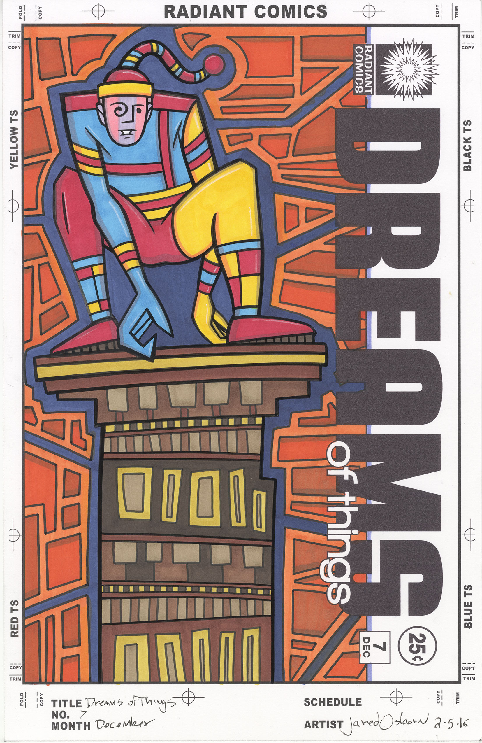
That’s what makes this “Dreams of Things #7” cover different for me. I’m not sure I like it. It’s my own fault to because the process I’ve been using for these covers has emphasized speed more than I usually do. That means I wanted to get them done quickly. That’s not quite the same as a deadline but it means there is compromise involved. I’ve made a few of these covers using old drawings. Drawings I finished and scanned it but never made a finished piece of art with. I print out the drawing in blue line, ink it, and then color the drawing with markers.
Usually whenever I color something I first make a color sketch. That saves me from making mistakes. But with these “Dreams of Thing covers I wasn’t doing that for two reasons. One was that I wanted to get them done quickly and two was that I was using simple graphic drawings were the color would be simple. Of course then things got complicated.
The drawing I picked for number seven is filled with shapes. It’s a weirdly dressed man crouching on a rooftop with lots of geometric shapes around him. The drawing isn’t particularly complicated but the color is. Like all the covers of this sort before I came up with a basic color idea but didn’t really work it out before hand. I knew I wanted the figure to be primary colors and the background to be secondary ones but that’s all I had.
The first color that I put down was the dark blue in the background. I wanted a night sky look to the background but the dark blue necessitated a lighter blue in the figure. Though still one of the primary colors this blue is really a tint of a primary color. It has white in it. It works as I anticipated it would but the lighter blue is still not quite as red as the red is nor as yellow as the yellow is.
That brings us to the building. I knew I wanted neutral browns for this but I think the brown/yellow might be a little too yellow,. It’s fighting too much for attention with the yellow of the guy’s clothes. I can fix that by making it a little more brown but I’m not sure if I want to. That might make the browns too brown. This is where a color sketch would really have helped. Other than that I’m fine with the building.
I had the most struggle with the orange boxes in the background. At first I was unsure if they should even be orange. I was thinking maybe purple but I stuck with orange. The problem then was that I don’t have very many orange markers. I basically have two. A middle orange and a dark orange. Except the dark orange is close to a mid-tone. I ended up dulling down the darker orange with a purple. This lead to greater differentiation between the oranges which is what I was looking for. It still might be a little too monochrome for but there is not much I can do about that. Overall there is a nice contrast between the dark blue and the orange. That works. It’s just looks a little ugly to me.
As I sit back and look at it on my easel I’m a little happier with it than when I first finishes it. I can’t say it’s my best piece but it has a certain appeal to it. I like the composition and the quirky image. It also fits with the weird dream imagery of the rest of the series. Like but not love. Looks like I’ll have to settle.
Discussion ¬