I’m back from the comic shop this week and I got ten new comics.
Check them all out here:
Comment
I’m back from the comic shop this week and I got ten new comics.
Check them all out here:
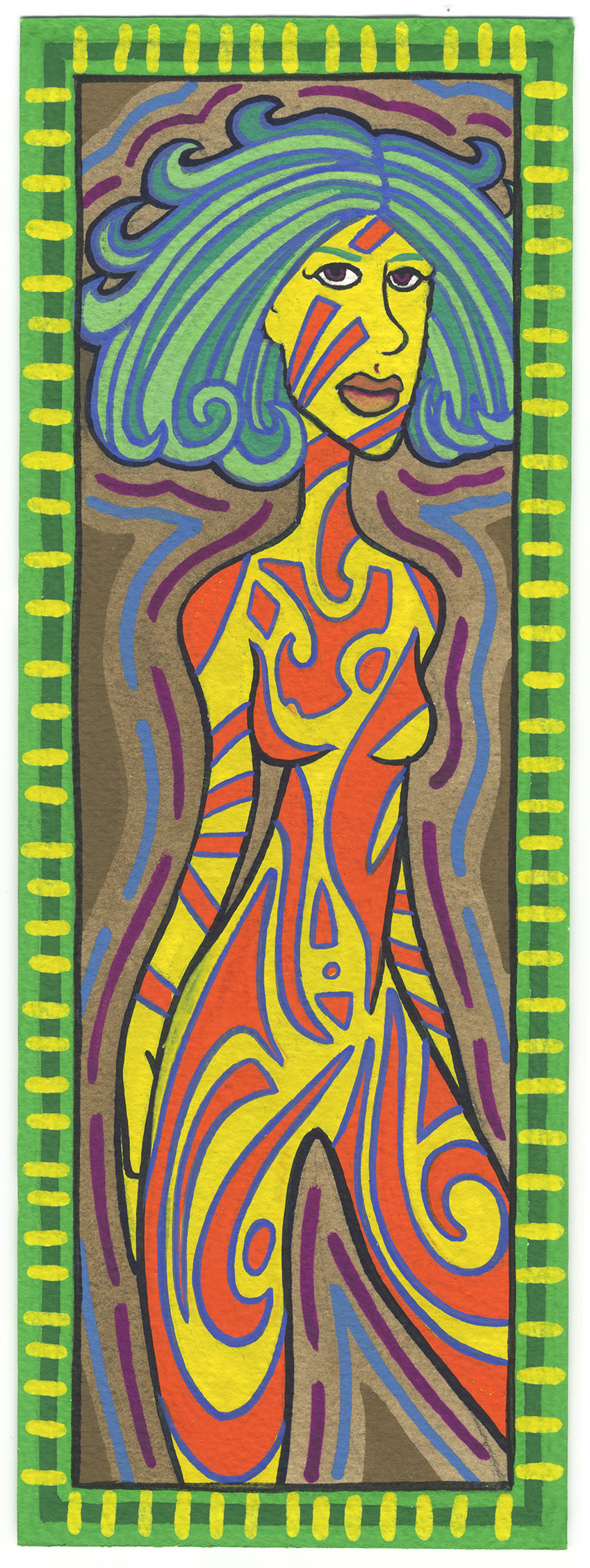
Today I decided to dip into a book of my old paintings, pull one out, and write about it. My book of old paintings is just a binder that I keep some small paintings in. The paintings are in sleeves with three binder holes in the side. The sleeves are really meant for photographs. The date on the painting is October 21, 2002. By that time I had switched to digital photography and didn’t have a lot of use for my old photo sleeves. This painting is an odd size for me at four by twelve inches but that was the size of the panoramic prints made for APS film of the 1990s. So I obviously made some paintings to fit the sleeves I had lying around. The name I gave this painting is “Create Me”.
First off I want to say that I like this size. I had forgotten that I worked at this size. I don’t often work this narrow and tall so it’s a good change of pace. Not to mention that the proportion suits figure drawings pretty well. The two to three ratio I often work at doesn’t always offer me the chance to stretch out a figure like this. And stretch her I did. Despite her large head her body is slightly elongated. Especially as we move from her midsection down to her thigh. It makes a nice swooping gesture.
I also have to say that the color holds up really well. It’s painted with gouache on 300 pound cold press watercolor paper and the paint is opaque and full of color. Those are are couple of the things I always liked about gouache. It’s a watercolor but with white in it so it’s not transparent like a regular watercolor. When I first started using gouache in the mid 1990s I was using a set of gouache pans. Those are the ones we are familiar with form school where the pans are in little circular plastic cups that are dampened with water and a paint brush. But after that I moved into tubes of gouache that were of a really high quality and were loaded with colorful pigment. I’m pretty sure most of this painting was done with those tubes. The paint looks brighter and more dense than my pan set.
You can really see the origin of my “Painted Lady” series in this piece. It is pretty much a Painted Lady but on a smaller scale. I don’t quite go into the detail with the body decoration as I do with the Painted Lady ones but the theme is similar. I like how I have one of her breasts as orange and the other as yellow. I don’t think that’s something I’ve done with the Painted Ladies. It looks like I have static pieces on her upper body. The ameba that floats on her chest, the lines on her face, and the lines on her arms give way to the more sweeping shapes of her lower body. There are large sweeping curves and spirals on her legs. This accelerates my eye down her body as I look.
As is often the case with my art the woman in the painting is looking out at us as hard as we’re looking at her. She’s really staring. The eyes are pretty simple too. There is no color to them and other than that they’re simple outlines with the round part all darkened in. I just this moment noticed that she has two green lines for eyebrows. That’s a subtlety that slipped by me. Looks like I used the same green that I used in the border.
I remember that green now. Over the years at different points in time I’ve had certain favorite colors that I liked to use over and over. I think that green is Winsor Newton Permanent Green Light Designers Gouache. I bet that’s one they still make but I’m not sure. I’d often buy off-brand paint when I saw it in the store because I liked to try new things but sometimes I’d discover a great new color but then never be able to find it again. I can’t remember the brand but I had a brown color called Cassel Earth that was my favorite brown but then I never found it again. Of course that was back in the pre-internet days. I’m sure I could find everything now. That is unless the stop making a color. That happens. My favorite orange acrylic isn’t made anymore.
Overall I think I worked out the colors well in this piece. The yellow and orange of the figure compliment each other well but then they both fight a little bit with the bright blue outline around the orange. This makes the color vibrate a little. The yellow of the body and the green of the border are also fighting with each other to become the most dominant to the eye. I think the green might win except for the yellow tick marks around the edges that knock the green back a bit. It’s an interesting balance. I think the thin black outline around the body helps maintain that balance.
The neutral colors in this painting also help to maintain the color balance. The most obvious of the neutrals is the brown color in the background. It sits there like an anchor in the background as the blue and purple lines kind of squiggle on its surface. It gives the bright yellow a place to settle into.
The second almost-neutral is the blue greens in the hair. It’s a fairly vibrant color but compared to the yellows and oranges it’s tame. It sits in its space in the middle ground without fighting for attention. I would usually not consider a blue green to be neutral but here it seems to work as one. It doesn’t take sides with either the yellow or the green.
Fourteen years ago. That’s how long it’s been since I painted this painting. Interesting to pull it out and take a look. And time sure does fly.
I’m back from the comic shop this week and I got four new comics.
Check them all out here:
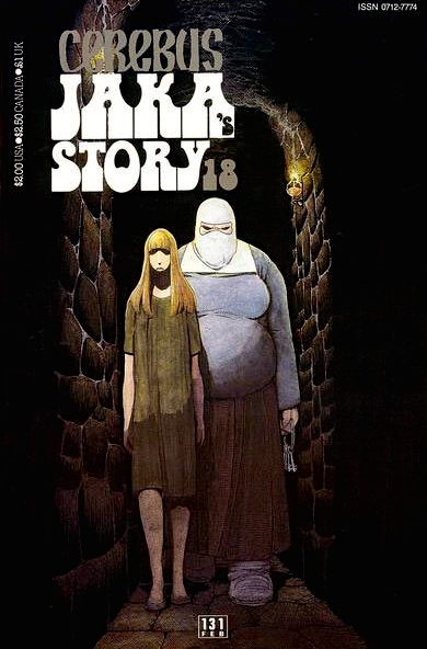
Time can really slip past a person can’t it? That question came to mind this past Saturday as I decided that I wanted to reread some Cerebus. Cereus is a comic book by Dave Sim that ran from December 1977 to March 2004. It told Cerebus’s story for three hundred issues which were also collected in large paperback editions. I came to Cerebus late. It was a comic that I had always meant to start reading but never quite did. I finally started to read it in the late 1980s when Cerebus bi-weekly was published reprinting the very first issues of the series. I bought the first forty two issues of it as well as tracking down some other back issues where I could. Then I just kind of fell off of it since I didn’t have all the connecting issues. It wasn’t until the mid 1990s that I bought all the collected editions that I was missing and decided to buy the collected editions as they came out. That’s how I read Cerebus up until 2001 and issue 266. Then I decided to read the monthly issues because I wanted to be there first for when it ended.
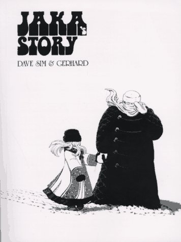
I haven’t reread any of the Cerebus issues since the series ended in 2004. That was twelve years ago. That’s a long time. But Dave Sim has a YouTube channel now where he gives people updates of his plans to preserve Cerebus and get all the books back into print. For the last three weeks he’s been telling us about the origins of one of the characters called Jaka. She’s Cerebus’s one true love who doesn’t love him back. She’s also the title character in Cerebus volume five which is named “Jaka’s Story”. These videos made me want to read “Jaka’s Story” again so I pulled it off the shelf. The printing I have came out in 1996 which is when I last read it. Twenty years ago. There is that time thing again.
Upon reading “Jaka’s Story” I was surprised by two things. First that I remembered almost nothing about the story and second that I think I liked it a lot more now than I did twenty years ago. Obviously I liked it back then since I kept buying it but I don’t remember it having as emotional an impact on me as it did with this reading. I hardly ever read all day or read a lot of the same comic series in a row but I read all four hundred plus pages of this one over a Friday night and Saturday morning. Then I read the next two volumes “Melmoth” and “Flight” (both smaller two hundred page volumes) on that same Saturday. I was hooked and couldn’t stop. Cerebus is good stuff.
All three volumes are different from each other. Sim does a good job at summing up “Jaka’s Story” in his intro but I’ll sum it up even shorter. It’s about the everyday life moments of a married couple, Jaka and Rick, as they go about their business. Plus there are a few other characters going about their business too. Cerebus is barely in this volume but his presence is often there. At the end the story turns political as our characters get caught up in things bigger than themselves.
On a side note I’d like to point out how brilliant Sim’s lettering is in this volume. The art in Cerebus by Sims and his art partner Gerhard is always good but lettering rarely gets mentioned. There is a character near the end of the story that is based on Margaret Thatcher. Normally I don’t like dialogue written phonetically or in a accent but in this case the lettering made it work. Sim would vary the size and spacing of the letter by how Thatcher was speaking. Long rolling sounds were lettered wide and high sharp sounds were tall. It all flowed so naturally that I could hear the real Margaret Thatcher’s voice in my head. Some of the best lettering ever in a comic.
The next volume that I read, “Melmoth”, was about a character that was in “Jaka’s Story”. The character was based on Oscar Wilde. Sim often based characters on real life people. Cerebus was in this volume more than in the last volume but the story was mostly about the death of Oscar Wilde. It was quite poignant because he was heathy and full of life in “Jaka’s Story” but now he was slowly wasting away. The Cerebus part of the story was also about him wasting away but he eventually became his own agent again and took action. That was not something Oscar Wilde was capable of anymore and that made it even sadder by comparison.
“Flight” the third volume that I read was different than the first two. It had a lot more of Cerebus in it and a lot more mysticism. Did I not mention Cerebus is an anthropomorphic aardvark in a world made up of humans? It’s a fantasy world of rival big cities who all have different gods and religions that are real and affect the world. Cerebus is a major player with some gods but he really never knows what’s going on. In this volume there is a lot of explaining what’s going on in the world but Cerebus doesn’t always care. He just wants Jaka and to be happy.
So there you go. Twenty years latter I re-read comics I had no memory of. Or at least I had forgotten all of the details. I hadn’t forgotten how good Sim and Gerhard’s artwork was though. In a rather unusual arrangement for comics Sim does all the figure work and Gerhard handles the backgrounds. To call them backgrounds is a bit of a disservice though because Gerhard really creates environments. They are richly illustrated and meticulously drawn. Sometimes the environment Cerebus is in can be 80 percent of the page and becomes the real star. It’s quite a collaboration. So go check out some Cerebus if you never have or re-read it if you haven’t in a while.
I’m back from the comic shop this week and I got six new comics.
Check them all out here:
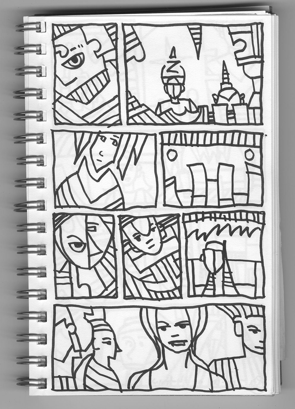
For something different I’m going to pull one of my ink books off the shelf, open it to a random page, and see what drawings I find there. That’s often how I start a new project. Since I have sixteen ink books finished, and the one from this year in progress, I have a lot to choose from. The ink books are filled with small spontaneous ink drawings that I draw with a Pentel Sign Pen. I usually draw six to nine small drawings per page. I’ve been mostly doing nine drawings per page for the last few years but earlier on that number varied a lot more. First I draw a small box on the page and then I draw inside the box. Having a border around the drawing helps me compose. I draw the boxes row by row as I fill the page. It may look like a comic book page but they’re all individual drawings that really don’t have anything to do with one and other.
So now I’ll pick a book and a page number. Let’s try book eleven and page thirty two. Let’s give it a look. First of all this page is an unusual one. It’s from July 17, 2010 (I date my ink book pages) and there is also a notation on the back that I drew this page on the train. I don’t think I’ve drawn many pages on the train. This one was from a day that I went down to Bryant Park to take street photos. Nowadays I bring something with me to read when I take the train to the park but there was a time I wanted to get some work done as I rode.
This page has eight panels. Eight panels drawn with a shaky line. That’s the train moving and also why I probably gave up drawing on the train. It’s not an easy thing to do. But it’s not too bad of a shaky line. I’ve tried drawing while riding the bus and that makes things much worse. The shaky line makes things not up to my usual standards though.
The first panel is one of my usual faces. He (or maybe she) has one eye looking out at us as he is silenced by some sort of gag over his mouth. Nothing too spectacular here as I’ve made similar drawings over the years. It does have a nice tilt to it though.
I like the use of space in the second panel. The background sky is a nice negative space that almost becomes the subject of the drawing. Plus there is a lot of depth to it. We have some shapes that are vaguely like machinery in the foreground, a person with a Z shaped hat in the middle ground, a spiked hat wearing face in the background, and then the sky. I like this panel. Any indication of faces is missing on the small figures and I bet that’s because of the shaky train. I’m guessing I didn’t want to draw anything that tiny.
The third panel is one I used for something. I can’t remember what but I think it was an eight by ten inch acrylic on canvas painting. I must have picked this one because I liked the shape of the hair and face. They fit together like puzzle pieces. The body is a little lumpy but that’s easy to work with. I’ll have to see if I can track down the painting.
Panel four looks familiar but I don’t think I made anything from it. It’s one of my rarer unsubjected drawings. I love creating images far more than I like to make abstract paintings but sometimes I make geometric abstract paintings. This drawing is along those lines. On occasion I like to compose with just shapes. Rectangles and circles are my favorites but I often work in triangles too. I haven’t finished too many pieces that have no figure in them but it does happen.
Panels five, six, and seven are all pretty small. The lines in them seem less shaky and more confident. That’s probably because the lines are shorter and made quickly. Panel five is a face that’s looking in two directions at once. It’s kind of a Picasso thing but it’s not very good. Just some lines and a face that never quite come together. Panel six is a bit better. It’s a nice little face with a weird body with lots of curved shapes in it. I’m not sure what that shape is between his eyes. That would have to go if I were to make something from this. Drawing seven looks like an incomplete mess. I think the shaking of the train was getting to me by then. It doesn’t suggest much to me besides a head on top of some sort of triangle body.
The eighth and last panel just misses being interesting. Once again I think that’s because of drawing on a train. It looks like I gave up on it. It could really use some sort of background or at least the background sky making a nice negative shape like in panel two. Instead we get a lot of clumsiness. I still don’t think it’s a total loss though. I like the placement of the three figures. I think I could work with them. The central figure has a really shaky jaw-line but that’s nothing to worry about. That gets fixed in the next version of the drawing. I’m not sure what those lines on the left side are. They look like a mishmash that could be a person or a thing. I’d have to clean that up.
So there you have it. That’s how I look at an ink book page. It’s funny how when I picked a random book and page number I picked an unusual page. Each ink book has a hundred pages in it and with sixteen finished ink books that makes sixteen hundred drawings. There are maybe six pages that were drawn on the train. Probably fewer. So the odds were long on picking a train page. But what the heck. Unusual can make for some nice analysis.
I’m back from the comic shop this week and I got eight new comics.
Check them all out here:
Sometimes I can’t finish things. Luckily for me that’s not too often but this week was the week for it and I found that frustrating. It was all about me wanting to make a large piece but not being able to. I haven’t made any of my 20 by 28 inch ink drawings in a while but I wanted to get one started again. I didn’t seem to be able to. In the past they’ve been fairly easy to start. I start them just like every other drawing I make. I pick a drawing out of one of my ink books that are full of drawing ideas and I work up a working drawing from that. Usually a six by nine inch drawing but sometimes a nine by twelve inch one. That’s why I do all those small ink drawings. So I can have a place to start from. And that’s where I started with this one.
After I found a drawing I liked I printed it out in blue line on a six by nine inch piece of paper. Nothing new there. I started to draw but quickly got nowhere. Nothing was working. I couldn’t get the eyes right, the spiral shapes were all wrong, and I had no idea what to do with the background figure. It was a frustrating bit of drawing. After about half an hour I decided to put that drawing aside and look for a new drawing idea to work form. Putting a drawing aside is almost always the right answer when I can’t make it work. Maybe I can another day.
I went back to one of my ink books and found another face drawing to use. I still wanted a face to work with so that’s what I went with. Once again I printed out a six by nine inch blue line and started to draw. More frustration. I gave up on this drawing even faster than the first. I couldn’t get it done. More swirls to struggle with, more eyes that I couldn’t find anything interesting to do with, and another dull neck. It seemed like I would never get that drawing done either so I decided to change course yet again.
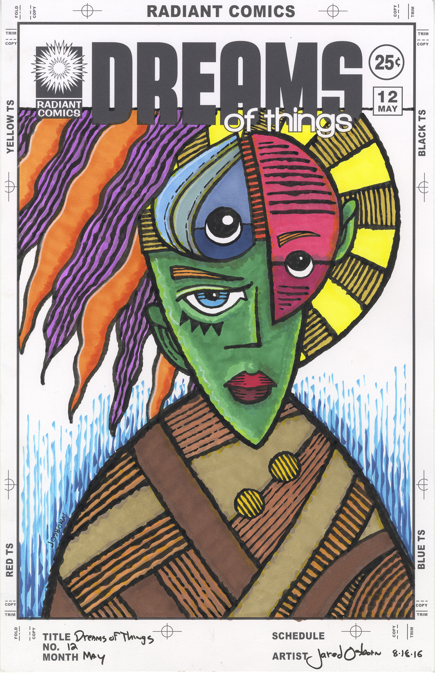
I went back to my ink books and looked for a drawing that was more figure and environment based. I found something with less face in it and more body. I thought for sure I had this thing licked and I’d have a finished drawing soon enough. It didn’t happen that way. I couldn’t figure the drawing out. I worked on it longer and harder than the first two but to no avail. Hard work isn’t always the answer. I can’t bull my way through a drawing that’s not working. That’s a hard lesson to learn but every artist has to learn it. So I abandoned a third drawing. I even decided to abandon the whole idea of a large ink drawing. That would take too long and I needed to get something done. A smaller piece just so I could accomplish something. A decided to switch over to one of my “Dreams of Things” covers.
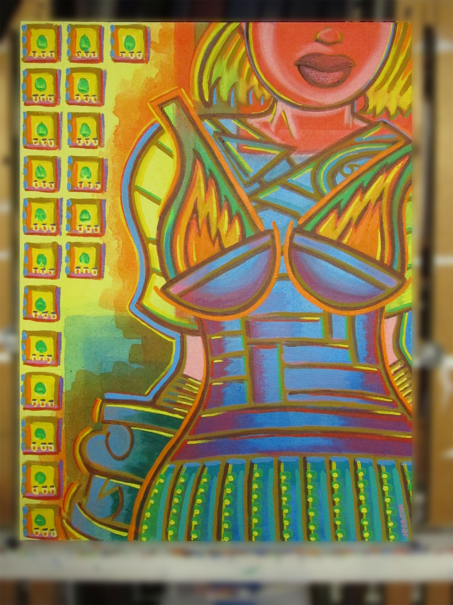
A few days before I had managed to get something done when I couldn’t get much done. I inked “Dreams of Things” #12 cover. One of my faux comic book covers. The way I got it done was to change up my inking technique. I usually use a smooth line to ink with and that takes a certain amount of concentration. I decided to switch over to a rough textured line technique that doesn’t take the same kind of concentration. It’s more free-wheeling. That worked for me a few days before with cover number twelve and I got that cover inked. I decided to work up another cover. The difference between covers twelve and thirteen would be that I already had the pencil drawing done for cover twelve and I had nothing yet done for number thirteen.
I had already proved to myself that I was going to have trouble getting any drawing done that day so I decided to dig through a bunch of my old drawings to see if I could find something that was finished enough to use. It’s pretty easy for me to do that since I scan in all my drawings so they’re all digital files on my computer. It did take a while for me to find one I could use though. Every drawing is not for every occasion. I was even getting frustrated as I was looking through the drawings and not finding anything. It was that kind of day.
After settling on a drawing I had to modify it a little. That wasn’t too hard since I did it digitally but even that was frustrating. I actually picked a horizontal drawing that I cropped and was using vertically. It was a drawing of a person in some kind of elaborate Japanese influenced armor. The person had super-wide shoulders that made the piece horizontal but I cropped it in such a way as the shoulders didn’t even fit onto the sides of the paper. The drawing was from a few years ago and I don’t think I ever made anything finished out of it so it was about time I did.
I don’t think I could have finished the cover if I inked it in my usual way. I obviously didn’t have my usual concentration that day. That much was obvious. Instead I inked with the side of my brush. I used a line that wasn’t thick-to-thin but was uneven. It took me a while to get it done. I was talking on a Google-chat as I was working and that’s usually and easy way to get distracted but this time it helped. I could work slowly and methodically while being able to either listen to someone or take a mental break and talk. It probably took me two and a half hours to ink. I think if I was on I could have cut that time by half an hour if not more.
It was a tough day of not finishing stuff. Days like that can try anyone’s patience. I’m glad something finally came together.
I’m back from the comic shop this week and I got seven new comics.
Check them all out here:
Physical effort. Some things take more physical then I think they will. They fool me every time. Maybe not every time. After all it’s why I put off this particular task. Wrapping paintings in plastic to keep the dust off them. That’s not something a successful artist who sells painting has to worry about but for those of us who are unknown and unsold it’s a problem. Dust build up over the years and gets into the nooks and crannies of the paintings. It can wreck things.
Besides dust wrecking things leaning a painting against another painting can wreck things too. I try not to do that but I have too many paintings in too small a space so I have to. I even built a painting rack to stop that from happening many years go but I filled that up. A thirty by forty inch painting can take up some real room. Wrapping the painting in plastic can help with the paintings not rubbing up against each other but if there is too much leaning weight on the paint it can still be a problem. I try to keep that to a minimum.
For my smaller paintings, the ones around eight by ten inches, I use envelopes and cardboard book mailers. A painting that size can slip into a ten by fourteen inch envelope and keep it clean. There is also not much weight to a small painting like that so there isn’t much of a rubbing issue once they go in the envelope. I keep them on a shelf so they’re not stacked up bearing each other’s weight. As you might imaging the smaller paintings are easier to handle and store.
I didn’t even have a ton of paintings to cover. I haven’t done much large painting in the last few years. I don’t have the room to store them. I had five paintings that were around the thirty by forty inch size plus another twelve paintings that were eighteen by twenty four inches. Less than twenty paintings. That shouldn’t take too much effort. Right?
There really isn’t much to wrapping a painting in plastic. All you need is plastic sheeting and some duct tape. The effort comes with the paintings being so big that I have to wrap them on the floor. It takes a lot more out of me working on the floor than working standing up. I’m not in bad shape. I like to cycle so I exercise regularly but working on the floor means I have to work kneeling and there is a lot of getting up and down going on. I have a rubber mat on the floor that I usually stand and work on so I tried to kneel only on that mat. I say tried because sometimes I forgot and kneeled for a bit on the hard tile floor. It’s amazing how much my knees hurt after doing that for a few minutes. I’m lucky enough to have good knees that never hurt so when they do it’s a shock.
The plastic sheeting comes on a ten foot roll so I pulled out a pencil and paper to figure out the size I would have to cut the plastic to for it to wrap an eighteen by twenty four inch painting. Remember how they tell you to measure twice and cut once? Well that didn’t help me because I added wrong. After I cut out the first three pieces they were too big. I went back and looked at my little diagram and saw I my mistake. I somehow figured I could only get three pieces across the ten foot length when I could actually get four. It kind of blew my mind a little that I messed up the simple math.
After the plastic is cut it’s time to tape them up. I place the painting on top of the canvas and then fold the sides in so they meet in the middle. Let them overlap a couple of inches. Then I run the tape down the seam from top to bottom and cut it off with my tape scissors. I have a separate pair of scissors for cutting tape because the tape glue always gums up the scissors. I take the tape residue off with rubber cement thinner but I don’t need the tape gumming up my everyday scissors. After that I fold the bottom corners over a little and then fold the bottom four inches up and tape that to the back of the plastic where the other seam is already taped. That leaves me with an open top on my “Envelope” where I left about four inches of plastic that can fold over and keep the dust out.
That’s it. That’s all there is to it. Doesn’t sound like much does it? But its the repetition that gets me. Seventeen paintings means I have to get down on the ground and then stand up again maybe sixty times. And it took me from two to three hours to do. Plus I had to dust the paintings first. Especially the big ones. I used my big soft drafting brush that I’ve had for thirty years but I had to carry the paintings outside to dust them off. It’s not as easy as you would think to dust a painting. The dust really sticks on there. Another thing that took more effort than I thought it would. Ain’t life like that?
Overall I’m glad I got this task done. I don’t think I’ve done this in five years. The fact that I haven’t done a ton of large paintings in that time added to my putting it off. Why pull out the plastic and tape for three paintings? Six paintings? Nine paintings? Next thing you know there are seventeen paintings. Things add up. Be careful when they add up to fatigue.