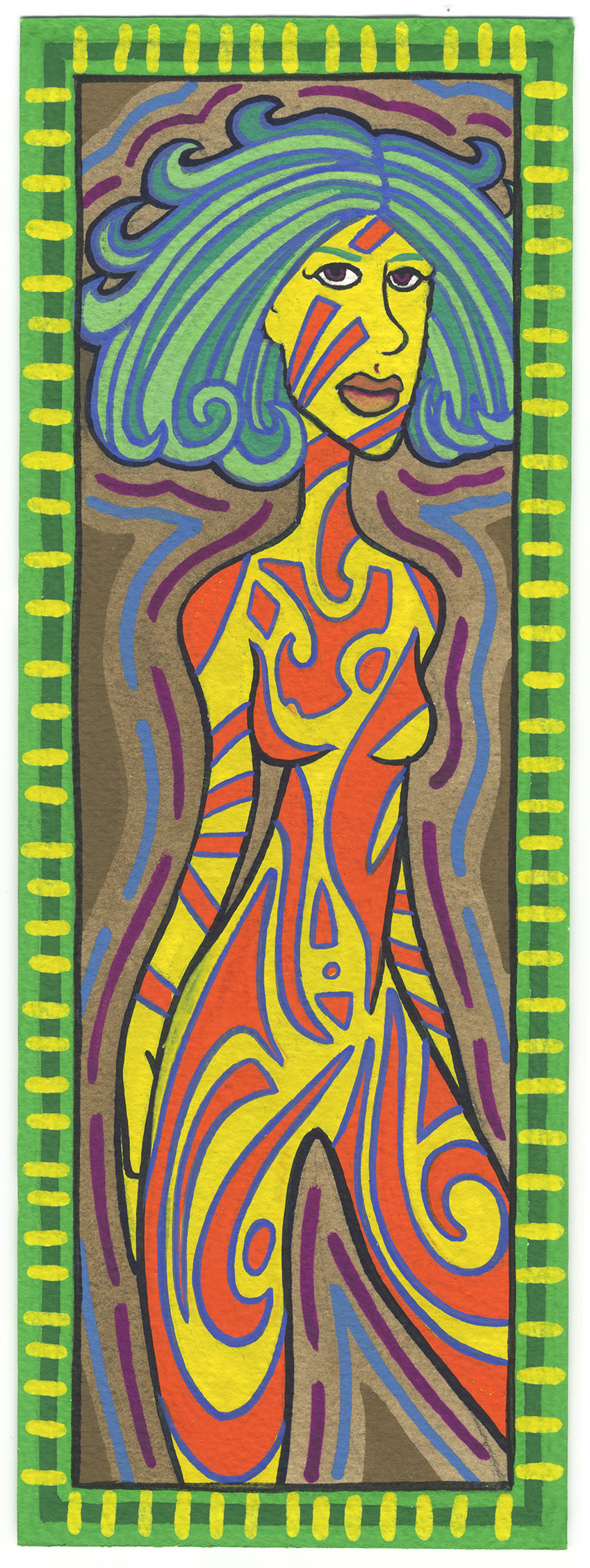
Today I decided to dip into a book of my old paintings, pull one out, and write about it. My book of old paintings is just a binder that I keep some small paintings in. The paintings are in sleeves with three binder holes in the side. The sleeves are really meant for photographs. The date on the painting is October 21, 2002. By that time I had switched to digital photography and didn’t have a lot of use for my old photo sleeves. This painting is an odd size for me at four by twelve inches but that was the size of the panoramic prints made for APS film of the 1990s. So I obviously made some paintings to fit the sleeves I had lying around. The name I gave this painting is “Create Me”.
First off I want to say that I like this size. I had forgotten that I worked at this size. I don’t often work this narrow and tall so it’s a good change of pace. Not to mention that the proportion suits figure drawings pretty well. The two to three ratio I often work at doesn’t always offer me the chance to stretch out a figure like this. And stretch her I did. Despite her large head her body is slightly elongated. Especially as we move from her midsection down to her thigh. It makes a nice swooping gesture.
I also have to say that the color holds up really well. It’s painted with gouache on 300 pound cold press watercolor paper and the paint is opaque and full of color. Those are are couple of the things I always liked about gouache. It’s a watercolor but with white in it so it’s not transparent like a regular watercolor. When I first started using gouache in the mid 1990s I was using a set of gouache pans. Those are the ones we are familiar with form school where the pans are in little circular plastic cups that are dampened with water and a paint brush. But after that I moved into tubes of gouache that were of a really high quality and were loaded with colorful pigment. I’m pretty sure most of this painting was done with those tubes. The paint looks brighter and more dense than my pan set.
You can really see the origin of my “Painted Lady” series in this piece. It is pretty much a Painted Lady but on a smaller scale. I don’t quite go into the detail with the body decoration as I do with the Painted Lady ones but the theme is similar. I like how I have one of her breasts as orange and the other as yellow. I don’t think that’s something I’ve done with the Painted Ladies. It looks like I have static pieces on her upper body. The ameba that floats on her chest, the lines on her face, and the lines on her arms give way to the more sweeping shapes of her lower body. There are large sweeping curves and spirals on her legs. This accelerates my eye down her body as I look.
As is often the case with my art the woman in the painting is looking out at us as hard as we’re looking at her. She’s really staring. The eyes are pretty simple too. There is no color to them and other than that they’re simple outlines with the round part all darkened in. I just this moment noticed that she has two green lines for eyebrows. That’s a subtlety that slipped by me. Looks like I used the same green that I used in the border.
I remember that green now. Over the years at different points in time I’ve had certain favorite colors that I liked to use over and over. I think that green is Winsor Newton Permanent Green Light Designers Gouache. I bet that’s one they still make but I’m not sure. I’d often buy off-brand paint when I saw it in the store because I liked to try new things but sometimes I’d discover a great new color but then never be able to find it again. I can’t remember the brand but I had a brown color called Cassel Earth that was my favorite brown but then I never found it again. Of course that was back in the pre-internet days. I’m sure I could find everything now. That is unless the stop making a color. That happens. My favorite orange acrylic isn’t made anymore.
Overall I think I worked out the colors well in this piece. The yellow and orange of the figure compliment each other well but then they both fight a little bit with the bright blue outline around the orange. This makes the color vibrate a little. The yellow of the body and the green of the border are also fighting with each other to become the most dominant to the eye. I think the green might win except for the yellow tick marks around the edges that knock the green back a bit. It’s an interesting balance. I think the thin black outline around the body helps maintain that balance.
The neutral colors in this painting also help to maintain the color balance. The most obvious of the neutrals is the brown color in the background. It sits there like an anchor in the background as the blue and purple lines kind of squiggle on its surface. It gives the bright yellow a place to settle into.
The second almost-neutral is the blue greens in the hair. It’s a fairly vibrant color but compared to the yellows and oranges it’s tame. It sits in its space in the middle ground without fighting for attention. I would usually not consider a blue green to be neutral but here it seems to work as one. It doesn’t take sides with either the yellow or the green.
Fourteen years ago. That’s how long it’s been since I painted this painting. Interesting to pull it out and take a look. And time sure does fly.
Discussion ¬