I’m back from the comic shop this week and I got four new comics.
Check them all out here:
Comment
I’m back from the comic shop this week and I got four new comics.
Check them all out here:
It’s kind of a tradition among YouTube comic book people to make a video of the top ten comics that you are looking to buy in the coming year. Being that I almost never buy back issues I haven’t ever made one of these lists but this year I decided to. I feel like being forward looking. That’s my only reason for doing it. Sometimes it’s good to look forward in time and imagine nice things. My list of stuff is also fairly easy to get. I don’t have big expensive comics on the list except for two. I threw them on just for fun. I doubt I’ll get those two but who knows? I can at least look forward to getting them. Most of my list is multiple issue runs. Stuff I want to fill in. Inexpensive stuff so I’ll count it all as one list entry.
1) “Delphine” by Richard Sala issues 3 and 4. This is an oversized series that came out almost ten years ago. I bought the first two issues and then, since the issues came out annually, I lost track of it. I’ve always meant to track down the final two issues but never have. They’re not easy to find but not particularly expensive either.
2) “Bone” by Jeff Smith issues 28-38. I was late to buying “Bone”. I remember getting the Image comics printings of issues 1-27 off of Ebay for a song years ago and then I started buying it off the rack with issue number 39. Somehow I never went back and bought issues 28-38. I’ll have to find them. I can probably get them for a song too since everybody wants the collected editions of “Bone” these days.
3) “Palookaville” by Seth Issues 1 and 2. These two issues are not easy to find. I first started buying the series with issue number 3 way back in the 1990s and I’ve never seen the first two issues. I have an undersized 10th anniversary edition of issue number 1 but that’s it. These two issues have self contained stories in them so I never bothered looking hard for them. The continuing stories started with issue 3.
4) “Mage: The Hero Discovered” by Matt Wagner issues 2-11. I bought “Mage” number 1 off the rack but then went off to college and missed most of the rest of the series. I found issues 12-15 in the bargain bin and then bought collected editions of the earlier issues. So I’ve had the whole series since the late 1980s but don’t have the individual issues. I think I’d like to get them. The don’t go for a lot especially since I already have number 1.
5) “Strangers In Paradise” by Terry Moore issues 2-3, 6-16, 18-19. Another series that I bought the first issue of but then I didn’t put it on my pull list. I bought an issue here and there until I decided to put it on my pull with issues number 20. I think it would be cool to get the rest of them.
6) “Birthright” numbers 1-4. This is an easy one. The series is only a few years old. I didn’t start picking it up until issue 5 and then it went on my pull list. I have the first four issues in a collected edition but why not go back and get them as individual issues?
7) Crossgen: “The First”, “Mystic”, and “Sigil”. I used to buy a few Crossgen series in the early 2000s and I enjoyed them a lot. I couldn’t afford them all so I missed out on a few series. I think these three all have 37 issues a piece and then aren’t very expensive. I’ve always meant to pick them up but it’s really been a matter of finding space for them. That’s a 120 issues or so and I’d have to get rid of that many comics to fit them. I’m planning on getting rid of a bunch of stuff this year so maybe I’ll finally finish off my Crossgen collection. I still need some things besides these three series though.
8) Marvel Team-Up #68. This is one of my favorite issues from my childhood. It teams up Spider-Man and the Man-Thing. I still have my original issue (I even made a video about it a while ago) but I think I want a mint condition copy of it. Just because that’s how I remember it. Not old and battered like my childhood copy. I did this for a few childhood favorites a decade ago and the pristine copies are fun to see. Of course I read the battered ones.
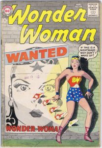
9) Wonder Woman #108. This one is on the list just for fun. That and it has a cover I really like by Ross Andru and Mike Esposito. WW 108 is a recent want of mine. I never knew it existed before a couple of years ago. I was looking at someone’s list of favorite Wonder Woman covers and this one was on it. It stood out to me and I made a mental note to get one one day. Since it’s from the late 1950s and runs a good hundred dollars I’m not sure I ever will but I’ll put it on the list anyway. It’s a wish list after all.
10) Frontline Combat #3. This is one that went on the list because I decided I should have an EC comic on the list. There are plenty of good EC comics to chose from with lots of great covers but this one stands out to me. It’s drawn by Harvey Kurtzman and there is something about him referencing the Battleship Missouri that resonates with me. It makes history come alive. This is another expensive comic but I think there is also a facsimile reprint of it. I might have to get that version of it.
11) Shade the Changing Man 1-8 by Steve Ditko. Only in the last two weeks have I finally gotten around to reading this 1970s Steve Ditko series. If I had known it was this good I would have read it years ago. I have in the Ditko Omnibus but I would like the original issues too.
So there you go. My top eleven wish list for 2017. I don’t know if I’ll ever make another one but this one was fun.
I’m back from the comic shop this week and I got six new comics.
Check them all out here:
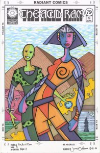
Sometimes as I’m working I have no idea what I’m doing. I don’t mean that on a micro level. If I have a pen, pencil, marker, or paintbrush in my hand I know what I’m doing as I’m drawing or painting. It’s not the technique of how to do something that escapes me it’s the why of something that escapes me. It’s often a feeling that comes and goes though. I can have it while working on a piece but somewhere along the way I figure things out. I see the point and am able to articulate it to myself in a way that satisfies me. But every so often I make a piece that escapes me. I don’t understand what it is or why it exists. “The Acid Ram #9” is one of those.
“The Acid Ram” is the name of one of my faux comic book series that I draw covers of. It’s supposed to be a title that is extremely weird. Almost impenetrable. What is an Acid Ram you ask? I have no answer for you. When I cam up with the title years ago I was searching for a name that would sound like it means something far out and trippy but didn’t mean anything specific. After many tries “The Acid Ram” is what I came up with. Acid could have something to do with hallucinogenic drugs or something to do with chemicals that dissolve stuff. Ram can be an animal or an action. Anyway, the mix those four definitions is something weird and funky so that’s why I settled on it.
I’ve only made a handful of “The Acid Ram” covers but I didn’t make this one any different than the other ones. A few weeks ago I was working on the pencils for a few different faux comic book covers and this was one of them. Depending on my mood I’ll work on a few things at once. More than a few. At any one point in time I’ll have a dozen things at various stages of finish so that I can work on any one that I feel like. I think I have about five faux comic book covers all pencilled and at the stage where they are ready to be inked. So I decided to pick one to ink and I picked “The Acid Ram” #9.
Just this week I bought a new inking brush. A Raphael Number Three Sable brush. These are generally considered to be a little bit inferior to the Winsor Newton Series Seven Number Three brushes but with the Winsor ones running about $35 and the Raphael ones about $25 I decided to go the cheaper route. That and I think the Winsor ones have dropped in quality over the last decade. It’s the first new sable brush I’ve bought in a few years because there was a shortage of them in the US. I was excited to use it since I’ve been using some artificial hair brushes the last year or so and I was getting tired of them. They’ve made the artificial hair brushes better than ever but they’re still not the same as sable hair.
I inked the whole piece almost without incident. I did have a bit of a tough time figuring out what exactly I wanted to do with it though. All the various objects and spaces in the drawing weren’t as clear to me as they should be. Of course inking a piece is all about clarifying things so that wasn’t too much of a shock. But I still had to figure out what the heck was going on in this piece.
Another of my faux comic book series is “Dreams of Things.” I’ve made a lot of them this year and I developed them not only to ink but also to color right over the inks with markers. That makes them different from my other faux comic book covers that I was in the habit of only inking and not bringing to color. I don’t think I’ve colored any of “The Acid Ram” covers with markers which made my decision to color this one a bit odd.
I found it a little bit tough to color this piece. I think it came out well in the end, does the job, and looks fairly simple but along the way it was a tricky bit of business. First of all the space the drawing exists in is very odd. There are two overlapping figures that create a bit of depth and are fairly straight forward except when you get to the bottom of them. The back figure’s legs seem to blend into the from figure’s legs. The legs of the front figure is well defined but the back one’s aren’t. Add that to the top of the background also being well defined with its sky and pyramids yet the bottom being defined by a bunch of stuff in front of a diagonal wall makes the space even more confusing. It was all a puzzle.
I did my best to put the puzzle together. I made a picture frame out of that little landscape on the bottom right and some magical yellow energy on the diagonal. That flatness helps the space of the rest of the picture make sense. Almost. I think it also makes the back guy’s legs flatten out even more and that makes my brain confused.
Overall I think my color on this piece is less vibrant and focused than usual. I don’t think that’s bad but different. I kept trying to balance the color as I drew this and think I ended up with pretty good balance but in such a way that there is no sense of reality to the picture. Neither the color nor the drawing give me any clue as to who these two people are, what they are doing, or why they exist. Except for the pyramids and the sky the color makes no sense in defining any kind of world that I know. That’s what’s so weird about this piece.
I’m back from the comic shop this week and I got four new comics.
Check them all out here:
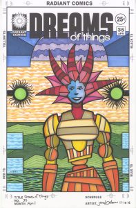
“Dreams of Things” #35 is sitting on my easel right now. Not that I work on any of my faux covers on the easel, they all get done on my drawing board, but I put them up on my easel to look at them after I finish them. Sometimes in the middle of working on them too. Actually it’s more likely near the end of me working on them. That’s when I have to step back and take a look at things.
When I work on one of these “Dreams of Things” covers I don’t have everything worked out. My usual habit with one of my paintings is to do a color sketch to figure out how I’m going to make the color work. If I were coloring this cover digitally I could easily change the colors around if I needed to. If I don’t like that her dress is red I can change it to blue with the click of a couple of keys. But with these “Dreams of Things” covers and most of my other marker drawings I’m working without a color sketch. That means I have to think about the color more as I put it down because there is no taking back marker once it’s on the paper.
I leave myself a lot to be decided in the color stage. Besides the basic color of things I leave open areas to be colored in some sort of textured way. In #35 I was a little surprised at how much open area I left myself. The way I’ve been making these covers is to pencil a few of them at once and then print out the pencils in blue line with the logos on the board. That’s usual for most of my faux comic book covers except that with “Dreams of Things” I sometimes dig through old and unused drawings for ones I can repurpose as “Dreams of Things” covers. That’s what I did with this one and then threw it on the pile of other covers to be inked whenever I felt like it.
Do you see the water at the bottom, the mountain, the orange sky, and the purple clouds? None of those were indicated in the pencils. The entire background was blank. I didn’t even notice that when I set it up in the template but when I went to ink it I sure did. I knew I was going to have to do something with that background because blank wasn’t working. I ended up keeping it simple and adding in background elements that are standard for me. I used them for their compositional contributions more than as objects. I think they are unspectacular but work well. They got the job done of defining the shallow background space.
The first thing I did when coloring this piece was to color the main figure. I did something I normally don’t do and went with a three color harmonious transition. Almost. I didn’t quite do it in the way it’s usually done. I started with the reds up top, brought that red into the yellow below it, and then blended the yellow in with the orange. Since mixing red and yellow is how one makes orange the normal harmonious transition would be with yellow on one end, red on the other, and orange in the middle. That was a little too harmonious for me. Too static. I find the color composition I used to be much more lively. It’s almost like my eye wants to cut off the red and re-stack it on the bottom. That keeps things moving which is what I wanted. The blue of the face was the most natural choice to make it stand out. I needed something strong in the middle of all that red.
After I colored the main figure I knew the background colors were going to be tricky. There is a lot of background in this piece and I didn’t want its color to overwhelm the main figure. I kept the color techniques in the background simple. For example if you look at the orange sky I’ve only used two orange colors plus the white of the paper. For other skies like this I’ve used three or even four colors. Those skies have a lot more visual presence than this one does. But I wanted the sky toned down here and that did it.
The two arcs of blue underneath the logo make a nice triangle with the face. That’s the only part of this piece I’ve used a three matching colors technique. Odd because I use that all the time. It’s probably the most stable and harmonious part of the cover. The blue, purple, and red on top also make a good analogous color scheme. They almost exist by themselves up there.
The green of the mountains was a natural choice but then the water at the bottom gave me pause. I knew I wanted those six boxes on the sides to be light blue but then what to do with the bottom? I hadn’t even decided it was water yet but when I did I went back in with the ink and brush to give it some black line. The black like would tone down whatever color I put there. I decided on a blue green marker and then added even more green to keep it from getting too blue. After that I put in the light blue boxes.
The final piece to the puzzle came after I put this on the easel and stepped back from it. I had already colored those green fuzzy balls on either side but they were giving me trouble. When inking them I had a hard time deciding if I should go with a messy and fuzzy approach or a neat and geometrical one. Messy won but as I looked at it I thought it was too messy. The inside of the circle was messy as well as the tentacles outside. I decided to clean up the inside, which was easy enough, by pulling out my circle template and redrawing the inside circle. This was the finishing touch that brought it all together for me.
So there is the story of “Dreams of Things” #35. I like how it came out but there were a few times as I was working on it that I though it was going to be a failure. So far two out of the thirty five I’d consider failures but I’m glad this one wasn’t among them.
I’m back from the comic shop this week and I got six new comics.
Check them all out here:

A couple of times a year I like to write about the TV shows that I’m watching. I’m not much of a movie person anymore so almost all my video-based entertainment comes from TV shows. Generally my tastes run towards the odder shows but I also like a good situation comedy and a quirky detective show. This year there didn’t seem to be a lot of new shows that interested me. I think I checked out fewer new TV shows this fall than normal but I not positive. One thing I am sure of is that there are not any new quirky detective shows on my list this year. Let’s run down the new shows.
Ash vs. Evil Dead – Not really a new show since it’s in its second season but last year I only watched a couple of episodes before I bailed on the series. This year I heard Lee Majors was going to be on the show so I decided to check it out again. AvED is an over the top gore filled horror comedy. That’s not my genre and despite liking the three or four episodes I saw I get bored with the gore. Lee Majors was off the show pretty quickly too. I might watch the rest of the season but I thought that last year too and never did.
Frequency – A cop show based on a movie I never heard of. A police detective in 2016 discovers she can talk to her dead father who is still alive in 1996 by the likes of a time transmitting ham radio. The first thing she does is save her father’s life as he was supposed to die in 1996 but that inadvertently makes her mother, who was originally alive in 2016, a victim of a serial killer in 1997. They’ve spent the rest of the season so far trying to catch the serial killer before he kills the mother. I’ve been enjoying this one. Its pretty well done but has the usual confusing time travel stuff. Timelines change and we have to keep track of that. It’s not too hard to keep track of though.
The Good Place – A sit-com staring Ted Danson and Kristen Bell. It takes place in the afterlife where heaven is only for the best of the best. Kristen Bell arrives with a bunch of new people to take up their new lives in heaven except we find out that there was a mix up and Bell is really not supposed to be in heaven. She tries to keep it quiet and blend in but that’s not easy. It’s okay stuff. I generally find it clever and amusing but it’s not the edgy comedy I generally prefer. I’ll keep up with it but I won’t shed a tear if it goes away.
The Great Indoors – I want to like this one. I really do. It stars Joel McHale from one of my favorite sit-coms “Community”. The premise is that a forty something McHale is a famous outdoorsman who has been traveling the world, going on adventures, and writing about it for a living but now that has ended as he has to work with a bunch of Millennials at the down-sized magazine he writes for. I really wish it was funnier. It’s been just okay until the last episode I watched (episode 6) where I don’t think there was a laugh to be found. Maybe it’ll bounce back but I doubt it.
Man With A Plan – Another show that I’ve wanted to like since I’m a fan of “Friends” and this show stars Matt LeBlanc. It has a dumb sit-com premise as LeBlanc’s wife is going back to work and LeBlanc has to spend more time at home with the kids. Sounds like a premise from thirty years ago. The show itself is better than I thought it would be since it’s not really a family based sit-com. In other words it’s not all about the kids. I don’t like sit-coms that are all about the kids. This one is mostly about the adults. Kevin Nealon plays LeBlanc’s brother and he’s a welcome sight. I’m on the fence with this one so I’ll watch a few more.
People of Earth – A surprise show for me as I had never heard of it until someone recommended it on Facebook. It takes place in a town outside of NYC called Beacon NY where a group of people go to a support group since they were all abducted by aliens. A big city journalist joins them as our main character and he comes to the realization that he may have been abducted too. Did I mention that this is a comedy? It’s a fun comedy too since there really are aliens on this show. We don’t know what they want but so far they’re mostly low level bureaucrats. This is easily my favorite new comedy.
Shooter – Another new TV show based on a movie but at least I’ve seen the movie this time. Shooter is about a former military sniper who has been framed for the attempted assassination of the President of the USA. It’s a well done show. It’s got conspiracy, action, jail breaks, a man on the run trying to clear his name, and all sorts of dramatic tension. I’ve really liked this one so far. I’m not sure how they are going to keep it up but I’ll be along for the ride.
Timeless – Another show with time travel in it but this time they’ve got a good old fashioned time machine. Two of them even. The first time machine was stolen by someone who seems to be our bad guy but is he really? The second time machine is an older prototype model that out three main characters (working for the government I think) take out to try and chase down and stop the guy in the first time machine. There is a big conspiracy going on too. Much like “Frequency” they’ve also changed their timeline in this show and between the two shows things can get confusing. Never the less I enjoy this one too. It’s a fun adventure show that showcases a different time period each week and we get to learn a little about history along the way.
Gilmore Girls – Not a new show but the Gilmore Girls were back after ten years in a four part six hour long Netflix show. I never watched Gilmore Girls first run but caught up with it after the show had ended. I like it. Its sharp writing and snappy dialogue were always entertaining. I thought the “Year in the Life” approach this new version used worked well as it allowed for a long story arc. All told I thought it was as good as if not better than the original.
I’m back from the comic shop this week and I got five new comics.
Check them all out here:
It’s not easy to get anything done. That’s the way the world is. It’s easier to get things done when you’re being paid to do them but even then it’s not always easy. I’ve known plenty of people who didn’t want to get anything done even at their jobs. It’s easier to do nothing. That’s the way of the world.
That’s why, when it comes to my own art that I don’t get paid for, I like to keep a lot of balls in the air. That may be the wrong metaphor since there is no danger of anything falling if I don’t catch it but you get the idea. I like to have a lot of projects in different media to work in so I can switch from one to another if I can’t get something done. If my drawing isn’t working I can switch to inking. If that doesn’t have it going on I can do some painting with watercolor, gouache, or acrylic. I can break out my markers and draw in color. I can work on some digital at if that gets me going. I can even work on some photography. That’s what’s been missing lately. Photography.
There are two stages to my photography. Taking the photos and then turning those photos into some kind of finished photo. Often I use Photoshop to digitally manipulate the image into something I want. I’ve got a few different methods of finishing a photo digitally and I go with whatever way moves me at the time. Except none of them have moved me lately. I don’t know why. I just checked my calendar and according to that it’s been about six months since I’ve worked on one of those. It seems like I must have worked on one since then but maybe not. I’m not even sure why I haven’t worked on one except that I haven’t been moved to. That’s what I’m pondering. What moves me. Or anyone else for that matter
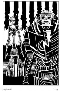
“Judge Too Much”
I also haven’t been able to get any of my large drawings or paintings done. It’s obvious to me why I can’t get those done though. Money troubles. As a freelancer I’ve had periods in my life when the money wasn’t flowing. That is never fun. During these times I seem to have a hard time getting anything big done. Its a psychological hurdle. I can’t think big during those times. Once things get better and I feel more secure I think big again and want to make bigger art. I’m guessing a lot of artists are like that. I’ve been wanting to work on some big 22×30 ink marker drawings but haven’t had it in me. That’s the way life is. But at least I got that one figured out.
What I’ve not gotten done at all in the last few months is my iPad edited street photos. As a photo editing tool I really like the iPad. It does a really good job. Over the years I’ve collected various photo apps and kept the ones that I like. There are about a half dozen of them that I use regularly to edit my photos in. It’s fun. Using a touch screen and my finger to edit photos may not be ideal if I was doing really delicate work on them but mostly the work is blunt but subtle. I’m not doing stuff on a pixel by pixel level but I don’t need to. The programs do a good job of changing the photos overall.
Back in September I even put together a PDF photo book of my iPad photos. That took a while. It’s not a book that will ever exist in physical form though because it’s pretty big and prohibitively expensive at one go those short run printing places. There are about 150 photos in the book and 150 pages. I think the price of a physical book was over a hundred dollars. No thanks. I like the way the PDF book came out and that will have to be good enough for now. After that I’m not sure how many photos I’ve made.
I post things on Instagram. https://www.instagram.com/artbyosborn/ Usually I post my art or my photography. With my art it’s pretty easy since I have most of my stuff scanned into the computer so I can use one of various programs I have set up to view my various files, pick one I like, and post it to Instagram. I only do it to get things out there for people to see. I only have about four hundred followers and get maybe thirty likes on any give piece but it’s still fun.
The way I’d post a photo to Instagram is that I’d make it there and then. I’d look through my digital files of photos until something grabbed my eye. They I’d transfer it over to my iPad and use those photo apps on it. It’s not a long process. I’d say I took fifteen minutes to half an hour on the outside to get one done. Not a huge time investment and often I’d make them while sitting down and watching TV at night. I usually found it a relaxing thing to do. But not lately.
I’m not sure when is the last time I made a photo on my iPad. It must be a month now. It’s my habit to try transfer my photos from my iPad to my desktop when after I made my Comic Book Haul YouTube videos on Thursday nights. I have to plug my iPad into my computer anyway so why not bring the photos over too? So I notice when there are no photos to transfer. Most of this year it’s been rare to have none. But not lately. Makes me ponder.
The only reason I can think of for not wanting to make photos is that on some level I’m upset with my iPad. My iPad is old. It’s an iPad 2. Apple’s update to iOS 10 left me behind. My iPad can only run up to iOS 9. That saddens me. Pretty soon all the new apps will be leaving me behind. I can still use all the old ones and work on my iPad as usual but it still bothers me. I don’t know if that’s really what’s holding me back but it’s all I got. I think I’ll keep pondering.