“Dreams of Things” #35 is sitting on my easel right now. Not that I work on any of my faux covers on the easel, they all get done on my drawing board, but I put them up on my easel to look at them after I finish them. Sometimes in the middle of working on them too. Actually it’s more likely near the end of me working on them. That’s when I have to step back and take a look at things.
When I work on one of these “Dreams of Things” covers I don’t have everything worked out. My usual habit with one of my paintings is to do a color sketch to figure out how I’m going to make the color work. If I were coloring this cover digitally I could easily change the colors around if I needed to. If I don’t like that her dress is red I can change it to blue with the click of a couple of keys. But with these “Dreams of Things” covers and most of my other marker drawings I’m working without a color sketch. That means I have to think about the color more as I put it down because there is no taking back marker once it’s on the paper.
I leave myself a lot to be decided in the color stage. Besides the basic color of things I leave open areas to be colored in some sort of textured way. In #35 I was a little surprised at how much open area I left myself. The way I’ve been making these covers is to pencil a few of them at once and then print out the pencils in blue line with the logos on the board. That’s usual for most of my faux comic book covers except that with “Dreams of Things” I sometimes dig through old and unused drawings for ones I can repurpose as “Dreams of Things” covers. That’s what I did with this one and then threw it on the pile of other covers to be inked whenever I felt like it.
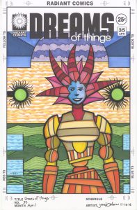
Do you see the water at the bottom, the mountain, the orange sky, and the purple clouds? None of those were indicated in the pencils. The entire background was blank. I didn’t even notice that when I set it up in the template but when I went to ink it I sure did. I knew I was going to have to do something with that background because blank wasn’t working. I ended up keeping it simple and adding in background elements that are standard for me. I used them for their compositional contributions more than as objects. I think they are unspectacular but work well. They got the job done of defining the shallow background space.
The first thing I did when coloring this piece was to color the main figure. I did something I normally don’t do and went with a three color harmonious transition. Almost. I didn’t quite do it in the way it’s usually done. I started with the reds up top, brought that red into the yellow below it, and then blended the yellow in with the orange. Since mixing red and yellow is how one makes orange the normal harmonious transition would be with yellow on one end, red on the other, and orange in the middle. That was a little too harmonious for me. Too static. I find the color composition I used to be much more lively. It’s almost like my eye wants to cut off the red and re-stack it on the bottom. That keeps things moving which is what I wanted. The blue of the face was the most natural choice to make it stand out. I needed something strong in the middle of all that red.
After I colored the main figure I knew the background colors were going to be tricky. There is a lot of background in this piece and I didn’t want its color to overwhelm the main figure. I kept the color techniques in the background simple. For example if you look at the orange sky I’ve only used two orange colors plus the white of the paper. For other skies like this I’ve used three or even four colors. Those skies have a lot more visual presence than this one does. But I wanted the sky toned down here and that did it.
The two arcs of blue underneath the logo make a nice triangle with the face. That’s the only part of this piece I’ve used a three matching colors technique. Odd because I use that all the time. It’s probably the most stable and harmonious part of the cover. The blue, purple, and red on top also make a good analogous color scheme. They almost exist by themselves up there.
The green of the mountains was a natural choice but then the water at the bottom gave me pause. I knew I wanted those six boxes on the sides to be light blue but then what to do with the bottom? I hadn’t even decided it was water yet but when I did I went back in with the ink and brush to give it some black line. The black like would tone down whatever color I put there. I decided on a blue green marker and then added even more green to keep it from getting too blue. After that I put in the light blue boxes.
The final piece to the puzzle came after I put this on the easel and stepped back from it. I had already colored those green fuzzy balls on either side but they were giving me trouble. When inking them I had a hard time deciding if I should go with a messy and fuzzy approach or a neat and geometrical one. Messy won but as I looked at it I thought it was too messy. The inside of the circle was messy as well as the tentacles outside. I decided to clean up the inside, which was easy enough, by pulling out my circle template and redrawing the inside circle. This was the finishing touch that brought it all together for me.
So there is the story of “Dreams of Things” #35. I like how it came out but there were a few times as I was working on it that I though it was going to be a failure. So far two out of the thirty five I’d consider failures but I’m glad this one wasn’t among them.
Discussion ¬