Recently I’ve been thinking about what artistic things I want to get done this summer. I’m not big on list making but occasionally I do make them. So these are the things I’ve been writing down in my notebook that I’m going to try and get done in the near future. I don’t expect to get all of them done but I find it helpful to write it all down anyway.
A Story Told in Bookmarks – I’m not 100% sure what this idea is. It came to me one day not fully formed and I wrote it down. I think the idea is to tell a comic strip story across a series of bookmarks. Each bookmark will have a panel or two of the story and with ten or so of them together it will tell the whole short story. I guess it sort of makes the bookmarks collectable. I don’t know if this is a good idea or not but it’s what came to me.
Finish Great Gatsby Illustrated Book – This one is obvious. I’ve been working on my own illustrated version of “The Great Gatsby” for two and a half years. It’s almost done but I never seem to find the time to put the finishing touches on it. And now I also decided to do a smaller black and white version of it too. But first I have to actually finish the 9×12 inch full color one. Hopefully by the end of the summer.
Create New Characters for a Comic Strip – I’ve been toying with the idea of finishing my “Four Talking Boxes” comic strip and starting another one. What that other one is I have no idea. But it would require that I come up with that idea and a whole new set of characters. If memory serves it took me about two weeks (per character) to come up with all the character design drawings I needed for a single “Four Talking Boxes” character. So six more characters is twelve weeks of drawing. This might take a while so it’s only an idea in my head right now.
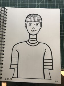
Message Tee Drawings – These are already underway. I’ve been working on a new set of 52 character drawings. Since these are just single drawings and not character designs they only take a short time and not the two weeks it would take to design a comic strip character. I have the pencil drawings for about forty of the drawings so far and when I get up to 52 then I’ll ink and color them. It’s going to take a bit of doing but these ones are for 2025 so I have time to get them done.
Make Drawing Videos – I’ve got it in my head to make some instructional drawing videos for YouTube. Specifically I want to show a technique I use all the time called “Surrealist Automatic Drawing.” I’ve been using this technique for thirty years or so and I only recently realized that no one teaches it. I learned it on my own from reading about the ideas of the Surrealists. I’ve never seen a class that teaches this type of drawing and people really don’t know about it. So maybe I’ll tell them.
Spinal Tap Cover – This one is really a one-off joke that’s been on the list of ideas for a while. Y’see, years ago I got these CGC comic book slabs with no comic books in them. John from my local comic shop broke the comic book he bought out of them so he could look through the comic. So I took the now empty slabs to someday make something out of. I eventually got the idea to make a cover for a “Spinal Tap” (the movie) comic that goes to eleven. Comics are graded on a 1-10 scale so a comic that goes to eleven would be the bomb! But since the whole thing is just a goof I’ve never bothered to actually make it. But I’ve recently talked about it with some friends so maybe someday I’ll make it.
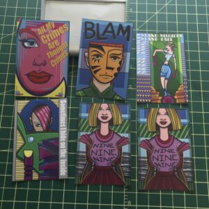
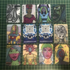
Stickers – I actually started this one just this week. I wanted to turn some of my art into stickers. I got some inkjet compatible sticker paper and after some trial and error with the formatting got some stickers printed out. They came out fairly well but I found that that came out much better if I put some self-seal lamination on them after printing. That’s just a sheet of clear 3mil plastic that’s sticky on one side. I had some on my shelf from a decade ago and I decided to give it a try. Not only does it make the stickers water resistant but it gives them more heft. Without the lamination sheet the 2×3.5 inch stickers curl up but with it they stay flat. Nice.
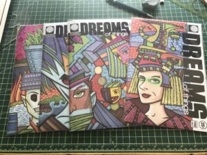
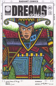
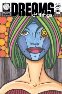
Make Prints – I’ve also started this one. I want to set up virtually all of my art as prints. This is a huge job. I’ve started with my actual prints and a bunch of my “Dreams of Things” covers. I’m setting them up first as 11×17 inch prints but I’m also sizing them down to 8.5.11 inch prints. The “Dreams of Things” ones take a little doing as I wrote about a couple of weeks ago. I also want to set up a lot of my large paintings as prints. That’s going to take even more doing. This could be a while.
Put “Dreams of Things” covers on Actual Comics – This is the last idea I came up with and wrote down in my notebook. I want to print out some of my “Dreams of Things” covers and attach them to an actual comic book thus making it look like a real comic book. I’ve done this sort of thing before with various pieces of art but somehow I’ve never done it with my “Dreams of Things” covers. I don’t know why it never occurred to me but now that it has I’m going to have to get it done.
There you go. That’s the list so far. I may add some other stuff to it if I think of new things to do. It’s okay with me if I put things on the list that never get done. The list doesn’t put pressure on me it just helps me visualize the future. But I also know that the future I visualize rarely becomes the actual future and I roll with it.
