I’m back from the comic shop this week and I got six new comics.
Check them all out here:
I’m back from the comic shop this week and I got six new comics.
Check them all out here:
I’ve been doing a lot of big ink drawings in the last two months. I think I’ve gotten nearly twenty of them done. I’ve also written about a few of them. But this week I thought I’d write not about the drawings themselves but about the tools I use to make my big ink drawings. Sometimes I mention a key tool or two that I use to make a given drawing but these big drawings are different then my smaller ones in that I use a lot of tools. These are the things that get lost to time so I like to document them.
An Easel and a drawing board – These two things are obvious but I thought I’d mention them. First I place the drawing board on the easel and then I tape the drawing to the board. I use an easel to keep the drawing vertical. The same reason everyone uses one.
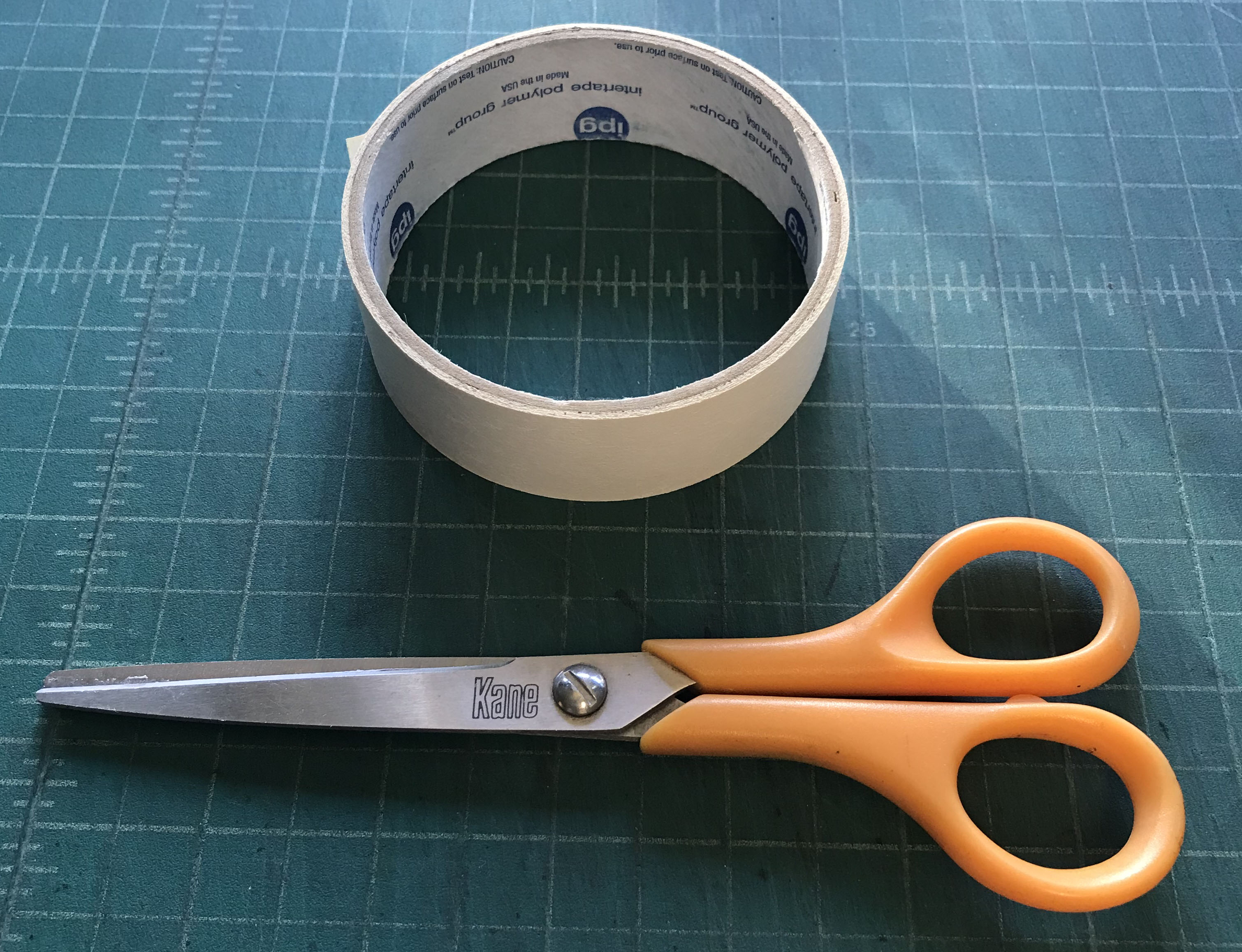
White paper tape – A simple tool that keeps the paper attached to the drawing board. It’s an artist’s tape with low adhesion so it doesn’t wreck the paper when you pull it off. You have too keep an eye on it because that low adhesion also means the tape might not hold all the way through the making of the drawing. Sometimes the tape needs to be rubbed down again.
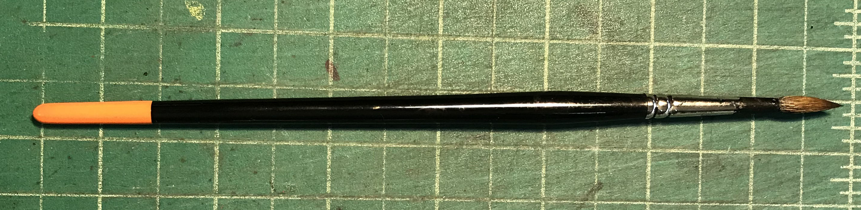
Windsor Newton Sable Series 7 or Raphael Master Brush Size #3 – The classic brush to use for inking comics. It’s a watercolor brush that comes to a sharp point and is great for just about any task when it comes to putting ink on paper.
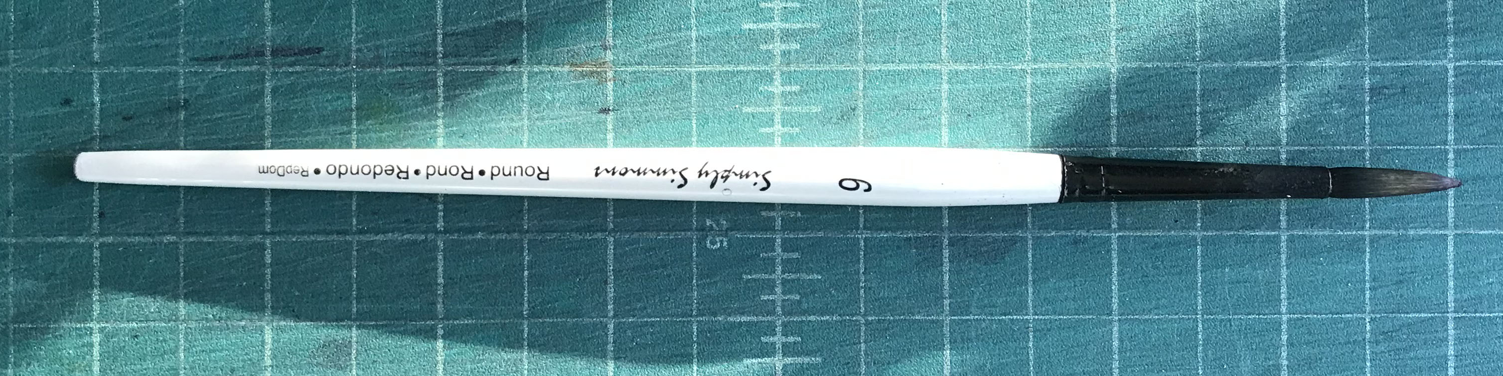
Simply Simmons Round Brush Size #6 – This is a cheap synthetic hair brush that is twice the size of my Series 7 #3. So I use it for big lines and filling in blacks. It’s not as good or as versatile as a quality sable brush but they’ve come a long way with these synthetic brushes. I’d say synthetic brushes used to be about 50% of what a sable brush is but now it’s more like 80%. That’s a lot of improvement.
Busted Brushes – Old Series Seven brushes that no longer come to a point. I use these for my monster faces and such. They’re for when I want to paint with texture rather than line.

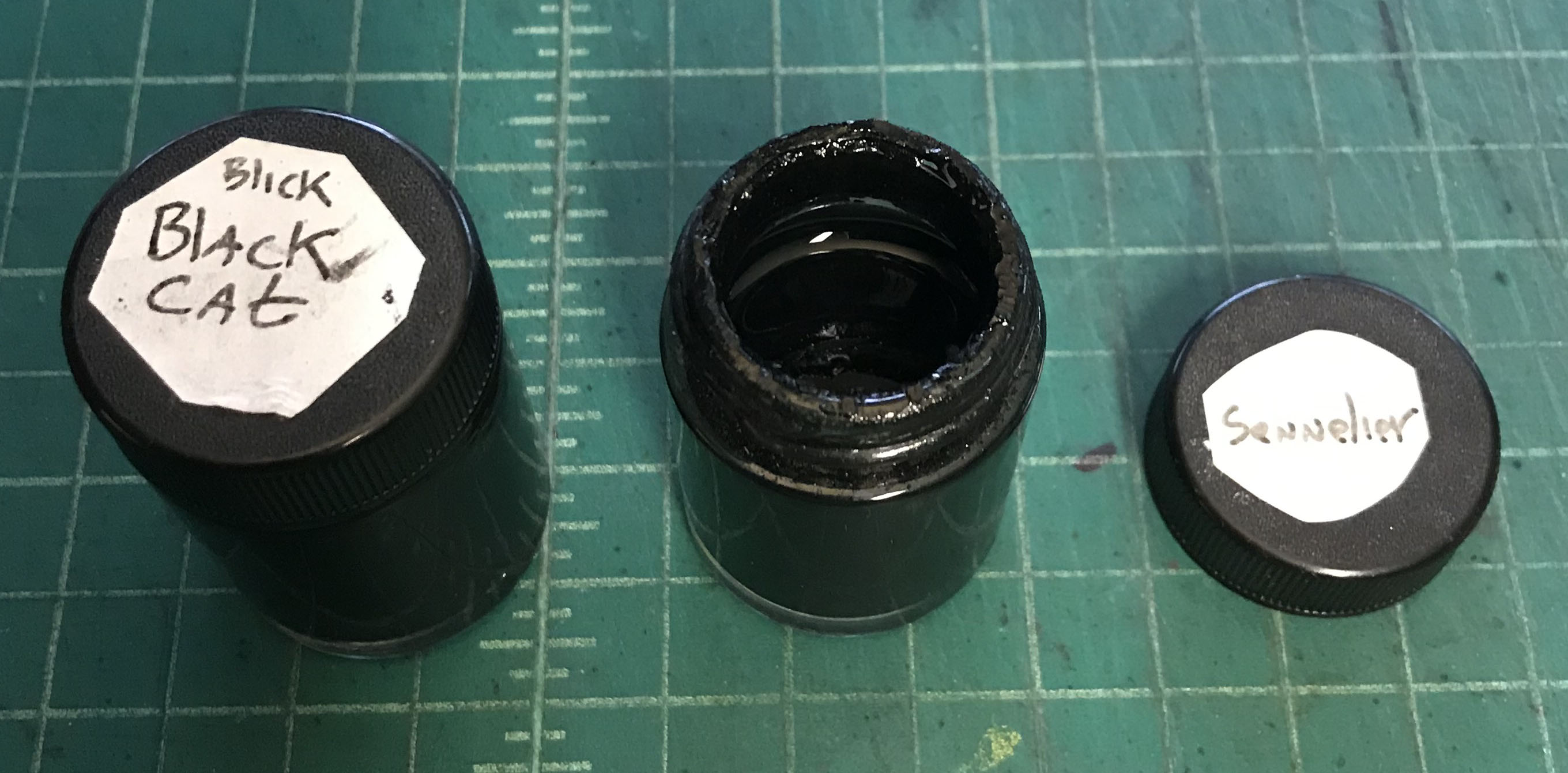
Sennelier India Ink – This is my favorite black India ink as of late. It’s thicker and darker than most inks and goes on dark. Its downside is that in can thicken up and not flow as well as it should. But with a little water it thins out again. Guessing the right amount of water can be a problem but not too much so. It’s also one of the more expensive inks but you get a lot of it if you buy the big bottle.
Blick Black Cat India Ink – This is the Dick Blick house brand of ink and as such it’s one of the cheaper ones. I bought a big bottle of it a few years ago and was disappointed with it. It was too thin and grey for me. A big bottle of ink has to be shaken up otherwise the pigment can settle on the bottom and the top will be thin. Even after vigorous shaking I couldn’t get this ink to be as dark as I wanted it to be. But I still used it. After a while I used enough of it so that there was some air in the top of the bottle. Somehow this thickened up the ink and it’s been a good thickness since. The last three quarters of the bottle have been excellent.
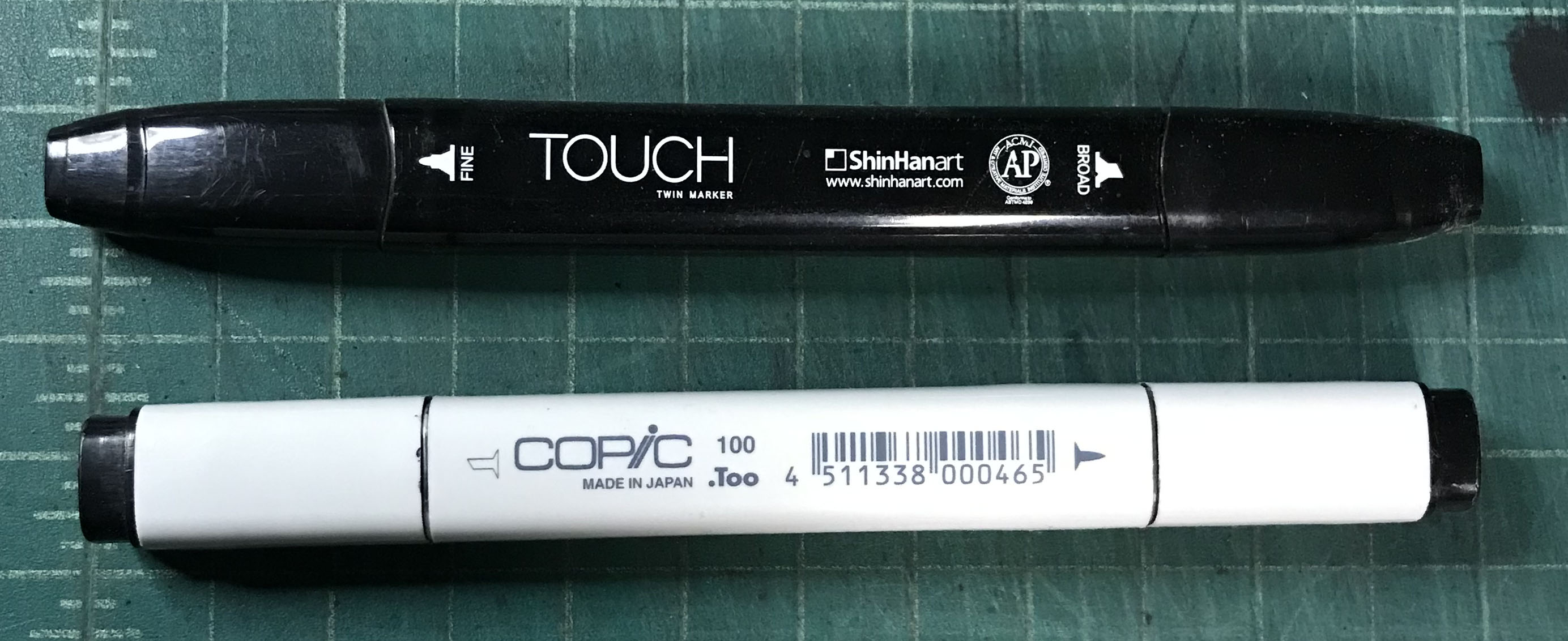
Copic Black Marker – A basic black marker with a chisel tip on one end and a fine point on the other. It can be refilled with marker ink which is good because it takes two to three markers to finish a drawing.
ShinHan Touch Black Marker – This is just like the Copic black marker except it comes from South Korea instead of Japan. I used up two bottles of ShinHan refills drawing these big drawing so I need to get some more.
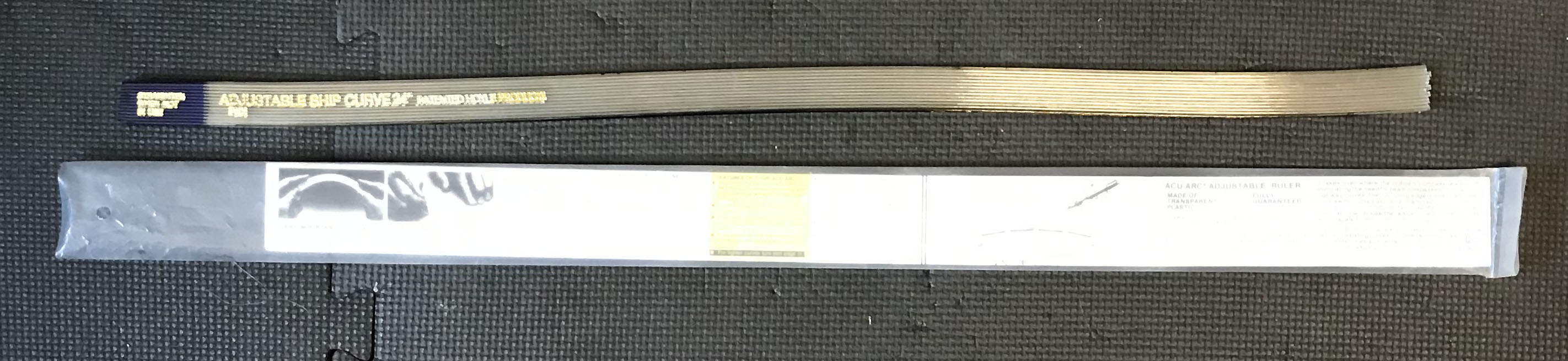
Flexible Ship’s Curve – Do you need to draw a long curve? This is what you need. It’s 24 inches long, can bend smoothly, and works well. Don’t bother with the “Flexible curve” that can be found in most art stores. That thing is worthless. Track one of these down instead.
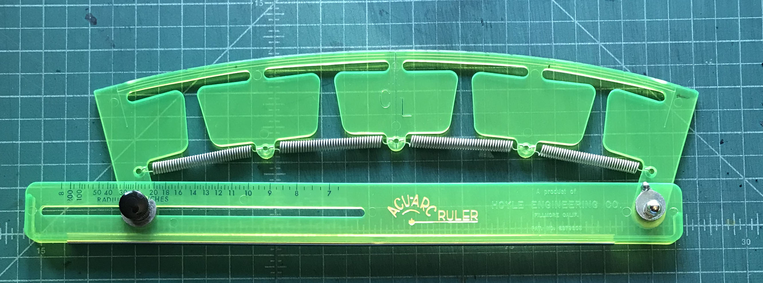
Adjustable Curve – An Acu-Arc Adjustable Ruler. This is good for longer symmetrical curves. It bends slightly to change the arc of the curve. It’s about twelve inches long. Most French curves aren’t symmetrical so this fills in where those can’t be used.
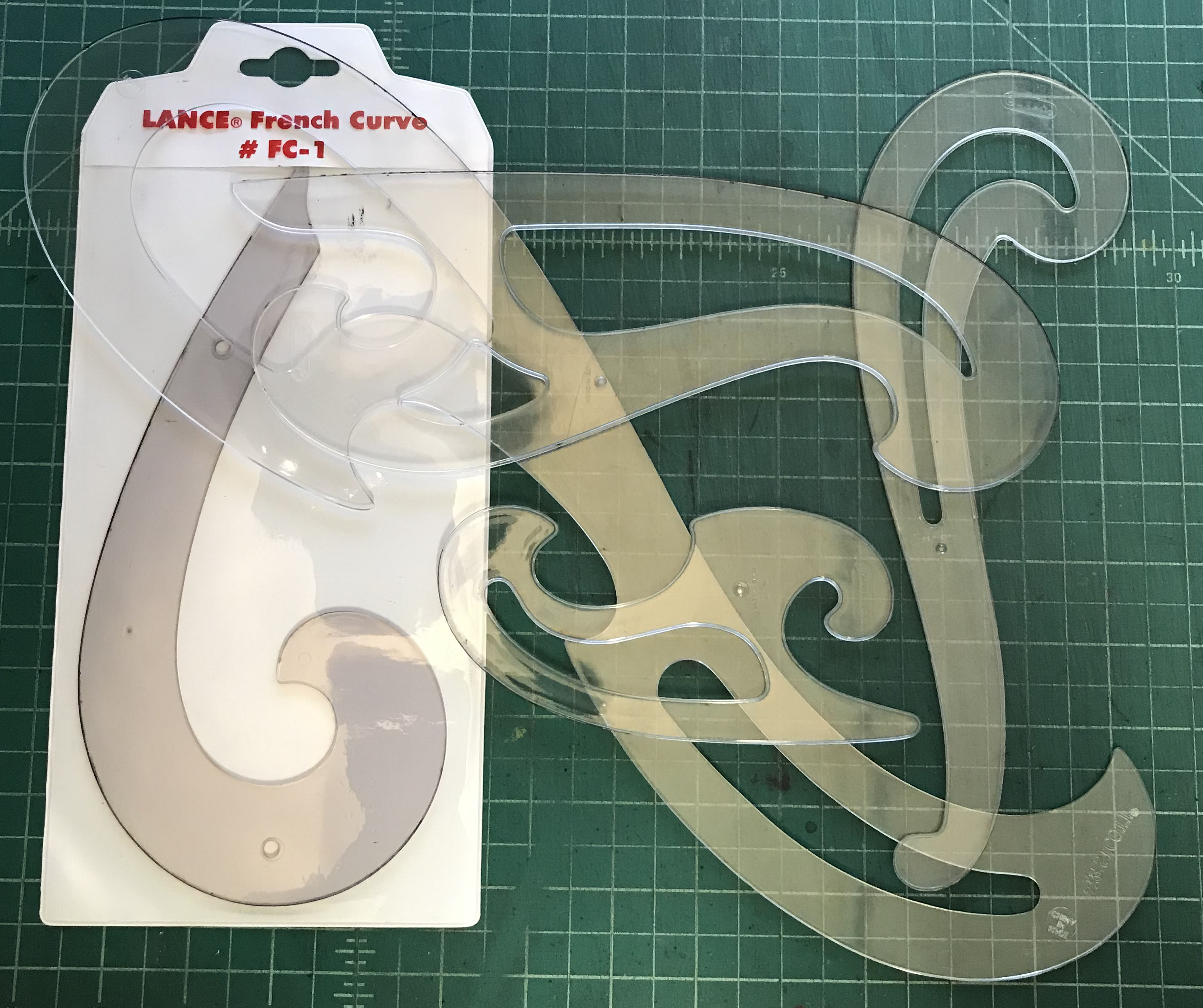
French Curves – I’ve got a lot of these. All different shapes and sizes. They’re generally pretty small compared to the ships curve or the adjustable curve but I do have two extra large French curves. I don’t use the bigger ones much. Usually one of the smaller ones will do the job.
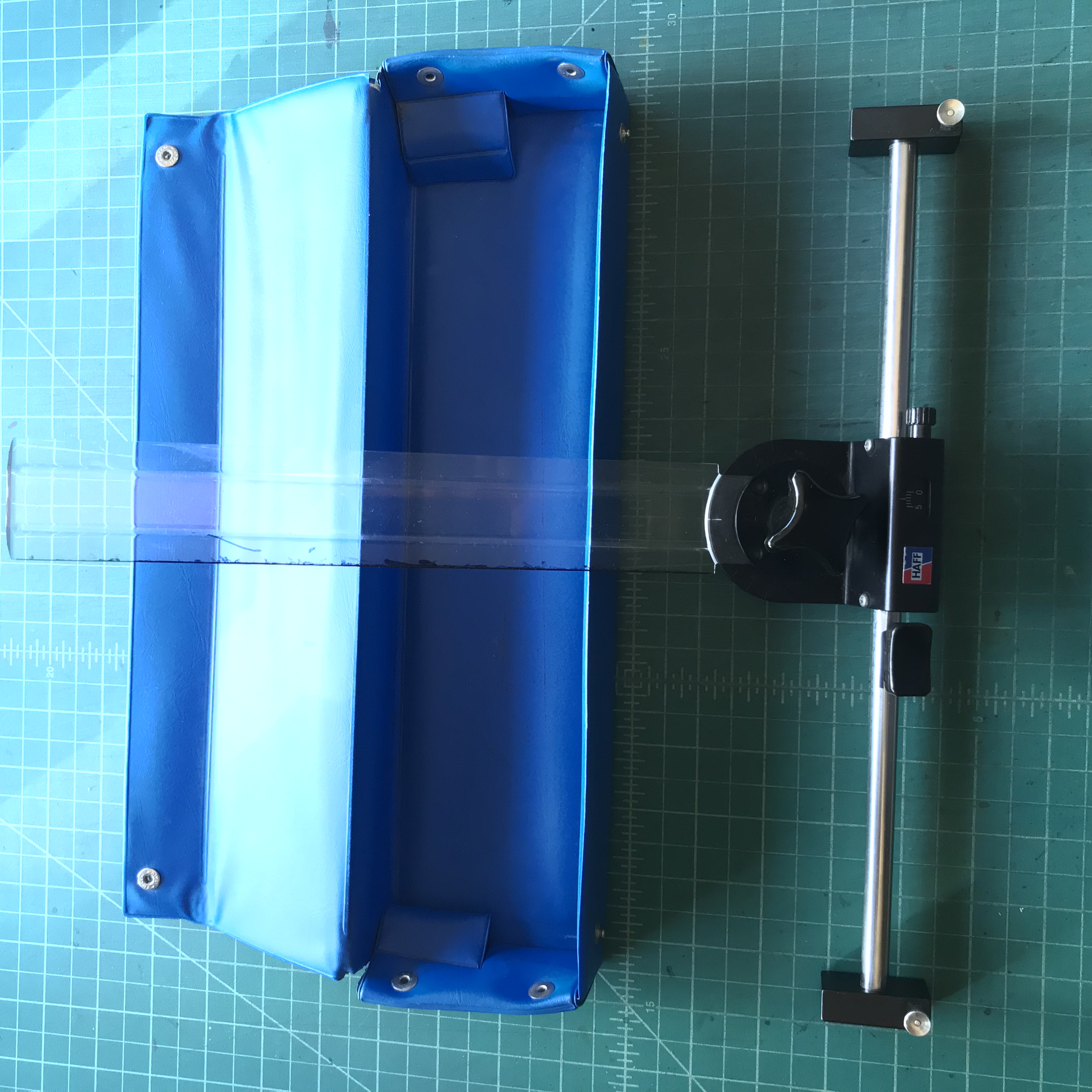
Haff Cross Hatching Machine – I’ve mentioned this before in blog posts. This is a handy little machine that helps me make all my parallel lines. I press a lever and then the ruler moves down a few millimeters and I draw a line. Repeat this for all the straight edge lines and I can draw perfectly spaces line patterns.
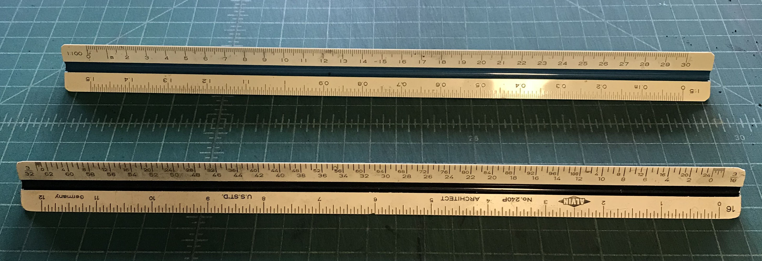
Ruler – Nothing complicated here. I need to measure an inch all around my paper so I can draw a border. I use a architect’s scale that I’ve had since my freshmen year of college. It measures in inches but I have another that’s just a couple of years younger that measures in the metric system. I’ve had these two for a long time.
A long straight edge – I’ve got a long straight piece of wood that I use for making the borders around my drawing. It’s about an inch square and thirty two inches long. It was just a piece of scrap wood that I had lying around and one day I grabbed it to use as a straight edge. I’ve been using it ever since.
![]()
Triangle – For these big drawings I use my clear 30º/60º triangle for straight edges. It has a grid built into it that I can line up with the edge of the paper if I need to square up lines. And I always need to square up lines.

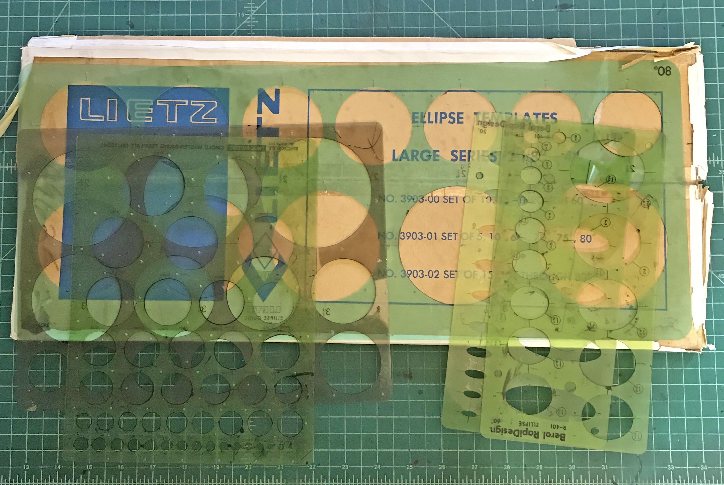
Circle and Elipse Templates – More basic stuff. If you want to make perfect circles and eclipses then these are what you need.
So there you go. That’s everything I use to make these drawings. No you can go make some of your own.
I’m back from the comic shop this week and I got three new comics.
Check them all out here:
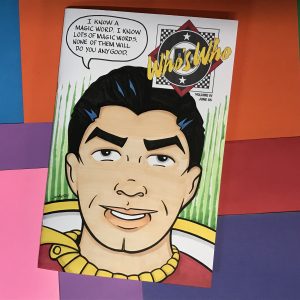
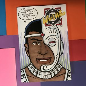
I just spent way too much time drawing a couple of sketch covers. These were two hand bound sketch covers. That means instead of buying two new comics that have a blank cover made for drawing on I instead picked out two old comics from my collection, pulled the staples, wrapped drawing paper around them, and put the staples back in. I used two old “Who’s Who?” comics from DC.
Sometimes I do sketch covers just as I would any other piece of art for art’s sake and sometimes I do them to try and sell them on eBay or Etsy. That’s an important distinction because If I’m making them for sale I have to watch how much time I spend on them. Sketch covers don’t sell for very much money. Most I see sold go for between $25 and $50. So I can’t spend half a day trying to make $25. It’s kind of moot because no one ever buys my sketch covers but I did just spend half a day trying to earn $25. That really makes for a failure of a day.
I love drawing faces. They’re one of my favorite things to draw and I draw them all the time. But when I draw faces I’m always looking for something new in a face. Some shape, form, or composition that is new to me. A little bit different. Faces give you a lot of leeway to steer away from reality and still have everybody know what you’re drawing. The problem I have with drawing comic book characters is that their faces are set in stone. If they’re not drawn a certain way then there is no point in drawing them.
When drawing an established character the number one thing you have to do is make that character easily recognizable. If you make a drawing of Spider-Man and nobody knows that it’s Spider-Man then you’ve failed. You’ve made the drawing pointless. You may as well have drawn any old face. Since I was doing a couple of DC Comics sketch covers I picked a character from each comic to draw on the cover. Cyborg and Shazam (the original Captain Marvel).
I’m pretty good at simplifying things. It’s one of my drawing strengths. I’ve made plenty of baseball card size drawings of super hero faces and they’ve come out pretty well. It does take me a bit of time to figure out exactly how to draw them but not an excessive amount of time.
The problem is that I wanted to draw these sketch cover heads as if they were my sketch card heads except the size was much bigger. 6.5×10 inches as opposed to 2.5×3.5 inches. That’s a different type of drawing. Things change in a drawing when the scale changes. A solution to a drawing problem at one inch isn’t the same solution at one foot. That’s the nature of drawing and scale. A nature I struggle with on occasion.
I just got a new 5.5×8.5 inch spiral bound sketchbook. I decided that would be a good place to do some drawing of superhero faces. I like to give each of my sketchbooks a purpose and that would be a good purpose for this one. I could make the drawings, scan them into the computer, size them, and then transfer them to the sketch cover. So that’s exactly what I did. But boy did it take time.
For some reason when drawing a fixed character head at that size symmetry is always a problem for me. The left and right sides don’t always match. Human faces are rarely symmetrical in real life but often in my drawings they are even more off. I have to really pay attention and use tracing paper to mirror my sides of the face in order to get things right. When drawing a head that is not a defined character I’m often looking to make things little asymmetrical so now doing the opposite takes time. Even with the character Cyborg, who has an asymmetrical head, I had to work hard to get the symmetry correct. One eye kept floating up and I had to bring it down.
Shazam’s head was a tough one too. He’s a character from the Golden Age of Comics and the artists who draw him back then were really good at simplifying. Of course they weren’t drawing his face six inches tall. I had to take his simplicity and try to make it work at a size it wasn’t meant for.
One of the things about comic book drawing is that as a drawing gets bigger more detail is supposed to be added. Superman’s face at an inch tall doesn’t look the same as Superman’s face at three inches tall. That’s just the way things are done. In an animated cartoon a character’s face is the same no matter what size it’s drawn at but not in a comic book. So I was not only drawing Shazam’s face but I was drawing it at a size it wasn’t meant for. That took more time than I anticipated.
After I had the drawings finished and transferred them to the sketch cover paper it was time to ink and color them. This had me baffled. I wasn’t sure how I wanted to ink them. The Cyborg face ended up being pretty complex with circle template and French curve work to be done. The Shazam head was simpler but also puzzling.
Usually I ink with a brush. That’s my default tool and what I’m best with. But I was baffled by the Cyborg face so I decided to go ahead and start my inking with a marker. I used a single line weight and inked over my pencil line. I put off 90% of the inking decisions. Then I stopped Cyborg and started inking Shazam. I used my brush for the Shazam face. It worked well for that and I was fine with how it came out. I was much happier than with the Cyborg face so then I went back to Cyborg with the brush and finished inking that one too.
After the inking I decided to keep it simple with the coloring. I used my markers as I always do with these sketch covers but I kept the molding to a minimum. I stuck with bright and flat color for the finish. It was a long journey to the finish but I got there.
I’m back from the comic shop this week and I got six new comics.
Check them all out here:
When I make art I generally like to keep things simple. Over the years I’ve learned to be pretty good at simple but it’s not easy. Simple is usually hard. Simple is stripping things down to the basics. If a form can be defined with just one line than use that one line. The problem is finding that one line (that’s the story of art). It can’t be wrong in any way. After all there is only one of them. If I’m going to draw a form with all sorts of shading and hatching then I might use hundreds of lines. If some of them are off you can’t even notice. That’s the advantage of plenty. One or two mistakes are easily hidden in a haystack.
Another of my art philosophies is that complexity is simplicity multiplied. By this I mean both are achieved in the same way. With complexity there is more room for error but you’re still putting one line on the paper at a time and you want to make that line nice. So to draw one face on a page can be simple but start to add more simple faces and things get complex.
You can strip down one face into the basics but as soon as you put another face next to it the two faces start to relate to each other in new ways. That has to be take into account. For example if two faces are next to each other you generally don’t want them to be identical. So you need two sets of solutions for how to draw a simple set of eyes. And a third and a fourth face and you need more simple solutions. That can get complicated.
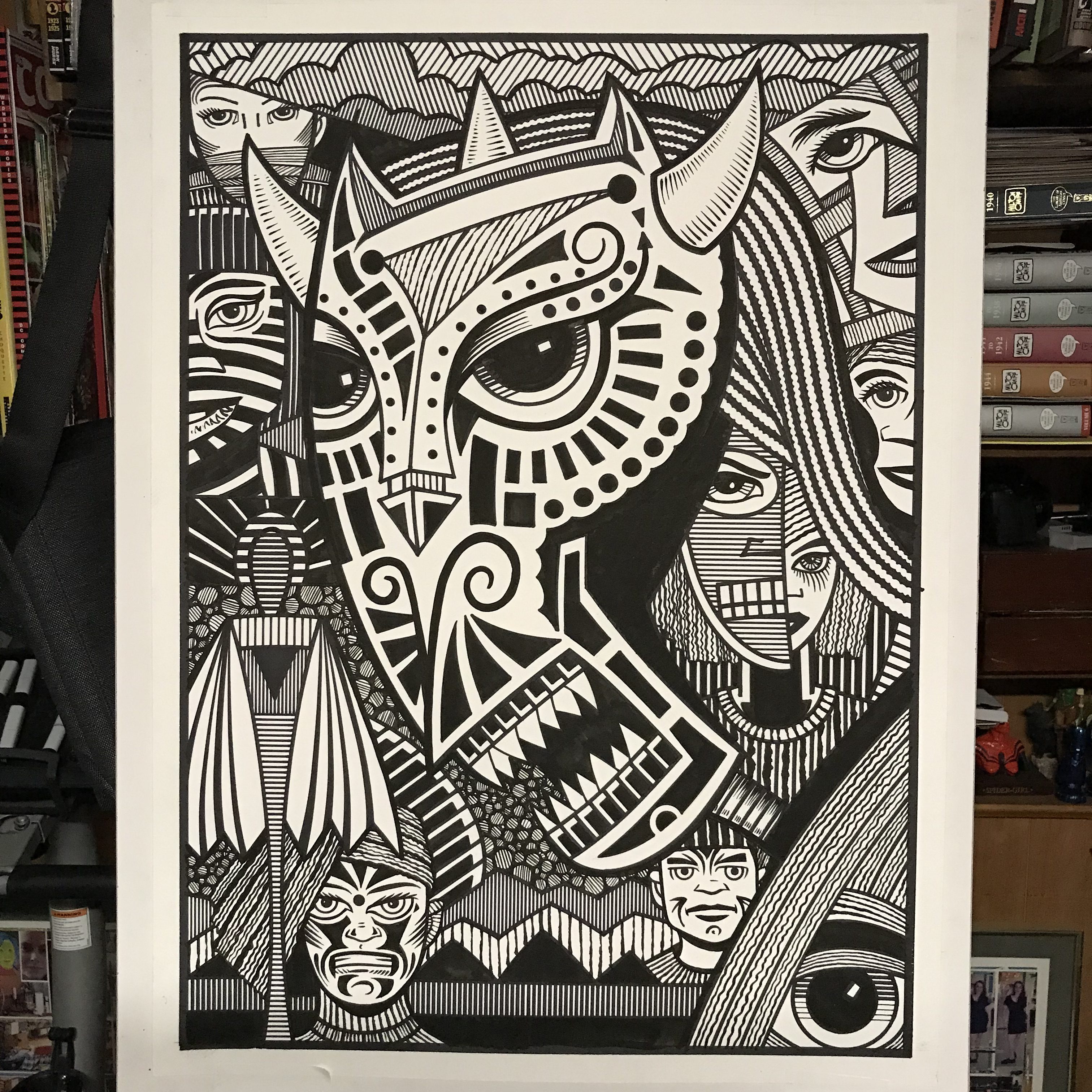
I bring up this topic because I just finished a complicated big ink drawing (20×28 inches). As a matter of fact I just finished two complicated big ink drawings in a row. I wanted that second one to be simple but missed the mark by a mile. The first one I knew was going to be complicated. That’s how I planned it. I picked a complicated sketch, made a complicated drawing from it, and then made a complicated big ink drawing from that. It was what I was in the mood for but it took a lot out of me. Complicated can be physically demanding because there are so many lines to draw. So after that one I decided to get simple.
Complicated my be physically demanding but simple is more observationally demanding. You really have to look at things and puzzle them out. Often the preliminary drawing of a simple subject takes more time than a complex one. With simple everything has to be figured out in advance but with complicated you can leave some stuff for later. I know I’m going to need half a dozen textures in certain areas but there is no need to lock them all down early. With simple I have to lock things down early. I don’t want any surprises at full size.
Simple can get away from me sometimes. That’s what happened with the second complex drawing. I had decided that I wanted to draw a giant face and that’s usually simple but I overlooked things in this case. I overlooked a lot of things. I picked a sketch to work on that had a giant face in it but the face was really a monster mask. Plus there were another half a dozen faces in the drawing. I tried to keep all the faces simple but I was somehow in denial about how complex a drawing I actually picked.
As I blew up the drawing and transferred it to the large paper I began to see how much work there was to it. I started to draw it in ink with a simple line. I often start these big drawings with the simplest lines first and then get complex with them. By simple line I mean with a marker and a straight edge or French curve. These are simple lines that I later go into with a brush and ink. The marker part is usually pretty easy. I follow the pencil lines. There isn’t a lot to think about because these aren’t the finished lines. But as I put more and more of those lines in I began to notice how many decisions I would have to make later on down the line. This drawing was a lot more complicated than I initially thought it was.
To begin with the space in the drawing is bizarre. It isn’t a face with a background behind it. The top of the drawing had some clouds and the bottom some mountains as it if was a normal background but everything else was filled with faces and shapes like a modernist painting. That and the main face was a positive shape but it had another face in its neck that created a negative space within the positive space. It was strange, complex, and would not work properly until I figured it out. The problem was that figuring out the space meant figuring out about nine other things first.
I did it all a little bit at a time. I put down all my simple lines and then concentrated on one area. The eye in the bottom right corner, the clouds on top, the face under the chin, or anything else. I approached it one piece at a time. The hardest part was that I knew nothing was going to be finished until all of it was near completion. I would add textures and shapes to one area, then a second, then a third, and then I had to go back to revisit the first area. No place would be finished until it was all finished. That can be a frustrating way to work and takes a lot of trust in the process.
In the end this turned out to be one of my most complicated big ink drawings. I count seven small faces, one big face, a faceless figure, and a lone eye. Plus there are about seven different background textures. I like the way it came out but I don’t know how in the world I ever thought this would be a simple drawing. I can really fool myself some days.
I’m back from the comic shop this week and I got five new comics.
Check them all out here:

Sometimes as I contemplate things little thoughts come to me. I like little thoughts and observations. The things that get lost among the big things of life. My street photos are often about fleeting moments in life. That’s why I like candid photography. Unposed photos. Sometimes by choosing what unposed photos to work on they become posed by the very process but that’s okay. In order to examine the unexamined you have to have to look at it. I like examining and writing about small moments and things right on this very blog. That’s why I’m writing about this thought that came into my head recently: I used to be thirsty all the time.
We all have strange quirks and odd tastes. That’s something human beings share. One of my strange tastes is that I don’t like anything to drink but water and milk. I don’t know why but it’s been that way all my life. Even as a kid I would never drink soda, fruit juice, or any kind or sugar water. Believe me that made me a weird kid because I was the only one who always turned down soda.
My taste in food has changed since I was a child. There are plenty of things I like as an adult that I wouldn’t eat as a child. That’s normal. But my taste in drinks has never changed. I can’t stand carbonation and I can’t stand sweet drinks. That’s strange because I like sweets. I like cake, cookies, ice cream, and especially chocolate. But put that same sugar into a liquid and I don’t want it. I think sweet drinks taste terrible and leave a horrible coating on my mouth. I don’t like any flavor in my water. Even a lemon wedge turns me off.
As a consequence of not liking stuff to drink I was thirsty a lot. But I didn’t realize it. I only started to notice it when I was in my early 20s. Young people today probably don’t know it but there was a time before there was bottled water everywhere. If you were out running around town and stopped to buy a drink at a local newsstand, deli, or convenience store it was always a soda or maybe a fruit juice. A soft drink of some kind. It was the rare store that had a pint of milk and none of them had a bottled water. Maybe carbonated water but I couldn’t stand that stuff either.
Whenever I was out with friends and they stopped to get a soft drink I would get nothing. I just wouldn’t drink. The was nothing for me to drink so I didn’t. I can even remember what a hassle it was to get a glass of water at a fast food place. It wasn’t something that happened often so the workers had no idea how to handle it. At most places they kept track of soft drink sales by counting the cups they used so they had to find me some cup that wouldn’t be counted. I lot of times I just didn’t bother and drank nothing. That was normal for me.
Most of this being thirsty took place in the 1980s when I was in college and for a couple of years afterwards. It was about 1990 when bottled water started to make it’s way into a lot of stores. I remember because of the Port Authority Bus Station in NYC. I used to go out with my friends in the city and eventually make my way home on a bus so I was often at the bus station. Despite my home being only about 40 miles from the bus station it was often a two hour ride. That’s public transportation for you. And there is also no bathroom on the busses.
Sometimes I’d be leaving straight from whatever gathering I was at and sometimes I’d crash in the city and leave the next day. If I was leaving that evening I was usually especially thirsty. I never liked drinking alcohol so I wouldn’t drink all night as my friends were drinking. Getting a glass of water at a bar isn’t always easy either so I’d just go thirsty. Like I said it was normal for me to be thirsty. If I was leaving the next day I would want to drink too much before getting on the bus for fear of getting stuck with a full bladder and no bathroom around. So usually I’d arrive at Port Authority a little thirsty.
The bus is burned into my mind with being thirsty because more than once I’d be catching the bus and be really thirsty. The whole ride I’d be thinking about getting a big tall glass of water after I got home. Sometimes I was so thirsty that I drank from the tap in the bathroom with cupped hands before I got on the bus (the water fountains never worked at that time). But I didn’t want to drink too much because with bad traffic I could be trapped on that bus for a long time.
Then the bottled water craze hit. Poland Spring water was the first one that I remember. I had actually been around since the early to mid 1980s but it wasn’t everywhere like it is today. It probably was around 1990 or so that all the little newsstands and stores at the bus station started stocking water. Bottles were everywhere. Suddenly I could hit the bus station, buy a bottle of water and maybe some cookies, and then head for my bus. I didn’t have to drink all the water then. I could sip it. It was in a bottle after all. The danger of having to use the bathroom when there was no bathroom was gone. I was a normal person just like everyone else who rode the bus with a drink in hand. I wasn’t thirsty.
That thought came to me back in 1992 or so. “I’m not thirsty.” And I hadn’t really been thirsty in a long time. Sure we all get thirsty every now and then but thirsty was how I lived my life when I was out running around back before bottled water. I haven’t been thirsty like I used to be in decades. Now, like so many other people, I carry a water bottle with me to places. It’s hard to believe that being thirsty was something I took for granted. I never even gave it a thought until one day I realized I wasn’t thirsty anymore. What a strange day.
I’m back from the comic shop this week and I got two new comics.
Check them all out here:
I’ve been reading my usual comic books these days. I go to the comic shop every week, pick up whatever comics they have reserved for me, check the shelves for anything interesting, and go home and read them over the course of the week. I haven’t been getting a lot of comics lately. Just three or four new ones a week. With comics costing four bucks a pop that’s plenty.
Some people prefer trade paperback or hardcover collections of comics rather than the individual issues but not me. I like the periodical nature of individual comics. I like the read the story as it’s new and discuss it as a current event. I can always read a whole six issue story arc at a later date but here is only one chance to read it as it comes out. I like that chance and I like that moment.
The other thing I like about individual issues is having a choice of comics to read. If I was to read a collected edition of “Invincible” (which I have collected in hardcover by the way) I’d have twelve issues in a row of it to read. That’s cool but I prefer to look over ten or twelve different recent comics and pick one to read. I say ten or twelve rather than three or four because I like to read my new issues twice before I file them away. So I keep them within an arm’s length for a couple of weeks to have more than just this week’s new comics to choose from.
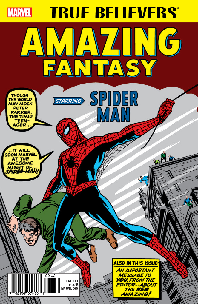
I haven’t bought any Marvel comics in a few years. I used to buy them a lot as a kid and bought them intermittently as an adult but recently they’ve had nothing to offer me. Marvel comics aren’t terrible or anything like that. I just don’t find them very interesting. I’m mostly an indie comics reader anyway. The one exception to that this past year has been Marvel’s “True Believers” line of comics. That’s their line of dollar reprint comics.
I’ve recently discovered that I really enjoy reprint comics. I think that’s because they are so cheap that there is a purity to them. You only want a cheap reprint if you are going to read it. A lot of people buy comics because they think they will be valuable. They never even read them. It’s even better for the value if you never read it. These days a comic can rise in value just because of the cover. The contents don’t even matter. But a reprint comic is all about the contents. A dollar reprint comic is never going to be worth fifty dollars so you had better want to read it or leave it on the shelf. Plus who want to read a fifty dollar comic if there is a chance you can accidentally turn it into a five dollar comic by slightly mishandling it?
This week I bought three Fantastic Four “True Believers” comics. All three are early issues from the 1960s. You can get all of these issues in collected editions but they don’t interest me enough to get them that way. The Jack Kirby and Stan Lee issues of the Fantastic Four are considered to be classics but they were never my favorites. I still like them though and I am enjoying them as dollar reprints. I like that I can pick a random one up and read it as an individual issue.
In general 1960s comic books are different than today’s comic books. 1960s comic books are meant to be read as individual issues. Today’s comic books are meant to be read in six issue chunks. Each individual issue is only one part of a longer story. There are rarely “Done in one” stories in today’s comics but that was the norm in the 1960s.
Sure a lot of 1960s comics made one big story but you didn’t have to read them that way. Every issue had a beginning, middle , and end. There might be a “To be continued” but the individual issue was still a satisfying read. That’s often not true with today’s comics. A “To be continued” can leave you wanting more but in a good way or a bad way. The good way is like having a meal, feeling full, yet still wanting more because it tasted so good. The bad way is like eating a meal that didn’t fill you up. You’re frustrated because you’re still hungry and you want more but there is no more. I find a lot of modern comics tend more towards the bad way.
I know some younger comic book collectors through YouTube who have gotten into old comic books but they were having a problem with them. They enjoyed reading them but couldn’t get all the way through a big collected edition. They’d start to get bored and stop. With ten or twenty issues of some 1960s comic in a collected edition that’s a long haul. I learned to read those big books one issue at a time just like it was the 1960s. By that I mean one issue a day. Read an issue and then put the book down until tomorrow. Some of them took this advice and liked it. They enjoyed the old comics better once they read them one at a time.
I even bought a few dollar reprints of “What If?” this year. Comics that I already had the originals of. I used to collect the series as a kid and I have a lot of the issues still on my shelf. I hadn’t looked at the issues in a long time but seeing a fresh new reprint of them for a dollar made me want to read them again. I could have read my originals but wanted the bright new copies. Somehow throwaway dollar copies appealed to me more than the already not very expensive originals.
I also bought a reprint of a “What If?” volume two comic that I wasn’t even interested in when it first came out long ago. It was a fun read even though it was a mediocre comic. There is something about it only costing a dollar, with no hope of it becoming valuable, that makes it less precious and therefor more fun.
There are actually lots of dollar comics out in the world. A lot of comic shops have what are called “Dollar Bins.” There are boxes upon boxes of comics all for sale at a dollar a piece. There is a difference between these dollar comics and dollar reprints. The reprints are generally comics people want. First appearances, the start of famous stories, or special issues in general. They fill a need for cheap copies of comics that have become expensive.
The comics in the dollar bins are comics that no one wants. They’re the leftovers. Endless rows of comics that have been printed in the last thirty years that will probably never be sold. Of course one of the good things about dollar bin comics is that there is always a chance one of them will become a twenty to fifty dollar comic overnight. It happens all the time. Of course that’s one comic in a thousand and you never know which one. But there are collectors who love to thumb through dollar bins to try and find treasure.
So as I sit and write this I can look over to my right and see about ten comics in my reading pile. I’ve got some new ones for this week, ones I will reread from the last two weeks, and a couple of reprints. That’s how I like to read ‘em.