I’m back from the comic shop this week and I got seven new comics.
Check them all out here:
Comment
I’m back from the comic shop this week and I got seven new comics.
Check them all out here:
I’ve got one section of my studio that has a standing file holder on it. That’s basically a flat piece of plastic with other flat pieces of plastic sticking out of it in a perpendicular fashion. You put folders in between the plastic supports and they stand up there. For me it’s a place to put odds and ends. Mostly old drawings that I might not want to tuck away just yet or some half finished work. That happens every now and then. I start something but then don’t finish it. It’s far enough along that I don’t want to throw it out but I have no idea what to do next. In the file it goes. Today I decided to pull three things out of that file and look at them.

“Leaping Lord” Unfinished
Since they’re not finished these have no names. So I’ll have to name them now. The first is “Leaping Lord”. Sometimes I think of it as “Unfinished Purple” but that’s too literal for me. I have no idea how old this one is. I’d guess it’s five to ten years old. It’s a technique I tried out a while ago and made some paintings of. It’s a monochrome watercolor technique. I use one thin layer of watercolor at a time and slowly build up color on the piece. It takes a long time because I have to wait for the watercolor to dry in between each layer of color I put down. I remember I finished about six to ten pieces in this style but never this one. I think it was the last one I did like this and ran out of patience. That said I kind of like this one as it is. I’ve written before about how purple is a tricky color to use but I really like the purple here. The problem is that I bit off more than I could chew.
There is no line work on this one as that was the last step I’d take. First I’d make the drawing. It doesn’t look like I made the drawing on this paper. I drew it separately, scanned it, and then printed it on watercolor paper. So the grey line under the watercolor is computer printed. It would eventually get obliterated anyway as I painted over it. Most of the other paintings I made in this style were smaller and less complex. “Leaping Lord” has a lot of parts. It’s not that it’s an especially complex drawing but for this technique it is. All those little stripes, circles, and shapes would have to be differentiated with different purples. Meanwhile I was only working with one transparent purple watercolor layered over and over again. I quickly reached the point where I couldn’t really get the purple any darker yet there still wasn’t enough tonal contrast in the piece. Looking at it again I still don’t see a way through. As an unfinished piece I do like it. I guess it’ll just have to stay that way for now.
Once again I’m not sure how old this next unfinished piece is. I’d guess three years or so. It dates back to the time I was trying to figure out a way to use markers as a finished technique. Once again it’s unnamed so I think I’ll call it ‘“Spring Worm”. It looks like I was also using a monochrome technique with this one except I used various shades and hues of green markers for the top image and various blue markers for the bottom. It looks like I spent a bit of time trying to figure this one out but never did. I didn’t do a color sketch. That was my problem.
“Spring Worm” Unfinished
Like the first piece this one also has the image printed on the paper via my inkjet printer. Then I went over the printed line with a thin green or blue marker. After that I tried to figure out the color. Looks like I failed miserably at it. I don’t like this one very much even as an unfinished piece. The darks aren’t dark enough and due to using marker it’s not really monochrome enough. There is too much color variation from green to green and blue to blue. Some greens have a little more yellow in them and some a little more blue. It doesn’t hold together and I should have figured it all out with a digital color sketch but I probably thought this was just going to be a quick piece but then it wasn’t. In the end I couldn’t fix the mess.
No date on my third unfinished piece either. Five years ago? Ten? Who knows? This time it’s gouache on paper. I’ll call it “Sunrise Poem”. It looks like I taped the sides on this one. I do that sometimes with my gouache paintings. That way when I pull the tape off at the end I have a nice clean edge. Lots of artists do this. I can tell I gave up on this one because I pulled the tape off. With other unfinished pieces I’ve left the tape on until I decide to finish the piece. That I took the tape off without finishing it means I gave up on it.
“Sunrise Poem” Unfinished
This one is unfinished because of a problem I’ve had with a few drawings. The positive and negative space looks good at the drawing stage. All the shapes and lines work together well. But in the color stage the shapes no longer play the same way. Usually because there is too much “Air” in the piece. Coloring the background of this piece yellow (or any color) makes the background too dominant. The whole “Face and Vase” interplay of positive and negative space of the spirals (now red and blue) and background disappears when they’re two distinct colors. Without color the eye connects the head to the neck-like thing to the right of it but with the color there it doesn’t. Everything that seemed connected in the drawing gets disconnected in the painting. When working with weird objects, shapes, and space I’ve had this problem happen before. In the end this one is merely okay. It’ll hang around as a cautionary tale. Nothing like tales of failure to send chills down the spine.
I’m back from the comic shop this week and I got six new comics.
Check them all out here:

Roll your own cigarette.
I’m sitting around here this evening thinking about things I want to do. Creative things. I don’t know if I’ll ever actually do them because who does everything they think of but you got to think of things anyway and then pick and choose. Of course the first thing I thought of was writing this blog. I’m going to get that done for sure because here I am writing it. There is a no-brainer.
They next thing I have to get done is a no-brainer too. I have to correct a typo on my web comic that posted today. I hate typos and always try to correct them. I make my “Four Talking Boxes” comic in an odd way. For the last year I’ve been writing them in the morning as I get ready for the day. That means I write after my shower as I get dressed. It takes about twenty minutes to half an hour. Yeah, I get dressed slowly these days. I run spell check to try and get all the typos out but don’t really proofread. Then on Thursdays I put the art together five strips at a time. I read the strip again at that time to make sure things are okay. Then the comic posts the following week and I read it online each morning to make sure it posted correctly. Like I said I don’t really proofread but I read it enough times that errors don’t get through too often. Today an error got through. I didn’t even read the strip this morning so it’s been there all day. I used your instead of you’re. It happens. After I finished writing this I’ll go fix it.
The other things I’ve been thinking about doing are more creative in nature. For instance another comic strip thing I’ve been thinking about doing is voiceover reading for the strips. Since “Four Talking Boxes” is all conversation it might be fun to read some of them and make a video of it. Nothing fancy. Just read the first character’s part and then the second. Switching back and forth through the four panels of the strip and the camera pans across the strip. I’d probably have to do it with other people since I have six characters in the strip and three of them are women. I don’t think I have a very convincing female voice. I don’t know how interesting it will end up being but it’s something to think about.
I did finally finish one thing this week. Also “Four Talking Boxes” related as I turned the first five hundred strips into a digital book. I had to design and make a cover for it as well as a back cover and some inside chapter break pages. I even wrote some little stories for the chapter breaks. I’m not even sure why I thought the chapter break stories were necessary but I wanted them there. As an artist things are often about getting things just how I want them to be. Now I have to figure out what to do with the digital book. How to get it out there.
I had been working on the “Four Talking Boxes” digital book for a while an finishing it got me started thinking about more digital books to get done. I’ve had my “Little Red Sketchbook” digital book sitting around for two years now and I haven’t finished it. I don’t know why. It just never came together. I also have another digital book called “Moments Float Back To Me” that I was working on a few weeks ago that features my art and photography along with a story. Once again I’m finished with the art and design part and am working on the story. I often have find the writing hardest to get done. I keep thinking I’m a planner when it comes to writing, as I often am in other things, but it turns out I’m more of a spontaneous writer. I have to sit down and get going with it. I think that’s why I’m good at short pieces of writing. That’s also how I got the “Four Talking Boxes” chapter pieces written. I just did them. I’d get up, bang something out for fifteen minutes, and then back off it again for twenty minutes. Repeat for a day and a half.
Now I’ve got it in my head to make yet another digital book. I think I’ve got a one track mind today. I’ve been making these little ink drawings lately. They’re on my 2.5.3.5 inch art card paper and are drawn with brush and ink. All sorts of little rough looking men, women, and strange creatures. None of them are great on there own but put them together and they add up to something. There is something about little ink drawings that when you blow them up to a larger size that look cool. I don’t know what that is but I have an idea to construct a story around them, blow them up, and make another digital book out of it all. I think I’m going to call that one “Large From Small” or some such.
And one more digital book idea. My monster a day drawings and a story of the woman who spends her time keeping the monsters of our collective unconscious at bay.”Fifty Four Monster” could be it’s name.
I also want to make some videos for my YouTube channel of me using my fortune card telling deck of cards that I made last decade. That is going to be tricky only in that I’ll have to learn what the cards mean. Sure I made up the meanings but that was a long time ago and I don’t have them memorized at all. I’m actually going to have to practice with them and that doesn’t fill me with joy. Maybe one of these days.
One final thing thing I’ve been pondering. Finishing up the “Organics” comic story I’ve been working on for ages. I’ve got 30 or so pages out of 42 pencilled, inked, and lettered. I’m not sure if I want to color it because that is a lot of work. Still have to finish those last pages too.
Oh, and I’m always thinking about new paintings and drawings. But that’s another story.
I’m back from the comic shop this week and I got eight new comics.
Check them all out here:
All right it’s been one of those weeks where I can’t seem to straighten my head out. I’ve been working on some Monster a Day ink drawings to try and focus but that only worked for a short time. It’s been like that for the past few days. Sometimes life is like that. Yesterday I cleaned up the top of my drawing table and attempted to finish a bunch of the half finished art cards that I had piled about the place. That’s another thing I do to try and focus. I draw an art card. But often it doesn’t work and I give up half way there. I make a pencil drawing and never ink it or I make an ink drawing and never color it. I shouldn’t say never because usually I finish them up at a later date. That’s just what I did yesterday as I finished seven art cards. Of course then I found another little pile of them. I say “Found” but they were never lost. They were just on the right side of my desk while the ones I finished were on the left. Anyway I couldn’t finish that second pile of them so there they sit. Lost my focus.
So that leads us to now and me wanting to write something. I decided all I had the energy for was to pull an old painting off my shelf and write a bit about it. That’s something I’ve done before so I should be able to do it again. I have a group of about fifty 8×10 inch paintings sitting on a shelf in a room. They are all in envelops or boxes so as to keep the dust off them so I can’t actually see them. So now I have a white envelope sitting next to me as I write this. I haven’t even had the energy to open the envelope. Somehow the mystery of which painting is in the envelope is more interesting than knowing what the painting is. It’s kind of like a blind box. That’s where you buy one of those little plastic toys without knowing exactly which toy you’re getting. I don’t like to buy blind boxes because I like to know exactly what toy I’m buying but since I’m not buying the envelope I’m okay with it. Anyway, I’ll open in now.
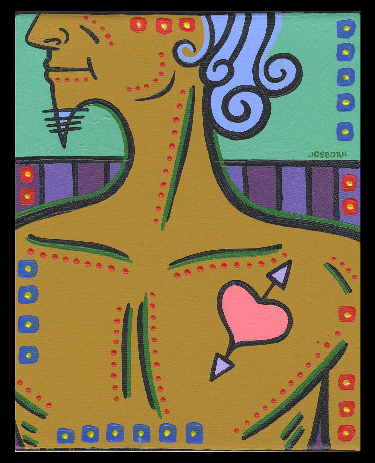
The painting turns out to be one named “Dickens”. There is no date on it so it must be from before I dated everything. I guess that would put in in the mid Aughts. Let me check my computer to see if I have a digital color sketch of it. I looked around and it looks like the date on this one is January 15, 2007. That’s a solid eight years ago. I’m not even sure if I’ve already written about this painting since I’ve done the random choosing thing before but I’m too lazy to check at the moment.
The first thing I notice about this painting is it’s maleness. Often my paintings are either of androgynous or of female figures. I don’t think I’ve painted a lot of bare chested men. It stands out. His skin tone is a yellow oxide color that I use often. Not necessarily for a skin tone but for a dark or brownish yellow. It’s one of my color staples. It doesn’t stand out and say “Yellow” like a bright yellow does but hangs back and is more earthy.
This painting also somehow reminds me of an ancient Greek philosopher. I think it’s the long curled hair with it’s light blue color and matching beard. Or it could be the Mediterranean tan. Maybe I saw some cartoon or drawing of Plato in my youth that I don’t remember but it imprinted on me. I have no idea why but this figure is an ancient Greek philosopher to me. An action philosopher because he’s got a pretty good physique.
I like the mint green sky in the background. That seems to be the number two color in the painting besides the yellow oxide. The mint green is familiar to me but it’s a tint of a green and I don’t remember which green. A tint means that I added white paint to a color. When painting these small acrylic paintings I will often mix a light tint of a color and a darker version. So I’d have three values: The color right out of the tube, a lighter tint, and a darker version of the tube color. I keep the mixed paints in little air-tight cubbies to use later. Looks like I picked just the green tint for this one. The light blue hair is also a tint of some unknown blue color I must have had. And the heart with the purple arrows is also a tint. There seem to be a lot of tints in this painting.
The purples that make up the fence behind the man might be the third strongest color. It’s tough to tell since the yellow oxide and mint green are so strong. The rest of the colors are more in balance. I find purple a very difficult color to work with. It’s almost always too dark and has to be tinted up. The problem with that is that adding white to purple almost always brings out too much red or blue in the purple. And often I don’t want a tint. So I often mix purple with light blues or light reds to get the color I want. That fence looks like I used two tints of purple. One with a light blue to make the lighter purple and one with just a little bit of white that brought out the magenta in the purple. I think I nailed the purples in the end.
The final part of this painting is all the strokes, boxes, and dots on the surface. Sometimes, especially on my larger paintings, they’re what the painting is all about but here they’re what brings the painting together. The finishing touches. The bits of color and action that make the other color in the painting come alive and say what they need to say. Most of the lines are related to the lines used to make the man’s anatomy and that’s because I used so few lines in this painting. The green stokes emphasize them rather than obscure or fight against them. That’s not a solution I often use. All in all I’d say this is one of my more harmonious paintings. There is a stillness to it too. And I’m glad I had the energy to write about it.
I’m back from the comic shop this week and I got seven new comics.
Check them all out here:
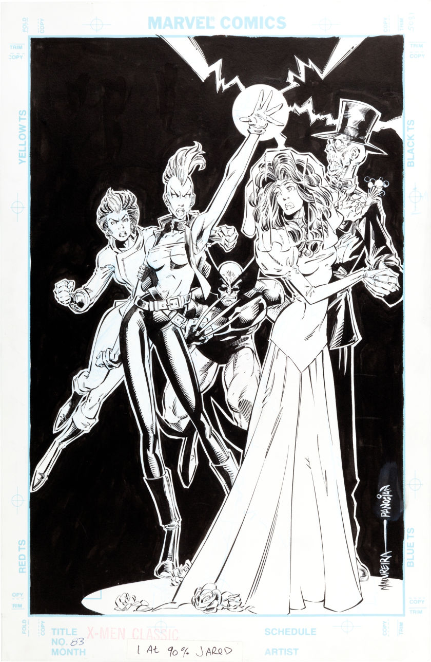
Classic X-Men 83 Original Art
Once upon a time I worked in the production department at Marvel Comics. All through the 1990s and halfway through the 2000s I was one of the behind the scenes people who helped do some work to make sure that the comics were printed properly. There is not much glory or money to be found in such a job. It’s the kind of job where you’re dealing with other people’s creative output all day but not leaving a trace of your own. You can find my name in a hand full of credits over that period but in general it’s hard to find the name of anyone who does that job. It’s a job that doesn’t leave much of a mark behind. So imagine my surprise when, as I was scrolling through my Tumblr feed, I came upon a mark I left behind long ago.
Among the things in my Tumblr feed I’ve subscribed to a lot of different comic book blogs. Since Tumblr is all about visuals people post pictures of comic book stuff including original artwork. One recent morning the art to the cover of X-Men Classic #83 by Joe Madureira and Dan Panoisan came up in my feed just like any other piece. The cover has a May 1993 cover date on it which means it probably was first on sale in about February 1993. That’s twenty two years ago. On the bottom of the cover you’ll see a note that says “1 at 90% Jared”. That Jared is me and I wrote that note way back in early 1993 (or even late 1992).
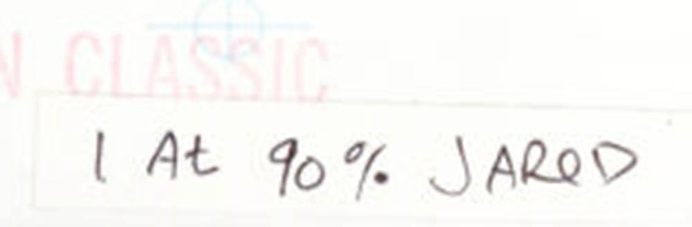
My Note on the Classic X-Men 83 Original Art
First off that note isn’t written on the actual paper the art is drawn on. Since we didn’t want to mar the original art with our production notes we would put a piece of removable white tape on the border of the art, write a note, and then remove the tape after the job was done. That’s another reason why few traces of my production work exist. So why is this piece of tape still on there? I have no idea. I guess I didn’t pull it off before I gave the art back to the editor. Or the editor took the page back before I could pull it off. Who knows?
I can tell you why I wrote the note though. The cover was for X-Men Classic #83 and the editor (I don’t remember who and can’t find his or her credit) thought the art obscured too much of the logo. This was before the days when we did things on computers so it was my job as the production guy to make all the pieces of the cover, art, logo, trade dress, and copy fit together correctly to make a finished piece to be sent to the printer. So I wrote that note on the bottom and brought the cover over to Robbie in the stat room for him to make a photostat of it at 90% of the size of the original size.
A photostat is like a cross between a photocopy and a photograph. It’s only in black and white like a photocopy but it’s made with a giant camera on light sensitive paper. Robbie ran the big photostat machine at Marvel so I gave him the original and he gave me back the original and the smaller copy. Photostat paper is pretty tough stuff so working with it is easy. It’s not going to wrinkle, rip, or bleed like a photocopy on normal paper would.
I’m not positive but I’m pretty sure this next part happened. Marvel had an art corrections department called “Romita’s Raiders”. They were basically artists in training, maybe two or three of them at a time, that John Romita Sr. oversaw. Any art corrections that needed to be made went to these guys and they penciled, inked, and generally corrected any page that needed it. Being an artist myself if it was an extremely simple touch up I would do it on my own but anything beyond that I would pass over to one of the Raiders. This touch up looks simple but not extremely simple so I’m guessing I passed it along.
In looking at the reduced size printed piece compared to the original I can see that Caliban’s (the guy in the tux) sleeve had to be completed and Storm’s (the woman in the Mohawk) blasts that are coming out of her hand had to be extended. That’s a simple fix but not an extremely simple one. Though I used an ink brush and pen all the time at home I didn’t use them at my work desk. And one of those tools was going to be needed so I must have given the piece to the Raiders to fix.

Classic X-Men 83 Printed Version
After I got the fixed stat of the art back it was my job to get a stat of the logo and corner box and paste them down on the fixed art for printing. That meant I had to take an X-Acto knife and cut away all the parts of the logo that the characters heads, hands, and blasts are in front of. I had to cut away a good ten to twenty percent of the logo. You could still read it and so that was acceptable. If you could imagine how much of the logo I would have to cut away with the original larger art you can see why the decision was made to reduce the size of the figures. I’m guessing it would obliterate fifty percent of the logo. That is not acceptable.
One last thing I wonder about this cover is where the stat art that got sent to the printer is? That the original art showed up on Tumblr means that it was returned to either Joe Madureira or Dan Panoisan like normal. One of them or a person they sold it to scanned it and posted it and so it ended up on the internet but what about the production stat that the cover was actually printed from? I wonder where that went? The printer sent all the original art back to Marvel and from there it went to whoever was working in Marvel’s art returns department at the time and he returned it to the artists who made the art. But since this “Original art” was a stat, a copy, who got it? Was it given to the Raider who made the corrections? I have no idea. All I know is that it wasn’t given to me nor would I have really expected it to be. But now it makes me wonder.
So there you go. A piece of my production art past came floating back to me on the pixels of the digital age. I have no records or even any idea of what individual comics I worked on in my production days. There were a lot of them. But here is one I can say for sure I had a hand in.
I’m back from the comic shop this week and I got eleven new comics.
Check them all out here:
I haven’t written much about comics here on my blog since I got tired of writing reviews of comics and started making comic book haul videos instead. I found that when I was writing reviews I was reading comics books differently than when I wasn’t writing reviews. I was looking for an angle to write about as I was reading. That wasn’t always an annoyance but at times it could be. Some comics were easy to write about since the comics had something to say but not all of them were. It’s tough to find something to say about a comic that isn’t saying much itself.
The comic book haul videos have been much more fun. I get to show off all of the comics I buy in any given week and ramble on for about a minute a piece about each of them. I show the comics off before I’ve even read them but I do talk about what happened last issue in them. No reviews in any real sense but some information. Besides I’ve always thought that any comic that I buy regularly means that I give it a good review. I’m not a completest collector so I wouldn’t by any comic just to have it and not even read or enjoy it.
One of the things I often mention in my videos are that a bunch of comics are on my hypothetical top five list. My favorites. I’m not much for making lists, as I often mention, but the concept of a top five list gets across how much I might like a certain comic. One of the recent commenters on my comic book haul video asked me what my actual top five would be. I looked at the list of all the comics I’ve bought this year and picked my very favorites. It was tough because there are so many good comics these days, we’re in a golden age, and I buy a lot more than five. I think I’m up to about forty comics a month. That is a lot of good comics. I didn’t want to whittle any more off my favorites list so I ended up with a top seven instead of five. So here they are.
Matt Kindt has put out about thirty issues of this comic and it’s going to end soon at issue thirty six. It was originally going to be a six issue story but it was successful enough to keep going. It’s been a lot of fun. Mind MGMT was a spy organization that used people with all sorts of strange super powers. It was disbanded years ago and the first story arc is about our lead character, Meru, finding out about it. Then she finds out someone is trying to put it back together and she and others band together to stop it. All sorts of adventure, intrigue, weird powers, and crazy things happen.
Put any Stray Bullets title that is currently coming out right here. This is one of my favorites that had been missing for years as David Lapham did other things but now it’s back. And it hasn’t missed a beat. If you like crime comics then you should be reading this one. It’s all about low level criminals and the people that get caught in their wake. Part thrill ride and part cautionary tale Stray Bullets is always a lot of fun even as you’re saying to some character, “No! Don’t do that! It’s not going to end well for you!”. And it usually doesn’t end well but it sure is a good story.
I’ll buy just about anything Terry Moore does. I used to buy his “Strangers In Paradise” and bought his more recent “Echo” but now he’s doing “Rachel Rising”. It’s a horror comic of all things that started with a woman climbing up out of a shallow grave. It took twenty-some issues to tell that story as we found out the town was cursed by witches a couple of hundred years ago. I guess the series has been doing well and Moore is still interested in it since he started a second story arc and it’s up to issue thirty two now. Like most of his work “Rachel Rising” is as much about the cast of characters and their interpersonal relationships as anything else. Good stuff.
Rick Remender and Wes Craig bring us a comic that I almost didn’t buy because I though the description of it was stupid. But I liked the cover, flipped it open, liked the inside art, and have been buying it ever since. It’s the story of a kid who goes to a high school for assassins. Yeah, that still sounds dumb to me but the comic is really good. It’s not so much about their school or their training but about the kids and what they get up to and how they get along. There are tons of gangs and cliques and most of them are a bit crazy. But they can’t get into too much overt trouble because the people who run the school are crazy adults and are much more dangerous than the kids. Lot’s of dysfunction and fun.
Ed Brubaker and Steve Epting bring us a period piece spy story. The first story arc, though well done, is pretty standard spy stuff. It’s the late 1960s or so an Velvet is no longer a field agent but still works for whatever British spy agency it is. MI6 or some such. She’s framed as a traitor and everyone is after her. That was the first four issues or so but it really takes off after that as they delve into the history and workings of the agency. We get to see other people who may or may not trust the info they got on Velvet’s betrayal. It’s only up to issue nine as I imagine Epting’s detailed and very well thought out art take quite a bit of time to draw but every new issue is a treat.
Brubaker makes my list again and also again you could put whatever the current work by Brubaker and Sean Phillips is right here. This one only has four issues under its belt as they just finished their series named “Fatale” but it’s as good as all their stuff. “Fatale” was horror but “The Fade Out” is a 1950s Hollywood crime drama. The Hollywood studio system is still in full effect and one of it’s starlets gets murdered. Studio security covers it up and makes it look like a suicide as they’d rather not have the scandal but a friend of hers who was the writer on her last movie finds himself sucked into the mystery of what really happened. Anything these two do shoots to the top of my list and this is no exception.
Something new and surprising found itself on my list and that’s “Drifter” by Ivan Brandon and Nic Klein. I don’t think I’ve read a comic by either of these guys before and I picked this one up just because I read a description of it. I liked the first issue well enough but it was the third that really hooked me. “Drifter” is the story of a man who crash lands on a far away frontier planet. It’s like an old western town filled with strange characters. And things aren’t as they seem. Our lead character disappeared for a year between the crash and his being found. And he has no idea why. Besides that we’re introduced to all sorts of characters and tough to understand alien life. It’s not an easy book to describe but it’s full of ideas. That’s what I like about it. Plus it’s got the most poetic recap page in comics.
So there is my top seven. What are yours?