All right it’s been one of those weeks where I can’t seem to straighten my head out. I’ve been working on some Monster a Day ink drawings to try and focus but that only worked for a short time. It’s been like that for the past few days. Sometimes life is like that. Yesterday I cleaned up the top of my drawing table and attempted to finish a bunch of the half finished art cards that I had piled about the place. That’s another thing I do to try and focus. I draw an art card. But often it doesn’t work and I give up half way there. I make a pencil drawing and never ink it or I make an ink drawing and never color it. I shouldn’t say never because usually I finish them up at a later date. That’s just what I did yesterday as I finished seven art cards. Of course then I found another little pile of them. I say “Found” but they were never lost. They were just on the right side of my desk while the ones I finished were on the left. Anyway I couldn’t finish that second pile of them so there they sit. Lost my focus.
So that leads us to now and me wanting to write something. I decided all I had the energy for was to pull an old painting off my shelf and write a bit about it. That’s something I’ve done before so I should be able to do it again. I have a group of about fifty 8×10 inch paintings sitting on a shelf in a room. They are all in envelops or boxes so as to keep the dust off them so I can’t actually see them. So now I have a white envelope sitting next to me as I write this. I haven’t even had the energy to open the envelope. Somehow the mystery of which painting is in the envelope is more interesting than knowing what the painting is. It’s kind of like a blind box. That’s where you buy one of those little plastic toys without knowing exactly which toy you’re getting. I don’t like to buy blind boxes because I like to know exactly what toy I’m buying but since I’m not buying the envelope I’m okay with it. Anyway, I’ll open in now.
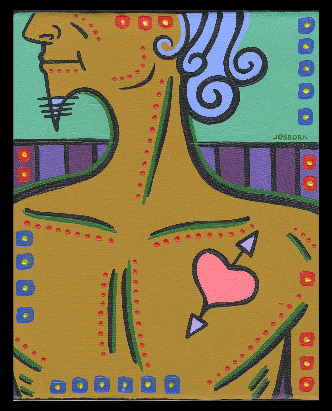
The painting turns out to be one named “Dickens”. There is no date on it so it must be from before I dated everything. I guess that would put in in the mid Aughts. Let me check my computer to see if I have a digital color sketch of it. I looked around and it looks like the date on this one is January 15, 2007. That’s a solid eight years ago. I’m not even sure if I’ve already written about this painting since I’ve done the random choosing thing before but I’m too lazy to check at the moment.
The first thing I notice about this painting is it’s maleness. Often my paintings are either of androgynous or of female figures. I don’t think I’ve painted a lot of bare chested men. It stands out. His skin tone is a yellow oxide color that I use often. Not necessarily for a skin tone but for a dark or brownish yellow. It’s one of my color staples. It doesn’t stand out and say “Yellow” like a bright yellow does but hangs back and is more earthy.
This painting also somehow reminds me of an ancient Greek philosopher. I think it’s the long curled hair with it’s light blue color and matching beard. Or it could be the Mediterranean tan. Maybe I saw some cartoon or drawing of Plato in my youth that I don’t remember but it imprinted on me. I have no idea why but this figure is an ancient Greek philosopher to me. An action philosopher because he’s got a pretty good physique.
I like the mint green sky in the background. That seems to be the number two color in the painting besides the yellow oxide. The mint green is familiar to me but it’s a tint of a green and I don’t remember which green. A tint means that I added white paint to a color. When painting these small acrylic paintings I will often mix a light tint of a color and a darker version. So I’d have three values: The color right out of the tube, a lighter tint, and a darker version of the tube color. I keep the mixed paints in little air-tight cubbies to use later. Looks like I picked just the green tint for this one. The light blue hair is also a tint of some unknown blue color I must have had. And the heart with the purple arrows is also a tint. There seem to be a lot of tints in this painting.
The purples that make up the fence behind the man might be the third strongest color. It’s tough to tell since the yellow oxide and mint green are so strong. The rest of the colors are more in balance. I find purple a very difficult color to work with. It’s almost always too dark and has to be tinted up. The problem with that is that adding white to purple almost always brings out too much red or blue in the purple. And often I don’t want a tint. So I often mix purple with light blues or light reds to get the color I want. That fence looks like I used two tints of purple. One with a light blue to make the lighter purple and one with just a little bit of white that brought out the magenta in the purple. I think I nailed the purples in the end.
The final part of this painting is all the strokes, boxes, and dots on the surface. Sometimes, especially on my larger paintings, they’re what the painting is all about but here they’re what brings the painting together. The finishing touches. The bits of color and action that make the other color in the painting come alive and say what they need to say. Most of the lines are related to the lines used to make the man’s anatomy and that’s because I used so few lines in this painting. The green stokes emphasize them rather than obscure or fight against them. That’s not a solution I often use. All in all I’d say this is one of my more harmonious paintings. There is a stillness to it too. And I’m glad I had the energy to write about it.
Discussion ¬