Composition is my strongest natural artistic talent. I know how to arrange things on an instinctive level. Of course talent has to be worked on or it doesn’t fully develop but it’s easier to work on a natural talent. There is nothing to force. A talent for composition is also hard to recognize in a young artist. It’s an obscured talent. There is so much to learn about making a drawing and composition usually isn’t at the head of the line. If you’re trying to draw a room and the couch doesn’t look like a couch no one notices that it’s in the exact right spot. It took a long time for me to realize that composition was my strong point and even then it didn’t matter to the world at large. It’s something that people appreciate but don’t notice on a conscious level. People know why art is pleasing to them but they don’t always know why.
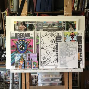
I bring up the subject because of the chance arrangement of art that I have on my easel at this moment. When I’m working on something big enough to need my easel that piece is all that’s on it. It could be either a big sheet of paper or a big canvas. But when I’m not working on my easel I put other art on it. Art I’m working on that I want to get a good look at. It’s important to step back and look at a piece from afar so I can judge it. I can see things in it that I can’t see when it’s on my drawing table. Sometimes the art display builds up on my easel. I put piece after piece on it as I finish them. I think the gathering of pieces appeals to my sense of composition.
The art that stacks up on my easel can start to create its own random composition. Or maybe the compositions aren’t so random because I’m the one placing the stuff on there but either way the whole bunch of images together start to create a new image. Right now I have some 11×17 inch drawings, 9×12 inch ones, 5×7 drawings, and finally even some small 2.5×3.5 inch drawings on the easel. Some are in color while others are in black ink or pencil. That’s quite the variety. Things aren’t always that varied on my easel.
I don’t think I’ve finished much in the last week but I got a bunch of stuff in progress. Plus there are things on the easel from past weeks. First of all my big white drawing board in on the easel. That’s always there unless a canvas is in its place. After I made a bunch of big drawings this last winter I usually had one of those big drawings on the easel but I’ve since put one of my big 22×30 inch photos on it. That’s in the back though and you can only see the top five inches of it sticking out the top.
In front of that big photo yet behind everything else are are bunch of my “Dreams of Things” faux comic book covers. They’re the 11×17 inch ones. I can’t even tell how many are back there but I can see bits of three of them. Two are just small pieces and the third is about half the cover. The one I can see the least up becomes an abstract piece. It’s just line and color.
The one I finished most recently is the faux cover that’s only been inked so far so it’s in black and white. That one is almost all the way in front and punches a hole in the colored ones that are behind it. It’s a drawing of three faces in three different orientations and there is no up and down in it. It’s almost like it has its own gravity and is sucking in the other drawings.
In front of the black and white ink drawing is a 9×12 inch pencil drawing. I hesitate to call it black and white because it’s really grey and white. The pencil drawing has the finest lines in it of all the pieces and is made of tiny little shapes so it’s hard to see what I step back from the easel. It’s the one that invites the viewer up for a closer look. There is a little piece of a 5×7 inch color painting sticking out on its right size so we get a bit of color to contain the black and white.
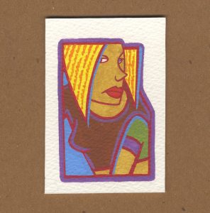
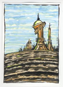
On the left side down in front are three 2.5×3.5 inch color drawings in front of two 5×7 inch ink and watercolor paintings. The stack is three-two-one counting the “Dreams of Things” cover behind it. They’re all shifted a little bit to the right. That’s a pretty good composition even if by chance. I like the way the three art cards came out. They’re bright and colorful with some cheery people on them. It’s almost like they’re in the landscape that’s behind them.
There are more 5×7 inch landscapes in the stacks but only two of them plus the little bit of the one on the right can be seen. There are also two 9×12 inch landscapes in the stack but neither can be seen. Or wait. Maybe I have them at the bottom of a pile of books being flattened a little bit. It really doesn’t matter since they can’t be seen but I can still feel their presence even if another viewer can’t. I made them all together so I tend to think of them as a group.
This chance arrangement is only going to last a short while longer. Things get moved around on the the easel too much for anything to stay long. But I will have to keep these up in the same order for one more day. It took me too long to write this blog. I started in the morning and am finally finishing it as the sun is setting. That means I lost the light to take the photo I was planning to take of it. I’ll have to do that tomorrow. Things always take longer than I think they will.


