I’m back from the comic shop this week and I got five new comics.
Check them all out here:
I’m back from the comic shop this week and I got five new comics.
Check them all out here:
I hit the wall this week. I had been working on my big ink drawings and acrylic on canvas paintings so much that I burnt out on them. I’ve enjoyed doing them but they take a lot of work and so I want to move onto other things. But what other things? That’s always the big question. I have no answer at the moment but I did manage to get one of my “Dreams of Things” comic book covers colored.
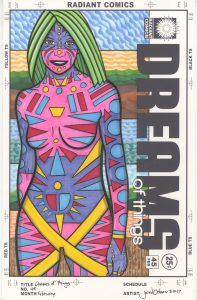
I haven’t made a comic book in a while but I continue to make comic book covers in my “Covers to Comic Books That Don’t Exist” series. That’s what this one is. “Dreams of Things” #84. Yes, I really have made 84 covers in this series so far. I’ve made covers for other non-existent series too but I often numbered them randomly. This is the first series that I started with number one and kept numbering them consecutively. And that number has kept getting bigger.
I draw these with India ink and Copic markers. I ink them first and then they often sit around for a while before I get around to coloring them. This one has been sitting for a couple of months. I let a bunch of them build up in a pile and work on the stage (pencil, ink, or coloring) that I feel like at the time. This time it was color.
As a side note Copic has been having trouble getting their refill inks to market. This winter I tried to buy a couple of new marker ink refills but everywhere they were out of them. I couldn’t figure out what was going on. Then in April I read that Copic redesigned their ink bottle and were letting supplies run low before they introduced the new one. Then the virus hit and messed up the supply chain. As a result I still can’t get refills for my yellow and orange markers.
I have two types of “Dreams of Things” covers. One has the logo horizontally and at the top of the cover like a traditional comic book and the other has the logo running vertically on the right side of the cover. I mention this because I was just making some mockups of new covers to be pencilled and most of them were the vertical type. I don’t know why but that seemed to be the trend. This one is the normal top horizontal logo type.
This one took me longer than usual to get done. I was so burnt out from working on my big pictures that I took a day off and just sat in a chair. When I got back to work the next day I was still feeling burnt out so I took things slowly. I worked on it little by little and took frequent breaks. It was the only way I could get anything done and it took me all day.
There was a lot of contemplation time with this one. I don’t do any color sketches with these covers so I have to get the color right the first time. I have a paper full of color swatches in front of me so I don’t have to guess what any of my marker colors look like on the page. It helps with contemplating color to have it in front of you.
The first colors I put down were the oranges and blues in the background. I really wanted to make that cat-like creature orange but thought it would be a bad idea. The idea was stuck in my head so I decided to use the orange first in the background to get the idea out of my head. After that I put down the blue but it ended up being too light so I darkened it a little bit later on. There isn’t much background in this piece so there weren’t a lot of decisions to be made.
Then I worked on the masked face on the right. The purple came to me right away but it took a while to make the decision to go with magenta for the other parts of the mask. I think I even left it blank for a bit and filled in the dark red on the bottom. I even went with the yellow hair before the magenta. I got there eventually though.
The orange was still stuck in my head for the cat and so I decided to go with an orange brown. I put about three marks down and it was all wrong. I shifted over to a darker brown with less orange in it. I used my scumbling technique to mix the various brown colors together. I like this technique because it adds a bit of texture to the drawing. One thing markers don’t have is any surface so I like to give them some texture. Overall I like the brown. After much contemplation I think it was the best choice.
As soon as I put the brown down I knew the cat’s collar had to be green. The only question I had was how to lay the color down. I ended up going with a directional approach to add a pattern and texture to the coat and collar. I drew some dark organic stripes in dark green before adding more green color in there. The color gives it a fur-like quality.
I am not sure what that red fist coming out of the cat’s head is. That’s the weirdest thing in this image. Is it a hat? Is it a visualization of his thoughts? Is it part of the background design? These are the questions I ask myself as even I don’t have all the answers. But I like images that make me think.
I finished up by coloring the city in the bottom right and the coat of the guy on the right. Since the main colors had been figured out already these colors almost chose themselves. I kept them mostly dark and neutral except for that burst of yellow on his collar. That stands out.
In the end I find this picture a little inscrutable. I try to figure out who these two are and what they want but they don’t seem to be interested in giving me answers. They have their own agenda that doesn’t include me. They stare ahead not wanting me to know what they’re up to. But that’s okay. I’ll give them a good hard look anyway.
I’m back from the comic shop this week and I got three new comics.
Check them all out here:
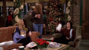
It’s time for another “Friends” walkthrough. Let’s see which one in next in my queue. It’s Season Three Episode Ten “The One Where Rachel Quits.” By the name I know it’s the one where Rachel finally quits her job as a waitress at Central Perk and begins her career as in the fashion world. I’m not even sure what to call her fashion carrier. I wanted to call her a fashion executive but I don’t think she was ever that. At least not until near the end of the series. She may have been a fashion buyer in the middle too but at first she’s just a fashion office grunt worker.
The show premiered on December 12, 1996. Let me consult my calendar and see what I was doing on that Thursday besides watching this episode as it first ran. Looks like I was working from home that day but with no notation of what I got done. I even went to the art store at the Nanuet Mall. I wonder what I bought? There is a strange line in my calendar that says “Distributed Art Pub NY $73.” I’m not sure what that means. It may have been some sort of art magazine I bought a subscription to.
Now onto the show. It starts with a Chandler Snoopy joke and then some solid “Rachel is a bad waitress jokes.” She really is and it sets up our first plot line. Now here comes the theme song. Our first scene is in the apartment building stairwell/hallway (a place we rarely get to see) with our second plot line being set up. Ross accidentally injures a Brownbird (a Girl Scout substitute) and now he will have to sell her cookies. As I remember it I wasn’t too fond of this storyline. It was a bit clichéd and predictable. We’ll see how it holds up.
Next scene is in the coffee house as they continue talking about Ross and his injuring the little girl. A quick line about Joey having a holiday job selling Christmas trees sets up our third plot line. Joey selling trees and Phoebe feeling sad for the trees. A lot of Phoebe being a weird jokes will be happening.
Some more Rachel is a bad waitress jokes follow. I think this was my favorite of the three plot lines. I think Gunther did a good job with this episode. It may have been his most screen time so far in the series.
Ross visits the little girl with the broken leg and tells him she was trying to win a trip to space camp. He finds out she loves science just like him and her father is a gambler maybe not boding well for her future. The little girl does a good job with her part.I just looked her up and she’s Mae Whitman. She was born in June of 1988 so she’s 32 years old now.
The next scene is Ross going door to door in his apartment selling the cookies. The lady behind her closed door isn’t believing his story. It’s an okay scene. Not my favorite plot line.
Now we get Phoebe visiting Joey at the Christmas tree stand. This scene has alway looked the most fake to me out of any scene on the show. I think I’ve even seen this same Christmas tree set on other shows. Despite Joey’s hat and coat is doesn’t look cold out at all and they look like they’re on a set the whole time. The wood chipper gag is funny though. Goofy funny.
Now Ross is at the coffee shop trying to sell the cookies to the gang. Some Monica was fat jokes and then Ross takes advantage of her weakness for cookies which sends her fleeing. That’s all a lead-in to Rachel’s plot. I like Gunter’s ‘Coffee mugs and spiders” joke. Rachel goes on about hating her job and the gang encourages her to pursue her fashion career. Joey tells here she needs the fear. Chandler helps out too and it’s good stuff. Rachel goes off and then quits. Good for her.
Now we’re back in Monica and Rachel’s apartment and the cookie plot line. Ross has to cut Monica off from the cookies. It’s middle of the road stuff. Except for the Pink Floyd joke. “Cookie Dude” is good stuff. Rachel walks in all wound up and working on her resume. She let’s Chandler have it for convincing her to quit her job. It’s a good scene.
Meanwhile at the tree stand Phoebe is trying to sell the trees that are sad so they don’t get thrown in the chipper. Not much happens and then we’re at a Brownbird meeting with Ross. The other girls don’t like him (no duh!). Ross doesn’t sell the most cookies and the little girls doesn’t get to go to space camp. He tries to fudge it but isn’t able to. Mediocre stuff.
Rachel thinks she blew the interview at Fortunata Fashions and is upset. And as a culmination of the Christmas trees plot line they all walk into Monica and Rachel’s apartment and all the unsold trees are there fulfilling their Christmas destinies. A fun little climax. Then the phone rings. Rachel got the job. She serves her last cup of coffee at Central Perk in a new scene. And she makes a scene at the coffee shop making Gunther cry. Of course then we get a quick scene at her new job where she has to make coffee.
Our end credit scene is the boys making their own space camp for the little girl. It’s cute and quick.
Now to stop in with http://uncutfriendsepisodes.tripod.com/season3/310uncut.htm and see what was cut from the episode for syndication and streaming. Seems like just one line was cut. Chandler saying “I’m going to call you that” after Ross tells him about being called “Cookie Dude.” That seems odd. Usually there is nothing cut or a few minutes cut. Not just one line.
Now I’m going to check what rating I gave it a few years ago when I rated all the shows on iTunes. I’m guessing I gave it a three out of five stars. Turns out that’s exactly what I gave it. It was a solid middle of the road episode. The Rachel quitting was the best of the plot lines and the other two weren’t bad but neither were they great. They each had some good jokes and some mediocre jokes. Still it was a fun trip back to December of 1996.
I’m back from the comic shop this week and I got five new comics plus a big book.
Check them all out here:
I just checked my calendar and it’s been two years since I finished my last 18×24 inch acrylic on canvas painting. That is my last one before I finished one this week. It’s been a while. Since then I’ve made plenty of drawings, big ink drawings, marker drawings, art cards, faux comic book covers, watercolor drawings, and other things I can’t remember right now. But no acrylic paintings.
What is the difference between all that stuff and my acrylic paintings? Surface. That’s the difference between drawing and painting. When making a painting an artist has to decide what they are going to do with the surface. Acrylic and oil paint have a thickness. You can really pour it on and lay on a thick coat of paint or thin it out and make the surface as smooth as possible. Then there is all the stuff in between those two extremes. There are lots of decisions to be made about the surface of the paint as you work.
Even when I’m dealing with color in a gouache or watercolor painting I consider it closer to drawing than painting. That’s because there are almost no decisions to be made about the surface. Those mediums are thin and don’t hold brush strokes like oil and acrylic paint do. Their surface is all about what paper you choose rather than how the paint is put on the surface.
The painting I finished is called “Strange Character.” It started as a drawing in my ink book and then I made an ink drawing out of it. This past winter I went on a 6×9 inch ink drawing tear. I made about 45 of them from mid November until the end of January. I would blow up one of my small ink book sketches onto a 6×9 inch piece of Bristol board and then go at it with a brush or pen full of ink.
I got tired of making big ink drawings as I’ve been doing a lot of this year so I decided to look through my stack of 6×9 inch ink drawings to see if there was anything I wanted to make a painting out of. I settled on a drawing that was originally named “Horrible Character” but as I worked on the painting I changed the name. I didn’t think the person in the painting was horrible or had anything to do with horror. Instead he was strange.
I’ve been coming up with stories that go along with my drawings and paintings lately. They mostly take place in the Dreamworld. That’s the place on the edge of our knowledge and consciousness where lessons are learned through stories, feelings, metaphor, and images. There is a lot of stuff to be learned from the Dreamworld if we have the imagination to perceive it.
I start the painting by transferring the image to the canvas. I blow up the drawing on the computer, print it out on multiple piece of paper, tape the paper together, and transfer the drawing to the canvas using graphite paper. That’s wax paper with a thin layer of graphite on one side. Press down on the paper with a pencil and a line of graphite transfers to the canvas.
The next step is to draw the black line of the drawing in purple paint on the canvas. In the past I used to use black paint for this but in recent years I’ve used a dark purple. The purple is so dark it’s hard to tell it’s not black and it functions as black in the color scheme but I find it slightly more lively. I usually do this part as quickly as I can because unlike its ink drawing compatriot this line drawing in not the final line drawing. It’s just step one and there are plenty of steps to go.
Step two is to make a color sketch on the computer. I prefer to figure out what my colors are going to be before I hit the paint. That cut the mistakes down a whole lot.
Step three is to lay down all the basic colors on the canvas. I use the sketch as a guide and paint in the color where it needs to go. This step can take most of the day. This and the purple line step can be a bit of a chore. There aren’t a lot of creative decisions to be made but it’s laying the groundwork for all the creative stuff to come.
Step four is to go back into the line with more purple paint. This gets me almost to the final line. As the painting goes on there is still decisions to be made and touch ups to be done but it’s here that I’m really thinking about the final line. I work the line and the color shapes back and forth until I get the relationship between the positive and negative spaces created by the paint just how I want it.
An 18×24 inch painting takes around three days. Day one is working on the image, transferring it to canvas, and painting the purple line. Day two is putting in all the color and reworking the purple line. Day three is where the whole thing comes together. That’s when all the lines, blobs, and brush strokes full of color are put on. This takes a remarkable amount of time because there is a lot of looking at and contemplating the painting going on.
I almost always work standing up but at this stage I spend a lot of time sitting and distracting myself for a few minutes before glancing over at the painting. Somehow moving in and out of concentration helps me see the next bit of color I want to paint. It seems like an almost endless process at first but as the day goes on and I put on more and more paint my choices narrow. It’s when I finally see no more choices that the painting is finished.
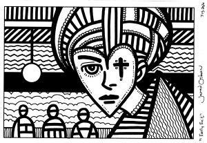
“Strange Character” is a strange character because we’re not sure what he’s thinking. His thoughts appear to be obvious, at least for a moment, but are they? We just get a glimpse of his head with some type of phallic symbol comic out of his head. Or is it a rocket? Is he a unicorn? Is that a lipstick? What is he really trying to tell us about his thoughts? I don’t know. That’s what makes him so strange.
What really brought this painting together for me are the light blue marks on his face. Even with all the other marks and patterns of color in this painting something was missing for me. It just wasn’t lively enough. It was missing a certain dream-like quality. The light blue marks changes that for me. The color of them works well with the pink of his face and the line and “No pattern-pattern” makes a nice counterpoint to all the color patterns in the painting. I knew I had it figured out after I put those lines in.
After finishing this one I still have two more 18×24 inch canvases ready to go. I bought them back in 2018 and they’ve been sitting around since then. Let’s see what I can do with them.
I’m back from the comic shop this week and I got six new comics.
Check them all out here:
I bought “Asterios Polyp” by David Mazzucchelli back when it came out in 2009. I even wrote a blog review about it. http://radiantcomics.com/comics-i-bought-this-week-october-1-2009/ I remember liking it but not being overly enthusiastic about the book. In rereading my review I think that comes across. I meant to give the book another look after some time had passed and somehow not just a couple of years went by but eleven. It’s hard to believe over a decade has passed since “Asterios Polyp” came out.
Asterios Polyp is the name of the lead character in this graphic novel. He is a “Paper Architect.” That means that none of his buildings have ever been built. He has spent his career in academia teaching architecture. He wrote some books that got him some fame and he’s well respected in his field despite having no standing buildings.
The story begins with lightning striking Asterios’s NYC apartment and sets it on fire. Asterios grabs three things: a lighter, a watch, and a Swiss Army knife and leaves. He doesn’t even look back as he flees the fire but instead heads up to what I assume to be Port Authority Bus Station and takes a bus out of town. So the story begins.
I was very aware of time in this story. I think it starts with the fact that back in 2009 when I first read this comic I was younger than Asterios Polyp. Now I’m older than him. I think that affected my perception of the story but I was also calculating ages overall in the story.
Asterios is fifty when the story begins and he is recently retired and divorced. It flashes back to his youth and early days teaching and gives us years for them. He met his wife Hana at a faculty party in 1984. It also says his wife’s parents were married in 1948, had four sons in five years, and his wife six years later. So his wife was born in 1959. That makes her fifty in 2009. That was a bit confusing since she seemed younger than him but then it’s later mentioned that the story takes place in the year 2000. So he was fifty then and she was forty one. She was in her mid twenties when they met and he was in his mid thirties.
There seemed to be a lot of recalculating in this story for me. Things that might not be clear in the beginning, like the three things Asterios grabbed as the fire burned, became clear later on in the story. The many flashbacks in the story emphasized this as we got glimpses into important moments in Asterios’s life. We got insight into him, his career, and his marriage.
In the story’s present Asterios takes the bus to a random town, gets off and finds a job as a car mechanic, and rents a room at his boss’s house. He blends right in with his boss’s family. Asterios is a really smart guy and has lots of interesting conversation with the people around him. It seems he wants to learn something about life from everyone he meets.
Let me drop in a word about the art. First of all Mazzucchelli is a visual storyteller of the highest order. His panel to panel storytelling is as clear and concise as can be. Never once was I wondering what was happening in a scene nor was I ever visually confused. This helps so much in entering the world of a comic and believing in it. Everyone loves him from his Batman and Daredevil days but this art is his much more cartoony style. He even keeps the color basic and uses it sparingly. But never once did I think the color wasn’t right on.
Mazzucchelli also used some interesting techniques in his drawing. He had a few scenes of Asterios and Hana (who was also a teacher and artist) arguing and the art style changed during those arguments. In those scenes Asterios was drawn as if he was made out of geometric shapes while Hana was drawn more loosely in a sketchy style. It reflected their points of view with him being rigid and material as she was more emotional and feeling. It really changed the mood in an interesting way when this happened.
I also learned an interesting thing about the art from a friend who went to a lecture back in 2009 where Mazzucchelli spoke about the book. He drew Asterios’s face with elipse templates rather than the normal freehand way. That’s because he wanted the same exact curves to Asterios’s face every time. He wanted a certain rigidity to the drawing. Since there was a rigidity to the character I found that fitting.
I really didn’t remember a lot of the story consciously since reading it back in 2009 but I think some things must have stuck in my subconscious. I was very aware of things, like those three fire items, that were going to pay off further in the story. Plus there were themes and little snippets of conversation that repeated themselves. Little inside jokes between husband and wife. It all seemed to work for me this time around.
I think that back in 2009 this seemed like just another midlife crisis story to me. It wasn’t bad but I had seen stuff like it before. This time around I didn’t get that feeling. Instead of a midlife crisis it seemed like more of an adventure story. After all he really wasn’t having a crisis. He just kind of abandoned his life because he was tired of it.
There is one more theme that was in this story. During the fire we see a room that has what looks like shelves full of video tapes with dates on them. We have no idea what these are. It isn’t until well into the book we get a flashback to Asterios and Hana in Asterios’s apartment in about 1985. Asterios reveals to her that he has video cameras all throughout his apartment recording everything. Hana freaks out at the weirdness but Asterios explains that he had a twin brother who was stillborn and that haunts him (his ghost twin is actually another character in the book who occasionally haunts Asterios’s dreams). He never watches nor does he want to watch the videos but they give him comfort knowing that there is a twin of himself on the videos. A lot of this book is about time’s passing.
With this second read so many years later I have to say there is a lot more stuff in this book than I caught the first time around. I haven’t even mentioned a lot of it here. Give it a read.
I’m back from the comic shop this week and I got five new comics.
Check them all out here:
I’m a big believer in working with what you have. That’s my creative mantra. I try not to worry about what equipment or art supplies that I don’t have and concentrate on the ones that I do have. I’ve seen people get stalled or hung up on something they want to create because they don’t have one of the things they think they need to create it. I try never to get hung up like that and move forward with the tools I got. But it isn’t always easy. The desire for the perfect tools and circumstance is strong in us humans.
I recently wrote a blog about reviving all my gouache paint (a type of watercolor) so I could use them again. “Art Writing: Back to Gouache” was its name. And what did I do after I wrote that blog? I went onto my wish list on dickblick.com and put a whole bunch of new tubes of gouache on my wish list. About $150 worth. I really wanted to buy it. I had just set up all my old gouache, which was still perfectly good, but here I wanted all new tubes.
Why did I want all new tubes? I think because in my head that seemed like an easy starting point. Cleaning up all the old tubes and cubbies of gouache was hard and it was all a bit disorganized in the end. I imagined that if I could start over again with all new tubes I could get more done. I have no idea if that would be true but the very thought was stopping me from getting things done. Even when I know that I should concentrate on what I have and not what I don’t have it isn’t always easy to do.
As I was looking for new tubes of gouache I stumbled upon something I hadn’t seen before. Some gouache (or watercolor) is sold in pans. You get 12, 24, 36, or even 48 colors in small pans in a set. You wet the paint and off you go. I knew about pan sets but I didn’t realize you could buy the pan sets empty and add your own gouache. I though that would be cool to do with all those new tubes of gouache I was looking at. Now my price was up to $170.
In the end I came to my senses and didn’t buy all those new tubes of gouache. But I also remembered that I had a cheap set of gouache somewhere in my cabinets. I looked around and found a Reeves 24 tube set of gouache that had probably been sitting there for half a decade. I ended up ordering an empty pan set for $20 and now I’ll put the Reeves paints I already have in there. I don’t even care about the new tubes anymore. Sure I might get them someday but not today. I can get things done with what I have.
You’d think that all that couldn’t happen to me twice in one month, right? Well it did. This week I decided to do an acrylic on canvas painting. I don’t think I’ve painted in acrylics in at least three years. I have my acrylics in tubes, jars, and in small plastic cubbies. I often mix my colors in the cubbies. They’re fairly air tight but over three years acrylic paint will still dry out in them. Acrylics can’t be revived with water. They turn to solid plastic. I can peel them out of the cubbies but that takes some doing.
The cubbies I like are hard to find these days. In fact I can’t find them. So as I was painting I decided to clean out all my cubbies. About sixty of them. If I was richer or they were easy to find I would have just thrown these ones out. It really is a fair amount of work to clean a cubby of paint. I cleaned out a few of them to use as I was going along but for the most part I used my acrylic paint straight from the tube or jar.
Almost all of my tubes and jars of acrylic were in good shape. A couple of them were dried out but those were ones with little paint in them. The paint in some of the jars was thickened and needed some water added to them but that’s because they were nearly ten years old and had a lot of paint missing from them. I’m amazed they were even still good.
I worked on the painting for a few days and it was a little bit clumsy without all my mixed color in the cubbies. I did have plenty of paint though. I have three 11x14x3 inch plastic bins with tubes of paint in them plus about ten other jars of paint. I estimate I had 75 tubes and jars of paint to choose from. That is plenty. I got the painting done and it came out nice but do you know what? I didn’t enjoy making it. It was a hard process. Sometimes working on art is like that. It could have been because I haven’t made a painting like that in a while.
So guess what I did afterwards? I started looking at new acrylic paints on the internet. Yes, I somehow got it in my head that if I started over and put together a new set of paints things would get easier. I’ve got 75 tubes of paint and I wanted new ones. Before I actually took the time to pick all the colors out I came to my senses. I think I’ll take an inventory of the paint I actually have. That’s probably the way to go before adding more.
One last thing is the canvas I painted on. It’s an 18×24 inch canvas and I bought a bunch of them back when I was doing acrylic on canvas work regularly. I have three of them left but it also got into my mind that I should order more. These three have been sitting around for years and I immediately wanted more before they were even used. Sometimes it’s tough to work with what you have. The allure of what we don’t have is strong.